10,000 search results
(0.024 seconds)
- Janda Christmas Doodles by Kimberly Geswein,
$5.00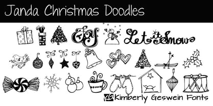 A variety of whimsical, hand-drawn Christmas doodles.
 - Handy Sans by MADType,
$21.00 Handysans is a happy hand drawn sans face.
 - Gnarlee by Gerald Gallo,
$20.00 Gnarlee is a casual hand-drawn serif font.
 - Wingbrush by Michael Browers,
$25.00Wingbrush is a whimsical, hand-drawn brush font. - Gala72 by Dmitriy Shchetinskiy,
$25.00 Gala72 font consist of 72 calligraphic greetings letterings for different event. These letterings are original and handwritten. This font makes it possible to use high quality calligraphy in your projects - greeting cards, certificates, invitation cards, letters of commendation etc.
 - Congratulatory 2.0 by Dmitriy Shchetinskiy,
$19.00 Congratulatory 2.0 font consist of 36 calligraphic greetings letterings for different event. Letterings are original and handwritten. This font makes it possible to use high quality calligraphy in your projects - greeting cards, certificates, invitation cards, letters of commendation etc.
 - High Tide AT by Arctype,
$12.00 High Tide is inspired by the lettering made by the fisherman of Cornwall. Shapes made by hand that are created to be functional with a geometric precision, yet appear hand-drawn and human for an honest and sincere quality.
 - Winsberg by Garisman Studio,
$20.00 Winsberg comes from hand scratches to get a natural and natural writing. Winsberg is very suitable for use in various media such as packaging, logo, label, poster, shirt design, quote of wisdom, hand lettering, typography and many other media.
 - KG Turning Tables by Kimberly Geswein,
$5.00 A neater version of my font Complete in Him, a hand-drawn marker font. Hand drawn with a brush marker, this font is neat but still has enough twists to make it fun. Perfect for painted or brushed looks.
 - Congratulatory New Year And Christmas by Dmitriy Shchetinskiy,
$19.00 Congratulatory New Year and Christmas font consist of 36 calligraphic greetings letterings. Letterings are original and handwritten. This font makes it possible to use high quality calligraphy in your projects - greeting cards, certificates, invitation cards, letters of commendation etc.
 - Pavement by ECHT! Johan Manschot,
$30.00 Pavement is a display typeface, based on the roughness and hardness of a street tile. I wanted to make a font with some real streetvibes, so it can easily be used for all kind of street cultures like music, (stencil) graffiti, street-art and fashion.
 - Gladolia by Ahmad Jamaludin,
$17.00 Get ready to rock your designs with the brand new Chunky Groovy Font, GLADOLIA! 🎉 Gladolia is a chunky typeface with a unique retro style that is sure to make your designs stand out. With 2 different style fonts, regular and oblique, plus an extra Extruded Font version for each style, you can easily create eye-catching designs without any extra effort. This font is perfect for a retro 80s theme and can be used for cover magazines, brochures, logos, headlines or quotes, stand-alone displays, and short paragraphs or content. Each font in the family is dynamic and authoritative on its own, making it perfect for any display project. So what are you waiting for? Elevate your designs with the cool and groovy vibes of Gladolia! 🤘 Similar Item: Sugar Peachy : LINK HERE Gyoza : LINK HERE Gunydrops : LINK HERE Swipe: LINK HERE Replay : LINK HERE Bright : LINK HERE Margin : LINK HERE Nighty : LINK HERE What you get? Gladolia Regular Gladolia Italic Gladolia Shadow Regular Gladolia Shadow Italic Features : Alternates and Ligatures Instructions ( Access special characters, even in circuit design ) Letters, numbers, symbols, and punctuation No special software is required to use this typeface even work in Canva Multilingual Support Give your design projects that fun, playful edge with GLADOLIA! Thank you, Dharmas Studio
 - Promenade by Jen Wagner Co.,
$17.00 Introducing Promenade – a calligraphic serif that started on paper with a flat nib pen (see the 6th image), and blossomed into a full serif with italics. At its core, this font is just... beautiful. It's elegant, it's crisp, it's delicate, but can still hold its own. As I was creating the graphics, I just couldn't get over the flow of the letters – especially the italic. It's got class, but also isn't afraid to rock a pair of Doc Marten's. Funny enough, Jen from Tonic (they make beautiful websites) saw a preview of this font and said, "I'd take that font to prom." Which of course spurred a conversation about how this font would take a Mercedes G-Series instead of a limo, and wear Doc Marten's instead of heels, but still wear the most gorgeous dress, and that is 100% Promenade (and inspo for the name – thanks, Jen!). I've also been loving combining the regular and italic, especially for logos (see the "Friendfolk" logo) One thing to note about Promenade is the letter spacing. It was spaced for clean reading and intentional balance, so I recommend setting the spacing a little tighter if you want to create the display look found in many of the logo mockups(around -20 to -40 should do!).
 - Black Puma by Gergely Soós,
$20.00 The Black Puma typeface was inspired by the rock beats and the honest spirit of today's indie music scene. Just as evolving garage bands', Black Puma’s strength lies in its fresh and brave approach: to playfully experiment and proudly take its imperfections as long as they are needed to stay real and honest. Black Puma's aim is to entertain, while expressing a strong human touch through its handmade and creatively assembled characters. Black Puma's varying rounded and edgy shapes create a vibrating yet coherent visual, which carries a positive, playful atmosphere. Its irregularities and extra bold characters empower Black Puma to have great and touching visual impact, which make it stand out of the mass flow of information delivered in the information society we live today. Black Puma font - with its 370 glyphs - includes all the accented characters of the Latin alphabet, and also comes with a couple of alternate characters (stylistic and contextual) to play around with. And, above all - as mentioned before - it includes its essence: the young spirit. So come, play around and have fun with Black Puma. Use it to create expressive, passionate posters, flyers and art work full of spirit for the awaiting young-minded public. You can find more artwork using Black Puma under the "Gallery" tab above.
 - Limited Appeal JNL by Jeff Levine,
$29.00 The cover of a 1950s-era catalog for the Freedman Novelty Company (of San Francisco California) had the word "Novelty" hand-lettered in an unusually angular type style against various geometric shapes somewhat resembling balloons. While the lettering was quirky enough to warrant re-drawing as a digital font, the shapes would have presented a visual nightmare in design and spacing, so simple black rectangles were substituted and the letters appear in white. Since novelty lettering of this type would never become "standard" in use, its function became the font's name, Limited Appeal JNL. There is just a simple A-Z and 1-0 character set along with basic punctuation.
 - Gradl Max by Fresh Air Fonts,
$14.00 Max J. Gradl was a German jewelry designer. A Web search today turns up several examples of his work from the turn of the 20th century. He seemed to favor green stones in silver metalwork. Gradl also did advertising work and co-authored a book on architectural design. Most important for our purposes, though, are the incredible hand lettered alphabets and monograms the man left behind. I’ve digitized one of those delightful alphabets and tried to keep it true to the original. Beyond the base character set of letters, numerals and basic punctuation, I had to extrapolate forms that, I hope, hold true to Gradl’s design. Enjoy!
 - Vagary JNL by Jeff Levine,
$29.00 For many decades, the fashion magazine “Vogue” featured superbly illustrated covers before photography became more commonplace. During the 1930s and 1940s those illustrations were accompanied by many creative styles of hand lettering for its monthly issues. The January, 1930 cover had the magazine’s name lettered in an Art Deco geometric monoline, which became the inspiration for Vagary JNL, which is available in both regular and oblique versions. A vagary [in a simple sense] is when something or someone changes in an erratic or unexpected way (as the wind’s direction or in a person’s mood or whim)… and thus seemed the fitting name for this type style.
 - Winter Garden JNL by Jeff Levine,
$29.00 Winter Garden JNL was modeled from the eccentric sans serif hand lettering with varying line widths found on the sheet music of 1917's "When the Girl You'd Give the World to Win Gives Her Heart to You". (It seems that sheet music from the early 1900s often had song titles that were more than just a few choice words. This particular ditty's title took up fourteen words to make its point.) The font is available in regular and oblique versions and gets its name from both the famed theater in New York and the city located 14 miles West of downtown Orlando, Florida.
 - Space Time by Lauren Ashpole,
$15.00 What can I say? I like fonts with stars. Space Time is a hand drawn font with a lot of variety. I started designing the regular version with the characters slightly touching but it wasn't quite what I had in my head. I’d imagined tightly spaced letters with overlapping shadows and the only way to get that effect was to create a second version with stackable layers. That means this download includes regular, base, outline, shadow, and stars files. Plus, the base and outline can be used for stacking or work fine as standalone fonts. This font is all caps but the lowercase letters feature alternative styles.
 - Trade Convention JNL by Jeff Levine,
$29.00 An ad for the annual Variety Club Convention appeared in the March 18, 1940 issue of "The Film Daily. The main headline was hand lettered in a classic Art Deco "solid" style of sans serif - ultra bold and with no counters - but had one additional feature: 'engraved' lines to the left of each character. This has now been expanded into the digital typeface Trade Convention JNL, which is available in both regular and oblique versions. Variety Clubs (now know as Variety - The Children's Charity) was founded in Pittsburgh, Pennsylvania in 1928 by entertainers specifically to aid children. Their history can be found at https://variety.org/who-we-are/history
 - Sea Cruise JNL by Jeff Levine,
$29.00 Years before the "Jet Age", and way before computers and satellite television turned us into jaded "armchair travelers", the ocean voyage aboard giant steamships to distant ports of call beckoned many to travel the Seven Seas. Far away lands had a magic and mysticism to them, for few Americans knew anything about those places unless they read about them in books or saw travelogs at their local theaters. Many songs were written with themes of romantic South Seas travel, and one vintage piece in particular entitled "Down Where the Trade Winds Blow" offered up the hand lettering which served as a model for Sea Cruise JNL.
 - Stamped Brass Stencil JNL by Jeff Levine,
$29.00 Up until the advent of modern packing and shipping methods, the common way to mark merchandise or other items to be transported was through the use of a brass stencil. These marking devices were hand stamped (or punched) using metal dies that were struck against sheets of brass to create the letters, numbers and other symbols [unlike the steel rule die cutting method used for manufacturing paper stencils]. One such example of an antique marking stencil had letters and numbers approximately one quarter of an inch in height, and Stamped Brass Stencil JNL recreates the design complete with the unusual variations of character shapes and widths.
 - Saussa by Linotype,
$29.99Patricia Pothin-Roesch's Saussa typeface began life as brush-lettered artwork for fruit salad packaging in France. After the key letters had been painted, Patricia Pothin-Roesch switched to digital tools to create the final font. True to its roots, Saussa is a real advertising face, perfect for point-of-purchase displays. Even its name is consistent with its intended area of application: Saussa sounds a lot like the word “sauce.” Saussa is an informal script; its outstrokes function almost like serifs, and the capitals have a lowercase structure. The feelings this typeface conveys are due to the hand of its creator, Patricia Pothin-Roesch, an experienced brush-letterer. - Song Merchant JNL by Jeff Levine,
$29.00 Although the early 1900s through the 1920s seemed to be the "Golden Age" of ridiculously long novelty song titles, it appears that even the decade of the 1940s had its fair share as well. Song Merchant JNL was modeled from the hand lettered [but exhausting] title of the sheet music for "Princess Poo-Poo-Ly Has Plenty Pa-Pa-Ya (and she Loves to Give it Away)". Despite the obvious double-entendre inferences of the title, the square block letters with rounded corners make for a useful headline font (even if the source material it was drawn from is quite forgettable). Available in regular and oblique versions.
 - Samui Script by Eclectotype,
$40.00 Named for the island that I had the pleasure of calling home for four years, Samui Script is a lovingly made, hand-lettering-style, script font, with a bouncy baseline and exuberant character. Taking mid 20th century commercial lettering as its inspiration, it is no revival, or pale imitation of past forms. This font can be as contemporary as you need it to be, or as retro, or somewhere in between. A wealth of sophisticated OpenType features lie beneath the bouncy exterior, making for a versatile script font that performs well at headline sizes, but is also legible enough to set small amounts of copy.
 - Seol Sans by Monotype,
$187.99 The Seol Sans design offers a fresh palette for designers working with the Korean alphabet, particularly those looking to pair Latin and Korean alphabet (or Hangul) forms without creating typographic friction. The choices for Hangul fonts that work well with humanist Latin typefaces are limited. As Monotype’s first original Korean design, the Seol Sans typeface is a humanist take on the traditional rigid and hard designs of Hangul characters. The Seol Sans design more closely resembles the natural curve of hand-written characters. Seol Sans features Neue Frutiger for its Latin glyphs, and works harmoniously with Neue Frutiger World and Monotype’s CJK typefaces: Tazugane Gothic (Japanese) and M XiangHe Hei (Chinese). Seol Sans is a great choice for global brands using a Sans Serif design looking to maintain their visual identity, and communicate with a consistent tone of voice in the Korean market. Seol Sans has over 18,000 glyphs, and supports the Adobe-Korea1-2 and KS X 1001:2004 character sets.
 - Scripps College Old Style by Monotype,
$49.00The story of Scripps College Old Style is a heart-warming and inspiring chronicle about a young librarian, a handful of students, a wealthy grandmother, a dedicated educator -- and two eminent American type designers. The story begins in 1938, when Dorothy Drake, the newly hired librarian at Scripps College, a small women's college in southern California, became an impromptu dinner companion of the American type designer Fred Goudy. By the 1990s, the original fonts that Goudy had created for Scripps College in the 1940s had become prized -- but they were seldom-used antiques. Scripps needed digital versions of the metal fonts. This goal posed two immediate challenges: finding a designer familiar with letterpress printing who was skilled at creating digital fonts, and locating the money to commission the designer's services. The first challenge was the easiest to conquer. Sumner Stone was my first and only choice," recalls Kitty Maryatt, the current curator of the Scripps College Press. "I knew he had letterpress experience, was an accomplished calligrapher, and that his typeface designs were simply exquisite. The choice was easy."The second challenge was more difficult. It took the dedication, hard work and tenacity of Maryatt to bring the beautiful Goudy designs into the twenty-first century. While Stone was eager to begin work on the project, the college had no more money for new typeface designs in the 1990s than it did in the1930s. Years of lobbying, cajoling and letter writing were necessary to obtain the college's approval for the design project. Once she had the necessary funding, the design brief posed yet a third challenge. Goudy had provided two sizes of type to the Press: 14 point and 16 point. Which would serve as the foundation for Stone's work? In addition, the Goudy fonts were quite worn. Should Stone use printed samples as his design master, or base his work on the original Goudy renderings? The 14-point master drawings were the ultimate choice, with the stipulation that the finished fonts would provide both a seamless transition from the worn metal versions and a faithful representation of the original Goudy designs. Once the budget and design brief were established, the process of converting the original Goudy drawings into digital fonts took just a little over two months. Stone delivered finished products to Scripps in the fall of 1997. The first official use of the fonts was to set an announcement for a lecture by Stone at Scripps in February of 1998. But the story is not quite finished. Maryatt was so pleased with the new digital fonts, she wanted to share them with the graphic design community. At Stone's suggestion, she contacted Monotype Imaging with the hope that the company would add the new designs to its library. An easy decision! Now Monotype Imaging is part of the story. We are proud to announce the release of Scripps College Old Style as a Monotype Classic font. The once exclusive font of metal type is now available in digital form for designers around the world. " - Ghosttown BC - Personal use only

- Akakios by Nantia.co,
$12.00 Akakios uppercase font is an adorable hand-made typeface with a lot of charisma. From “hand-written” quotes to product packaging, merchandise, and branding projects, this font is so versatile that it can cover them all. Greek character set included.
 - Sage & Pink by Pixel Colours,
$15.00 Sage & Pink is a font lovingly designed to look as close as possible to a natural hand writting. Includes 3 styles of letters to make your designs look uniquely made by hand. A font family that also looks great on logos!
 - Corazon by HandletterYean,
$10.00 Corazon is a simple, yet cute font. This mono-line serif font shows simplicity, and has happy and fun vibe which can be used for quotations, logos, titles, advertising, business cards, signs, greeting cards, flyers, magazines, t-shirts, and much more!
 - Wondershine by Handpik,
$13.00 wondershine is elegant,beauty and smoothless serif display .This font is suitable for invitation cards, decorations, clothing products, greeting cards and others. This font also has uppercase, lowercase, numeric, puntuation and multilingual. and there are several ligature and stylistic alternate.
 - Hellshock by Comicraft,
$19.00 Check into your local lunatic asylum with this font, etched on the walls of his padded cell by Comicraft's left-handed right-hand man, Dave Lanphear, for Jae Lee's Image comic 'Hellshock'. Artwork from Elephantmen: War Toys by Starkings & Moritat
 - Houseback by Wacaksara co,
$16.00 Houseback is truly inspired by hand-lettering and vintage style, with the natural flow of hand-lettering this typeface is ready to use for your projects such as logotype, letterhead, posters, apparel design, labels, advertisements, product designs, mural, and more.
 - Frazzle by Paul O'Connell,
$9.95 This roughly hand drawn font was created to give that loose scribbled effect look and to imitate a typically hand written style. Designed and produced by Paul O'Connell of POCT, it is a typeface purely for fun to experiment with.
 - Nagotire by HafisHidayat,
$20.00Introducing the elegant and fashionable Nagotire handwritten font, which looks like a signature, this font is purposely made with a quirky alternative. Nagotire is suitable for greeting cards, product packaging, news, invitations, posters, blog posters, branding, business cards, logos, etc. - Rileyson by Club Type,
$36.99 Crisp contemporary Sans-serif family useful for clear, clean corporates, stylish branding letterforms or friendly, casual messaging too, with use of its capital and lower case ligatures, swash capitals, old style numerals and many ornaments.
 - Blugie by Cititype,
$12.00 Blugie is a tasty new font for all of your fun projects! It's a mixed-case font (uppercase and lowercase are all the same height) so you can mix and match letters within a word.
 - Caveman by Corradine Fonts,
$14.95 Caveman is a very rustic font, suggestive of prehistoric cave art when man first learned to draw and to express emotions through painting. It comes in four styles and two sets of very decorative dingbats.
 - Charterhouse by Device,
$29.00 A heavy obround sans with a high x-height and unusual lower-case spurs that flow up and into the bowl. This curve is mirrored in the ascenders. The alternates provide for closer, denser setting.
