10,000 search results
(0.02 seconds)
- Cienfuegos - Personal use only

- Beautiful Beasts - Unknown license

- WhoopAss - Personal use only

- Pea Bethany's Doodles - Unknown license

- D3 Labyrinthism katakana - Unknown license

- Instant Soup Mix - Unknown license

- PiratesTwo - Unknown license

- Brushstroke Plain - Unknown license

- Fish in the bathroom - Unknown license

- Skeleton Sketched - 100% free

- Chemical Gus - Unknown license

- QuickKleinSketches - 100% free

- Roadbrush by Kustomtype,
$25.00 Roadbrush was inspired by the mid-20th-century hand lettering of Albert Eckhardt, Jr., that I found in a 1950’s sign painting book. Roadbrush is a retro brush-style script that I re-designed and completely re-mastered. Roadbrush is a powerful font that can be used for logotype, packaging, posters, T-shirts, signage & design projects with a retro & vintage feel. Roadbrush comes with four styles that contain all upper and lower case characters, punctuation, numerals and mathematical operators, as well as all accented characters.
 - Chelsie Hilton by PeachCreme,
$19.00 We're excited to present to you our new font, "Chelsie Hilton"! A great thing about this font is that it is both chic and legible at the same time. You can confidently use it on such machines as Cricut since its edges are smooth enough and this font will fit just right. When creating this signature font, we took care to make it as crisp and modern as possible. "Chelsie Hilton" is perfect for logos, wedding designs, quotes, cards, stationery, signature, display text, and many more.
 - Trendiest by Lucky Type,
$15.00 Hello designers, let me introduce my newest handwritten font Trendiest. Trendiest is a new modern handwritten font with a bold style and contemporary design approach, naturally handcrafted, perfect for use in title designs such as clothing, invitations, book titles, stationery designs, quotes, branding, logos, greeting cards, T-shirts , packaging design, posters and more. Complete with upper and lower case letters, as well as multilingual support, numbers, punctuation, and some excellent ligatures. Thank you so much for looking and let me know if you have any questions.
 - Aesthetic Violet by Abo Daniel,
$12.00 introducing AESTHETIC VIOLET - natural handbrush script - AESTHETIC VIOLET is natural handbrush font with ending swash. It is great for quotes, card, banner, book, social media content, and anything about your project. The ending swash makes this font look so natural. Very easy to access it. You only need to add an underscore twice after the lowercase. This product came in 2 styles, regular and slant. Features: - Uppercase - Lowercase - Ending swash - Number & punctuation - Multilingual - PUA encoded I hope you love it. regards, Abo Daniel Studio
 - Pokerface by Ascender,
$29.99 Pokerface is an industrious mixed-case display font devised on the theme of playing cards, designed by Jim Ford. Most letterforms in the font have 'four of a kind' while some are only available in pairs. It features Clarendon-style slab serif and grotesque sans serif forms. Furthermore, the letterforms are 'shuffled' to give a random appearance in standard text. It fuses a utilitarian sturdiness with a soft and friendly feel, and adds a bold flare to headlines, logos and posters. Character Set - Latin 1, OpenType extras.
 - Myster by Serebryakov,
$49.00 Myster is a truly random font — each lowercase letter has three alternatives, that interchange in the set. This makes Myster look alive, hand-crafted, painted for a special occasion, rather than a font selected from a regular type case… Of course, the mystical character of the font defines the scope of its usage — film, gaming and publishing industries. However Myster’s field of application goes beyond them. This font is able to create a desired atmosphere in packaging, children books, magazines, as well as in advertising.
 - Frunch by Nasir Udin,
$22.00 Starve for tasty bold font? Say hello to Frunch! A delicious bold script font with a vintage vibe. Frunch comes to you with several alternate letters for you to play with and the complete set of lowercase-letter swashes that make your words look delicious and stand out. It's especially created for food & beverages branding as well as product packaging typography (e.g.: snack, honey, breakfast meal, milk, bread and cake). It's also perfect for poster, business cards, headline, restaurant menus, and much more. Have fun with Frunch!
 - Coluna by Dominik Krotscheck,
$12.00 Coluna is a friendly, handdrawn all caps font. Due to its playful, organic shapes it makes you think of cocktails on the beach and the earthy smell of the woods in the morning. It offers vast support for languages using the latin alphabet and comes with a couple of icons to make it even easier to complete the handmade look of your designs. Coluna is perfectly all sort of different use cases, such as birthday cards, packaging, children's books, branding, posters, menus and many more.
 - Healt Justice by Lucky Type,
$15.00 Health Justice is a new modern handwritten font with a bold style and contemporary design approach, naturally handcrafted, perfect for use in title designs such as clothing, invitations, book titles, stationery designs, quotes, branding, logos, greeting cards, T- shirts, packaging designs, posters, and more. Complete with upper and lower case letters, as well as multilingual support, numbers, punctuation, several perfect ligatures and has swashes that will make your designs more attractive. Thank you so much for looking and let me know if you have any questions.
 - Gildersleeve by Greater Albion Typefounders,
$7.95 Gildersleeve evokes the spirit of the Arts and Crafts movement of the 1920s. Think of a hand-cut Roman display face, with loving care lavished over each serif and letterform. Gildersleeve is offerered in the classic combination of a regular face, a bold face, an italic and an italic bold. Any of them are ideal for poster or cover work, as well as for chapter and section headings in a longer document, in combination with a text face such as Vertrina or Clementhorpe Text.
 - Dulcinea Serif by JVB Fonts,
$29.50 The aim of this typeface is to merge two historical moments in the form and style of writing, on the one hand calligraphy uncial, and on the other Roman serif was established as a universal standard for type fonts continuous text at the time. Is intended in terms of their functionality as a font for titles. The family includes some extended range glyphs as several Caps swashes and stylish alternatives for upper and lower case, standard and discretional ligatures, old numerals and other OpenType features.
 - Hachura by Outras Fontes,
$24.00 Hachura is a sketchy typeface designed by Ricardo Esteves. Its general proportions are based on the garalde models, with traditional roman serifs. It was initially made by hand using a drawing technique to create a font that simulates the unfinished aspect of a work in constant progress. This textured face is useful for display sizes, making a very visible presence. Because of its basic dimensions and careful distribution of black and white, it still also very readable in text sizes like 10 or 8 points.
 - Calligri by SummitType,
$25.00 Someday, as computers become the new medium for writing, the art of cursive handwriting will slowly become a lost art. Calligri seeks to preserve this endangered style with tastefully drawn letters that connect with each other in classical artistry. Calligri includes a full character set (UPPER and lower case), all punctuation, all special characters, Euro symbol, and all Latin Extended-A characters, making this font a perfect match for any project including personal messages or notes, holiday cards and newsletters, and wedding invitations and announcements.
 - Bellamy by Calamar,
$12.00 Bellamy is a hand-drawn calligraphic script with dancing baseline and lots of possibilities. This expressive font will look awesome on your cards, wedding invitations, headings, branding materials, quotes, t-shirt and any other amazing projects you are working on. Bellamy includes Upper and Lowercase Basic Characters, Alternates Lowercase Characters, Standard Ligatures, Numbers and Punctuation. Bellamy has multilingual support for the Western and Central European Languages.
 - Ramllast by Thanoestd,
$15.00 INtroduction, Ramllast, This font is natural handwriting style, so if you need digital signature or natural hand writing for quotes, this is the perfect typeface for you! This font perfectly made to be applied especially in logo, and the other various formal forms such as invitations, labels, logos, magazines, books, greeting / wedding cards, packaging, fashion, make up, stationery, novels, labels or any type of advertising purpose.
 - Jodler by Beau Williamson,
$4.99 Inspired by show card lettering and the more human side of art deco, I wanted this font to retain the casual unevenness of informal hand lettering. As decorative as the font looks, I do envision it being used for text more than display. Obviously not a workhorse, but rather a quirky niche font. I find it makes dense philosophic texts more friendly to read.
 - Broiter by Abbasy Studio,
$15.00 Introducing Broiter, 2 font mono weight family with plenty of alternative long stemmed characters. These 2 fonts make it effortless to create hand made lettering, and perfectly suitable for made to be applied in logo, and the other various formal forms such as invitations, labels, logos, magazines, books, greeting / wedding cards, packaging, fashion, make up, stationery, novels, labels or any type of advertising purpose.
 - Hedgehog Lake by Tom Simons,
$10.00 “Can you write this card? You have the best handwriting.” Was commonly heard question by Karin that inspired the creation of this font. Now anyone is able to write in her unique style. Hedgehog Lake includes over 400 glyphs for languages based on the latin alphabet and comes in two weights. Perfect for designs that need a human touch like invitations, titles, and more.
 - Sveglia by Wacaksara co,
$15.00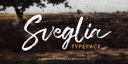 Sveglia is a hand brush casual script font inspired by urban fashion. This font is great for your next creative project such as Logotype, printed quotes, invitations, cards, product packaging, headers, Letterhead, Poster, Apparel Design, Label, and etc. Sveglia comes with uppercase, lowercase, numerals, punctuations and so many variations on each character include OpenType alternates, and common ligatures to let you customize your designs.
 - Hazzard by Dirtyline Studio,
$32.00 Hazzard is a script that is inspired by a retro style and combination with hand lettering style. I have made with personality in every single curve. I hope this can inspire your work with its very bouncy baseline. It also includes a super handy set of bonus swashes. Hazzard is ideal for logos, handwritten quotes, product packaging, header, poster, merchandise, social media & greeting cards.
 - Velvet Hammer by Great Lakes Lettering,
$40.00 The Velvet Hammer is a true hand calligraphy font that offers the viewer a sense of strong elegance. This font can be used for all things such as cards, posters, signage, wedding invitations, catalogs, book covers and so much more! The Velvet Hammer’s simple unique style can stand strong on its own or sit comfortably side by side with any display or text font!
 - Eckhardt Poster Brush JNL by Jeff Levine,
$29.00Eckhardt Poster Brush JNL is part of a series of fonts emulating many of the various styles of hand lettering employed by sign painters and show card writers. The series is named in honor of the late Albert Eckhardt, Jr. - a talented sign writer and a good friend of the font's designer, Jeff Levine. Eckhardt Poster Italic JNL is an angled treatment of the font. - Kickrush by Hustletter Studio,
$20.00 Kickrush is a font with the edgy characters and Positive energy for modern hand-lettered designs. It suitable for poster, logo, branding, t-shirt, packaging, book cover, hipster design, cards, and any brush lettering needs and more. Kickrush also includes full set of uppercase and lowercase letters, multilingual symbols, numerals, punctuation. What Included this font : PUA Encoded Characters Fully accessible without additional design software. Simple installations
 - Brosley by RCKY Studio,
$18.00 Brosley is a beautiful hand-painted font, a contemporary approach to design and unique in each letter. Suitable for use in title designs such as clothing, invitations, book titles, stationery designs, quotes, branding, logos, greeting cards, T-shirts, packaging designs, posters, and more. Brosley contains a complete set of lowercase, uppercase, alternative, binder, punctuation, numbers, and multi-lingual support. Thank you for your purchase!
 - Specta Retro Script by Identitype Co,
$20.00 Specta Typeface Inspired by Retro style and combination with Hand Lettering style. I'm made with personality touch every single curve. I hope this can make inspire you from your work. and a very bouncy baseline It has a perfectly paired complimentary marker font , and a super handy set of bonus Swash. Ideal for logos, handwritten quotes, product packaging, header, poster, merchandise, social media & greeting cards.
 - Spur Wide JNL by Jeff Levine,
$29.00 Spur Wide JNL was modeled from an example of hand lettering from the antique French alphabet book L'Art du Tracé Rationnel de la Lettre. Heavy Roman style letters with spurs (often referred to as Latin) were most popular with sign painters and show card writers in the early part of the 20th century. Spur Wide JNL is available in both regular and oblique versions.
 - Emoji Emotions by Pixel Colours,
$16.00 Emoji Emotions Font is a hand drawn dingbats font inspired in human emotions and feelings. Includes the complete emojis and the individual faces. Create beautiful quotes, social media posts, posters, cards, ads, packaging or any design with character! Includes 9 original emojis that you will love :) Includes: Emoji Emotions: includes the complete emojis Emoji Emotions Faces: includes just the faces so you can make color emojis
 - Vanilla Bubble by Insan Perkasya,
$12.00 Introducing the "Vanilla Bubble" font, a fat handwriting font with a unique shape plus a few strokes to add a striped impression, this font is made directly by hand so it produces a cute and natural shape. This font is very suitable for all designs such as logos, wedding invitations, greeting cards and others, please try it. If you have any questions, don't hesitate to contact us.


