10,000 search results
(0.024 seconds)
- Imagine, if you will, Stroke Dimension by Måns Grebäck as the James Bond of the typography world—sophisticated, yet oozing with personality. Created by the masterful artist Måns Grebäck, a name that ...
- Hello My Love Pro by Debi Sementelli Type Foundry,
$39.00 “Hello My Love” is a font love story. Inspired by my own long and happy marriage of 35 years, it was created to celebrate love! A classic hand-lettered script with a modern and fresh feel, it fits beautifully with current designs and yet is sure to stand the test of time. Made with invitation designers in mind, the Hello My Love Pro script font includes a total of 1985 glyphs plus a BONUS FONT, Hello My Love Ornaments! It has 91 hand illustrations including frames, florals and design elements. As a result, you will be able to create a variety of designs to highlight your special project. It’s especially well-suited for invitations for branding weddings and other special occasions! And it supports 129 languages! The font is loaded with features: Stylistic and Contextual Alternates, Swash Caps, Standard and Discretionary Ligatures, Beginning Swashes for lower case letters, Cross-less t and f that can be combined with a flourished letter to avoid clashing plus 3 ampersands, small word art "and" & "No.", Roman Numerals, Ordinals and Fractions. This font was created to make designing easy. Need to convert upper case letters into Roman numerals throughout a guest list? Just turn on contextual alternates in Open Type capable programs and presto, the caps become Roman! Want a variety of letter choices? There are 215 stylistic alternate upper cases and 259 stylistic alternate lower cases as well as 69 ligatures to give you plenty of options. You can choose from swashes in 4 different styles and 3 different lengths resulting in unique beginning lower case letters. Works for Cutting Machines! No special software is required to use Hello My Love. All of my fonts have been specially coded for PUA (Private Use Area) so you can access all of the swashes and alternates using Character Map (PC) or Character Viewer (Mac) or with any number of apps including PopChar. If you would like to purchase PopChar at a special discount email me and I will send you the link. For Microsoft Word users, you can easily access the Stylistic and Contextual Alternates and the Roman Numerals through the Typography feature. (Microsoft Word 2010 and later) For more details about how to use my fonts, check out my video tutorials on my YouTube channel: https://www.youtube.com/user/Letteringartstudio/videos
 - Sadlyne Cyrillic by Ira Dvilyuk,
$19.00 Amazing lightness of modern calligraphic writing is reproduced in handwritten script font Sadlyne. This font consists of a pair of handwritten script font and additional font with hand-drawn flourishes and decorative elements. An outstanding feature of them is the fanciful swirls of the initial and final tails of the letters, which will add a playful elegance to your typography designs. The handwritten font itself includes all abundance of modern calligraphic font capabilities. The font pair Sadlyne is the best option for your wedding stationery and wedding monograms. Also it will be perfect for branding, logos, social media, packaging, and other projects. Sadlyne script contains a full set of uppercase letters and 5 full sets of lowercase letters, (standard, alternative, and initial, final form and flourish form). To make a needed form just type a letter with a number (such as a1, b1, c1...) and 27 ligatures - which can be used to create a handwritten calligraphy look. Sadlyne script font contains the Cyrillic glyphs too. The Cyrillic part of the font contains the uppercase letters and 3 full sets of lowercase letters, (standard, initial and final form). To make a needed form just type a letter with a number such as a1, б1, в1... After that select the word and apply the Open Type Features in programmes such as Adobe Illustrator, Photoshop, and others) Also Cyrillic part of the font contains 12 Cyrillic ligatures. To use all features of the font you need to have an access to all Opentype Features in software you work with. Sadlyne Symbols is a font with over 36 hand-drawn elements, illustrations and swashes that can help you to make your design unique and matchless. Combine and merge swashes and illustrations to create your own designs and make borders, frames, dividers, logos, and more (just use A-Z and a-z keys in the included Sadlyne Symbols font). A different symbol is assigned to each uppercase or lowercase standard character, so you do not need graphics software, just type the letter you need. Multilingual Support for 31 languages: Latin glyphs for Afrikaans, Albanian, Basque, Bosnian, Catalan, Danish, Dutch, English, Estonian, Faroese, Filipino, Finnish, French, Galician, Indonesian, Irish, Italian, Malay, Norwegian Bokmål, Portuguese, Slovenian, Spanish, Swahili, Swedish, Turkish, Welsh, Zulu. And Cyrillic glyphs support for Russian, Belorussian, Bulgarian, and Ukrainian languages.
 - TA Bankslab by Tural Alisoy,
$33.00 The building of the Northern Bank of St. Petersburg's Baku branch was built in 1903-1905. It was the first Art Nouveau-style building in Baku, Azerbaijan. Later the bank was transformed into the Russian-Asian Bank. After the oil boom in Baku in the 19th century, branches of many banks and new banks were opened in the city. The branch of the Northern Bank of St. Petersburg was among the first banks that was opened in Baku. N.Bayev was the architect of the building for the branch of the Northern Bank of St. Petersburg located at Gorchakovskaya 3 in 1903-1905. The building currently houses the Central Branch of the International Bank of Azerbaijan. My purpose in writing this is not to copy and paste the information from Wikipedia. What attracted me to the building was the word "Банкъ" (Bank) written in Cyrillic letters, which was also used in Azerbaijan during the Soviet era. The exact date of the writing is not known. Every time I pass by this building, I always thought of creating a font of this writing someday. I had taken a photo of the building and saved it on my phone. I did a lot of research on the font and asked a lot of people. However, some did not provide information at all and some said they did not have any information. I was interested in the history of this font but I do not know if this font really existed or it was created by the architect out of nowhere. If there was such a history of this font, I wanted to recreate this font and make it available. If not, I had to create it from scratch in the same way, using only existing letters on the building. Finally, I made up my mind and decided to develop the font with all letters I have got. It was difficult to create a font based on the word, Банкъ. Because in the appearance of the letters, the midline of the letters on A, H, K was very distinct, both in the form of inclination and in more precise degrees. The serif part of the letters, the height of the upper and lower sides, differed from each other. I don't know whether it was done this way when the building was constructed or it happened over time. I prepared and kept the initial version of the font. I took a break for a while. I started digging on the story of the font again. Meanwhile, I was researching and got inspired by similar fonts. Unfortunately, my research on the font's history did not yield any results. I decided to continue finishing up the font. After developing the demo, I created the font by keeping certain parts of these differences in the letters. In addition, I had to consider the development of letters in the Cyrillic, as well as the Latin alphabet, over the past period. Thus, I began to look at the appearance of slab-serif or serif fonts of that time. In general, as I gain more experience in developing fonts, I try to focus on the precision of the design for each font. In recent years, I specifically paid attention to this matter. YouTube channel and articles by Alexandra K.'s of ParaType, as well as, information and samples from TypeType and Fontfabric studios on the Cyrillic alphabet were quite useful. I gathered data regarding the Latin alphabet from various credible sources. I do not know if I could accomplish what I aimed at but I know one thing that I could develop the font. Maybe someday I'll have to revise this font. For now, I share it with you. I created the font in 10 styles. 7 weight from Thin to Extra Black, an Outline, Shadow, and Art Nouveau. The Art Nouveau style was inspired by the texture in the background used for the text on the building. The texture I applied to capital letters adds beauty to the font. If you like the font feel free to use it or simply let me know if your current alphabet doesn't support this font.
 - TA Bankslab Art Nouveau by Tural Alisoy,
$40.00 TA Bankslab graphic presentation at Behance The building of the Northern Bank of St. Petersburg's Baku branch was built in 1903-1905. It was the first Art Nouveau-style building in Baku, Azerbaijan. Later the bank was transformed into the Russian-Asian Bank. After the oil boom in Baku in the 19th century, branches of many banks and new banks were opened in the city. The branch of the Northern Bank of St. Petersburg was among the first banks that was opened in Baku. N.Bayev was the architect of the building for the branch of the Northern Bank of St. Petersburg located at Gorchakovskaya 3 in 1903-1905. The building currently houses the Central Branch of the International Bank of Azerbaijan. My purpose in writing this is not to copy and paste the information from Wikipedia. What attracted me to the building was the word "Банкъ" (Bank) written in Cyrillic letters, which was also used in Azerbaijan during the Soviet era. The exact date of the writing is not known. Every time I pass by this building, I always thought of creating a font of this writing someday. I had taken a photo of the building and saved it on my phone. I did a lot of research on the font and asked a lot of people. However, some did not provide information at all and some said they did not have any information. I was interested in the history of this font but I do not know if this font really existed or it was created by the architect out of nowhere. If there was such a history of this font, I wanted to recreate this font and make it available. If not, I had to create it from scratch in the same way, using only existing letters on the building. Finally, I made up my mind and decided to develop the font with all letters I have got. It was difficult to create a font based on the word, Банкъ. Because in the appearance of the letters, the midline of the letters on A, H, K was very distinct, both in the form of inclination and in more precise degrees. The serif part of the letters, the height of the upper and lower sides, differed from each other. I don't know whether it was done this way when the building was constructed or it happened over time. I prepared and kept the initial version of the font. I took a break for a while. I started digging on the story of the font again. Meanwhile, I was researching and got inspired by similar fonts. Unfortunately, my research on the font's history did not yield any results. I decided to continue finishing up the font. After developing the demo, I created the font by keeping certain parts of these differences in the letters. In addition, I had to consider the development of letters in the Cyrillic, as well as the Latin alphabet, over the past period. Thus, I began to look at the appearance of slab-serif or serif fonts of that time. In general, as I gain more experience in developing fonts, I try to focus on the precision of the design for each font. In recent years, I specifically paid attention to this matter. YouTube channel and articles by Alexandra K.'s of ParaType, as well as, information and samples from TypeType and Fontfabric studios on the Cyrillic alphabet were quite useful. I gathered data regarding the Latin alphabet from various credible sources. I do not know if I could accomplish what I aimed at but I know one thing that I could develop the font. Maybe someday I'll have to revise this font. For now, I share it with you. I created the font in 10 styles. 7 weight from Thin to Extra Black, an Outline, Shadow, and Art Nouveau. The Art Nouveau style was inspired by the texture in the background used for the text on the building. The texture I applied to capital letters adds beauty to the font. If you like the font feel free to use it or simply let me know if your current alphabet doesn't support this font.
 - FS Brabo Paneuropean by Fontsmith,
$90.00Worldly Even though it’s a new arrival, FS Brabo has seen the world. Designed by a Brazilian working in London and studying in Belgium under a Dutchman, it’s certainly well-travelled. And it was inspired by the extraordinary archive of early book typefaces at the world-renowned Plantin-Moretus Museum in Antwerp, while Fernando Mello was attending Frank Blokland’s Expert class Type Design course at the Plantin Institute of Typography. It was there that Fernando became engrossed in the collection of early metal type, matrices, punches and type samples by figures such as Garamond and Granjon. So much so that he took on the mighty task of developing ‘a beautiful, functional, serifed text font’ of his own. Heroic FS Brabo’s journey from sketch to font family took an epic three years, starting in Antwerp, continuing at Fontsmith in London, and reaching its conclusion back in Fernando’s home city of São Paulo. No wonder Fernando was reminded of another titanic face-off: that of Antwerp’s Roman hero of legend, Silvius Brabo, and the evil ogre, Antigoon. Brabo came to the town’s rescue after the tyrannical giant had been charging ships’ captains extortionate taxes and chopping off the hands of those who refused to pay up. Having finally downed Antigoon after a long and terrible duel, Brabo cut off the giant’s own hand and threw it into the river Scheldt, unwittingly giving the town its name: the Dutch for ‘hand-throw’ is hand werpen. What better way for Fernando to name his literary typeface than after the hero of Antwerp’s oldest tale? The garalde factor FS Brabo is not a revival, but a very much a contemporary, personal interpretation of a garalde – a class of typeface originating in the 16th century that includes Bembo, Garamond and Plantin, with characteristically rounded serifs and moderate contrast between strokes. Brabo’s ‘ct’ and ‘st’ ligatures, upper-case italic swashes and contextual ending ligatures – ‘as’, ‘is’, ‘us’ – all preserve the beauty and character of traditional typefaces, but its serifs are chunkier than a garalde. Their sharp cuts and squared edges give them a crispness at text sizes, helping to bring a beautifully bookish personality to hardworking modern applications. A workhorse with pedigree It may give the appearance of a simple, four-weight typeface, but FS Brabo has hidden depths beneath its simplicity and beauty. OpenType features such as cap italic swashes, contextual ending swashes – programmed only to appear at the end of words – and stylistic alternatives make this a complete and well-equipped typeface. Comprehensive testing was carried out at text and display sizes, too, to prevent counters from filling in. All of which makes FS Brabo a very modern take on a traditional workhorse serif typeface: colourful and versatile enough to adorn not just editorial projects but also signage, advertising and logotypes. - FS Brabo by Fontsmith,
$80.00 Worldly Even though it’s a new arrival, FS Brabo has seen the world. Designed by a Brazilian working in London and studying in Belgium under a Dutchman, it’s certainly well-travelled. And it was inspired by the extraordinary archive of early book typefaces at the world-renowned Plantin-Moretus Museum in Antwerp, while Fernando Mello was attending Frank Blokland’s Expert class Type Design course at the Plantin Institute of Typography. It was there that Fernando became engrossed in the collection of early metal type, matrices, punches and type samples by figures such as Garamond and Granjon. So much so that he took on the mighty task of developing ‘a beautiful, functional, serifed text font’ of his own. Heroic FS Brabo’s journey from sketch to font family took an epic three years, starting in Antwerp, continuing at Fontsmith in London, and reaching its conclusion back in Fernando’s home city of São Paulo. No wonder Fernando was reminded of another titanic face-off: that of Antwerp’s Roman hero of legend, Silvius Brabo, and the evil ogre, Antigoon. Brabo came to the town’s rescue after the tyrannical giant had been charging ships’ captains extortionate taxes and chopping off the hands of those who refused to pay up. Having finally downed Antigoon after a long and terrible duel, Brabo cut off the giant’s own hand and threw it into the river Scheldt, unwittingly giving the town its name: the Dutch for ‘hand-throw’ is hand werpen. What better way for Fernando to name his literary typeface than after the hero of Antwerp’s oldest tale? The garalde factor FS Brabo is not a revival, but a very much a contemporary, personal interpretation of a garalde – a class of typeface originating in the 16th century that includes Bembo, Garamond and Plantin, with characteristically rounded serifs and moderate contrast between strokes. Brabo’s ‘ct’ and ‘st’ ligatures, upper-case italic swashes and contextual ending ligatures – ‘as’, ‘is’, ‘us’ – all preserve the beauty and character of traditional typefaces, but its serifs are chunkier than a garalde. Their sharp cuts and squared edges give them a crispness at text sizes, helping to bring a beautifully bookish personality to hardworking modern applications. A workhorse with pedigree It may give the appearance of a simple, four-weight typeface, but FS Brabo has hidden depths beneath its simplicity and beauty. OpenType features such as cap italic swashes, contextual ending swashes – programmed only to appear at the end of words – and stylistic alternatives make this a complete and well-equipped typeface. Comprehensive testing was carried out at text and display sizes, too, to prevent counters from filling in. All of which makes FS Brabo a very modern take on a traditional workhorse serif typeface: colourful and versatile enough to adorn not just editorial projects but also signage, advertising and logotypes.
 - Pencil Caps is a distinctive font that embodies the essence of handmade artistry and the simplicity of pencil sketches. Designed to capture the whimsy and raw aesthetic of pencil-drawn capital letter...
- Goldney by Set Sail Studios,
$16.00 There are a lot of script fonts out there - but Goldney isn't your average one, it's designed to be your go-to modern handwriting font. Goldney produces incredibly realistic letterforms and free-flowing sentences - this was achieved by writing out hundreds of individual words, then hand-picking the most natural looking letters. Also hand-picked was a whopping 90 Ligatures - these unique letter combinations give even more authenticity to each word layout. It's the perfect choice for genuine handwritten logos & branding, advertisement text, quotes, headers and product packaging. Goldney consists of 4 fonts files; Goldney • A handwritten script font containing upper & lowercase characters, numerals, and a large range of punctuation. Goldney Alt • This is a second version of Goldney, with a completely new set of both upper and lowercase characters. If you wanted to avoid letters looking the same each time to recreate a custom-made style, or try a different word shape, simply switch to this font for an additional layout option. Slanted Versions • Are included for both regular and alternate fonts. These can be used for a more italicised, fast-hand flow to your text.
 - Kira by Eurotypo,
$35.00 Kira is a modern hand-painted script with an irregular baseline. Rough edges and imperfect lines give to this brush font a unique and trendy look. All glyphs have been carefully painted giving your words a wonderful flow. Fat and thin stroke in this font impresses the harmony. Want to give your projects an organic, hand-painted look? Kira font contains 717 glyphs, with inky lines, and “perfect or imperfect” painted edges, including a few extra character alternates, stylistics and contextual alternates, swashes, stylistics sets, ligatures for a genuine hand-lettered effect. This font includes OpenType features that may only be accessible via OpenType-aware applications, a Central European language support. To activate the optional glyphs you may click on Swash, Contextual, Standard Ligatures and Discretionary, Titling, or Stylistic sets buttons in any OpenType savvy program or manually choose the characters from Glyph Palette. Bonus: 40 useful ornaments and a lot of catchwords that you use for the most demanding design project! Kira looks lovely on wedding invitations, greeting cards, logos, business cards and is perfect for using in ink or watercolour based designs, fashion, magazines, food packaging and menus, book covers and more!
 - Broadgauge Ornate by FontMesa,
$25.00Broadgauge Ornate originated from MacKellar, Smiths & Jordan in 1869 and was only available as an all caps font with numbers. Today this old beautiful wood type rises again from the archives complete with original numbers and an all new lowercase. An all caps Greek character set has also been added plus accented characters for western, central and Eastern European countries. Included in each font file are two sets of left and right pointing hands located on the Less Than and Greater Than keys and also on the Bracket keys. Because this font works well with a Las Vegas theme I've decided to make the pointing hands gambling related with one set of hands rolling dice and the other holding cards. The condensed versions were created because in today's computer graphics applications people stretch and condense fonts to fit their project but don't notice the change in vertical stroke widths or line thickness. After compressing the letter shapes of each Broadgauge Ornate condensed font the vertical lines were corrected making sure they were the proper width or thickness. The results are balanced condensed versions that weren't simply compressed with out consideration for their appearance. - Clutchee - 100% free

- Janda Snickerdoodle Serif - Personal use only

- Frangipani Rose - Personal use only

- Almanac of the Apprentice - Unknown license

- Loved by the King - Personal use only

- Hash And Beans JNL by Jeff Levine,
$29.00Sitting in a diner and looking upon a wall full of nostalgia, there hangs a picture of another older diner in some Northern city. The lettering from it's rooftop sign almost screams "Make a font out of this!"... so Jeff Levine did... "Hash and Beans JNL". - Koerier by Hanoded,
$15.00 Koerier means 'Courier' in Dutch and is a reference to the classic font it was modeled on. Each glyph was hand drawn, giving the font a unique look and feel, making it an ideal typeface for ads, posters and packaging. Comes with a full range of diacritics.
 - Posterizer KG Rough by Posterizer KG,
$30.00 Posterizer KG Rough is basically a hand-printed texture version of the Egyptian Slab Serif font Posterizer KG that already exists. Posterizer Kg Rough looks good on substrates with a rustic texture like wood, metal, textile, rough paper. It contains all the Latin and Cyrillic glyphs.
 - TurvyTopsy by Greater Albion Typefounders,
$9.00 TurvyTopsy offers all the fun of delightful hand-drawn irregularity, captured in a typeface. Designing this was a wonderful exercise in ignoring all the rules of precise geometric construction to which we normally work. These irregular forms somehow achieve a delightful character & legibility all of their own.
 - Prospect by ParaType,
$25.00 PT Prospect™. An original serif family designed in 1997-2001 by Natalia Vasilyeva and licensed by ParaType. A face of wide proportions and free lettershapes. The serifs have slanted edges. Based partially on the hand lettering of the author. For use in titling and display composition.
 - Brown Sugar by Muntab Art,
$18.00 Brown Sugar fonts includes uppercase letters, numerals, a large range of punctuation. Serif font with modern stylish style. Created for poster, web design, branding, illustrations, badges and some other works. Please contact us if you have any question, we are happy to help you! Thank you!
 - California Bound JNL by Jeff Levine,
$29.00 California Bound JNL is based on the hand lettering found on the side of the old California Zephyr passenger trains; the route now being a part of Amtrak. This somewhat unusual Art Deco design is more utilitarian than decorative, yet it still captures the "Streamline Era" perfectly.
 - Alessyia by Umbra95,
$15.00 Alessyia is a classic style typeface font. This font has classic but at the same time a fresh look. "Alessia family" includes 3 font types: Regular ( Classic and elegant with straight geometric lines ) Grunge ( Dirty and messy ) Retro ( Hand drawn brush font with an uneven texture )
 - Solitude JNL by Jeff Levine,
$29.00 A piece of vintage sheet music with the hand lettered title "Solitude" is the namesake and inspiration for Solitude JNL. Purely Art Deco in its typographic curves and angles of the period, this typeface typifies the "Streamline" style that permeated designs of the 30s and 40s.
 - Sweet Flower Monogram by AEN Creative Studio,
$14.00 Sweet Flower Monogram is an incredibly beautiful and romantic monogram with handwritten script font, featuring little hearts as ornaments. It looks stunning on wedding invitations, logos, labels, business branding, thank you cards, quotes, greeting cards, business cards and every other design which needs a handwritten touch.
 - Passenger Train JNL by Jeff Levine,
$29.00 A 1940s travel poster for the Florida East Coast Railway (which then carried passengers but is now a freight line) had the railroad’s name hand lettered in a bold Art Deco sans. This inspired Passenger Train JNL, which is available in both regular and oblique versions.
 - Blue Elfira by Qwrtype Foundry,
$14.00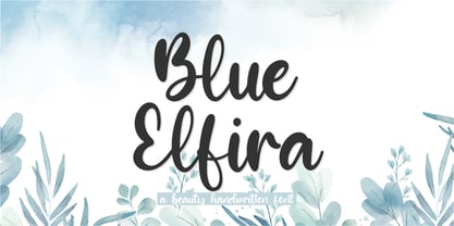 Proudly presenting: Blue Elfira Blue Elfira is a beautyful handwritten script font. Blue Elfira is perfect for product packaging, branding projects, magazines, social media, wedding invitations, or just used to express words above the background. Blue Elfira also comes with multillingual support. Enjoy the font, thank you!
 - Admercia by Khoir,
$15.00 Admercia is a classic minimalist serif font with lots of variant on each letter, this font is perfect for your design needs like creating eye-catching logos and titles to stand out in any design project. Admercia Uppercase Lowercase 75+ Language 87 Alternates Thank you for seeing
 - Quijibo by Matt Frost,
$20.00 Hand-made slab serif. It’s cute, it’s versatile. It has a decorated version called Quijiboquail and a non-decorated version just called Quijibo. Each comes in three weights, plus italic. Each has 3,000+ kerning pairs. Go to http://facebook.com/frostfoundry to share this and see more!
 - Thornback by Lauren Ashpole,
$15.00 Thornback is a hand-drawn font that uses quick, scribbled strokes to create it's slightly messy sans-serif characters. The detailed letters make it a good choice for headlines but it's also bold enough to add a homemade touch to smaller text blocks while keeping things legible.
 - The Sherloks by Dikas Studio,
$15.00 Sherlock have 4 Style : Regular, Oblique Regular, Vintage and Oblique Vintage with hand drawn character and opentype feature its very helpfull to get Vintage design. Suitable and applicable to create vintage design, branding, logos, product packaging, invitation, quotes, t-shirt, label poster etc. Caps Only Fonts.
 - Meadowlark JNL by Jeff Levine,
$29.00 The cover of the 1908 sheet music for "When the Meadow-Larks Are Calling, Annie Laurie" has the title hand lettered in a semi-formal Art Nouveau Roman type design with gentle spurs. This is now available as Meadowlark JNL in both regular and oblique versions.
 - Dream Earth by Epiclinez,
$18.00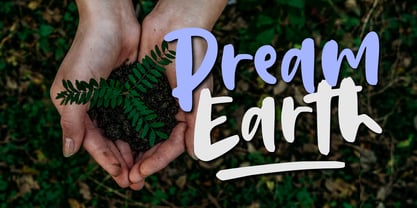 Dream Earth is a cool, brushed, and relaxed handwritten font. This font is suitable for designs such as t-shirts, sportswear, logos, advertisements, clothing, and more So what's included : Basic Latin A-Z & a-z Numbers, symbols, and punctuations Ligatures and swashes Accented Characters : ÀÁÂÃÄÅÆÇÈÉÊËÌÍÎÏÑÒÓÔÕÖØŒŠÙÚÛÜŸÝŽàáâãäåæçèéêëìíîïñòóôõöøœšùúûüýÿžß Thank you
 - Diltoon by Prioritype,
$15.00 Introducing a new unique and cute font. You can apply this font in projects such as packaging products, crafts, video previews, food products, logos, and much more to explore. For a view see some of the preview examples above. Features: -Uppercase -Lowercase -Numeral -Punctuation -Multilingual Thanks.
 - Gumball Stencil by Ana's Fonts,
$12.00 Gumball is a hand drawn font using an old letter ruler. It is a versatile sans serif font, perfect to make a statement in postcards, posters, titles, branding and packaging, etc. The Gumball font family includes four fonts: Gumball, Gumball Italic, Gumball Blackout, Gumball Blackout Italic
 - Razor Bland by Din Studio,
$29.00 Razor Bland is a classy handwritten font. Made for any professional project branding. It is the best for logos, branding and quotes. Every letter has a unique and beautiful touch. Features: PUA Encoded Multilingual Support Numerals and Punctuation Thank you for downloading premium fonts from Din Studio
 - Seacoast by Fikryal,
$18.00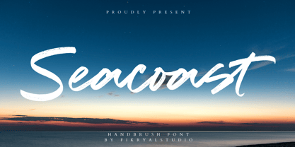 Seacoast is a hand brush font perfect for crafting, branding, invitation, stationery, wedding designs, social media posts, advertisements, product packaging, product designs, label, photography, watermark, special events, or anything. Seacoast comes with a full set of uppercase and lowercase letters, ligatures, multilingual symbols, numerals, and punctuation.
 - Cuckoo Fat by Very Good Fonts,
$19.00Cuckoo Fat was first seen in 1988 when I painted it on a record shop's window. Since then this hand lettered font has been there and done that. Cuckoo Fat is a loud and proud, classic and informal display font designed to work well on any job. - TF Teenage Riot by Teenage Foundry,
$19.00 Teenage Riot is a Display Font. Inspired by the awesome Chicano lettering style. Look simpler with 2 styles (Regular & Outline) in today’s modern era. Suitable for poster designs, logos, merchandise and others. Features: Uppercase, Lowercase, Numeral, Punctuation & Multilingual. For any questions please contact me 🙂 Thanks!


