6,002 search results
(0.025 seconds)
- Core Sans WHH Sub NR by S-Core,
$15.00The Core Sans NR Family is a part of the Core Sans Series, such as Core Sans N, Core Sans N SC, Core Sans M, and Core Sans G. This family is the rounded version of Core Sans N family. Letters in the Core Sans NR Family are designed with genuine neo-grotesque and neutral shapes without any decorative distractions. The spaces between individual letter forms are precisely adjusted to create the perfect typesetting. The Core Sans NR Family consists of 3 widths (Condensed, Normal, Extended), 9 weights (Thin, ExtraLight, Light, Regular, Medium, Bold, ExtraBold, Heavy, Black), and Italics for each format. It also supports WGL4, which provides a wide range of character sets (CE, Greek, Cyrillic and Eastern European characters). Each font includes support for Tabular numbers, Arrows, Box drawings, Geometric shapes, Block elements, Mathematical operators, Miscellaneous symbols and Opentype Features such as Proportional Figures, Numerators, Denominators, Superscript, Scientific Inferiors, Subscript, Fractions and Standard Ligatures. The Core Sans NR Family provides both OpenType (.OTF) and TrueType (.TTF) versions in the same package. We highly recommend it for use in books, web pages, screen displays, and so on. - BF Corpa Gothic Pro by BrassFonts,
$39.00 BF Corpa Gothic™ Pro is a kind of “Neue”-Edition of the beloved typeface designed by Guido Schneider. Inspired by hand-drawn geometric fonts from 1920s posters, this sans serif typeface is slightly condensed, and it appears compact and captivates with its expressive shapes and unique details, despite its pronounced Grotesque character. With its rather constructed, technical – but also vivid – appearance, the BF Corpa Gothic™ Pro is not only suitable for headlines and display applications, but is also pleasant to read in short and middle length text. The type family is engineered for exciting, professional but unusual designs. It is equipped with OpenType Features like 4 figure sets (LF, TF, OSF, SC), nice ligatures, many currency symbols, fractions, alternates, special characters, arrows and symbols – and small caps. 9 style sets give you the option to individualize and adjust the typeface to the requirement of your design, without changing the general visual feeling. In this way you can also switch the simply slanted styled Italic into a “real Italic”. Each of the 16 fonts (Upright and Italic) contains more than 940 glyphs and supports up to 220 Latin-based languages.
 - Helios Antique by W Type Foundry,
$25.00 Helios Antique & Helios Stencil Check our PDF specimen for more details Helios type family is the result of a mixture between the early sans serif and the modern trends of our era. Its rational structure is subtly wider than the majority of the first sans, generating a higher impact in its uses. All the typeface terminals are more open in order to balance better the whites and blacks of Helios, and where the strokes meet it has a deeper contrast giving more legibility to the reader. Furthermore, in some letters it is possible to see some prominent features such as the leg of the "R" and the tail of the "Q", which are particular gestures that identify this type family. Helios Stencil is the tough version of this type family. All the stencil gaps were measured rigorously, thus in small sizes it conveys a neutral aesthetic whereas in big sizes a display logic appears. Helios Antique is composed by 36 styles, 782 glyphs and small caps. Besides, it has powerful OpenType features for each style, including alternates characters, ligatures, fractions, special numbers, arrows, extended language support and many more.
 - Live Grotesk by Matt Chansky,
$18.00 An exquisite neutral body copy and memorable modern headline font – all under one pixel-perfect font family. Live Grotesk is no ordinary font, in fact it's two fonts in one, seamlessly working together. When big messaging requires a charismatic headline font to activate layout designs, amplify attention, and delight audiences with brand retention – turn on "FM," Live Grotesk's headline font. When you need a body copy font that is space-efficient, a highly refined neutral with a high x-height to help with readability, particularly on screens – Live Grotesk is for you. Stylish simplicity and neutrality are key components of the signature body copy look. This is why Live Grotesk is a uniquely crafted modern font for today's modern creatives. With a variety of weights, from light to bold, you'll also enjoy the robust offering of multilingual glyphs, plus a handful of extras like the estimated symbol, directional arrows, and helpful UX characters. When the creative direction calls for memorable, approachable, and consumable typography, consider Live Grotesk to elevate your marketing tactics. It's a font alive with versatility, that's why it's called Live Grotesk.
 - PT Root by ParaType,
$40.00 PT Root is a contemporary sans serif with strict, laconic forms. It’s a versatile typeface that provides a wide range of possibilities. Regular style works great in long texts (both on screen and in print), as well as in the interfaces. Medium and Demibold are good for signage, while the lightest and boldest styles look great in large sizes and are suitable for the brand identity. PT Root is a sans serif with 10 weights and a variable version. Its character set includes extended Latin and extended Cyrillic, three arrow variants, fractions, index numbers and letters. PT Root automatically lifts dashes and brackets with the case change. Its characters have stylistic variants, including the single-storey a, a strikethrough zero and some local alternates for Bulgarian and Serbian Cyrillic. PT Root can work in a project both independently and in pairs. Contemporary serif typefaces are the best text companions for it — try for example PT Serif, Yefimov Serif or Scientia. In case PT Root is the only text typeface in the project, then combine it with serious typefaces, such us technical (Din Condensed as an example) or pronouncedly contemporary typefaces, including postmodern ones, from Stapel or Spile to Helsa.
 - Giraffenhals by TypoGraphicDesign,
$19.00 The kiddy and rough character and the huge capital height with the tiny x-height (plus the cute giraffe character dingbats), gives the typeface a high recognition value and uniqueness. Application Area The warm, child-like, bold and striking handmade font “Giraffenhals” would look good at logos, display size for poster, flyer, comics and graphic novel lettering, headlines in magazines or websites, packaging, music covers or webbanner etc. Technical Specifications ■ Font Name: Giraffenhals ■ Font Weights: Regular-Condensed + Bold-Condensed + DEMO (with reduced glyph-set) ■ Font Category: Display for headline size ■ Font Format:.otf (OpenType Font for Mac + Win) + .ttf (TrueType Font) ■ Glyph Set: 443 glyphs ■ Language Support: Afrikaans, Albanian, Catalan, Croatian, Czech, Danish, Dutch, English, Estonian, Finnish, French, German, Hungarian, Icelandic, Italian, Latvian, Lithuanian, Maltese, Norwegian, Polish, Portugese, Romanian, Slovak, Slovenian, Spanisch, Swedish, Turkish, Zulu ■ Specials: Alternative letters, stylistic sets, automatic contextual alternates via OpenType Feature. Euro, kerning pairs, standard & decorative ligatures, Versal Eszett (German Capital Sharp S), extras like Dingbats & Symbols, arrows, hearts, emojis/smileys, stars, further numbers, lines & shapes ■ Design Date: 2011–2017 ■ Type Designer: Manuel Viergutz ■ License: Desktop license, Web license, App license, eBook license, Server license
 - Mellow Sans by ParaType,
$30.00 Mellow Sans is a soft and friendly rounded sans serif. Its bold styles are great for packages of something tasty, while light and regular ones work well in rather long texts, from a children's book to a reading app, or a family restaurant menu. The typeface was created by Natalya Vasilyeva, an expert in designing text and calligraphic typefaces. Mellow Sans’s forms are based on humanist sans serifs. The nobility and liveliness of Renaissance calligraphy reads beneath its curves and makes the typeface even friendlier, while helping the eye to move along the line. The typeface supports extended Latin, extended Cyrillic (all major languages of the Russia’s peoples) and Greek. It also has old style figures, arrows and non-alphabetic signs. With Mellow Sans as a heading typeface (in that case bold styles fit the best), calm open sans serifs, f.e. Vast or Fact, are its optimal text companions on the screen. Calm serifs, f. e., Octava, Scientia or Aelita, will work as its companions on paper. And to create expressive typography, for example, in packaging, you can match Mellow Sans with quirky rounded serifs — Cooper or Epice.
 - Sporty Pro by Sudtipos,
$39.00 We love sports – like billions of fans all over the world – but in Argentina, we really love fútbol (soccer). Fútbol is part of our culture: it makes our hearts’ race and our pulses quicken, it inspires screams of joy and screams of anguish, and it has been the cause of more than a few heated conversations amongst friends. So you can imagine our delight when, in recent years, a local team’s fútbol jersey used a Sudtipos font; it got us thinking about designing a font that explicitly had sports in mind yet still had the versatility to work for other types of projects. Sporty has a geometric and modular structure with many potential applications that far exceed jerseys, score boards and stadium wayfinding. Its flexibility is evident when examining its four style – from a square style to a rounded one – as well as the Shadow and Inline options. Each of the styles also comes with a set of miscellaneous shapes including modular banners, plates and arrows. Sporty comes in 3 widths – Condensed, Regular and Expanded – and 7 weights that equate to a total of 39 fonts.
 - Core Sans NR by S-Core,
$15.00 The Core Sans NR Family is a part of the Core Sans Series, such as Core Sans N, Core Sans N SC, Core Sans M, and Core Sans G. This family is the rounded version of Core Sans N family. Letters in the Core Sans NR Family are designed with genuine neo-grotesque and neutral shapes without any decorative distractions. The spaces between individual letter forms are precisely adjusted to create the perfect typesetting. The Core Sans NR Family consists of 3 widths (Condensed, Normal, Extended), 9 weights (Thin, ExtraLight, Light, Regular, Medium, Bold, ExtraBold, Heavy, Black), and Italics for each format. It also supports WGL4, which provides a wide range of character sets (CE, Greek, Cyrillic and Eastern European characters). Each font includes support for Tabular numbers, Arrows, Box drawings, Geometric shapes, Block elements, Mathematical operators, Miscellaneous symbols and Opentype Features such as Proportional Figures, Numerators, Denominators, Superscript, Scientific Inferiors, Subscript, Fractions and Standard Ligatures. The Core Sans NR Family provides both OpenType (.OTF) and TrueType (.TTF) versions in the same package. We highly recommend it for use in books, web pages, screen displays, and so on.
 - Nsai by AukimVisuel,
$15.00 Nsai is a modern sans serif font family with a geometric twist, created in 2021 by a Congolese type designer, Audry Kitoko Makelele. It is available in two versions (normal and extended) making a total of 36 fonts. There are 9 weights with their true italics. Over 600 glyphs per font provide a wide range of language support, from Latin to Cyrillic, as well as powerful Opentype features such as professional kerning, stylistic variations, very special ligatures, old-fashioned tabular figures, Fractions, denominators, exponents, unlimited indices, arrows and more to satisfy the most demanding professionals. On the one hand, it features rounded curves with very open terminals that make this font family elegant, user-friendly and contemporary and on the other hand very useful for writing titles on any medium. Perfectly suited for graphic design and any display use. It could easily work for web, signage, corporate as well as editorial design. It’s a wonderful, bold and elegant font. This font is guaranteed to make your design stand out from the crowd and leave a lasting impression, as it has the potential to enhance any creation.
 - Blackest by Zetafonts,
$39.00 Download PDF Specimen See Blacker and Blacker Sans , the perfect matching companions of Blackest. Blackest is an inverse contrast wedge serif typeface family, designed by Francesco Canovaro and Andrea Tartarelli as a development of the Blacker typeface designed by Cosimo Lorenzo Pancini. The classical skeleton and sharp edges of the original have been kept while bringing the contrast of the typeface in the realm of the so called “italian” or reverse-contrast typefaces. The result is a typeface family that manages to be quirky but classical, and playful without losing elegance. With its exuberance and six weights of eye-catching proportions, Blackest is perfect for display use: editorial & magazine design, poster design and logo development - but to allow its usage as a for typesetting of longer texts a text variant in two weights has been developed, with less contrast, looser spacing, and high readability. Blackest features an extended character set that covers over 220 languages using the Latin alphabet, as well as Russian Cyrillic. Open type features include small caps, positional figures, alternate letter forms, stylistic sets, arrows and extra punctuation and discretionary ligatures.
 - Core Sans WHH Head NR by S-Core,
$15.00The Core Sans NR Family is a part of the Core Sans Series, such as Core Sans N, Core Sans N SC, Core Sans M, and Core Sans G. This family is the rounded version of Core Sans N family. Letters in the Core Sans NR Family are designed with genuine neo-grotesque and neutral shapes without any decorative distractions. The spaces between individual letter forms are precisely adjusted to create the perfect typesetting. The Core Sans NR Family consists of 3 widths (Condensed, Normal, Extended), 9 weights (Thin, ExtraLight, Light, Regular, Medium, Bold, ExtraBold, Heavy, Black), and Italics for each format. It also supports WGL4, which provides a wide range of character sets (CE, Greek, Cyrillic and Eastern European characters). Each font includes support for Tabular numbers, Arrows, Box drawings, Geometric shapes, Block elements, Mathematical operators, Miscellaneous symbols and Opentype Features such as Proportional Figures, Numerators, Denominators, Superscript, Scientific Inferiors, Subscript, Fractions and Standard Ligatures. The Core Sans NR Family provides both OpenType (.OTF) and TrueType (.TTF) versions in the same package. We highly recommend it for use in books, web pages, screen displays, and so on. - Magritte by Molly Suber Thorpe,
$17.99 Magritte is a serif display font with surrealist sensibilities. This is an ideal font for dreamy, unexpected branding, advertising, and merch. It has uppercase and lowercase alphabets, dozens of beautiful ligatures and dingbats, and even includes support for Modern Greek. Magritte has 600 glyphs in Latin and Greek consisting of: the complete Latin alphabet (with all accent marks), the complete Modern Greek alphabet (with all accent marks), 50 ligatures and stylistic alternates, 24 fun dingbats and arrows, numerals including oldstyle figures and fractions, extensive symbols, punctuation, and diacritical markings. The OpenType ligatures are the fun part. To get the most out of Magritte, use software that supports Open Type fonts (Adobe programs, Corel Draw, Affinity Designer, etc). This type family has tons of built-in OpenType ligatures and alternates, which are what make it so customizable and decorative. You can always access the ligatures, alternates, and dingbats through your software's glyphs panel. Languages Magritte includes the Latin and Greek alphabets with all accent markings. The most common languages it supports are: English, Catalan, Danish, Dutch, French, German, Greek, Italian, Norwegian, Portuguese, Spanish, and Swedish.
 - Ed's Market by Laura Worthington,
$29.00 It’s like hiring your own professional sign painter with a solid repertoire of styles; each one is distinctive, yet clearly by the same hand. No variants were created on the computer – each weight and version was individually hand-lettered. Ed’s Market lets you evoke the warm, inviting vibe of classic 20th-century grocery posters and showcard lettering right from your type menu. Smart programming ensures that digital perfection doesn't trump human charm: each display face features three variations of each letter, to ensure a natural hand-painted look when characters repeat. Ed’s Market includes three script styles, each with more than 100 alternate characters and swash forms. Seven display faces feature three variations of each letter, to ensure a natural hand-painted look when characters repeat. Design Elements offer expandable arrows, rules and ribbons; along with badges, swashes, scribbles, clouds and snipes. See what’s included! http://bit.ly/1Mzurs3 *NOTE* Basic versions DO NOT include swashes, alternates or ornaments These fonts have been specially coded for access of all the swashes, alternates and ornaments without the need for professional design software! Info and instructions here: http://lauraworthingtontype.com/faqs/
 - VLNL Bint by VetteLetters,
$35.00 Kornelis de Vries, a headmaster from the Dutch province of Friesland, cultivated new potato breeds that he named after pupils in his school. In the early 1900s he came up with the tasty Bintje (a Frisian girl’s name) and it became a big success – in Belgium and France it has remained the most popular potato for french fries to this day, more than a century since its introduction. Donald Roos took 10 kilos of fresh Bintje potatoes and cut the Bint typeface by hand with a short, sharp knife. He then inked each character once and printed it twice; the second, lighter printing is accommodated in the lower case alphabet. The Bint family offers a script to make the letters bounce up and down the baseline; with OpenType functionality the font randomly chooses each character from the upper- or lowercase alphabet. ‘Tabular lining figures’ will activate a series of negative numerals in boxes; ‘Discretionary ligatures’ activates specially designed letter combinations like ‘www’ as well as arrows and stars. Bint has a distinct, slightly rough handmade appearance, making it useful for a wide range of designs.
 - Slothy Jelly by Scratch Design,
$12.00 Introducing Slothy Jelly! A fun font for everyone. Slothy Jelly is a cute handwritten font that has fun and happy characteristics. This font is authentically handwritten with the marker pen for a consistent look. This font also has alternates so you can mix and match the letters and make it more fun! For some extra hand-drawn cuteness, this font is also thrown in a bonus font with symbols like emojis, hearts, underlines, arrows, and circles - and drawn with the same pen to perfectly go with the writing. So it will help to make your design more cute and happy. This font is suitable for branding, posters, children's books, magazines and others. Your download will contain the following fonts such as Slothy Jelly Regular - a pretty and cute handwritten including a set of uppercase, lowercase, alternates, ligatures and multilingual support. Slothy Jelly Symbols - a dingbat font of many hand-drawn elements These fonts will work in any program, but please note that the alternates and ligatures of the font can only be accessed on software that supports OpenType features. Thank you for your purchase! Hope you enjoy this font
 - Axeo by Asritype,
$13.00 Axeo is a freeform serif typeface. With more than 500 glyphs for each cut, Axeo supporting wide Latin Base Languages. The font structures is sans-serif typeface. Then, the fonts is made into serif (serifed) using rhombus and adapted/modified rhombus (before remove overlaps) placed on its appropriate positions. This fonts is released first, while the sans-serif is being in process. There are 10 fonts; 5 weight in normal width: Light, Regular, Medium, Bold, and Black; and 4 in semi-condensed: Light, Regular, Medium, Bold and Black, too. The fonts has some minor character variations, all are sets in SS01.There are also standard and discretionary ligatures, arrow, some geometric shapes and ornaments. With its sansserif structure, the Medium, Bold and Black fonts is playful with text effect in various applications such MS Word, CorelDraw or others to enhance the appearance. Its serif form will make unique enhancements. Thus, the fonts is suitable for Branding, logos, cards, advertisements, banners, display and more; for the main texts or its companions. While the light, regular and medium fonts can also be used as description text, card text, note, caption and longer non-formal texts or other usages.
 - Core Sans M by S-Core,
$25.00 The Core Sans M Family is a part of the Core Sans Series, such as Core Sans N, Core Sans N Rounded, Core Sans N SC, and Core Sans G. This font family has open and square letter shapes, and overall rounded finishes provide a soft and friendly appearance. Simple and modern shapes with a tall x-height make the text legible and the spaces between individual letter forms are precisely adjusted to create the perfect typesetting. The Core Sans M Family consists of 2 widths (Condensed, Normal), 7 weights (ExtraLight, Light, Regular, Medium, Bold, ExtraBold, Heavy), and Italics for each format. Small Caps versions are also available. It supports WGL4, which provides a wide range of character sets (CE, Greek, Cyrillic and Eastern European characters). Each font includes support for Tabular numbers, Arrows, Box drawings, Geometric shapes, Block elements, Mathematical operators, Miscellaneous symbols and Opentype Features such as Proportional Figures, Numerators, Denominators, Superscript, Scientific Inferiors, Subscript, Fractions and Standard Ligatures. The Core Sans M Family provides both OpenType (.OTF) and TrueType (.TTF) versions in the same package. We highly recommend it for use in books, web pages, screen displays, and so on.
 - Ellie Script by Fenotype,
$25.00 Ellie Script is a hand drawn signature style typeface. Ellie is great for branding, headlines, invitation cards, poems, posters or as a logotype. Boasting over 600 glyphs, Ellie is equipped with handy OpenType features - Contextual Alternates and Standard Ligatures are automatically on and they help to keep the connections smooth and text varied to simulate hand writing. In addition Ellie Script is equipped with Swash and Stylistic Alternates that can be used for more customised look and in addition it has Stylistic Alternates that can be used for long end swash to a word. If that isn’t enough there are also Discretionary Ligatures: certain letter pairs like th, lt, or, is are made into more showy. They work best in shorter texts. Ellie has three ampersands and two sets of numerals, and even more alternates can be found from the Character Window. Ellie Script is PUA encoded so you can access the extras in most graphic design softwares. Ellie Script Ornaments is a set of strokes and arrows with the same look so that they can be used to complement layouts with Ellie Script. Have fun!
 - Lecturia by Ingo,
$42.00 Lecturia is a modern humanist sans serif typeface. Ascending dynamic movement characterizes the structure of it’s characters -- the stylistic alternates emphasize this impression. The family comprises eight weights from the most delicate "Hairline" to the strong "Bold" -- each upright and italic. Using the variable font, the intermediate levels can be controlled fluently. The forms and proportions of Lecturia have been selected to be very legible as body type for longer texts. Lecturia ist still legible from a great distance or under unfavorable conditions. In large sizes as a heading, the font is very eye-catching. The shapes of the individual characters follow the "humanistic" form language of modern faces. In addition to ligatures for problematic letter combinations, it contains stylistic alternates for some characters that make the appearance even livelier. Small caps provide a restrained opportunity for emphasis. In addition, Lecturia offers several sets of numerals: proportional standard figures, lining figures, proportional oldstyle figures, non-proportional tabular figures, superscripts and subscripts, numerator and denominator to represent fractions, circled numbers. The very good legibility of Lecturia makes it the ideal typeface for information systems -- a selection of directional arrows is included.
 - Novel Sans Hair Pro by Atlas Font Foundry,
$50.00 Novel Sans Hair is the new package of 24 ultra light weights of Novel Sans Pro, the humanist grotesque typeface family within the largely extended award winning Novel Collection, containing Novel Pro, Novel Sans Pro, Novel Sans Hair Pro, Novel Sans Condensed Pro, Novel Mono Pro, Novel Sans Rounded Pro and Novel Sans Office Pro. Novel Sans Hair has a carefully attuned character design and a well balanced weight contrast. Classic proportions and the almost upright italic makes Novel Sans Pro being a modern humanist with the calligraphic warmth of a real italic. Many similarities with the other typeface families within the Novel Collection enable designers to combine the families and reach highest quality in typography. Novel Sans Hair [1020 glyphs] comes in 24 styles and contains small caps, an extra set of alternate glyphs, many ligatures, lining figures [proportionally spaced and monospaced], hanging figures [proportionally spaced and monospaced], small caps figures [proportionally spaced and monospaced], positive and negative circled figures for upper and lower case, superior and inferior figures, fractions, extensive language support, arrows for uppercase and lowercase and many more OpenType™ features.
 - Mr Happy by Hipopotam Studio,
$22.00 Hand drawn narrow typeface designed for one of our books. You can layer different styles over the background style to achieve lots of colorful effects. Use just one style to get a single color letter or set the shadow and fill over the background style to get a full, three color mode. Mr Happy has upper and lowercase characters with up to three alternate glyphs. Build in OpenType Contextual Alternates feature will automatically set alternate glyphs depending on frequency of appearance of the same character (even in web font but only in HTML5 browsers). The script doesn’t throw random glyphs. For example in the word “HIPPOPOTAMUS” you will automatically get three different “P” glyphs and two “O” glyphs. It really works great but of course you can always fine tune it by hand.
 - Verse Sans by Hubert Jocham Type,
$39.00 In 2006 the art director of Emotion, a women’s psychology magazine, asked me to design a copy typeface for them. Before I actually got the job I started to work on a serif. I wanted it to be feminine but still clear and modern. On one hand there are the floral round elements and on the other hand the angular serifs. In the composition I wanted the two extremes to work together. All the other elements had to be harmonized. The proportions needed to match the magazine’s requirements. The ascenders and descenders are short enough to work in narrow columns but long enough to work in small sizes. As you can imagine, the emotion-job never happened. In copy you should not get heavier than Heavy. Extrabold and Ultrabold work best in display.
 - Ador by Fontador,
$24.99 Ador is a humanist sans serif especially designed for contemporary typography and comes up with 8 weights from ultralight to black plus true italics and 343 ligatures. A large x-height not only creates space in the letters for extra-bold styles, but also lends Ador an open and generous character in the more narrow and semi-bold versions. The nice balance between sharp ink trapped and soft, dynamic shapes helps to work in small sizes. Diagonal stress, angled finials and the 4 degree true italic styles give Ador a dynamic look. The font contains 981 glyphs including small caps, tabular, old style, fractions … and a wide range of flexibility for Latin language support for every typographical needs. Ador is a contemporary sans serif typeface, special for logotypes, brands, magazines and editorial.
 - Excelsor Script by Storm Type Foundry,
$32.00Excelsor Script is inspired by lithographically produced scripts. It is softer and simpler than, for example, engraved Splendid Script, because its designer used pens and lithographic needles. The graver for steel is held in a quite different way and this has an influence on the shape of the letter. Similar type faces were in use from Neo-Classicism until the beginning of Art Nouveau, when they were pushed aside by a completely different view of festive typography. It has, in contradistinction to other scripts, slightly narrowed letters, which signifies a distinctive elegance without wasting space on the line. For practical reasons it was not possible to encircle the bottle with too long a label. It is, therefore, a suitable type face for labels. Its two optical grades cover a wide range of sizes. - Frieze by Fine Fonts,
$29.00 The origin of this font was a frieze in the RAF Chapel in Westminster Abbey which Michael Harvey was commissioned to design and create. It was comprised of the names of the top brass in wartime Bomber Command, namely Dowding, Harris, Newall, Tedder, Portal and Douglas. The Brief was to cut the letters in bronze and gild them. Instead, they were cut in perspex and gilded. To sit comfortably within the long and narrow vertical space available beneath the chapel’s stained glass window, extended letterforms were used with many vertical serifs omitted and with lengthened horizontal serifs. Some twenty years later, the missing upper-case letters were drawn together with the lowercase letters and Frieze, the font, was born. Subsequently, additional weights and styles were added to create a font family of six styles.
 - Linotype Nautilus by Linotype,
$29.99According to Hellmut G. Bomm "Nautilus was based on a handwritten type used for the text Li. Das Helle, Klare from the I Ging. "The intention was to create a clear, highly legible typeface. While the even strokes of sans serif types eventually tire the eyes in long texts, the marked stroke contrast of Nautilus lends the type its legibility. The characters were drawn with a broad tipped pen, and like an antiqua type, the forms of Nautilus display a variety of elements. The narrow figures with relatively large spaces between them create an overall open appearance and allow a large quantity of text to fit into a small space. "The headstrong forms of Nautilus make this an excellent display type. The italic weights are independent typefaces with hints of a handwritten character." - Zin Serif by CarnokyType,
$46.00 Zin Serif is a contemporary typeface designed for various situations of typographic usage. Characteristic feature is a large x-height and balance between neutral construction of letters (strictly vertical axis) and dynamic open forms (opened terminals). Another typical feature is a visually narrower connection between stems and strokes. The complete font family consist of three width proportions (Normal, Condensed and Extended). Every sub-family has 5 weights, ranging from Light to Black with matching Italics. Zin Serif can be effectively used for both text and display typesetting. It can be used especialy in magazine layouts and editorial design, as well in advertising typography, orientation systems, corporate identities and many other situations. Zin Serif is a member of the Zin super family, which also includes Zin Sans, Zin Slab and Zin Display fonts.
 - Romanovsky by ParaType,
$30.00 Romanovsky is the font developed on the base of samples from the catalogue of Osip Lehman foundry in Sankt Petersburg. Original Latin design that was used for Romanovsky can be found in Feder Grotesk by Jacob Erbar. The current digital font is not a scanned version of Lehman’s samples but a newly drawn typeface that differs from the original in many details. Romanovsky is a sans serif typeface with narrow proportions and noticeable contrast. It will be good for headings and display matters. Character set covers languages of Western and Central Europe and Cyrillic-based languages. It also contains around 20 ligatures of uppercase letters for the most frequent combinations. Designed by Vasily Biryukov. The bold weight was developed together with Olexa Volochay. Released by ParaType in 2013.
 - Sabon by Linotype,
$45.99 In the early 1960s, the German Master Printers’ Association requested that a new typeface be designed and produced in identical form on both Linotype and Monotype machines so that text and technical composition would match. Walter Cunz at Stempel responded by commissioning Jan Tschichold to design a new version of Claude Garamond’s serene and classical Roman. Its bold, and particularly its italic styles are limited by the requirements of Linotype casting machines, forcing the character widths of a given letter to match between styles, giving the italic its characteristic narrow f. The family’s name is taken from Jacques Sabon, who introduced Garamond’s Romans to Frankfurt. Sabon has long been a favorite of typographers for setting book text, due to its smooth texture, and in large part because Tschichold’s book typography remains world famous.
 - Slim Pickens by Dear Alison,
$19.00Have you ever seen lettering that you can connect with but have no clue where you've seen it before? It strikes a chord with certain feelings but you don't know why. Slim Pickens was inspired by the lobby card and poster titling from the 1949 Doris Day film "My Dream is Yours", and keys into the look and feel of vintage handwritten film poster titling. Something about that era in film made it easy to tie visuals with getting swept up in all sorts of emotions, good and bad. A narrow font, full of life and wonderfully hand-drawn, Slim Pickens is an accent font you'll want to have in your font collection for those tight fits, so buy it today and fill in the gaps of your designs with a little nostalgia! - Tusker Grotesk by Lewis McGuffie Type,
$35.00 Tusker Grotesk is a headline typeface designed for robust and high-impact use. The initial inspiration for Tusker came from postwar typefaces like Haettenschweiler, Impact and Helvetica Inserat which use very high x-heights. Other influences in the condensed end of the Tusker family are old grotesques like Folio Extra Condensed and Stephenson Blake Elongated Sans No.1 with their flat terminals and closed-up apertures. Then as the widths in Tusker grow, the lettering takes some more inspiration from gothic style sans such as Inland Type's Title Gothic No.8, while maintaining the optical weight established in the narrow end of the family. Each width set is duplexed, stackable and is ideal for headlines, logos and bold attention-grabbing editorial design. Tusker has extended latin coverage ideal for western, central and eastern European languages.
 - Brim Combined by Jamie Clarke Type,
$20.00 Brim Combined packs all of the character of the popular layered typeface, Brim Narrow, into three eye-catching font styles. Inspired by antique wood type from the 1800s, Brim is warm and tactile. Its innovative styles produce both striking headlines and sophisticated titles, making it perfect for posters, packaging and logotypes. Brim Combined makes it even easier to achieve punchy headlines on the web. This flattened version of Brim does not require professional design software to use and is compatible with Microsoft Word. • Combined 1 features Brim’s elegant, handmade line work • Combined 2 includes a drop shade with an outline • Combined 3 has an offset shade and a reversed-out face Brim is an all-caps typeface with Western European, Central European and South Eastern European language support.
 - Kicker FC by Arkitype,
$16.00 Kicker FC is a typeface created for the love of sport, it has all the right elements to make for a great sports display font to give your brand and art work the right look and feel in this genre. It has a great variation in weights, stylistic alternates to provide flexibility and to add more customisation a shadow version for each weight to give your typography a custom graphic look and feel. Kicker FC is perfect for use in various sports categories, college sports, baseball, basketball, football and as show in all the poster images and more specifically the name Kicker FC, soccer. Not only is the typeface a perfect fit for sport, it works just as well for beverage, tech and various other industries. Narrow in width provides great eye catching headlines.
 - Happiness by Omotu,
$18.00 Happiness! A handwrittent script font with 2 styles, regular and slant. Happiness font is suitable for branding, logotype, apparel, T-shirt, Hoodie, product packaging, quotes, flyer, poster, advertising, etc. Whats Include? 1. Uppercase and lowercase characters 2. Multilingual support. 3. Numerals, punctuations, end titling, alternate, and ligarures 4. Accessible in the Adobe Illustrator Glyphs panel, or under Stylistic Alternates in the Adobe Photoshop OpenType menu, Adobe InDesign, Corel Draw, even work on Microsoft Word. Please message me if you're unsure of any language support. Thanks for looking, and I hope you enjoy it! Please don't hesitate to drop me a message if you have any issues or queries. Omotu Studio
 - Wardah by Omotu,
$18.00 Wardah! A handwrittent signature font. Comes with two styles, regular and rounded. Wardah font is suitable for branding, logotype, apparel, T-shirt, Hoodie, product packaging, quotes, flyer, poster, book cover, advertising, etc. Whats Include? Opentype support Multilingual support PUA encoded Features: Uppercase, lowercase, numerals, punctuations, stylistic sets, alternate, and ligatures Accessible in the Adobe Illustrator Glyphs panel, or under Stylistic Alternates in the Adobe Photoshop OpenType menu, Adobe InDesign, Corel Draw, even work on Microsoft Word Please message me if you’re unsure of any language support. Thanks for looking, and I hope you enjoy it! Please don’t hesitate to drop me a message if you have any issues or queries.
 - Billy Signature by Omotu,
$16.00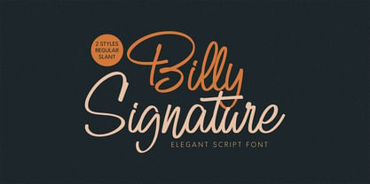 DETAILS Billy Signature! A handwrittent script font with 2 styles, regular and slant. Billy Signature font is suitable for branding, logotype, apparel, T-shirt, Hoodie, product packaging, quotes, flyer, poster, advertising, etc. Whats Include? 1. Uppercase and lowercase characters 2. Multilingual support. 3. Numerals, punctuations, and ligarures 4. Accessible in the Adobe Illustrator Glyphs panel, or under Stylistic Alternates in the Adobe Photoshop OpenType menu, Adobe InDesign, Corel Draw, even work on Microsoft Word. Please message me if you're unsure of any language support. Thanks for looking, and I hope you enjoy it! Please don't hesitate to drop me a message if you have any issues or queries. Omotu Studio
 - Kendrew by madeDeduk,
$16.00 Introducing The Kendrew is a kids handwriten playful font and will be perfect for book, title branding, product packaging, invitation, quotes, t-shirt, label, poster, logo etc. Feature Uppercase & Lowercase Number & Symbol International Glyphs Multilingual support Feel free to drop us a message any time and follow my shop for upcoming updates Shoot me on email at: dedukvic@gmail.com and find more previews on my Instagram here : https://www.instagram.com/acekelgondolayu/?hl=en Hope you enjoy it.
 - Kewl Script by Sudtipos,
$59.00 Kewl is the result of being caught in the afterimage of one design project while conceptualizing another one. Just before finishing the final tests on Mrs Blackfort, the first of what became a long series of Charles Bluemlein fonts, some of the letters began morphing differently in my mind. The idea was to go on the heavier and more playful side, but with a South American sign letterer’s twist, rather than just good handwriting. I did some sketching, took some notes, then got busy with other projects. Some of that stuff eventually seeped into Candy Script and, to a lesser extent, the Whomp font. But it was only a matter of time before I got back to the original concept and finished it. Kewl is ideal for food packaging, book and music covers, magazines, and window splashes. Illustrations by Catriel Martinez.
 - Ocean View by Mans Greback,
$59.00 Ocean View is a beautiful handwriting lettering. This script typeface is cute and feminine, optimized for a modern signature logotype with a genuine craft style. Its monolined strokes and hand drawn letterforms emits optimism and lightheartedness. Use underscore _ to make a swash. Example: Cle_arly Use multiple underscores to make different swashes. Example: Super__________star (Download required.) The Ocean View family consists of five high-quality cursive fonts: Thin, Light, Regular, Bold and Black The font is built with advanced OpenType functionality and has a guaranteed top-notch quality, containing stylistic and contextual alternates, ligatures and more features; all to give you full control and customizability. It has extensive lingual support, covering all Latin-based languages, from Northern Europe to South Africa, from America to South-East Asia. It contains all characters and symbols you'll ever need, including all punctuation and numbers.