10,000 search results
(0.024 seconds)
- Crosshatch by A New Machine,
$24.00 A hand-drawn, crosshatch font suitable for display. It comes in the regular crosshatched version as well as a hollow form. Great for giving your design a handmade touch!
 - Graffick Top by Graffiti Fonts,
$12.99Halfway between graffiti & typeography you find styles like Graffick™. These fonts are derived directly from hand written letters made mechanically perfect to behave more like common digital fonts. - P22 Stanyan by P22 Type Foundry,
$24.95 P22 Stanyan Autumn is a set of three fonts based upon a casual hand lettering text created for the deluxe 1969 edition of "...and autumn came" by Rod McKuen.
 - Fairytale Serif Oblique by Nicky Laatz,
$26.00 A whimsical little serif transporting you back in time. Based on vintage hand scribed italics, Fairytale Serif is ready to charm it's beholder with its quaint inky edged letters.
 - Surface Stencil JNL by Jeff Levine,
$29.00 A hand-cut antique brass stencil for marking barrel tops of dill pickles was the source of inspiration for Surface Stencil JNL, available in both regular and oblique versions.
 - WalcomeOne by Ingrimayne Type,
$7.95 WalcomeOne simulates sloppy, messy hand printing. Despite being irregular and childlike, it is quite legible even at small sizes. It comes in four weights, each with an oblique style.
 - Borough Park JNL by Jeff Levine,
$29.00 Borough Park JNL is named for a neighborhood in the southwestern part of the borough of Brooklyn, NY and was modeled from hand lettering found on vintage sheet music.
 - Noodle by Letterhead Studio-VV,
$15.99 Noodleis a hand made font. It's a fun and whimsical font that would be perfect for greeting cards, toys, picture books or anything that requires a naive sensibility. Enjoy!
 - Late Hours JNL by Jeff Levine,
$29.00 The free form hand lettered titles for the 1961 film “The Children's Hour” inspired the digital typeface Late Hours JNL, which is available in both regular and oblique versions.
 - Skurier by GRIN3 (Nowak),
$20.00 Skurier is a hand-drawn font inspired by monospaced fonts like Courier. Language support includes Western, Central and Eastern European character sets, as well as Baltic and Turkish languages.
 - Cul De Sac by Hanoded,
$25.00 Cul De Sac is a beautiful cartoon-like font. It was hand drawn, using an old fashioned pen and India ink. Use it for your ads, posters and websites.
 - Gold Diggin by Open Window,
$19.95 Gold Diggin is an authentic hand-drawn original. It harkens back to posters from the Gold Rush Era. Add some humor and moonshine to your designs with Gold Diggin.
 - Detention JNL by Jeff Levine,
$29.00Detention JNL is simply the hand printing of its designer, Jeff Levine. Its uses range from personalizing notes and messages to a graffiti look or as "legible grunge lettering". - Chantego by Patria Ari,
$15.00 Chantego is a playful hand drawn display typeface with rough marker shapes. This font suit for apparel, branding, logo, social media posts, advertisements, product packaging, product designs, illustration, etc.
 - Sketchetik Fill by Hiekka Graphics,
$19.00 Sketchetik Fill – brother of famous Sketchetik – is a hand-drawn font in four styles: Light, Regular, Bold and Black. Sketchetik Fill is recommended for use as a display typeface.
 - Graffick Wide by Graffiti Fonts,
$12.99Halfway between graffiti & typeography you find styles like Graffick™. These fonts are derived directly from hand written letters made mechanically perfect to behave more like common digital fonts. - Mondio by Gittype,
$20.00 Mondio, it is a low script hand writing font. handwritten to give your designs a free-flowing and stylish design. , this font is a delightful addition to any project!
 - Banana Milk by wearecolt,
$19.00 Inspired by coffee shop chalkboards, Banana Milk is a bubbly font with a hand-drawn feel. A fun display font for logos, headings, books, posters and other cool stuff.
 - Rackham by Scriptorium,
$18.00Rackham Italic is based on the hand lettered titles of Arthur Rackham from the book English Fairytales. The Rackham font is based on his more familiar title lettering style. - Amalfi by Irina Vascovet,
$26.00 Amalfi a hand written pointed pen font that is filled with personality. The font comes with upper and lowercase characters in both Roman and Cyrillic, numbers, marks and punctuation.
 - ITC Franklin by ITC,
$40.99 The ITC Franklin™ typeface design marks the next phase in the evolution of one of the most important American gothic typefaces. Morris Fuller Benton drew the original design in 1902 for American Type Founders (ATF); it was the first significant modernization of a nineteenth-century grotesque. Named in honor of Benjamin Franklin, the design not only became a best seller, it also served as a model for several other sans serif typefaces that followed it. Originally issued in just one weight, the ATF Franklin Gothic family was expanded over several years to include an italic, a condensed, a condensed shaded, an extra condensed and, finally, a wide. No light or intermediate weights were ever created for the metal type family. In 1980, under license from American Type Founders, ITC commissioned Victor Caruso to create four new weights in roman and italic - book, medium, demi and heavy - while preserving the characteristics of the original ATF design. This series was followed in 1991 by a suite of twelve condensed and compressed designs drawn by David Berlow. ITC Franklin Gothic was originally released as two designs: one for display type and one for text. However, in early digital interpretations, a combined text and display solution meant the same fonts were used to set type in any size, from tiny six-point text to billboard-size letters. The problem was that the typeface design was almost always compromised and this hampered its performance at any size. David Berlow, president of Font Bureau, approached ITC with a proposal to solve this problem that would be mutually beneficial. Font Bureau would rework the ITC Franklin Gothic family, enlarge and separate it into distinct text and display designs, then offer it as part of its library as well. ITC saw the obvious value in the collaboration, and work began in early 2004. The project was supposed to end with the release of new text and display designs the following year. But, like so many design projects, the ITC Franklin venture became more extensive, more complicated and more time consuming than originally intended. The 22-font ITC Franklin Gothic family has now grown to 48 designs and is called simply ITC Franklin. The new designs range from the very willowy Thin to the robust Ultra -- with Light, Medium, Bold and Black weights in between. Each weight is also available in Narrow, Condensed and Compressed variants, and each design has a complementary Italic. In addition to a suite of new biform characters (lowercase characters drawn with the height and weight of capitals), the new ITC Franklin Pro fonts also offer an extended character set that supports most Central European and many Eastern European languages. ITC Franklin Text is currently under development.
 - Morris by HiH,
$10.00 Morris is a four-font family produced by HiH Retrofonts and based on the work of the very English William Morris. William Morris wanted a gothic type drawn from the 14th century blackletter tradition that he admired both stylistically and philosophically. He drew from several sources. His principal inspiration for his lower case was the 1462 Bible by Peter Schoeffer of Mainz; particularly notable for the first appearance of the ‘ear’ on the g. The upper case was Morris’s amalgam of the Italian cursive closed caps popular throughout the 12th through 15th centuries, a modern example of which is Goudy’s Lombardic Capitals. The gothic that Morris designed was first used by his Kelmscott Press for the publication of the Historyes Of Troye in 1892. It was called “Troy Type” and was cut at 18 points by Edward Prince. It was also used for The Tale of Beowulf. The typeface was re-cut in at 12 points and called “Chaucer Type” for use in The Order of Chivalry and The Works of Geoffrey Chaucer. Morris' objective is designing his gothic was not only to preserve the color and presence of his sources, but to create letters that were more readable to the English eye. ATF copied Troy and called it Satanick. Not only was the ATF version popular in the United States; but, interestingly, sold very well in Germany. There was great interest in that country in finding a middle ground between blackletter and roman styles -- one that was comfortable for a wider readership. The Morris design was considered one of the more successful solutions. Our interpretation, which we call Morris Gothic, substantially follows the Petzendorfer model used by other versions we have seen, with the following exceptions: 1) a larger fillet radius on the upper arm of the H, 2) a more typically broadpen stroke in place of the foxtail on the Q, which I do not like, 3) inclusion of the aforementioned ear on the g and 4) a slightly shorter descender on the y. We have included five ornaments, at positions 0135, 0137, 0167, 0172 and 0177. The German ligatures ‘ch’ & ‘ck’ can be accessed using the left and right brace keys (0123 & 0125). Morris Initials One and Morris Initials Two are two of several different styles of decorative initial letters that Morris designed for use with his type. He drew from a variety of 15th century sources, among which were Peter Schoeffer’s 1462 Mainz Bible and the lily-of-the-valley alphabet by Gunther Zainer of Augsburg. Each of the two initial fonts is paired with the Morris Gothic lower case. Morris Ornaments is a collection of both text ornaments and forms from the surrounding page-border decorations.
 - Beba by Eurotypo,
$28.00 Beba is based on geometric structures, where the same formal characteristics are applied to as many letters as possible. It is a sans-serif monoline typeface. It has a modern, clean and minimalist image; ideal to use for advertising, printed or digital graphics and signage system design.
 - FF Rian's Dingbats by FontFont,
$41.99 British type designer Rian Hughes created this pi and symbols FontFont in 1993. The family has 5 weights, and is ideally suited for poster and billboards.It provides an extensive collection of wonderful dingbats and expressive graphic cartoons. It comes with tabular lining and proportional lining figures.
 - Bestan by Konstantine Studio,
$17.00 Bestan is inspired by the typography of the ship's steel containers and industrial-based business branding. Added a slight touch of futuristic vibes to make Bestan appears as a fresh game-changer, either for corporation purpose and also modern urban vibes to your visual graphic design stuff.
 - Innovate by NicolassFonts,
$29.00 Innovate is a modern versatile sans-serif typeface. What differentiates Innovate from the other fonts is an exceptionally distinctive design. It is brilliantly suited for graphic design and display use and perfect for logotypes, t-shirts, packaging, brand identity, books, magazines, newspapers, posters, billboards, and advertising.
 - Hauslan by Álvaro Thomáz Fonts,
$15.00 Hauslan is a simple, minimal and geometric type family inspired by the rationality presented by Bauhaus in 1920 which affected many areas such as architecture and graphic design. Following the concept of basic geometric shapes, Hauslan focuses on readability and versatility, either for small texts or headlines.
 - Cryptolucre by Otto Maurer,
$15.00 Cryptolucre is a font specifically for all crypto currencies like Bitcoins, Litecoins, Ethereum, Ark, Siacoin, Golem and what else is there. The icon version includes some existing currency logos and newly invented currency logos. The sans serif font comes in 11 font styles with 1 graphic font.
 - Fontazia Mazzo by Deniart Systems,
$15.00 Fontazia Mazzo features a unique assortment of floral bouquets in abstract vases. A modern addition to any interior design layout or for any project where flowers say just the right thing! Like other type, these dingbats can easily be integrated into any text document or graphic program.
 - Latica by Vertigo,
$25.00 Latica is a new, original, geometric, sans-serif font family, graphically attractive with both upper and lower case letters. Fonts are spaced and mastered for optimal readability. The typeface is versatile and can be successfully used in magazines, websites, posters, brandings, etc. It provides multilingual support.
 - Katerina by NicolassFonts,
$25.00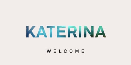 Katerina is a modern versatile sans-serif typeface. What differentiates Katerina from the other fonts is an exceptionally distinctive design. It is brilliantly suited for graphic design and display use and perfect for logotypes, t-shirts, packaging, brand identity, books, magazines, newspapers, posters, billboards, and advertising.
 - Woodpecker by profonts,
$41.99 Woodpecker is a self-confident, sturdy caps-only sans serif design imitating grained wood created and digitized by German type designer Ralph M. Unger for the profonts library. Woodpecker is perfectly suited for any graphic work around timber, lumber, prperty markets, carpenter, furniture and so on.
 - Fools Gold by BA Graphics,
$45.00 A throwback to the 70s, a graphic design with a lot of different applications. You can use this font with a normal setting or a very tight setting even over lap it, it has such great flexibility. Experiment with the possibilities and you will be pleasantly surprised.
 - Egosta by skillyas studio,
$15.00 EGOSTA is a complete sans serif family. The letterform and sharp variations characterize a bold and playful typeface in a graphic layout, making it perfect for modern and futuristic visual needs, EGOSTA complete family contains 10 styles with two axes; Weight and Width, from Thin to Bold.
 - Kargo Sans by iframe,
$69.00 IF Kargo Sans Clean and Highly Professional. This sans serif typeface includes nine (9) weights and variable format. Aims to serve a wide variety of graphic styles, branding, logotype, packaging, ecommerce in modern way. 9 weights Variable Upper / lower case, numbers, punctuation Language support: Latin and Greek
 - Dr. Bones by Sipanji21,
$18.00 Dr Bones is one of those halloween themed fonts, it looks like a series of bones. Dr. Bones is good for some Halloween themed graphic designs, such as logos, banners, t-shirts, posters, products, advertising, or other designs. make your design more attractive with Dr. Bones Font.
 - Naname Kun by Julmeme,
$15.00 Naname Kun is a geometric typeface created with oblique lines as a main texture. Its unique particularity is to be filled with diagonal hatching that varies in thickness to create different styles and weights. Applicable for any type of graphic design, especially for posters and logotypes.
 - Charlea by Kereatype,
$24.00 Charlea is a serif typeface inspired by the beauty of modern serifs, fused with modern appeal to cater to contemporary needs. It includes 20 fonts ranging from Thin to Extra Black, with true italics. Charlea offers numerous possibilities for application in various graphic or editorial projects.
 - Fruitella by Zamjump,
$17.00 Fruitella is a geometric sans serif look. Designed with powerful opentype features in mind. equipped with ligature standards that are different from ligatures in general. Perfect for graphic design and any display use. It can easily work for web, signage, corporate, and also for editorial design.
 - The Main by NicolassFonts,
$25.00 The Main is a modern sans-serif font family. It comes in 16 weights, 8 uprights, and matching italics. The Main has separate softly beveled corners, which gives it a unique look. Each weight includes OpenType features. Completely suited for graphic design and any display use.