10,000 search results
(0.023 seconds)
- Phantasm by Partnrz,
$15.00
- Swash by Paul O'Connell,
$9.95
- Pocket Serif by Letradora,
$18.00
- Iron Warrior by Cyberian Khatru,
$15.00
- Sincerely Yourz by Outside the Line,
$19.00
- Scamps by Spark Creative,
$39.00
- Element 120 by Hanoded,
$15.00
- 50's Headline DSG - Unknown license

- ITC Studio Script by ITC,
$29.99 - Ruina One by RodrigoTypo,
$25.00
- Gromer by Heyfonts,
$13.00
- Beast Bird by ErlosDesign,
$19.00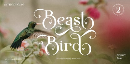
- Valvolina by Device,
$39.00
- Vagabond by Studio K,
$45.00
- ITC Tomism by ITC,
$29.99 - ALT Lautus by ALT,
$5.00
- NF Elena by NicolassFonts,
$17.00
- Blancs by 4RM Font,
$30.00
- Pattheda - Personal use only

- Callaxis - Unknown license

- ringey - Unknown license

- Ask My Flashlight by Dismantle Destroy,
$19.00 - Dead Inside by Nantia.co,
$13.00
- JH Lea by JH Fonts,
$45.00
- Claim Check JNL by Jeff Levine,
$29.00 - KG Falling Slowly by Kimberly Geswein,
$5.00
- Social Gathering JNL by Jeff Levine,
$29.00
- Sketchetik by Hiekka Graphics,
$19.00
- Washington Heights JNL by Jeff Levine,
$29.00
- No Parking JNL by Jeff Levine,
$29.00
- Maryhoid by TOMO Fonts,
$15.00
- Chiba Script by Brainware Graphic,
$12.00
- Victor Habaz MF by Masterfont,
$59.00
- Montreal Architect Px by Letradora,
$15.00
- Kaybuts by sugargliderz,
$44.00
- HGB Info SC by HGB fonts,
$10.00
- HS Decomage by Hemphill Studio,
$19.00
- Dingbatz Formz 2 DSG - Unknown license

- Incompleeta by Rex Face,
$19.99
- Luizane by Panatype Studio,
$17.00


