10,000 search results
(0.044 seconds)
- Claretta by Cooldesignlab,
$10.00 Claretta is a Family Font full of modern styles. It comes with a completely new set of letters & glyphs, all filled with love. This font has 4 Styles: Normal, Bold, Italic & Outline. However, Claretta offers a futuristic design approach and sharp personality. Created & designed for Design purposes such as Titles, Logos, Games, Applications, Films, Posters, T-shirts, etc. Mac users can use the Letter Book, and Windows users can use Character Maps to view and copy additional characters to be included in your favorite text editor / application. I hope you enjoy this font. If you have questions, don't hesitate to give me a message :) CooldesignLab,
 - Perfect Dream by Sealoung,
$17.00 Introducing Perfect Dream – a new serif with all the nostalgic vibes! A classy eighties magazine-inspired serif - with a complementary italic version :) Comes in two normal and condensed versions, mix them together to create an interesting effect. Perfect Dream is a beautiful nostalgic upper and lower case typography that looks amazing in both large and small settings as display and body text. I love combining regular and italics, either all in one word (as in the Missfits sample) or in body text! Don't forget to use all caps as well in your blending and matching - this adds contrast and impact to your type design.
 - Monterey Pop by K-Type,
$20.00 Monterey Pop oozes 1960s freedom and optimism, and is based on Tom Wilkes’s poster lettering for the Monterey International Pop Festival in June 1967, the event which heralded the legendary Summer of Love. The fonts include a newly-designed lowercase and a full complement of Latin Extended-A characters. In addition to the normal font, Outline and Thinline versions with matching spacing and kerning are supplied for use separately or overlapped with the regular font for bicolor effects. The Outline font is best for darker lines, and the Thinline font is designed for white and tinted outlines which can tend to halo and appear slightly bolder.
 - BOnuts by BOtype,
$29.00 BOnuts is a modern rounded sans built in 8 styles and crafted for you by BOtype. It's clean and minimal and modern rounded design gives you a wide array of uses such as branding, editorial & print, and also makes it perfect for UI & digital applications. We designed Bonuts to have the most legibility to give you a very versatile font family you use for any use you want. It includes Alternate Characters, Ligatures, Tabular Figures, Fractions, Numerators, Denominators, Superiors and Inferiors. It supports Central and Eastern European languages, basic Cyrillic and Greek. The type family consists of 8 weights (Thin, Light, Normal, Regular, Medium, Bold, Black and Heavy).
 - FF Meta Headline by FontFont,
$75.99German type designer Erik Spiekermann and American type designers Christian Schwartz and Josh Darden created this display and sans FontFont in 2005. The family has 12 weights, ranging from Light to Black in Compressed, Condensed, and Normal and is ideally suited for book text, editorial and publishing as well as poster and billboards. FF Meta Headline provides advanced typographical support with features such as ligatures, alternate characters, case-sensitive forms, fractions, super- and subscript characters, and stylistic alternates. It comes with tabular lining and proportional lining figures. This FontFont is a member of the FF Meta super family, which also includes FF Meta, FF Meta Correspondence, and FF Meta Serif. - Americane by HVD Fonts,
$40.00 "It's all about Soul!" – Strong, decided and edgy. The Americane super family is inspired by the old wood type specimen books. Delivering some glorious vibes of the handcrafted values from the pioneers AND keeping one eye on todays demands and technology, Americane is made for high professional use. Americane & Americane Condensed is a super family of 24 fonts in total – a normal and a condensed width in six weights with matching italics. Made for complex, professional typography, the OpenType fonts feature five variations of numerals, alternate letters, arrows and an extended character set to support Central and Eastern European as well as Western European languages.
 - Clean Deco JNL by Jeff Levine,
$29.00 Normally, a short paragraph or two on this page tells the backstory to a font design. In this particular case, that story has been lost to time. Whatever the original source – whether a vintage bit of typography or an original idea – the beginnings of this font lay unfinished for quite a while as it was perceived to duplicate another previous release. However, after recently checking a sample of the design against other Jeff Levine Fonts, it’s reasonably certain this type face may have similar characteristics, but can stand on its own merit. That said, Clean Deco JNL is available in both regular and oblique versions.
 - Francker by Linotype,
$29.99 Francker is a sans-serif, based on clean and simple design principles that betray its Danish origin. Its curves are based on the “super ellipse”, a mathematical shape about half-way between an ellipse and a rectangle. Francker’s lowercase lettershapes a, b, n, and u, have no spurs, emphasizing the simplicity of their construction. The Francker family is available in two widths, normal and condensed, each in nine weights, from extra light to extra black. Use Francker for signage, posters, magazines, advertisements, or corporate identity projects—wherever an industrial, contemporary look is needed. The Francker type was developed and designed by Anders Francker, an engineer and designer living in Denmark.
 - PF Monumenta Pro by Parachute,
$69.00 Royal, majestic, elegant. These letters are based on Roman and Greek characters carved on stone. They come in 3 different styles. Normal and Shaded are designed to have serifs with a finer thinning. On the other hand, Metallic is bolder and simulates in the most realistic way three-dimensional metallic lettering. There are some alternate characters placed at lowercase positions as well as a few stylistic alternates which are accessed through the OpenType features. Pay attention to letters like Greek Omega (lowercase position) and Greek Xi (lowercase position) as well as B, R, K (lowercase position). Monumenta Pro was recently upgraded to support Latin, Greek and Cyrillic.
 - Rimbomba by Muykyta,
$13.00 Rimbomba is a freehand style font with long ascenders and descenders and a steep slant making it elegant yet casual. It is inspired by writing letters by hand, as it was done before, with strokes that in the normal style imitate the tip of a pen and in the medium and bold styles they imitate a round pen stroke. It is a font with strength in its movements and finesse in its curves, which creates a homogeneous set that is easy to read and which produces a certain reading speed. It is complemented with stylistic alternatives for the beginning and the end of the words.
 - NorB TypeWriter by NorFonts,
$35.00 NorB TypeWriter is my emulation of the IBM Selectric 'Light Italic' ball witch was used by my grand-brother for his correspondance during the 70’s and 80’s. It's however a slanted mono-spaced looking typewriter font. You may want to use this font with any word processing program for text and display use, print and web projects, apps and ePub, comic books, graphic identities, branding, editorial, advertising, scrapbooking, cards and invitations and any casual lettering purpose… or even just for fun! NorB TypeWriter features 677 glyphs, OpenType features and comes in 8 weights each with their matching italics and in a Thin, Light, Normal and Bold version.
 - Americane Condensed by HVD Fonts,
$40.00 “It’s all about Soul!” – Strong, decided and edgy. The Americane super family is inspired by the old wood type specimen books. Delivering some glorious vibes of the handcrafted values from the pioneers AND keeping one eye on todays demands and technology, Americane is made for high professional use. Americane Condensed & Americane is a super family of 24 fonts in total – a normal and a condensed width in six weights with matching italics. Made for complex, professional typography, the OpenType fonts feature five variations of numerals, alternate letters, arrows and an extended character set to support Central and Eastern European as well as Western European languages.
 - Laire Sans by Jolicia Type,
$15.00 Laire sans that we created at the end of 2021, we made visual communication more Friendly, bold with a geometric touch in our sans category called Laire, has a good level of legibility when applied as body text because we really consider the optical in each letter. Laire Sans has 40 Styles of Normal, Condensed, Oblique fonts with Weight from thin to extra Black, has a total of 693 glyps, Cyrillic is also available to meet the needs of several languages. Designed with Opentype features to help make using fonts easier We also include variable fonts to make it easier for users to set their own according to their desired needs
 - Barosa by NREY,
$19.00 Hi, friends! Introducing new typeface - Barosa. It is a new display font with 2 styles and cool characters. Typeface designed as monolite, all descending and ascending elements has same size as most characters. Barosa has multilingual support includes cyrillic. Many ligatures make your typography most variable. Barosa Typeface was inspired by ethnic slavonic style which combining classic typography with awesome features bring classic touch on this culture. It works well with normal size text and for large displays or short words. You may combine uppercase and smallcase in the text body, as alternates symbols. The Barosa typeface is suitable for : product packaging, labeling, logo, classic shop, ethnic shop, titles, etc
 - FF Eureka Sans by FontFont,
$68.99 Slovak type designer Peter Biľak created this sans FontFont between 2000 and 2001. The family has 20 weights, ranging from Light to Black in Condensed and Normal (including italics) and is ideally suited for book text and editorial and publishing. FF Eureka Sans provides advanced typographical support with features such as ligatures, small capitals, alternate characters, case-sensitive forms, fractions, and super- and subscript characters. It comes with a complete range of figure set options – oldstyle and lining figures, each in tabular and proportional widths. This FontFont is a member of the FF Eureka super family, which also includes FF Eureka and FF Eureka Mono.
 - Erghon by Rotterlab Studio,
$17.00 Erghon is a handwritten font with quick dry strokes and a signature style. It's perfect for branding projects, homeware designs, product packaging or simply as a stylish text overlay to any background image or posters. Erghon has an entire alternate glyph set. This is accessible simply by their own separate font file - just install this as normal and select 'Erghon Swash' , ‘Erghon' or ‘Erghon’ in your text-tool. Erghon includes 2 Font files: 1. Erghon Regular - A handwritten script font containing upper & lowercase characters, numerals and a large range of punctuation. 2. Erghon Swash - A set of 26 hand-drawn swashes, with cool touch to underline your text set in Erghon.
 - Code Monkey by Comicraft,
$19.00 Underpaid? Overworked? If you like Fritos, Jolt and Mountain Dew in your cubicle, your big warm fuzzy Donkey Kong heart is going to like these fonts a lot. Developed in conjunction with actual Code Monkeys*, this user-defined type IS defined -- it's loud and proud, and available in functional monospace for screen or elegant proportional spacing for print. When your pet project needs a soft, pretty face that's visible from across the office, sit down and pretend to work with CodeMonkeyVariable. Released from the captivity of monospacing, these lovely letters can convey even your wildest story ideas. When your syntax needs to line up on screen, get monospaced out with CodeMonkeyConstant. Copy from other sources and your screen captures will look so sweet you'll no longer have to pray your code complies to specs, because even your login page will look like dynamic rock star programming.
 - Classic Grotesque by Monotype,
$40.99 Classic Grotesque by Rod McDonald: a traditional font with a modern face. The growing popularity of grotesque typefaces meant that many new sans serif analogues were published in the early 20th century. Setting machines were not compatible with each other but all foundries wanted to offer up-to-date fonts, and as a result numerous different typeface families appeared that seem almost identical at first glance and yet go their separate ways with regard to details. One of the first fonts created with automatic typesetting in mind was Monotype Grotesque®. Although this typeface that was designed and published by Frank Hinman Pierpont in 1926 has since been digitalised, it has never achieved the status of other grotesque fonts of this period. But Monotype Grotesque was always one of designer Rod McDonald’s favourites, and he was overjoyed when he finally got the go-ahead from Monotype in 2008 to update this “hidden treasure”. The design process lasted four years, with regular interruptions due to the need to complete projects for other clients. In retrospect, McDonald admits that he had no idea at the beginning of just how challenging and complex a task it would be to create Classic Grotesque™. It took him considerable time before he found the right approach. In his initial drafts, he tried to develop Monotype Grotesque only to find that the result was almost identical with Arial®, a typeface that is also derived in many respects from Monotype Grotesque. It was only when he went back a stage, and incorporated elements of Bauer Font’s Venus™ and Ideal Grotesk by the Julius Klinkhardt foundry into the design process, that he found the way forward. Both these typefaces had served as the original inspiration for Monotype Grotesque. The name says it all: Classic Grotesque has all the attributes of the early grotesque fonts of the 20th century: The slightly artificial nature gives the characters a formal appearance. There are very few and only minor variations in line width. The tittles of the ‘i’ and ‘j’, the umlaut diacritic and other diacritic marks are rectangular. Interestingly, it is among the uppercase letters that certain variations from the standard pattern can be found, and it is these that enliven the typeface. Hence the horizontal bars of the “E”, “F” and “L” have bevelled terminals. The chamfered terminal of the bow of the “J” has a particular flamboyance, while the slightly curved descender of the “Q” provides for additional dynamism. The character alternatives available through the OpenType option provide the designer with a wealth of opportunities. These include a closed “a”, a double-counter “g” and an “e” in which the transverse bar deviates slightly from the horizontal. The seven different weights also extend the scope of uses of Classic Grotesque. These range from the delicate Light to the super thick Extrabold. There are genuine italic versions of each weight; these are not only slightly narrower than their counterparts, but also have variant shapes. The “a” is closed, the “f” has a semi-descender while the “e” is rounded. Its neutral appearance and excellent features mean that Classic Grotesque is suitable for use in nearly all imaginable applications. Even during the design phase, McDonald used his new font to set books and in promotional projects. However, he would be pleased to learn of possible applications that he himself has not yet considered. Classic Grotesque, which has its own individual character despite its neutral and restrained appearance, is the ideal partner for your print and web project.
 - Aire by Lián Types,
$37.00 Aire is what Sproviero would call a < big display family >. We recommend seeing its user’s guide. After his success with Reina, Sproviero comes out with this big family of 7 members: Each of them loaded with lots of sophisticated ligatures, alternates and the entire cyrillic alphabet. The overall impression that the font gives is lightness and delicateness; that’s the reason the designer chose to call it Aire, or Air, in English. "Aire was somehow having a rest from my fat face Reina [...] It started as a really thin style of Reina, but it rapidly migrated from it and grew up alone. And how it grew..." The inspiration came from his own past creations: “The heavy strokes of Reina were shouting for a more delicate thing. Something more feminine. More fragile. Something which had a lot of elegance and fresh air inside”. Aire responds to this: Sproviero found that many of the typefaces of nowadays which are used for headlines (best known as display fonts) have almost always just one, maybe two weight styles. This was his opportunity to try something new. Aire makes it easier for the user to generate different levels/layers of communication thanks to its variety of styles. With this font you can solve entire decorative pieces of design with just one font, and that was the aim of it. Aire was designed to be playful yet formal: While none of its alternates are activated it can be useful for short to medium length texts; and when the user chooses to make use of its open-type decorative glyphs, it can be useful for headlines with dazzling results. On March of 2012, Aire was chosen to be part of the most important exhibition of typography in Latinoamerica: Tipos Latinos 2012. TECHNICAL Aire is a family with many members. In total, the user can choose between almost 6,000 (!) glyphs (1,000 per style). Each member has variants inside, which are open-type programmed: The user decides which glyph to alternate, equalizing the amount of decoration wanted. Every decorative glyph has its weight adjusted to the style it belongs to. Exclusively for decoration, Aire Fleurons Pro is an open-type programmed set of ornaments. And last but not least, remember Aire is delicate. What’s my point? It is not recommended to activate all the alternates at the same time. It is typo-scientifically proved: A maximum of 3 or 4 alternates per word would be more than enough.
 - Quiroga Serif Pro by TipoType,
$29.00 Quiroga Serif began in 2007 with the name Quadratta Serif. This typography was designed for continuous text, legible at medium and small sizes, with great saving of space, optimized for 6, 8, 10 and 12 points. The morphology is a mix between tradition and innovation; it has a vertical axis, thick serifs, tall x-height, light modulation and a lot of internal space between letters: key to improve legibility at small sizes. Formally, my idea was to make a serif type that had a unique color, this is visible due to the light modulation. This is also complemented with the incorporation of not common, alternative signs. Some parts of the letters that are usually curb or diagonal where made horizontal (for example: a, q, p, etc.), this makes the eye of each character to be wide and unique. The serifs (wedge type) suffered diverse variations during the process. At the begining they where thicker and ended vertically, but this caused a great deal of printing errors. And so we decided to modify them by giving them an angle to avoid visible errors in medium and small sizes. The ch, and ll ligatures where rescued because they are a part of our current spanish alphabet. The historic ligatures and stylistic alternates give different options to users who want different alternatives within a text. The accentuation signs were composed in a middle line above all signs to avoid visual shock. We also gave plenty of importance to small caps numbers, mathematical signs and currency signs so that the could interact well.
 - Trance FJ by Frncojonastype,
$29.00 «fj Trance™» is the first colaborative display typography of frncojonastype this 2020. «fj Trance™» is a display typography that characterizes. For having reverse contrast and play with the exaggeration of shapes and counterforms from the same typography. Conceptualized and designed originally by Jorge Morales Salas, produced by Franco Jonas Hernandez, collaborating Valentina Pino Faúndes and Rodrigo Araya Salas. Also, Greek and shadow variable version has been designed only available by his distributor of favorite typefaces :) • To exclusive licenses and to follow the develop of this project please visit frncojonas.com Learn about upcoming releases, work in progress and get to know us better! WB: frncojonas.com BE: beh.net/frncojonas TW: @frncojonas ING: @frnco.jonas
 - Sanchez by Latinotype,
$- CHECK OUT Sánchez Niu (new, nova, neue, next) Sánchez, designed by Daniel Hernández, is a serif typeface belonging to the classification slab serif, or Egyptian, that bears a strong resemblance to the iconic Rockwell, but with rounded edges— offering contrast and balance to the square structure. Sánchez & Sánchez Condensed comprises 12 variants, ranging from extra light to black, each of the same x-height. Regular and Italic variants are available for free. Download specimen pdf
 - Core Bori by S-Core,
$59.00 CoreBori is a soft Serif font. The Korean alphabet is designed into ovals, and it is also reflected in English alphabets. With oval shape and condensed width of initial and final consonants are distinguishing factors in hangul. Supported codepages are MS Windows 1252 Latin1 and MS Windows 949 Korean consisting of 11,172 Korean letters and Symbols except Chinese. We Suggest to use this font to fairy tale books, t-shirts, posters, logos and other items.
 - Asthetic by Craft Supply Co,
$15.00 Introducing Asthetic: A nostalgic serif font that channels the essence of bygone eras. With its timeless lines and vintage charm, Asthetic evokes a sense of nostalgia in your projects. Infuse your designs with the allure of the past using Asthetic's classic and enduring style. This typeface is ideal for greeting card, packaging, brand identity, poster, or any purpose to make your design project look eye catching and trendy. Feel free to play with this typeface!
 - Milky Rainbow by Abo Daniel,
$16.00 introducing MILKY RAINBOW - Bold and Bouncy Handwritten Font - MILKY RAINBOW is natural handwritten font. come with a bold style, it is very eye-catching. It is great for packaging, branding, quotes, cards, banner, book, cutting, silhouette, social media content, and anything of your craft project. I created some ligatures to make it look so natural. Features: - Uppercase - Lowercase - Number & punctuations - Multilingual - PUA encoded I hope you love it. regards, Abo Daniel Studio
 - Cheerful Girl by Abo Daniel,
$11.00 introducing CHEERFUL GIRL - handwritten font with doodles - Cheerful girl is natural handwritten font. It is great for quotes, cards, banners, books, cutting, silhouettes, social media content and anything of craft project. I created the doodles to make this product perfect. and it is very easy to access. What's included? - CHEERFUL GIRL - CHEERFUL GIRL DOODLES Features: - All Uppercase - Number & punctuations - Multilingual - Doodles - PUA encoded I hope you love it... regards, Abo Daniel Studio
 - Lovely Purple by Abo Daniel,
$15.00 introducing LOVELY PURPLE - catchy and quirky handwritten - LOVELY PURPLE is natural handwritten font. It is great for quotes, card, banner, book, cutting, silhouette, social media content and anything of craft project. Lowercase and uppercase are matching each other, so you can combine them as you want. I created some ligatures to make it look so natural. Features: - Uppercase - Lowercase - Number & punctuations - Multilingual - PUA encoded I hope you love it... regards, Abo Daniel Studio
 - Routemaster by Work by Dan,
$12.00 Routemaster is a hand-drawn condensed title font by the graphic designer Daniel Thomas. Found under the stairs, hand painted on a dusty rolled up bus route canvas. Re-created and refined with additional glyphs, Routemaster is old, bold and unique. A characterful font. Pleasant for posters, lovely for a logo, brilliant for branding, tasteful for t-shirts, playful for packaging and becoming for book cover design. Enjoy your design journey with Routemaster
 - Chicnatures by Abo Daniel,
$21.00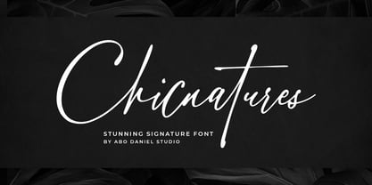 introducing CHICNATURES - stunning signature font - A classy and naturally beautiful typeface! CHICNATURES is perfect for branding, logotype, photography, invitations, quotes, watermarks, advertisements, cards, product designs, labels, social media, and much more! Chicnatures is completed with hundreds of ligatures to make it look so natural and easy to use. (you can see on presentation pictures) Features: - Uppercase - Lowercase - Number & Punctuations - Ligatures - Multilingual Support - Swash - PUA encoded I hope you love it. regards, Abo Daniel Studio
 - Tropical Vibes by Flawlessandco,
$9.00 Introducing "Tropical Vibes" - A Display Retro Fon, a captivating display retro font that channels the essence of nostalgia and carefree spirit. There's some connected letters and some alternates that suitable for any graphic designs. This font support for some multilingual. Also contains uppercase A-Z and lowercase a-z, alternate character, numbers 0-9, and some punctuation. If you need help, just write me! Thanks so much for checking out my shop!
 - Rumble by Comicraft,
$19.00 Hold on to your Hats and Stand in a convenient Door Frame, and be warned that anything you have on your desktop that is not nailed down is going to hit the floor when these characters thunder across your hard drive. Perfect for sound effects like BOOM! THOOM and, er... RUMBLE, this font family is an Earth Shaker!
 - White Risolles by pentagonistudio,
$19.00 White Risolles Is Clean Script Font Inspired By Handwritting Characters. Font Features : White Risolles OTF ( Open Type ) White Risolles WOFF ( Web Font ) SOFTWARE REQUIREMENTS : Fonts and alternate : No special software required they may be used in any basic program /website apps that allows standard fonts That's it folks! You can go ahead and get cracking :) Have a Good Day !
 - Cookie Kit by Bogstav,
$12.00 Cookie Kit is just like that easy recipe for that delicious cake that you probably know - easy to make and it tastes absolutely fabulous - Cookie Kit has the same effect with designs: It's easy to make cool effects with the 4 layers. Play around with your favourite colors and you get great results at the go!
 - Cortland JNL by Jeff Levine,
$29.00Cortland JNL was modeled [in part] from lettering spotted in the opening credits of Columbia Pictures 1945 Batman® serial. The classic clean lines of the Art Deco lettering used were perfect for translating into digital format. - Rabno by Baqoos,
$18.00 Rabo is a modernist duality linear sans apt for headline, editorial, branding, packaging, printed materials and typographic applications. 200+ glyphs with ligatures, fractions and alternatives(supported by Illustrator, Photoshop & InDesign) provided in opentype .otf and .woff format.
 - Roman Wells by Wooden Type Fonts,
$15.00 A revival of one of the popular wooden type fonts of the 19th century, suitable for display, heavy stems, very thin serifs, short descenders. Heavily revised, very much improved, extensive kerning. Now in otf and ttf formats.
 - False Widow by OhType!,
$18.00 False Widow is a display typeface, designed for graphic pieces looking for a great visual impact. Aggressive but measured in its proportions is easily adaptable to different uses and formats such as posters, headers; print and digital.
 - Corporative Sans by Latinotype,
$26.00 Corporative Sans typeface is developed by Latinotype Team. Corporative Sans is the new version of Corporative. This font has a marked personality and distinctive traits, what makes it suitable to be used at large text sizes. Since it is a condensed font, it can also be used in smaller sizes. Corporative comes with the Latinotype’s standard set of 350 characters, making it possible to use the font in 128 different languages. Corporative provides users with a wide range of characters, weights and widths for every project. By combining different variants, designers can achieve the best results. The family consists of 64 fonts: a basic family that includes 8 weights plus italics, an alternative family of 8 weights with matching italics and 2 condensed families, one regular and one alternative, both with italics. Latinotype has added new faces to its team. Latinotype Team now comprises: Rodrigo Fuenzalida, César Araya, Bruno Jara, Luciano Vergara and Daniel Hernández. Corporative was created by Latinotype Team and developed by Javier Quintana, Rodrigo Fuenzalida and César Araya, under the supervision of Luciano Vergara and Daniel Hernández.
 - Silver Thread JF by Jukebox Collection,
$32.99 Silver Thread is a hairline thin geometric sans serif font with both art deco and 1970s elements to it. Perfect for any project that needs a typeface which evokes elegance and sophistication. Digitally revived from an older photo-typositing face, Silver Thread is named after a waterfall in eastern Pennsylvania. The font contains alternate versions of B, Q, W, &, a, e, k, n, s, t, u, w, y and 4 for added variety. They can be found under the Stylistic Alternates OT feature. Jukebox fonts are provided in OpenType .otf format and all fonts contain basic OpenType features as well as support for Latin-based and most Eastern European languages.
 - Cypher by Typeco,
$29.00Cypher is a techno looking font that attempts to employ the Gestalt principal of closure. It may, at larger sizes look like some sort of code or a bunch of dots and dashes, but when viewed at smaller sizes it falls together into legible words. This font family was first inspired by an experiment to try to make a legible upper and lower alphabet with the smallest grid possible that would still describe the letterforms. The original conclusion was that it could be done in a 3x6 grid. This made a fun design exercise, but it makes a lousy font. The grid was expanded a bit for aesthetic reasons to a 3x8 grid, But not restricted so severely and so occasionally goes wider than 3 for the certain letterforms. From this a whole family of widths and weights was born, and rather than simply obliquing for italics, a true italic of sorts was created. Cypher is a versatile family of 24 fonts – 4 widths, each with 3 weights and their accompanying italics.