3,071 search results
(0.028 seconds)
- Chokey Pro by AVP,
$45.00 Chokey Pro is a richly featured, multi-language, joined handwriting script with a host of uses. Derived from La Carte, Chokey Pro works well wherever a sense of informality and spontaneity is required. Use it for menus and wine lists, newsletters, recipes - even poetry. The idea was to create a stylish but legible script that would handle fairly sizeable chunks of copy. With 500 alternative letters (including over 100 combinations), a full range of small caps, superior characters and number variants, Chokey Pro will meet the demands of even the most sophisticated texts.
 - Mighty Mouth by Comicraft,
$39.00 Trouble never hangs around, when it hears this Mighty sound, These letters come to save the day -- Mighty Mouth is on the way! When there's Danger, never Despair; The Sound of Mighty Mouth is in the air! Now YOU TOO can shoot your mouth off with the Mouth Almighty of Mighty Mouth. Comicraft’s latest offering utilizes variable type technology, for user-adjustable bold, italic and BOUNCE in illustrator (or any other program that handles variable fonts)! CAUTION: You may wish you’d never opened it, this font has no control over your tongue!
 - Gleams Sans Display by Alandya TypeFoundry,
$15.00 The Gleams Sans Display is unique, this font and is equipped with multilingual to be able to handle most typographic applications ranging. will be perfect and look luxurious for many projects such as fashion, magazines, logos, branding, photography, invitations, quotes, blog headings, posters, advertisements, postcards, etc. The Gleams Sans include ligatures, capital letters and lowercase alternate letters. You need a program that supports OpenType features like Adobe Illustrator, Adobe Photoshop CC, Adobe Indesign and Corel Draw. and you can also access alternative flying machines via Font Book (Mac users) or Windows Character Map (Windows users).
 - Embassy by Bitstream,
$29.99The English roundhand has always occupied the central position in the group of faces appropriate to the social printing handled by engravers, and their contemporary imitators, thermographers. At the end of the nineteenth century when engraving was mechanised by the pantographic engraving machine, the traditional roundhands found their way onto pantographic pattern plates. Embassy is a traditional roundhand of vigorous contrast with straightforward capitals with ball terminals; it was transferred from such an engravers’ pattern plate to the Fotosetter at Intertype about 1955. Alphatype’s Yorktown is similar, but appears to have less contrast. - Nuber Next by The Northern Block,
$39.95 Nuber Next is a modern geometric sans influenced by the popular neo-grotesques of the 1950s including Helvetica and Univers. Carefully remastered from the original Nuber type family to improve letter shape, overall uniformity and introduce a flexible width system capable of handling a wider variety of typographic applications. Details include 750 characters per font, nine weights and five widths with matching italics. Opentype features include seven variations of numerals, fractions, case-sensitive forms, stylistic alternates, ligatures, extended monetary symbols and language support covering Cyrillic, Western, South and Central Europe.
 - Breadcrumbs by Hanoded,
$15.00 Every morning, after the kids have gone to school, I vacuum the floor and remove about half a kilo of breadcrumbs… No, not really have a kilo, but any given bird could probably survive on the leftovers. When it was time to name this font, Breadcrumbs was all I could think of! Breadcrumbs and children seem to go together well, as they are featured in Hansel & Gretel and Hop-o'-My-Thumb. Breadcrumbs font is a happy, sloppy fairytale font, which you can use for your book covers, your party posters and maybe crumbly bread packaging. But that is entirely up to you.
 - ITC Franklin by ITC,
$40.99 The ITC Franklin™ typeface design marks the next phase in the evolution of one of the most important American gothic typefaces. Morris Fuller Benton drew the original design in 1902 for American Type Founders (ATF); it was the first significant modernization of a nineteenth-century grotesque. Named in honor of Benjamin Franklin, the design not only became a best seller, it also served as a model for several other sans serif typefaces that followed it. Originally issued in just one weight, the ATF Franklin Gothic family was expanded over several years to include an italic, a condensed, a condensed shaded, an extra condensed and, finally, a wide. No light or intermediate weights were ever created for the metal type family. In 1980, under license from American Type Founders, ITC commissioned Victor Caruso to create four new weights in roman and italic - book, medium, demi and heavy - while preserving the characteristics of the original ATF design. This series was followed in 1991 by a suite of twelve condensed and compressed designs drawn by David Berlow. ITC Franklin Gothic was originally released as two designs: one for display type and one for text. However, in early digital interpretations, a combined text and display solution meant the same fonts were used to set type in any size, from tiny six-point text to billboard-size letters. The problem was that the typeface design was almost always compromised and this hampered its performance at any size. David Berlow, president of Font Bureau, approached ITC with a proposal to solve this problem that would be mutually beneficial. Font Bureau would rework the ITC Franklin Gothic family, enlarge and separate it into distinct text and display designs, then offer it as part of its library as well. ITC saw the obvious value in the collaboration, and work began in early 2004. The project was supposed to end with the release of new text and display designs the following year. But, like so many design projects, the ITC Franklin venture became more extensive, more complicated and more time consuming than originally intended. The 22-font ITC Franklin Gothic family has now grown to 48 designs and is called simply ITC Franklin. The new designs range from the very willowy Thin to the robust Ultra -- with Light, Medium, Bold and Black weights in between. Each weight is also available in Narrow, Condensed and Compressed variants, and each design has a complementary Italic. In addition to a suite of new biform characters (lowercase characters drawn with the height and weight of capitals), the new ITC Franklin Pro fonts also offer an extended character set that supports most Central European and many Eastern European languages. ITC Franklin Text is currently under development.
 - Morris by HiH,
$10.00 Morris is a four-font family produced by HiH Retrofonts and based on the work of the very English William Morris. William Morris wanted a gothic type drawn from the 14th century blackletter tradition that he admired both stylistically and philosophically. He drew from several sources. His principal inspiration for his lower case was the 1462 Bible by Peter Schoeffer of Mainz; particularly notable for the first appearance of the ‘ear’ on the g. The upper case was Morris’s amalgam of the Italian cursive closed caps popular throughout the 12th through 15th centuries, a modern example of which is Goudy’s Lombardic Capitals. The gothic that Morris designed was first used by his Kelmscott Press for the publication of the Historyes Of Troye in 1892. It was called “Troy Type” and was cut at 18 points by Edward Prince. It was also used for The Tale of Beowulf. The typeface was re-cut in at 12 points and called “Chaucer Type” for use in The Order of Chivalry and The Works of Geoffrey Chaucer. Morris' objective is designing his gothic was not only to preserve the color and presence of his sources, but to create letters that were more readable to the English eye. ATF copied Troy and called it Satanick. Not only was the ATF version popular in the United States; but, interestingly, sold very well in Germany. There was great interest in that country in finding a middle ground between blackletter and roman styles -- one that was comfortable for a wider readership. The Morris design was considered one of the more successful solutions. Our interpretation, which we call Morris Gothic, substantially follows the Petzendorfer model used by other versions we have seen, with the following exceptions: 1) a larger fillet radius on the upper arm of the H, 2) a more typically broadpen stroke in place of the foxtail on the Q, which I do not like, 3) inclusion of the aforementioned ear on the g and 4) a slightly shorter descender on the y. We have included five ornaments, at positions 0135, 0137, 0167, 0172 and 0177. The German ligatures ‘ch’ & ‘ck’ can be accessed using the left and right brace keys (0123 & 0125). Morris Initials One and Morris Initials Two are two of several different styles of decorative initial letters that Morris designed for use with his type. He drew from a variety of 15th century sources, among which were Peter Schoeffer’s 1462 Mainz Bible and the lily-of-the-valley alphabet by Gunther Zainer of Augsburg. Each of the two initial fonts is paired with the Morris Gothic lower case. Morris Ornaments is a collection of both text ornaments and forms from the surrounding page-border decorations.
 - Skolar PE by Rosetta,
$70.00 Originally developed for academic publishing, Skolar asserts credibility and sustains comfortable reading. It has established itself as a go-to choice for all kinds of scholarly texts, no matter the field or school of thought: it handles the minutiae of linguistic, scientific, and editorial typography with ease. A classic with a twist, Skolar brings a trace of human touch to serious typography. Thanks to this knack for subtlety, it is also successfully used in other genres from branding to children’s literature. Skolar PE has a vast character set that caters to nearly four hundred languages and transliteration systems (Pinyin, IAST/Sanskrit) using Latin, Cyrillic, and Greek (including polytonic). Its larger x-height, robust serifs, low contrast, and its deft italic make it a pleasure to read even at small sizes. With Skolar, footnotes and bibliography become readers’ best friends. The OpenType feature set is engineered for the most rigorous editorial settings. Tabular, proportional, old-style, and lining figures as well as a full set of fractions, ordinals, and scientific superiors and inferiors will stand up to any conjectural challenge. Language-sensitive forms and compound diacritics will handle the demands of many linguistic texts. The companion families Skolar Gujarati, Skolar Devanagari, Skolar Sans PE, and Skolar Sans Arabic expand its typographic and semantic potential even further.
 - Balboa by Parkinson,
$20.00 Balboa is a display design combining elements of early sans serif and grotesque types with contemporary types. It evolved from ATF Headline Gothic, Banner (a headline typeface I drew for the San Francisco Chronicle), and Newsweek No.9, a Stephenson Blake-like grotesque I designed for Roger Black's 1980 redesign of Newsweek Magazine. There are nine styles, including the three new styles that have been added in 2014: Medium, Light and Ultra Light.
 - Typewriter Sans JNL by Jeff Levine,
$29.00 At first glance, Typewriter Sans JNL seems to look like the pantograph lettering of an engraved sign or the rounded-end lettering from an architect's templates. It might also be mistaken for plastic pin-back lettering used on some bulletin boards. In actuality, the design is based on examples of an electric typewriter ball element with a sans font named "Dual Gothic", suggested for use "in credit reports and other financial applications".
 - Clunic by Greater Albion Typefounders,
$16.95 Clunic is a Blackletter font in the best traditions of Victorian Gothic revival—that is to say aesthetically marvelous but no historical basis whatsoever. The design combines the perpendicular character of medieval manuscripts with modern legibility and a healthy respect for calligraphic principles. There are alternate large and small forms of some glyphs. Clunic is ideal for use on certificates, themed invitations, posters, headings, initial capitals or sign-writing with an historic theme.
 - Masberco by Arterfak Project,
$18.00 Introducing Masberco, a dark blackletter style seamlessly merging street art and gothic typography. Crafted with meticulous letter spacing, it radiates an elegant yet fierce typographic presence. Masberco is a standout display font, especially effective in medium to large sizes. It exudes dark vibes, making it an ideal choice for underground styles like posters, flyers, logos, logotypes, branding, book covers, emblems, and more. Here’s what you’ll get : Uppercase Smallcaps Numbers & symbols Stylistic alternates Stylistic set
 - Truth FB by Font Bureau,
$40.00 In 1994, Apple® Computer, Inc., asked David Berlow for “a future gothic” to replace Chicago®, their system font. Now called Charcoal®, the design was released with Mac® OS 8 in 1996. Through operating system bundles it found its way into every form of design. Released from constraint, Berlow designed Truth FB, a radical series with a spectrum of seven weights. Like its forbear, Truth FB opens new design avenues; FB 2005
 - Middle Ages by Mans Greback,
$49.00 Middle Ages is a hand-drawn medieval type, designed by Måns Grebäck during 2019. With its blackletter style it works great in many historical context typesettings, as well as for traditional Christmas projects. It has a Gothic style that also works well for rock music genres, or for tattoos and other rough graphics. The font is multilingual and supports all Latin-based European languages, contains numbers and all symbols you'll ever need.
 - Prince Of Darkness by Comicraft,
$19.00 The 52 characters assembled by this Gothic font, Prince of Darkness, were once interred in coffins onboard the Russian cargo ship Demeter, when it set sail for the sleepy shores of Whitby, Northern England ages ago. Hunted down by Vampire Hunters for century after century, this noble Transylvanian set has hidden for years in England and Eastern Europe. Now, Prince of Darkness is available as a font with more Layers than Dracula has Lairs.
 - Aribau Grotesk by Emtype Foundry,
$69.00 Born from the intersection of the geometric and grotesque typefaces. Aribau Grotesk combines low contrast and generous width proportions with typical traits of american gothics from the early 20th century, like the counters aperture and a double story ‘g’. Driven by the process, some details that come from the geometric style arose, like the clean-shaped figures and the circular dots that convey a more affable and contemporary look. Aribau Grotesk PDF.
 - Fiscal by Hackberry Font Foundry,
$24.95 This is a squared sans serif font family developed out of a taller Bank Gothic model plus a true lower case with many OpenType features and over 600 characters: Caps, lower case, small caps, ligatures, discretionary ligatures, swashes, small cap figures, old style figures, numerators, denominators, accent characters (including CE), ordinal numbers (1st-infinity: lining and oldstyle), and so on. It is designed for text use in body copy. For display tighten the tracking.
 - Benton Sans RE by Font Bureau,
$40.00 A redesign of drawings of News Gothic from the Smithsonian, Cyrus Highsmith and the Font Bureau studio created Benton Sans, one the most popular and versatile families in this genre. This version of the family is part of the Reading Edge series of fonts specifically designed for small text onscreen, having been adjusted to provide more generous proportions and roomier spacing, and having been hinted in TrueType for optimal rendering in low resolution environments.
 - McKellar Borussian NF by Nick's Fonts,
$10.00This unusual Gothic face was found in the 1882 McKellar, Smiths and Jordan specimen book under the name Borussian, a then-current variant of “Prussian”. This version is true to the original, so please note: a few of the uppercase characters—notably E and G—are rather unusual, so proceed with caution. All versions of this font include the Unicode 1250 Central European character set in addition to the standard Unicode 1252 Latin set. - Rulinover by Ridtype,
$18.00 Rulinover is a serif font inspired by adrenaline-pumping gothic horror movies and games. With that comes Rulinover as a supporting tool to support typography based on genres of horror adventure, challenge and dare in a particular game or film. And also supported by many alternative ligature and letter concepts that are useful in making logotypes or monogram styles. For that, Rulinover is also equipped with various languages such as Latin 1 & 2.
 - Barstow by NeueCo,
$45.00 Barstow is an exuberant revival of Wells & Webb's 1854 woodtype sensation, Gothic Tuscan Italian, building off the original 47 characters with hundreds of new glyphs including Latin language support, symbols, and punctuation. Barstow Shadow is a modulated outline complement to the regular style. Barstow Xtra is composed of charming woodtype ornaments and twists on emoji. The Barstow family is best used in display functions at sizes above 36pts, in short headlines and accent text.
 - Vestigia by Rodrigo Navarro Bolado,
$32.00 Vestigio m. Ing. & Fr. vestige: a trace, mark or visible sign left by something as an ancient city in a condition or practice vanished or lost. Vestigia is born by lost pieces of other typography, being then, Garbancera's descendant. It evolved to be seen in big point sizes and compete with other fierce competitors, while retaining some features of it ancient predecessor, navigates a gothic fraktur experimental style, existing between legible and illegible reading.
 - Halivelavierta by Ilhamtaro,
$99.00 HALIVELAVIERTA is a combination font between blackletter and serif, but I included it in the blackletter category because of the boldness and spacing that is close to a blackletter font, resulting in a font with a slightly gothic feel, vintage but also suitable for modern designs. YOU WILL GET : Halivelavierta.otf To enable the OpenType Stylistic alternates, you need a program that supports OpenType features such as Adobe Illustrator CS, Adobe Indesign & CorelDraw X6-X7. Cheers!
 - Media Gothic is a contemporary font that embodies a sleek and modern aesthetic, drawing inspiration from the principles of geometric design and minimalist styles. It falls within the category of sans...
- Sitcom by GroupType,
$19.00 If there was an American Typeface Hall of Fame, Bank Gothic, designed by the great Morris Fuller Benton would hold a place of special distinction considering this design has survived so many trends in typographic fashion since being introduced in 1930. It's just as desirable today as it was over eighty years ago; arguably more. Today, Bank Gothic is a very popular choice as a titling face for science fiction books, posters and countless television and movie titles. It is also a popular typeface for use in computer games and digital graphics. GroupType’s 2010 revival of this American classic is true to the design, the period, and Benton’s aesthetic. GroupType worked with some of the most talented and experienced type designers that were historically grounded and sensitive to this design project. Fortunately, Mr. Benton has left us a large selection of other great typefaces for insight and guidance. GroupType’s new revival includes the original three weights in regular and condensed style but also a new small cap and lowercase in each font necessary for 21st century typography.
 - Jessen-Schrift by profonts,
$41.99 The original Jessen typeface, named in reminiscence of the great supporter of the printing art at the end of the 19th century, Peter Jessen, was designed in the years of 1924 until 1930. Bible Gothic was created by the famous German designer Rudolf Koch. Ralph M. Unger digitized this font exclusively for profonts in 2005, keeping his digitization as close as possible to the original design of Koch in order to preserve the distinguished character and the partly unconventional, original forms. The concept of a Bible Gothic was developing for years in Koch's mind and drove the direction of his work, but only after the experience with his Neuland design could he start the creation of his Peter Jessen typeface. Produced quite like Neuland, Jessen, however, is much more refined and more accurate in detail than Neuland. At first glance, it seems to look plain and simple, but if you look closer, the richness of its distinguished upper case forms unfold to a perfectly clear flow of text
 - Scribonius GTSLB by Intellecta Design,
$30.00 Blackletter typefaces, also known as Gothic, Fraktur, or Old English, have been used in the headings and initial chapters of books. This style of typeface is recognizable by its dramatic thin and thick strokes, and in some fonts, the elaborate swirls on the serifs. Blackletter typefaces are based on early manuscript lettering and evolved in Western Europe from the mid twelfth century. They are best used for headings, logos, posters, and signs, as they are not easy to read in body texts. Blackletter was type that emulated the most common handwritten scripts of the era and was used for books of hours and initial chapters of books Brazilian type designer Paulo W created this font ideally suited for advertising and packaging, festive occasions, editorial and publishing, logo, branding and creative industries as well as poster and billboards. An elegant and clean typeface, with two harmonic blackletters styles, the bold lowercases with beaufitul ornamented initials. A classic decorative design around an antique theme: The headings of gothic texts, this font works great in display purposes. ENJOY
 - Japanese Brush - Unknown license

- Domyouji by Typodermic,
$11.95 Introducing Domyouji, the typeface that seamlessly blends the industrial style of the 1970s with today’s sleek design ethos, all with a hint of Handel Gothic. Domyouji was purposefully created as the ideal high-tech body text companion for Korataki, combining soft curves and strong corners to give your message an undeniable sense of precision and technological accuracy. Each of Domyouji’s four distinct styles, including Regular, Italic, Dirty, and Spraypaint, offer a unique look and feel to suit your specific design needs. Whether you’re looking for a more refined and polished appearance or a bold and edgy statement, Domyouji has got you covered. With its dynamic and futuristic aesthetic, Domyouji is the perfect typeface to elevate any technological or industrial themed project, from sleek product packaging to cutting-edge advertising campaigns. So, if you’re looking to convey a message of innovation and sophistication, choose Domyouji, and let its modern yet timeless style speak for itself. Most Latin-based European writing systems are supported, including the following languages. Afaan Oromo, Afar, Afrikaans, Albanian, Alsatian, Aromanian, Aymara, Bashkir (Latin), Basque, Belarusian (Latin), Bemba, Bikol, Bosnian, Breton, Cape Verdean, Creole, Catalan, Cebuano, Chamorro, Chavacano, Chichewa, Crimean Tatar (Latin), Croatian, Czech, Danish, Dawan, Dholuo, Dutch, English, Estonian, Faroese, Fijian, Filipino, Finnish, French, Frisian, Friulian, Gagauz (Latin), Galician, Ganda, Genoese, German, Greenlandic, Guadeloupean Creole, Haitian Creole, Hawaiian, Hiligaynon, Hungarian, Icelandic, Ilocano, Indonesian, Irish, Italian, Jamaican, Kaqchikel, Karakalpak (Latin), Kashubian, Kikongo, Kinyarwanda, Kirundi, Kurdish (Latin), Latvian, Lithuanian, Lombard, Low Saxon, Luxembourgish, Maasai, Makhuwa, Malay, Maltese, Māori, Moldovan, Montenegrin, Ndebele, Neapolitan, Norwegian, Novial, Occitan, Ossetian (Latin), Papiamento, Piedmontese, Polish, Portuguese, Quechua, Rarotongan, Romanian, Romansh, Sami, Sango, Saramaccan, Sardinian, Scottish Gaelic, Serbian (Latin), Shona, Sicilian, Silesian, Slovak, Slovenian, Somali, Sorbian, Sotho, Spanish, Swahili, Swazi, Swedish, Tagalog, Tahitian, Tetum, Tongan, Tshiluba, Tsonga, Tswana, Tumbuka, Turkish, Turkmen (Latin), Tuvaluan, Uzbek (Latin), Venetian, Vepsian, Võro, Walloon, Waray-Waray, Wayuu, Welsh, Wolof, Xhosa, Yapese, Zapotec Zulu and Zuni.
 - Signal To Noise - Unknown license

- Cupcake Pastry by Abo Daniel,
$12.00 introducing CUPCAKE PASTRY -quirky script font duo- This font is designed for crafters. It is great for branding, packaging, quotes, t-shirt design, card, banners, and anything of craft projects. Uppercase and lowercase characters match each other. What's included? CUPCAKE PASTRY LINE CUPCAKE PASTRY SOLID Features: Uppercase Lowercase Numeral Multilingual 37 Ligatures PUA encoded I hope you love it. regards, Abo Daniel Studio
 - Bellanos by Letterara,
$12.00 Bellanos is a new, fresh, sweet, and unique handcrafted font. It's ideal for branding and decorate your projects. Bellanos font has a classy and modern look that can be used for logos, branding, invitations, posters, advertisements, stationery, animated films, social media posts, youtube channel, and much more! It is PUA coded which means you can access all the glyphs and sweeps easily!
 - Humble Boys by Abo Daniel,
$15.00 Introducing HUMBLE BOYS - a playful font - It's great for branding, packaging, logo, quotes, and another project that needs a cheerful feel. It came with 3 styles Regular, Solid, and Accent Humble Boys Solid and Humble Boys Accent is a perfect combination. It is multilingual support This font is very easy to use...even for a beginner. Regards, Abo Daniel Studio
 - Light Bearer by Letterara,
$12.00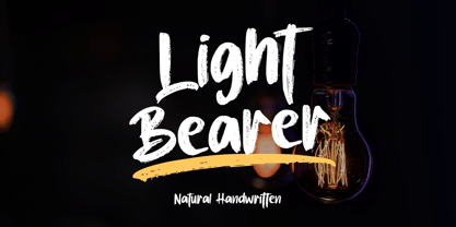 Light Bearer is a cool handwritten font. It's ideal for branding and decorate your projects. The Light Bearer font has a classy and modern look that can be used for logos, branding, posters, advertisements, stationery, movies, social media posts, youtube channels, and much more! This is a PUA code which means you can access all the glyphs and sweeps easily!
 - Kashima Brush by Abo Daniel,
$15.00 Kashima is brush font with Japanese style that made using the real brush pen. It looks very natural. This font is great for apparel, branding, logo, magazine, quotes, packaging, advertising, and more, that need a styling of a Japanese brush feel. Kashima is all capital font and includes punctuation, symbols, and numerals. It also has multilingual support. Thank you abo daniel
 - Chester Network by Abo Daniel,
$15.00 Introducing CHESTER NETWORK The Comic Typeface This font is great for apparel, branding, logo, magazine, quotes, packaging, advertising, and more, that need comic feel. It is Uppercase Font. Came with punctuations, symbols & numerals. Also support multilingual and already PUA encoded. Hope you love it. and don't hesitate to follow our store to get the best product updates. Thank You Regards, Abo Daniel
 - Brushlie by Abo Daniel,
$13.00 Brushlie is urban font family that made with real brush and is ideal for logos, apparel, quotes, product packaging, or anything which needs a font with a natural brush taste. There are available 2 version - Brush - Solid and the swash make it compete Even though Brushlie is an uppercase font, the lowercase characters will give alternate for uppercase characters. Thank You Abo Daniel
 - Dolphus Mieg Alphabet Three by Intellecta Design,
$14.00 The Dollfus Mieg Company was founded in 1800 by Daniel Dollfus (1769-1818) and Anne-Marie Mieg (1770-1852). In the 1890s and again in 1901 it published Monograms and Alphabets for Combination, a book with alphabets and monograms for cross-stitching. This book served as example for several digital fonts by Paulo W. Here you can get one of them,
 - FF Ticket by FontFont,
$41.99 German type designer Daniel Fritz created this display FontFont in 2000. The family has 8 weights, ranging from Thin to Bold (including italics) and is ideally suited for advertising and packaging, editorial and publishing as well as poster and billboards. FF Ticket provides advanced typographical support with features such as ligatures, alternate characters, and case-sensitive forms. It comes with tabular lining figures.

