8,163 search results
(0.037 seconds)
- AHDN - Unknown license

- Ebola - Unknown license

- Tattoo - Unknown license

- Avain - Personal use only

- Wonton - Unknown license

- Valley - 100% free

- Kigo by Prominent and Affluent,
$30.00 Artistic, bold and creatively designed - Kigo Font is the perfect choice for graphic designers who want to add an element of fun to their designs. Inspired by retro sans serif and the beloved shape of a cat, Kigo Font combines classic design with whimsy. With 4 styles including Regular, Round, Regular Italic and Round Italic, this font family offers versatility in every project you undertake. The multilingual support of Kigo allows you to seamlessly incorporate your message in any language without compromising on style or clarity. Perfectly suited for professional use, Kigo Font adds that touch of personality without sacrificing professionalism. Whether it's for branding projects or marketing collateral, let Kigo Font be your go-to choice when looking to create something truly unique. Upgrade your designs today with this playful yet sophisticated font!
 - Joyful Turkey by Putracetol,
$16.00 Joyful Turkey - Display Thanksgiving Font is a charming and playful typeface designed to embrace the spirit of Thanksgiving. Its quirky and rounded characters add an element of fun and warmth to your designs, making it the perfect choice for projects that celebrate this special holiday. This font includes seven delightful decorative variations with Thanksgiving-themed elements such as turkey, pumpkin, pie, leaves, and more. Ideal for Thanksgiving-themed designs, including invitation cards, birthday invites with a Thanksgiving theme, party decorations, logos, stickers, clothing, packaging, children's books, magazines, and more, Joyful Turkey brings a delightful and heartwarming touch to your creative projects. With its whimsical and cheerful style, this font captures the essence of gratitude and celebration, making it an ideal choice for designs that reflect the Thanksgiving spirit.
 - Thanksgiving Joy by Putracetol,
$16.00 Thanksgiving Joy - Various Fun Font is a whimsical and playful typeface designed to celebrate the spirit of Thanksgiving. With its rounded and friendly characters, this font adds an element of fun and warmth to your designs, making it a perfect choice for projects related to this special holiday. This font boasts nine delightful decorative variations, each inspired by different Thanksgiving motifs like turkey, pumpkins, pie, leaves, and hats. It's an ideal font for creating Thanksgiving-themed designs, including invitation cards, birthday invites with a Thanksgiving theme, party decorations, logos, stickers, clothing, packaging, children's books, magazines, and more. With its charming and playful style, Thanksgiving Joy captures the essence of gratitude, celebration, and the joy of Thanksgiving, making it an ideal choice for any project that aims to bring the warmth of this holiday to life
 - Merong by Yahya Type,
$22.00 Introducing Merong, a versatile serif font that adds a touch of elegance and sophistication to your design projects. Whether you're creating a print or digital design, Merong is the perfect typeface for capturing attention and delivering your message in style. With its variable font technology, Merong offers a range of styles, from regular and elegant to bold and dramatic. You can easily adjust the weight and width of the font to suit your needs, making it a flexible choice for a variety of projects. Merong is an excellent choice for a variety of design projects, from branding and marketing materials to editorial layouts and web design. It's a font that can adapt to your needs and help you achieve your desired aesthetic. WHAT’S INCLUDED? Numbers Punctuation Ligatures Multilingual support...
 - Bigail by Mevstory Studio,
$25.00 Bigail condensed design makes it an ideal choice for display purposes, such as headlines, titles, and logos. Its clean and legible appearance makes it suitable for short text applications, such as captions or taglines, where space is at a premium. Bigail is versatile and well-suited for a variety of design fields, including branding, advertising, editorial design, and web design. Its condensed design is particularly useful for designs where space is limited, such as packaging, signage, and mobile app interfaces. Overall, Bigail is a high quality font that offers excellent readability and legibility while conveying a sense of modernity and sophistication. Its sleek and streamlined design makes it a great choice for a wide range of design applications, making it a valuable addition to any designer’s font library.
 - Amadi by Craft Supply Co,
$20.00 Amadi - Quirky Serif Font is a delightful typeface that dances to its own beat, infusing a dash of whimsy and charm into your designs. With its quirky serifs and playful letterforms, Amadi takes the traditional serif style and gives it a whimsical twist. This font is the perfect choice for projects that aim to stand out and make a statement with a touch of quirkiness. Whether you're working on invitations, posters, or any creative endeavor, Amadi adds a distinctive and charismatic touch. Its irregular flows and unique character shapes inject a sense of fun and individuality into your designs. Amadi is like a joyful dance in the world of typography, making it an excellent choice for projects that want to break free from convention and embrace a playful, quirky spirit.
 - Christmas Chances by Putracetol,
$16.00 Christmas Chances - Christmas Font is a captivating display typeface designed to evoke the festive spirit of Christmas. With its elegant serif letterforms, this font adds a touch of sophistication to your holiday-themed designs. It comes with ligatures and six unique alternative decorations, including Santa hats, Christmas trees, Santa Claus, festive ornaments, Christmas cakes, and more. These decorative elements allow you to infuse the holiday spirit into your projects, making it perfect for various Christmas-themed designs. This font is specifically crafted for Christmas-themed projects, making it a versatile choice for a wide range of applications, including t-shirt designs, invitation cards, greeting cards, mugs, gift designs, Christmas ornaments, and much more. Christmas Chances - Christmas Font is your go-to choice for spreading holiday cheer and warmth in your creative endeavors.
 - Logika Nova by Designova,
$35.00 Logika Nova is a simple, clean typeface with a modern design and remarkable appearance. This is a perfect choice for creating logotypes, branding, headlines, corporate identities, and marketing materials for web, digital & print alike. The typeface will be a great option for branding, logo/logotype design projects, marketing graphics, banners, posters, signage, corporate identities, and editorial design. Adding extra letter spacing will make this font the perfect choice for minimal headlines and logotypes, as shown in the promo designs attached. Handcrafted and designed with powerful OpenType features in mind, each weight includes extended language support with Western European, Central European, and South Eastern European sets. A total of 280 glyphs are available. Logika Nova typeface includes 12 fonts, with six upright weights (Thin / Light / Book / Regular / Bold / Heavy) and Italic equivalents of all six weights.
 - Luce Stilren by Objectype,
$20.00 Luce Stilren is a serif font with a modern and geometric design from Objectype Studio. With clean lines and bold shapes, this font adds a professional and contemporary touch to any design project. The main feature of this font is its flexibility. Whether you’re working on a branding project, logo design, magazine headlines, or wedding invitations, Luce Stilren is the perfect choice. This font is designed to provide reading comfort, making it a great choice for both print and digital publications. Luce Stilren supports various languages and includes various typographic features such as ligatures, old-style numbers, and letter-style variations. With these possibilities, you can customize the font according to your needs. With Luce Stilren, you can take your designs to the next level. Get it now and start creating!
 - Discota by Craft Supply Co,
$20.00 Discota - Fluffy Display Font embodies the retro coolness of the 80s and 90s, exuding a playful and groovy aesthetic reminiscent of those iconic decades. Its rounded, boogie-inspired design with soft edges and friendly appearance makes it an ideal choice for projects aiming to evoke nostalgia or a carefree, energetic atmosphere. Discota effortlessly captures the spirit of the past, making it the perfect choice to infuse your creative work with a touch of nostalgia and a whole lot of fun. Choose Discota to bring the funky and stylish aesthetics of the 80s and 90s to your designs, creating a memorable and captivating visual experience. This typeface enhances a wide range of design projects, including greeting cards, packaging, brand identity, posters, and more, adding eye-catching and trendy appeal.
 - Lumien by Craft Supply Co,
$20.00 Lumien – Display Serif: All-Caps Elegance Introduction to Lumien Meet Lumien, a captivating all-caps display serif font that exudes elegance and sophistication. Its timeless design makes it a versatile choice for various applications. Design and Style Lumien boasts a classic serif design with all-capital letters. Its clean lines and sharp edges give it a modern yet timeless appeal, making it suitable for a wide range of display projects. Versatility and Usage This font shines in display settings, making headlines, titles, and logos stand out. It’s an excellent choice for branding, editorial design, and high-impact graphics that demand attention. Distinctive Features Lumien’s all-caps characters ensure clarity and legibility, even at smaller sizes. Its versatility extends to both digital and print media, enhancing the visual impact of any project.
 - CA Zentrum by Cape Arcona Type Foundry,
$40.00 CA Zentrum is a compelling mix of conciseness and pragmatism. Bold, distinct and original, contemporary and versatile. At a closer look, it reveals rounder reading-friendly forms. The choice of weights aims at an easy, straight forward use. A set of five well-balanced weights and three widths ranging from light to black and from condensed to wide. This variety ought to be enough to cover most needs without throwing the typographer into questions. The family’s glyph set supports over 100 Latin languages. With its blend of timelessness and modernity, the type-family is uniquely suited for modern corporate visual languages, websites, corporate design, editorial design and advertising. Careful spacing and a great choice of OpenType features make it especially well suited for text copy and/or editorial design.
 - ITC Franklin by ITC,
$40.99 The ITC Franklin™ typeface design marks the next phase in the evolution of one of the most important American gothic typefaces. Morris Fuller Benton drew the original design in 1902 for American Type Founders (ATF); it was the first significant modernization of a nineteenth-century grotesque. Named in honor of Benjamin Franklin, the design not only became a best seller, it also served as a model for several other sans serif typefaces that followed it. Originally issued in just one weight, the ATF Franklin Gothic family was expanded over several years to include an italic, a condensed, a condensed shaded, an extra condensed and, finally, a wide. No light or intermediate weights were ever created for the metal type family. In 1980, under license from American Type Founders, ITC commissioned Victor Caruso to create four new weights in roman and italic - book, medium, demi and heavy - while preserving the characteristics of the original ATF design. This series was followed in 1991 by a suite of twelve condensed and compressed designs drawn by David Berlow. ITC Franklin Gothic was originally released as two designs: one for display type and one for text. However, in early digital interpretations, a combined text and display solution meant the same fonts were used to set type in any size, from tiny six-point text to billboard-size letters. The problem was that the typeface design was almost always compromised and this hampered its performance at any size. David Berlow, president of Font Bureau, approached ITC with a proposal to solve this problem that would be mutually beneficial. Font Bureau would rework the ITC Franklin Gothic family, enlarge and separate it into distinct text and display designs, then offer it as part of its library as well. ITC saw the obvious value in the collaboration, and work began in early 2004. The project was supposed to end with the release of new text and display designs the following year. But, like so many design projects, the ITC Franklin venture became more extensive, more complicated and more time consuming than originally intended. The 22-font ITC Franklin Gothic family has now grown to 48 designs and is called simply ITC Franklin. The new designs range from the very willowy Thin to the robust Ultra -- with Light, Medium, Bold and Black weights in between. Each weight is also available in Narrow, Condensed and Compressed variants, and each design has a complementary Italic. In addition to a suite of new biform characters (lowercase characters drawn with the height and weight of capitals), the new ITC Franklin Pro fonts also offer an extended character set that supports most Central European and many Eastern European languages. ITC Franklin Text is currently under development.
 - Morris by HiH,
$10.00 Morris is a four-font family produced by HiH Retrofonts and based on the work of the very English William Morris. William Morris wanted a gothic type drawn from the 14th century blackletter tradition that he admired both stylistically and philosophically. He drew from several sources. His principal inspiration for his lower case was the 1462 Bible by Peter Schoeffer of Mainz; particularly notable for the first appearance of the ‘ear’ on the g. The upper case was Morris’s amalgam of the Italian cursive closed caps popular throughout the 12th through 15th centuries, a modern example of which is Goudy’s Lombardic Capitals. The gothic that Morris designed was first used by his Kelmscott Press for the publication of the Historyes Of Troye in 1892. It was called “Troy Type” and was cut at 18 points by Edward Prince. It was also used for The Tale of Beowulf. The typeface was re-cut in at 12 points and called “Chaucer Type” for use in The Order of Chivalry and The Works of Geoffrey Chaucer. Morris' objective is designing his gothic was not only to preserve the color and presence of his sources, but to create letters that were more readable to the English eye. ATF copied Troy and called it Satanick. Not only was the ATF version popular in the United States; but, interestingly, sold very well in Germany. There was great interest in that country in finding a middle ground between blackletter and roman styles -- one that was comfortable for a wider readership. The Morris design was considered one of the more successful solutions. Our interpretation, which we call Morris Gothic, substantially follows the Petzendorfer model used by other versions we have seen, with the following exceptions: 1) a larger fillet radius on the upper arm of the H, 2) a more typically broadpen stroke in place of the foxtail on the Q, which I do not like, 3) inclusion of the aforementioned ear on the g and 4) a slightly shorter descender on the y. We have included five ornaments, at positions 0135, 0137, 0167, 0172 and 0177. The German ligatures ‘ch’ & ‘ck’ can be accessed using the left and right brace keys (0123 & 0125). Morris Initials One and Morris Initials Two are two of several different styles of decorative initial letters that Morris designed for use with his type. He drew from a variety of 15th century sources, among which were Peter Schoeffer’s 1462 Mainz Bible and the lily-of-the-valley alphabet by Gunther Zainer of Augsburg. Each of the two initial fonts is paired with the Morris Gothic lower case. Morris Ornaments is a collection of both text ornaments and forms from the surrounding page-border decorations.
 - Tita Script by Latinotype,
$59.00 Tita is dedicated to my grandmother Hebe, witty and arrabalera 1. The font is inspired by Milonga 2 music and the fileteado porteño 3. I picture it at The Moulin Rouge, sparkling, provocative, loving. It evokes Tita Merello and my grandmum singing her music. Tita is Argentinean to its very core. A font to shout goal and dulce de leche 4 with passion! Its curves originate from polirhythmic calligraphy, which I learnt from my mentor Silvia Cordero Vega. Tita is a pedigree script that is based on hand lettering and Sandra Biondi’s calligraphy works. Font digitalisation by Daniel Hernández. Edited by Javier Quintana / Programmed by Manuel Corradine. 1. A person from the arrabal (a working class neighborhood on the outskirts of the city of Buenos Aires) 2. Musical genre originated in the Río de la Plata areas of Argentina and Uruguay 3. Decorative hand lettering and artistic style that is frequently spotted in Buenos Aires 4. Sweet milk sauce
 - Absentia Slab by DR Fonts,
$19.00 Conceived as a slab serif companion to the Absentia Sans family, this typeface complements its sibling with charisma and style. Built on the same geometric framework, they combine and harmonize gracefully. Yet Absentia Slab stands on its own as a novel alternative to conventional options. Anchored by blocky serifs, it presents an appearance of stability and steadiness. Its audacious design integrates unique features such as vertical terminals in glyphs ‘a’, ‘e’ and ‘6’. To make optimal use of available space, one-sided serifs (and in some cases, simple strokes without any serifs) help maintain an airy, uncluttered footprint as seen in letters ‘m’, ‘E’ and ‘N’. This forward-looking typeface is well suited for a variety of projects: understated yet spirited, technical yet welcoming. It has a modernist appeal, while reminiscent of XIXth Century woodblock lettering. Designed by Daniel Robichaud, Absentia Slab is available in ten weights with matching italics and two variable fonts.
 - Semikolon by URW Type Foundry,
$35.00 SemikolonPlus: Optimal readability by reduced, distinct letter forms. Appropriate for early readers of any age in schools and other educational institutions. SemikolonPlus minimizes the risk of confusing similar characters and therefore is predestinated for the use in text blocks, work sheets, educational games et cetera. Furthermore, with its accented characters, currency signs, true fractions and other special characters, SemikolonPlus is suited for numerous typographic tasks and – thanks to its distinct letter forms - offers great readability, even in lower point sizes. SemikolonPlus is recommended by the German association of alphabetization and basic education, which uses it for adult education, reading magazines, teaching material and the own YouTube-channel. SemikolonClassic: Is the familiar font with alternative character forms. E.g. it contains the lower case double level a and g, as well as glyphs harmonically formed to the typeface. The SemikolonClassic is suitable for diverse uses in various sectors. Together or in combination SemikolonPlus and SemikolonClassic offer extensive possibilities for the layout of text material with their heavy font weights.
 - Diverda Sans by Linotype,
$40.99Diverda Sans is a geometric family of typefaces that are all free from ornament. Swiss designer Daniel Lanz optimized Diverda Sans for maximum legibility. In contrast to many other modern typefaces, which try to squeeze the traditional rounder forms of the alphabet into square designs, and which often attempt to equalize the widths of the capital letters, Diverda Sans remains true to the proper proportions of the Roman alphabet. The x-heights of Diverda's characters are low, and the differences between curved, square, and triangular elements are very clear. Like the more calligraphic typefaces of the past, Diverda's strokes exhibit contrast that is inspired by movements of the pen on paper; down strokes are heavier than up strokes. Possible applications for the Diverda Sans include magazine design, as well as advertising for fashion, design, or architectural products. Because of its 10 different individual styles or weights, Diverda Sans is also a good fit for Corporate Identity solutions. - Boston by Latinotype,
$29.00 Designed by Daniel Hernández and Paula Nazal with digital editing by Elizabeth Hernández. Corrections and review by Alfonso García and Rodrigo Fuenzalida. Boston is a slightly rounded-edged typeface, which is inspired by “Trenda”—a geometric sans serif based on the uppercase of “Trend”(a Latinotype font, released in 2013, that was very well received). This new typeface comes with a wider character set that offers a complete family of uppercase and lowercase in different weights. Boston is a versatile, easy-to-use, functional display font with a strong personality, especially its uppercase, which makes the designer’s work easier. Boston’s lightest and heaviest variants are ideal for display use while its middle weights work well with short and mid-length texts. This typeface has been designed especially for corporate projects, logotypes and publishing. Boston comes in 8 weights, ranging from Thin to Heavy, and includes matching italics as well as small caps and alternates. The family contains a 634-character set that supports 206 different languages.
 - ITC New Winchester by ITC,
$29.99ITC New Winchester is a revival of a typeface that never really had a first release. The original Winchester was an experimental design created by the American type designer W.A. Dwiggins in 1944. Dwiggins was interested in improving the legibility of the English language by reducing the number of ascenders and descenders; to do this, he gave Winchester very short descenders and created uncial forms for a number of letters. The result was a distinctive text typeface that was occasionally used by Dwiggins and Dorothy Abbe in handset form. Fifty years later, Indiana type designer Jim Spiece has turned Dwiggins's experiment into a new family of digital text types. Spiece gave New Winchester a bold weight, as well as small caps (both roman and italic) and old style figures; he also created two forms of the lowercase f, one with and one without an overhang (in metal type, a kern), and a full set of f-ligatures. - Ceciliany by Brenners Template,
$19.00 Ceciliany is a classy font family that adds calligraphic touches to the basic structure of the display serif. Italic styles share a language set and OpenType Features compared to static styles, but have a completely different metrics In addition, an elaborate and detailed kerning system is also operated separately. 9 weights and 18 unique styles offer designers the amazing creativity of the serif font family. It offers a variety of options for editorial design as well as typography work for various channels. Features 9weights, 18styles Optimized Kernings Stylistic Set Fractions Oldstyle Figures Discretionary Ligatures : AM, AR, BA, BR, CA, CH, CR, DE, EA, El, FR, GA, GH, HR, IL, IM, JA, KA, KR, Ki, LA, LE, LO, MA, Ma, Me, NA, NE, NT, Nu, PS, RA, RE, RO, Ro, SA, ST, TH, UB, Ze, Zo, ft, li. Standard Ligatures : ff, fi, fl. * In particular, ligatures displayed in preview images can be easily applied to Adobe apps. Check out the ligature features of the software you are using.
 - Topsy Turvy by Krafted,
$10.00 Looking for a fun and versatile font to captivate your audience, clients, or guests? Trying to create the perfect contrast between your titles/headings and body copy? Maybe you’re a Beauty Influencer, Interior Designer, or run a Cooking YouTube channel - looking for a way to stand out from your competition. Maybe you feel like your birthday e-cards are missing that “something”. If you can say “yes” to any of these then hold on to your seats and get ready for a modern, fun, and delightful experience! Introducing Topsy-Turvy - A Modern Calligraphy Font. This gorgeous, fun, and elegant font can be used for a host of different content needs and projects. Use it for your headings, logos, business cards, printed quotes, invitations, packaging, resumes, and even your website or social media branding. Delight your audience, clients, or guests with this versatile, elegant font. What you’ll get: - Multilingual & Ligature Support - Full sets of Punctuation and Numerals Compatible with: - Adobe Suite - Microsoft Office - KeyNote - Pages
 - Samaritan Tall Lower by Comicraft,
$49.00 Fifteen hundred years from now, a man will be selected to go back in time to prevent a catastrophic event which turned his world into a dystopia. Sent back in time, he was enveloped in empyrean fire, the strands of energy that make up time itself. Crash-landing near Astro City in late 1985, he learned how to master and channel the empyrean forces that had suffused his body -- finally learning to control his powers in time to prevent the destruction of the Space Shuttle Challenger, the event he had been sent to avert. He described himself to journalists as nothing more than "a Good Samaritan", and has continued to help his fellow man in Astro City ever since. John JG Roshell has also been struggling with the empyrean challenge of fitting all of Kurt Busiek's ASTRO CITY dialogue into balloons with the regular Samaritan font, so he created the Samaritan Tall font to help his fellow comic book letterers! It's kinda the same thing, really.
 - Share-Regular - Unknown license

- dearJoe 2 - Unknown license

- Steelplate Textura - Personal use only

- Paulus Franck Initialen - Personal use only

- Madani by NamelaType,
$49.00 Madani is a geometric sans serif consisting of 9 weights ranging from Thin to Black and matching Oblique. With a touch of character choice, adding tails to some glyphs on the stylistic set 1 and pointing joined at some of the tapered characters in the stylistic set 2, suitable for display and body text font.
 - TV Western JNL by Jeff Levine,
$29.00 In the 1889 Franklin Type Foundry specimen book is a type face called “Armenian”. With lighter weight horizontal slab serifs than more traditional Western fonts, it could be pictured as being used as copy on wanted posters or town notices. This is now available as TV Western JNL in both regular and oblique versions.
 - Chocolate Pro by Sudtipos,
$79.00Most everyone agrees that chocolate is irresistible. Now the Koziupa & Paul tag team is offering you a choice of three irresistible flavors, from the bittersweet Amargo, to the mouth-watering Dulce, you now have three different possibilities for the pleasure of your taste buds. The OpenType versions includes de 3 flavors all in one. - Perfect Island by Balpirick,
$15.00 Perfect Island is a Modern Handwritten Font. Perfect Island is a lovely script font featuring charming, playful characters that seem to dance along the baseline. Add this font to your most creative ideas, and notice how it makes them stand out! Perfect Island also multilingual support. Enjoy the font, feel free to email. Thank you!
 - Diafragma by ParaType,
$30.00 Typeface was designed in 2021-2022 by Alexey Chekulaev. It has small serifs and original contours, it’s also well read in small sizes. Each style has 1400 characters of Latin, extended Cyrillic, Greek, including small caps, as well as alternate characters. Diafragma is a good choice for headings, logos, branding, packaging, publications and websites.
 - One Crayon by Balpirick,
$15.00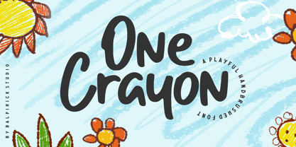 One Crayon is a Playful Handbrushed Font. One Crayon is a cute and informal display font. It embodies playfulness and authenticity and is the perfect choice for any children activity or school project. One Crayon also multilingual support. Enjoy the font, feel free to comment or feedback, send me PM or email. Thank you!
 - Balcon by Tour De Force,
$25.00 Balcon is condensed sans family designed to be your first web font choice. Contains 5 weights: Light, Regular, Bold, ExtraBold and Black, it fits perfect into any project, from editorial editions to packages, labels, posters. If you're looking for a bit decorative version of this family, feel free to check Balcon Round sans family.


