10,000 search results
(0.021 seconds)
- Charpentier Renaissance Pro by Ingo,
$42.00 A very legible Renaissance Antiqua This typeface is based on the desire to create an Antiqua like those which might have existed at the beginning of the »printing age« — the basic form oriented on the classical Roman and early Middle Ages models, the ductus defined completely by writing with a wide pen and much individual expression in detail. In the spring of 2005 I had the opportunity to closely examine a few pages in the famous book »Hypnerotomachia Poliphili« from 1499. The script used here from Aldus Manutius is exemplary. Most of the book, however, is not very carefully printed. The characters do not stay on the line; the print is at times too strong and at times much too weak. And on these imperfect pages the true character of the letters is recognizable; that is, that they are cut with lively detail which is a result of the patterns provided by full-time writers. After all, around 1499 script was written as a rule and the printed type was oriented on this pattern. I prefer the typeface on the lightly printed pages. The characters are not placed neatly on the line, but the distinct and emerging lively ductus of the individual characters automatically presents harmonious word formations in the eye of the beholder, with the non-perfect line stepping into the background. Also in Charpentier Renaissance, the strokes of the wide pen are still noticeable. The font has very defined softly bent serifs. The forms are powerful and stand solidly on the baseline. Charpentier Renaissance is very legible and yields a solid and yet still lively line formation. The accompanying italic, like its historical models, has almost no inclination. The lower case characters of Charpentier Renaissance Oblique have such idiosyncratic figures that they can also form a font of their own. Please visit www.ingofonts.com
 - Richard Starkings by Comicraft,
$39.00 A NEW HOPE! You begged with us..! You pleaded with us..! But we decided to release the official Richard Starkings font anyway! Huh? WHAT? You heard that line before? Where? Hmm... on this very site...? Well, yes, the Hedge Backwards font is all fine and dandy and does resemble the lettering legerdemain of comic book lettering robot, Richard Starkings... but has it been tweaked over the years to better suit the writing stylings of ELEPHANTMEN creator and writer, Richard Starkings? Has it been refurbished and digitally remastered by ELEPHANTMEN designer and Comicraft Secret Weapon, John JG Roshell? Hmm? No? Well then... here it is, retooled, reimagined and reStarkingsed...ah, what the hell, we started from scratch! This ain't no Greedo Shoots First -- you won't have to keep your pasty '70s VHS recordings of previous Richard Starkings Fonts inside a concrete bunker. Because any other font that claimed to be the official Richard Starkings font would have been called The Official Richard Starkings Font, would it not?
 - Ongunkan Adinkra Script by Runic World Tamgacı,
$80.00 The Adinkra alphabet is a way to write some of the languages spoken in Ghana and Ivory Coast, such as Akan, Dagbani, Ewe and Ga. It is a simplified version of the Adinkra symbols, and was introduced in 2015 by Charles M. Korankye, who has written a number of books about it. According to tradition, the Adinkra symbols were created by Nana Kwadwo Agyemang Adinkra, the King Gyaman people in the Ashanti region of Ghana from 1810 to 1820. Or they were created by Gyaman people, and the king liked them so much that he wore them on his clothes and named that after himself. The Adinkra symbols are used as decoration, logos, arts, sculpture, pottery and so on. The symbols represent sayings, proverbs or concepts, such as wisdom, authority, strength, unity, love adaptability, wealth, peace, war or agreement. Since Unicode codes have not been assigned yet, it is designed on a latin-based font. Please contact me if you want changes to the keyboard layout.
 - Tatty by Scrowleyfonts,
$- Tatty is a sans serif, monoline font that is distinguished by the gentle, rounded, backward curves on the ascenders. I created it because I had a picture in my mind of a font that I wanted to use when designing images and logos for clients' websites but I could never find one that was just exactly right. Many years ago I worked for a sign-writing company. My job was to copy and enlarge letter sets from printed copy and then cut masks for airbrushing. One morning I arrived at my desk to find that the airbrush artist had written on a rough, rubbed out, scribbled on drawing of the letter ‘a’ - “make a letter happy, make it beautiful”. That was the brief I set myself in the design of Tatty - to make every letter happy and beautiful. The result is a flowing, elegant yet simple type which I believe works particularly well for poetry.
 - Aragon ST by Canada Type,
$39.95 Aragon ST is a special version of Hans van Maanen’s Aragon family. It was developed for science writing, and it serves as the very first introduction of SciType, an innovative new way of building fonts specifically for typesetting science text. For more information about SciType, please consult the SciType FAQ PDF in the Gallery section. The Aragon design is a remodelling of the classic mid-1500s Garamond forms through a modern lens. It is a text workhorse that performs very well in a variety of sizes, from footnotes and legal copy to lengthy, immersive-reading body sets. Its efficient and legibility-asserting traits are wedge serifs and uniquely tapered stems that slightly shift the weight stress to the top half of the forms while maintaining the clarity and synergy of the counterspace’s sequence. Aragon ST takes all that a step further for science writers. For details about the functionality of Aragon ST, please consult the Aragon ST Access Chart PDF in the Gallery section.
 - KG Say Something by Kimberly Geswein,
$5.00 This quirky font features tons of personality in curls and swirls. Use it for titles & small snippets of text. (Don't try turning a term paper written in this font!)
 - Moneymachine by Mans Greback,
$49.00 Moneymachine is a sans and serif combined display typeface. Inspired by the art of money printing, the typography used for certificate production and classic letterforms, Moneymachine uses a traditional and perfected serif font and blends it together with a modern and clean sans-serif. The result is an original and confident work, which fits perfectly as a logotype or headline in any context that requires that extra touch of coolness. The Moneymachine family consists of six fonts: The Regular that combines sans and serif. Inverted for a white-on-black version. The Serif and Sans for more basic writing. White and Black for a lettering with a banner. The font is built with advanced OpenType functionality and has a guaranteed top-notch quality, containing stylistic and contextual alternates, ligatures and more features; all to give you full control and customizability. It has extensive lingual support, covering all Latin-based languages, from North Europe to South Africa, from America to South-East Asia. It contains all characters and symbols you'll ever need, including all punctuation and numbers.
 - Zombie - Unknown license

- Hitormis by Forberas Club,
$16.00 Hitormis is handwritten font with uppercase style. Recommended to use for wall art, children theme, funny theme, comics, cartoon, simple write, poster and display.
 - Syntha - Personal use only

- Syntha - Personal use only

- Edvard by Julia Bausenhardt,
$45.00 This font is based on the handwriting of Norwegian painter Edvard Munch. Using his many letters, drafts, notes- and sketchbooks as reference, this font characterizes the elegant yet sometimes quite irregular writing style Munch had. To resemble naturalistic writing and remain as authentic as possible, a combination of extended ligatures and alternates has been included, as well as Swash characters (accessible via open-type). Additionally, several of Munch's paintings and woodcuts are embedded as extras.
 - Indiana Script by Mans Greback,
$59.00 In a classic logotype style, Indiana Script is a sharp and steady typeface created by Måns Grebäck. With its bold brush strokes and vintage tilt, this typeface works great in old-style logos and headlines. It contains ligatures and alternate characters, and supports a very wide range of languages. Write _ after a word to get a swash. Example: Indiana_ With ligatures activated, write _ and a number for more swashes. Example: Visual_2 Music_6
 - TE Al Thuluth by Tharwat Emara,
$75.00 This Font is similar to the calligraphic style AL THULUTH. I added many glyphs to each other to get this feature and it become easier to graphic designer to write with Arabic AL THULUTH font without being a real calligrapher. It works beautiful in Headlines of Arabic books and photos and it is Fine Art . It also used in writing on T-shirts and clothes . This Font contains many Glyphs in Latin, Farsi, Urdu, Arabic ).
 - DF Pigtail by Dutchfonts,
$33.00 DF Pigtail is the result of a curious marriage of the 'free'-form of writing with the fixed (mono) space for each character of the typewriter typeface. In the early sixties of the last century, typewriter typography became popular as a Fluxus vocabulary. The Fluxus art movement (in fact a Dada like follow up) which encouraged a do it yourself aesthetic, and valued simplicity over complexity and anti commercialism over the conventional market-driven approach. I was educated in the mid seventies when this form of typography was still very popular and was even applied in corporate design. This particular letter has been used by my teacher Jan Begeer to compose his design assignments. Recently I rediscovered this type and was struck by its pigtail similarity and drew it my way.
 - Wild Rhytm by Forberas Club,
$16.00 This new script font is written by our team, and ready to pop up your project by using this font for your party, event, invitation or at your wedding decor.
 - Horror Brush by Gassstype,
$27.00 Introducing of our new product the name is Horror Brush is Handmade Brush Font Rough and Creepy typeface. This is a Rough Brush Typeface that is written casually and quickly.
 - Manstromer by Trustha,
$16.00 Manstromer is a dynamic handwritten font, written with fast movements. Comes with two fonts styles, regular and slant. Manstromer is suitable for branding, advertising, headlines, packaging design, and many more.
 - Signamaestro by Almarkha Type,
$35.00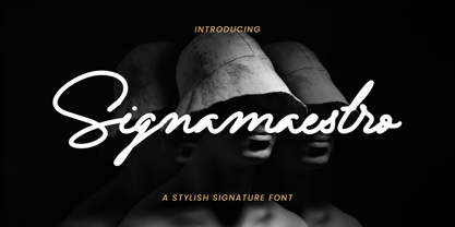 Introducing Signamaestro - Stylish Signature Script is a Quality script that is written casually and quickly Signamaestro is perfect for homeware designs,branding projects, Logo, design, Quotes, Product packaging, Photography, Watermark.
 - Drac Tombstone by Forberas Club,
$16.00 This new Handwritten font is written by our team, and ready to pop up your project by using this font for your party, event, invitation or at your wedding decor.
 - Lady Dodo by Sudtipos,
$49.00 And the day in which I introduce my second typographic family has arrived. In order to do this, I borrowed several passages from this beautiful book by Maurice Maeterlinck, “Life and Flowers”. His poetic observation of Nature made me reflect about the small discoveries behind the flow of my pen on paper. About that quick, spontaneous, overwhelmed stroke, with some awkwardness as well as certainty in it. About the writing that looms line after line. About the mischievous stains of ink flooding my writing tool. Lady Dodó was born as a product of these drawings, pieces of writing and reflections. Following the steps of its ancestor and friend, Lady René, it takes advantage of the goodness of the Open Type technology to propose a systematized as well as a personalized writing font. Both friendly and challenging. Due to the large number of alternate characters (both for lower and upper case as well as for numbers) and to its precise programming, it proposes to design diverse and rich typographical sets with multiple strokes in a simple way. However, Lady Dodó is not just made of typographical signs; it also proposes a set of modules to make patterns and another one to design frames. From the combination of these modular signs, an infinite universe of possibilities for decoration arises. Here is Lady Dodó, ready to get started and write its destiny. July 2015.
 - Ongunkan Irk Bitig Viking by Runic World Tamgacı,
$99.00 This is the Viking font that I developed based on the letters in the Irk Bitig book, which is written with the brush line of the old Turkish runic alphabet, the information below. It was interesting work. Irk Bitig or Irq Bitig (Old Turkic: 𐰃𐰺𐰴 𐰋𐰃𐱅𐰃𐰏), known as the Book of Omens or Book of Divination in English, is a 9th-century manuscript book on divination that was discovered in the "Library Cave" of the Mogao Caves in Dunhuang, China, by Aurel Stein in 1907, and is now in the collection of the British Library in London, England. The book is written in Old Turkic using the Old Turkic script (also known as "Orkhon" or "Turkic runes"); it is the only known complete manuscript text written in the Old Turkic script. It is also an important source for early Turkic mythology.
 - Mojacalo AH - Unknown license

- Potrzebie - Unknown license

- Castaway - Unknown license

- Jinky - Unknown license

- DS Zombie Cyr - Unknown license

- Creature - Unknown license

- Almost Love by Forberas Club,
$16.00 Almost Love type is handwriting style. Nice to application for wedding invitation, tees design, cover, writing text, wedding moment, logo photography , signature and many more.
 - Seronita by Letterara,
$12.00 Seronita is a modern calligraphy font. It has a natural writing style and is perfect for adding an elegant and luxurious feel to your designs.
 - LD Cottage by Illustration Ink,
$3.00LD Cottage resembles the antique writing you would find in an ancient fairytale or story. Enjoy this fun font and let your imagination take flight! - Swagstie by Forberas Club,
$16.00 Swagstie is handwriting style. This font create and nice to application for memo, tees design, cover, writing text, home decor, wall art and many more.
 - Robard by Dear Alison,
$24.00 My brother is an architect, and I have always loved his lettering, you know, the style of writing that can be found on architectural drawings. There is a common thread to it, yet each architect or engineer brings their own personality to it. I have seen a similar style being used by some hand-letterers for invitations, place cards and signage. Inspired, I set out to create my own, and the result is my new typeface, Robard! I wanted something compact, somewhat modular, done quickly but with control, and sourced from hand-lettering. Starting out with a handful of pigment ink pens, I settled on a 0.1mm Copic Multi-Liner, and using a light table with a grid underneath the paper, I cranked out grouping after grouping, letter after letter, numbers, punctuation, accents, just trying to zero in on the feeling and the look I was after. There were some ideas that didn't work, like unicase (there would be no regular lowercase), or swash alternates. Ultimately, I ended up with a decent array of glyphs to choose from, and alternates like oldstyle numbers, and an alternate set of caps for the lowercase slots, and even alternative figures so doubles like 88 would be different. In the font, the OpenType ligature code automatically alternates the cap and lowercase (alternate cap) letters, and numbers as you type, lending Robard that hand-lettered look in a digital typeface that I was hoping for. There are also oldstyle figures, and unlimited fractions, ordinals, and a few alternate letters. I hope you like Robard!
 - Struck Base PERSONAL USE ONLY PERSONAL USE ONLY - Personal use only

- Patched Medium - Personal use only

- Dreamland - 100% free

- LemonCookieBold - 100% free

- REGALIZ - Unknown license

- Funny Face - Unknown license

- Enlighten - Personal use only


