10,000 search results
(0.068 seconds)
- KG Belfort by Krismagraph,
$19.00 Belfort is a modern sans serif family font with a neo-Grotesk touch, it is a sans serif typeface that tends to be easily accepted by readers, has wide usage possibilities, and shows a simple, bold, and strong personality. The Belfort font contains 2 basic shapes: upright and round. Each has 10 different weights (Thin, Extra Light, Light, Regular, Medium, Semibold, Thick, Extrabold, Black, and Heavy). with ligatures and alternating in several letters. and is equipped with a multilingual accent.
 - Vianova Serif Pro by Elsner+Flake,
$59.00 The font superfamily Vianova contains each 12 weights of Sans and Slab and 8 weights of the Serif style. The design from Jürgen Adolph dates back into the 1990s, when he studied Communication Design with Werner Schneider as a professor at the Fachhochschule Stuttgart. Adolph started his carrier 1995 at Michael Conrad & Leo Burnett. He was responsible for trade marks as Adidas, BMW, Germanwings and Merz. He has been honored as a member of the Art Directors Club (ADC) with more than 100 awards. On February 26, 2014, Jürgen Adolph wrote the following: “I was already interested in typography, even when I could not yet read. Letterforms, for instance, above storefronts downtown, had an irresistible appeal for me. Therefore, it is probably not a coincidence that, after finishing high school, I began an apprenticeship with a provider of signage and neon-advertising in Saarbrücken, and – in the late 1980s – I placed highest in my field in my state. When I continued my studies in communications design in Wiesbaden, I was introduced to the highest standards in calligraphy and type design. “Typography begins with writing” my revered teacher, Professor Werner Schneider, taught me. Indefatigably, he supported me during the development of my typeface “Vianova” – which began as part of a studies program – and accompanied me on my journey even when its more austere letterforms did not necessarily conform to his own aesthetic ideals. The completely analogue development of the types – designed entirely with ink and opaque white on cardboard – covered several academic semesters. In order to find its appropriate form, writing with a flat nib was used. Once, when I showed some intermediate designs to Günter Gerhard Lange, who occasionally honored our school with a visit, he commented in his own inimitable manner: “Not bad what you are doing there. But if you want to make a living with this, you might as well order your coffin now.” At that time, I was concentrating mainly on the serif version. But things reached a different level of complexity when, during a meeting with Günther Flake which had been arranged by Professor Schneider, he suggested that I enlarge the offering with a sans and slab version of the typeface. So – a few more months went by, but at the same time, Elsner+Flake already began with the digitilization process. In order to avoid the fate predicted by Günter Gerhard Lange, I went into “servitude” in the advertising industry (Michael Conrad & Leo Burnett) and design field (Rempen& Partner, SchömanCorporate, Claus Koch) and worked for several years as the Creative Director at KW43 in Düsseldorf concerned with corporate design development and expansion (among others for A. Lange & Söhne, Deichmann, Germanwings, Langenscheidt, Montblanc.”
 - Vianova Slab Pro by Elsner+Flake,
$59.00 The font superfamily Vianova contains each 12 weights of Sans and Slab and 8 weights of the Serif style. The design from Jürgen Adolph dates back into the 1990s, when he studied Communication Design with Werner Schneider as a professor at the Fachhochschule Stuttgart. Adolph started his carrier 1995 at Michael Conrad & Leo Burnett. He was responsible for trade marks as Adidas, BMW, Germanwings and Merz. He has been honored as a member of the Art Directors Club (ADC) with more than 100 awards. On February 26, 2014, Jürgen Adolph wrote the following: “I was already interested in typography, even when I could not yet read. Letterforms, for instance, above storefronts downtown, had an irresistible appeal for me. Therefore, it is probably not a coincidence that, after finishing high school, I began an apprenticeship with a provider of signage and neon-advertising in Saarbrücken, and – in the late 1980s – I placed highest in my field in my state. When I continued my studies in communications design in Wiesbaden, I was introduced to the highest standards in calligraphy and type design. “Typography begins with writing” my revered teacher, Professor Werner Schneider, taught me. Indefatigably, he supported me during the development of my typeface “Vianova” – which began as part of a studies program – and accompanied me on my journey even when its more austere letterforms did not necessarily conform to his own aesthetic ideals. The completely analogue development of the types – designed entirely with ink and opaque white on cardboard – covered several academic semesters. In order to find its appropriate form, writing with a flat nib was used. Once, when I showed some intermediate designs to Günter Gerhard Lange, who occasionally honored our school with a visit, he commented in his own inimitable manner: “Not bad what you are doing there. But if you want to make a living with this, you might as well order your coffin now.” At that time, I was concentrating mainly on the serif version. But things reached a different level of complexity when, during a meeting with Günther Flake which had been arranged by Professor Schneider, he suggested that I enlarge the offering with a sans and slab version of the typeface. So – a few more months went by, but at the same time, Elsner+Flake already began with the digitilization process. In order to avoid the fate predicted by Günter Gerhard Lange, I went into “servitude” in the advertising industry (Michael Conrad & Leo Burnett) and design field (Rempen& Partner, SchömanCorporate, Claus Koch) and worked for several years as the Creative Director at KW43 in Düsseldorf concerned with corporate design development and expansion (among others for A. Lange & Söhne, Deichmann, Germanwings, Langenscheidt, Montblanc.”
 - Vianova Sans Pro by Elsner+Flake,
$59.00 The font superfamily Vianova contains each 12 weights of Sans and Slab and 8 weights of the Serif style. The design from Jürgen Adolph dates back into the 90th, when he studied Communication Design with Werner Schneider as a professor at the Fachhochschule Stuttgart. Adolph started his carrier 1995 at Michael Conrad & Leo Burnett. He was responsible for trade marks as Adidas, BMW, Germanwings and Merz. He has been honoured as a member of the Art Director Club (ADC) with more than 100 awards. On February 26, 2014, Jürgen Adolph wrote the following: “I was already interested in typography, even when I could not yet read. Letterforms, for instance, above storefronts downtown, had an irresistible appeal for me. Therefore, it is probably not a coincidence that, after finishing high school, I began an apprenticeship with a provider of signage and neon-advertising in Saarbrücken, and – in the late 1980s – I placed highest in my field in my state. When I continued my studies in communications design in Wiesbaden, I was introduced to the highest standards in calligraphy and type design. “Typography begins with writing” my revered teacher, Professor Werner Schneider, taught me. Indefatigably, he supported me during the development of my typeface “Vianova” – which began as part of a studies program – and accompanied me on my journey even when its more austere letterforms did not necessarily conform to his own aesthetic ideals. The completely analogue development of the types – designed entirely with ink and opaque white on cardboard – covered several academic semesters. In order to find its appropriate form, writing with a flat nib was used. Once, when I showed some intermediate designs to Günter Gerhard Lange, who occasionally honored our school with a visit, he commented in his own inimitable manner: “Not bad what you are doing there. But if you want to make a living with this, you might as well order your coffin now.” At that time, I was concentrating mainly on the serif version. But things reached a different level of complexity when, during a meeting with Günther Flake which had been arranged by Professor Schneider, he suggested that I enlarge the offering with a sans and slab version of the typeface. So – a few more months went by, but at the same time, Elsner+Flake already began with the digitilization process. In order to avoid the fate predicted by Günter Gerhard Lange, I went into “servitude” in the advertising industry (Michael Conrad & Leo Burnett) and design field (Rempen& Partner, SchömanCorporate, Claus Koch) and worked for several years as the Creative Director at KW43 in Düsseldorf concerned with corporate design development and expansion (among others for A. Lange & Söhne, Deichmann, Germanwings, Langenscheidt, Montblanc.”
 - Via Roma Display by Font&Co.,
$19.00 A font inspired by regime propaganda inscriptions found in Italian institutional and civic architecture of the 20’s and 30’s. Bold, severe lettering, suggestive of pre-war Italian Art Deco and American Depression Modern aesthetics.
 - Brecia Lovely by Arterfak Project,
$23.00 Introducing our latest experiment, “Brecia Lovely,” a hybrid font that combines script font (as uppercase) and slim serif (as lowercase). It features beautiful ligatures and special characters that provide a dynamic, elegant, and luxurious impression. Inspired by fashion magazines and modern typography, Brecia Lovely offers elegance that you can use in your designs, such as posters, flyers, stories, magazines, blogs, editorials, titles, displays, and more. It is a classy font that you can combine with 50+ ligatures and 60+ alternates. What you will get: Uppercase Lowercase Numbers Symbols & punctuation Stylistic alternates Ligatures Multilingual support Thank you for visiting, happy designing
 - Monstice by Seventh Imperium,
$25.00 Monstice Family is an elegant, playful and decorative family which includes five separate styles. There is a base serif design that was expanded to Engraved, Inline, Hatched, and Emboss styles. There is also a set of decorative elements to assist in adding details and flourishes. The font is well suited for display typography for posters, book covers, packaging and many other uses where one might need a splash of detail. All fonts have OpenType features including swash, ligatures, and alternates. This font is easy to use and will allow the designer plenty of exploratory features to create their own combinations.
 - Endaley by IbraCreative,
$17.00 Endaley is a modern and elegant serif typeface that seamlessly blends timeless sophistication with contemporary design. Its sleek and refined letterforms exude a sense of class and professionalism, making it a versatile choice for a wide range of applications, from editorial layouts to branding and beyond. The well-balanced serifs and subtle curves of Endaley create a harmonious visual rhythm, striking a delicate equilibrium between tradition and modernity. With its distinctive yet understated personality, Endaley adds a touch of refinement to any project, embodying a contemporary aesthetic while paying homage to the enduring elegance of serif typography.
 - Rastanty Cortez by Realtype,
$12.00 Rastanty Cortez consists of sophisticated, elegant, classy and modern handwriting. With a little dirty curvature and made from the typography of new trends, this font will give you a design that looks fresh and modern. Rastanty Cortez, with a soft style and elegant nuances, classy and natural, is perfect to get a more charismatic impression or give a unique touch to your projects and branding, greeting cards, wedding, banner, name card, lettering, fonts pairing, etc. Try mixing your design with this font. Don't hesitate to pair it with serif or serif in your work idea. Find interesting layouts to complement your project.
 - Sugarless Coffee by Gassstype,
$23.00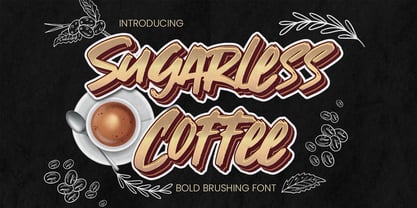 Hello Everyone, introduce our new product Sugarless Coffee - Bold Brushing Font Crafted Display, inspired by the title of the sports poster and We make it very energetically. Sugarless Coffee font with strong and challenging nuances. very suitable for the title, typography, Poster, magazines, brochures, packaging,Websites and much more for your design needs, making your designs more modern and professional. Inspired by Logo style and combination with Cute Craft style. that will fulfill your design needs for quotes,sporty theme, logotype, wordmark, etc. This has many opentype features and support multi language. You can activate Ligature OpenType panel design more interesting.
 - Porchlight by Ana's Fonts,
$15.00 Porchlight is a soft serif font inspired by vintage French typography. It includes three weights: regular, semi bold and bold, with matching italics. It also includes bonus ornaments that complement the font beautifully, for elegant and easy designs. Included in this trendy font family: 6 fonts: regular, semibold and bold, plus italics, with over 300 glyps each, including small caps and lots of ligatures. ornaments font with 52 ornaments (13 different designs, mirrorred horizontally and vertically). borders font, with borders with different thickness. Use Porchlight in print layouts, logotype design, social media posts, branding and packaging.
 - Minor by Glen Jan,
$25.00 Minor is contemporary simple equable text grotesk in 6 weights with italics. It combines the best features of neo- and humanist sans types for legibility and easy reading. Clean design and balanced white spaces enables using Minor for long texts. Or in any other work as secondary invisible type in pair with display face. Using as primary type in large sizes it, static and non-emotional, will focus attention to text content. Minor family supports Latin Extended-A (Western, Central Europe, Baltic, Turkish) and Cyrillic Extended encoding languages. All styles contain basic OT-features and numeric forms for text typography.
 - Enchanted Love by VP Creative Shop,
$20.00 Introducing Enchanted Love - Elegant Sans Serif Typeface - 8 weights Enchanted Love is classic yet creative typeface loaded with 8 fonts, alternate and ligature glyphs to make you typography truly unique! Language Support : Belarusian, Bosnian, Bulgarian, Chechen, Macedonian, Russian, Serbian, Afrikaans, Albanian, Asu, Basque, Bemba, Bena, Breton, Chiga, Colognian, Cornish, Czech, Danish, Dutch, Embu, English, Estronian, Faroese, Filipino, Finnish, French, Friulian, Galician, Ganda, German, Gusii, Hungarian, Indonesian, Irish, Italian, Jola-Fonyi, Kabuverdianu, Kalenjin, Kamba, Kikuyu, Kinyarwadna, Litvian, Lithuanian, Lower Sorbian, Luo, Luxembourish, Luyia, Machame, Makhuwa-Meetoo, Makonde, Malagasy, Maltese, Manx, Meru, Morisyen, North Ndebele, Norwegian Bokm ål, Norwegian Nynorsk, Nyankole, Ormo, Polish, Portuguese, Quechua, Romanian, Romansh, Rombo, Rundi, Rwa, Samburu, Sango, Sangu, Scottish Gaelic, Sena, Shambala, Shona, Slovak, Soga, Somali, Spanish, Swahili, Swedish, Swiss German, Taita, Teso, Turkish, Ukrainian, Upper Sorbian, Uzbek (Latin), Volap ük, Vunjo, Walser, Welsh, Western Frisian, Zulu FEATURES Uppercase, lowercase, numeral, punctuation & Symbol -Hairline, Extra light, Light, Regular, Bold, Extra Bold, Black and Heavy versions Cyrillic support ligature glyphs alternates Multilingual support - 95 languages No special software is required to type out the standard characters of the Typeface. How to access alternate glyphs? To access alternate glyphs in Adobe InDesign or Illustrator, choose Window Type & Tables Glyphs In Photoshop, choose Window Glyphs. In the panel that opens, click the Show menu and choose Alternates for Selection. Double-click an alternate's thumbnail to swap them out. Feel free to contact me if you have any questions! Mock ups and backgrounds used are not included. Thank you! Enjoy!
 - ALCATRAZ - Personal use only

- Fangtasia - Personal use only

- TRUEblood - Personal use only

- Mray Barlo by Ergibi Studio,
$20.00 MRAY BARLO is a typeface display that makes us feel nostalgic! It brings back the 60s to 70s vibe with a fun, retro typeface, with a uniquely crafted touch to each letter. The many alternative characters in this font add a unique style making this typeface stand out from the usual display fonts, perfect for headlines, logos, posters, packaging, T-shirts, coffee shops, restaurants, magazine headers, signs or gift/post cards, cafe and wedding or any kind of advertising purposes. What's Included : MRAY BARLO Standard glyphs Ligatures International Accent Works on PC & Mac Simple installations If there is a problem, question, or anything about my fonts, don't hesitate to ask! Big Thanks ~ Ergibi Studio
 - Dunhill Script by Lipton Letter Design,
$29.00 A bit of happenstance and accident are always full of possibility — Richard Lipton’s Dunhill Script is based on observations of the work of his left-handed calligraphy students and then from a small detail generated by his own freehand sketching. Like his other script typefaces, Dunhill was born from the desire to achieve a certain visual drama. Many details show the pen at work, like the terminal shapes and the caps and ascenders. Dunhill also has a range of alternate stylistic glyphs and contextual features that can transform it into a connected script. It’s a great choice for editorial display or advertising and branding settings on its own or paired with a Roman sans or serif.
 - Tchig Mono by Eclectotype,
$30.00 This is Tchig Mono, a monospaced type family that doesn't take itself too seriously. Why make a monospaced font? For coding, sure, but display? It’s my humble opinion that it’s the aesthetic choices driven by the constraints of the monospaced environment that makes them attractive. It’s a challenge for the type designer to squash and expand glyphs into a rigid bounding box, and the more unorthodox shapes that spring from this have a feel about them which lends them to postmodernist layouts and hipsterish anti-design. And the payoff for the type designer - no kerning! Yay. So what’s different about Tchig? Like I said before, it doesn't take itself too seriously. Even the name Tchig is just a stupid, fun sound (although it does show off that nice g!). There are a selection of playful alternates that give text a slightly alien feel. Stylistic set 1 chops off ascenders and descenders of lowercase letters, giving it a kind of small caps meets unicase feel (it is also accessible using the small caps feature). The other sets (or stylistic alternates if you don't have access to stylistic sets) make certain letters more twirly, more square, more “experimental”. Automatic fractions use a half-width numerator and denominator so fractions like one half and five eighths have the same width as figures (and every other glyph). There you go then - a monospaced type family not initially intended for use in the usual ways monospaced families are intended to be used. Give it a try. You could even do some coding with it if you like.
 - Groovy 3D Caps JNL by Jeff Levine,
$29.00 It all started with a simple idea back in 1998: do a digital version of a "lost" 70's typeface, and make up the missing letters that were not present in the only available example Jeff Levine had to work with. Jeff wasn't yet doing his own digital font creation, so he hooked up with Brad Nelson who owns a small foundry called Brain Eaters Fonts. Together, they collaborated on "Action Is"- a freeware font named after the source of the type example. This was a title page for a commemorative photo album of images from the 60's TV music show "Where the Action Is", formerly hosted by Jeff's employer at the time, singer-writer-producer Steve Alaimo. The free font took off like a rocket, being released just at the peak of the 60’s/70’s retro craze in the late 1990’s, and it was EVERYWHERE! It showed up on TV shows, packaging and web design -- and was even spotted on signage used on the side of a major amusement resort’s retro-themed hotel. From that point on, Jeff kept getting requests for a version with a lower case. Although they shared the copyright in the freeware version, Brad Nelson gave Jeff his blessing to re-work and take Action Is into the realm of commercial type. Newly improved and re-released as Groovy Happening JNL, it became one of Jeff's better selling type designs. A simplified, yet similar font was issued called Groovy Summer JNL. Now, after about a decade, Jeff had decided to clean up the 3-D (drop shadow) version that was originally freeware with many minute design flaws and re-release it commercially. Groovy 3D Caps JNL is an all-caps, limited character set font which ties in well with the previous releases, yet retains itís 1960s-1970s era charm. The font flag art is courtesy of Barbara D. Berney and is used by permission.
 - Altmann Grotesk by Ateljé Altmann,
$50.00 Altman Grotesk was initially planned as an internal studio typeface for the graphic design studio Ateljé Altmann based in Stockholm, Sweden. After thoroughly researching both classic and contemporary sans serif typefaces, the aim for Altmann Grotesk was set at joining unobtrusiveness yet distinctiveness in one look. As a result, the sans serif successfully embraces a polarizing image of minimalism and uniqueness. During the design process of Altmann Grotesk, it soon became clear that it had the potential to be more than a studio typeface—which ultimately led to a sans serif font family with five distinctive weights that are perfected to fit every possible typography use case.
 - FF Atma Serif by FontFont,
$72.99 American type designer Alan Dague-Greene created this serif FontFont in 2001. The family has 8 weights, ranging from Book to Black (including italics) and is ideally suited for book text and editorial and publishing. FF Atma Serif provides advanced typographical support with features such as ligatures, small capitals, petite capitals, alternate characters, case-sensitive forms, and fractions. It comes with a complete range of figure set options – oldstyle and lining figures, each in tabular and proportional widths.
 - Demos Next by Linotype,
$50.99 The Demos® Next typeface family is a complete renewal and expansion to Dutch type designer Gerard Unger’s classic from 1975. This enhanced typeface design introduces subtle changes to character shapes, proportions and spacing to improve legibility and readability in print and on screen. The new expanded family now has 6 weights of regular and condensed designs, each with a complementary italic for a total of 24 typefaces, and provides a welcome set of OpenType® typographic features.
 - FF Elementa Rough by FontFont,
$47.99 Lithuanian type designer Mindaugas Strockis created this display FontFont in 2002. The family contains 2 weights: Regular and Bold and is ideally suited for advertising and packaging, film and tv as well as software and gaming. FF Elementa Rough provides advanced typographical support with features such as alternate characters, case-sensitive forms, and stylistic alternates. It comes with tabular lining figures. This FontFont is a member of the FF Elementa super family, which also includes FF Elementa.
 - Stonage by Struvictory.art,
$14.00 Stonage is a minimalistic handwritten font inspired by tribal aesthetics and decorated with geometric patterns. The typeface includes Decorative and Symbol styles. Stonage Decorative is represented by thin line lowercase and ornate uppercase. Use Stonage Symbols to create unique patterns in tribal style. Stonage font family is suitable for craft products branding and packaging (needlework, minimal clothing, organic food), tourism products, surface design, music albums, typographic posters ect. Use individual letters and symbols to create logos and monograms.
 - FF Stamp Gothic by FontFont,
$62.99 Dutch type designer Just van Rossum created this display FontFont in 1992. The font is ideally suited for advertising and packaging, film and tv, editorial and publishing, music and nightlife as well as software and gaming. FF Stamp Gothic provides advanced typographical support with features such as ligatures, alternate characters, case-sensitive forms, and stylistic alternates. It comes with proportional lining figures. As well as Latin-based languages, the typeface family also supports the Greek writing system.
 - Bright Sunshine by Mindtype Co.,
$15.00 Introducing the "Bright Sunshine" script font. New fashionable handwriting font and super cool with sexy style. And also the Capital letters set with contemporary and sophisticated accents. Bright Sunshine offers beautiful typographic harmony for a diversity of design projects, including logos & branding, wedding designs, social media posts, advertisements & product designs. "Bright Sunshine" includes Italics, full set of lovely uppercase and lowercase letters, multilingual symbols, numerals, and punctuation. And this Font has given PUA unicode (specially coded fonts).
 - Primaria by PeGGO Fonts,
$18.00 Primaria is a display font, inspired on the very first basic handwrite style teaching at primary school, designed in cursive and print styles in three weights each one: light, Regular and Bold, considering stylistic and typographic needs, it also contain OpenType initial lowercase alternative forms in order to get better links in those case where pairs of letters could be look better. Recommended playful and friendly design, teaching and learning stuff, children toys projects, food & drink and soft stuff.
 - Alexandria Eschate by Factory738,
$15.00 Alexandria Eschate Font Duo is a contemporary pair of script and serif fonts. Its offers beautiful typographic harmony for a diversity of design projects, name card, headlines, branding visual identity, poster, logo, magazines and etc. 2 fonts (Script and Serif) Basic Latin A-Z and a-z Numerals & Punctuation Stylistic Alternates Multilingual Support for ä ö ü Ä Ö Ü ... OTF file format Free updates and feature additions Thanks for looking, and I hope you enjoy it.
 - Nitrous by Angga Mahardika,
$20.00 Nitrous is a script and serif typeface with elegance and vintage looks. This font has some of alternate characters, swashes and ligatures. You can design beautiful, elegant and diverse typographic elements with it. This font duo is effective on product packaging, particularly for wares that prefer a handcrafted, artisan approach to their finished presentation. Nitrous is ideal for strong branding, identity, and logo design, as its letter forms effortlessly express a tone of familiarity, reliability, and timelessness.
 - Aure Brash by Aure Font Design,
$23.00 Aure Brash speaks with the cheeky inuendo of a sassy parrot. The quirky forms of this unique outline font engage the reader with a subtext of whimsy. Designed for its visual impact, Brash stands out as a title font and offers delightful possibilities for graphic imagery. Brash is an original design developed by Aurora Isaac. After more than a decade in development, 2018 marks the first release of the CJ and KB glyphsets. The CJ glyphset is a full text font with an extended set of lowercase and uppercase glyphs supporting a variety of European languages. Additional glyphs include standard ligatures, four variations of the ampersand, and check-mark and happy-face with their companions x-mark and grumpy-face. Numbers are available in lining and oldstyle versions, with numerators and denominators for forming fractions. Companion glyphs include Roman numerals, specialized glyphs for indicating ordinals, and a variety of mathematical symbols and operators. The CJ glyphset also includes an extended set of glyphs for typesetting Western Astrology. These glyphs are also available separately in the KB glyphset: a symbol font re-coded to allow easy keyboard access for the most commonly used glyphs. Brash is not designed for use in extended text. It shows its strength paired with strong text fonts such as Aure Jane or Aure Teddy. Used sparingly, Brash will add witty highlights to catch the reader's eye. Give Aure Brash a trial run! You may discover a permanent place for this font family in your typographic palette. AureFontDesign.com
 - Project Soft by TypeUnion,
$40.00 Project Soft is the more playful version of our 2017 release, Project Sans. The font features the same 10 weights and matching italics but while the Sans version was more structured, the Soft version shows a cheeky side that creates a vast array of potential. The font still features substantial language support as well as specifically designed italics that feature a unique look for certain characters.
 - Cramble by Letteralle,
$29.00 Cramble is designed to bring a modern and clean feel. Cramble is a versatile serif with a simple yet elegant approach. Contains uppercase & lowercase characters, all punctuation & numerals. Cramble also features alternative characters to show its uniqueness. Cramble perfect for editorial projects, Logo design, Wedding, Clothing Branding, product packaging, magazine headers, or simply as a stylish text overlay to any background image. Happy Designing, Thank You.
 - Molabrista by Jehansyah,
$15.00 Molabrista Display this is a very beautiful serif font, you can enjoy it as an extraordinary work, make this font design your choice as your favorite font, with several alternates that you can combine into the shape you want, to add an elegant and luxurious impression to your design. show, very suitable for any project Include : Numeric Punctuation Latin Alternate Thank you very much
 - Dassitzt by Linotype,
$29.99Dassitzt is a family of two typefaces, Dassitzt LT Typos and Dassitzt LT Pictos. Dassitzt LT Typos is a heavy industrial-grunge display face, with dark, even letters that appear cut out of black paper or iron. Dassitzt LT Pictos is a whimsical collection of pictograms. The figures in this font are black silhouettes that show a minimum amount of detail, but a maximum amount of expression. - Butterfield by Scriptorium,
$18.00Butterfield is based on poster lettering from posters for rock shows at the Fillmore in the 1960s. It is particularly influenced by the lettering of Wes Wilson, but has added features and improvements to make it more generally useful. It is one of the most effective examples of the psychedelic style. Combining the basic font with Photoshop's wave pattern produces the unique look seen above. - Space Toaster by Chank,
$99.00 What are your super powers? Space Toaster was created by Chank Diesel in 1995 as a custom font for the Cartoon Network's "Space Ghost Coast to Coast" web site. This font represents the printed voice of talk show host Space Ghost, the greatest super hero ever. Since it’s original release in 1995 Space Toaster's character set has been bulked up and the kerning has been vastly improved.
 - Dealers by Gumpita Rahayu,
$20.00 Back to the past when the old building and the beauty of a old store decorated by distinctive signage. With a clear feels of authentic historical value and the today's needs must be balanced in order to create the nostalgic feels. Introducing an authentic touch based on old fashioned signage developed into the wood type feels, and it's called Dealers. Dealers is a development of the classic taste wood type to form a solid blocked shapes, modern serifs, and with all caps based characters and slightly condensed. With specific characteristics, dealers font is intended for coffee shops, stores, restaurant menu that you want to create the impression of a classic and harmonious. With the addition of catchwords in the OpenType features, allowing you to be more creative to meet the requirements on the design you create.
 - Adrim by Kaer,
$18.00 Hi there! I'm happy to present you my new font! Adrim is a modern symbols and lines display font. Each uppercase character have a unique pattern with moon, stars and leaves. Here are also clear font option. It is perfect to use in any vintage logos, branding, flyers, product packaging, romantic stationery, ecology posters, astrology blog design, holiday invitations. What you will get: * Pattern and Clean styles * Uppercase and lowercase * Numbers * Symbols * Ligatures * Punctuation * Multilingual support If Adrim font family is not ok, please check out Avery https://www.myfonts.com/fonts/kaer/avery/ I hope you enjoy this font. Follow my shop to receive updates of products and the very hottest news! If you have any question or issue, please contact me: kaer.pro@gmail.com Please request to add additional characters and glyphs if you need! Thank you!
 - Malloy by Supfonts,
$22.00 Introducing the elegant new Malloy Calligraphy Font! For those of you who are needing a touch of elegance and modernity for your designs, this font was created for you! Malloy was built with OpenType features and includes beginning and ending swashes, alternate swash characters for most lowercase letters, numbers, punctuation, alternates, ligatures and it also supports all latin languages :) What's Included Malloy TTF Malloy OTF Multilingual support all Latin languages Accessing the swashes / opentype features / glyphs: If you have opentype capable software such as Illustrator or Photoshop CC, you can access the alternate letters and ligatures via the character/opentype panel and glyphs panel. Or You can use Character Map (win) / FontBook (mac) to copy-paste required symbol into your text editor. Check out my blog: www.instagram.com/youthlettering pinterest.com/dmitriychirkov7 Thanks so much for checking out my shop! All the best, Dmitrii


