10,000 search results
(0.061 seconds)
- Big Welly by Inclusive Fonts,
$19.95 Big Welly …in the United Kingdom we have a very British phrase which is ‘Give it some Welly (Wellie)’ this is often shouted to a person as encouragement or criticism, it asks for more effort to be put into whatever he or she is doing. The saying comes from an informal name for Wellington Boots; Wellies - named after The Duke of Wellington. Hence, ‘Big Welly’ the font, this font is bold and big on the one hand and handwritten on the other. These two attributes make this font ideal as a poster font or t-shirt font for instance to make your message really stand out. So, if you need a bit of added oomph in your design – look no further than ‘Big Welly’.
 - Headline Helpers One SG by Spiece Graphics,
$39.00 Wouldn't it be nice to have an assortment of little hand-lettered words? Words like “The” or “A”; “With” or “At”; “To” or “From”? Headline Helpers are word accents that can go just about anywhere. Set off the title of your next design project with one of these little gems. Or use a Helper with your new product introduction headline. Convenient instructions and character map come as standard equipment with this highly desirable addition to your type library. Headline Helpers One is available in the OpenType Std format. Advanced features currently work in Adobe Creative Suite InDesign, Creative Suite Illustrator, and Quark XPress 7. A Windows TrueType version of this font has also been provided if you prefer normal keyboard access.
 - Headline Helpers Five SG by Spiece Graphics,
$39.00 Wouldn't it be nice to have an assortment of little hand-lettered words? Words like “The” or “A”; “With” or “At”; “To” or “From”? Headline Helpers Five includes word accents that can go just about anywhere. Set off the title of your next design project with one of these little gems. Or use a Helper with your new product introduction headline. Convenient instructions and character map come as standard equipment with this highly desirable addition to your type library. Headline Helpers Five is available in the OpenType Std format. Advanced features currently work in Adobe Creative Suite InDesign, Creative Suite Illustrator, and Quark XPress 7. A Windows TrueType version of this font has also been provided if you prefer normal keyboard access.
 - Castile by Eyad Al-Samman,
$3.00 Castile is a central region of Spain that formed the core of the Kingdom of Castile, under which Spain was united in the 15th and 16th centuries. "Castile" is a Kufic modern Arabic typeface. It is suitable for books' covers, advertisement light boards, and titles in magazines and newspapers. It is very distinctive when used in black and white printout. It decorates colored pages and makes artworks more attractive. This font comes in three different weights. I adore Spain and the historical achievements of the Islamic civilization existed there in the past. By designing "Castile" Typeface, I wanted to refer to the Islamic civilization that Muslims had in Spain and especially in Andalusia. Today the name of Castile survives in two autonomous regions of Spain: Castile-La Mancha (capital city is Toledo) and Castile-Leon (capital city is Valladolid). The main characteristic of "Castile" Typeface is in its modern open-end style for some of its Arabic characters such as "Sad", "Dad", "Seen", "Sheen", "Qaf", "Faa", "Yaa" and others. The shape of the characters' "dot", "dots", and "point" is innovative; a triangle with a semi-circle shape. "Castile" Typeface is suitable for books' covers, advertisement light boards, and titles in magazines and newspapers. Its charactersí modern Kufic styles give the typeface more distinction when it is used also in posters, greeting cards, covers, exhibitionsí signboards and external or internal walls of malls or metroís exits and entrances. It can also be used in titles for Arabic news and advertisements appeared in different Arabic and foreign satellite channels.
 - Lexington by Canada Type,
$24.95A revival and major expansion of a 1926 Ludwig Wagner Schriftgiesserei typeface called Titanic, Lexington is the ultimate art deco expression of the high times of signage and theater during the first half of the twentieth century. Big feminine caps and cozy direct minuscules make for a unique combination rarely found in other deco faces. Topped off with the humorous and quite suave tall and pointy ascenders and descenders of the alternates, Lexington makes for a versatile and uniquely eye-catching display face beneficial to poster art, book covers, classy menus, product packaging and music paraphernalia. The original specimen Hans van Maanen worked from showed the majuscules, minuscules, figures, and 4 alternates of some ascending minuscules. This new digital version includes all of the above, plus many more additions: - Plenty more alternates, for some caps as well as for all the ascending and descending lowercase. - Three different size variations for the comma and the period. - Oldstyle figures. - A full complement of accented characters to support more Latin-based languages than ever, including Baltic, Celtic, Turkish, and Central/Eastern European languages. - A Handtooled style variation that covers both the main character set and the alternates. Lexington was named after Manhattan's Lexington Avenue, home of the some of the most famous and polished art deco architecture of the 1920s and 1930s. Lexington and Lexington Handtooled come in all popular font formats. The OpenType versions combine their respective alternates with the main character sets, for ease of use within OpenType-savvy applications. - Peanut Square Layer by PizzaDude.dk,
$19.00 This is a font that will fit in the "hard to read section" because it may not be super legible at first sight - that is because of the negative space. But when you combine the two layers (Layer and Box) the letter suddenly appears very legible! Play around with your favourite colour palette while adjusting the transparency in order for the colours to blend, giving a really nice handcrafted look! You have 4 different versions of each letter to play around with and of course there is multilingual support!
 - Diamond Ring by Dharma Type,
$24.99 Diamond Ring is an Art Deco font inspired by Japanese designs for cosmetic packaging and posters used from the end of the 19th century to the early 20th. The most distinguishing characteristic is the diagonal parts of the glyphs. All diagonals have the same degree of the angle. By this elements, whole design of this font and typography with this font look like the shining of diamond ring during total solar eclipse. When you prefer more humanly letter form, please try our Yasashii that used in La La Land.
 - Destructive Decisions by Chank,
$99.00 Destructive Decisions is a font based upon the inherent flaws of human nature—presented under the guise of complete legibility. At first impression this font is very readable, but upon closer examination you'll notice the edges are fuzzy and some of the lines are off-kilter. You can read it, but it is also a bit foggy. No matter how hard it strives for perfection. This font was originally designed for a cable tv show about substance abuse, but is now available for use in your web and print designs, too.
 - Diorite by Three Islands Press,
$24.00Diorite is modern face built on classical letterforms -- but left with a bit of residual roughness. Some might call Diorite forthright, others brutal. (It reminded the designer of the dark, hard igneous rock of the same name, treasured by the ancient Egyptians for statuary.) The typeface has a relatively chunky, four-style family; the italics are true cancellaresca corsiva, also writ heavy. "The cancellaresca is of course a Gothic design," notes the designer. "Just use a broader pen, and you'll see!" Has four styles: regular, bold, cursive, and cursive bold. - Manual by TypeUnion,
$39.00 Manual is an 80 font super family formed of 10 weights in 4 different widths. The font is styled with a slight retro feel to give it a unique appearance. Manual is a blue-collar font that works hard for you and your design ideas. The higher x-height enhances the readability for smaller, more informative text sizes whereas the black weights create beautiful, impactful headlines to fit a variety of spaces. The support of the expansive weights and widths will give your design a truly unique feel.
 - Distill by MADType,
$19.00 Distill draws its inspiration mainly from Theo van Doesburg's De Stijl era lettering. The type he designed for the Aubette Café, De Stijl Magazine, etc was used as a starting point and then expanded upon. While this typeface was inspired by historical references, it also has the ability to invoke a contemporary feel under the right conditions. Distill will work hard whether you are designing a neo-constructivist poster or a futuristic website. Distill is a family of 12 fonts: 4 weights, each containing condensed, regular, and expanded widths. It also features several alternate characters.
 - Smashing by PintassilgoPrints,
$26.00 Smashing is a stout typeface, with a twist. It’s a massive all-caps font with bouncing glyphs, positively bold yet quite good-humored. Its upper and lower case slots stores different lettershapes, providing handy options to choose from. When working with OpenType savvy applications you can turn on the contextual alternates feature to instantly get alternating glyphs, which add spontaneity to your artwork and prevent neighbor double letters from using the same glyph. Also try the discretionary ligatures feature to get some cool interlocking pairs. A smashing font for truly smashing designs!
 - Type Tiles JNL by Jeff Levine,
$29.00 Type Tiles JNL is based on a ‘completed’ version of ‘Alpha-Blox’ by American Type Founders, circa 1944. The capitals, lower case and numerals shown in the sample sheet put out by ATF depicted type made with five-high blocks comprised of modular units spaced two points apart. These units could be combined in varying ways to create custom type of varying heights and widths and was available for purchase in both linear (multi-line) and reverse (white on black) formats. Using the 'reverse' model shown on the sample sheet, all of the characters were re-created digitally, and missing punctuation, foreign characters and other glyphs found in a basic computer font were drawn and added. The 'J' and 'T' in the type sample had truncations, so a more complete character was created for each of those letters. For those wanting an unbroken string of words or blank end caps, there is a double column space on the vertical bar key. A single column space is located on the broken bar key for shorter end caps. Type Tiles JNL is available in both regular and oblique versions
 - Colville by Canada Type,
$29.95 The Colville fonts began their existence in 2015 as a project-specific typeface, made to be used on a custom-made headstone commemorating Canadian artist Alex Colville (1920-2013) and his wife Rhoda Wright. For that purpose, some initial shapes were modelled after letters Colville himself had used on a Governor General gold medal he designed in the mid-1970s. From there started a year-long project that culminated in a set of four comprehensive fonts ranging in weight from Light to Bold, each containing over 750 glyphs to cover Pan European language support, stylistic alternates, five sets of figures, automatic fractions, and some ornaments rooted in Alex Colville’s art. These fonts exhibit a strong art deco aesthetic that has always been a favourite of architects, metal casters, and sign makers. This is a very humanist geometry alternating from the precisely calculated to the curvy and lithe, subtle contrast, flat stroke stops, and airy proportions that make for a counterspace built for accommodation and comfort. The breadth and timeless humanism of the Colville set makes fit in a variety of applications, from straightforward headlines, titles, and emphasis captions, to branding and packaging.
 - Fringe by La Boîte Graphique,
$20.00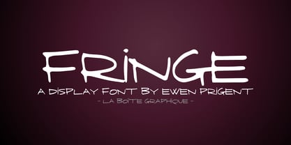 Fringe is a hand made font ideal for your graphic project.
 - Bear by La Boîte Graphique,
$16.00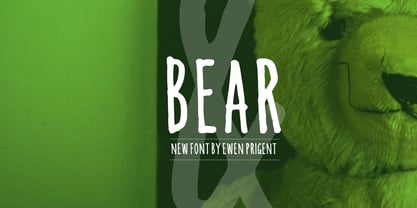 Bear is a hand made font ideal for your graphic project.
 - Bitmap Sketch by The Tree is Green,
$20.00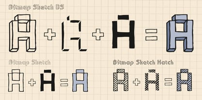 Inspired by early bitmap fonts, hand drawn for a contemporary twist.
 - Kikster by La Boîte Graphique,
$29.00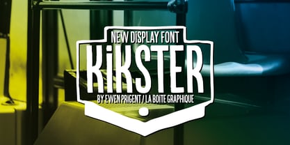 Kikster is a hand made font ideal for your graphic project.
 - Madurai Slab by insigne,
$24.00 Chennai’s market-tested type styles have taken new form once again. The geometric forms of Chennai and its derivant Madurai, both successful in web-based applications and logotypes, have now been adapted for the superfamily Madurai Slab, a potent, square slab serif ideal for headlines and posters. Under the surface of Madurai Slab’s straightforward geometric structure, the font’s exaggerated vertical serifs provide the face with an extra chunk that commands the reader’s attention and gives the font more impact in its heavier styles. The extra-fortified forms are anything but monotonous, though. The bolder structure of the slab is instead rational, diligently thought-out, with minimally contrasting strokes, making the sturdier look particularly legible in shorter textual content blocks. This child of Madurai contains a comprehensive range of nine weights--slender to black--and features condensed and extender selections for a complete set of fifty-four fonts. All users of the Madurai Slab collection can access numerous OpenType alternates. Madurai Slab is furnished for experienced typographers, together with alternates, compact caps and many alts like “normalized” capitals and lowercase letters that come with stems. The typeface also contains a range of numeral sets, together with fractions, old-style and lining figures with superiors and inferiors. OpenType-capable programs including Quark or the Adobe suite allow quick changes to ligatures and alternates. Previews of these options can be found in the .pdf brochure. Madurai Slab also features the glyphs to enable all Central, Eastern and Western European languages. In all, Madurai Slab supports around forty languages that utilize the prolonged Latin script, making it an excellent option for multi-lingual publications and packaging. This richness of options makes this the best slab serif family for websites as well as for print, motion graphics, logos, t-shirts and the like. Madurai Slab is a great choice when looking for a Neo-Grotesque slab serif font. In the hands of a learned designer, this new slab offers the potential for beautiful and well-blended layouts. With its widths adjusting to compact and extended content blocks, this typeface is perfect for the headings, captions and other brief, immediate messages that you need to drive your message home.
 - Sabon Paneuropean by Linotype,
$45.99Jan Tschichold designed Sabon in 1964, and it was produced jointly by three foundries: D. Stempel AG, Linotype and Monotype. This was in response to a request from German master printers to make a font family that was the same design for the three metal type technologies of the time: foundry type for hand composition, linecasting, and single-type machine composition. Tschichold turned to the sixteenth century for inspiration, and the story has a complicated family thread that connects his Sabon design to the Garamond lineage. Jakob Sabon, who the type is named for, was a student of the great French punchcutter Claude Garamond. He completed a set of his teacher's punches after Garamond's death in 1561. Sabon became owner of a German foundry when he married the granddaughter of the Frankfurt printer, Christian Egenolff. Sabon died in 1580, and his widow married Konrad Berner, who took over the foundry. Tschichold loosely based his design on types from the 1592 specimen sheet issued by the Egenolff-Berner foundry: a 14-point roman attributed to Claude Garamond, and an italic attributed to Robert Granjon. Sabon was the typeface name chosen for this twentieth century revival and joint venture in production; this name avoided confusion with other fonts connected with the names of Garamond and Granjon. Classic, elegant, and extremely legible, Sabon is one of the most beautiful Garamond variations. Always a good choice for book typography, the Sabon family is also particularly good for text and headlines in magazines, advertisements, documentation, business reports, corporate design, multimedia, and correspondence. Sabon combines well with: Sans serif fonts such as Frutiger, Syntax. Slab serif fonts such as PMN Caecilia, Clairvaux. Fun fonts such as Grafilone, Animalia, Araby Rafique. See also the new revised version Sabon Next from the Platinum Collection." - Fleischmann Gotisch PT by preussTYPE,
$29.00 Johann Michael Fleischmann was born June 15th, 1707 in Wöhrd near Nuremberg. After attending Latinschool he started an apprenticeship as punchcutter in the crafts enterprise of Konstantin Hartwig in Nuremberg, which ought to last six years. For his extraordinary talent Fleischmann completed his apprenticeship after four and a half years, which was very unusual. 1727 his years of travel (very common in these days) began, during which he perfected his handcraft by working in different enterprises as journeyman. First location was Frankfurt/Main where he worked for nearly a year at the renowned type foundery of Luther and Egenolff. Passing Mainz he continued to Holland, where he arrived in November 1728 and stayed till he died in 1768. In Amsterdam he worked for several type founderies, among others some weeks for Izaak van der Putte; in The Hague for Hermanus Uytwerf. Between 1729 and 1732 he created several exquisite alphabets for Uytwerf, which were published under his own name (after his move to Holland Fleischmann abandoned the second n in his name), apparently following the stream of the time. After the two years with Uytwerf, Fleischmann returned to Amsterdam, where he established his own buiseness as punchcutter; following an advice of the bookkeeper and printer from Basel Rudolf Wetstein he opened his own type foundery 1732, which he sold in 1735 to Wetstein for financial reasons. In the following Fleischmann created several types and matrices exclusively for Wetstein. In 1743 after the type foundery was sold by Wetstein’s son Hendrik Floris to the upcoming enterprise of Izaak and Johannes Enschedé, Fleischmann worked as independent punchcutter mostly for this house in Haarlem. Recognizing his exceptional skills soon Fleischmann was consigned to cutting the difficult small-sized font types. The corresponding titling alphabets were mostly done by Jaques-Francois Rosart, who also cut the main part of the ornaments and borders used in the font examples of Enschedé. Fleischmann created for Enschedé numerous fonts. The font example published 1768 by Enschedé contains 3 titling alphabets, 16 antiquacuts, 14 italic cuts, 13 textura- and 2 scriptcuts, 2 greek typesets (upper cases and ligatures), 1 arabic, 1 malayan and 7 armenian font systems, 5 sets of musicnotes and the poliphonian musicnotesystem by Fleischmann. In total he brought into being about 100 alphabets - the fruits of fourty years of creative work as a punchcutter. Fleischmann died May 27th, 1768 at the age of 61. For a long time he was thought one of the leading punchcutters in Europe. A tragedy, that his creating fell into the turning of baroque to classicism. The following generations could not take much pleasure in his imaginative fonts, which were more connected to the sensuous baroque than to the bare rationalism of the upcoming industrialisation. Unfortunately therefore his masterpieces did not survive the 19th century and person and work of Fleischmann sank into oblivion. The impressive re-interpretation of the Fleischmann Antiqua and the corresponding italics by Erhard Kaiser from Leipzig, which were done for the Dutch Type Library from 1993 to 1997, snatched Fleischmann away from being forgotten by history. Therefore we want to place strong emphasis on this beautiful font. Fleischman Gotisch The other fonts by Fleischmann are only known to a small circle of connoisseurs and enthusiasts. So far they are not available in adequat quality for modern systems. Same applies the "Fleischman Gotisch", which has been made available cross platform to modern typeset-systems as CFF Open Type font through the presented sample. The Fleischman Gotisch has been proved to be one of the fonts, on which Fleischmann spent a good deal of his best effort; this font simply was near to his heart. Between 1744 and 1762 he created 13 different sizes of this font. All follow the same principles of forms, but their richness of details has been adapted to the particular sizes. In later times the font was modified more or less sensitive by various type founderies; letters were added, changed to current taste or replaced by others; so that nowadays a unique and binding mastercopy of this font is missing. Likewise the name of the font underwent several changes. Fleischmann himself probably never named his font, as he did with none of his fonts. By Enschedé this textura was named Nederduits, later on Nederduitsch. When the font was offered by the german type foundery Flinsch in Frankfurt/Main, the more convenient name of Fleischmann-Gotisch was chosen. In his "Masterbook of the font" and his "Abstract about the Et-character" Jan Tschichold refered to it as "Duyts" again. To honour the genious of Johann Michael Fleischmann we decided to name the writing "Fleischmann Gotisch PT" (unhyphenated). Developing the digital Fleischman Gotisch I decided not to use one of the thirteen sizes as binding mastercopy, but corresponding to the typical ductus of the font to re-create an independent use of forms strongly based on Fleischmann´s language of forms. All ascenders and descenders were standardised. Some characters, identified as added later on, were eliminated (especially the round lower case-R and several versions of longs- respectively f-ligatures) and others were adjusted to the principles of Fleischmann. Where indicated the diverse characters were integrated as alternative. They can be selected in the corresponding menu. All for the correct german black letter necessary longs and other ligatures were generated. Through the according integration into the feature-code about 85% of all ligatures in the type can be generated automatically. Problematic combinations (Fl, Fk, Fh, ll, lh, lk, lb) were created as ligatures and are likewise constructed automatically. A historically interesting letter is the "round r", which was already designated by Fleischmann; it is used after preceding round letters. Likewise interesting is the inventive form of the &-character, which is mentioned by Tschichold in his corresponding abstract. Nevertheless despite all interpretation it was very important to me to maintain the utmost fidelity to the original. With this digital version of a phantastic texturfont of the late baroque I hope to contribute to a blossoming of interest for this genious master of his kind: Johann Michel Fleischmann. OpenType features: - Unicode (ISO 10646-2) - contains 520 glyphes - Basic Latin - Latin-1 Supplement - Latin Extended-A - Latin Extended-B - Central European Glyhps - Ornaments - Fractions - Standard ligatures - Discretionary ligatures - Historical ligatures - Kerning-Table
 - Negro by Storm Type Foundry,
$32.00 Dark, spicy & distinctive display typefaces from the nineteenth century I had in mind when creating this font family. Extreme contrasts and sharp endings may remotely remind some blackletters, especially in narrowed styles. The range of interpolated widths is useful for designing a provoking poster, magazine, music or book cover.
 - FG Lina by YOFF,
$20.95 FG Lina was inspired by an old handwritten book I found in the library. It contains some alternate caps characters and some rough lowercase characters. I had lots of fun designing the missing characters to fit in the script. I hope you will enjoy this Quill Script font!
 - Tired Sunday by Bogstav,
$18.00 Ever been tired on a Sunday? I have...and actually that was the feeling I had, when I started making this font. Nevertheless, when working on this font, my Sunday just got a whole lot better! Hope it'll make your Sunday (or any other day!) good as well! :)
 - Kish by That That Creative,
$15.00 KISH is a super quirky display type with reverse contrast. Imagine if the old west and the 70s had a lovechild with a sense of humor; now imagine that that child was a display font. That's KISH. It's the perfect typeface for adding sophisticated playfulness to any design project.
 - Posterama by Monotype,
$40.99 The Posterama™ typeface family contains 63 fonts and is a true journey through space and time. Designed by Jim Ford, each Posterama family contains 7 weights from Thin to Ultra Black, in 9 distinct families. What makes Posterama so unique and versatile are the eight alternative display families. By making use of a collection of alternative glyphs, Posterama sets an evocative flavor to visualize an entire century of futuristic reference points from art, architecture, poster design and science fiction into one family. Posterama Text is the base family. It has the most robust character set including upper and lowercase glyphs and pan-European language support (including Greek and Cyrillic). Note: all the other Posterama variants described below do not have lowercase letters or Greek and Cyrillic support. Posterama 1901 recalls the decoratively geometric style of Art Nouveau from the turn of the 20th century. Letterforms such as the slender, snaking ‘S’, the high-waisted ‘E’ and the underlined ‘O’ revive the spirit of Charles Rennie Mackintosh and the designers of the Viennese Secession. Posterama 1913 pays homage to the Armory Show, or 1913 Exhibition of Modern Art, which brought the revolutionary work of European artists such as Picasso, Duchamp and Kandinsky to the US for the first time to the shock and astonishment of press and public. Near-abstract, angular characters such as the ‘A’, ‘E’ and ‘N’ hint at cubism’s jagged and clashing planes. Posterama 1919 uses a small, but important, variation to set a tone when the Bauhaus was founded, and the surge in radical European typography that followed. The straight-sided, roundheaded ‘A’ adds a flavor of 1919 – this style of ‘A’ can still be seen in the Braun logo, designed in 1934. Posterama 1927 captures the year of Metropolis, The Jazz Singer and Paul Renner’s pioneering, geometric Futura typeface from 1927, which had a profound influence on design in the US and Europe. Posterama 1933 – With its low-waisted, sinuous designs, the Posterama 1933 typeface family echoes lettering of the Art Deco period, which in turn had its roots in Art Nouveau, the key influence on Posterama 1901. The two fonts make a great team and can be used interchangeably. Posterama 1945 features a few Cyrillic characters to conjure up an era when Russian art and political posters made their mark in cold war propaganda, espionage and also giant aliens and monsters. Posterama 1984 takes its typographic influences from George Orwell’s classic novel, publicity for the dystopian action and sci-fi movies (Blade Runner, Videodrome and Terminator) and games like Space Invaders and Pac-Man that made an impact at that time. Posterama 2001 was inspired by Stanley Kubrick’s science fiction masterpiece, which made extensive use of the Futura typeface. Posterama 2001 finds its cosmic orbit with its nosecone-style ‘A’ from NASA’s much-missed ‘worm’ logotype. There’s an echo, too, in Bauhaus designs from as early as 1920, whose minimalist, geometric lettering also featured a crossbar-less ‘A’.
 - Village Green JNL by Jeff Levine,
$29.00 Village Green JNL is based upon a font called “Giraffe Extended” from the 1892 edition of the MacKellar, Smiths & Jordan type specimen book, and is available in both regular and oblique versions. Its Art Nouveau styling can also fit well with 1960s counter-culture revival projects. According to Wikipedia “A village green is a common open area within a village or other settlement. Historically, a village green was common grassland with a pond for watering cattle and other stock, often at the edge of a rural settlement, used for gathering cattle to bring them later on to a common land for grazing. Later, planned greens were built into the centres of villages.”
 - Blackoak by Adobe,
$29.00Joy Redick designed Blackoak, a big and heavy Egyptienne-sytle titling slab serif face, in 1990. The extremely robust style of the characters in this typeface was consciously distorted; creating letterforms that appear flattened and stretched, like a rubber band. Blackoak is drawn in the style of old wood tpes, just like those that one envisions when one thinks of the large, decorative posters that once filled Wild West America. The wood type collection of the Smithsonian Institute in Washington, DC acted as a primary source of inspiration for this design. True to its rooks, Blackoak is meant for use exclusively in headlines in very large point sizes, or for logos and other corporate advertising purposes. - Dave Gibbons Lower by Comicraft,
$49.00 Other guys may imitate him, but the original is still the greatest! Get in with the In Crowd and check out the font created by Mister Fontastic for Dave Gibbons Original Graphic Novel, The, ah, The Originals. Yes, Dave Gibbons now comes in lower case, it's not just what he does when he gets back from the off license. Be sure and pick up The Originals from Amazon -- now available in paperback, and probably still available as a hard case, much like Dave. After the crack about the case of beer above, I'm guessing you'll find me with a broken spine in the remainder pile. See the family related to Dave Gibbons Lower: Dave Gibbons Journal & Dave Gibbons .
 - Hyper Top by Bisou,
$12.00 Made in La Chaux-de-Fonds (Switzerland), Hyper Top is born while the designer (Bisou) watches "One from the Heart", a movie from Francis Coppola where Las Vegas is completely rebuilt in studio. The opening scene stages the signboard of the Dunes hotel and casino. This is the starting point of the most modern font ever designed by Bisou. Hyper Top is thought from ground up to give a strong impact. Dynamic, joyful, fast, this modern bold font is best suitable titles. It works perfectly with short texts for advertisement like candies, fireworks, protein bars or chewing gums. Just hang it over a prank and trap shop and see the coolest bad ass kids come in.
 - Enemy Lines by Comicraft,
$19.00 You've been shot down over enemy territory and you've managed to survive for weeks thanks to your training and instincts*... but now you're being ruthlessly pursued by MAPPO's footsoldiers... The ELEPHANTMEN! Will your commanding officer go against orders in an attempt to rescue you or will his mission be abruptly aborted, stranding you behind ENEMY LINES? In order to survive, you may have to betray your own rebel forces, your allies and the entire free world! The future of mankind hangs in the balance! Failure is not an option! Bummer. *This font's modus operandi bears no relation to the story of any other font that may have been shot down behind enemy lines, real or imagined.
 - Latino Gothic by Latinotype,
$39.00 “Latino Gothic” is the result of two years of hard work by the Latinotype design team under the artistic direction of Alfonso García. We are really proud to present a superfamily with the magnitude and characteristics of "Latino Gothic". A very complete typographic font made up of no less than 90 styles. "Latino Gothic" offers a new interpretation of the original design totally focused on the needs of visual communication of the 21st century. «Latino Gothic» is designed to respond to the most varied communication needs thanks to its 5 widths and 9 weights, with their respective italics. 90 different styles make it the most versatile and complete gothic family on the market!
 - Baskerville Neo by Storm Type Foundry,
$69.00 One of the most widely used typefaces in the world is actually a legacy of 18th century aesthetics, representing the spirit of late Baroque design, architecture, fashion and society. It has been created and printed for millions of readers around the world for more than two and a half centuries. It influenced many modern typographers. It shaped culture, education, entertainment and science, but also the development of typography itself. As a calligrapher and technical innovator, Baskerville invented new design, papermaking and printing methods, and his typography is very natural and legible to this day. Graphic design today calls for clean and minimalistic solutions, where the use of historical typefaces can achieve a vivid contrast with contemporary elements on the page or screen. Baskerville is undoubtedly the best choice for any kind of publishing house. In keeping with the original inventor’s spirit of excellence, we hereby offer its most advanced digital version. This is not a precise remake of rare Baskerville prints or a restoration of the original punches cut by John Handy, but rather our ideal essence of transitional typography. The old masters were limited by the technology of the time, but today we can dare to have very fine lines, unlimited ligatures, size variations and sophisticated OpenType functions. Drawing, programming, proofing and testing took us many years of development and brought thousands of new letters and dozens of language options. We are convinced that your readers will enjoy this font mainly for reading extensive works, but also for creating corporate identity, orientation systems and cultural posters. Baskerville is perfectly modern in its antiquity, striking in its modesty and timeless in its transiency.
 - Molto by TypeTogether,
$49.00 Xavier Dupre’s Molto font family is a tonal master, creating tenderness in a slab serif and tempering toughness with flourishes. Slab serifs created their original niche by their ability to grab attention and overwhelm, which caused them to be seen as strong, dominant, and desired fonts, especially in advertising. Slab serifs are the result of placing defined edges on something meant to take up an inordinate amount of space, rather than meant to be graceful. Molto updates this concept to allow a greater, and gentler, range in the lighter weights. Molto’s nine weights are defined by their intended use. The two extreme weights (Hair and Fat) act as display partners for magazines, titles, and posters. The Hair weight is runway ready with its sturdy serifs, breathy internal space, and stable lettershapes that were designed both to perform and impress. Molto’s Fat weight packs maximum punch in a believable way. Its wide and deliberate curves contrast against thin connections and landing strip stems. Molto can be put to perfect use in a fashion magazine using swashy Hair headlines set against its darkest weight. Molto’s seven intermediate weights, with their classic and legible shapes, are meant for texts of all sizes. The notches on diagonals, distinct numerals, and acute terminals grant benefits from caption sizes up to headings. Molto’s refined light weights and punchy heavy weights set the stage for a swashy surprise — alternate capital letters act as refined garments laid atop its concrete skeleton. The Molto font family rejects saving space in favour of intensifying shapes, placing maximum weight on the edges for better legibility and impact. Latin-based digital and printed designs will benefit from Molto’s design voice and breadth. This means UI, video, and online text, and print materials like dictionaries, packaging, advertising, and branding can all put Molto’s robust forms to multipurpose use. Molto successfully creates balance in a slab serif design: an opinionated and striking type family, stalwart in captions and exuberant in display, thanks to swashes which add some originality to the slab category.
 - Spirits Burner by Ditatype,
$29.00 Spirit Burner is a gothic-themed display font combining the gothic characteristics with uneven edge lines and unique details to show firm, lovely, dramatic impressions. The letter shapes follow the gothic characteristics with uneven soft lines and unique details such as ornaments and decorations to add uniqueness to the design. Dark and contrast colors add the dramatic, mysterious impressions to the font, and the uneven edge lines show your designs organic, experimental impressions, while the unique details show personal impressions. Therefore, designs with this font, which is suitable to apply for big text sizes for more legible letters, will be able to express strong, lovely impressions and will look distinct and impressive. In addition, you can enjoy the available features here. Features: Multilingual Supports PUA Encoded Numerals and Punctuations Spirit Burner fits best for various design projects, such as brandings, quotes, printed products, merchandise, social media, etc. The font’s unique, strong characteristics are perfect for designs requiring firm, dramatic impressions, for example, music bands and products with gothic-themed markets. Find out more ways to use this font by taking a look at the font preview. Thanks for purchasing our fonts. Hopefully, you have a great time using our font. Feel free to contact us anytime for further information or when you have trouble with the font. Thanks a lot and happy designing.
 - Dan Panosian by Comicraft,
$29.00 It’s true -- having your own font IS The Secret Of Happiness! At times suave and sophisticated, at other times rough and ready for anything, superstar comics artist Dan Panosian has worked on the likes of CAPTAIN AMERICA, SPAWN, THE FLASH,, SPIDER-MAN, X-THE X-MEN and GREEN LANTERN, as well as the movie, HARRY POTTER AND THE SORCERER'S STONE and games like DUKE NUKEM. He hasn't been seen in comics for some time, but he’s back, baby, working on a series of JOHN TIFFANY bandes desinée, and he’s brought his own font with him, courtesy of that awfully nice John JG Roshell at Comicraft. John Tiffany is one of the best bounty hunters in the world and he has no illusions about the world that employs him. Tiffany relies exclusively on four people: the Reverend Lovejoy, who taught him to love his money; Wan Chao, of the geek underworld who serves as an interface with the outside world; Dorothy, his partner, and Magdalena, the ‘call girl in his life.’ But in Mexico, the hunter has become prey, his head has a price. And if his rivals know his location, it means that John Tiffany was betrayed by one of four people he thought he could trust...and now he can rely on only ONE thing, his secret weapon. His FONT. See the families related to Dan Panosian: Urban Barbarian.
 - LiebeLotte by LiebeFonts,
$29.90 Forget that hipster coolness for a minute and design something cute and charming with LiebeLotte! Go ahead and make beautiful things with her: birthday cards, wedding invitations, love letters, new signage for your deli—so many things look sweeter when you use this well-crafted handwriting font. We’ve put all of our heart and soul into this typeface—it took us a whole year to draw, refine, and interconnect all these loopy letterforms. We hope it’s really hard to tell that this is a typeface at all—the perfect connections and many swash variations make it look like you actually sat down with a pen. A pretty good pen in fact. LiebeLotte comes with a state-of-the-art character set. She also sports a variety of ligatures and alternative forms, available through OpenType features. (Please make sure your software supports ligatures for the letter connections and OpenType if you wish to use the advanced features.) Advanced designers, please take a look at our best-sellers LiebeErika and LiebeKlara: the all-new LiebeLotte makes a great companion for these popular fonts. We do think you’ll have plenty of fun with this versatile package of loopy letters for letter lovers. Or lovely letters for loop lovers. And hey, you can absolutely use LiebeLotte to make happy hipster designs, too! Promise!
 - Ogenblik by Hanoded,
$15.00 The other day, I was thinking how time flies and how my kids grow up so fast. In the blink of an eye, they had turned from babies into almost-teenagers. They're not teenagers yet, but given their tantrums, it does feel like I have three teenagers in the house... ;-) Ogenblik, in Dutch, means: ‘in the blink of an eye’, ‘lightning fast’, or ‘for a brief moment’. It’s similar to the German ‘Augenblick’, which means exactly the same. Ogenblik was made with the same dried out marker pen that helped me create my font Castlerigg. I guess it had more than one extra font in it! Ogenblik is a bit of a grungy, yet quite legible and neat font. Comes with multilingual support.
 - Funky Yard by Prioritype,
$19.00 Funky Yard - SVG Groovy Font + Extras. Presenting this latest hand drawn font. Funky Yard is a groovy display font with 2 styles, namely: Solid and Brush. There is an additional hand-drawn in the font file to further vary your design. Great for merchandise design, posters, branding, covers etc. *Note: To access extras, just type: underscore + underscore + numeral (1-15). Standard ligatures activated. Features: Uppercase, Lowercase, Numeral, Punctuation, Multilingual & Ligatures. Multilingual contained: Afrikaans, Albanian, Asu, Basque, Bemba, Bena, Breton, Catalan, Chiga, Cornish, Danish, Dutch, English, Estonian, Filipino, Finnish, French, Friulian, Galician, German, Gusii, Indonesian, Irish, Italian, Kabuverdianu, Kalenjin, Kinyarwanda, Luo, Luxembourgish, Luyia, Machame, Makhuwa-Meetto, Makonde, Malagasy, Manx, Morisyen, North Ndebele, Norwegian Bokmål, Norwegian Nynorsk, Nyankole, Oromo, Portuguese, Quechua, Romansh, Rombo, Rundi, Rwa, Samburu, Sango, Sangu, Scottish Gaelic, Sena, Shambala, Shona, Soga, Somali, Spanish, Swahili, Swedish, Swiss German, Taita, Teso, Uzbek (Latin), Volapük, Vunjo, Zulu. Thanks :)
 - Pantoufle by Kitchen Table Type Foundry,
$16.00 Pantoufle is French for slipper. Not the flipflop variety (or thongs if you’re from Australia), but the one you wear indoors when it’s cold. I have some too; Spanish ones, made from recycled PET bottles. Here in Holland, we call them ‘Pantoffels’ and you don’t have to be a language expert to see the resemblance between the French and the Dutch word. That is because the French are probably more savvy when it comes to keeping your feet warm and the Dutch just borrowed the word, pronunciation and all! Pantoufle is a font I made with a big fat marker pen. My kids had used it to decorate some gifts for Sinterklaas (if you want to know what Sinterklaas is, look it up). Pantoufle comes with extensive language support and a full set of alternates for the lower case glyphs. Enjoy!