10,000 search results
(0.045 seconds)
- Bravely by Craft Supply Co,
$20.00 Bravely- Handwritten Font is an handwritten script font based on the expression of real handwriting, lets you transform type into an exciting and beautiful piece of work. The irregular, hand-lettered look adds a real human touch to things and comes along with a lot of loving details. Combine all font-styles the way you want, add some ornamental swashes or banners and even a single word becomes magnificent.
 - Koliba JY by JY&A,
$39.00Inspired by architecture and hand-lettered posters of the 1940s, JY Koliba makes a statement that is very 21st century. With an ultra-light weight plus an elegant book and bold, Koliba was designed to be flexible. Fine-tuned with a full Latin glyph complement, and Windows kerning support for designer Jure Stojan’s Slovenian mother tongue, Koliba is set to be one of the foundry’s best-loved sans serifs. - Tent Show JNL by Jeff Levine,
$29.00 Call the lettering French Clarendon Condensed, call it circus lettering, wanted poster type or Old West letters, the style of this typeface is one of the most recognizable and evokes all of the above images and more. Tent Show JNL was re-drawn from examples of a vintage set of wood type, and contains all of the eccentricities that are present in these hand-routed classic letter forms.
 - Valise Montreal by Device,
$29.00 A condensed loose brush style. This font has a breezy elegance and casual sophistication, yet in a different context or color, it could be seen as nervous and urban. A weird dichotomy. Set in smallish text blocks, it has a surprisingly even color. This is due to a balace that has been struck between keeping the roughness and idiosyncracies of a hand-drawn face but ensuring an overall regularity.
 - Freeland by Trial by Cupcakes,
$29.00 Freeland is a casual brush typeface, with a rich, inky texture, and just a bit of a masculine, edgy vibe. It’s modern, bold, and lively, but not too whimsical. Features plenty of ligatures and stylistic alternates for a realistic, hand-lettered look. Uppercase letters can be used alone, as a cohesive group, or they can be paired with their lowercase cousins, for lettering that dances effortlessly across your design.
 - Signpost by Studio K,
$45.00 The name says it all. Signpost is a display font purpose-designed for directional, informational and publicity signage, as well as posters, public notices and advertisments. It comes complete with a choice of 'pointing hands' symbols and quartrefoil borders of the kind used on traditional British street signs. It is essentially a drop shadow version of my Red Top font family, which has a similar range of applications.
 - PaperCutPeach by PineStreet,
$25.00 PaperCutPeach is unique in that it is a paper cut font but also a SCRIPT FONT. With PaperCutPeach you can create extraordinary lettering that looks effortless, casual and handmade. Each and every glyph is based on a paper letter cut by hand with a pair of scissors by me in my studio. Ideal for packaging for organic products, illustrated goods, book covers, editorial illustrations and other freestyle projects.
 - Spring Market Serif by BeckMcCormick,
$16.00Spring Market is a farmhouse-style serif font. One of my first-ever releases, it was lovingly hand-drawn and inspired by the countryside of Upstate South Carolina. Spring Market Rustic Farmhouse Serif Font has the perfect amount of rusticity and refinement for your next project. I recommend this font for logos, invitations, and your next home decor project that needs that shabby chic touch! Spring Market features European language support! - Cinema Nouveau JNL by Jeff Levine,
$29.00 Shadowland was a magazine dedicated to the arts, and was published from 1919 through 1923. The lettering for its masthead was hand lettered in a then-contemporary Art Nouveau style. Although the photoplay (movies) was just an incremental part of the magazine’s overview of the arts, the digital version of the type design has been named Cinema Nouveau JNL, and is available in both regular and oblique versions.
 - White Rose by The Good Type,
$10.00 White Rose is an original hand-drawn typeface that was made for the White Rose Catholic Worker house in Chicago. White Rose (the Catholic Worker house) follows a long tradition of providing hospitality, being active and involved in the community and living a sustainable lifestyle. In the same way, White Rose (the typeface) follows a long tradition of typefaces, mimicking Old Style and Transitional forms while retaining an element of style.
 - Picturesque Stencil JNL by Jeff Levine,
$29.00 Picturesque Stencil JNL gets its name and design from the title of a circa-1920s children’s stencil activity book entitled “Dean’s Picturesque Stencil Book No. 10 - Series 75”; published by the F. Weber Company of Philadelphia and printed in England by Dean. The book’s stenciled title was hand lettered in a bold Roman design in the Art Nouveau style. Picturesque Stencil JNL is available in both regular and oblique versions.
 - HT Tabaccaio by Dharma Type,
$19.99 HT Tabaccaio?is a casual and versatile script. Its very unique kern, loop, and dot makes it unforgettable look. HT Tabaccaio is well-suited for product design, books covers, film posters, branding, magazines, signage and other creative projects. Holiday Type Project offers retro hand drawing scripts. Inspired by retro script on shopfront lettering, wall paint advertisements in Italy around 1950s. Check out the script fonts from Holiday Type!
 - Panforte Serif by Zetafonts,
$39.00 Panforte Serif is the basic ingredient for any tasty visual feast: a prime-cut font family, deliciously readable online and offline, space-saving and organic, appealing to hipster consumers and seasoned gluttons. Hand drawn in easy big strokes, its a very condensed typeface that allows you to typeset easily long texts. Lovers of world cuisine will be delighted to discover that it supports over 190 languages using the latin alphabet.
 - Kembara Cinta by Fargun Studio,
$12.00 Kembara Cinta - a new fresh & modern hand lettered font, decorative characters and a dancing baseline! So beautiful on invitation like handicraft, greeting cards, branding materials, business cards, quotes, posters, and more design concept! Features : Unique ligatures Stylistic sets Basic Latin A-Z and a-z Numbers International Symbols included Punctuations Need help? If you need help or advice, please contact me by e-mail "fargunstudio@gmail.com" Thank you for purchased
 - Bon Ami by Fontop,
$12.00 Bon Ami is a hand lettered condensed font perfect to add a fun feel and individual look to everything you create including cards & invites, logos, souvenirs, stationary, and so on. It also works perfectly when pairing with other fonts, f.e. with my Paramaribo font (as in the image with the cupcake). The font consists of Latin multilingual support as well as uppercase letters, lowercase letters, numbers and basic punctuations.
 - Mama Script by Sudtipos,
$45.00 Initially an experiment in vertical calligraphy, Mama Script was developed by drawing on multiple sources of inspiration. These range from simple swashy handwriting, lettering and signage, to the works of renowned calligraphers. This script likes to stand out everywhere it appears. Mama Script comes with a full set of alternates, as well as many ligatures for precise display use and a simulated balance between the hand and the machine.
 - Geetype by G-Type,
$46.00 Inspired by a piece of cigarette pack lettering designed by the renowned poster and type designer A.M. Cassandre (perhaps best known for his Peignot typeface), Geetype evokes a 1920s & 30s mood and is an unusual, eye-catching single weight display face. Think vintage hand lettered poster campaigns, Hollywood's golden era and a time when smoking was positively encouraged. Think Greta Garbo, another 'g' with strong, emotional screen presence.
 - Fremont by Larin Type Co,
$16.00 Fremont This is a beautiful and elegant hand drawn font, will underline your individuality in any project. Its relaxed feel makes this font incredibly versatile, fitting a wide range of designs. You can also use them to create a logo or templates, invitations, blog, branding, marketing, book covers, magazines, advertising, stationery, logo design and much more. This font is easy to use has OpenType features, and supported PUA encoded.
 - Organically by PintassilgoPrints,
$29.00Friendly and generous, this is an organically grown display typeface. Its original handcrafted shapes have been significantly polished, but without losing its old-fashioned charm. The versatile regular cut comes equipped with a wealth of decorative OpenType features such as swashes, majuscule discretionary ligatures and stylistic alternates. The family also comes with a stylish set of useful ornaments and a very eye-catching spiky version. All hand made, with care. - Newt Juice by Cool Fonts,
$24.00 Newt Juice is a funky hand drawn font comes in both Outline and Fill styles. Put them both together in your favorite application and you can get some really organic looks. Newt Juice is perfect for kid stuff or grungy graffiti. While it is an all caps font, the upper and lower case characters are position differently to create more randomness. Be the first on your block to juice the newt!
 - Etched Stencil JNL by Jeff Levine,
$29.00 The American Sign Museum in Cincinnati houses an amazing collection of vintage signage from all kinds of sources and covering many eras of retail advertising. Someone visiting the museum posted online an image of one particular piece of glass with hand lettering saying “gold leaf” in a bold Art Deco stencil style. Etched Stencil JNL was inspired by that image and is available in both regular and oblique versions.
 - Burnest by Adam Fathony,
$10.00 In collaboration with Renov Olivian who was experienced with hand-drawn lettering for a project. We've decided to create Vintage Inspirated Fonts with strong identity for an outdoor design, camping, wild, journey, adventure, masculine, and etc. Burnest Comes with 3 Weight, Thin, Light and Regular. On each Weight have 3 different style, Clean (sharp corner), Round (Rounded Corner), and Rough (Rough Version). 9 Fonts in Total for completing your design style.
 - John Sans by Storm Type Foundry,
$49.00 The idea of a brand-new grotesk is certainly rather foolish – there are already lots of these typefaces in the world and, quite simply, nothing is more beautiful than the original Gill. The sans-serif chapter of typography is now closed by hundreds of technically perfect imitations of Syntax and Frutiger, which are, however, for the most part based on the cool din-aesthetics. The only chance, when looking for inspiration, is to go very far... A grotesk does not afford such a variety as a serif typeface, it is dull and can soon tire the eye. This is why books are not set in sans serif faces. A grotesk is, however, always welcome for expressing different degrees of emphasis, for headings, marginal notes, captions, registers, in short for any service accompaniment of a book, including its titlings. We also often come across a text in which we want to distinguish the individual speaking or writing persons by the use of different typefaces. The condition is that such grotesk should blend in perfectly with the proportions, colour and above all with the expression of the basic, serif typeface. In the area of non-fiction typography, what we appreciate in sans-serif typefaces is that they are clamorous in inscriptions and economic in the setting. John Sans is to be a modest servant and at the same time an original loudspeaker; it wishes to inhabit libraries of educated persons and to shout from billboards. A year ago we completed the transcription of the typefaces of John Baskerville, whose heritage still stands out vividly in our memory. Baskerville cleverly incorporated certain constructional elements in the design of the individual letters of his typeface. These elements include above all the alternation of softand sharp stroke endings. The frequency of these endings in the text and their rhythm produce a balanced impression. The anchoring of the letters on the surface varies and they do not look monotonous when they are read. We attempted to use these tricks also in the creation of a sans-serif typeface. Except that, if we wished to create a genuine “Baroque grotesk”, all the decorativeness of the original would have to be repeated, which would result in a parody. On the contrary, to achieve a mere contrast with the soft Baskerville it is sufficient to choose any other hard grotesk and not to take a great deal of time over designing a new one. Between these two extremes, we chose a path starting with the construction of an almost monolinear skeleton, to which the elements of Baskerville were carefully attached. After many tests of the text, however, some of the flourishes had to be removed again. Anything that is superfluous or ornamental is against the substance of a grotesk typeface. The monolinear character can be impinged upon in those places where any consistency would become a burden. The fine shading and softening is for the benefit of both legibility and aesthetics. The more marked incisions of all crotches are a characteristic feature of this typeface, especially in the bold designs. The colour of the Text, Medium and Bold designs is commensurate with their serif counterparts. The White and X-Black designs already exceed the framework of book graphics and are suitable for use in advertisements and magazines. The original concept of the italics copying faithfully Baskerville’s morphology turned out to be a blind alley. This design would restrict the independent use of the grotesk typeface. We, therefore, began to model the new italics only after the completion of the upright designs. The features which these new italics and Baskerville have in common are the angle of the slope and the softened sloped strokes of the lower case letters. There are also certain reminiscences in the details (K, k). More complicated are the signs & and @, in the case of which regard is paid to distinguishing, in the design, the upright, sloped @ small caps forms. The one-storey lower-case g and the absence of a descender in the lower-case f contributes to the open and simple expression of the design. Also the inclusion of non-aligning figures in the basic designs and of aligning figures in small caps serves the purpose of harmonization of the sans-serif families with the serif families. Non-aligning figures link up better with lower-case letters in the text. If John Sans looks like many other modern typefaces, it is just as well. It certainly is not to the detriment of a Latin typeface as a means of communication, if different typographers in different places of the world arrive in different ways at a similar result.
 - Quell by Underscore,
$35.00 Quell is a novel attempt to bridge the gap between geometrically constructed shapes on the one hand, and modulated strokes and subtle calligraphic influence on the other hand. The visual tension in Quell stems from conflict between two tendencies: The perfectly round shapes are geometrically constructed, yet the contrast of stroke widths and oblique line terminations suggest calligraphic roots. How this dualism affects typographic impression is up to designers and typographers using Quell — as variable font the seamless transition between modulated contrast and linear appearance offers unique typographic possibilities. Linear appearance gives the text a solid and compelling voice, whereas the modulated styles convey elegance, vibrance and a delicate tone. Quell is suited to display setting, headlines, way finding and identity. The combination of linear and contrast variants provides typographic range to convey different stance while rooted in the same visual heritage. In short paragraph typesetting the fonts have a modern look and characterful tone, but should not be overused for longer texts. Quell has been in development for over a year, and is the proud third release under the Underscore label. Released in 2018 this design by Johannes Neumeier is available from the Underscore webshop as well as selected retailers.
 - Rhope by Linecreative,
$14.00 Introducing "Rhope," an enigmatic and expressive hand-sketched font that captures the essence of untamed creativity. Crafted with the raw energy of a pencil, this font exudes the captivating charm of scribbled artistry. "Rhope" is not just a font; it's a visual experience that brings a sense of spontaneity and intrigue to your projects. With its distinctive hand-drawn appearance, "Rhope" is uniquely suited for a variety of themes, making it a versatile choice for your creative endeavors. Embrace the dark and mysterious with its inherent horror vibes, or infuse a playful spirit into your designs for a fun and whimsical touch. This font seamlessly transitions between genres, offering a dynamic quality that adapts to your creative vision. Perfectly poised for brand titles, "Rhope" adds an element of authenticity and originality to your visual identity. The irregular lines and organic imperfections create a personalized and human touch, setting your brand apart with a memorable and artistic flair. Whether you're working on chilling horror projects, lighthearted and fun designs, or establishing a brand identity that stands out, "Rhope" is your go-to font. Its versatility and handcrafted nature make it a valuable asset for designers seeking a font that breaks free from the ordinary and injects character into their work.
 - Potbank by Asdesign,
$50.00 Like many cities in the Midlands and North of England, Stoke-on-Trent has a rich history linked to making and industry. In Stoke’s case it was pottery. In the early 1900s bottle kilns could be seen covering the landscape of the six towns making up Stoke-on-Trent with hundreds of factories producing some of the best ceramics in the world. But by the 1990s most of these had gone. Torn down for development of housing or just left to rot. During the next few decades Stoke continued to change. The industry was in a decline and Stoke itself was seen as another poor midlands city with a dwindling industry. Then in 2008, Spode, one of the largest and most famousceramics factories in Stoke entered into administration. Pens cast aside, drawings left half finished, designs left in the turned-off kilns; Spode factory was abandoned. This was a real shock and the way everything was getting thrown into skips to be put on the tip was heartbreaking. Thankfully people salvaged some of the technical drawings, sketch design, old sample pieces and ceramics that people hard worked so hard on. Potbank has been in development over a number of years taking inspiration from the heritage and designs from the ceramics industry. It has a mixed Clarendon and Antiqua style structure with its main purpose to be used as a printed type.
 - Blank Manuscript by Aah Yes,
$14.95Blank Manuscript allows you to produce sophisticated musical scoresheets even on basic Word Processors - anything from simple plain staves to complex full-page orchestral scores of your own design, to write in the notation yourself. The basic stuff is really easy and straightforward, but there's some quite advanced things you can do as well. So Copy and Save these Instructions. • The main stuff is simple and tends to follow the initial letter. Treble, Bass and Alto clefs are on upper case T B A (there are more clefs, below). The 5 Lines for the clefs are on L or l. • A small v will give a small vertical line (like a bar line) and a Big U will give a Big Upright - these can start or end a line or piece. • Time Signatures - type the following letters: Think of W for Waltz and it's easy to remember that 3/4 time is on W. Then from that they go up or down together like this: V=2/4 W=3/4 X=4/4 Y=5/4 Z=6/4 Compound Times are on H I J K like this: H=3/8 I=6/8 J=9/8 K=12/8 Common Time and Cut Common symbols can be found on semi-colon and colon respectively (all begin with Co- ). 2/2 3/2 are on lower case a and b, 7/4 and 7/8 are on lower case c and d, 5/8 is on small k (think POL-k-A) • Flat signs are on the numbers. Flat signs on LINES 1 to 5 are on numbers 1 to 5. Flat signs on SPACES 1 to 5 are on numbers 6 to 0 (space 1 being above line 1, space 5 being above the top line of the stave). Sharp signs are on the letters BELOW the long-row numbers. Which is q w e r t for the sharp signs on Lines 1 to 5, and y u i o p for sharp signs on spaces 1 to 5. Doing it this way means it works the same for all clefs, whether Treble, Bass, Alto, Tenor or any other. Sharp and Flat Signs always go in this order, depending on how many sharps or flats your key signature requires: Treble Clef Sharps t i p r u o e Flats 3 9 7 4 2 8 6 Bass Clef Sharps r u o e t i w Flats 2 8 6 3 1 7 = Alto Clef Sharps o e t i w r u Flats 7 4 2 8 6 3 1 • Guitar Chord Boxes are on G and g (G for Guitar) Upper Case G has a thick line across the top Lower case g has an open top, for chords up the fretboard TAB symbols are available: Six-string Tablature is on s & S for Six. Four-string Tablature is on f & F for Four. (Lower case has the "TAB" symbol on it, Upper Case has just the lines to continue.) Five-string tablature, is on lower case "j" (as in BAN-j-O) and of course L or l will continue the 5 lines. •RARE CLEF SIGNS including Tenor Clef, are on various punctuation marks, i.e. dollar, percent, circumflex, ampersand & asterisk, above the numbers 4 to 8. NOTE: The important symbols were kept on the letter and number keys, which are fairly standard all over, but some of the less important symbols are on various punctuation keys, which in different countries are not the same as on my keyboard. If it comes out wrong on your system, all I can say is it's right on the systems we've tried, and they'll be in here somewhere, probably on a different key. CLOSING THE ENDS OF THE LINES and BAR-LINES is done with the 3 varieties of brackets - brackets, brace and parentheses - Left/Right for the Left/Right end of the line. Parentheses L/R () which are above 9, 0 give a clef with a small vertical upright (the same as a bar line). Brace L/R and Brackets L/R (both on the 2 keys to the right of P on my keyboard) will close off a staff line with tall upright bars. Brace gives a double upright - one thick, one thin. Brackets give a single tall upright. A Big Upright is on Big U, (Big U for Big Upright) and a small vertical line is on small v (small v for small vertical). The Big Upright is the maximum height, and the small vertical is exactly the same height as a stave. And there's a tall upright Bar, on Bar (which is to the left of z on my keyboard, with Shift,) which is the same height as the bar on upper case U but twice as broad. • There's a staff intended for writing melodies, which is a little bit higher up than an ordinary treble clef giving a space underneath to put lyrics in - on m and M for Melody line. Lower case has the Treble Clef on, Upper case M has just the higher-up staff lines with no clef. (Use mMMMMMMM etc.) However this clef will be in the wrong place to put in sharp and flat signs, key signatures and so on, so if you use this clef you'll have to write the sharps, flats and key signature yourself. There's also a clef that's smaller (less tall) than the ordinary clef, but with the same horizontal spacing so it will align with other standard-sized clefs - on slash (a plain clef) and backslash (with a Treble Clef). • There are some large brackets for enclosing groups of staves, such as you'd use on large orchestral scores, on Upper Case N O P Q R, which can aid clarity. N and O on the left, Q and R on the right. P is a Perpendicular line to be used on both sides to increase the height of the enclosure, in this way but with the staff lines in between: N Q P P P P P P O R OTHERS —————————————— • Repeat marks are on comma (left) and period/full stop (right). • Hyphen is left as a sort of hyphen - it's a thin line like a single staff line, with the same horizontal spacing as ordinary staff lines - in case you want to draw a line across for a Percussion Instrument, or a Title or Lyric Line. • Space is a Space, but with HALF the width or horizontal spacing as ordinary staff lines, so 2 space symbols will be the same width as a clef symbol or line. • Grave (to the left of 1 on the long row, or hold down Alt and type 0096 then let go) gives a staff line that is one eighth the width of an ordinary staff line. • If you want manuscript in a clef and key which requires a flat or sharp sign in the space underneath the 5 lines, they’re on = equals and + plus . SYMBOLS • Many of these symbols will only be useful if you have worked out in advance which bars will need them, but they are here in case you've done that and wish to include them. • Symbols for p and f (piano and forte) are on 'less than' and 'greater than' < > (above comma and full stop) and m for mezzo is on Question, next to them. They can be combined to make mp, mf, ff, pp, etc. These signs -- and other signs and symbols like Pedal Sign, Coda Sign and so on -- can be found on various punctuation mark keys, including above 1, 2, 3 in the long row, and others around the keyboard. There's a sort of logic to their layout, but in different countries the keys are likely to give different results to what is stated here, so it's probably best to just try the punctuation and see if there's any you might want to use. (But on my keyboard a Coda sign is on circumflex - because of the visual similarity. Pedal sign is on underscore. A "Sign" symbol is on exclamation mark.) They were only included in case you really need them to be printed rather than handwritten. • However, a Copyright symbol is deemed necessary, and also included are a "Registered" symbol and a TradeMark symbol. They are found in the conventional places, and can be accessed by holding down ALT and typing 0169, 0174 or 0153 respectively in the numberpad section and letting go. • Staff lines with arco and pizz. above are on capital C and D respectively ---C for ar-C-o. • An empty circle above a staff line (to indicate sections by writing letters A, B, C or 1,2,3 inside for rehearsal marks) is on n. The actual signs for an A, B, C and D in a circle above the staff line can be produced by holding down ALT and typing 0188, 0189, 0190 and 0191 respectively and letting go. • The word "Page", for indicating page numbers, is on the numbersign key. • The two quotes keys, (quote single and quote double) have symbols representing "Tempo is", and "play as triplets", respectively. • INSTRUMENT NAMES There's a whole lot of Instrument Names built in (over a hundred) which can be printed out above the clef, and you do it like this. Hold down Alt and type in the given number in the numberpad section, then let go. For Piccolo it's 0130, for Flute it's 0131, Cornet is on 0154, Violin is on 0193, and the numbers go up to over 0250, it's a fairly complete set. There's also a blank which is used to align un-named clefs on 0096. Put them at the very beginning of the line for the best results. Here they are: WOODWIND Piccolo 0130 Flute 0131 Oboe 0132 Clarinet 0133 Eng Horn 0134 Bassoon 0135 Soprano Sax 0137 Alto Sax 0138 Tenor Sax 0139 Baritone Sax 0140 Saxophone 0142 Contrabassoon 0145 Recorder 0146 Alto Flute 0147 Bass Flute 0148 Oboe d'Amore 0149 Cor anglais 0152 Pipes 0241 Whistle 0242 BRASS Cornet 0154 Trumpet 0155 Flugelhorn 0156 Trombone 0158 Euphonium 0159 Tuba 0161 French Horn 0162 Horn 0163 Tenor Trombone 0164 Bass Trombone 0165 Alto Trombone 0166 Piccolo Cornet 0167 Piccolo Trumpet 0168 Bass Trumpet 0170 Bass Tuba 0171 Brass 0172 VOICES Vocal 0175 Melody 0176 Solo 0177 Harmony 0178 Soprano 0179 Alto 0180 Tenor 0181 Baritone 0182 Treble 0183 Bass 0197 (see also PLUCKED STRINGS) Descant 0184 Mezzo Soprano 0185 Contralto 0186 Counter Tenor 0187 Lead 0206 BOWED STRINGS Strings 0192 Violin 0193 Viola 0194 Cello 0195 Contrabass 0196 Bass 0197 Double Bass 0198 Violoncello 0199 Violin 1 0200 Violin 2 0201 Fiddle 0252 PLUCKED STRINGS Harp 0202 Guitar 0203 Ac. Gtr 0204 El. Gtr 0205 Lead 0206 Bass 0197 Ac. Bass 0207 El. Bass 0208 Slide Gtr 0209 Mandolin 0210 Banjo 0211 Ukelele 0212 Zither 0213 Sitar 0214 Lute 0215 Pedal Steel 0216 Nylon Gtr. 0238 Koto 0239 Fretless 0244 KEYBOARDS + ORGAN Piano 0217 El. Piano 0218 Organ 0219 El. Organ 0220 Harpsichord 0221 Celesta 0222 Accordion 0223 Clavinet 0224 Harmonium 0225 Synth 0226 Synth Bass 0227 Keyboards 0228 Sampler 0249 PERCUSSION and TUNED PERCUSSION Percussion 0229 Drums 0230 Vibes 0231 Marimba 0232 Glockenspiel 0233 Xylophone 0234 Bass marimba 0235 Tubular Bells 0236 Steel Drums 0237 Kalimba 0240 OTHERS Harmonica 0246 Mouth Organ 0247 FX 0251 Intro 0243 Verse 0245 Refrain 0248 Chorus 0250 un-named 0096 (this is a small spacer stave for aligning clefs without a name) ALSO copyright 0169 registered 0174 TradeMark 0153 Rehearsal marks 0188-0191 (giving A, B, C, D in a circle, an empty circle is on n ) Clef signs for Treble Bass Alto without any staff lines 0253-0255 An Alphabetic List of all signs: a 2/2 time b 3/2 time c 7/4 time d 7/8 time e sharp sign, centre line f Tab sign for 4-string tab g Guitar Chord Box, no nut h half-width stave I sharp sign, third space up j Tab sign for 5-string tab k 5/8 time l Lines - 5 horizontal lines for a stave m Melody Clef - a standard clef but placed higher up, with Treble sign n Stave with an empty circle above o sharp sign, fourth space up p sharp sign, space above stave q sharp sign, bottom line r sharp sign, fourth line up s Tab sign for 6-string tab t sharp sign, top line (fifth line up) u sharp sign, second space up v vertical line (bar-line) w sharp sign, second line up x Fretboard, four strings y sharp sign, first space up z Fretboard, five strings A Alto Clef B Bass Clef C “arco” above stave D “pizz.” above stave E Double Vertical Lines F Four Horizontal lines (for 4-string tab) G Guitar Chord Box with nut H 3/8 time I 6/8 time J 9/8 time K 12/8 time L Lines - 5 horizontal lines for a stave M Melody Clef - a standard clef but placed higher up, plain N Bounding Line for grouping clefs - top left O Bounding Line for grouping clefs - bottom left P Bounding Line for grouping clefs - Perpendicular Q Bounding Line for grouping clefs - top right R Bounding Line for grouping clefs - bottom right S Six Horizontal lines (for 6-string tab) T Treble Clef U tall, thin Upright line V 2/4 time W 3 / 4 time X 4/4 time Y 5/4 time Z 6/4 time 1 flat sign, first line up (the lowest line) 2 flat sign, second line up 3 flat sign, third line up 4 flat sign, fourth line up 5 flat sign, fifth line up (the top line) 6 flat sign, first space up (the lowest space) 7 flat sign, second space up 8 flat sign, third space up 9 flat sign, fourth space up 0 flat sign, space above stave - Shilia by Linotype,
$103.99 SHILIA – AN ARABIC FONT THAT LIVES HAND IN HAND WITH LATIN TEXT CHARACTERS A special design principle underlies the Arabic font Shilia created by Mamoun Sakkal: the form of the characters means that they harmonise happily with sans serif Latin fonts, such as Univers. Because of this, Shilia is the ideal choice for any bilingual project and for use in international corporate branding. Shilia™ had its beginnings in the 1970s. Taking one of the oldest variants of Arabic script, the minimalist Kufic, as his inspiration, Mamoun Sakkal fashioned simple stroke shapes that are combined according to a geometric grid. Shilia is at home in both worlds, that of the East and that of the West. And although Shilia has been primarily designed to be used as a display font, it is also ideal for setting shorter texts. Before being published by Linotype, Shilia underwent major adaptation and updating, and is now available in the modern OpenType format. Mamoun Sakkal increased the characters available per individual typeface variant to over 1,800, and his daughter, Aida Sakkal, worked on programming the extensive OpenType features for the font. There are numerous ligatures that can be used to provide suitable variation and avoid repetition within a given context, and many special features such as the dots under the initial and final segments of words being automatically centralised. Shilia not only supports Arabic, but also Persian and Urdu. Special character combinations for setting texts in these languages, particularly Urdu, are provided through OpenType. And there are a total of 19 stylistic sets with additional character variants available to the user. An example of Urdu text Shilia is available in eight weights, from UltraLight to Black. The corresponding condensed versions are in the course of preparation. Along with the Arabic characters, all of the typeface versions include matching Latin alphabet letters of Adrian Frutiger’s Linotype Univers® family, making Shilia intrinsically suitable for setting bilingual texts. A set of ornaments carefully designed to allow for numerous compositions of bands and decorative patterns rounds off the range of characters on offer. With its 21 weights, Shilia is one of the most extensive of Arabic typeface families that is currently on the market. Its clear and well-balanced forms emphasise the linear nature of the font without allowing it to appear sterile or artificial. Shilia not only cuts a good figure as a display font for signage or in artistic projects, thanks to its substantial range of features, the font family can also be used to set texts, such as corporate and administrative documents. In addition, but the full compatibility between the Arabic and Latin characters makes Shilia the perfect choice for international and multilingual design projects.
 - Ver Army - Unknown license

- Bandmaster JNL by Jeff Levine,
$29.00 The opening movie titles from the 1940 musical comedy “Strike up the Band” (starring Judy Garland and Mickey Rooney) inspired Bandmaster JNL, which is available in both regular and oblique versions.
 - Pill Gothic by Betatype,
$40.00 Pill Gothic walks the tightrope between a heads down, hard working, utilitarian sans and something that stands out, saying, "Look at me!" Designers looking for a type that will work in blocks of text for callouts, captions and headlines will find that unique balance with Pill. Pill Gothic asks the question: what is the effect of a few truly unique characters on the meaning of a type? In particular, the 'a' and the 'g', while relating strongly to the forms of the other characters, stand out from the traditional milieu of sans serif types. The name Pill Gothic came from early studies of the condensed weight where the lower case characters had the shape of a pill capsule.
 - Brilanys Signature by Multype Studio,
$19.00 Brilanys Signature is a clean, elegant hand-drawn script font with unique curves and an elegant inky flow. Features : uppercase, lowercase, symbol, number, ligature, and also support multi language. Brilanys Signature is perfect for photography, watermark, social media posts, advertisements, logos & branding, invitation, product designs, label, stationery, wedding designs, product packaging, special events or anything that need handwriting taste.
 - Chanson De Paris JNL by Jeff Levine,
$29.00 A couple of pieces of sheet music from France [circa 1925] offered the inspiration for Chanson De Paris JNL (Song of Paris), which is available in both regular and oblique versions. This hand lettered Art Nouveau style features a unique take on thick-and-thin lettering which foreshadows the Art Deco typefaces to come during the 1930s.
 - Deco Diva JNL by Jeff Levine,
$29.00 The title hand lettered onto the 1933 sheet music cover for “Yours is My Heart Alone” represents the classic Art Deco typographic features of unusual character shapes and widths, yet at the same time it projects simplicity in geometric design. This served at the basis for Deco Diva JNL, which is available in both regular and oblique versions.
 - Gyftype Bones by giftype,
$20.00 This font is based on the different bones of an skeleton , it is ideal To make a clear an original text , designed to make a very special gift !. On the other hand it has a multitude of use both in posters and in documents of differents Kind , parties , invitations ...finally , it includes Greek and Cyrilic characters.
 - Thistails Font Duo by Panatype Studio,
$9.00 Thistails is font duo with modern vintage look design style, available as a script and Display Sans serif typeface. These two lovely fonts would be perfect to combine in your design. Suitable for digital lettering, logo, t-shirt, print, business cards, branding materials, quotes, nature photography, etc, made with hand painted and carefully crafted. OpenType Features: Ligatures, Stylistic Set
 - Cherry Dreamy by Fromletterel,
$12.00 Cherry Dreamy is a font duo of lovely script and tidy hand-lettered font. Those fonts match really well with each other. Cherry Dreamy script featured with few ligatures to give you some surprise and make this font more interesting, also included with swash alternates so it becomes lovelier. Perfect for heading, flyer, cards, branding, web design, quotes, etc.
 - Artist Colony JNL by Jeff Levine,
$29.00Artist Colony JNL is the third type design inspired by some online examples from an early 20th Century French book of decorative hand lettering. While Arte Critique JNL and French Art Initials JNL embrace the Art Noveau style, Artist Colony JNL leans more toward the emerging Art Deco Movement of the late 1920s and early 1930s. - Now Showing JNL by Jeff Levine,
$29.00 Inside the pages of the April, 1937 issue of the fan magazine “Hollywood Now” is an unusual bit of hand lettering used for the titles in a number of featured articles. A narrow thick-and-thin Art Deco alphabet with many stylized characters, this type design is now available as Now Showing JNL in both regular and oblique versions.
 - Bristany by Multype Studio,
$14.00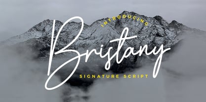 Bristany is a clean, elegant hand-drawn script font with unique curves and an elegant inky flow. Features : uppercase, lowercase, symbol, number, ligature, and also support multi language. Bristany is perfect for photography, watermark, social media posts, advertisements, logos & branding, invitation, product designs, label, stationery, wedding designs, product packaging, special events or anything that need handwriting taste.
