10,000 search results
(0.031 seconds)
- Stencil Label JNL by Jeff Levine,
$29.00 In the 1943 Three Stooges comedy short “Higher than a Kite”, Curly reaches into a box with the label “hand grenades” painted on its side and pulls out one of the devices. The bold, squared stencil hand lettering on that prop inspired Stencil Label JNL, which is available in both regular and oblique versions.
 - PaperCutAlmond by PineStreet,
$25.00 PaperCutAlmond breathes just the hands-on self-made authentic happy feeling you may be looking for. Each and every glyph is based on a paper letter cut by hand with a pair of scissors by me in my studio. Ideal for packaging for organic products, illustrated goods, book covers, editorial illustrations and other freestyle projects.
 - PiS Malefiz by PiS,
$24.00 PiS Malefiz is inspired by the hand-drawn type on the package of the german 60's version boardgame „Malefiz“, also known as Barricade or Barricata. Extended to five hand-drawn weights PiS Malefiz turned out to be the weird lovechild of Saul Bass and Ralph Steadman, fun and childish plus angry and strange. Just as playing the boardgame, PiS Malefiz is a wild and superfast rollercoaster ride of emotions! Combine the five interchangeable weights for total whackyness or use the clean and legible thin and regular versions for sleek and slender slanting. Have fun! Keep the dice rolling!
 - Chaman by Cubo Fonts,
$29.00 Chaman is a “hybrid” font. On the one hand serifless, temperate and readable, and on the other hand quick and livily as a manual script, thanks to many unexpected ligatures. Letter design is plain and functional, punctuated by dynamic elements, mostly in ligatures and contextual glyphs, generated at the beginning and end of the word, thanks to your software’s OpenType features. It draws inspiration from the Tibetan alphabet, originally close to our own latin alphabet, as it stems from Bhram handwriting, itself derived from Phoenician alphabet. This alternation of stright vertical lines and regular bows makes Chaman’s design stand out.
 - GG Casual by Gerald Gallo,
$20.00 GG Casual is based on a hand lettering style of Gerald Gallo. The family is casual and informal and is ideal for use in conveying these qualities.
 - Wheat by Atlantic Fonts,
$26.00 Like fresh, warm just-out-of-the-oven bread, Wheat is wholesome and comforting. Wheat's crusty texture and bubbly, hand-drawn letters give it all natural appeal.
 - Jules Thicket by Rachel White Art,
$14.00 Jules Thicket is a wonky caps font, with kicky angles. Mix and match caps and lowercase letters to create a unique hand-lettered look in your designs.
 - Canadian Brusher by Motokiwo,
$15.00 Canadian Brusher, hipster Hand-brush display font with stunning characters and texture. It’s all caps with numeral & punctuation and standard multilingual support. Very cool for multipurpose project.
 - Fair Play JNL by Jeff Levine,
$29.00 Inspired by hand lettering on a 1939 World’s Fair Poster, Fair Play JNL is a bold, condensed design with spurred serifs and some flared characters… and is available in both regular and oblique versions.
 - Family Deco JNL by Jeff Levine,
$29.00 Family Deco JNL was inspired by the bold Art Deco hand lettering of the movie credits for the 1936 Laurel and Hardy comedy “Our Relations”, and is available in both regular and oblique versions.
 - Christmas Fleurons by Greater Albion Typefounders,
$5.00 Christmas Fleurons is a set of delightfully hand-drawn Christmas ornaments. It complements our Merry Fleurons and Merry Snowmen faces, and is ideal for all your Christmas cards, gift labels, invitations, posters and banners.
 - Dumper by LetterStock,
$25.00 Introducing "Dumper" - Your Original Hand-Drawn 60's Retro Bold Font Step into the bold and vibrant world of "Dumper," a font that seamlessly blends original hand-drawn craftsmanship with the iconic style of the 60's retro era. Ideal for posters, headlines, and vintage-themed branding projects, this font exudes a dynamic energy that adds a bold statement to your designs. Key Features: Original Hand-Drawn Craftsmanship: Each character in "Dumper" is crafted by hand, bringing a unique and authentic touch to your creations. 60's Retro Bold Vibes: Immerse your designs in the bold and lively spirit of the 60's, making "Dumper" a perfect choice for projects seeking a retro aesthetic. Why Choose "Dumper": Craft posters and headlines that command attention with bold and dynamic lettering. Design branding materials that transport your audience back to the vibrant 60's era. Establish a brand presence with a font that effortlessly captures the essence of retro boldness. Download "Dumper" Now and Let Your Designs Boldly Embrace the 60's Retro Vibe!
 - Toscography by Misprinted Type,
$25.00 Toscography is inspired by vernacular and naive hand-painted walls and signs from Brazil. It feels organic, spontaneous and fresh and it has a light texture on its characters that makes it feel like it is starting to decay.
 - Being Strong by Subectype,
$15.00 Being Strong is a layered script and is inspired by bold, hand-lettered, vintage scripts. It includes OpenType features and additional accented characters, and is great for logotype, posters, badges, book covers, t-shirt designs, packaging and any more.
 - FranklinGothicHandCond by Wiescher Design,
$39.50 FranklinGothicHandCond is another part of a series of hand-drawn fonts from way back in time – before computers changed the way we worked in advertising. When I was in advertising – before computers – a very time consuming part of my daily work was sketching headlines. I used to be able to sketch headlines in Franklin Gothic, Times, Futura, Helvetica and several scripts. We had a kind of huge inverted camera – which we called Lucy. We projected the alphabet onto a sheet of transparent paper, outlined the letters with a fineliner and then filled them in. It was very tedious work, but the resulting headline had its own charm and we had a permanent race going on who was best and fastest. I won most of the time! They used to call me the fastest "Magic Marker" this side of the Atlantic. Great days, just like today! Your sentimental type designer from the past, Gert Wiescher.
 - FranklinGothicHandBold by Wiescher Design,
$39.50 FranklinGothicHandBold is another part of a series of hand-drawn fonts from way back in time – before computers changed the way we worked in advertising. When I was in advertising – before computers – a very time consuming part of my daily work was sketching headlines. I used to be able to sketch headlines in Franklin Gothic, Times, Futura, Helvetica and several scripts. We had a kind of huge inverted camera – which we called Lucy. We projected the alphabet onto a sheet of transparent paper, outlined the letters with a fineliner and then filled them in. It was very tedious work, but the resulting headline had its own charm and we had a permanent race going on who was best and fastest. I won most of the time! They used to call me the fastest "Magic Marker" this side of the Atlantic. Great days, just like today! Your sentimental type designer from the past Gert Wiescher
 - Graham Cracker JF by Jukebox Collection,
$36.99 Graham Cracker is a fun, cartoony and child-like font that can't help but fill you with happiness! The font was inspired by hand-drawn lettering on an old 1960s movie poster, and contains over 175 interlocking ligatures that add a hand-lettered feel. Stylistic substitutions like this are where the OpenType technology really shines, allowing computer fonts to more closely mimic the variations of hand drawn lettering. The ligatures can be found under the Discretionary Ligatures OT feature, or applied from the glyph palette. Jukebox fonts are available in OpenType format and downloadable packages contain both .otf and .ttf versions of the font. They are compatible on both Mac and Windows. All fonts contain basic OpenType features as well as support for Latin-based and most Eastern European languages.
 - Phantasm by Partnrz,
$15.00 Beware of the Phantasm! Just in time for Halloween, Phantasm is perfect for your creepiest projects. It has great legibility and boasts a much larger character set than most display fonts. It can look wispy and vaporous, or you can make it look like it has been scratched into a surface by hand. All letterforms use a minimum of strokes and the gentle curves reinforce the hand-etched look.
 - Just Frames by Outside the Line,
$19.00 Just Frames... 31 to be exact. Some swirls, some hearts, some ovals, some squares. Some line, some solid, all with a fun hand drawn feel. Just add some hand drawn type and you are done.
 - Badwulf by Oleg Stepanov,
$11.00 Badwulf is a hand-lettered display font. It is good for cartoons, children's books and games.
 - Voluptate by Fontscafe,
$39.00 The "Voluptate Pack" font is a smart sophisticated handwriting pack that includes ‘Voluptate’, ‘Voluptate Classic’ and ‘Voluptate Elements.’ Every single character in our ‘Voluptate’ font distinct and given every letter a unique identity – very much like a person’s handwriting. Of course the characters are similar enough to work hand in hand, but not so similar as to appear as an obviously computer generated type set. The ‘Voluptate Classic’ is very similar in design and ever so slightly informal in its appearance. A thoughtful mix-and-match of both these fonts can give a delightful appearance to your designs. You could use the Voluptate on most areas of the text for example, and the ‘classic’ to emphasize a more personal touch to certain areas, say for example where you may be quoting somebody’s word. When you get the pack you also get a handy ‘Voluptate Elements’ set of designs that can enhance your creations in so many ways. All 3 are available individually, but it's like getting the elements for free when you buy the pack.
 - Kernig Braille by Echopraxium,
$5.00 This font is the younger sister of HexBraille with which it may be combined to create new patterns. This also explains why their introductory text are similar. Introduction The purpose of this monospace font is to display braille in an original and "steganographic" way. The Kernig prefix means "Robust" in German, this is because of the crank shapes . The core of the glyph design is a flat hexagon which can be read as 3 rows of 2 dots (i.e. regular braille glyph grid). Even if within a glyph, braille dots ("square dots" indeed) are placed on the vertices of a flat hexagon, the difference with HexBraille is that edges connecting vertices are not straight lines but "crank shapes" instead. This can be summarized by saying that the whole glyph is a Hexcrank (a flat hexagon where vertice pairs are connected by a crank shape) NB: The initial design is illustrated by glyphs 'ç' (no dot) and 'û' (6 dots) as shown by poster 6. A. "Kernig Lattice" In KernigBraille, glyphs are connected to each other, thus for each Hexcrank glyph there are 6 connections: 2 on left/right and 4 on top/bottom. In the final design some cranks were removed for esthetical reason (i.e. leave empty space for allowing patterns diversity). In summary, a text using this font won't display a honeycomb but a lattice instead. NB: Please notice that in order to obtain the lattice without vertical gaps, you must set the interline to 0. The lattice is made from 3 kind of shapes: a.1. Hexcrank a.2. Square a.3. Irregular cross (mostly unclosed) The design favored squares over crosses. The whole slightly resembling a PCB. B. Text Frames It's possible to frame the text with 4 sets of frame glyphs (as illustrated by poster 2) b.1. Kernig { € ° £ µ § ¥ ~ ¢ } b.2. Rectangular-High { è é ê ï î à â ä } b.3. Rectangular-Low { Â ù Ä Ê Ë Ô õ ö } b.4. Mixed Kernig+High: a mix of Kernig and Rectangular-High frame glyphs When using frame glyphs, it is advised to show Pilcrow (¶) and Non Breaking Space, which are replaced by empty shapes in this font (e.g. in Microsoft Word, use CTRL+8 or use [¶] button in the ribbon).
 - ITC Cali by ITC,
$29.99 There are a few professions in which being left-handed confers an advantage-think of the great southpaw pitchers in major league baseball, like Sandy Koufax. Now, think of all the great left-handed calligraphers. Not so easy, right? Here's a hint: Luis Siquot. Far from being an advantage, Siquot's lefty orientation proved a hurdle to overcome. When I was young, I had serious problems writing," he recalls. "If there was a lot of text, I almost always soiled the paper with wet ink as my hand followed the pen." Then, a friend told Siquot about a special store in London that catered to left-handed people. It was there that he found an Osmiroid pen specially designed for left-handed calligraphers. ITC Cali is based on Siquot's use of this pen. "Electronic scans of my calligraphy were the foundation of the design," he says. "I was careful to leave in some imperfections to avoid an excessively mechanical look, and added the little notches in the strokes to imitate the texture of writing on a rough cotton paper." ITC Cali works equally well in text and display sizes, but it is a calligraphic script, Siquot warns, "and shouldn't be set in all capitals." That said, ITC Cali is a remarkably versatile design, well-suited to a variety of communication projects."
 - Neue Aachen by ITC,
$40.99 Impressed by the quality of the Aachen typeface that was originally designed for Letraset in 1969 and extended to include Aachen Medium in 1977, Jim Wasco of Monotype Imaging has extended this robust display design to create an entire family. Derived from the serif-accented Egyptienne fonts dating to the early 20th century, Aachen has serifs that are very solid but considerably shorter than those of its precursor. The incorporated geometrical elements, such as right angles and straight lines, provide the slender letters of Aachen with a slightly technological, stencil-like quality. Despite this, the effect of Aachen is by no means static; its dynamism means that this typeface, originally designed for use in headlines, has come to be used with particular frequency in sport- and fitness-related contexts. Jim Wasco, for many years a type designer at Monotype Imaging, recognized the potential of Aachen and decided to extend the typeface to create an entire typeface family. He appropriated the existing Aachen Bold in unchanged form and first created the less heavy cuts, Thin and Regular. Wasco admits that he found designing the forms for Thin a particular challenge. It took him several attempts before he was able to achieve consistency within the glyphs for Thin and, at the same time, retain sufficient affinity with the original Aachen Bold. But he finally managed to adapt the short serifs and the condensed and slightly geometrical quality of the letters to the needs of Thin. The weights Light, Book, Medium and Semibold were generated by means of interpolation. Supplemented by Extralight and Extrabold, the new Neue Aachen can now boast a total of nine different weights. Wasco initially relied on his predilection for genuine cursives in his designs for the Italic cuts. But it became apparent with these first trial runs that the soft curves of cursives did not suit Aachen and led to the loss of too much of its original character. Wasco thus decided to compromise by using both inclined and cursive letters. Neue Aachen Italic is somewhat narrower than its upright counterparts; the lower case 'a' has a closed form while the 'f' has been given a descender, but the letters have otherwise not been given additional adornments. The range of glyphs available for Neue Aachen has been significantly extended, so that the typeface can now be used to set texts not only in Western but also Central European languages. Wasco has also added a double-counter lowercase 'g' while relying on the availability of alternative letters in the format sets for the enhancement of the legibility of Neue Aachen when used to set texts. The seven new weights and completely new Italic variants have enormously increased the potential applications of Aachen and the range of creative options for the designer. While the Bold weights have proved their worth as display fonts, the new Book and Regular cuts are ideal for setting text. And the subtlety of Ultra Light will provide your projects with a quite unique flair. The new possibilities and opportunities in terms of design and applications that Neue Aachen offers you are not restricted to print production; you can also create internet pages thanks to its availability as a web font.
 - PlainPensle by Ingrimayne Type,
$14.95 As its name suggests, PlainPensle is a handwriting font that emulates printing and writing with a pencil or ballpoint pen. The plain and bold styles have hand printing that is ordinary and nondescript. The italics and bolditalics contain simple handwritten cursive.
 - MAISY by Cultivated Mind,
$29.00 A chic and simple geometric hand font. Maisy comes with a set of icons and is perfect for fashion, marketing, books, websites, magazines, film and television. Maisy comes in two font styles (basic/wide) and four weights (light/regular/bold/black).
 - Melon Kundang by Zamjump,
$13.00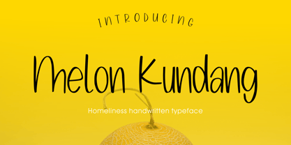 Melon Kundang its homeliness font, very simple and very easy to remember with distinctive hand strokes! This font would be perfect for party invitations, quotes, t-shirts, birthday cards, product packaging and more. • lowercase and uppercase • Includes numbers and punctuation
 - Merci by Atlantic Fonts,
$26.00 “Merci” is a playful, cool, hand-drawn font ready to mix things up with interchangeable upper and lower case letters and double letter ligatures. Get artsy, go graphic, feel the groove, and spread some love.
 - Mercadillo by Monotype,
$16.99 Mercadillo is a casual script typeface based on the hand painted signs you can see in markets, shops and bars. Comes in 4 different weights (Black, Bold, Regular and Light) and it has OpenType features.
 - Simple Stamp by Oleg Stepanov,
$20.00 Simple Stamp is the hand-drawn font. It is good for games, cartoons, posters, chidlren's books, and for any other places, where loud and funky headlines are needed.
 - Criminal Intent JNL by Jeff Levine,
$29.00 The hand lettering found throughout the movie trailer for 1942's "Mr. and Mrs. North" inspired Criminal Intent JNL, which is available in both regular and oblique versions.
 - 1890 Notice by GLC,
$38.00 We have created this family inspired from the hand-drawn letters used from the late 1800s until beginning of 1900s for notices, advertising, posters and also early comic titles. It is a hand-made font, with little imperfections that give it its special poetic note. It can be used together with 1906 French News, 1906 Titrage and 1820 Modern.
 - Harry Plotter by ParaType,
$25.00 An original typeface designed for ParaType in 2003 by Zakhar Yaschin. Extravagant letterforms were inspired by the style of books about young wizard on the one hand, and purblind regiments of scripts from Halloween cards on the other hand. Its classical nature is successfully hidden behind the giant triangular serifs. For use in advertising and display typography.
 - Amy by AVP,
$19.00 Developed from the simplest possible curves, Amy is a wide hand lettered style with tall straight ascenders and generously looped descenders. The capitals are centred horizontally with the lower case. A handful of ligatures helps copy to flow for easy reading and optional proportionally spaced numerals make the font suitable for quite lengthy chunks of copy.
 - Bombshell Pro by Emily Lime,
$54.00 Bombshell Pro is a passionate hand-calligraphy font that includes long connections between letters so you can create beautiful headings or signature looks. Open-type version features 800+ glyphs including initial and terminal letters, alternates, roman numerals (III & IV), and "run-on" letter connections. So you can create realistic hand-calligraphy on all of your creations!
 - Monthly Issue JNL by Jeff Levine,
$29.00 An Art Nouveau, hand lettering on a Good Housekeeping magazine cover from the 1920s inspired Monthly Issue JNL, which is available in both regular and oblique versions. Prior to the 1940s, it was not unusual to find the covers of many popular magazines hand lettered with either their names and/or content information; often in different type styles.
 - Kite Script by Fontdation,
$20.00 Kite Script: my another hand-lettering that comes to font. A script typeface that combined thick-thin lines, inconsistent height, loose-tight kerning and unique baseline combinations for natural hand-writing feels. Easy and super playful to customize, suits best for almost all of your designing project; wedding invitations, t-shirt designs, fancy logotype, quote writings, etc.
 - Redbird by Eurotypo,
$34.00 Redbird is a modern hand-painted script with an irregular baseline. Rough edges and imperfect lines give to this brush font a unique and trendy look. All glyphs have been carefully painted giving your words a wonderful flow. Fat and thin stroke in this font impresses the harmony. Want to give your projects an organic, hand-painted look? Redbird font contains 584 glyphs, with inky lines, and "perfect or imperfect" painted edges, including a few extra character alternates, swashes and ligatures for a genuine hand-lettered effect. This font includes OpenType features that may only be accessible via OpenType-aware applications, a Central European language support. Bonus: 60 useful ornaments and a lot of catchwords that you use for the most demanding design project! Redbird looks lovely on wedding invitations, greeting cards, logos, business cards and is perfect for using in ink or watercolour based designs, fashion, magazines, food packaging and menus, book covers and more!
 - Mangaba Pro by Eliezer Grawe,
$9.00 Mangaba is a condensed font designed to create a hand-drawn feel for texts in small spaces. It is great for packaging and labels as well as titles and other short texts. It has low contrast and high x-height. Blend well with other hand drawn, cursive and san serif fonts. Includes Latin characters, punctuation, diacritics and old-style numbers. It is a font inspired by the Brazilian cerrado, a region similar to the savannah, with low trees, with twisted trunks and exotic fruits, such as Mangaba. ?Mangaba Pro is perfect for bringing a natural and exotic touch to logos, packaging and even texts on social networks.
 - Mozzart Sketch by Posterizer KG,
$19.00 Mozzart Sketch is a decorative version of Mozzart Sans, slightly rounded, Neo-Grotesque corporate font, created for MOZZART D.O.O. company from Belgrade, Serbia. Mozzart Sketch is a decorative hand-sketched font for headlines and short texts, and also very readable in small weights. All glyphs were carefully hand drawn, with marker as a tool, then traced and digitized. The family contains: 5 Weights, 3 Condensed and 1 Oblique versions of the font, complementing each other perfectly. All versions contains completely MacOS Roman and MacOS Cyrillic code pages, tabular figures, small caps... perfect for profesional designers and very useful for artistic things, catalogues, music... and many other sensual and beautiful things. Enjoy!