10,000 search results
(0.03 seconds)
- Torcao by insigne,
$24.00 Torcao is one of the sporks of the font universe, a useful and functional outlier. Half square, half circle, this uncommon squircle of a family with its asymmetry of curved and angular shapes drives through headlines and body copy with forward velocity. The robust, technical appearance is light-hearted and inviting, and its organic nature plays off of its one-of-a-kind kinks and hybrid forms. Torcao is not merely an experimental font, though. The figures have been crafted and refined into a functional, hard-working typeface that lends itself to many sizes and environments. The font family features a tall x-height and light modulation, which give the typography its unique color highly effective in headlines but still quite legible in longer text. This family contains a comprehensive range of nine weights--slender to black--and features condensed and extender selections for a complete set of forty-eight fonts. The font has been decked out for experienced typographers, together with swash alternates and simplified titling. The typeface also contains a range of numeral sets, together with fractions and old-style figures. OpenType-capable programs including Quark or the Adobe suite allow quick changes to ligatures and alternates. Previews of these options can be found in the .pdf brochure. Torcao also features the glyphs to enable all Central, Eastern, and Western European languages. In all, the font supports around forty languages that utilize the prolonged Latin script, making it an excellent option for multi-lingual publications and packaging. Simple, technical, and open, the Torcao type family could just be the perfect choice for your web type or print project.
 - Black Willow by Krakenbox Studio,
$15.00 Black Willow - is Hand Brush with rough and textured inky. Its has urban, vintage, cool styles and modern look makes it a fantastic choice for fashion, signature, album covers logos, branding, magazines, social media posts, advertisement, and many more. Use this display font to add that special cool touch to any design idea you can think of!
 - Peanut Crunch by Hanoded,
$15.00 I really like peanuts! My family and I often eat an Indonesian snack called Rempeyek, which is a deep fried, battered peanut cracker and I was probably craving one when I made this font. Peanut Crunch is a hand painted display font. It comes with some alternates and a bunch of ligatures for you to play around with.
 - Allerton by Jeff Levine,
$29.00 Presenting a condensed Art Deco sans serif font with rounded corners and squared inner lines, based on the hand lettered title on the cover of the sheet music for 1944’s “Just A Little Fond Affection”. Allerton JNL is available in both regular and oblique versions, and was named after a neighborhood in the Bronx, New York.
 - Violets by Tanincreate,
$12.00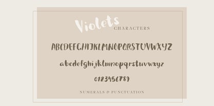 Violets is a cute handwritten brush font designed initially for using in a packaging design. Quirky and casual it is actually very versatile, and can be used in a variety of project styles - children book design, invitations, quotes, headings, blogs, logos and more, where a hand written type is needed. Features numbers, signs, punctuation, multilingual glyphs.
 - Mimogie by Youngtype,
$14.00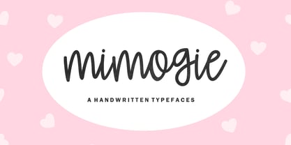 Mimogie - Handwritten Typefaces Contains a complete set of lowercase, uppercase, alternative, ligatures, punctuation marks, numbers and multilingual support. This font is ideal for use in watercolor designs or hand bold styles, such as blog headers, posters, wedding elements, t-shirts, clothing, book covers, business cards, greeting cards, branding, merchandise, invitations and handmade quotes and more. again. again. Thank you :)
 - Splashdown by Comicraft,
$29.00 Surf's Up! Head on down to the Barrier Reef with your favorite board, your latest pair of Oakleys and join us where the waves break. Zip up your wetsuit and be prepared to Wipe Out! On the other hand, if you'd rather not get wet, simply install this font and experience similar results. Splashdown is totally tubular, dude!
 - Structia by Typodermic,
$11.95 As you consider the words you need to convey, it’s clear that you’re looking for something that feels just as precise and intentional as the message you’re promoting. Structia is a typeface that does not shy away from its influence—it leans into the hard edges and geometries that are typically associated with brutalist architecture. And yet, even as it draws inspiration from an austere and somewhat daunting aesthetic, Structia also possesses a sense of control and discipline that is undeniably alluring. At the core of Structia’s appeal is its mechanical precision. Every line, every curve, is carefully calculated and crafted to create a sense of mathematical accuracy that is difficult to resist. There is no room for error or imperfection in Structia—every stroke is sharp and precise, with chamfered corners that add an extra layer of texture and visual interest. This is not a typeface that allows for ambiguity—it demands clarity and specificity, and it delivers both with remarkable consistency. But Structia is more than just a collection of angular shapes and precise lines. It is a typeface that conveys a sense of scientific accuracy and chilly logic—a kind of elegance and refinement that is unexpected. There is a beauty in the way that Structia balances the hard-edged geometries of brutalism with a sense of control and finesse that is undeniably modern. It is a typeface that feels at once futuristic and timeless—a design that can be used in a wide variety of contexts and still feel fresh and relevant. And then there are the two effect styles—Structia Panel and Structia War—which take the basic geometry of the typeface and push it even further into the realm of science fiction. Structia Panel feels like something you might see on a spacecraft or in the architecture of an alien planet, with thin, laser-like struts that give it a futuristic edge. Structia War, meanwhile, takes the concept of Structia Panel and adds a layer of battle damage, as if the letters have been through a cosmic conflict and emerged victorious. In the end, Structia is a typeface that demands attention and respect. It is not a typeface that will fade into the background or blend in with the crowd—it is a design that is meant to be noticed and admired. And yet, even as it draws your eye with its hard-edged geometries and precise lines, it also possesses a sense of elegance and refinement that is undeniably alluring. Structia is a typeface that balances the old and the new, the hard and the soft, the mechanical and the human—and the result is something truly remarkable. Most Latin-based European, and some Cyrillic-based writing systems are supported, including the following languages. A Afaan Oromo, Afar, Afrikaans, Albanian, Alsatian, Aromanian, Aymara, Bashkir (Latin), Basque, Belarusian (Latin), Bemba, Bikol, Bosnian, Breton, Bulgarian, Cape Verdean, Creole, Catalan, Cebuano, Chamorro, Chavacano, Chichewa, Crimean Tatar (Latin), Croatian, Czech, Danish, Dawan, Dholuo, Dutch, English, Estonian, Faroese, Fijian, Filipino, Finnish, French, Frisian, Friulian, Gagauz (Latin), Galician, Ganda, Genoese, German, Greenlandic, Guadeloupean Creole, Haitian Creole, Hawaiian, Hiligaynon, Hungarian, Icelandic, Ilocano, Indonesian, Irish, Italian, Jamaican, Kaqchikel, Karakalpak (Latin), Kashubian, Kikongo, Kinyarwanda, Kirundi, Komi-Permyak, Kurdish (Latin), Latvian, Lithuanian, Lombard, Low Saxon, Luxembourgish, Maasai, Macedonian, Makhuwa, Malay, Maltese, Māori, Moldovan, Montenegrin, Ndebele, Neapolitan, Norwegian, Novial, Occitan, Ossetian, Ossetian (Latin), Papiamento, Piedmontese, Polish, Portuguese, Quechua, Rarotongan, Romanian, Romansh, Russian, Sami, Sango, Saramaccan, Sardinian, Scottish Gaelic, Serbian, Serbian (Latin), Shona, Sicilian, Silesian, Slovak, Slovenian, Somali, Sorbian, Sotho, Spanish, Swahili, Swazi, Swedish, Tagalog, Tahitian, Tetum, Tongan, Tshiluba, Tsonga, Tswana, Tumbuka, Turkish, Turkmen (Latin), Tuvaluan, Uzbek (Latin), Venetian, Vepsian, Võro, Walloon, Waray-Waray, Wayuu, Welsh, Wolof, Xhosa, Yapese, Zapotec Zulu and Zuni.
 - MVB Bossa Nova by MVB,
$39.00MVB Bossa Nova is based on unattributed hand-lettering found in an old book, circa 1946. Yet unlike many scripts based on a vintage source, it feels fresh and dynamic. This is due to the skilled hands of Holly Goldsmith, who gave the forms a contemporary vigor despite their age. Alternate glyphs with extended ascenders offer extra flair. - Freak by Cool Fonts,
$24.00 This is a funky hand lettered font that just begs to be used for coffeehouse promo. It is best when used in sizes above 16 points and is even better when used for posters where it can be printed in giant sizes. It was hand drawn in Fractal Designs Painter with lots of little Doo-Dads.
 - Coo Coo by chicken,
$23.00 So I made five rather odd characters for a logo for a friend… Then I thought I'd fill a couple of spare hours expanding it to a single alphabet… And some considerable time later I ended up with a whole font with full punctuation, a bunch of alternates, pretty broad international support and some OpenType features to keep things varied… There are elements of Art Deco, Art Nouveau, Lego, circuit boards and Ceefax, Memphis lamps and lab clamps, hieroglyphs, googly eyes and who knows what else… Intricate, insane, highly irregular, but somehow it hangs together… Throw down a few letters nice and big when the fancy takes you…
 - Rising Sun by Proportional Lime,
$25.95 This typeface was inspired by Gering and Remboldt's work during the late 1490s. Their printing concern, the Soleil d'or in Paris, was one of the printing business to engage in the use of blackletter printing, when the rest of the Parisian printers where using humanist influenced roman typefaces. This peculiar backwards trend was really one of the original examples of "retro", taking advantage of the desires of the more conservative northern Europe that had not yet embraced the newer roman types.
 - Fairbank by Monotype,
$29.99Monotype Bembo is generally regarded as one of the most handsome revivals of Aldus Manutius' 15th century roman type, but the original had no italic counterpart. The story is told that Stanley Morison commissioned Alfred Fairbank, a renowned calligrapher, to create the first italic for Bembo, which was released as metal fonts in 1929. Alfred Fairbank, however, claimed that he drew the design as an independent project and then sold his drawings to Monotype. According to him, the statement has been made that I was asked to design an italic for the Bembo roman. This is not so. Had the request been made, the italic type produced would have been different." Whichever version you believe, it was obvious that Fairbank's design - while undeniably beautiful - was not harmonious with Bembo roman. A second, more conventional italic was eventually drawn and added to the Bembo family. Fairbank's first design, which was based on the work of sixteenth-century writing master Ludovico degli Arrighi, managed to have a modest life of its own as a standalone font of metal type. It never made the leap into phototype fonts, however, and the face could have been lost, were it not for Robin Nicholas, Monotype Imaging's Head of Typography in the United Kingdom, and Carl Crossgrove, a senior designer for Monotype Imaging in the US. Nicholas and Crossgrove used the original drawings for Fairbank as the starting point for a new digital design, but this was only the beginning. They improved spacing, added subtle kerning and optimized the design for digital imaging. In addition, Nicholas created an alternative set of lowercase letters, fancy and swash capitals and enough alternate characters to personalize virtually any design project. By the time his work was complete, Nicholas and Crossgrove had created a small type family that included Fairbank, a revived version of the earlier metal font, and Fairbank Chancery, a more calligraphic rendition of the design. An additional suite of ornate caps, elegant ligatures, and beginning and ending letters accompanies both fonts, as does a full complement of lowercase swash characters. Now, instead of a failed Bembo italic, Fairbank emerges in its true glory: a sumptuous, elegant design that will lend a note of grace to holiday greetings, invitations, and any application where its Italianate beauty is called for." - Movie Arts JNL by Jeff Levine,
$29.00 In the June 18, 1929 issue of “The Film Daily”, the curvy and casual hand lettering found within the ad for the movie “Such Men are Dangerous” belies that this was actually a pre-code drama. Digitally redrawn as Movie Arts JNL, it is available in both regular and oblique versions.
 - Beldon by Aqeela Studio,
$12.00 Introducing a new beautiful calligraphy font, Beldon! It is perfect for elegant logos, upscale packaging, wedding stationery, websites, and any other projects requiring a handwritten and luxurious touch. A wide range of ligature alternates are included so that you can give your logo or name a custom, hand-calligraphy look.
 - Stuttgart Gothic by Scriptorium,
$18.00Stuttgart Gothic is based on early 20th century hand lettering samples developed by Ernst Schneidler at the Stuttgart School of Design. It is a very bold style in the gothic tradition, but with additional characters for modern users. It is at once both quintessentially gothic and uniquely modern and decorative. - Codswallop by Hanoded,
$20.00 The origin of the word Codswallop is uncertain, but it might have something to do with a 19th century English soft drink brewer named Hiram Codd. Codswallop is a beautiful hand drawn font. A little weird, a tad grotesque and a wee bit over the top, but fun and useful nonetheless.
 - Cerise by Magpie Paper Works,
$58.00 Cerise from Magpie Paper Works is a sweet, hand-lettered font ready for any use. She's full of Opentype features that mix & match for a convincing calligraphy effect. Cerise includes decorative contextual caps, double-letter ligatures, discretionary ligatures, and old-style numerals as well as 62 coordinating strokes and swashes.
 - Displatter by Sronstudio,
$15.00 Displatter is a natural hand-brushed font, this font is perfect for logo, invitation, stationery, wedding designs, social media posts, advertisements, product packaging, product designs, label, photography, watermark, special events or anything. Displatter comes with full set of uppercase and lowercase letters, multilingual symbols, numerals, punctuation and ligatures. Thank You, Sronstudio
 - Kendrick by Monotype,
$15.99 A heavy-set but lively font, Kendrick’s dense strokes were hand-painted using a thick wet brush. This all-caps set of letters is bold but brushy, textured and expressive; fun but very much meaning business. Kendrick is streetwise and no-nonsense, but with a big cheesy grin to boot.
 - Sánchez Niu by Latinotype,
$- Sánchez Niu is a redesign of Sánchez—one of the first font families by Latinotype designed in 2011. In the typedesign industry the terms ‘nova’, ‘neue’, ‘next’, ‘new’ are often used to refer to a typeface that has been modified in different ways: redesign, technical readjustments, greater number of characters, etc. At Latinotype we are now starting to use the word ‘niu’ to refer to these kinds of typefaces. Niu is an adaptation of the original word ‘new’, i.e., we have adapted this English word to the phonology and spelling of our own language but keeping the original meaning. Race mixing, diversity, change and adaptation are part of the essence of Latin American culture and, at Latinotype, we are all constantly expressing these elements in everything we do. Latin Power! This new version includes improvements that make it work well with longer text. Such improvements have not had a major effect on the look of the font, though. We have adjusted the original proportions and added a number of new characters as well as OpenType features such as small caps, oldstyle figures, tabular numbers and stylistic alternates. Sánchez Niu contains a set of 720 characters that support 219 languages. The font is well-suited for long text, headlines and logotypes, and it has been optimised for web usage. Sánchez Niu comes with two free fonts—Regular and Regular Italic! Corrections, digital editing and review by César Araya, Rodrigo Fuenzalida and Alfonso García.
 - VLNL Bleek by VetteLetters,
$35.00 Bleek started its life as a logo for a rock band with the same name. This makes sense as it has distinct roots in classic rock logo design. Any rock band name set in VLNL Bleek looks instantly cool – profi logo quality! Of coarse Bleek will serve an awesome purpose as a headline font as well. Or gig flyers and posters. Or band backdrops. Just turn it up to 11! DBXL expanded the original logo into the full Heavy weight and added Light and Medium cuts. VLNL Bleek is an all caps font with uppercase and lowercase variations for maximum effect. It has a number of Open type features, like and alternate F, mirrored A and O and a TT ligature to spice up your designs. VetteLetters says: Rock on!
 - Verse Sans by Hubert Jocham Type,
$39.00 In 2006 the art director of Emotion, a women’s psychology magazine, asked me to design a copy typeface for them. Before I actually got the job I started to work on a serif. I wanted it to be feminine but still clear and modern. On one hand there are the floral round elements and on the other hand the angular serifs. In the composition I wanted the two extremes to work together. All the other elements had to be harmonized. The proportions needed to match the magazine’s requirements. The ascenders and descenders are short enough to work in narrow columns but long enough to work in small sizes. As you can imagine, the emotion-job never happened. In copy you should not get heavier than Heavy. Extrabold and Ultrabold work best in display.
 - Nouveau Semi Stencil JNL by Jeff Levine,
$29.00 The cover on the sheet music for the 1922 song "If She Comes from Dixie" had the title hand-lettered in an Art Nouveau style with a semi-stencil effect. It's now available as Nouveau Semi Stencil JNL in both regular and oblique versions. The typeface is not considered a "pure" stencil because many of the letters were made solid; lacking the classic stencil "breaks" at key points found in more traditional stencil designs.
 - Shock Block by Wing's Art Studio,
$16.00 Shock Block: An electrifying font powered by science, 80s movies and horror comics. Boasting an eye-catching design that's hand-drawn in pen and ink to replicate the look of classic horror comics, 80s movies and Saturday morning cartoons, Shock Block is a highly volatile font powered by experimental science and 1.21 gigawatts of electricity! User be warned, safety goggles are required! Shock Block is an all-caps design with unique upper and lowercase characters along with numerals, punctuation and language support. It also includes a contrasting 'Block' style and a selection of lighting blot symbols and underlines. It's a unique typeface that's perfect for movie titles, school projects, presentations, comic books, or anything that could do with extra spark. Add a simple electric glow effect using these free presets for Adobe Illustrator, Photoshop and After Effects.
 - Stretto by Canada Type,
$29.95 Stretto (Italian for narrow) is a revival, correction and expansive update of an Aldo Novarese reverse-stress font called Sintex, which he did for VGC in 1973. Openly idiosyncratic and playfully rebellious in its design, this alphabet fuses the straights and rounds in an unusual manner, riffing on the idea of hand-made sign and wood type forms while adhering to its odd grid’s parameters. In spite of its counter-stress, its legibility is high and even, helped by its unicase forms and very distinct counters. First released in 2007, it became quite popular with film studios and nostalgia designers (Sintex was the font used for David Bowie’s Hunky Dory album and Life on Mars? single). A dozen years later we revisited it for an update. Stretto now comes with over 660 characters and includes Pan European language support.
 - Paranoid - 100% free

- Sevil alias Esra Lite - Unknown license

- Headhunter Two by Barlov,
$25.00 The original Headhunter shareware font was created in ©1992 by the famous D. Rakowski. It consisted of 63 unique skeletal Glyphs, including Capital A-Z, and a few bone symbols, but lacked lowercase and numerals. He has since abandoned his fonts to pursue other things. (You can download it from FontSquirrel for free.) I've always enjoyed this limited Halloween font, but its incompleteness had to be rectified; thus I took it upon myself to delve slightly into the world of typography, resulting in the birth of HeadhunterTwo. I've slightly reworked his original contribution and "fleshed out" more of the font than necessary. As of this writing, it consists of 777+ Glyphs and passes Underware's compatibility test for Latin Plus (Supporting 219 Latin based languages, which are spoken in 212 countries.)
 - Storybook by ArtyType,
$29.00 Storybook is a friendly informal script with rounded features and a generous x-height for enhanced legibility. This distinctive italic typeface comes in three weights and bridges the gap between traditional scripts and contemporary hand-written styling; it adapts to a nostalgic or classic purpose whilst retaining a modern feel at the same time. The design lends itself to subject matters like childrens' books, various literature projects and even speech bubbles in equal measure. The Storybook glyph palette boasts an extended European character set and a well considered series of swash alternates which instantly transform the appearance of any texts when activated.
 - Natural Curves OG by Kingpin Designs,
$9.00 'Natural Curves OG' is a friendly typeface that works seamlessly without any trimmings. It's perfect for giving any work a hand-drawn look and feel. The typeface is balanced so the eye doesn't move straight to any singular letter, which means that creating a hierarchy with other elements in your design is simple. Colour blocking to support brand identity is easy with this typeface, and it adds character simply and authentically. This typeface was created for my own brand's identity, and it's been great to add splashes of art in the form of type all over my website and collateral.
 - Chorasign by Qaratype,
$24.00 Chorasign is a stylish modern calligraphy font with casual chic flair. It is perfect for branding, wedding invites and cards, and maybe for red wine label. Chorasign includes full set of gorgeous uppercase and lowercase letters, numerals, a large range of punctuation. All lowercase letters include beginning and ending swashes, giving realistic hand-lettered style. Main Features: Uppercase & Lowercase letters Punctuation and special characters Multilingual support Beginning lowercase swash: example: -a (hyphenlowercase letter) Ending lowercase swash: example: a- (lowercase letterhyphen) Short underline _1 or _2: example: Chorasing_1 / Chorasign_2 Long underline _3 or _4: example: Chorasing_3 / Chorasign_4
 - Garrison by Latinotype,
$39.00 Garrison is a contemporary sans serif that offers a straightforward interpretation of the English humanist sans, gently blending rigid tones over a warm structure. It’s available in 7 weights and it comes with a duo-italic set; on the one hand the Oblique complements your text as the slanted version of the Regular, and the smooth, flowing italic will make your written piece stand out brightly. This simple and carefully crafted typeface, with traits flirting with geometry, becomes a powerful workhorse. Its versatility makes it ideal for both paragraphs and bigger typesettings, a great choice for branding, signage, editorial, and more.
 - Trippy Hippie JNL by Jeff Levine,
$29.00 Don’t let the name “Trippy Hippie JNL” fool you. Although the type design fits well with the 1960s-70s hippie movement and the “love generation”, the design is actually straight out of a page from a vintage German lettering textbook entitled “50 Alphabete fur Technikur und Fachschulen” (loosely translated to “50 Alphabets for Technicians and Specialized Schools”). The novelty, free form shapes and stroke weights of this hand lettered alphabet fits well in creating 1920s period pieces or for designing a retro-inspired rock and roll concert poster. Trippy Hippie JNL is available in both regular and oblique versions.
 - Shockbar by Letterhend,
$14.00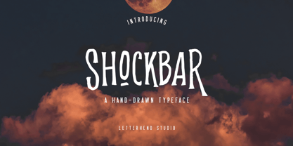 Introducing Shockbar, a hand drawn typeface. This font is made to be applied especially in logos, and the other various formal forms such as invitations, labels, logos, magazines, books, greeting / wedding cards, packaging, fashion, make up, stationery, novels, labels or any type of advertising purposes. Features: Uppercase & Lowercase Numbers and Punctuation Multi-lingual support Alternates PUA encoded We highly recommend using a program that supports OpenType features and Glyphs panels like many of Adobe apps and Corel Draw, so you can see and access all Glyph variations. Email us to letterhend@gmail.com if you need something! Happy Designing!
 - Constaline Script by Invasi Studio,
$17.00 Constaline is a super versatile pairing font monoline script and sans typeface with tons of alternate decorative characters. The Constaline font duo has a Rough Grunge texture and a clean style. Script Regular, Script Stamp, Sans Regular, and Sans Stamp are the four varieties available. They can be used for a wide variety of purposes. This font has been carefully hand-drawn to make sure its characters look consistent. Constaline font duo is suitable for logotype, badge, emblem, clothing design, signage, posters, packaging, and much more! Features: Uppercase & Lowercase Numerals & Punctuation Alternates and Ligatures Multilanguage Supports 60+ Latin based languages
 - Typo Upright by Bitstream,
$29.99A faithful reproduction of the common French Ronde of the nineteenth century; the design originates at the Inland Typefoundry in St. Louis as French Script and was revised by Morris Fuller Benton in 1905 and made popular by ATF under the name Typo Upright. Stephenson Blake also had a version available as Parisian Ronde. - Fightever by Ditatype,
$29.00 Fightever is an expressive script font that embodies the boldness and energy of a brushstroke. With its interconnected letters and dynamic design, this typeface brings a sense of movement and liveliness to your projects. The defining feature of Fightever lies in its connected brush style, where each letter flows seamlessly into the next. This interconnectedness creates a sense of continuity and fluidity, resembling the strokes of a brush gliding effortlessly across the canvas. The result is a script font that feels organic and natural, with each letter forming a harmonious composition. Fightever captures the essence of artistic expression. The font exudes a sense of raw energy and passion, as if every letter is infused with the brushstroke's vibrant movement. This dynamic style adds a touch of personality and uniqueness to your designs. Enjoy the various features available in this font. Features: Alternates Multilingual Supports PUA Encoded Numerals and Punctuations Fightever perfect for logos, branding materials, invitations, or any design project that calls for a touch of handcrafted charm. This font will also work on designs related to art, fashion, hand-lettering, or any project that requires a personal touch, this font will bring an authentic and expressive feel. Find out more ways to use this font by taking a look at the font preview. Thanks for purchasing our fonts. Hopefully, you have a great time using our font. Feel free to contact us anytime for further information or when you have trouble with the font. Thanks a lot and happy designing.
 - Bluenote Demi by Wiescher Design,
$39.50 Bluenote is a font based on Franklin Gothic condensed. In the 60s and 70s the record label Blue Note published all those classic jazz records of my youth. Someone at their arts department cut letters to ribbons and designed wonderful record covers with those fragmented glyphs. I recently had a look at my music collection and rediscovered these letters. Being a hard-working type designer I couldn't resist the challenge, here is the result from your dilligent designer Gert Wiescher
 - Diorite by Three Islands Press,
$24.00Diorite is modern face built on classical letterforms -- but left with a bit of residual roughness. Some might call Diorite forthright, others brutal. (It reminded the designer of the dark, hard igneous rock of the same name, treasured by the ancient Egyptians for statuary.) The typeface has a relatively chunky, four-style family; the italics are true cancellaresca corsiva, also writ heavy. "The cancellaresca is of course a Gothic design," notes the designer. "Just use a broader pen, and you'll see!" Has four styles: regular, bold, cursive, and cursive bold.

