10,000 search results
(0.414 seconds)
- Magnesit Dark by Rekord,
$22.00 Sporty and brawly, Magnesit Dark creates impact everywhere it lands. Impressive headlines are its specialty, but it feels right at home used in packaging, branding and poster design. Very tall x-height, wide language support and minimalistic yet playful appearance, make it suitable on any serious typographic job. Three distinct styles expand the possibilites even further: the straight to the point Regular, the friendly Soft and the determined Hard styles share metrics across related Magnesit and Magnesit Stencil families, so you can mix and match to achieve exactly the effect you need. Magnesit Dark works great with illustrations, the generous shapes can be easily filled with strong imagery to great effect. Based on the best-selling Grim, Magnesit is a vast improvement of the concept with long awaited addition of lowercase, reworked proportions, spacing and kerning, expanded language support and useful icons to satisfy even the most demanding typographers’ needs.
 - Magnesit by Rekord,
$22.00 Sporty and brawly, Magnesit creates impact everywhere it lands. Impressive headlines are its specialty, but it feels right at home used in packaging, branding and poster design. With a very tall x-height, wide language support and minimalistic yet playful appearance, it can take on any serious typographic job. Three distinct styles expand the possibilites even further: the straight to the point Regular, the friendly Soft and the determined Hard styles share metrics across related Magnesit Stencil and Magnesit Dark families, so you can mix and match to achieve exactly the effect you need. Magnesit works great with illustrations, the generous shapes can be easily filled with strong imagery to great effect. Based on the best-selling Grim, Magnesit is a vast improvement of the concept with long awaited addition of lowercase, reworked proportions, spacing and kerning, expanded language support and useful icons to satisfy even the most demanding typographers’ needs.
 - Beautiful rain by Sulthan Studio,
$12.00 Beautiful rain made in the rainy season I made an irregular handwritten font at will with beautiful and attractive results full of love and affection in it, making this font very attractive to use in your photos with two words that go hand in hand or also to connect your own name or partner's name because Having a swash heart that can be connected is very suitable for use on greeting cards, wedding invitations, magazines, logos, clothes, stickers, and many more.
 - PM Alcorn by Paper Moon Type & Graphic Supply,
$17.00 A new font inspired by classic retro and mid-century modern interlocking hand-written typography. Do you need to create some fun snack packaging to stand out on the shelf? PM Alcorn will quell your appetite. Are you designing a product that needs a funky, friendly retro vibe? PM Alcorn is fun, funky, friendly, and easy to read! It's perfect for everything from games to bath products. Plus with tons of ligatures and stylistic alternates it has real hand-lettered feel.
 - Gangsoka by Prioritype,
$15.00 A unique looking but classy and elegant looking font, that's the conclusion of this font. It's perfect for your design project and there is a choice of unique character alternatives. Can be applied to your designs such as logos, packaging, accessories, clothing, crafts, creative posts, branding, landing pages, UI / UX and others. See some of the previews above for reference. Features: -Uppercase -Lowercase -Numeral -Punctuation -Stylistic Alternate -Multilingual Note: To access the Opentype feature, it would be better if you use a program that supports it and is available with a glyph panel so you can see various alternative characters. Examples of programs such as Adobe Illustrator, Corel Draw or Inkscape. Thanks.
 - dT Jakob by dooType,
$30.00 dT Jakob started as a revival by Gustavo Soares for Paul van der Laan’s class at the Type and Media Masters, in The Hague, NL – back in 2007. There are quite a few excellent geometric sans typefaces available, but we did want to make our contribution and have a fine geometric face to offer. dT Jakob was born out of Erbar, by Jakob Erbar, one of the very first geometric sans, released in metal around 1926. Our goal was to make a versatile typeface, that handles display and text typography beautifully. To achieve that we designed a complete range of weights, matching italics and lots of OpenType Features. Hope you enjoy it :D
 - DT Paperside by Dragon Tongue Foundry,
$15.00 Paperside: Neither Papyrus nor SSI Countryside. Inspired in some ways by the Papyrus form, but untextured and smoother, with the dimensions and proportions more open, like that of Countryside SSi, with its larger easily readable lowercase body, and more consistent, shorter stems. Paperside has an open scripted feel which is pleasing on the eye and easy to read. Paperside can enhance the first letter of most sentences automatically, and changes other letters to suit their position within words, and the letters they appear beside. Now comes in 5 weights plus italic. For best results, use this ‘smart font’ with Contextual Ligatures turned on. Mulitiple Stylistic Alternatives are included. Inspiration for this font came from two other fonts. Papyrus: was designed by Chris Costello and created in 1982, it is a hand-drawn textured typeface, emulating texts written in biblical times. One of the most used (and misused) fonts of all times. Owned by Letraset, and currently published by the Internation Typeface Corporating (ITC). Countryside SSi: The serif font of an unknown designer, is currently licensed by Southern Software Inc. Feel free to preview some of the Dragon Tongue fonts that are yet to be released, at https://www.dragon-tongue.com/fonts
 - Satero Serif by Linotype,
$29.99 Satero was designed by Prof. Werner Schneider in 2007. Never before have we had so much written material to consume; this is the age of mass-communication. Unfortunately, the decision of which typeface to use is too often made lightly. The typeface is one of the most elementary means of language, and it can play a major role in a text's legibility and the amount of time the reader needs for it. The Satero Type System offers a high degree of legibility due to its dynamic and forms. The individual characters have been based on classical concepts. They are clearly made, and leave all unnecessary elements behind. The type works to create an environment of extreme legibility. Essential parts of the a, c, e, s, and r are to be found at the x-height line, which is the most important area of a line of text in determining legibility. The Satero Type System includes two members whose basic forms are the same. The Sans Serif members are more horizontally differentiated than common grotesques, which aides their legibility. The Serif design employs asymmetrical serifs, avoiding elephant feet" altogether. Their dynamic is progressive. The condensed nature of the seriffed counterparts is optimal for newspaper and magazine applications, where space is at a premium and paper must be saved. All fonts in the Satero Type System include a number of alternate glyphs, as well as ligatures and proportional lining figures; all weights except the Heavy and Heavy Italic fonts are also equipped with small caps, small cap figures, and oldstyle figures as OpenType features. "
 - Satero Sans by Linotype,
$29.99 Satero was designed by Prof. Werner Schneider in 2007. Never before have we had so much written material to consume; this is the age of mass-communication. Unfortunately, the decision of which typeface to use is too often made lightly. The typeface is one of the most elementary means of language, and it can play a major role in a text's legibility and the amount of time the reader needs for it. The Satero Type System offers a high degree of legibility due to its dynamic and forms. The individual characters have been based on classical concepts. They are clearly made, and leave all unnecessary elements behind. The type works to create an environment of extreme legibility. Essential parts of the a, c, e, s, and r are to be found at the x-height line, which is the most important area of a line of text in determining legibility. The Satero Type System includes two members whose basic forms are the same. The Sans Serif members are more horizontally differentiated than common grotesques, which aides their legibility. The Serif design employs asymmetrical serifs, avoiding elephant feet" altogether. Their dynamic is progressive. The condensed nature of the seriffed counterparts is optimal for newspaper and magazine applications, where space is at a premium and paper must be saved. All fonts in the Satero Type System include a number of alternate glyphs, as well as ligatures and proportional lining figures; all weights except the Heavy and Heavy Italic fonts are also equipped with small caps, small cap figures, and oldstyle figures as OpenType features. "
 - Tablet Gothic by TypeTogether,
$35.00 Graphic designers of any nationality and background know very well that the art of composing titles correctly is not easy, Especially when it comes to periodical publications where there is need for both flexibility and graphic coherence. Tablet Gothic was originally engineered as a titling type family, meant to help designers working on publications that require output as hard copies and a variety of digital platforms at the same time. As such, it is a grotesque sans serif that looks to the future of publishing with a clear understanding of its history, and reminiscences that go back to nineteenth century Britain and Germany. Tablet Gothic delivers the sturdy, straightforward and clean appearance expected from a grotesque, but it allows itself a good measure of personality to make it stand out on the page. Its 84 styles –six series of condensation and seven weights in each series plus obliques– guarantee that, whatever the publication format is, there's a Tablet Gothic font that will do the job and perform well both technically and aesthetically. Furthermore, the rounder styles, Tablet Gothic Wide, Normal and Narrow achieved amazing results at very small sizes, producing a beautiful texture and highly readable text blocks. Tablet Gothic fonts can be purchased individually, by series or as a complete bundle (best value!)
 - Janda Christmas Doodles by Kimberly Geswein,
$5.00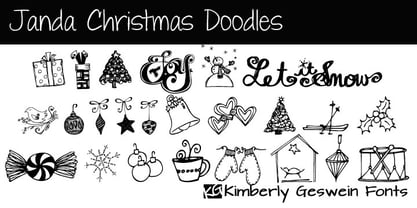 A variety of whimsical, hand-drawn Christmas doodles.
 - Monocto by Lafonts,
$29.00 Monocto is an upright italic, clearly evidenced by the lowercase letters a, e, f, g, i, k, l, v, w, x, y and several capitals. On one hand, the design is inspired by an historical German running hand written with a pen angle of 45°, and on the other, by rational, utilitarian monospace types, similar to those designed for the mechanical typewriter during the Industrial Revolution. As the writing tool touches the paper, a double-square with broken corners is produced, which then, according to ductus, transforms itself into letter components that are either 90°-verticals or 45°-diagonals. The systematic geometry of Monocto offers unexpected design possibilites.
 - LiebeFish by LiebeFonts,
$19.90 LiebeFish is a collection of 172 individually hand-drawn fish. Each has its very own personality; some are happy, some are sad. Some like company, some are bored, most are cute and a few are weird. If you look closely, some fish will surely look like people you know. LiebeFish probably is the most comprehensive collection of hand-drawn fish ever. They look great on almost any greeting card, birthday card or invitation. LiebeFish also serve as a perfect companion to any informal graphic design that needs a personal, handmade touch. If you like this font, have a look at our other cute fonts such as LiebeTweet and LiebeRobots.
 - Du by sugargliderz,
$20.00 Du is a self hommage to Uncertain Felttip. Uncertain, made in 2008, is a typeface which reproduced faithfully the style in which I am writing on copy paper, usually using the felt-tip pen. This time, I wrote the new family by the same method but using the tablet PC and the touch pen. Although, as for some characters, Uncertain differs in a form, it is the result of reflecting my hand writing. I wrote all the characters. If it is original, all the characters diverted and composed, for example, characters, such as Aacute and Agrave, are written. Different specification from Uncertain is family composition. Although Uncertain had only 3 weight, 7 weight were designed for Du. This way a user can choose his favorite weight because the variation of weights increased.
 - Original Quality by Hanoded,
$15.00 Original Quality: I often see these words on various objects - from T-shirts to sprinkles and cookies. In fact, I see this term so often that I decided to name a font after it. Original Quality font is an adaptation of an older font of mine called Butterfly Ball. It is a totally different typeface, but I hope it hasn’t lost its original quality… ;-) Comes with all the diacritics you want, plus a handful of cute stylistic alternates.
 - XLeefMeAlone by Ingrimayne Type,
$14.95 XLeafMeAlone is a collection of leaf silhouettes from common Indiana trees based on actual leaves. Various leaves, selected for their good looks not their intelligence, were scanned and hand-traced. Some species, such as some oaks, are over-represented because they are more picturesque than others, such as apple or peach. LeafMeAlone was featured in the “Type Drawer” column of Personal Publishing (later renamed Business Publishing--I do not know if it still exists) in November of 1990.
 - La Jefa by Lauren Ashpole,
$15.00 A short font for short people* La Jefa is very, very loosely based on a Christmas card I received years ago from my boss at the time. Designed to capture that personalized touch, it's a hand lettered font with a short x-height and ample spacing. Although all of the letters are lowercase, the uppercase provides a unique set of characters that can be mixed in for a more natural handwritten feel. *also people of tall or average height
 - Snow Job JNL by Jeff Levine,
$29.00 Snow Job JNL was inspired by the hand lettered titles for the 1964 Rankin-Bass animated holiday classic "Rudolph the Red Nosed Reindeer". Because of the variable heights of the characters they float about the baseline in a free-form design. Available in both regular and oblique versions, the typeface gets its name from both the winter theme of the TV special along with the old term for deceiving someone with compliments while hiding one's true intent.
 - FF Kaytek Sans by FontFont,
$50.99 Kaytek™ Sans is a fresh take on the correspondence typefaces of the 90s - which were originally designed for the demands of office environments. Just like its predecessors, this text typeface is robust and hard-working - meaning it works well in challenging design or printing environments - but it’s not without personality. Look closer at the lowercase g and a, especially in the italic, and you can see some unexpected elements of subversiveness within the design. This blend of sturdiness and quirkiness means it’s just as relevant for information-heavy projects, such as annual reports, as it is in more expressive environments. Although first and foremost designed for text, Kaytek Sans’ details shine through in its heavier weights and larger sizes, meaning it also has display potential. Every style of the typeface takes up exactly the same amount of space, thanks to the way Radek Łukasiewicz created the design. He based the entire typeface on a single, master set of proportions. This means designers can switch between styles without the text being reflowed, making it particularly useful in magazines, where space might be limited, and also on the internet, where hover links appear in a different style. As well as its roots in the office, Kaytek Sans draws on a little bit more 90s nostalgia. It’s named for the first and only Polish walkman, and embodies the same solid, no-nonsense shapes that made the analogue technology of the era so charming. Just like these early personal music devices, Kaytek Sans is practical, but not clinical, able to work hard while still exuding warmth and personality. It pairs effortlessly with Kaytek Slab, which is a sturdier and more expressive take on the design. Kaytek Sans comes in 12 weights, from Thin to Black Italic, and offers multi-language support. Kaytek Slab, Kaytek Headline and Kaytek Rounded are also available.
 - LunchBox Slab by Kimmy Design,
$25.00 LunchBox Slab is the pair of LunchBox, a uniquely hand-drawn typeface that gives numerous customizable options and a fully authentic look. The serifs in LunchBox Slab are simple blocks, with bulbous terminals on curved letters, which creates a unique effect. Identical to its pair behind the scenes, LunchBox Slab’s OpenType features allow access to over 1,500 different characters. Contextual alternatives give each letter 4 different character styles, all cycling through each other to ensure that no two letters ever show up together. There is also a custom set of small caps, each with 4 style variations as well. Stylistic alternatives give an extra hand-drawn flourish, loop and slight variation, also with 4 different styles per letter. Discretionary ligatures pertain to both regular all caps LunchBox as well as stylistic alternatives. It gives special letter combinations a unique interaction, giving your design a unique and personalized look without spending hours creating it and outlining your text. Included are also a set of swashes that also have four style variations to both the regular and stylistic alternatives, as well as lowercase letters with ascenders and descenders. All of these options are available in Light, Regular and Bold. LunchBox Slab Ornaments includes nearly 200 different graphics, flourishes, frames, catchwords, text breaks and arrows. If you do not use OpenType but are using a program that includes a full glyph panel, you will be able to manually access each of the style variations you want. Enjoy!
 - Mr Eaves Modern by Emigre,
$59.00 Mr Eaves is the often requested and finally finished sans-serif companion to Mrs Eaves, one of Emigre’s classic typeface designs. Created by Zuzana Licko, this 2009 addition to the Emigre Type Library expands the versatility of the original Mrs Eaves with two complimentary families: Mr Eaves Sans and Mr Eaves Modern. Mr Eaves was based on the proportions of Mrs Eaves, but Licko took some liberty with its design. One of the main concerns was to avoid creating a typeface that looked like it simply had its serifs cut off. And while it matches Mrs Eaves in weight, color, and armature, Mr Eaves stands as its own typeface with many unique characteristics. The Sans version relates most directly to the original serif version, noticeably in the roman lower case letters a, e, and g, as well as in subtle details such as the angled lead in strokes, the counter forms of the b, d, p, and q, and the flared leg of the capital R, the tail of the Q. The distinctly loose-fitting letter spacing of Mrs Eaves was applied also to the Sans version. This, together with generous built-in line spacing due to a small x-height and extended ascenders and descenders, renders the same kind of lightness and airiness when setting text that is so characteristic of Mrs Eaves. Deviations from the original Mrs Eaves are evident in the overall decrease of contrast, as well as in details such as the flag and tail of the f and j, and the finial of the t, which were shortened to maintain a cleaner, sans serif look. And the lower case c had to be balanced out differently after it lost its top ball terminal. And with the loss of serifs, Mr Eaves set width is slightly narrower. Mr Eaves Italic also carries over many forms from its Mrs Eaves model, most notably the v, w, and z, which are unusually flamboyant for a sans italic design. It also utilizes lead in and terminal tails that are reminiscent of the serif italic. The biggest departure here is the width of the characters. The extra narrow gauge and delicate features seemed more appropriate for the Serif than the Sans. To allow for a comfortable fit, Mr Eaves Italic has a more robust design and wider character width. Meanwhile, the Modern family provides an overall less humanistic look, with simpler and more geometric-looking shapes, most noticeably in the squared-off terminals and symmetric lower case counters. This family has moved furthest from its roots, yet still contains some of Mrs Eaves’ DNA. The Modern Italic is free of tails, and overall the Modern exhibits more repetition of forms, projecting a cleaner look. This provides stronger differentiation from the serif version whenever a more contrasting look is desired. Each version (Sans and Modern) contains its own set of alternates providing unique options for applications such as headlines, word logos, letterheads, pull quotes, and other short text settings. Both the Sans and Modern come in six weights. The simpler forms of a sans-serif provide the opportunity of more weights than do serif letter forms, which are more complex in structure, making it difficult to accommodate additional weight without distortions. Regular and Bold match the original Mrs Eaves weights, while the Heavy provides an additional weight for extra emphasis.
 - Christmas Pattern by Mauve Type,
$29.00 The same procedure as every year? Again Christmas cards and greetings need to be designed... Sick of the usual Christmas imagery? Finally here is the ultimate typographical solution: 4 Christmas Pattern Fonts for display use. Playfull yet straight, Christmassy yet aesthetically pleasing. Pattern is the new sexy! Practical details: - Use in great display sizes only. The bigger – the better! - Fonts gain kind of "transparency" through the patterns – handy for use on top of images. - Characterset is caps only and supports Central, Eastern and Western European languages. - Entertaining 2 min movie explaining the basic concept and making of the Pattern Fonts. - Combine with "non-Christmassy" Pattern Fonts from the Pattern family. - Also available: a blank version in light, regular and bold.
 - Supria Sans by HVD Fonts,
$50.00 Supria Sans™ and Supria Sans Condensed is an extended family of 36 fonts designed by Hannes von Döhren. It contains two widths, six weights and three styles, including the curvy, feminine Italic as well as the more conventional Oblique. Although it is inspired by the utilitarian clarity of Swiss type design, subtle curves and fine detailing impart a more playful character to the whole Supria Sans family. Supria Sans™ is equipped for complex, professional typography. As an exclusively OpenType release, these fonts feature small caps, five variations of numerals, arrows and an extended character set to support Central and Eastern European as well as Western European languages. Supria Sans™ received the “Certificate of Excellence in Type Design” at the TDC2 (2011).
 - Nympha by Onrepeat,
$30.00 Nympha Family Features: 4 Styles 2 Weights Over 800 characters per style (3200 in total) Up to 10 stylistic variations for each character (!) European Language Support Hundreds of Ligatures, Swashes and Stylistic Alternates Old Numerals True Italics & Much More Trailer: https://vimeo.com/471556131 Nympha is an elegantly crafted and luxuriously exuberant serif typeface, exuding femininity and glamour but also a side of exquisity. Its hard contrast and refined details, along with its opulent swashes and voluptuous curves, create a beautiful and powerful statement to any typographic composition, mixing glamour with a contemporary aesthetic. One could say Nympha has two distinct, yet connected, personalities in the form of two stylistic sets of characters: a contemporary and elegant one and an exquisite and unusual one, both can (and should) be mixed to achieve surprising results. Nympha offers a vast amount of swashes, alternates and ligatures, featuring up to 10 stylistic variations for each character, making it possible to generate endless compositions with ease. Available in 4 styles, 2 weights, offering over 3200 characters. Visit https://www.behance.net/gallery/106734865/Nympha-Typeface/ for a full walkthrough of everything Nympha has to offer.
 - Brochette by Hanoded,
$15.00 A ‘Brochette’ in French is a skewer. I used to be a tour guide and some years ago, I guided a couple of tours in Mali. Every night at dinner we had the choice of a ‘Brochette de Capitaine’ (grilled Nile perch on a skewer) or a ‘Brochette de Bœuf’ (grilled beef on a skewer). Of course, every night the Brochette came with French fries and ‘petits pois’ (peas). It was really nice, but after 4 months of eating Brochettes, I longed for something different! Brochette is a very nice rounded font. It comes with curls, swirls and swashes.
 - Naga by Canada Type,
$24.95 Naga is Hans van Maanen's original creation of art deco shapes interected with intricate mazes of what could be Celtic or Mesoamerican knotwork art. The totality of the typeface borders on the mysterious, exotic and yet clearly discernible as far as readability is concerned. Naga comes with a companion outline style that emphasizes its intricacy. Both fonts hold up quite strongly when combined with photo/illustration masks. The Naga family comes in both OTF and TTF formats, and includes an extended range of characters covering most Latin-based languages. A few unicase forms are also included.
 - Pamela Bestie by Ardian Nuvianto,
$18.00 Pamela Bestie is a fun and playful layered font that's perfect for adding some personality to your designs. This font comes in two styles: regular and extrude. The regular style features a smooth, clean design that's easy to read and works well for headlines and body text. The extrude style has a dimensional, layered look that adds depth and texture to your designs. Both styles of Pamela Bestie feature a hand-drawn feel with slightly irregular letterforms, giving the font a charming and quirky personality. The font includes a full set of uppercase and lowercase letters, as well as numerals and punctuation. Overall, Pamela Bestie is a versatile font that's great for a variety of design projects, from branding and packaging to social media graphics and more. Whether you use it alone or layered with the extrude style, this font is sure to add some fun and whimsy to your designs.
 - Reklame Script by HVD Fonts,
$30.00 Reklame Script is a brush typefamily consisting of four weights. It was designed by Hannes von Döhren in 2010. This family is influenced by the handlettering of printed advertisements of the 1940s and 1950s. You can combine the four weights to gain a better emphasis – perfect for headlines, posters, and other display uses. Reklame Script is equipped for professional typography. The OpenType fonts have an extended character set to support Central and Eastern European as well as Western European languages. The fonts also contain double-letter ligatures to prevent repetition.
 - Hyggemand by Hanoded,
$16.00 Hyggemand is not a real word: it is a combination of Hygge (meaning ‘fun’ or ‘coziness’ in Danish) and Mand (which means man in Danish). Combined it means something like ‘Nice Man’. I just like the sound and look of this name, so if I offend Danish languages purists, then I apologise for this monstrosity! ;-) Hyggemand is a happy kids font that comes with extensive language support and a set of alternates for the lower case glyphs. If you want the cute Huggeman face, you will find it as a stylistic alternate for the asterisk.
 - Linotype Sunburst by Linotype,
$29.99Linotype Sunburst is part of the Take Type Library, chosen from the contestants of Linotype’s International Digital Type Design Contests of 1994 and 1997. Designed by British artist Ed Bugg, Linotype Sunburst is a font which consistently avoids all that is round. The forms are angular and pointed with triangular serifs which seem almost like flags waving from the paper. This playful font could easily be associated with sun, sand and vacation. Linotype Sunburst is intended for headlines in large point sizes or short texts with medium point sizes, if used carefully. - Habano ST by Sudtipos,
$39.00 Habano is an eleganty flowing bold script with some very surprising traits. Taking its roots in both the art deco style and the kind of lettering used for pop culture, its minuscules are classy yet obedient, and its majuscules and figures are playfully round and memorable. This contrast in character between cases makes for an appealing display face that can turn simple words into images that are hard to forget. Once again, the unique lettering talent of Angel Koziupa makes itself evident through an alphabet that leaves the memory of its soft touch for long after it is initially perceived.
 - Alda by Emigre,
$59.00 The original idea for Alda came from exploring an alternative approach to generating different typeface weights by adapting the characteristics of physical objects. I was interested to find out how far this could be pushed before the letters became a parody of what they referenced. Initially I took this treatment very literally, with the boldest weight expressing the tension of bent steel, and the lightest being as spineless as a rubber band. This allowed me to infuse each weight with unique characteristics, where the bold is robust and angular, and the light is delicate and soft.
 - Niveau Grotesk by HVD Fonts,
$40.00 Niveau Grotesk—the companion of Niveau Serif —is a type family of six weights plus matching italics and small caps. It was designed by Hannes von Döhren in 2013. Influenced by classical nineteenth-century faces, the fonts are based on geometric forms. Because of its straight architecture, Niveau Grotesk has a “punch” in big sizes but is very legible in smaller sizes and longer texts—in print or on screen. Niveau Grotesk is equipped for complex, professional typography with alternate letters, arrows, fractions and an extended character set to support Central and Eastern European as well as Western European Languages.
 - Mardi Gras Improved by Solotype,
$19.95George Bruce's New York foundry had a remarkable number of decorative types, most of which were lost or destroyed when the firm was taken over by the American Type Founders Co. and closed down in 1906. Bruce catalogs are prized among collectors. - Ingrid Font by Enrich Design,
$24.95This font was created from the handwriting of my friend Ingrid. I always felt she had great handwriting and this font is proof of this. There are for styles to choose from, a great alternative to the common handwriting fonts seen everywhere. - Neftali Pro by TipoType,
$25.00 2015 First Prize TipoType award. Neftali is a type family designed for continuous reading in long texts & editorial design, created as an interpretation of Pablo Neruda’s “Poema 20”. This work delivers a subtle experimentation of Baroque and Roman styles, rescuing features from some of the most successful chilean typefaces such as “Australis”, “Berenjena” and “Biblioteca”, along with its particular calligraphic details, medium weights, accentuated strokes, and wide curves that seek to project Pablo Neruda’s particular way of reciting. This typeface contains uppercase, lowercase, small caps, oldstyle, and tabular numbers; in addition to a true italic for every weight; and calligraphic details designed to compose his poems. A typography to talk about everything, except love… (Special thanks to: Francisco Gálvez & Patricio Truenos; without the help of the latter, this project wouldn’t have had an ending)
 - WolfieBoy - Unknown license

- Nawin Arabic by Letterjuice,
$43.00 Nawin is an informal Arabic typeface inspired by handwriting. The idea behind this design is to create a type family attractive and ownable for children but at the same time a design that keeps excellent letter recognition for reading. Handwriting has been a great source of inspiration in this particular typeface. By emulating the movements of the pen, we have obtained letter shapes that express spontaneity. A bright group of letters create a lively and beautiful paragraph of text. To get closer to handwriting and the variety of letter shapes that we draw while writing, this typeface offers a large number of alternative characters, which differ slightly from the default ones. Because we have programed the «Contextual Alternate» feature in the fonts, these alternate characters appear automatically as you set a text on your computer. The proportions and letter shapes are flexible, escaping from tradition to increase expressivity and personality in the design. For instance, variability on vertical proportions between letters Alef and initial Lam, create movement in text and avoid the cold mechanical feel of repetition. Nawin is quirky and elegant at the same time. Letter recognition is relevant when reading continuous text. For this reason, we have added another contextual alternate feature with alternate characters that help to avoid confusion when letters with similar or the same shape repeat inside one word. For instance, this is the case of medial «beh and Yeh» repeated three times continuously in the same word. The alternate characters change in shape and length, facilitating distinction to the reader. Since this typeface is inspired by handwriting and the free movement of the hand while writing, we considered ligatures a good asset for this design. The typeface has a wide range of ligatures that enhance movement and fluidity in text making look text alive.
 - Varietta by Sudtipos,
$39.00 Varietta is the result of my fascination with photographing the type designs of some marquees in Spanish markets. In them you can see many letter designs with reversed contrast and in different widths, probably based on the possibilities of photocomposition. At the same time I was working on the expansion of the Hastile typeface designed by Alessandro Butti for the Nebiolo foundry in Italy in the late 1930s, of which I had not seen any digitization. As I am not a fan of perfect revivals, I thought it could be interesting to connect Spain and Italy in a single typeface. The first step was to expand Butti's design to 27 styles, ranging from thin condensed to black expanded. To look for the Spanish connection and its characteristic inverse contrast I took advantage of the current technology that allows variable typefaces with many axes. From this, three scenarios of horizontal contrast were incorporated (top, bottom and mixed) which allows infinite possibilities of use. The final result is a collection of 108 static typefaces or a single variable file.
 - Pines by Piñata,
$9.00 Imagine you've decided to cut letters out of paper thereby creating a modern sans-serif for a broad application range. What result would you get? We already know the answer! Pines is a font family that we've carefully cut out of paper and then added lots of emotions and a few bright natural accidental details. Now you can create any text layouts and contemporary design with special warmth and friendliness that was inspired by paper. Pines font family is great for any ecological design theme. Use if for websites, hand-made items, and eco-friendly products packaging. Our font family is also great for ecological brand identity and navigation. We've named the font family Pines since it perfectly integrates into the natural environment and looks authentic and harmonious as if it came from the pine forest itself.
