10,000 search results
(0.036 seconds)
- Moon Dream by Eotype,
$12.00 Moon Dream is a wide sans serif display font that has beautiful curves. Each end is made slightly rounded giving the impression of a comfortable and friendly. Moon dream provides a collection of glyphs with unique shapes. With alternative styles and ligature features, this font is perfect for complementing various projects.
 - Auburn by Albatross,
$19.00 Auburn is a bold, hand-drawn brush script packed with OpenType features and accompanied by a handy set of extras, including catchwords and flourishes. Auburn was created by hand with Japanese brush pens for an authentic and organic script feel. With plenty of alternates and stylistic sets, Auburn is a full-featured script that can be used in a variety of design applications. A little beefier than a normal script, Auburn is great for packaging and titling, but is useful for a wide variety of occasions including weddings, birthdays, logos and restaurant menus, to name a few. OpenType features include Stylistic Alternates, 2 additional Stylistic Sets, Swashes, Discretionary Ligatures, Standard Ligatures, and Contextual Ligatures.
 - Trouble Child by Ana's Fonts,
$16.00 Trouble Child is a playful all caps display font with lots of variations and a set of extras. Use Trouble Child in any design that needs a bold font, such as logotypes, quotes and social media posts, website and magazine layouts, and poster designs. Trouble Child includes: Trouble Child font 4 variations: outline, blackout, underline and outblack versions of the font Trouble Child Extras font, with doodles, shapes and border elements (seen in the previews) 2 SVG fonts: regular and blackout Software requirements for the SVG fonts: Photoshop CC2017+ // Illustrator CC2018+
 - Wicked Culture by Sarid Ezra,
$17.00 Introducing, Wicked Culture, an eccentric font with sans and handwritten in one font! Wicked Culture is a modern and quirky font that combined sans and handwritten typeface in one font. With sans as uppercase dan handwritten as lowercase. You can use the lowercase and uppercase in the same word that will make your text more stunning and special! You can use this font for the magazine, poster, and suitable for quotes. This font also support multi language. What you will get: All Caps Font with different uppercase and lowercase Well Kerned.
 - Puntodewa by Twinletter,
$12.00 Puntodewa Sans serif font. The font design is influenced by the Serif family-style and geometric shapes, which makes it easy for us to create compositions in designs that are modern and unique. This font is our best effort to make your project nice and special, and hope you enjoy it. of course, your various design projects will be perfect and extraordinary if you use this font because this font is equipped with a font family, both for titles and subtitles and sentence text, start using our fonts for your extraordinary projects.
 - Scripps College Old Style by Monotype,
$49.00The story of Scripps College Old Style is a heart-warming and inspiring chronicle about a young librarian, a handful of students, a wealthy grandmother, a dedicated educator -- and two eminent American type designers. The story begins in 1938, when Dorothy Drake, the newly hired librarian at Scripps College, a small women's college in southern California, became an impromptu dinner companion of the American type designer Fred Goudy. By the 1990s, the original fonts that Goudy had created for Scripps College in the 1940s had become prized -- but they were seldom-used antiques. Scripps needed digital versions of the metal fonts. This goal posed two immediate challenges: finding a designer familiar with letterpress printing who was skilled at creating digital fonts, and locating the money to commission the designer's services. The first challenge was the easiest to conquer. Sumner Stone was my first and only choice," recalls Kitty Maryatt, the current curator of the Scripps College Press. "I knew he had letterpress experience, was an accomplished calligrapher, and that his typeface designs were simply exquisite. The choice was easy."The second challenge was more difficult. It took the dedication, hard work and tenacity of Maryatt to bring the beautiful Goudy designs into the twenty-first century. While Stone was eager to begin work on the project, the college had no more money for new typeface designs in the 1990s than it did in the1930s. Years of lobbying, cajoling and letter writing were necessary to obtain the college's approval for the design project. Once she had the necessary funding, the design brief posed yet a third challenge. Goudy had provided two sizes of type to the Press: 14 point and 16 point. Which would serve as the foundation for Stone's work? In addition, the Goudy fonts were quite worn. Should Stone use printed samples as his design master, or base his work on the original Goudy renderings? The 14-point master drawings were the ultimate choice, with the stipulation that the finished fonts would provide both a seamless transition from the worn metal versions and a faithful representation of the original Goudy designs. Once the budget and design brief were established, the process of converting the original Goudy drawings into digital fonts took just a little over two months. Stone delivered finished products to Scripps in the fall of 1997. The first official use of the fonts was to set an announcement for a lecture by Stone at Scripps in February of 1998. But the story is not quite finished. Maryatt was so pleased with the new digital fonts, she wanted to share them with the graphic design community. At Stone's suggestion, she contacted Monotype Imaging with the hope that the company would add the new designs to its library. An easy decision! Now Monotype Imaging is part of the story. We are proud to announce the release of Scripps College Old Style as a Monotype Classic font. The once exclusive font of metal type is now available in digital form for designers around the world. " - Freudian by Garisman Studio,
$18.00 Welcome to Freudian Typeface! This font gives a feeling of vintage, classic, old, and handmade. It's already PUA Encoded! I think this font is perfect for people looking for vintage aesthetic or hand-drawn logo. Suitable for any graphic designs such as branding materials, t-shirt, print, business cards, logo, poster, t-shirt, photography, quotes, etc. Advantages: - Simple installation - Support for MAC and PC - OpenType features (support untuk Adobe Illustrator, Photoshop, Indesign, Corel Draw X6-X8, and other software support opentype) - Support for 23 Languages: Afrikaans, Albanian, Catalan, Croatian, Czech, Danish, Dutch, English, Estonian, Finnish, French, Hungarian, Icelandic, Italian, Norwegian, Polish, Portuguese, Slovak, Slovenian, Spanish, Swedish and Zulu - Opentype ligatures - Pairing fonts
 - Spoonbill by Scriptorium,
$12.00In 1916 the Prang company - still famous for their excellent pens and pencils - commissioned Thomas Woods Stevens to hire the best calligraphers of the era to hand letter sample pages with different Prang pens and in a variety of styles. The resulting book is a font maker's dream, a collection of period lettering samples perfect for making new fonts. One of the sample pages shows off the look of the Spoonbill pen with a set of classic art deco style letters by Charles Earley. This sample is the basis for our Spoonbill font, which includes a full character set, plus character variations for nesting and overlapping, and a small selection of decorative border characters in the art deco style. - Guildhall by Device,
$39.00 Class, with a punch. It's rare to find fonts that are refined without being too delicate, stylish while still being bold and impactful. Guildhall is a heavy rectangular flared serif in face widths with matching italics. Suitable for film posters, rock concerts and band logos, beer labels, packaging and magazine headlines.
 - Aussie Stencil JNL by Jeff Levine,
$29.00 An assortment of antique, hand-punched brass stencils from Australia [used for crate marking and shipping] served at the models for Aussie Stencil JNL, which is available in both regular and oblique versions. The lettering of the original stencil punches had rounded edges to the characters; looking more machine rendered than hand punched into the brass sheets.
 - SF Rasmi by Sultan Fonts,
$29.99 Rasmi font It is a font for print and the web. Especially for coordinating university and school books, scientific research, exams, government and corporate correspondence, and coordinating financial, judicial, and diplomatic documents. The Rasmi font family includes four weights: thick for headlines, bold for subheadings, medium for body text, and thin for footnotes and explanations. The font supports Arabic, Latin, Persian, Urdu, and Kurdish languages. The graphic designer can use Rasmi variable font to reach wider options in working with the text.
 - Trigomy by Markus Reiter,
$24.90 Trigomy is a proportional pixel font designed on a 5 pixel grid. It is intended for either very small text or as huge display font for posters and the like. To get a crisp look this font should be used at 10 pt or multiples of 10 pt. (A tip for Adobe Creative Suite applications is to change the standard anti-aliasing method from “sharp” to “crisp” and to align the text to whole pixels. Also avoid centered text.) To get started with type design I thought it was best to start with a pixel font because you don't have to focus much on the design itself, but rather have to focus on how kerning and spacing works and the various features you can implement with OpenType. And of course I wanted to have a pixel font that had all that I was missing from other pixel fonts. We were learning trigonometry at the time I started designing Trigomy, and most of the time I misspoke it “trigometry”. So, when I had to come up with a name for my first font I thought: "Why not go with Trigomy?"
 - Alibon by Alit Design,
$18.00 Presenting 🕌Alibon Arabic Typeface🕌 by alitdesign. Alibon Arabic Typeface is a stunning font product that features a religious and Islamic style, making it an ideal choice for Ramadan promotions and other Islamic design projects. The font's carefully crafted design is sure to impress your audience and help your designs stand out. One of the standout features of Alibon Arabic Typeface is its support for PUA Unicode, which ensures that users can easily access all of the font's characters without any issues. The font also supports multilingual characters, making it perfect for use in various languages other than Arabic. With 958 glyphs characters, Alibon Arabic Typeface offers a vast range of options, allowing users to create unique and eye-catching designs. The font's characters are well-crafted and easily readable, making it an excellent choice for any design that requires an Arabic font. As a bonus, Alibon Arabic Typeface comes with a Bahlull Dingbats font that includes a collection of 304 Islamic symbols and ornaments. These extra glyphs can be used to add a personal touch to your designs and enhance their visual appeal. In summary, Alibon Arabic Typeface is a versatile and elegant font product that is perfect for Ramadan promotions and other Islamic design projects. With PUA Unicode support, multilingual characters, 958 glyphs characters, and a bonus Bahlull Dingbats font with 304 characters, this product offers everything you need to create stunning designs that resonate with your audience. Language Support : Latin, Basic, Western European, Central European, South European,Vietnamese. In order to use the beautiful swashes, you need a program that supports OpenType features such as Adobe Illustrator CS, Adobe Photoshop CC, Adobe Indesign and Corel Draw. but if your software doesn't have Glyphs panel, you can install additional swashes font files.
 - Blues Malone by Subectype,
$17.00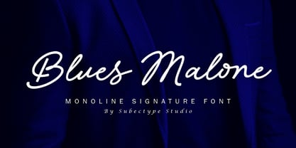 Blues Malone is a monoline signature font with an elegant style. It has good readability and is perfect for logos, invitations, wedding, signatures, Branding, clothing, headline, and much more! Blues Malone comes with ending swash alternate which will make your design more beautiful and elegant. I hope you enjoy this font. If you have any questions please don't hesitate to drop me a message :) Thank You, Subectype
 - Intima Politha by Attype Studio,
$15.00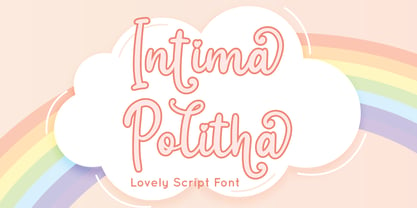 Intima Politha is a lovely script font with stylistic set and alternates. Fall in love with its incredibly versatile style and use it to create spectacular designs! Intima Politha is perfect for branding, logo, invitation, quotes, apparel design, product packaging, merchandise, game titles, cute style design, Book/Cover Title and more. What's Included : - Ending Swash - Multilingual Support --- Hope you enjoy with our font! Attype Studio
 - Redmarch by BaronWNM,
$12.00 Redmarch is a monoline script font that gives a natural-looking impression that is perfect for those of you who want to use a signature font. Redmarch is very suitable for branding, advertising, name cards, product labels, printing t-shirts, greeting cards, invitation cards, etc. Redmarch has several ligatures, begining and anding swashes to give a sweet touch at the beginning and end of words.
 - Little Boy Blue by Hanoded,
$15.00 I believe it was Picasso who had a Blue Period between 1901 and 1904. It seems that I have one myself - really not comparing myself to Picasso btw… Recently I created Blue Sheep font and now this one: Little Boy Blue. Little Boy Blue is a very legible, easy-on-the-eye font for texts, books, covers and packaging. Comes with 50 shades of diacritics.
 - Bocadillo by Hanoded,
$22.00 A Bocadillo is a sandwich. I guess I was craving one when I had to name this font! Bocadillo is a sweet Brush script. It is all caps, but upper and lower case are different and like to mingle. It is an ideal font for product packaging, posters, book covers, postcards and big ‘I love you’ billboards. Comes with a generous helping of diacritics.
 - Chronic by PintassilgoPrints,
$24.00 Chronically strong, yet pacific. Chronically bold, yet friendly. This font was at first inspired by a HAP Grieshaber work and soon incorporated elements from pieces by Willem Sandberg, two astonishing artists who lived through two world wars. They had to struggle for freedom and consistently manifested, with words, works and actions, their absolute love of liberty. Both were chronically free. As this font intends to be.
 - Alchemila by Heyfonts,
$18.00 Alchemila "UNIQUE serif modern font" likely refers to a typeface that combines elements of traditional serif design with contemporary and distinctive features. Serif fonts have small lines or strokes attached to the ends of characters, which can contribute to a more formal or traditional appearance. The term "modern" in this context typically implies a contemporary or updated style. Here's an explanation of the characteristics and significance of a UNIQUE serif modern font: -Serif Elements: Serifs are the small lines or strokes at the ends of characters, and they are a hallmark of traditional typography. In a UNIQUE serif modern font, these serif elements are likely to be present but may have a distinctive shape or style that sets them apart from more conventional serif fonts. -Contemporary Design: The "modern" aspect of the font suggests a contemporary or updated design. This may involve a departure from the more classical serif styles seen in traditional typefaces, incorporating modern design principles, cleaner lines, and a more minimalist aesthetic. -Distinctive Characters: A UNIQUE serif modern font is likely to feature characters with unique and individual design elements. This could include unconventional serifs, letter shapes, or other stylistic details that make the font stand out and contribute to its uniqueness. -Versatility: While serif fonts are often associated with formality and readability, a UNIQUE serif modern font may offer versatility suitable for a range of design applications. It could be used in both traditional and modern contexts, providing flexibility for various design projects. -Applicability to Branding: Fonts play a crucial role in branding, and a UNIQUE serif modern font could be an excellent choice for businesses or projects that want to convey a sense of tradition and reliability while maintaining a contemporary and innovative image. -Digital and Print Design: Modern serif fonts are often designed with both digital and print applications in mind. The clarity of the typeface, even at smaller sizes, and its aesthetic appeal make it suitable for a variety of design projects, from websites and apps to print materials like brochures and posters. -Attention to Detail: The uniqueness of the font may be reflected in the careful attention to detail in each character. This could include refined curves, balanced proportions, and other design elements that contribute to the overall visual appeal and readability of the font. -Available Features: Unique serif modern fonts may come with additional features, such as alternative characters, ligatures, or stylistic sets, allowing designers to customize the appearance of the text for specific design needs. When selecting or working with a UNIQUE serif modern font, designers should consider the overall design goals, the intended audience, and the context in which the font will be used
 - P22 Parrish by P22 Type Foundry,
$24.95 Maxfield Parrish (1870-1966), whose career spanned nearly ninety years, holds a unique place in American art and culture. He was enormously accomplished and successful in both fine art and commercial endeavors. Parrish's hand-drawn letters were a significant part of his works, which bridged the familiar with a startling otherworldliness. P22 has created the Parrish font set in cooperation with the National Museum of American Illustration.
 - Kingfish by Fype Co,
$16.00 Kingfish is a perfectly playful display font with sweet ligatures. Inspired by hand lettering marker pen with bold, thick and strong style. The unique characteristics of kingfish make it suitable for logotype, packaging, branding, heading, poster, apparel, title, and more kids content. With a set of ligature characters make your have many choices to be creative. It brings joyful and happiness to all of us.
 - Hall Of Fun by Konstantine Studio,
$15.00 Hall of Fun, a fast dry brush handwriting script font, comes out with clean and brush version to fit for your needs. Included the Stylistic Alternates for every letters and Ligatures to seamlessly handwriting feels. Straight from the hands and will be a perfect pair for fashion branding, logo, social media marketing, presentation, vintage products, make yourself standout with the Hall of Fun right away!
 - August Cameron by Agniardi,
$15.00 August Cameron is a signature font with beautiful curves and alternate characters. A style that we choose was the natural look hand made, unique identity. South Portland also comes with alternative characters that are carefully created for adding a minimalist decor of the letters. Stylistic alternates allows versatile design options and works perfectly for Headlines, Posters, Logos Packaging, Branding, T-shirts, Greetings, Presentations and much more.
 - Woodrow by Chank,
$49.00If Mister Frisky is a bit too kooky for your project, try Woodrow. The big floppy serifs and hand-drawn strokes give this font very "Chanky" characteristics. Woodrow is bold, bouncy, fun and legible like Mister Frisky, but it is also a little more traditional and structured. Chank created Woodrow in 1997. It was named in honor of The Chank Company's first office assistant, Scott "Woodrow" Macdonald. - The Mordent by Ironbird Creative,
$15.00 The Mordent is a hand drawn display typeface with organic and vintage feel. Comes with regular, stamp and dingbats styles. Suitable for any graphic designs such as branding materials, t-shirt, print, logo, poster, t-shirt, quotes .etc We hope you enjoy the font, please feel free to comment if you have any thoughts or feedback. Thanks for purchasing and have fun! Regards, Ironbird Creative
 - Blinks High by Reyrey Blue Std,
$12.00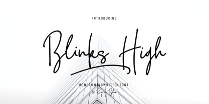 Blink High Signature Script is a beautiful handwriting font based on authentic hand writing with natural signature style. Blink High Signature Script is perfect for branding projects, logo, wedding designs, social media posts, advertisements, product packaging, product designs, label, photography, watermark, invitation, stationery and any projects that need handwriting taste. Features : · All Uppercase and Lowercase · Number & Symbol · Supported Languages · Alternates and Ligatures · PUA Encoded
 - Brosley by RCKY Studio,
$18.00 Brosley is a beautiful hand-painted font, a contemporary approach to design and unique in each letter. Suitable for use in title designs such as clothing, invitations, book titles, stationery designs, quotes, branding, logos, greeting cards, T-shirts, packaging designs, posters, and more. Brosley contains a complete set of lowercase, uppercase, alternative, binder, punctuation, numbers, and multi-lingual support. Thank you for your purchase!
 - Macarons by Latinotype,
$35.00 The Macarons font family consists of a monoline version, regular and bold weights, and a set of gestural catchwords, which reflects the use of the ruling pen as a freestyle tool. Ornaments and dingbats are also included. Macarons is a display type based on the classic Garamond typeface. It’s inspired by the foodie culture and the slow food movement, which began as a rebellion against fast food and has now grown to a global scale. Every day, thousands of people around the world take pictures of their food, look for new recipes to try and recover old ones, enjoy wine-pairing, and value locally produced food. Macarons is a fresh and spontaneous looking typeface that has been designed by Coto Mendoza, who also has developed a hand-made product line (Ride my Bike, Ride my Bike Serif, Four Seasons, D.I.Y. Time, Dans le Cuisine and In a Jar). This font is not constructed out of modules: each character is drawn by hand. Macarons is ideal for cookbooks, menus, liquor bottle labels, food packaging, wedding invitations, greeting cards, tea boxes, food blogs, small shops, cupcake bakeries and so on. Try! A freshly-baked homemade macaron!
 - Yoshinta by Suza Studio,
$15.00 Yoshinta Script Font Duo is a new modern script font with an irregular base line. Trendy and feminine style. Yoshinta Script looks beautiful in wedding invitations, thank you cards, quotes, greeting cards, logos, business cards, and more. Perfect for use in ink or watercolours. Including beginning and end letters, alternatives and support for many languages. To enable the OpenType Stylistic alternative, you need a program that supports OpenType features such as Adobe Illustrator CS, Adobe Indesign & CorelDraw X6-X7, Microsoft Word 2010 or newer versions. There are several additional ways to access alternatives / swashes, using Character Maps (Windows), Nexus Fonts (Windows), Font Books (Mac) or software programs such as PopChar (for Windows and Mac).
 - Aceituna by Hanoded,
$15.00 Aceituna means ‘olive’ in Spanish. It comes from the Arabic Al-Zeitoun. I am multi-tasking today: finishing this font and thinking about what to cook for my family tonight (yes, I am the one who cooks!). We normally eat Asian food, but I was toying with the idea of serving something Mediterranean and realised we had run out of olives. So there you have it: the super simple trick of naming a new font! But enough of cooking: Aceituna font was made with a Japanese brush pen. It is a very versatile font: tall and thin, elegant and a little messy. A hint of texture and, like olives, it goes with almost anything.
 - Hantu Tail by Attype Studio,
$18.00 Hantu Tail is a delicate and incredibly distinct Halloween Script Font. Fall in love with its incredibly versatile style and use it to create spectacular designs! Hantu Tail perfect for halloween promotion, branding, logo, invitation, stationery, social media post, product packaging, merchandise, blog design, game titles, cute style design, Book/Cover Title and more. What's Included : - Hantu Tail Family Font - ligatures - Ending Swash - Multilingual, US Roman, Latin 1 Support --- Hope you enjoy with our font! Attype Studio
 - Kabouter by Hanoded,
$15.00 Kabouter (kaːˈbɑu̯.tər) means ‘gnome’ in Dutch. I have no particular love for gnomes (even though I have a font called Garden Gnome…), but this font had a fairytale feeling to it and the name looked good. Kabouter is a happy display font. It is fun, bouncy and quirky. Use it for your book covers, toy-packaging and home made apple sauce labels. Besides that, you now know how to say gnome in Dutch, which will leave your friends astounded! ;-)
 - Glowing Brush by FadeLine Studio,
$15.00 Glowing Brush is a natural and beautiful brush-lettered font, a calligraphy style with decorative end characters and a dancing baseline! This font is perfect for use in ink or watercolor based designs that produce natural handwriting. With a style like this, this font will be suitable in use for logos, branding projects, homeware designs, product packaging, mugs, quotes, posters, shopping bags, t-shirts, book covers, name cards, invitations, greeting cards, and all your other lovely projects.
 - Apple Pie by FontMesa,
$25.00 You might call this a Bodoni Ornate font that Bodoni never made, close examination of this old 1800s font and it's plain to see that the top half of the letters is very Bodoni in appearance. Apple Pie is a revival of and old font from the William Hagar Type Foundry, which I've been able to date back to 1850. The William Hagar type specimen book from the 1850s only shows this font as a caps only typeface plus numbers, later in 1869 MacKellar Smiths and Jordan offered this font with a lowercase. Over a two year period I was able to collect enough letters to begin production of this old decorative font, the type specimen books only showed a small line of text for this font so I would search through old documents on eBay and also shows relating to Ephemera. I could have easily developed a new font based on a very small sample of letters but I wanted to wait and find as many letters as possible, I was unable to find the Q, X, Z and ten lowercase letters so those missing letters are of my own design. New to this font is the addition of an all Caps Greek character set, accented letters for Eastern Central and Western European countries is also within this font. Fill fonts are available for the Apple Pie font, you will need an application that works in layers such as Adobe Photoshop, Adobe Illustrator or Corel Graphics in order to use the Fill fonts. Some Fill fonts may be used as stand alone fonts but the versions for Apple Pie look best when layered behind the parent or main Apple Pie fonts. Be sure to check out the left and right hands located on the Less Than and Greater Than keys.
 - Prored by Tour De Force,
$25.00 Prored is an avantgarde sans serif typeface that contains 5 weights – Light, Regular, Bold, ExtraBold and Black. It is small and compact font family with own characteristic expression, constructed to be safe choice for all kinds of typographic tasks. With specific curved endings that are adhered on baseline, Prored includes tiny note of singularity – just enough to make it’s own identity recognizable and catchy. Taller x-height gives an afterimage of a bit narrowed look, but with rational proportions and well balanced weights, 5 of them are really sufficient and capable to handle extreme typographic issues. Especially charming is Black which can be used also as display typeface in situations where elegant solutions are required in combination with stronger visibility. Beside Central Europe, Prored also contains glyphs for Turkish and Baltic languages. Highly neutral impression recommends Prored as an excellent choice for branding campaigns or new identities. Recommended for use in: branding campaigns, identities, editorial publications, packages, web design, as web font and many more.
 - Sonata Allegro by Tamar Fonts,
$35.00 “The Emperor Has Clothes” Like in music — the Allegro Sonata form consists of three main sections—the Exposition (section), the Development, and the Recapitulation — so in regard to this Allegro Sonata font family — there is an Exposition (font), a Development, and a Recapitulation—in which each theme is restated alongside its development material. While the Recapitulation font is perfect for titling and branding, the Exposition is perfect for branding {as demonstrated in the Inspiration Gallery pertaining this font} as well as being a comfortable read in long runs of text. The Exposition rounded, mono-line, with great x height, contemporary—A Synthesis Between Geometric & Hand-drawn—font, is at times geometric and at times hand drawn; in the end it all came down to finding the balance in a typeface between the robustness needed to function as a text face and enough refinement to look good as a display font. Following the Exposition, comes the Development (section), decorative, botanic-like, exuberant and playful font, signifying ABUNDANCE [of possibilities] & BENEVOLENCE—in regard to each theme/character, and to demonstrate—that 'structures' in music, are solid structures—like architecture {contrary to the words of J. W. von Goethe, who said: “Music is liquid architecture; Architecture is frozen music”}, just in some spiritual domain that is far beyond one's physical senses to grasp. Like in my art and music works in which I consider its 'Texture' element of vital importance, so is the case when it comes to type, as apparent in my previous Phone Pro/Polyphony font, as well as in this current Sonata Allegro/Development font. Each glyph has its own uniqueness, and when meeting with others, will provide dynamic and pleasing proximity. And due to the [individualistic] nature of this Development font, just a minimal amount of kerning/pairing were necessary... The development font is an extravagant design that looks best when used at large sizes—perfect for titling, logo, product packaging, branding project, wedding, or just used to express words against some [light or dark] background. Finally, “The (Exposition Font) Emperor Has (the Development Font) Clothes!” As said, there are three fonts/styles altogether in this Sonata Allegro type family, designed with the intention of harmonizing between Latin and Hebrew, which makes it an ideal font for the side-by-side use of Latin and Hebrew characters. However, they are being sold separately (kindly search for “Sonata Allegro Hebrew” on this MyFonts site), so they are economical for those interested just in either one of them. My aim is to shake up the type-design world with a range of distinctive fonts which break away from the generic letterforms, to make your design projects stand out—as a graphic designer, add this font to your most creative ideas for projects. This typeface has [lots of ligatures /] OpenType features, to enhance your designs even more — happy designing! Sonata Allegro Features: · 3 Weights/Styles · Multilingual Support · Proportional Figures & Ligatures While using this product, if you encounter any problem or spot something we may have missed, please don't hesitate to write to us; we would love to hear your feedback—in order to further fine-tune our products. Copyright Tamar Fonts/Hillel Glueck 2022 ALL RIGHTS RESERVED Any unauthorized distribution of my work is strictly prohibited, and will be prosecuted; do the right thing, and do not participate in the piracy of my typefaces; if you appreciate my work, then please pay for it and help me prosper — thank you!
 - Sonata Allegro Hebrew by Tamar Fonts,
$35.00 “The Emperor Has Clothes” Like in music — the Allegro Sonata form consists of three main sections—the Exposition (section), the Development, and the Recapitulation — so in regard to this Allegro Sonata font family — there is an Exposition (font), a Development, and a Recapitulation—in which each theme is restated alongside its development material. While the Recapitulation font is perfect for titling and branding, the Exposition is perfect for branding {as demonstrated in the Inspiration Gallery pertaining this font} as well as being a comfortable read in long runs of text. The Exposition rounded, mono-line, with great x height, contemporary—A Synthesis Between Geometric & Hand-drawn—font, is at times geometric and at times hand drawn; in the end it all came down to finding the balance in a typeface between the robustness needed to function as a text face and enough refinement to look good as a display font. Following the Exposition, comes the Development (section), decorative, botanic-like, exuberant and playful font, signifying ABUNDANCE [of possibilities] & BENEVOLENCE—in regard to each theme/character, and to demonstrate—that 'structures' in music, are solid structures—like architecture {contrary to the words of J. W. von Goethe, who said: “Music is liquid architecture; Architecture is frozen music”}, just in some spiritual domain that is far beyond one's physical senses to grasp. Like in my art and music works in which I consider its 'Texture' element of vital importance, so is the case when it comes to type, as apparent in my previous Phone Pro/Polyphony font, as well as in this current Sonata Allegro/Development font. Each glyph has its own uniqueness, and when meeting with others, will provide dynamic and pleasing proximity. And due to the [individualistic] nature of this Development font, just a minimal amount of kerning/pairing were necessary... The development font is an extravagant design that looks best when used at large sizes—perfect for titling, logo, product packaging, branding project, wedding, or just used to express words against some [light or dark] background. Finally, “The (Exposition Font) Emperor Has (the Development Font) Clothes!” As said, there are three fonts/styles altogether in this Sonata Allegro type family, designed with the intention of harmonizing between Latin and Hebrew, which makes it an ideal font for the side-by-side use of Latin and Hebrew characters. However, they are being sold separately (kindly search for “Sonata Allegro Hebrew” on this MyFonts site), so they are economical for those interested just in either one of them. My aim is to shake up the type-design world with a range of distinctive fonts which break away from the generic letterforms, to make your design projects stand out—as a graphic designer, add this font to your most creative ideas for projects. This typeface has [lots of ligatures /] OpenType features, to enhance your designs even more — happy designing! Sonata Allegro Features: · 3 Weights/Styles · Multilingual Support · Proportional Figures & Ligatures While using this product, if you encounter any problem or spot something we may have missed, please don't hesitate to write to us; we would love to hear your feedback—in order to further fine-tune our products. Copyright Tamar Fonts/Hillel Glueck 2022 ALL RIGHTS RESERVED Any unauthorized distribution of my work is strictly prohibited, and will be prosecuted; do the right thing, and do not participate in the piracy of my typefaces; if you appreciate my work, then please pay for it and help me prosper — thank you!
 - Intervensi by Arendxstudio,
$18.00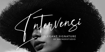 Intervensi is an elegant, hand drawn signature font, perfect for wedding card design, logotype, website headers, fashion design and much more. Features : • Character Set A-Z • Numerals & Punctuations (OpenType Standard) • Accents (Multilingual characters) • Swash
 - Splinters JNL by Jeff Levine,
$29.00Splinters JNL is a fun, hand-drawn font emulating letters formed from pieces of wood. Use at larger point sizes for best results. Please note: There is no kerning and a limited character set.