10,000 search results
(0.042 seconds)
- Bertham by Ascender,
$29.99 Bertham Pro Family (4 fonts) is a revival of Frederic W. Goudy’s Bertham typeface. Steve Matteson produced this unique typeface and added bold, italic and openface styles. The fonts include a variety of OpenType features including swash capitals, small capitals and old style figures. It is unmistakably American in appearance recalling a day of quality craftsmanship and hard work. Publishing, branding and packaging materials will draw inspired attention due to its grace and distinctive appearance.
 - Spektra by Type Salon,
$35.00 Spektra is a multi-script type family that combines 5 scripts: Latin, Cyrillic, Arabic, Greek and Hebrew. It is a variable font - ranging from backslant to italic axis. Its condensed and black shapes are combining the same style concept throughout every script. Progressive shapes contribute to expressing statements on bigger mediums. Spektra combines different locations, cultures and ideas as statements around the world and celebrates the differences among them. Awards • Modern Cyrillic 2021
 - Kahlo by Latinotype,
$25.00 Kahlo is a latin-style hipster type family. It's a formal and elegant option for designers. The family has four weights and italics, initial capital letters, and some alternate characters. This typeface is most suitable for magazine headlines, posters, logos, cosmetics packaging, advertising etc. Photography by Damien Vignaux (www.elroy.fr) Languages include: Basic Latin, Western European, Euro, Catalan, Baltic, Turkish, Central European, Romanian and Pan Africa Latin. Kahlo is a renaming of Frida.
 - Gutreks by Maulana Creative,
$15.00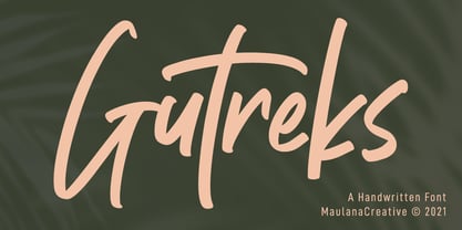 Gutreks is a handwritten feel font. With marker stroke, italic and fun character with a bit of ligatures. To give you an extra creative work. Gutreks font support multilingual more than 100+ language. This font is good for logo design, Social media, Movie Titles, Books Titles, a short text even a long text letter and good for your secondary text font with sans or serif. Make a stunning work with Gutreks font. Cheers, MaulanaCreative
 - Troia by Ahmet Altun,
$10.00 Troia Font Family comes in three weights; normal and italic. In addition, with rounded corners, each weight has its own smoother version. Thanks to its large letters and added spaces between the letters, this font can be used to get perfect results and create great works such as web typography, banners, logos, texts, t-shirts and printings, and also presentations. Troia's eye-pleasing and nice-looking style makes writing much more pleasant.
 - Magis by Showup! Typefoundry,
$35.00 Magis® is a modern sans serif with a geometric touch. It comes in 18 weights, 9 uprights, matching italics, and variable font. Magis® bringing energy and making it suitable for modern design. Designed with powerful OpenType features in mind. Each weight includes extended language support (+ Cyrillic), arrows, ligatures, and more. Perfectly suited for graphic design and any display use. It could easily work for web, signage, corporate as well as editorial design.
 - Exorts Compressed by Seventh Imperium,
$15.00 Exorts Compressed is a display font family. This square condensed sans is designed with an increased cap character and tight kerning to give the ability create the large and bold typography. It is made specifically for editorial design, headlines, posters, magazines, clothing and other purpose printed material. The family comes in weight from extra light to extra bold and have italic version of each weight. Features include: OpenType stylistic sets, ligature, and Multiple Language Support.
 - Astoria Classic by Alan Meeks,
$45.00 The latest addition to the Astoria Range, Astoria Classic has the same basic characteristics as Astoria but with vertical stress. The characteristic subtle top left serif which makes it not quite a Roman and not quite a sans has been retained. Unlike Astoria, the Italics in form are old style yet have a modern look. This is designed specifically as a text face, however it still works very well as a headline font.
 - Sabu by Larin Type Co,
$16.00 Sabu is multitasking, modern sans-serif font family, and a great solution for anyone your project. It includes upright and Italic style, each of them has weight weights from thin to extra bold. This is a multi-purpose one that is perfect for big and small text, it is constructed modern and easy to read. With it, you can create logos, banners, use in advertising, packaging, books covers and magazines, headings, descriptions and much more.
 - Qe Laurenty by Hishand Studio,
$15.00 The newly released Qe Laurenty sans serif font exudes an air of timeless sophistication and elegance. Its clean lines and precise geometry make it a truly classy choice for any design project. Qe Laurenty's refined curves and delicate letterforms add a touch of luxury to any typographic composition. This font's exquisite detailing and balanced proportions make it perfect for creating elegant branding materials. Complete with ligatures alternates regular italic icon kerning multilingual support
 - Graviola by Harbor Type,
$30.00🏆 Selected for Tipos Latinos 7 with a Certificate of Excellence. With semi-rounded terminals, Graviola is soft and friendly. The family consists of 16 fonts, from Thin to Black and matching italics. While the intermediate ones are suited for body text, the extreme weights look specially beautiful at display sizes. Each font contains 530+ glyphs, supporting more than 90 languages. Stylistic sets provide alternates in two groupings (a, v, w, y and G, g, &). - Ponzu by Mint Type,
$40.00 Ponzu is an elegant stencil-style display sans-serif. Its shape is defined by the sharp endings created by stems that vanish in infinite contrast. It is a hybrid typeface that features beautiful terminals typical for serif fonts. It is perfect for display use in editorial, branding, posters, screen applications etc. Ponzu comes in 9 weights each with complimentary stylish italics. Each style supports multiple languages including Cyrillic script and is packed with OpenType features.
 - JHC Audemars by Jehoo Creative,
$20.00 Presenting JHC Audemars, an impeccably crafted condensed serif font exuding a resolute and refined character. Distinguished by its unique inverted letter shapes, this font embraces an avant-garde aesthetic. Boasting a comprehensive range of weights from Thin to Black, along with an elegant italic style, JHC Audemars ensures versatile application in various design contexts. Ideal for sophisticated branding and editorial endeavors, this font effortlessly merges strength with sophistication, delivering a commanding and memorable typographic presence.
 - Recht by Mint Type,
$32.00 Recht is a geometric sans with much attention to curvature compensations, classifying between classic geometric sans-serif typefaces and neo-grotesques. The family contains 10 weights with corresponding italics, Cyrillic script with inclusion of Ukrainian Cyrillic, and a bunch of OpenType features. Recht has a closed aperture and is extremely versatile, working exceptionally well in both headlines and long text paragraphs. You can use stylistic sets for added geometric or humanist flavour.
 - Levino by Punch,
$39.00 Levino is an italic font family which comes in 9 weights (and/or Variable). The light weights have an elegant look, the middle weights are perfect for texts like menus, copywriting & product descriptions, where the bolder weights create an inviting, prominent statement. Regardless of its classic characteristics, we believe Levino can be a great addition to modern design as well! Try out the several OpenType features and don't forget to download your free demo copy!
 - Valdo by Larin Type Co,
$16.00 Valdo is an elegant and contrast serif font family, and a great fashionable solution for your project. It includes upright and Italic style, each of them has eight weights from thin to extrabold. This is a multi-purpose and classic font that is perfect for fashion project, it is contrasted, modern and easy to read. With it, you can create logos, banners, use in advertising, packaging, book covers and magazines, headings, descriptions and much more.
 - Mr Eaves Modern by Emigre,
$59.00 Mr Eaves is the often requested and finally finished sans-serif companion to Mrs Eaves, one of Emigre’s classic typeface designs. Created by Zuzana Licko, this 2009 addition to the Emigre Type Library expands the versatility of the original Mrs Eaves with two complimentary families: Mr Eaves Sans and Mr Eaves Modern. Mr Eaves was based on the proportions of Mrs Eaves, but Licko took some liberty with its design. One of the main concerns was to avoid creating a typeface that looked like it simply had its serifs cut off. And while it matches Mrs Eaves in weight, color, and armature, Mr Eaves stands as its own typeface with many unique characteristics. The Sans version relates most directly to the original serif version, noticeably in the roman lower case letters a, e, and g, as well as in subtle details such as the angled lead in strokes, the counter forms of the b, d, p, and q, and the flared leg of the capital R, the tail of the Q. The distinctly loose-fitting letter spacing of Mrs Eaves was applied also to the Sans version. This, together with generous built-in line spacing due to a small x-height and extended ascenders and descenders, renders the same kind of lightness and airiness when setting text that is so characteristic of Mrs Eaves. Deviations from the original Mrs Eaves are evident in the overall decrease of contrast, as well as in details such as the flag and tail of the f and j, and the finial of the t, which were shortened to maintain a cleaner, sans serif look. And the lower case c had to be balanced out differently after it lost its top ball terminal. And with the loss of serifs, Mr Eaves set width is slightly narrower. Mr Eaves Italic also carries over many forms from its Mrs Eaves model, most notably the v, w, and z, which are unusually flamboyant for a sans italic design. It also utilizes lead in and terminal tails that are reminiscent of the serif italic. The biggest departure here is the width of the characters. The extra narrow gauge and delicate features seemed more appropriate for the Serif than the Sans. To allow for a comfortable fit, Mr Eaves Italic has a more robust design and wider character width. Meanwhile, the Modern family provides an overall less humanistic look, with simpler and more geometric-looking shapes, most noticeably in the squared-off terminals and symmetric lower case counters. This family has moved furthest from its roots, yet still contains some of Mrs Eaves’ DNA. The Modern Italic is free of tails, and overall the Modern exhibits more repetition of forms, projecting a cleaner look. This provides stronger differentiation from the serif version whenever a more contrasting look is desired. Each version (Sans and Modern) contains its own set of alternates providing unique options for applications such as headlines, word logos, letterheads, pull quotes, and other short text settings. Both the Sans and Modern come in six weights. The simpler forms of a sans-serif provide the opportunity of more weights than do serif letter forms, which are more complex in structure, making it difficult to accommodate additional weight without distortions. Regular and Bold match the original Mrs Eaves weights, while the Heavy provides an additional weight for extra emphasis.
 - Mr Eaves Sans by Emigre,
$59.00 Mr Eaves is the sans-serif companion to Mrs Eaves, one of Emigre’s classic typeface designs. Created by Zuzana Licko, this 2009 addition to the Emigre Type Library expands the versatility of the original Mrs Eaves with two complementary families: Mr Eaves Sans and Mr Eaves Modern. Mr Eaves was based on the proportions of Mrs Eaves, but Licko took some liberty with its design. One of the main concerns was to avoid creating a typeface that looked like it simply had its serifs cut off. And while it matches Mrs Eaves in weight, color, and armature, Mr Eaves stands as its own typeface with many unique characteristics. The Sans version relates most directly to the original serif version, noticeably in the roman lower case letters a, e, and g, as well as in subtle details such as the angled lead in strokes, the counter forms of the b, d, p, and q, and the flared leg of the capital R, the tail of the Q. The distinctly loose-fitting letter spacing of Mrs Eaves was applied also to the Sans version. This, together with generous built-in line spacing due to a small x-height and extended ascenders and descenders, renders the same kind of lightness and airiness when setting text that is so characteristic of Mrs Eaves. Deviations from the original Mrs Eaves are evident in the overall decrease of contrast, as well as in details such as the flag and tail of the f and j, and the finial of the t, which were shortened to maintain a cleaner, sans serif look. And the lower case c had to be balanced out differently after it lost its top ball terminal. And with the loss of serifs, Mr Eaves set width is slightly narrower. Mr Eaves Italic also carries over many forms from its Mrs Eaves model, most notably the v, w, and z, which are unusually flamboyant for a sans italic design. It also utilizes lead in and terminal tails that are reminiscent of the serif italic. The biggest departure here is the width of the characters. The extra narrow gauge and delicate features seemed more appropriate for the Serif than the Sans. To allow for a comfortable fit, Mr Eaves Italic has a more robust design and wider character width. Meanwhile, the Modern family provides an overall less humanistic look, with simpler and more geometric-looking shapes, most noticeably in the squared-off terminals and symmetric lower case counters. This family has moved furthest from its roots, yet still contains some of Mrs Eaves' DNA. The Modern Italic is free of tails, and overall the Modern exhibits more repetition of forms, projecting a cleaner look. This provides stronger differentiation from the serif version whenever a more contrasting look is desired. Each version (Sans and Modern) contains its own set of alternates providing unique options for applications such as headlines, word logos, letterheads, pull quotes, and other short text settings. Both the Sans and Modern come in three weights. The simpler forms of a sans-serif provide the opportunity of more weights than do serif letter forms, which are more complex in structure, making it difficult to accommodate additional weight without distortions. Regular and Bold match the original Mrs Eaves weights, while the Heavy provides an additional weight for extra emphasis.
 - Binate by Monotype,
$49.99 Binate provides a smart and adaptable solution for the modern creative. Designed with functionality at its core, Binate offers a synergetic blend of neutrality and expression — all within a contemporary superfamily. Binate combines the characteristics of a workhorse sans serif and an elegant brush-inspired display style. The Binate family delivers a wide variety of possibilities and combinations for designers with its vast range of weights from Hairline to Black. Built for purpose, Binate offers designers a diverse spectrum of expression, as Binate is as comfortable in the tiny details on packaging as it is in large formats like billboards and posters. Binate’s apertures present a crisp and rigid style that evoke a utilitarian design, yet experimenting with some of Binate’s lower hooks can offer a more approachable and friendly demeanor. All of Binate's companions — like its Italics — can unlock new layers of creativity and tone of voice, and they all feel at home on both digital and print mediums. Binate encourages you to experiment with its impressive weight ranges and arms you with ample tools to refine and tweak endlessly.
 - Someri by Arabetics,
$39.00 Someri (English: Sumerian) is an Arabetic type design with a Cuneiform spirit. The Someri family follows the guidelines of the Mutamathil Taqlidi type style. It has one glyph for every basic Arabic Unicode character or letter, as defined in Unicode Standards version 5.1, and one additional, final-position, glyph for each Arabic letter that is normally connected with other letters from both sides in traditional cursive Arabic strings. Someri employs variable x-height values. It includes all required Lam-Alif ligatures and uses ligature substitutions and selected marks positioning but it does not use any other glyph substitutions or forming. Text strings composed using types of this family are non-cursive with stand-alone isolated glyphs. Tatweel (or Kashida) glyph is a zero width space. Keying it before any glyph will display that glyph isolated form. Keying it before Alif Lam Lam Ha will display the Allah ligature. Someri family includes both Arabic and Arabic-Indic numerals; all required diacritic marks, Allah ligature, in addition to all standard English keyboard punctuations and major currency symbols. Fonts are available in regular and italic styles.
 - Ouster Sans by Skinny Type,
$15.00 Ouster Sans offers various options for creating logos, titles and titles. Great for books, editorial, packaging, advertising, branding and more. A modern sans serif font with a vintage touch, giving users the freedom to create compositions. Ouster Sans includes a Collection of Uppercase Letters, Styles, Latin Based Language Support, Numbers and Punctuation. Style Sets are available in Lowercase to Uppercase. Ouster Sans Also Included in 12 different weight and italic font file styles Ouster Sans is coded with PUA Unicode, which allows access to all features without special design software. Mac users can use Font Book, and Windows users can use Character Map to view and copy additional characters to paste into your favorite text editor/app. How to access all alternative characters, using the Windows Character Map with Photoshop: https://www.youtube.com/watch?v=Go9vacoYmBw How to access all alternative characters using Adobe Illustrator: http://youtu.be/iptSFA7feQ0nn feel free to message me if you have any issues or questions :) If you need any help or have any questions let me know or send an email. I'm happy to help :) Thanks & Happy Designing!
 - Silsilah by Arabetics,
$39.00 The Silsilah family follows the guidelines of the Mutamathil Taqlidi type style. It has one glyph for every basic Arabic Unicode character or letter, as defined in Unicode Standards version 5.1, and one additional, final-position, glyph for each Arabic letter that is normally connected with other letters from both sides in traditional cursive Arabic strings. Silsilah employs variable x-height values. It includes all required Lam-Alif ligatures and uses ligature substitutions and selected marks positioning but it does not use any other glyph substitutions or forming. Text strings composed using types of this family are non-cursive with stand-alone isolated glyphs. Tatweel (or Kashida) glyph is a zero width space. Keying it before any glyph will display that glyph isolated form. Keying it before Alif Lam Lam Ha will display the Allah ligature. Silsilah family includes both Arabic and Arabic-Indic numerals; all required diacritic marks, Allah ligature, in addition to all standard English keyboard punctuations and major currency symbols. Fonts are available in regular and italic styles.
 - Braly Latoya by Ws Studio,
$15.00 Braly latoya Script is an elegant calligraphy font, including Regular and Italic. This font is casual and pretty with a doodle. Can be used for various purposes. such as logos, product packaging, wedding invitations, branding, headlines, signage, labels, signatures, book covers, posters, quotes, and others. The Braly latoya script featuring an alternative to OpenType styles, binders and International support for most Western Languages is included. To enable OpenType Stylistic alternates, you need a program that supports OpenType features such as Adobe Illustrator CS, Adobe Indesign & CorelDraw X6-X7, Microsoft Word 2010 or a later version. How to access all alternative characters using Adobe Illustrator: Braly latoya Script is coded with PUA Unicode, which allows full access to all additional characters without having to design special software. Mac users can use Font Book, and Windows users can use Character Map to view and copy any of the additional characters to paste into your favorite text editor / application. How to access all alternate characters, using the Windows Character Map with Photoshop:
 - Cenzo Flare by W Type Foundry,
$20.00 Cenzo Flare is a mixture of modern sans serif base with a touch of flare to it. The inspiration is drawn from all kinds of old Americana advertising, Italian posters, old century logos and signs. All that plus the strong trend on retro fonts now displayed on tv series and current music imagery results on Cenzo Flare. A typeface designed for headlines, posters, advertising and corporate identity. With its appealing curvy smooth edges it is sure to catch the eye. Also enjoy multiple styles that work on their own or as overlapping layers with the InLine & Line variants to create colorful designs. This 40 font family consists of four 5-weight subfamilies: Regular, InLine, Line & Condensed. All of them with matching italics. Designed with powerful opentype features, each weight includes alternate characters to play with, extended language support and many more. We’re proud to introduce: Cenzo Flare. Learn about upcoming releases, work in progress and get to know us better! On Instagram W Foundry On facebook W Foundry wtypefoundry.com
 - Nasrallah by Arabetics,
$39.00 The Nasrallah family follows the guidelines of the Mutamathil Taqlidi type style. It has one glyph for every basic Arabic Unicode character or letter, as defined in Unicode Standards version 5.1, and one additional, final-position, glyph for each Arabic letter that is normally connected with other letters from both sides in traditional cursive Arabic strings. Nasrallah employs variable x-height values. It includes all required Lam-Alif ligatures and uses ligature substitutions and selected marks positioning but it does not use any other glyph substitutions or forming. Text strings composed using types of this family are non-cursive with stand-alone isolated glyphs. Tatweel (or Kashida) glyph is a zero width space. Keying it before any glyph will display that glyph isolated form. Keying it before Alif Lam Lam Ha will display the Allah ligature. Nasrallah family includes both Arabic and Arabic-Indic numerals; all required diacritic marks, Allah ligature, in addition to all standard English keyboard punctuations and major currency symbols. Fonts are available in regular and italic styles.
 - Steelfish by Ray Larabie is a bold, dynamic typeface that captures the essence of modernity and strength. Its design is a tribute to the resilience and enduring power of steel, making it a favorite a...
- Macaw by Unio Creative Solutions,
$4.00 “Macaw” is a welcome addition to our library, a modern serif typeface with roots in classical typography. Its forms are sober and delicate in its lightest weights and as the width increases to the boldest, it unleashes a powerful and distinctive emphasis on your project. Developed in a range of four weights with a matching set of true italics, the design of Macaw takes its inspiration from the Italian newspaper market at the beginning of last the century, a time where roman typography was predominant. In fact, the main purpose of this typeface is to preserve versatility and legibility, to prescind from any text size. A multilanguage serif family with a unique fluidity to modern and classic projects. Particularly useful for any editorial need and seamlessly adaptable to any destination of use such as corporate identity, web design, and social feeds. Specifications: - Files included: Macaw Light, Macaw Regular, Macaw Medium, Macaw Bold with corresponding italics - Formats:.otf - Multi-language support (Central, Eastern, Western European languages) Thanks for viewing, Unio.
 - Fester by Fontfabric,
$150.00 Get inspired with Fester Behance presentation After several years of iterations, our brand new sans family of 16 styles is ready to take over with vector excellence! Fester is a semi-condensed Grotesque developed to beam big messages across the galaxy with a clear, bold voice. Emerging as if from the future, this low-contrast sans warps slick lines and sharp terminals into unexpected geometric shapes for extra flair. Ranging from Thin to Heavy, the typeface is loaded with 8 weights + italics, one variable style, over 760 glyphs, and Extended Latin + Cyrillic for flawless work at hyper-speed. Fester syncs with designs that feature big type, sharp layouts, interfaces, outlines, and raster images to help decipher any cutting-edge idea and make a memorable first contact. Family overview: 8 weights (from Thin to Heavy) + italics Extended Latin Cyrillic 760 glyphs Variable Font 1 free font - Fester-ExraLight 130+ languages OpenType Features: Localized Forms Subscript and scientific inferiors Superscript (Superiors) Numerators and Denominators Fractions Lining Figures Tabular Figures Oldstyle Figures Case-Sensitive Forms Standard and Discretionary Ligatures Stylistic Alternates Contextual Alternates Slashed Zero
 - Palo Slab by TypeUnion,
$30.00 Palo Slab is an epic font family made up of 9 weights in four widths, along with italic & oblique options to total a massive 108 styles. Using our 2020 release Palo as the base, the slab version began to take on its own life and personality to become a unique entity in its own right. From super punchy heavy weights to the delicate lighter weights, the Palo Slab super family is a versatile beast that offers you ultimate flexibility. The heavy weights ranging from Compressed Black to Wide Black are built with super tight spacing and love to be big and bold, so perfect for showing off your brand. The Italic styles add curves to the slab feel, providing a beautiful flow, but we've also included an oblique option if you want to use the blockier version. Palo Slab features extensive latin language support as well as OpenType features such as case sensitive punctuation, old style figures, scientific numbers and ligatures, + arrows. You can check out our 2020 release Palo here.
 - Bernhard Gothic SG by Spiece Graphics,
$39.00 This design is one of the true gems to come out of the 1930s typeface era. Even though the face was originally designed to counter the invasion of European sans-serifs, it remains faithful to the principles found in its creator's poster work. Lucian Bernhard's lettering creation for American Type Founders is to this day a favorite among font connoisseurs worldwide. It has a unique personality. This deluxe version is packed with extras including the original oldstyle figures, alternates, and ligatures. A number of styles and alternate characters have been added to the family such as heavy italics, extra heavy italics, and capital figures. And an easier-to-identify "flagged" figure one and the new euro symbol are now located in each individual style. Bernhard Gothic is also available in the OpenType Std format. Lining and oldstyle figures, stylistic alternates, and additional discretionary ligatures are now combined in each style. These advanced features currently work in Adobe Creative Suite InDesign, Creative Suite Illustrator, and Quark XPress 7. Check for OpenType advanced feature support in other applications as it gradually becomes available with upgrades.
 - Novel Sans Pro by Atlas Font Foundry,
$50.00 Novel Sans Pro is the humanist grotesque typeface family within the largely extended award winning Novel Collection, containing Novel Pro, Novel Sans Pro, Novel Sans Hair Pro, Novel Sans Condensed Pro, Novel Mono Pro, Novel Sans Rounded Pro and Novel Sans Office Pro. Novel Sans Pro has a carefully attuned character design and a well balanced weight contrast. Classic proportions and the almost upright italic makes Novel Sans Pro being a modern humanist with the calligraphic warmth of a real italic. Many similarities with the other typeface families within the Novel Collection enable designers to combine the families and reach highest quality in typography. Novel Sans Pro [1020 glyphs] comes in 6 weights and contains small caps, an extra set of alternate glyphs, many ligatures, lining figures [proportionally spaced and monospaced], hanging figures [proportionally spaced and monospaced], small caps figures [proportionally spaced and monospaced], positive and negative circled figures for upper and lower case, superior and inferior figures, fractions, extensive language support, arrows for uppercase and lowercase and many more OpenType™ features.
 - Margot by Eclectotype,
$36.00 Like a lovechild of American Typewriter and Cooper Black, typewritten in melted chocolate, this is Margot. A bold single weight display typeface in roman and italic styles, Margot is boisterous but cuddly; warm but impactful. Margot comes fully loaded with a bunch of esoteric dingbats (grouped in the ornament feature), four figure styles (proportional- and tabular- lining, and proportional- and tabular- oldstyle), a spattering of swash capitals (K, Q and R), stylistic alternates and one discretionary gi ligature in the Roman. Stylistic alternates are split into stylistic sets thus: SS01 - alternate forms for ampersand and asterisk, and # changes to an attractive numero symbol. SS02 - in the Roman, a and g change to single storey versions; in the italic, the ae digraph changes to a less ambiguous double storey version. SS03 - the lining figure 3 gets changed to its alternate form. SS04 - the lining figure 4 gets changed to its alternate form. Margot is perfect for friendly headlines, logos, T-shirts (I love New York, perhaps?), food packaging and videogame apps. Margot gets its name from my equally boisterous and cuddly cat. Enjoy!
 - Chinook by Unio Creative Solutions,
$9.00 Chinook has been designed as an homage to the iconic chunky look of the Italian movie titling from the 70s and 80s. Despite its vintage flair, our sturdy display font is perfectly adaptable for any contemporary context with its balanced and soft text typesetting. This project is obviously influenced by the everlasting classic "Cooper Black", but includes more modern letter shapes, with rounded serifs and a fluffy overall appearance. Chinook, includes a customized italic set, features an extended charset covering several languages based on the Latin Alphabet, and sports a complete set of Open type features. It's equipped with swashes, alternates as well as discretionary ligatures, old-style figures, subscript and superscript numerals, and even more special glyphs. The heavy appearance makes this font ideal for high-impact design, such as headlines, titling, branding, and logotype. Specifications: - Files included: Chinook, including Italic - Multi-language support (Central, Eastern, Western European languages) - OpenType Features (Superscript and Subscript Numerals, Fractions, Oldstyle figures, Stylistic Alternates, Discretionary Ligatures, Swashes) Thanks for viewing, Unio.
 - Fabrizio by ARTypes,
$60.00 The new Fabrizio™ types, designed by Ari Rafaeli, have made their first appearance in Saggi di Letteratura Italiana: Da Dante per Pirandello a Orazio Costa, by Lucilla Bonavita, printed at Pisa in March 2016 by Fabrizio Serra Editore for whom the type was specially designed. The types are now offered for general sale. Each style (roman, small capitals, italic, semi-bold, bold) contains Cyrillic and ‘polytonic’ Greek letters and letters for many European languages (Czech, Hungarian, Icelandic, Lettish, Polish, Romanian, Serbian, Ukrainian, Welsh etc.), non-kerning fs, long ſ, ligatures and fractions. Alternative forms are supplied in ‘B’ versions of each style. A set of swash letters and sets of superiors, inferiors, fractions and phonetic letters are also offered. Two ‘Special’ fonts (roman and italic) containing special accents, letters for transliteration, Vietnamese letters, mathematics signs and symbols, arrows, commercial signs, pictograms, figures in circles, scansion marks, braces & benzene rings and the Rafaeli-Meruba Hebrew letters, as well as Latin, Cyrillic and Greek letters, are included in the Fabrizio family.
 - Adriane Text by Typefolio,
$49.00 Adriane Text was designed between 2006 and 2007 with additional production completed by Silas Dilworth for this 2008 release [v1.002]. Focusing on text composition and unique typographic characteristics, details within the characters provide both personality and excellent legibility at small sizes. With a medium contrast, a predominantly vertical axis, and a generous x-height, it can be classified as a transitional typeface. This package of advanced OpenType fonts consists of the style-linked quartet of Regular and Bold weights accompanied by corresponding Italics, each of which include small caps and full support for Extended Latin character sets - now including Central European diacritics. Old style and lining figures are provided in both proportional and tabular spacing, and an extensive set of ligatures, ornaments, dingbats, and alternate ampersands are available across the family. The Italics possess a fluidity that contrasts with the staid posture of the Roman styles. The degree of inclination for the uppercase and lowercase characters are slightly different, offering an enhanced visual rhythm in the text settings.
 - Fielding by AVP,
$25.00 Characterized by generous unstressed curves, subtley waisted stems and asymmetric serifs, Fielding is a great choice for sure-footed stylish text and elegant headlines. Its warm classical forms resolve into highly readable text at any size both on paper and on screen. Six weights and corresponding italics provide a choice of styles while small capitals, superscript, subscript, fractions, a range of ligatures and cameo capitals will add refinement to the most demanding of layouts. Default numerals are of uniform height, a little smaller than capitals and are proportional: not 'old style' in the traditional sense, they nevertheless sit comfortably in general text. Tabular numerals and lining numerals are also available. Italic styles are lighter in weight and freer in form, skipping alongside their upright counterparts to provide pleasing emphasis or variation. The comprehensive latin character set includes eastern European, Baltic and Turkish languages. First designed for a quarterly magazine, Fielding can be used wherever a modern interpretation of tradition is required including branding and packaging, websites, news media, books, general publicity and smart documentation.
 - Brush Hand Marker by TypoGraphicDesign,
$19.00 The typeface Brush Hand Marker is designed from 2020 for the font foundry Typo Graphic Design by Manuel Viergutz. The rough sans-serif display typeface with 4 font styles (Italic, Invert, Shadow, 3d) is inspired by handwriting. 348 glyphs incl. 100+ decorative extras like icons, arrows, dingbats, emojis, symbols, geometric shapes, catchwords, decorative ligatures (type the word #LOVE for ❤ or #SMILE for ☺ as OpenType-Feature dlig) and stylistic alternates (2 stylistic sets). For use in logos, magazines, posters, advertisement plus as webfont for decorative headlines. The font works best for display size. Have fun with this font & use the DEMO-Font (with reduced glyph-set) for FREE! Font Specifications ■ Font Name: Brush Hand Marker ■ Font Weights: Italic, Invert, Shadow, 3d + DEMO (with reduced glyph-set) ■ Font Category: Display for headline size ■ Font Format:.otf (Mac + Win, for Print) + .woff (for Web) ■ Glyph Set: 348 glyphs ■ Specials: Alternative letters, stylistic sets, automatic contextual alternates via OpenType Feature. Dingbats & Symbols, arrows, hearts, emojis/smileys, stars, further numbers, lines & geometric shapes ■ Design Date: 2020 ■ Type Designer: Manuel Viergutz
 - Glyphic Neue by Typeco,
$29.00Glyphic Neue was inspired by the Op Art style of lettering in the United States that ran rampant in many photo type houses in the 1960's and 1970's. The Glyphic Series from the Franklin Photolettering group was an influence and spring board for this family of fonts, hence it's name. But Glyphic Neue departs from its unicase Franklin influence in several ways. Firstly the designer created both upper and lower case forms. The lowercase has been designed with barley protruding ascenders and descenders and with an x-height equivalent to the cap height, so that upper and lower can be exchanged indiscriminately for a quirky effect. Some of the letters take a cue from the original Glyphic series but many have been redesigned entirely to fit the designers vision. The italic forms differ enough from the upright version making it almost an entirely different display alphabet. Glyphic Neue is a versatile family of 6 fonts -- 3 widths, each with an accompanying italic that look equally at home when used on a party flier or a sports team visual identity. - Novel Sans Condensed Pro by Atlas Font Foundry,
$50.00 Novel Sans Condensed Pro is the humanist grotesque typeface family within the largely extended award winning Novel Collection, containing Novel Pro, Novel Sans Pro, Novel Sans Hair Pro, Novel Sans Condensed Pro, Novel Mono Pro, Novel Sans Rounded Pro and Novel Sans Office Pro. Novel Sans Condensed Pro has a carefully attuned character design and a well balanced weight contrast. Classic proportions and the almost upright italic makes Novel Sans Condensed Pro being a space saving, modern humanist with the calligraphic warmth of a real italic. Many similarities with the other typeface families within the Novel Collection enable designers to combine the families and reach highest quality in typography. Novel Sans Condensed Pro [1020 glyphs] comes in 6 weights and contains small caps, an extra set of alternate glyphs, many ligatures, lining figures [proportionally spaced and monospaced], hanging figures [proportionally spaced and monospaced], small caps figures [proportionally spaced and monospaced], positive and negative circled figures for upper and lower case, superior and inferior figures, fractions, extensive language support, arrows for uppercase and lowercase and many more OpenType™ features.
 - Vocal by Ani Dimitrova,
$35.00 Vocal is a sans serif type family designed by Ani Dimitrova. The family has 28 weights, ranging from Hairline to Heavy with matching Italics and Small Caps. In addition, you get a nice alternate version of the Heavy weight with extra thin accents. Which is a pure joy for setting titles. Vocal comes with extended coverage of the Latin, Greek and Cyrillic Script. The Regular and Medium weights are perfect for body text while the extra drawn Italic gives an interesting texture to the text. The stems are a little tapered to the middle and the corners are cutted, which makes them a little rounded in small sizes. That gives the font an organic, warm and friendly touch. Vocal is equipped for complex, professional typography with Open Type Features including — small caps, localized forms, standard ligatures, subscripts, superscripts, numerators, denominators, numbers in circles arrows, currency symbols and fractions. The fonts are carefully hinted and its wide proportions make them a perfect choice for screen usage. Vocal suits also ideal for book and editorial design.