10,000 search results
(0.015 seconds)
- Boucle2 by TipografiaRamis,
$39.00 Bouclé.2 – an upgraded edition of Bouclé fonts (2009), with careful refinements to glyph shapes and extension of glyph amounts, which enabled support of more Latin languages. New edition consists of eight styles: Light, Regular, Bold weights for plain and round fonts respectably, plus Regular and Light italics. Typeface is released in OpenType format with some OpenType features.
 - Grimnotes by Allouse Studio,
$16.00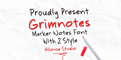 Proudly Presenting, Grimnotes a Marker Notes Font with 2 styles Grimnotes is perfect for any titles, logo, product packaging, branding project, megazine, social media, wedding, or just used to express words above the background. Grimnotes also come with Multi-Lingual Support. Enjoy the font, feel free to comment or feedback, send me PM or email. Thank You!
 - PR Swirlies 01 by PR Fonts,
$10.10 This font is a collection of simple calligraphic ornaments suitable for invitations, gift tags, and anything that can benifit from a “spoonful of sugar” visually. The "Sand Drift" version combines well with: PR Bramble Wood 1, PR Bramble Wood 2, PR Hallow Doodles 01, PR Hallow Doodles 02, PR Cauldron, PR Swirlies 01], PR Swirlies 05.
 - Fd Twist by Fortunes Co,
$9.00 The Twist font is a bold typeface with a playful appearance. I tried to combine 2 fonts inspired by TV broadcasts, mid-century storybooks. It is suitable for broadcast, labels, logos, magazines, clothing and other commercial purposes. You can choose from three styles, regular, round, and rough, so you can get the retro/modern look you want
 - FF Inkling by FontFont,
$30.99 American type designer Joel Decker created this script FontFont in 1997. The family contains 2 weights: Regular and Bold and is ideally suited for advertising and packaging, poster and billboards as well as software and gaming. FF Inkling provides advanced typographical support with features such as ligatures and case-sensitive forms. It comes with proportional oldstyle figures.
 - FF Beadmap by FontFont,
$41.99 British type designers David Crow and Ian Wright created this display FontFont in 2002. The family contains 2 weights and is ideally suited for advertising and packaging, editorial and publishing as well as poster and billboards. FF Beadmap provides advanced typographical support with features such as ligatures and case-sensitive forms. It comes with tabular lining figures.
 - Breakfast Pastry by Missy Meyer,
$12.00 I’d been thinking for a while about making a serif font with ball terminals: big fun round ends to the letters anywhere I can squeeze them in. So I made Breakfast Pastry! I started with a hand-drawn set of basic letters, then went hog-wild making alternates and ligatures galore with fun swirls, curls, and even more balls! I’ve cleaned the letters up significantly to make them smooth and easy for any cutting or printing you may want to do, but I’ve also left in some of the hand-drawn character so that the letters are warmer and not too formal. Then I took the first font, and made a second solid version without the cutouts. After that I thought: I tend to make plumper fonts ... why not make an even thinner version? So I did! All three versions have the same character set (over 700 glyphs total), which means they all have the same extras and alternates. All three fonts have over 300 extended Latin characters for language support, as well as over 200 bonus items: alternate letters, letters with swashes, two-letter ligatures, small caps, catchwords, and even some bonus ornaments and elements to make the fonts even more flexible. (After all, if one swash on a letter is good, two or three might be great!)
 - Gerando by ArimaType,
$18.00 Gerando is a cool and adaptable display font. Add this modern font to each of your favorite designs and make them instantly stand out. If you have questions, please contact us at arimatype@gmail.com
 - Atol by Type & Roll,
$30.00 Atol is a contemporary take on classic didone types. High contrast and modern proportions, combined with subtle details, makes it ideal for characteristic, bold, tightly-set headlines in magazines, branding, animated typography and more.
 - Contract Banner by Solotype,
$19.95Our penchant for banner types lives on. This one is our take on an 1880s font called Mezzotint. Banner fonts give the appearance of art work, without having to do any. We like that. - Ohex by kome.studio,
$12.00 Contemporary geometric typeface. Ohex™font family consists of 5 unique font styles — thin, light, regular, bold and black + VARIABLE version. Opentype features including stylistic alternates, ligatures and kerning pairs. Currency glyphs and stylish digits. Capital letters are designed on the shape of a hexagon. Lowercase letters to cooperate with them, refers to the street style look. Great for logos, posters, magazine layouts, headers, apparel and prints. - Multilanguage support covering Western, South and Central Europe. 1256 Latin 1 / 1250 Latin 2: Eastern Europe / 1254 Turkish / 1257 Windows Baltic / Macintosh Character Ser (US Roman) 1256 Latin 1: Afrikaans, Basque, Catalan, Danish, Dutch, English, Faeroese, Finnish, French, Galician, German, Icelandic, Irish, Italian, Norwegian, Portuguese, Scottish, Spanish, and Swedish. 1250 Latin 2: Eastern Europe / 1254 Turkish / 1257 Windows Baltic : Czech, Polish, Hungarian, Croatian, Romanian, Estonian, Latvian , Lithuanian, Turkish, Slovak and Slevenian -
 - Kompot Sans by VP Creative Shop,
$20.00 Kompot typeface with 2 styles Kompot Sans is swirly, vintage typeface with 2 styles to enchant your next project. They are loaded alternate glyphs and multilingual support. Very versatile fonts that works great in large and small sizes. Basic latin, advanced latin, basic Cyrillic and advanced Cyrillic character sets are supported! Kompot Sans is perfect for branding projects, home-ware designs, product packaging, magazine headers - or simply as a stylish text overlay to any background image. Uppercase numeral, punctuation & Symbol Regular Outline Alternate glyphs Multilingual support Basic and Advanced Cyrillic support How to access alternate glyphs? To access alternate glyphs in Adobe InDesign or Illustrator, choose Window Type & Tables Glyphs In Photoshop, choose Window Glyphs. In the panel that opens, click the Show menu and choose Alternates for Selection. Double-click an alternate's thumbnail to swap them out.
 - Al Murberry by Aluyeah Studio,
$90.00 Bonjour! Murberry a fashion chic display font. This font was carefully crafted and inspired by one of leading fashion brand in the world. In general, it creates a luxurious and elegant look in design. Coming to you with 50+ luxury ligature and 30+ alternate in 4 weight – light, normal, medium and bold – to create a perfectly beautiful, classy, chic, elegant, and luxurious design. Use this font for your fashion brand, resort, cosmetics, invitations, wedding, branding, packaging, magazines, boutique, social media, restaurant, spa, greeting cards, headers, headline and many more. Features: OpenType support Multilingual support (15 languages) PUA Encoded Super Easy to Use alternates – It’s OpenType support but you can easily call alternates character using special combination like a.2 c.2 e.3 etc so you don't need special software. To get results like the preview just type Mu.2RBe.5RRY
 - Prostir Sans by Kobuzan,
$25.00 Prostir Sans is a powerful typeface of the humanistic sans serif. He strives to be a "workhorse" that does almost any job without unnecessary problems, while remaining expressive enough. Has large x-heights and small ink traps. The typeface looks emotional and feels free, combining smooth curves and contrasting connections. It consists of 2 conditional parts — Basic and Display, which differ in the thickness of diacritical symbols and additional elements. This contrast adds unusual rhythm and liveliness. It has 7 grades in weight and and supports variable, adjustable on two axes, which allows you to fine-tune the desired style with sliders. Features: – Total glyph set: 753 glyphs; – 14 styles (7 weights x 2 widths); – Support 210+ languages; – Latin Extended; – Cyrillic Basic + Bulgarian letters; OpenType features: – Proportional, oldstyle, circled, tabular numerals, superiors, fractions; – Punctuations and symbols; – Arrows; – Stylistic sets; – Ligatures; – Case-sensitive forms.
 - Tokyo Olive by Dharma Type,
$14.99 Tokyo Olive was designed as an homage to nostalgic display types and advertisements in the mid-late 80s. The mid-late 80s was the era of the post-modernism and fancy-decorative design especially in Japan In other words, it was the mixture of superficial form-operation and girly taste. This curious design movement vanished without a trace in the 90s, but it had its moments. Tokyo Olive has voluminous and simple geometric skeleton (for post-modern) with rounded and craft-style stencil joints (for fancy decoration). We added a classic open style as a little spice. The mixture of those essences makes new impression we have never seen before. Tokyo Olive family consists of 5 styles for stacking color font. Please use Photoshop or Illustrator, or your favorite graphic design apps that can handle layers. Layers are the printing plates of wood type. You should be able to change text color for each layer. Tokyo Olive "Standard" style is the base of this font family. You can add open effect by stacking "Fill" layers over the Standard layer. Instruction 1. Type your text as you like. 2. Set font-name "Tokyo Olive" and font-style "Standard". 3. Set color of "Standard" layer. 4. Duplicate the "Standard" layer to make "Fill" layer. 5. Set font-style "Half Fill" or "Full Fill" and new color of upper layer. Tokyo Olive Standard, Half Open, and Full Open style can be used solely.
 - Shameless by Positype,
$79.00 I will spare you the long-winded description this time and all of the motivations and witty innuendoes. Quite frankly, I forgot about creating this typeface and it sat on my hard drive for almost a year. Luckily, my daughter Isobel saw the initial drawings one day and ask me about those pretty letters and I remembered… yep, that happened. That said, time made this a better typeface… with fresh eyes and time, much was redrawn, retooled and expanded to something I truly enjoy playing with. Shameless makes extensive use of Contextual alternates to create a proper ebb and flow from letter to letter. Interestingly, there are only a handful of ligatures… instead many special combinations are accounted for solely by relying on Contextual Alts. Mix in Stylistic Alts, Swashes, responsive Titling Alts, numerous Style Sets, etc and you can have a lot of fun. I created 2 versions. A ‘Standard’ version that has 2200+ characters and a ‘Deluxe’ version that has 2400+ characters and an interesting caveat… I plan on expanding the Deluxe version any time I have an idea to add to the typeface… and as such, buyers will receive all of those updates at no charge (with updates going directly to the distributors). You get what you pay for… no insane discounts. Oh, and if you are wondering… Shameless is based on my handwriting using Kuretake Zig CocoIro pens. I love these pens.
 - Stay Classy Font Duo by Nicky Laatz,
$17.00 Stay Classy! ...with the suave new Stay Classy Font Duo consisting of a sophisticated signature-style script, and an elegant, classy, all-caps serif font. With impeccably refined curves and silky smooth edges, the Stay Classy Font Duo is perfect for adding a classy, modern touch to your projects. Perfect for branding, weddings, social media, product design, stationery and advertising - Stay Classy is versatile enough to add that elegant element to just about any project where a special touch of class is required. THE SCRIPT : To make the script appear as natural as possible in your designs , I have included 2 sets of opentype stylistic lowercase alternates - one of which includes the elegant end letters. Words look more naturally finished off if end letters are formed with a subtle up-curve. Last but certainly not least, a large selection of 30 carefully styled character ligatures ( letter combinations ) have also been built in ( see previews above ) . For those after a more rustic, original look. THE SERIF : The Serif includes carefully constructed built-in opentype kerning pairs to ensure impeccable letter spacing throughout the font. Typically, in any all-caps serif font, there are certain letter pairs (such as OV AW AT AY AV WO and many more ) that often look incorrectly spaced when coupled together, due to their natural dimensions. Built-in opentype kerning pairs eliminate this issue - meaning perfectly balanced letter spacing no matter what you type.
 - Kaizen by Colllab Studio,
$9.00 Presenting Kaizen! A Bold Handbrush Font in 2 Versions. This font made with the perfect combination of each character. You can combine with Extra to get a unique combination. It looks original and can be used for all your project needs. Each glyph has its own uniqueness and when meeting with others will provide dynamic and pleasing proximity. This font can be used at any time and in any project. You can see in the presentation picture above, Kaizen looks unique and Japanese style on design projects. So, Kaizen can't wait to give its touch to all your design projects such as quotes, poster design, personal branding, promotional materials, website, logotype, product packaging, etc. WHAT'S INCLUDED? 1. Kaizen Version One (Solid) • The first version comes with uppercase, lowercase, ligatures, numeral, punctuation, symbols, and Standard Latin Multilingual Support (Afrikaans, Albanian, Catalan, Danish, Dutch, English, French, German, Icelandic, Indonesian, Italian, Malay, Norwegian, Portuguese, Spanisch, Swedish, Zulu, and More). 2. Kaizen Version Two (Inline texture) • The first version comes with uppercase, lowercase, ligatures, numeral, punctuation, symbols, and Standard Latin Multilingual Support (Afrikaans, Albanian, Catalan, Danish, Dutch, English, French, German, Icelandic, Indonesian, Italian, Malay, Norwegian, Portuguese, Spanisch, Swedish, Zulu, and More). 2. Extra Swashes • Included 6 Underline Swashes. You can feature all with typing c_1 until c_6 (in both versions) A Million Thanks Colllab Studio
 - Delirian by Andrey Sharonov,
$35.00 Delirian Script & Ornaments Delirian is elegant script with contemporary mood and perfect forms, inspired by immortal classic calligraphy. Not too thin and not too thick, good balanced and variable, born for luxury and beauty. In my examples I show how this script can be used. It's great for logotypes, branding, wedding invitations, romantic cards, alcohol labels, packaging, spelling of names and others. Delirian Script comes with beautiful Uppercase and Lowercase letters, numbers and punctuation. In addition to the main character set, there are 158 alternates characters, 36 ligatures and 10 lengths of end-swashes. You also get Ornament set of 26 elements which harmoniously complements original script. Multilingual Support Script support Western European characters and works with following languages: English, Croatian, Danish, Dutch, Estonian, Faroese, Filipino, Finnish, French, German, Hungarian, Icelandic, Irish, Italian, Norwegian, Polish, Portuguese, Slovenian, Spanish, Swedish, Turkish. OpenType Stylistic Alternates works on the principle of simple combinations with activated Standard Ligatures option in OpenType panel (Adobe Photoshop, Adobe Illustrator). To get alternate just add for example number 2 (two) after any letter. Every Uppercase has 1-2 variations and Lowercase about 3-4 alternate characters. For example: A2 A3 - Uppercase; a2 a3 a4 - Lowercase; a.1 a.2 - Lowercase with underline. _1 _2 _3 - End-swashes Ligatures works with activated Discretionary Ligatures option in OpenType panel. This special features don't work in Microsoft Word.
 - Brokson by Andrey Sharonov,
$25.00 This font pair was crafted by hand under inspiration of old-fashioned typography on different vintage labels, packages, sighs and others. It’s will be a godsend for those who want to add vintage mood to design project. Collection includes Script, Serif and it’s variations like Regular, Rough and Aged. This pair perfectly cooperating with each other. Brokson can be used in different purposes: lettering and logotype, labels, t-shirts, product packaging, advertising and many others. In addition to the basic set, Brokson Script has beautiful alternatives of Uppercase characters, variations of the end for Lowercase and some ligatures. Also, there are two types of end-swashes and eight lengths of each style. Brokson Serif was designed as a secondary and additional font after Script, but in the process of their use I realized it also look great as a priority. Quick combinations for Opentype features: Uppercase Alternates - just add for example «2, 3, or 4» after Uppercase; End-letter - just add «2» at the end of the word; End-swashes (tails) - just add _1, _2, _3… or /1, /2, /3…up to 8, where number is length of tail. This combinations works only with activated Standard Ligatures option in Opentype panel (Adobe Illustrator / Photoshop). Multilingual Support Danish, Dutch, English, Estonian, Faroese, Finnish, French, German, Hungarian, Icelandic, Italian, Norwegian, Polish, Portuguese, Slovene, Spanish, Swedish, Turkish.
 - Kernig Braille by Echopraxium,
$5.00 This font is the younger sister of HexBraille with which it may be combined to create new patterns. This also explains why their introductory text are similar. Introduction The purpose of this monospace font is to display braille in an original and "steganographic" way. The Kernig prefix means "Robust" in German, this is because of the crank shapes . The core of the glyph design is a flat hexagon which can be read as 3 rows of 2 dots (i.e. regular braille glyph grid). Even if within a glyph, braille dots ("square dots" indeed) are placed on the vertices of a flat hexagon, the difference with HexBraille is that edges connecting vertices are not straight lines but "crank shapes" instead. This can be summarized by saying that the whole glyph is a Hexcrank (a flat hexagon where vertice pairs are connected by a crank shape) NB: The initial design is illustrated by glyphs 'ç' (no dot) and 'û' (6 dots) as shown by poster 6. A. "Kernig Lattice" In KernigBraille, glyphs are connected to each other, thus for each Hexcrank glyph there are 6 connections: 2 on left/right and 4 on top/bottom. In the final design some cranks were removed for esthetical reason (i.e. leave empty space for allowing patterns diversity). In summary, a text using this font won't display a honeycomb but a lattice instead. NB: Please notice that in order to obtain the lattice without vertical gaps, you must set the interline to 0. The lattice is made from 3 kind of shapes: a.1. Hexcrank a.2. Square a.3. Irregular cross (mostly unclosed) The design favored squares over crosses. The whole slightly resembling a PCB. B. Text Frames It's possible to frame the text with 4 sets of frame glyphs (as illustrated by poster 2) b.1. Kernig { € ° £ µ § ¥ ~ ¢ } b.2. Rectangular-High { è é ê ï î à â ä } b.3. Rectangular-Low { Â ù Ä Ê Ë Ô õ ö } b.4. Mixed Kernig+High: a mix of Kernig and Rectangular-High frame glyphs When using frame glyphs, it is advised to show Pilcrow (¶) and Non Breaking Space, which are replaced by empty shapes in this font (e.g. in Microsoft Word, use CTRL+8 or use [¶] button in the ribbon).
 - Lido STF - Personal use only

- Humble Hearts by Joanne Marie,
$20.00 Humble Hearts is a mono script font designed to look handlettered and unique. With over 700 glyphs you will have lots of fun designing beautiful logos, t-shirts, wedding stationery, menus - the list is endless! Anyone can access the alternate glyphs via Font Book on a mac or Character Map in Windows to copy and paste into non designer software. Please take a look at all of the pictures to see this font at work. You can use the basic glyphs as a lovely script on it's own or you can make your designs really fancy using the alternates and swashes. You can choose to have the breaks in the swashes (as shown) or solid swashes. In addition to the multilingual characters included in this font are the following styles and glyphs: Alternates Ligatures Swashes Ornaments & Premade words
 - Smooth Gracier by Nathatype,
$29.00 Smooth Gracier is a stylish display serif font to express modern, friendly, fun nuances on your designs. The unique geometry details and the contrast sketch lines help to make the font visually interesting. It is suitable to apply for bigger sized-texts due to its dramatic, bold styles. Enjoy the lovely features available in this font. Features: Stylistic Sets Multilingual Supports PUA Encoded Numerals and Punctuations Smooth Gracier fits for various design projects, such as posters, banners, logos, magazine covers, quotes, headings, printed products, invitations, merchandise, social media, etc. Find out more ways to use this font by taking a look at the font preview. Thanks for purchasing our fonts. Hopefully, you have a great experience using our font. Feel free to contact us for further information when you have a problem using the font. Thank you. Happy designing.
 - Brutal Milk No 1 by Casloop Studio,
$9.00 Introducing Brutal Milk Font Collection where prominence, trustworthiness, and sophistication converge. Brutal Milk is a captivating grotesque typeface that seamlessly blends the robust aesthetics of brutalism with the sleek sophistication of Swiss Design and the nostalgia of Y2K. This collection featuring three distinctive variants – Brutal Milk No1, Brutal Milk No2, and Brutal Milk No3 – offers a unique typographic journey for extraordinary design. Let's break down what we present in this work - Brutal Milk No.1 | Modern Elegance with a Brutal Twist Aims for body text with the perfect balance of elegance and modernity. Brutal Milk No.1 is meticulously crafted for optimal readability, making it an ideal choice for a wide range of applications. - Brutal Milk No.2 | Softened Brutalism for Approachable Headers Aims for display/header text with a gentle and approachable impression. Brutal Milk No.2 is crafted to add a touch of warmth to your designs, making it perfect for conveying a friendly and inviting tone. - Brutal Milk No.3 | Rigid Rebellion for Prominent Headers Make a bold statement with headers that exude firmness. Brutal Milk No.3 is designed to capture attention with its rigid impression, injecting a sense of prominence and confidence into a visual identity. The Features The Brutal Milk Font Collection comes loaded with features such as case-sensitive forms, discretionary ligatures, ordinals, fractions, denominators, numerators, superscripts, and scientific inferiors – ensuring flexibility in design needs. Language Support From Western and Central European languages to South Eastern European, South American, Oceanian, and even Esperanto, Brutal Milk Collections caters to a diverse range of linguistic needs. Brutal Milk stands as a testament to versatility and innovation. Whether you're crafting a sleek logo, establishing a brand identity, adorning decor, creating impactful posters, delivering compelling presentations, designing dynamic websites, refining UI/UX experiences, or engaging in graphic design endeavour. The impressions it imparts—modern, minimal, youthful, funky, groovy, trendy, hip, fly, and undeniably cool—speak volumes about its adaptability to contemporary design trends. Redefine the boundaries of creativity and immerse yourself in the dynamic world of Brutal.
 - Instant Hero by PizzaDude.dk,
$15.00 A scribbled kids handwriting kinda font without overdoing it, which makes it super legible, even at very small sizes. I have added 5 different versions of each letter, and they automatically changes as you type!
 - Code Next by Fontfabric,
$39.00 10 years later, one of the first geometric typefaces in our portfolio and a popular favorite of yours is rising to a whole new level! We’re revealing the stand-alone type family Code Next—a staggering evolution from Code Pro in functionality, versatility, and application. The transformation includes 6 new weights, 10 new Italics, full support of Extended Cyrillic and Greek, full redesign and glyphs refinement, 2 variable fonts, to name but a few. Going back to 2011, the grotesque-inspired Code Pro was designed to complement memorable pieces that make a statement. Balancing between stylization and simplification, it was encoded with the distinct voice of basic organic shapes to stand the test of time. Little did we know, it would expand and live up to the potential of a “font from the future” as the new Code Next. Today, a type family of 22 styles, this geometric sans solidifies its relevance and carries a strong constructive aesthetic through simplified forms with a twist. These fit any modern design in print, web, and display visualization. Developed to go above and beyond, Code Next comes prepared for multi-script projects with Extended Latin, Extended Cyrillic, and Greek. Explore Code Next’s versatility and switch things up with the help of 2 variable fonts, more than 1280 glyphs, and an extensive OpenType features set including small caps, standard and discretionary ligatures, contextual and stylistic alternates, stylistic sets, case sensitive forms, and much more. Overview: • Font family of 22 fonts • 10 weights • Languages - Full support of Extended Latin; Extended Cyrillic; Greek • Entirely refined design and metrics • Glyph count - 1288 • Variable fonts - 2 fonts OpenType features: • Small Caps • Standard Ligatures • Discretionary Ligatures • Contextual Alternates • Stylistic Alternates • Stylistic Sets • Case-Sensitive Forms • Ordinals • Localized Forms • Lining Figures • Proportional Figures • Tabular Figures • Oldstyle Figures • Subscripts • Scientific Inferiors • Superscripts • Numerators and Denominators • Fractions • Roman figures • Extensive mathematical support • Navigation symbols
 - Pirouette by Linotype,
$40.99Pirouette is based on a logo that Japanese designer Ryuichi Tateno created for a packaging design project in 1999 (a shampoo container!). Tateno's logo experimented with complex, overlapped swash letterforms. He continued to develop these outside of the initial packaging project, until they took on a life of their own. Eventually, Tateno designed a full typeface out of the logo, Pirouette, which was the first place display face in Linotype's 2003 International Type Design Contest. The Pirouette typeface contains six different fonts. The basic font is Pirouette Regular. This is an engraver's italic lowercase paired with elaborate swash capitals. The swash capitals have two visual elements in their forms: thick strokes and thin strokes. Pirouette Text includes the same lowercase as Pirouette Regular, but the uppercase letters are much shorter and simpler. This "text" font can be used to set longer amounts of copy. Pirouette Alternate contains different lowercase glyphs and additional ligatures, which can be used as substitutes for the lowercase forms in the Pirouette Regular and Pirouette Text fonts. Pirouette Ornaments contains swashes and other knick-knacks that can either be added onto the end of a letter, or used as separate decorative elements or swooshes (accolades) on a page. Pirouette Separate 1 and Pirouette Separate 2 are two fonts that can be layered over top of one another in software applications that support layering (e.g., most Adobe and Macromedia applications, as well as QuarkXPress). Pirouette Separate 1 contains the thick stroke elements from Pirouette Regular's uppercase letters, as well as the same lowercase glyphs that can be found in Pirouette Regular and Pirouette Text. Pirouette Separate 2 contains only the thin stroke elements from Pirouette Regular's uppercase letters. By layering Pirouette Separate 1 and Pirouette Separate 2 over one another, you can give the uppercase letter's thick and thin stroke elements different colors and create unique, more calligraphic designs. The Pirouette family, Tanteno's first commercial typeface, was greatly influenced by the calligraphic and typographic work of the master German designer, Prof. Hermann Zapf, especially his Zapfino typeface. - MMC Insignia Pro by MMC-TypEngine,
$42.50 MMC INSIGNIA PRO, is an Iconic & Emblematic Neogothic Geometric Display… Assembled by Trivial Squares and Diagonals Symbols Pattern from a puzzled grid Aftermath!! Includes Small Caps & Stylistic Alternates!! +Extra Monospaced Figures. In 22 styles, with Obliques, both for single display and layer Typesetting, plus OpenType Features & Bonus Blocks Fonts! MMC Insignia Pro, is the cursive version of MMC Insignia and the default or main lowercases in ‘SC’ feature plus cursive stylistic alternates and sets such as Monospaced figures… Its atmosphere stands by on both Corporative to Decorative, Modern & Fashion, Federalist, Bohemian, Romantic, Ludic, Treasured Look, Etc. This Display font-family is the result of the repeated applications of this unique infamous Icon or Symbol, of two counterpointed triangles, implicit as hourglasses, in order to compose an innovative and unprecedented typographic pattern and modulation concept through the letterforms, in an extremely Geometric style. The Graphic Sign used throughout this type, is a remarkable trend used already in Logos of different businesses, whose most famous case refers to a famous International Bank, which doesn’t need to be mentioned, as it is instantly associated! This characteristic innovation was the main motivation while creating this type. Usage Suggestions: Type Fancy Titling texts, Display Remarkable Logos, Branding Projects, Labels, Emblems, Fashion Patterns, or in everything Noble and designed for Excellence as a type of Insignia, or distinguished marks and attributes of Royalty and Power!! That’s also forwardly, the reason why it was named MMC Insignia… TIPS: 1-Combine styles into innumerous possibilities of Chromatic Typesetting, by ‘central pasting’ layers… You may dislocate layers for improvisations! 2-USE BLOCK “FREE-STYLES” 1 & 2 also to add default 3D! Change 3D directions by switching Block 1 to Block 2, that way you can Zig-Zag words and lines. *Also shift the block layer up to bottom limit, it makes the 3D direction turn upside down. Greetings! André, MMC-TypEngine.
 - Litter Funk by PizzaDude.dk,
$15.00 You may already have guessed it...Litter Funk is experimental typography. Some letters are fat blocks, others have stars, stripes or dots, some are funny and funky while others are plain weird - but all in all, they leave a really nice confusing effect when used. Due to the contextual alternates, each letter comes in 5 different versions, and automatically cycle as you type. Well, the font was fun to make - I hope you have fun using it! :)
 - Thugolatz by Almarkha Type,
$25.00 Hello Everyone, introduce our new product Thugolatz - Ligature Extended Sans, inspired by the title of the sports poster and We make it very energetically, taking into account the thickness and density of each gliph, along with a ligature that makes this font look unique. Thugolatzs font with strong and challenging nuances. very suitable for the title, typography, clothes, Poster, magazines, brochures, packaging,Websites and much more for your design needs, making your designs more modern and professional.
 - Config by Adam Ladd,
$25.00 Config was influenced by geometric sans with circular forms but the proportions have been condensed by incorporating straight sides for a design that is sturdy and efficient yet friendly. The neutral design with subtle details makes it functional for type setting in small and large sizes. Its clean nature makes it readable at small sizes but the touch of character—as seen in the notched joints, rounded details, and horizontal/vertical terminals—make it interesting at large sizes.
 - Thealiens by Almarkha Type,
$25.00 Hello Everyone, introduce our new product Thealiens - Ligature Condensed Sans, inspired by the title of the sports poster and We make it very energetically, taking into account the thickness and density of each gliph, along with a ligature that makes this font look unique. Thealiens font with strong and challenging nuances. very suitable for the title, typography, clothes, Poster, magazines, brochures, packaging,Websites and much more for your design needs, making your designs more modern and professional.
 - Cherry Rush by D&K Project,
$15.00 Cherry Rush - It's fun, it's cute, it's smooth, and it's mighty splash. A mixed-case font (Uppercase and lowercase) with lots of combination possibilities, make greats fun display! It's good to make a logotype, sticker, fun kids sign, and other lettering project. This fun is perfect combination uppercase and lowercase. This font contains all uppercase, lowercase, numbers and basic punctuation also a fun 40 ligatures. (If you're having trouble finding the basic punctuation, you can access it in the Glyphs panel) Please let me know in the comments what you think or if you have any issues or queries , If you have any questions about licensing, need help with a typeface, or would like to request a new feature, drop me a message.
 - Highpath Signature by Nathatype,
$29.00 Are you looking for a signature font? Wanna make your branding spark? Do you sometimes have an appetite for a bit more wholesome typography? We give you the best solution. Highpath Signature- A Signature Font Highpath Signature is a lovely signature font designed with classic vibes. This font support multi languages to make your brand globally acceptable. It's a font with simple shapes, making it very suitable to be used on any purposes. A real head-turner for your presentation, designs, branding, quotes, invitation, website illustrations, and much more. Features: Ligatures Stylistic Sets PUA Encoded Numerals and Punctuation Thank you for purchasing premium fonts from Natha Studio. Happy Designing! If you have any questions, please feel free to contact us.
 - Huron by Solotype,
$19.95A Barnhart Bros. & Spindler type from the late victorian period. We have been faithful to the spirit of the original buy "calmed down" a few of the lowercase letters to make the lines read more smoothly. - Birthday Doodles by Outside the Line,
$19.00 Birthday Doodles.... cakes, hats, banners, flags, confetti, streamers, balloons, noise makers, and some written and printed words. Plus a full set of numbers. Everything you need to make cards, invitations, and to scrapbook all your parties.
 - Prisom by Illuminaut Designs,
$10.00 I really wanted to make my own condensed typeface for memes and such. I think i have succeeded. This typeface is so average looking that no one would suspect that it is in fact very radical.
 - Arizona Futur by Fonts of Chaos,
$10.00 Hello. Arizona Futur is a pixel font with little pixel guys. Easy to use to make cool artworks. The little guys have the same size than the alphabet. So you can mix the words with illustration.
 - Pacioli by MADType,
$29.00 This font is based on an alphabet published by Luca Pacioli in his 1509 mathematical treatise De divina proportione. In this book, Pacioli describes how to build the Roman alphabet geometrically using lines, squares and circles. Pacioli was not the first or the last man in his era to describe the building of letters mathematically. Felice Feliciano did this before Pacioli, and Albrecht Dürer further developed these forms years after. According to Pacioli, the thick strokes should be 1/9th of the height, and the thin strokes should have 1/2 the weight of the thick strokes. I felt that this beautiful alphabet needed to be restored to its full geometric glory and set out to construct an accurate replica using Pacioli's instructions. Included in the font you'll find the letters that have the grid overlay and also the letters without the grid. The letters J, W, U, and Z were not included in the book, so I have created my own versions of these characters that fit into Pacioli's grid. Pacioli shows two different Os in the book, so I have included the second O as well as a second J, Q, and Z as OpenType stylistic alternates. Also included in the font are border patterns and a fleuron taken from the cover of the book.
