10,000 search results
(0.028 seconds)
- 1467 Pannartz Latin by GLC,
$38.00 This family was inspired by the edition De Civitate Dei (by Sanctus Augustinus) printed in 1467 in Sobiano (Italy, Roma) by Konrad Sweynheym and Arnold Pannartz who was the Punchcutter. It is one of the first few “Roman style” fonts, just before the birth of Jenson’s pattern (look at 1470 Jenson Latin). The present font contains all of the specific latin abbreviations and ligatures used in the original (about 54). Added are the accented characters and a few others not in use in this early period of printing. Decorated letters such as 1512 Initials, 1550 Arabesques, 1565 Venetian, or 1584 Rinceau can be used with this family without anachronism. If Italic style is required (not yet existing in early time of printing), we recommend using 1557 Italique.
 - Lubaline by Lián Types,
$39.00 Who haven't heard the phrase that ‘any past time was better’?. Although I sometimes find this phrase a little too pessimistic (because I try to think that the best is yet to come), it may be true regarding my passion, typography. I'm too young (29) unfortunately, and this means I did not have the pleasure of being contemporary with maybe the man who has influenced my work the most (1). The man that showed that letters are more than just letters to be read. Herb Lubalin (1918-1981), also called sometimes as ‘the rule basher’ (2), smashed the taboos and sacred rules of type design and gave it personality. He rejected the functionalist philosophy of europeans in favor of an eclectic and exuberant style. To him, letters were not merely vessels of form, they were objects of meaning. (3). Nowadays, when looking at his portfolio, who dares to deny that the term ‘typography’ and ‘beauty’ may go hand-in-hand without any problem? Ed Benguiat, one of Herb’s partners, still likes making jokes with the phrase “screw legibility, type should be beautiful” and what I understand of this is not to forget the rules, but to know and break them carefully. In an era of pure eclecticism, we, the lovers of flourishes and swashes, can't do nothing but admire all the legacy that Lubalin, this wonderful type-guru, left. My font Lubaline read as “the line of Lubalin” is my humble tribute to him. Those who know his work, may see the influences easily like in his ‘Beards’ (1976) and ‘The Sound of Music’ (1965) posters; the art-deco forms in many of his amazing logos and practically in all his creations where letters seem to be alive just like you and me. I really hope that the future finds me still learning more and more about type-design and letterforms, and like him, always willing to make innovations in my field: Because letters are not just letters to be read. NOTES (1) These are some of my fonts in which some of Lubalin’s influences can be seen (in order of creation): Reina, Aire, Erotica, String, Beatle, Heroe, Selfie, Model, Seventies, and many others that are still in progress. (2) (3) Steven Heller. Herb Lubalin: Rule Basher. U&lc (1998) http://www.printmag.com/imprint/my-favorite-lubalin/
 - Risthiya Brush by Gatype,
$14.00 Themilan is a super casual handwritten script with a detailed brush texture, and a unique all-caps sans serif font, it also has dashing strokes across all letters to add style to your designs. It can be used for various purposes. such as titles, signatures, letterheads, nameplates, labels, newsletters, posters, logos, correspondence, wedding invitations, badges, etc. Themilan Brush Font is encoded with Unicode PUA, which allows full access to all additional characters without special design software. Mac users can use Font Book, and Windows users can use Character Map to view and copy any extra characters to paste into your favorite text editor/app. To enable the OpenType Stylistic alternative, you need a program that supports OpenType features such as Adobe Illustrator CS, Adobe Indesign & CorelDraw X6-X7, Microsoft Word 2010 or a later version. How to access all alternate characters, using Windows Character Map with Photoshop: https://www.youtube.com/watch?v=Go9vacoYmBw How to access all the alternate characters using Adobe Illustrator: https://www.youtube.com/watch?v=XzwjMkbB-wQ Thanks a lot for viewing and let me know if you have any questions.
 - Lamna by Craft Supply Co,
$20.00 Introduction to Lamna – Wide Serif Font Lamna is a distinct wide serif font, characterized by its upright and bold appearance. Its design combines traditional elegance with modern simplicity, making it versatile for various applications. This font stands out due to its unique wedge-shaped serifs and strong structure. Design Features The key feature of Lamna is its wedge-shaped serifs. These serifs are not just decorative; they add a sense of stability and formality to the text. The wide structure of the font enhances readability, making it ideal for both print and digital media. Moreover, its upright stance contributes to its authoritative tone, suitable for titles and headings. Versatility and Usage Remarkably, Lamna adapts well to different contexts. Its clear, strong lines make it perfect for headlines and logos, where a commanding presence is needed. Additionally, it performs well in body text, offering a comfortable reading experience. Its versatility extends to various industries, including publishing, advertising, and digital design.
 - Amigie by Craft Supply Co,
$20.00 Introduction to Amigie – Display Serif Amigie – Display Serif is a unique display font that stands out with its distinctive serif design. Its bold and innovative shape makes it perfect for eye-catching displays and powerful branding. This font captures attention, offering a fresh take on traditional serif styles. Design and Innovation Each character in Amigie – Display Serif boasts a unique serif shape, blending classic elegance with modern creativity. The font features sharp, clean lines, and its unique serifs add a touch of sophistication. Furthermore, its balanced proportion ensures that each letter is clear and impactful, perfect for making a statement. Versatility and Functionality Amigie – Display Serif is not just visually striking but also highly versatile. It’s ideal for a wide range of applications, from editorial designs to bold advertising. Additionally, it works exceptionally well for headlines, logos, and packaging, where its unique character can shine. This font is also highly legible, making it suitable for both digital and print media.
 - Rotis Semi Sans by Monotype,
$40.99 Rotis¿ is a comprehensive family group with Sans Serif, Semi Sans, Serif, and Semi Serif styles, for a total of 17 weights including italics. The four families have similar weights, heights and proportions; though the Sans is primarily monotone, the Semi Sans has swelling strokes, the Semi Serif has just a few serifs, and the Serif has serifs and strokes with mostly vertical axes. Designed by Otl Aicher for Agfa in 1989, Rotis has become something of a European zeitgeist. This highly rationalized yet intriguing type is seen everywhere, from book text to billboards. The blending of sans with serif was almost revolutionary when Aicher first started working on the idea. Traditionalists felt that discarding serifs from some forms and giving unusual curves and edges to others might be something new, but not something better. But Rotis was based on those principles, and has proven itself not only highly legible, but also remarkably successful on a wide scale. Rotis is easily identifiable in all its styles by the cap C and lowercase c and e: note the hooked tops, serifless bottoms, and underslung body curves. Aicher is a long-time teacher of design and has many years of practical experience as a graphic designer. He named Rotis after the small village in southern German where he lives. Rotis¿ is suitable for just about any use: book text, documentation, business reports, business correspondence, magazines, newspapers, posters, advertisements, multimedia, and corporate design.Today Rotis ia also available with pan european caracter set.
 - Rotis Semi Sans Paneuropean by Monotype,
$92.99Rotis¿ is a comprehensive family group with Sans Serif, Semi Sans, Serif, and Semi Serif styles, for a total of 17 weights including italics. The four families have similar weights, heights and proportions; though the Sans is primarily monotone, the Semi Sans has swelling strokes, the Semi Serif has just a few serifs, and the Serif has serifs and strokes with mostly vertical axes. Designed by Otl Aicher for Agfa in 1989, Rotis has become something of a European zeitgeist. This highly rationalized yet intriguing type is seen everywhere, from book text to billboards. The blending of sans with serif was almost revolutionary when Aicher first started working on the idea. Traditionalists felt that discarding serifs from some forms and giving unusual curves and edges to others might be something new, but not something better. But Rotis was based on those principles, and has proven itself not only highly legible, but also remarkably successful on a wide scale. Rotis is easily identifiable in all its styles by the cap C and lowercase c and e: note the hooked tops, serifless bottoms, and underslung body curves. Aicher is a long-time teacher of design and has many years of practical experience as a graphic designer. He named Rotis after the small village in southern German where he lives. Rotis¿ is suitable for just about any use: book text, documentation, business reports, business correspondence, magazines, newspapers, posters, advertisements, multimedia, and corporate design.Today Rotis ia also available with pan european caracter set. - Rotis Semi Serif Paneuropean by Monotype,
$92.99Rotis¿ is a comprehensive family group with Sans Serif, Semi Sans, Serif, and Semi Serif styles, for a total of 17 weights including italics. The four families have similar weights, heights and proportions; though the Sans is primarily monotone, the Semi Sans has swelling strokes, the Semi Serif has just a few serifs, and the Serif has serifs and strokes with mostly vertical axes. Designed by Otl Aicher for Agfa in 1989, Rotis has become something of a European zeitgeist. This highly rationalized yet intriguing type is seen everywhere, from book text to billboards. The blending of sans with serif was almost revolutionary when Aicher first started working on the idea. Traditionalists felt that discarding serifs from some forms and giving unusual curves and edges to others might be something new, but not something better. But Rotis was based on those principles, and has proven itself not only highly legible, but also remarkably successful on a wide scale. Rotis is easily identifiable in all its styles by the cap C and lowercase c and e: note the hooked tops, serifless bottoms, and underslung body curves. Aicher is a long-time teacher of design and has many years of practical experience as a graphic designer. He named Rotis after the small village in southern German where he lives. Rotis¿ is suitable for just about any use: book text, documentation, business reports, business correspondence, magazines, newspapers, posters, advertisements, multimedia, and corporate design. Today Rotis ia also available with paneuropean caracter set. - Rotis Semi Serif by Monotype,
$40.99 Rotis¿ is a comprehensive family group with Sans Serif, Semi Sans, Serif, and Semi Serif styles, for a total of 17 weights including italics. The four families have similar weights, heights and proportions; though the Sans is primarily monotone, the Semi Sans has swelling strokes, the Semi Serif has just a few serifs, and the Serif has serifs and strokes with mostly vertical axes. Designed by Otl Aicher for Agfa in 1989, Rotis has become something of a European zeitgeist. This highly rationalized yet intriguing type is seen everywhere, from book text to billboards. The blending of sans with serif was almost revolutionary when Aicher first started working on the idea. Traditionalists felt that discarding serifs from some forms and giving unusual curves and edges to others might be something new, but not something better. But Rotis was based on those principles, and has proven itself not only highly legible, but also remarkably successful on a wide scale. Rotis is easily identifiable in all its styles by the cap C and lowercase c and e: note the hooked tops, serifless bottoms, and underslung body curves. Aicher is a long-time teacher of design and has many years of practical experience as a graphic designer. He named Rotis after the small village in southern German where he lives. Rotis¿ is suitable for just about any use: book text, documentation, business reports, business correspondence, magazines, newspapers, posters, advertisements, multimedia, and corporate design. Today Rotis ia also available with paneuropean caracter set.
 - Referenz Grotesk by Sudtipos,
$49.00 Made in Germany, Referenz Grotesk is a typeface full of references referring to the type design history of Stuttgart State Academy of Art and Design. Its typographic history holds a broad spectrum of shapes and characters, including F.H. Ernst Schneidler (1882–1956), Imre Reiner (1900–1987), Walter Brudi (1907–1987), Kurt Weidemann (1922–2011) and Frank Heine (1964–2003). During extensive research phases for Referenz Grotesk included collection and analysis. This led to further research in the Academy’s collection and archive where the majority of Weidemann’s estate is housed next to works of other designers and professors like F.H. Ernst Schneidler and Walter Brudi. Another place of research was the typesetting workshop where Schneidler had previously taught and worked. Some of his freshly cast fonts were tested and used there for the first time and are still stored in several of the type cases. Regarding the more recent history, for instance about the Emigre designer Frank Heine, former colleagues and professors have been consulted. These studies resulted in the new font Referenz Grotesk that includes traces of Kurt Weidemann’s Corporate as well as calligraphic hints that link to Schneidler’s Stuttgarter Schule (Stuttgart School) where writing played an important role during the form finding process. For the regular text fonts these features are integrated in a subtle manner whereas several alternative glyphs pick up more expressive forms. The final sans serif type family has a clarity and contemporary straightness that becomes more characteristic in its heavier weights. Additionally more than 60 alternative glyphs per weight allow for individual combinations that can be tailored specifically for each application and context. They open up a broad range of visual expressions, from subtle to playful and eccentric characteristics. Referenz Grotesk is available in six weights: Light, Regular, Medium, Bold, Extra Bold and Black, plus italics. In addition, the family includes multiple OpenType functions such as Stylistic Sets, Tabular Figures and Case Sensitive forms. Variable version of the font is included when you license the full pack.
 - Kids At Play by Celebrity Fontz,
$19.99 Kids at Play is a playful and curious font with children silhouettes in the form of letters. The letters/children are engaged in a variety of poses and activites. If you want to develop a text, story, or publication for or about children, this is a must-have font. Includes full set of accented characters.
 - Masculina by Brave Lion Fonts,
$8.00 Masculina is a strong font with sharp ends. It is a majuscule font and supports many languages. If you love capital letters, Masculina is a must-have. It is recommended for signs and headlines but there are many more ways to use it. Masculina is ready for you. Make the maximum out of it.
 - ITC New Rennie Mackintosh by ITC,
$50.99 Looking to add a little Arts & Crafts flavor to your next project? Perhaps you just need a distinctive, new sans serif design? And one with a large international character set. In either case, ITC New Rennie Mackintosh™ may be the typeface for you. Its narrow proportions saves space, and the design shines at large sizes. While it can be an excellent typeface for Art Nouveau flavored labels, name tags and chapter call-outs, this is a suite of fonts that you can also turn to for a bevy of print and on screen uses. Games and apps, as well as print headlines and menus all benefit from ITC New Rennie Mackintosh’s vintage vibe. Based on Phill Grimshaw’s original 1996 design, Monotype Studio designers reimagined the iconic family, added lowercase characters, a new weight structure of light, regular and a more robust bold design; each with an italic counterpart. In addition, a large international character set that include support for many Western and Eastern European languages – including Cyrillic and Greek – give the family a deep typographic bench. An added benefit: the new designs can also be combined with Grimshaw’s original ornament and initial character fonts.
 - Fungis by Ivan Petrov,
$30.00 Fungis is a somewhat �brother� of Fungia. These two typefaces were conceived simultaneously as an experiment on designing typeface based on natural shapes. In both cases it was mushrooms. Of course the main theme of these typefaces is not mushrooms itself (it was just a start point) but the interaction between form and counterform. In spite of unquestioning individuality the font has some associations with wood typefaces from wild west, typefaces from circus posters of 19th century and even slight feeling of gothic. The font can be useful in different cases: posters, titles, book covers, billboards, street signs, magazine spreads and all situations that demand expressive typography.
 - Zapanese by Nocturnal Workspace,
$15.00 The first version of the Zapanese font has been published since 2019 under the name Zapan Script, and can be downloaded for free on the dafont website. At first this font was just a learning project from the 3rd type font and because we saw the enthusiasm of the downloaders, we developed it into a duo font with extra japanese elements. 2 versions Support Glyphs Basic Hiragana & Basic Katakana PUA Encode Characters, fully accessible without additional design software. Includes a range of multilingual characters. Zapanese is suitable typeface for various purposes like logotype, signage, label, poster, dropcap, titles, letterhead, book cover and etc. Thank you!
 - Limited Appeal JNL by Jeff Levine,
$29.00 The cover of a 1950s-era catalog for the Freedman Novelty Company (of San Francisco California) had the word "Novelty" hand-lettered in an unusually angular type style against various geometric shapes somewhat resembling balloons. While the lettering was quirky enough to warrant re-drawing as a digital font, the shapes would have presented a visual nightmare in design and spacing, so simple black rectangles were substituted and the letters appear in white. Since novelty lettering of this type would never become "standard" in use, its function became the font's name, Limited Appeal JNL. There is just a simple A-Z and 1-0 character set along with basic punctuation.
 - Party Style by Sensatype Studio,
$15.00 Party is A Neon font for Event, Party, and Techno branding needs, with Fun style touch that you can combine to get any variations and unique shapes easily just in seconds with choose alternates of them. It is a serif display font with moderate contrast that perfect for branding projects, logo, wedding designs, social media posts, advertisements, product packaging, product designs, label, photography, watermark, invitation, stationery, and any projects, it makes with a high level of legibility. What's Included: Character set A-Z Numerals & Punctuation Accented Characters (West Europe) Works on PC & Mac Recommended using Adobe Illustrator or Adobe Photoshop. Wish you enjoy our font. :)
 - Logotype Style by Sensatype Studio,
$15.00 Logotype is Modern Logo Font is a well-balanced modern font with a minimalist, unique, and iconic sans serif, font that you can combine to get any variations and unique shapes easily just in seconds with choose ligatures of them. It is a sans serif font with minimalist style that perfect for branding projects, logo, poster designs, social media posts, advertisements, product packaging, product designs, label, photography, watermark, invitation, stationery, and any projects, it makes with a high level of legibility. What's Included: Character set A-Z Numerals & Punctuation Accented Characters (West Europe) Works on PC & Mac Recommended using Adobe Illustrator or Adobe Photoshop. Wish you enjoy our font. :)
 - Sorren Ex by Reserves,
$49.00 Sorren Ex is a slightly less condensed, more robust version of Sorren. Its overall width has been increased to the point just before its rounded forms begin to flatten, retaining the aesthetic essence of the original without compromise. Sorren is a definitive bold condensed sans influenced by neo-grotesque designs. A relatively low stroke contrast complimented with sharp, horizontal stroke ends lend an unyielding appearance, while its rounded forms and refined curves juxtapose its inherent strength with grace. Stylistically, Sorren has a classic, timeless feel with a contemporary finish and attention to detail. It is characteristically more elegant and considerably sturdier than the typical condensed sans, lending to its singular disposition.
 - Itadakimase by Allouse Studio,
$16.00 Proudly Present, Itadakimase a Brush Font With Style. You can play around with these both to give you an a natural impression. Itadakimase come with Multi-Lingual Support, Underline Styles to fulfill your need. We highly recommend using a program that supports OpenType features and Glyphs panels like many of Adobe apps and Corel Draw, so you can see and access all Glyph variations. Itadakimase is perfect for any tittle, logo, product packaging, branding project, megazine, social media, wedding, or just used to express words above the background. Enjoy the font, feel free to comment or feedback, send me PM or email. Thank You!
 - Mojodelic by Mysterylab,
$21.00 Looking for a font with that certain... umm... special mojo? Mojodelic might just be the niche font that you need to create that unique statement — one that really pops off the page. While this typeface certainly grooves with the 1960s – 1970s vintage psychedelic and pop art look, it's also a perfect fit with retro 1990s party-way-too-hard youth culture graphics. With its ultra-bold reverse-contrast design and whimsical little curlies, this one's got equal parts silliness and swagger. Try it on skateboard graphics, retro message t-shirts, apparel logos, beverage labeling, candy packaging, teen/tweener marketing, greeting cards... you name it. Enjoy.
 - Elegancy Style by Sensatype Studio,
$15.00 Elegancy is Modern Luxury Elegant Font is a well-balanced contemporary font with a fancy, unique, and versatile Luxury serif, font that you can combine to get any variations and unique shapes easily just in seconds with choose alternates of them. It is a serif display font with moderate contrast that perfect for branding projects, logo, wedding designs, social media posts, advertisements, product packaging, product designs, label, photography, watermark, invitation, stationery, and any projects, it makes with a high level of legibility. What's Included: Character set A-Z Numerals & Punctuation Accented Characters (West Europe) Works on PC & Mac Recommended using Adobe Illustrator or Adobe Photoshop. Wish you enjoy our font. :)
 - Royal by Sensatype Studio,
$15.00 Royal is Modern Luxury Unique Serif Font is a well-balanced contemporary font with a fancy, unique, and versatile Luxury serif, font that you can combine to get any variations and unique shapes easily just in seconds with choose alternates of them. It is a serif display font with moderate contrast that perfect for branding projects, logo, wedding designs, social media posts, advertisements, product packaging, product designs, label, photography, watermark, invitation, stationery, and any projects, it makes with a high level of legibility. What's Included: Character set A-Z Numerals & Punctuation Accented Characters (West Europe) Works on PC & Mac Recommended using Adobe Illustrator or Adobe Photoshop. Wish you enjoy our font. :)
 - Rustling Trees by Adam Fathony,
$15.00 Rustling Trees - Script Textured Fonts Brand new stylish textured fonts ! In collaborating with Albion Room. Fresh from the oven as inspired to create easy digital lettering for you. Flowing texture makes this fonts has a unique characteristic, also give you alternate characters lowercase and uppercase, alternate for the initial and terminal forms. It will be great for Logotypes, Posters, Digital Lettering Arts, Clean design, Branding Design, Sign, etc. Multiple Language available just check it out :) Features : Stylistic Alternates (up to 10 style in some letters) Initial & Terminal (also comes with alternate initial and terminal glyphs) Refined All caps (No more tail or swash when type in all caps)
 - Slaphappy by Comicraft,
$29.00 Are you feeling a little dazed, silly, or light-headed? Are you talking incoherently as if you've received repeated blows to the head? Would you perhaps describe yourself as punch-drunk? Happy-go-lucky? Have you recently been sleep deprived or are experiencing excessive feelings of fatigue or tiredness? Have you become prone to inane semi-maniacal rambling? Have you been making strange and/or meaningless remarks? Are you demonstrating fits of random and inexplicable behavior? Did you just give yourself a wedgie? Experiencing bouts of uncontrollable laughter -- at your own jokes? Standing on a silver surfboard holding a hot dog and wondering why?! You're off your rocker, dude; Slaphappy!
 - Jackhill by Sensatype Studio,
$15.00 Jackhill is Modern Unique Display font with stylistic and unique style ready for any project you want, font that you can combine to get any variations and unique shapes easily just in seconds with choose alternates of them. It is a display font with moderate contrast that perfect for branding projects, logo, urban designs, social media posts, advertisements, product packaging, product designs, label, photography, watermark, and any projects, it makes with a high level of legibility. What's Included: Character set A-Z Uppercase & Lowercase Numerals & Punctuation Accented Characters (West Europe) Stylistic alternates Works on PC & Mac Recommended using Adobe Illustrator or Adobe Photoshop. Wish you enjoy our font. :)
 - Juicer by Hanoded,
$15.00 We use an old hand juicer at home: a cheap plastic one that we bought a long time ago at a Swedish home appliances and furniture giant. We haven never considered upgrading to an electronic one, as it still works, it doesn’t use electricity and we don’t really use it that often. This font is called Juicer. It was not named after our manual juicer, or any juicer in particular. It was just a word that seemed to fit the font nicely. Juicer font is a handwritten, script-ish kinda font that comes in two great styles and contains a set of double letter ligatures.
 - Winter Garden JNL by Jeff Levine,
$29.00 Winter Garden JNL was modeled from the eccentric sans serif hand lettering with varying line widths found on the sheet music of 1917's "When the Girl You'd Give the World to Win Gives Her Heart to You". (It seems that sheet music from the early 1900s often had song titles that were more than just a few choice words. This particular ditty's title took up fourteen words to make its point.) The font is available in regular and oblique versions and gets its name from both the famed theater in New York and the city located 14 miles West of downtown Orlando, Florida.
 - Nurnberg by Vintage Voyage Design Supply,
$20.00 Nürnberg (Nuremberg in eng.) New blackletter-sans font family in modern look with contrasts elements in six widths. Impressive style with non-typical Blackletter uppercases as alternates and normal Sans as standard. In the company with good-looking lowercases and their alternates you can get outstanding result for your project. Six widths give you wide range of use. Massive Bold or Black will be really good in none-long magazine headlines, some logos or cafe/bar signs, menu's or coffeeshops. Medium or Regular is for normally (not giant) text blocks or any of accented texts. Light and Thin are good in big pt. Short word forms or numerals is just awesome.
 - Millbrae JNL by Jeff Levine,
$29.00 In the city of Millbrae (just South of San Francisco in San Mateo County, California) stands an office building which formerly housed the Millbrae Theater. California has the distinction of preserving artifacts of its past, unlike many other portions of the US, and the perpendicular "Millbrae" sign with its neon tubes and Art Deco lettering is still attached to the renovated structure. Gene Gable (a friend of type designer Jeff Levine) took a photo of the sign and sent it along as simply an image of great lettering of the past to enjoy, but it triggered the inspiration to create the namesake font Millbrae JNL.
 - Arabic Ramadan Style by Sensatype Studio,
$15.00 Arabic Ramadan Font is a fancy, unique, and versatile arabic font, that you can combine to get any variations and unique shapes easily just in seconds with choose alternates of them. It is a serif display font with moderate contrast that perfect for moslem branding projects, logo, wedding designs, social media posts, advertisements, product packaging, product designs, label, photography, watermark, invitation, stationery, and any projects, it makes with a high level of legibility. What's Included: Character set A-Z Uppercase & Lowercase Numerals & Punctuation Accented Characters (West Europe) Stylistic alternates Works on PC & Mac Recommended using Adobe Illustrator or Adobe Photoshop. Wish you enjoy our font. :)
 - Southwark by Hanoded,
$15.00 London is one of my favourite cities, so it was about time I named a font after it. Well, technically, I named a font after one of London’s districts. Southwark comes from the Anglo-Saxon word Suthriganaweorc, which means ‘Fort of the men of Surrey’. The font Southwork is a handmade Clarendon. I used a Japanese brush pen to create the outlines. I gave the glyphs texture by filling them in with a brush and Chinese ink. Southwark, therefore, has an uneven look and a brushy texture. It looks good on just about anything, but posters, greeting cards and product packaging come to mind.
 - Herold by HiH,
$10.00 Herold is a bold Art Nouveau advertising face released by H. Berthold, Berlin, Germany in 1901. It is also seen under the name “Herold Reklame.” The design is attributed to Hermann Hoffmann by the Klingspor Museum. A herold (‘herald’ in English, ‘heraldus’ in Latin) is one who delivers proclamations and announcements. Medieval heralds are often pictured with a horn with which to get everyone’s attention prior to performing his function. His only PA system was his own voice. Left and right glyphs of a herald with horn may be found at positions 137 and 172. Herold is quite compact with a high x-height, just right for making -- what else? -- announcements.
 - Margaret by Sensatype Studio,
$15.00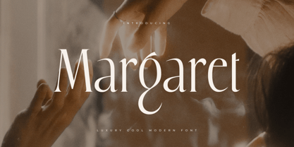 Margaret is Modern Luxury Unique Serif Font is a well-balanced contemporary font with a fancy, unique, and versatile Luxury serif, font that you can combine to get any variations and unique shapes easily just in seconds with choose alternates of them. It is a serif display font with moderate contrast that perfect for branding projects, logo, wedding designs, social media posts, advertisements, product packaging, product designs, label, photography, watermark, invitation, stationery, and any projects, it makes with a high level of legibility. What's Included: Character set A-Z Numerals & Punctuation Accented Characters (West Europe) Works on PC & Mac Recommended using Adobe Illustrator or Adobe Photoshop. Wish you enjoy our font. :)
 - Yanking by Sensatype Studio,
$15.00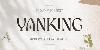 YANKING is Modern Display Ligature Font is a well-balanced contemporary font with a fancy, unique, and versatile Luxury serif, font that you can combine to get any variations and unique shapes easily just in seconds with choose alternates of them. It is a serif display font with moderate contrast that perfect for branding projects, logo, wedding designs, social media posts, advertisements, product packaging, product designs, label, photography, watermark, invitation, stationery, and any projects, it makes with a high level of legibility. What's Included: Character set A-Z Numerals & Punctuation Accented Characters (West Europe) Works on PC & Mac Recommended using Adobe Illustrator or Adobe Photoshop. Wish you enjoy our font. :)
 - Belha by Eurotypo,
$48.00 Sometimes we feel that we need something fresh, sometimes you may use something like an informal style, or even a little bit of spicy taste in a provocative message. Belha is a curly cursive typeface that can express a seductive atmosphere of casual style. All their glyphs were made carefully and were hand-drawn. The font contains different letter shapes, full of ligatures, swashes and stylistic alternates that can provide great flexibility for your designs. Belha includes diacritics signs for CE languages. It may be used for advertising, packaging design, flyers, posters, children books and many other purposes. How it will work, just depends on you.
 - Al Chevrola by Aluyeah Studio,
$80.00 Al Chevrola is a dynamic modern sans serif. Strong, with curves and an elegant touch. It is a rounded, geometric near-monoline construction sans serif typeface with display details which gives it modern, simple, elegant, chic, cool, and strong vibes. Each style and character looks amazing in large headlines. Al Chevrola works great in branding, logos, magazines, packaging. FEATURES: 4 Weight OpenType support Easy to use (with special combination) Multilingual support (15 languages) PUA Encoded Thanks for checking out Al Chevrola. I really hope you enjoy using it! If you have any questions I'd be more than happy to answer them, just send me a message.
 - Klapt by SevenType,
$24.99 Klapt is a geometric sans serif family that is soft on the outside and sharp on the inside. This family of four weights, includes an extended character set supporting most Latin languages even Vietnamese! Klapt, which can be bold or very elegant, is well suited for designs ranging from branding and corporate identity to editorial design and also web design. It is great for display purposes especially for headlines, posters, magazines, book covers, logos... you name it! Feel free to share your designs using Klapt or just get in touch via email to hi@seventype.com. Need extended Cyrillic support? We've got you covered https://www.myfonts.com/fonts/seventype/klapt-cyrillic/
 - Blue Venom by Linecreative,
$16.00 Blue Venom is a unique typography with a modern style, Each letter is cut into two parts, the first consists of three labyrinthine combined lines and the other is a diagonal cut line, so that the combination of these two parts into one letter that looks stunning , and each letter consists of four character choices, two character choices for numbers, and equipped with Ligatures (Opentype feature) All character options are included in one font. You can use alternatives in most major image editors, just find the Glyps (Alternate) menu item there. For example, in Adobe Illustrator you need to select the Window / Type / Glyphs menu item.
 - Blackhole PB by Pink Broccoli,
$14.00 A vintage look to the future of type, this funky typestyle with circular cut outs was stylish for its day, and a true novelty for today. Blackhole PB began as a digitization of a film typeface known as Circue Solid by LetterGraphics. This typestyle has such funkadelic appeal to it that it just makes me smile. Definitely not for broad uses, but full of novel flair. This font is the bees knees for anyone with a circle fetish. They are like hidden mickeys in this typestyle, building up curves and counters all over the place. Take it for a spin and have a flashback to wilder times.