10,000 search results
(0.034 seconds)
- Slurm by Nikola Klimova,
$15.00 Slurm is a hand-drawn fun font that is ideal for use in headlines, descriptions and logotypes used in product design and similar applications. In longer texts it works well as a complementary font for comics and illustrations. Various sizes and weights for individual characters are derived from the hand-drawn font. Each glyph is an original; no shapes are repeated. Ligatures have been created for double letters and the typeface includes diacritics for languages that use Latin letters. The typeface features two basic styles, Regular and Bold, which can be used separately just as well as combined. Each style also includes pictures that can be used for various occasions.
 - Alysar by KA Designs,
$12.00 Alysar is a delicate + modern handwritten font. Some letters are rigid, some strokes are "scratchy" - and that is the beauty of this font. This font is intended to look authentic - as if it just left your nib. This font is perfect for your wedding invitations, announcements and decor, branding, logos, quotes, labels, signs and more! This font includes alternate letters with swashes embedded into the font file for all lowercase letters - beginning and ending. These letters are easily accessible through Photoshop and Illustrator Simply highlight any lowercase letter and choose one of the alternates available or access all alternates through the glyphs panel. Thank you so much for your interest!
 - Romantic Robusta by Supersemarletter,
$12.00 Romantic Robusta is a flowing handwritten font, described by an elegant touch. It is perfect for your favorite projects. Fall in love with its incredibly distinct and timeless style and use it to create spectacular designs! This font is PUA encoded which means you can access all of the glyphs and swashes with ease! Font Features : • Regular version • Character set A-Z in uppercase and lowercase • Ligatures in Lowercase and special • Alternates option • Numerals & Punctuation • Accented Characters • Multiple Languages Supported Recommended to use in Adobe Illustrator or Adobe Photoshop with opentype feature. If you have questions, just send me a message and I'm glad to help. Best Regards, Supersemar Letter
 - Another by Supersemarletter,
$10.00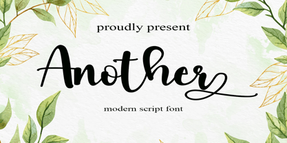 Another is a flowing handwritten font, described by an elegant touch, perfect for your favorite projects. Fall in love with its incredibly distinct and timeless style and use it to create spectacular designs! Provide ligatures with special make the design letter looks incredible. Honestly it works perfectly for headlines, logos, posters, packaging, T-shirts and much more. Font Features : • Regular version • Character set A-Z in uppercase and lowercase • Ligatures in Lowercase and special • Alternates option • Numerals & Punctuation • Accented Characters • Multiple Languages Supported Recommended to use in Adobe Illustrator or Adobe Photoshop with opentype feature. If you have questions, just send me a message and I'm glad to help.
 - Alkaria by Konstantine Studio,
$10.00 Please welcome, Alkaria. Fun and casual vintage retro decorative font. The definition of real versatility and flexibility. You can rock on both vibes, retro and modern by using a single font. Yes, just like your favourite day-to-day sneakers. Wide variety of Stylistic Alternates and Ligatures in every single letter to elevate your design game to the next level. And it comes in 3d Shadow version too. Cut the process more because it should be easy. Perfectly fit for the visual project such as logo, branding, poster, food and beverages, social media content, website, UI/UX design, youtube thumbnail, CV, mood board, wedding, you name it.
 - Waddle by Ben Sanders,
$18.99 Waddle is inspired by the playfulness of mid-century jazz albums, opening title sequences and movie posters. Friendly, rounded, slightly roughed, with a bouncy baseline, this unique typestyle boasts a generous number of glyphs and ligatures across all three weights. Waddle Thin is perfect for body copy and is both fun and elegant. Waddle Plump has been designed for bold headlines and titles. Waddle Regular is an ideal all-rounder. Combine the Waddle Family for maximum affect the next time you need to get a playful and positive message across to an audience of any age. Not too kiddy, not too serious ... just right.
 - Ronet by yasireknc,
$10.00 It can be tricky to find typefaces that can convey the feeling of personal warmth that comes from a handwritten note, custom brandings, special series of products, especially as we type more and more and write with a pen or pencil less and less. To add some more of that warmth to a font, I’ve made Ronet. A duo font based on the my handwriting. Double eponymous styles of the font —Ronet and Ronet Alternative— each have a unique flavor with its own rhythm and character. It can be used on branding designs, product labels, invitation cards, social purposes which is bloggers, influencers but they were capable of so much more, and I’m happy to share them for general use. Ronet has extraordinary alternative characters, that makes these fonts so impressive. These two styles have dynamic substitution, alternates, and beautiful kerning! Nevertheless, they each support an impressive range of languages using the Extended Latin alphabets and because they were designed to work well in a simple tool, a rare feature of these fonts is that they look just as good no matter where you use them. LOTS of writing, and then even more care once I developed and refined digital outlines from the samples. Ronet and Ronet Alternative each wrote pages and pages of letters to produce lots of examples for comparison and selection, in order to get the most authentic overall texture that captured the spirit of my left hand.. Ronet feels friendly and personal, like a neighbor or local shopkeeper who always seems happy to see you. This will perk up your social feeds in a snap. Start with Ronet and just add in your design to make it perfect. What started with a simple pen and paper has become a diverse and ever-expanding creative outlet that blends hand-drawn creativity with cutting-edge technology — and the end results are popping out everywhere, from advertising to design and decor to art and DIY.
 - Diecast by Device,
$39.00 A companion piece to Mulgrave, this font is the intermediary design between the chunky Victorian style that Mulgrave reproduces and the Ministry of Transport sans introduced in 1933 and digitised as Ministry. Although they date from between 1910 and 1933, these signs show the beginnings of several features Ministry later incorporated, notably the thinner strokes and the more modern forms of the G, M, R and S. The letter widths are approaching a monospace - the L, F and E are relatively wide compared to the W and M, a feature that may have something to do to the casting process. These idiosyncracies were all ironed out when the first version of the MOT alphabet was produced. The Device digitization, as with Mulgrave, stays true to the worn and repainted original metal source material and preserves the unusual widths.
 - Coldharbour Gothic by Device,
$39.00 Reminicent of mid-19th century antique type and Victorian cast-iron signage, Coldharbour Gothic lovingly preserves all the eroded and rusted textures in digital form. Characters have been selected to have cleaner and rougher counterparts - by flipping between cases, the user can customise the result and achieve the degree of decay or preservation they desire.
 - Beatnik by Type Innovations,
$39.00 I was working at Bozell Worldwide, an advertising agency, on their yearly promotional pitch. An art director was looking for a condensed informal headline treatment to be used on one of the new ad campaigns. I took several different font designs and started to condense and scale the proportions in the hopes of finding several good solutions. They finally settled on a version of Times Roman, scaled horizontally to about 50 percent proportions. I liked the look so much that I later went back to the drawing board and refined the concept by adding slanted serifs and a varying alignment on all the letter forms giving the typeface a very casual and informal appearance. At about that time, I was reading a book by Jack Kerouac, and was so inspired by his writings on the ‘beat generation’ that I decided to name the font ‘Beatnik’. Afterwards, I added a set of true small capitals and old style figures. I'm currently working on additional weights and variations to expand this ‘hip’ new font series. Groovin' baby.
 - Matchmaker by Angie Makes,
$30.00 Matchmaker, a modern calligraphy typeface, was inspired by the various works of modern day calligraphers. Its tall, quirky, and juxtaposed letterforms provide a deviation from traditional calligraphy-inspired typefaces. Matchmaker features smart contextual alternates and swashes that add to the front and beginnings of letters (using lowercase letters, enter === before the word then +++ after the word to see the feature in action). Also watch as letters on the end of words magically receive a shortened tail. This font works best in OpenType aware software so that you can take advantage of its many tricks and features. Comes as an .otf (OpenType font) file. Here is a great article on open type aware software: http://www.myfonts.com/info/opentype-support-in-applications/ Chocked full of swashes, alternates, and ordinals, Matchmaker just might be the perfect match for your next project.
 - Quicken by Fargun Studio,
$16.00 Quicken was inspired by the spirit of the past, when manual labor was common, and technology was just beginning to develop. Retro style and combination with Hand Lettering style, specially for traditional typography lovers and anyone who want to add natural handmade feeling in its brand identity. It comes with Lovely clean versions that expands its possibilities in use. Quicken is very good looking in logo, labels, t-shirt prints, product packaging, invitations, advertising and others. I've designed some examples, so you can see how it can be used. To enable the OpenType Stylistic alternates, you need a program that supports OpenType features such as Adobe Illustrator CS, Adobe Indesign & CorelDraw X6-X7. There are additional ways to access alternates, using Character Map (Windows), Nexus Font (Windows), Font Book (Mac) or a software program such as PopChar (for Windows and Mac).
 - Elektrakution by Comicraft,
$19.00 SHE'S DEAD, FRANK It's the year 1991, BC (Before Comicraft) when REM were still making records and Frank Miller’s memorable run on Marvel Comics’ DAREDEVIL was just over ten years old. Comicraft’s Richard Starkings found himself working in Anaheim, California for Graphitti Designs. Graphitti had produced the first hardcover edition of Miller’s Batman tale, DARK KNIGHT RETURNS and was now putting together the sequel to Miller’s DAREDEVIL — ELEKTRA LIVES AGAIN! Richard was not engaged to letter this book, the pages of Frank’s incredible original art that came through Graphitti’s studio were already lettered by Marvel Stalwart, Jim Novak. However, there were some cover elements that needed to be added, based on the logo originally rendered by Frank’s brother, Steve. Starkings set about the task of creating an alphabet that could be used to develop Steve’s idea for the trade dress -- the cover elements, the back cover copy and credits on the interior pages. This was long before Macintosh computers and font programs made this work considerably easier, so Rich sat down with a pencil and a sheet of vellum and rendered an alphabet that could be used as the basis for the text that was needed... Those sketches have languished in a drawer for nearly thirty years, but now, finally, Comicraft’s John Roshell has dusted off those old letterforms and Elektrakuted a font based on those designs, a font we HAD to call ELEKTRAKUTION! As for Elektra; she’s dead, Frank. Features: Ten weights (Light, Regular, Bold; Rough Light, Regular & Bold; Inline, Inline Rough, Outline & Outline Rough) with upper & lowercase characters, Western & Central European accents and Greek characters.
 - Astori by Gian Studio,
$16.00 Astori font is an elegant Display typeface with subtle details. This neat font can add modern and fashionable brand appeal. This versatile display typeface has enough character for logos and branding, as well as headlines, apparel, bridal and more. Keep it classic, or decorate it with ornate alternatives to uppercase and lowercase glyphs! To access the alternatives, you must have access to an older version of Photoshop to copy/paste the glyphs from the included PSD, OR the Glyphs Panel, which can be found in Photoshop CC or any Version of Adobe Illustrator.
 - Bright Ideas by Ingrimayne Type,
$9.00 The BrightIdeas family contains two novelty fonts that have letters on light bulbs. The fonts have some characters on standing bulbs and some on hanging bulbs and these two sets are made to alternate with the OpenType contextual alternatives (calt) feature. To use only one set of bulbs, this feature must be turned off and character spacing adjusted. The family contains a style with clear bulbs and one with filled bulbs. They can be used in layers to add color. Both are monospaced. The characters on the bulbs are derived from the font Myhota-Bold.
 - Montalica by Gatype,
$12.00 Montalica Typeface font is an elegant serif typeface with subtle details. This neat font can add modern and fashionable brand appeal. This versatile display typeface has enough character for logos and branding, as well as headlines, apparel, bridal and more. Keep it classic, or decorate it with ornate alternatives to uppercase and lowercase glyphs! To access the alternatives, you must have access to an older version of Photoshop to copy/paste the glyphs from the included PSD, OR the Glyphs Panel, which can be found in Photoshop CC or any Version of Adobe Illustrator.
 - Rotis Sans Serif by Monotype,
$45.99 Rotis is a comprehensive family group with Sans Serif, Semi Sans, Serif, and Semi Serif styles, for a total of 17 weights including italics. The four families have similar weights, heights and proportions; though the Sans is primarily monotone, the Semi Sans has swelling strokes, the Semi Serif has just a few serifs, and the Serif has serifs and strokes with mostly vertical axes. Designed by Otl Aicher for Agfa in 1989, Rotis has become something of a European zeitgeist. This highly rationalized yet intriguing type is seen everywhere, from book text to billboards. The blending of sans with serif was almost revolutionary when Aicher first started working on the idea. Traditionalists felt that discarding serifs from some forms and giving unusual curves and edges to others might be something new, but not something better. But Rotis was based on those principles, and has proven itself not only highly legible, but also remarkably successful on a wide scale. Rotis is easily identifiable in all its styles by the cap C and lowercase c and e: note the hooked tops, serifless bottoms, and underslung body curves. Aicher is a long-time teacher of design and has many years of practical experience as a graphic designer. He named Rotis after the small village in southern German where he lives. Rotis is suitable for just about any use: book text, documentation, business reports, business correspondence, magazines, newspapers, posters, advertisements, multimedia, and corporate design.
 - Hello January Cyrillic by Ira Dvilyuk,
$19.00 The slope and clear rhythm of the Hello January Cyrillic cursive script font will harmoniously blend in with the laconic design of your projects. Also, elements from the Hello January symbols font will be a good addition to it when creating logos. The font pair Hello January script font will look gorgeous on wedding stationery, love stories, branding materials, monoline logos, business cards, Insta quotes, elegant fashion sketches, and much more. Hello January script font contains the Cyrillic glyphs too. Hello January script is pretty monoline cursive font, plus a Symbols font with 36 lovely hand-drawn swashes and illustrations. Hello January script font contains a full set of uppercase and lowercase letters. Hello January Symbols is a font with over 36 hand-drawn elements, illustrations, and swashes that can help you to make your design unique and matchless. Combine and merge swashes and illustrations to create your own designs and make borders, frames, dividers, logos, and more (just use A-Z or a-z and 0-9 keys in the included Hello January Symbols font). A different symbol is assigned to each uppercase or lowercase standard character, so you do not need graphics software, just type the letter you need. Multilingual Support for 31 languages: Latin glyphs for Afrikaans, Albanian, Basque, Bosnian, Catalan, Danish, Dutch, English, Estonian, Faroese, Filipino, Finnish, French, Galician, Indonesian, Irish, Italian, Malay, Norwegian Bokmål, Portuguese, Slovenian, Spanish, Swahili, Swedish, Turkish, Welsh, Zulu. Cyrillic glyphs support Russian, Belorussian, Bulgarian, and Ukrainian languages.
 - DIN Next by Monotype,
$56.99 DIN has always been the typeface you root for—the one you wanted to use but just couldn’t bring yourself to because it was limited in its range of weights and widths, rendering it less useful than it could be. The century-old design has proven to be timeless, but modern use cases demanded an update, which resulted in DIN Next—a versatile sans serif family that will never go out of style. This classic design turned modern must-have includes seven weights that range from light to black, each of which has a complementary italic and condensed counterpart. The family also included four rounded designs, stretching the original concept’s range and core usability. DIN Next also boasts a suite of small capitals, old style figures, subscript, superscript and several alternate characters. A quintessential 20th-century design, its predecessor DIN was based on geometric shapes and was intended for use on traffic signs and technical documentation. Akira Kobayashi’s update made slight changes to the design, rounding the formerly squared-off corner angles to humanize the family. Rooted in over 100-years of history, it’s safe to say that there will always be a demand for the DIN design, and thanks to DIN Next, now it’s as usable as it is desired. Wondering what will pair with it perfectly? Check out Agmena™, Bembo® Book, Cardamon™, Joanna® Nova, FF Quadraat® and Quitador™. Featured in: Best Fonts for Logos, Best Fonts for Websites, Best Fonts for Tattoos
 - Noland by Flavortype,
$14.00 Noland, A new carefully crafted Variable Geometric Typeface. The Ideas of this fonts are from retro poster, music, movie poster, theater, science fiction from the 70s and early 80s. Adding the elements from the reference above to be represented as Noland. It’s Versatile, Fun, Sharp and Retro-ish feel that you get in Noland Typefaces. Noland Available with 3 Weights: Regular, Semibold and Bold. Also Available in Variable, so the weights are more flexible between Regular and Bold. Just Play with slider weight. Our creation on the display to give you a reference what it looks like on your project. such as Branding, Header, Logotype, Poster, Magazine, Packaging, and etc. It shows that Noland clearly can accommodate Retro Vintage style.
 - Ardena Variable by Julien Fincker,
$185.00 About Ardena: Ardena is a modern sans-serif typeface family. While neutral and clear at first glance, it can be characterized as both pleasant and confident due to its open, rounded forms and vertical terminals. It can be used in both a restrained and expressive way. The thinner and thicker weights are particularly suitable for strong headlines, while the middle weights can be used for typographic challenges and body text. Completed with an extensive character collection, it becomes a real workhorse. A versatile allrounder that is up to all challenges – for Corporate Identity, Editorial, Branding, Orientation and Guidance systems and much more. Variable Font The Variable Font contains 2 axes: weight and oblique – all in just one file. Features: With over 1064 characters, it covers over 200 Latin-based languages. It has an extended set of currency symbols and a whole range of Open Type Features. There are alternative characters as stylistic sets, small caps, automatic fractions – just to name a few. Arrows and numbers: In particular, the extensive range of arrows and numbers should be highlighted, which are perfectly suited for use in orientation and guidance systems. Thanks to Open Type Features and an easy system, the various designs of arrows and numbers can also be simply "written" without first having to select them in a glyph palette. The principle is easily explained: If a number is placed in round or square brackets, it will automatically be displayed in an outlined circle or square. If you add a period to the number, it is displayed in a full circle or square. The same principle also applies to the arrows. The arrows themselves are combinations of greater/less symbols with the various slashes or hyphens. Get the static version of the Ardena family here: https://www.myfonts.com/fonts/julien-fincker/ardena/
 - Brainly Script by Max.co Studio,
$19.00 Brainly Script is the font of choice for writing things that go beyond words. This font type is designed with high detail to deliver stylish elegance. So, it can be said, the character of the change is very beautiful, a kind of classical decorative copper script. Brainly Script presents alternative variants of most letters, binders, and many calligraphy tips, ideal for elegant labels, high-end packaging, personal stationery, and compositions for certain brands, beautiful titling, verses, letters and short texts, which are intended to be read only with the eyes or intended to whisper into someone's ear. Brainly Script has 792+ glyphs and 534 alternative characters, including various language support. With the OpenType feature with an alternative style and elegant binder. The OpenType feature does not function automatically, but you can access it manually and for the best results needed for your creativity in combining these Glyph variations. And also a touch of ornament makes this font look elegant. To enable the OpenType Stylistic alternates, you need a program that supports OpenType features such as Adobe Illustrator CS, Adobe Indesign & CorelDraw X6-X7, Microsoft Word 2010 or later versions. (Windows), Font Book (Mac) or a software program such as PopChar (for Windows and Mac). How to access all alternative characters using Adobe Illustrator: https://www.youtube.com/watch?v=XzwjMkbB-wQ How to use stylistic sets fonts in Microsoft Word 2010 or later versions: https://www.youtube.com/watch?v=NVJlZQ3EZU0 There are additional ways to access alternates / swashes, using the Character Map (Windows), Nexus Font (Windows) Font Book (Mac) or a software program such as PopChar (for Windows and Mac). How to access all the alternative characters, using the Windows Character Map with Photoshop: https://www.youtube.com/watch?v=Go9vacoYmBw If you need help or advice, please contact me by e-mail "maximal.fonts@gmail.com" Thank you for watching!
 - PF Bodoni Script Pro by Parachute,
$79.00 Always intrigued by Bodoni's original work, I was set out—back in 2000—to examine his work and study Manuale Tipografico, one of the greatest specimen books ever printed. Issued in 1818 at Parma, Italy by Bodoni's widow, the two-volume work shows an impressive array of 142 roman alphabets and some foreign ones such as Greek and Cyrillic. After a careful examination of all characters, I decided to create a typeface based on the distinct script capitals presented in the book. Matching lowercase italics were later selected and designed to complete the series. Since my intention was not to create simply a digital version of Bodoni's work, this typeface was designed with connected characters and capitals with extra calligraphic elements. The result was released in 2002 and published in our award-winning catalog/book IDEA/Trendsetting Typography vol.1. Later in 2005 we revived a large number of ornaments and borders (credit goes to designer George Lygas). All this work was left behind till recently when it was revisited to create a complete 'Pro' family. Several new uppercase and lowercase glyphs were designed in order to create a distinct typeface, which is based on Bodoni but yet it stands out on its own. The new version also takes care of conflicts between neigbouring letters, something that was not included in the first version. Bodoni Script Pro is a 3-weight superfamily. It supports 10 special opentype features including 'contextual alternates' as well as support for both Latin and Greek. Each font comes with 725 glyphs including a large number of alternates as well as 144 ornaments. Furthermore, when you purchase the whole package you get a bonus font which contains 120 frame parts. These parts, when put together, create some truly amazing borders. -Panos Vassiliou
 - Mealsika Script by Solidtype,
$17.00 Say hello to Mealsika Script - A contemporary script with a vintage calligraphy style with moving baseline and an elegant touch.That makes the font look fabulous! It can be used for various purposes such as headings, signatures, logos, wedding invitations, t-shirts, letterhead, signage, labels, news, posters, badges, and more. Features 350+ glyphs and 179 alternate characters including initial and terminal letters, alternates, ligatures and multiple language support. To enable the OpenType Stylistic alternates, you need a program that supports OpenType features such as Adobe Illustrator CS, Adobe Indesign & CorelDraw X6-X7, Microsoft Word 2010 or later versions. These are all coded with PUA Unicode. Mac users can use Font Book and Windows users can use Character Map to view and copy any of the extra characters to paste into your favourite text editor/app. Thanks and Happy Creating :)
 - Salloon by Ingrimayne Type,
$8.95 The original version of Salloon was what has become Salloon-Wide. It was designed a year or two before 1990. The narrower version, which is now the regular version of the face, was constructed a few years later. There never has been a true lower-case set of letters for these fonts, but the narrower version introduced a second set of caps by removing the side bumps from the letters. Although Salloon may look like an old font, no historic font closely resembles it. Fonts with bold, thick stems such as Salloon invite interior decoration. The five striped versions and the shattered version of the font were produced a year or two after the construction of the narrower Salloon when the arrival of a font distortion program made it easy to cracked and stripe fonts. In 2019 an outline style and two highlighter styles were added to be used in layers with the Salloon-Regular and one highlighter style was added to be used with Salloon-Wide.
 - Jetworld by Nelson Borhek Press,
$12.00 Jetworld is the space-age typeface with the retro-forward look. Jetworld’s tapered and weighted parabolic-arch curves interplay with its rigid, straight verticals and horizontals to create an unexpected but pleasing motion and a rhythm that is constantly changing. Jetworld is an OpenType font that speaks of clean space-age design, midcentury optimism, and the promise of new frontiers. Jetworld gives a midcentury-modern or retro-futuristic look to book covers, magazine layouts, posters, and album covers. But Jetworld is adaptable, too. With hints of ancient cuneiform writings mixed with the look of markings on an alien spaceship, Jetworld spans eons. And Jetworld’s large character set includes multi-lingual support and many other special characters. That means Jetworld can be used for more than just headlines and more than just English. Jetworld combines a distinctive personality with surprising readability. Jetworld is unusual in that it is not descended from handwriting or calligraphy. Instead, Jetworld was inspired by midcentury modern architecture and consumer goods. Think of the parabolic arches seen in midcentury masterpieces like the Theme Building at Los Angeles International Airport, the TWA terminal at JFK Airport in New York, and even the cartoon architecture of “The Jetsons” television show. Think of boomerang-patterned Formica countertops and tabletops, or arch-shaped “hairpin” legs on midcentury furniture. Jetworld’s character shapes were inspired by all of these. Jetworld—direct from the world of the future to you.
 - HS Safa by Hiba Studio,
$50.00 HS Safa, an elegant Arabic display typeface carefully crafted for book titles, creative graphic projects, and modern logos. Categorized under "titles," it draws inspiration from the rules of Fatmic Kufi calligraphy, infusing a beautiful idea and special dimensions that preserve the allure of the Arabic font and its fixed rates. HS Safa is built upon the foundation of HS Sama font, but with a fresh and stunning molding (ornament) for the vertical strokes, adding a new dimension to its charm. This intricate detail enhances the overall visual appeal, making HS Safa a captivating choice for any design project. With comprehensive support for Arabic, Persian, and English languages, this typeface is versatile and accommodating. Available in two weights, Regular and Bold, it effortlessly integrates into the collection of contemporary Arabic Kufic fonts, catering to diverse design preferences. Whether seeking a modern Arabic font with a touch of uniqueness, HS Safa is a perfect addition to elevate any creative endeavor.
 - Lakone by Locomotype,
$20.00 Lakone is a modern serif font that brings a touch of sophistication to your designs. With its narrow character and sleek aesthetics, Lakone is the perfect choice for titles and headlines that demand attention. But Lakone offers more than just good looks. With its extensive set of Opentype features, including dozens of ligatures, swashes, and alternatives, this font empowers you to unleash your creativity and elevate your typography game. These features provide you with endless possibilities to customize your designs and add that extra touch of elegance. Stand out from the crowd with Lakone. Whether you're designing a magazine cover, a logo, or a website, this font will captivate your audience and leave a lasting impression. Don't settle for ordinary typography when you can have the allure and versatility of Lakone. Get ready to elevate your design projects and make a bold statement with this modern serif font.
 - Frisco Antique Display SG by Spiece Graphics,
$39.00 Here is a decorative condensed antique design that is sure to fit a variety of contemporary situations. The Bruce Type Foundry (later acquired by V. B. Munson) developed this wonderfully shaded Tuscan in the 1880s - or possibly earlier. It was known back then as Style No. 1050 and carried a pronounced three-dimensional look with a thin hairline at the bottom and right of each stroke. It is best to use Frisco Antique in large display sizes because it is easy to lose these delicate hairlines. A lowercase and several alternate characters have been provided for your convenience. Frisco Antique Display is also available in the OpenType Std format. Some new characters have been added to this OpenType version. Advanced features currently work in Adobe Creative Suite InDesign, Creative Suite Illustrator, and Quark XPress. Check for OpenType advanced feature support in other applications as it gradually becomes available with upgrades.
 - Weekend Warrior - 100% free

- Alkalis by Craft Supply Co,
$20.00 Alkalis: Modernity Meets Elegance Meet Alkalis – Modern Elegant Serif, where modern meets timeless. This serif offers the perfect contrast for versatility. It’s crafted for both text and display needs. Alkalis brings a touch of elegance to any project. Balanced Contrast With Alkalis, experience the ideal balance in font design. The contrast is just right, not too sharp, not too soft. This balance makes it perfect for an array of uses. Plus, it’s designed to be as fitting for body text as it is for headers.
 - Clever by 1871 Project,
$9.00 Introducing Clever, our first serif family! Featuring 5 weights making it super versatile for almost any project! I started creating this at the beginning of quarantine and just recently finished up! Clever is inspired by timeless packaging from a forgotten era. It has a beautiful range of stylistic alternates with unique characters making it a powerhouse for logos, headlines, posters, shirts, you name it! More ligatures/alternates on the way in the coming weeks/months! What do you get? Clever in 5 weights 109 Alternates + 27 Ligatures
 - Retroparty by Putracetol,
$21.00 Introducing Retro Party - A Display Retro Script Font. In creating this font, I just wanted to combine classic style with modern retro style, so be this font. Hope you like it. Inspired by some retro fonts that I made before. Retro Party is perfect for vintage and retro design, badge, logos,t-shirt, poster, branding, packaging, signage, book coverand so much more! Come with Opentype feature with a lot of alternates, its help you to make great lettering. This font is also support multi language.
 - Shmulkas by Fontsoon,
$9.00 Nu?! Vhat else vould you font?! Introduction to the first kosher vant...er...font! Yes, our Board certified rabbis made all the proper blessings so you can use this font guilt free. Just kidding, what's Jewish without a schmear of guilt. This font borrows its style from the 2nd. Avenue Deli all the way down to Guss Pickles on Essex street. If pastrami on white bread with ketchup is for you, this font is NOT. Its strictly pastrami on rye with mustard and slaw on the side.
 - MVB Calliope by MVB,
$39.00Gayle Sato, longtime friend of MVB Fonts, has amazing handwriting. It’s a natural, simple hand, with perfect rhythm. Devoid of flourishes, it doesn’t try to be beautiful. It’s just genuine, quick, and clean — the handwriting we all wish we had. The digitization by Mark van Bronkhorst captures these qualities. Retaining the roughness of a felt pen, MVB Calliope is a handwriting typeface that feels much more authentic than most, highly legible but still raw. The Regular was released in 2005, with the other weights shortly thereafter. - Bankal by Hugo Kuder,
$10.00 After a few months my new typeface "Bankal" is here! To create it, I always tried to keep a 90 degree angle. In French when you say that something is "bancal" it means that it's not right. This is why I choose this as a name because despite the name she is right. And for the K it's just for the style here. Bankal is a sans-serif font with 3 variations (bold, regular, light) Check more on my website : https://www.hugokuder.com/ or my instagram : hugokuderdesign
 - Anton Charlote by Gloow Studio,
$16.00 Introducing Anton Charlote - A Display Retro Script Font. In creating this font, I just wanted to combine classic style with modern retro style, so be this font. Hope you like it. Inspired by some retro fonts that I made before. Anton Charlote is perfect for vintage and retro design, badge, logos,t-shirt, poster, branding, packaging, signage, book coverand so much more! Come with Opentype feature with a lot of alternates, its help you to make great lettering. This font is also support multi language.
 - Jasmin by Vincenzo Crisafulli,
$29.00 Jasmin is a tribute to the ancient stories of The Thousand and One Nights, in which a main story serves as a connection for a series of other stories, just like all the other glyphs are derived from one of Jasmin's letters or from a sign. A graphic path in which we tried to combine the calligraphy designed with a quill with geometric research. Among the glyphs there is one referring to a letter from a famous font by Paul Renner, made by Fonderia Bauer in 1927.
 - Blossom Lovely by Romie Creative,
$13.00 blossom lovely is an elegant monoline script font that works just fine. I've always dreamed of designing a font that feels welcoming, Smooth lines, single weight lines and charming variations of blossom lovely achieve the ideal balance of humanity and clarity. This font is perfect for branding and marketing campaigns that call for personality and friendliness. My goal with this font is to create a readable script font that will serve a variety of purposes. This font maintains personality in creating a consistent character set. It has a handmade taste and provides a hint of authenticity; perfect for your upcoming project. Do not miss!
 - Pexico by Setup,
$- Pexico is a pixel typeface that uses 10 by 14 grid (capital letter) in 8 styles: 4 basic styles for text setting — Regular, Bold, Narrow, and Mono and 4 stylistic variations of the Regular style for display setting — Outline, Dots, Round, and Inverse. It fits the display's pixel grid when used at 20pt size or its multiples. Pexico supports Latin, Cyrillic, and Greek Monotonic scripts, all with thoroughly designed diacritics. Moreover, Pexico makes use of advanced OpenType features, just as any other modern text typeface. Each style also has 9 sets of numbers, small capitals and is properly kerned. For more information go to Urtd.
