10,000 search results
(0.062 seconds)
- Dupla by Tipo Pèpel,
$22.00 When Dupla was designed, its DNA shown the best of the typographic heritage from the XIX century types, the oldest san serif known, also named as “Grotesk”, a soft synonym for bizarre, unnatural weird. XIX century Germans' eyes were surprised, astonished by the formal strangeness that provoked the mutilation of the well known serifed types. But the skeleton and DNA are barely perceptible, an invisible part of the nature of objects. We are interested in the epidermis, the outer, the visible, which directly speak to the eyes, and Dupla tells us with overwhelming presence, that is a formal, traditional type, covered with a childlike sweetness, with slight curves, epidermic, sweetening even ink’s traps up. Frutiger said that Latin alphabet letter’s minimum skeleton is like a lock where you should fit all the letters you see, but that skeleton allows many skins. We use a different skin for every specific use. And Dupla’s skin points to how generous, how friendly it is; the sweetness of the big and good-natured. They do not feel very comfortable in low-cost airplanes company’s seats, but in the proper location with enough room, they'll fill the atmosphere with kindness. Do not ask for narrow columns, or terse captions in squalid sizes; do not ask for ridiculous “small print” in dark contracts where «The party of the first part shall be known in this contract as the party of the first part …» That’s not for Dupla. Large headlines, generous width columns to cover, rude pullquotes half-breaking columns, loud exclamations, great sizes, with black weights. It’s in the insultingly generous, almost obscene use where Dupla is felt. And if you consider this a obscene, gargantuan, typographical feast, Dupla brings you everything to demonstrate that quantity does not mean less quality. Multi-language support, Latin plus full coverage, complete sets of small caps, fractions, old numerals, modern, tabular, bonds and all the “gourmet” paraphernalia that Patau has accustomed us, after many years of work. If you want to be obscene and pass the censorship, use Dupla. Hedonism is just a venial sin.
 - Prillwitz Pro by preussTYPE,
$49.00 Johann Carl Ludwig Prillwitz, the German punch cutter and type founder, cut the first classic Didot letters even earlier than Walbaum. The earliest proof of so-called Prillwitz letters is dated 12 April 1790. Inspired by the big discoveries of archaeology and through the translations of classical authors, the bourgeoisie was enthused about the Greek and Roman ideal of aesthetics. The enthusiasm for the Greek and Roman experienced a revival and was also shared by Goethe and contemporaries. »Seeking the country of Greece with one’s soul«. All Literates who are considered nowadays as German Classics of that time kept coming back to the Greek topics, thinking of Schiller and Wieland. The works of Wieland were published in Leipzig by Göschen. Göschen used typefaces which had been produced by until then unknown punch cutter. This punch cutter from Jena created with these typefaces master works of classicist German typography. They can stand without any exaggeration on the same level as that of Didot and Bodoni. This unknown gentleman was known as Johann Carl Ludwig Prillwitz. Prillwitz published his typefaces on 12th April 1790 for the first time. This date is significant because this happened ten years before Walbaum. Prillwitz was an owner of a very successful foundry. When the last of his 7 children died shortly before reaching adulthood his hope of his works was destroyed, Prillwitz lost his will to live. He died six months later. His wife followed him shortly after. The typeface Prillwitz as a digital font was created in three optical styles (Normal, Book and Display). The typeface Prillwitz Press was created especially for a printing in small sizes for newspapers. »Prillwitz Press« combines aesthetic and functional attributes which make written text highly readable. It was originally designed for a newspaper with medium contrast to withstand harsh printing conditions. Its structure is quite narrow which makes this typeface ideal for body text and headlines where space is at premium. For the Normal – even more for the Book – a soft and reader-friendly outline was created through a so-called »Schmitz« and optimized in numerous test prints. The arris character and the common maximal stroke width contrast of the known classicist typefaces (Didot/Bodoni) were edited by the study of the original prints. This was also done in order to reach a very good readability in small type sizes. This typeface is perfectly suited to scientific and belletristic works. Accordingly it has three styles: Regular, Bold and Italic as Highlighting (1). The typeface Prillwitz is a complete new interpretation and continuing development of the conservated originals from 1790. They have been kept in the German Library in Leipzig. It was always given the priority to keep the strong roughness and at the same time optimizing the readability of this striking font. The type family has all important characters for an efficient and typographic high quality work. ----------- (1) Accentuation of particular words or word orders (e.g. proper names, terms etc.). Typographic means for Highlighting could be Italic, SmallCaps or semi-bold.
 - Freigeist by René Bieder,
$29.00 The story of Freigeist is a journey into the past, back to the early grotesk fonts and long before Helvetica and Co were standard fonts in operating systems. For what we take for granted today is the result of innovation and pioneering spirit of type foundries such as Caslon or Stephenson Blake in the 19th century, whose expressive designs are mostly forgotten today. The Freigeist family captures this untamed spirit — hence the name (German for “free spirit”) — and puts it into a contemporary context, resulting in a multi-faceted family with a wide range of applications, font styles and features for modern typesetting. Design Details Unlike other modern grotesk typefaces like Helvetica or Univers, Freigeist is characterized by a warm and dynamic appearance. It draws inspiration from various historical models such as Caslon’s Doric or the Grotesque variants of Stephenson Blake. Particularly noticeable are the narrow terminals, the serpentine S or the dynamic g in combination with ascenders that reach to the cap-height only. Italics Many italic grotesk fonts are strongly oriented towards their upright counterparts. Unfortunately, this often means that they cannot do justice to their actual task, which is to highlight words or sections of a text. The italic cuts of Freigeist try to remedy this situation by using the greatest possible formal distance while reinforcing the untamed spirit. What adds to this, is a reminiscent of handwritten forms, which can be found in a, n, y or g, as well as the German sharp s or the ampersand. Alternate Characters Alternative letterforms are ideal for customizing the overall appearance of a text, for usage in logos or they can even work as custom fonts for companies. Freigeist comes with ten stylistic alternatives that are easy to insert via the Opentype window, such as the single-storey a, a tail-less version of the a for compact text, when uses in condensed widths or a dialed down version of the r. Languages Freigeist has a built-in support for Latin and Cyrillic based languages and covers more than 210 languages. Opentype Features and Symbols The family comes with many opentype features to support modern typesetting. This includes ligatures, different number sets or alternative shapes for texts set in all caps. Styles Freigeist is available in five widths (XCon, Con, Normal, Wide, XWide) and six weights (Thin, Light, Regular, Medium, Bold, Black). Including the accompanying italics, the family comes in 60 cuts that are suitable for any application. Testfonts If you like to test the fonts before buying the full version, please follow the link below: https://www.renebieder.com/test-fonts Update 1 A lot has changed in this first update. It is more than just a 1.01 or 1.02. It is actually the 2.0! I’ve gone through all! single glyphs of the 18 master files, making the family more sharp and even a bit more modern. I’ve added some new opentype features and redesigned the italics, because I wasn’t happy enough with the result. I’ve added new kerning pairs, new metrics, and even new glyphs. Please check my website for more details on the new design and overview about the opentype features and alternate shapes. If you purchased the Freigeist family already, thanks a lot!! It is the most advanced family that I published so far. I hope that you’re happy with this new version. Thanks!
 - Xyzai by Typodermic,
$11.95 The turn of the millennium marked a significant shift in the world of design. From the pulsating lights of Times Square to the glowing screens of our computers, technology became an essential part of our lives. Inspired by this futuristic aesthetic, the Xyzai typeface brings a unique blend of industrial elegance and scientific clarity to your message. Xyzai’s segmented LED-inspired structure and unusually wide letterforms are sure to catch the eye of any viewer. Its unconventional design allows for a voice that is both striking and sophisticated. Whether you’re creating a digital display, poster, or magazine layout, Xyzai adds a touch of boldness and sophistication to any project. This Y2K-inspired techno typeface comes in two styles—regular and italic—allowing for versatility in your design choices. Whether you’re looking to create a sleek and modern feel or want to add a touch of edginess to your design, Xyzai is the perfect choice. The ruggedness of Xyzai’s design is reflective of the technology that inspired it, giving it a raw, authentic feel. Its LED-inspired design is both innovative and timeless, making it a font that will stand the test of time. In conclusion, Xyzai is a typeface that bridges the gap between technology and art. Its industrial elegance and scientific clarity make it a must-have for any designer looking to create a bold and striking message. Choose Xyzai and embrace the future of design today. Most Latin-based European writing systems are supported, including the following languages. Afaan Oromo, Afar, Afrikaans, Albanian, Alsatian, Aromanian, Aymara, Azerbaijani, Bashkir (Latin), Basque, Belarusian (Latin), Bemba, Bikol, Bosnian, Breton, Cape Verdean, Creole, Catalan, Cebuano, Chamorro, Chavacano, Chichewa, Crimean Tatar (Latin), Croatian, Czech, Danish, Dawan, Dholuo, Dutch, English, Estonian, Faroese, Fijian, Filipino, Finnish, French, Frisian, Friulian, Gagauz (Latin), Galician, Ganda, Genoese, German, Gikuyu, Greenlandic, Guadeloupean Creole, Haitian Creole, Hawaiian, Hiligaynon, Hungarian, Icelandic, Igbo, Ilocano, Indonesian, Irish, Italian, Jamaican, Kaingang, Kanuri, Kaqchikel, Karakalpak (Latin), Kashubian, Kikongo, Kinyarwanda, Kirundi, Kurdish (Latin), Latvian, Lithuanian, Lombard, Low Saxon, Luxembourgish, Maasai, Makhuwa, Malay, Maltese, Māori, Moldovan, Montenegrin, Nahuatl, Ndebele, Neapolitan, Norwegian, Novial, Occitan, Ossetian (Latin), Papiamento, Piedmontese, Polish, Portuguese, Quechua, Rarotongan, Romanian, Romansh, Sami, Sango, Saramaccan, Sardinian, Scottish Gaelic, Serbian (Latin), Shona, Sicilian, Silesian, Slovak, Slovenian, Somali, Sorbian, Sotho, Spanish, Swahili, Swazi, Swedish, Tagalog, Tahitian, Tetum, Tongan, Tshiluba, Tsonga, Tswana, Tumbuka, Turkish, Turkmen (Latin), Tuvaluan, Uzbek (Latin), Venda, Venetian, Vepsian, Võro, Walloon, Waray-Waray, Wayuu, Welsh, Wolof, Xavante, Xhosa, Yapese, Zapotec, Zarma, Zazaki, Zulu and Zuni.
 - Marianas by Typodermic,
$11.95 Marianas is a typeface that demands attention. With its militaristic, industrial-looking Art Deco design, it’s a force to be reckoned with. It’s the typeface you choose when you want to convey strength and power. But it’s not just its aesthetics that make Marianas stand out. This font has a history, a purpose. It was first recruited for a video game about the Pacific Air War, where it proved to be the perfect choice for conveying the bold, fearless attitude of the game’s characters. Marianas is a hybrid of two distinct styles—the suave elegance of the 1920s and the serious, mechanical precision of the 1940s. So if you want to make a statement, if you want to stand out from the crowd, choose Marianas. It’s a typeface that’s not for the faint of heart, but for those who are bold enough to embrace the power of design. Most Latin-based European, and some Cyrillic-based writing systems are supported, including the following languages. A Afaan Oromo, Afar, Afrikaans, Albanian, Alsatian, Aromanian, Aymara, Bashkir (Latin), Basque, Belarusian (Latin), Bemba, Bikol, Bosnian, Breton, Bulgarian, Cape Verdean, Creole, Catalan, Cebuano, Chamorro, Chavacano, Chichewa, Crimean Tatar (Latin), Croatian, Czech, Danish, Dawan, Dholuo, Dutch, English, Estonian, Faroese, Fijian, Filipino, Finnish, French, Frisian, Friulian, Gagauz (Latin), Galician, Ganda, Genoese, German, Greenlandic, Guadeloupean Creole, Haitian Creole, Hawaiian, Hiligaynon, Hungarian, Icelandic, Ilocano, Indonesian, Irish, Italian, Jamaican, Kaqchikel, Karakalpak (Latin), Kashubian, Kikongo, Kinyarwanda, Kirundi, Komi-Permyak, Kurdish (Latin), Latvian, Lithuanian, Lombard, Low Saxon, Luxembourgish, Maasai, Macedonian, Makhuwa, Malay, Maltese, Māori, Moldovan, Montenegrin, Ndebele, Neapolitan, Norwegian, Novial, Occitan, Ossetian, Ossetian (Latin), Papiamento, Piedmontese, Polish, Portuguese, Quechua, Rarotongan, Romanian, Romansh, Russian, Sami, Sango, Saramaccan, Sardinian, Scottish Gaelic, Serbian, Serbian (Latin), Shona, Sicilian, Silesian, Slovak, Slovenian, Somali, Sorbian, Sotho, Spanish, Swahili, Swazi, Swedish, Tagalog, Tahitian, Tetum, Tongan, Tshiluba, Tsonga, Tswana, Tumbuka, Turkish, Turkmen (Latin), Tuvaluan, Uzbek (Latin), Venetian, Vepsian, Võro, Walloon, Waray-Waray, Wayuu, Welsh, Wolof, Xhosa, Yapese, Zapotec Zulu and Zuni.
 - Picture Yourself by Linotype,
$29.99Create your own world with the Picture Yourself collection! Picture Yourself is a graphic image collection, which functions a font family instead of hundreds of EPS files. The family is made up of 24 different symbol typefaces. Designed by the collaborative effort of Karin and Peter Huschka, both living in Germany, Picture Yourself was a winner in the 2003 International Type Design Contest, sponsored by Linotype GmbH. The symbol library found in Picture Yourself offers an astounding array of high-contrast, simple forms, which may be used happily either separately or together in your layouts. Just as the fonts themselves stem from two designers working in collaboration, the imagery of the collection itself stems from two different influences. In large part, the font family was inspired by work displayed in the Frankfurt-based German Architecture Museum's 2003 Oscar Niemeyer exhibition. The photographs and sketches that were displays there inspired the first ideas for the Picture Yourself world of images. More of the typeface's design, as well as its name, were inspired by the underlying philosophy of the Beatles' music, especially the classic song from Lennon and McCartney, "Lucy In The Sky With Diamonds." In comparison with other large pictographic type collections, all of the characters in Picture Yourself fonts share the same horizon. The glyphs themselves are also drawn so that many of them can be combined with one another, creating tall or wide decorative compositions. Additionally, the proportions of the forms of the pictographs are aligned with various industry standards, in order to harmonize workflow. Picture Yourself Portraits (3:4), Landscapes (6:4), Cinema (9:4), and Panorama (12:4) each adhere to one of several photo or video formats. The Picture Yourself family of fonts can best be used with graphics applications like Adobe Photoshop or Illustrator, where different characters may be assigned to different layers, each with their own color. - Movatif by Typodermic,
$11.95 Introducing Movatif, the typeface that effortlessly combines the best of 20th Century sans-serif typefaces into one irresistible mash-up. With seven different weights to choose from, this font has the versatility to make any design stand out. But Movatif isn’t just any ordinary font—it’s packed with OpenType features that will leave your audience in awe. By simply pairing certain letters together, you can create a captivating visual effect that will absolutely freak folks out. Take the letters M and A, for example—they snap together in a way that is both cool and slightly fascinating. But what really sets Movatif apart is the way familiar pieces interact in unexpected ways. With every letter, your design takes on a personalized style that captures the dreary 1970s malaise in a fashionable way. So if you want to create something truly unique, give Movatif a try. With its versatile weights and captivating features, it’s the typeface that will take your design to the next level. Most Latin-based European writing systems are supported, including the following languages. Afaan Oromo, Afar, Afrikaans, Albanian, Alsatian, Aromanian, Aymara, Bashkir (Latin), Basque, Belarusian (Latin), Bemba, Bikol, Bosnian, Breton, Cape Verdean, Creole, Catalan, Cebuano, Chamorro, Chavacano, Chichewa, Crimean Tatar (Latin), Croatian, Czech, Danish, Dawan, Dholuo, Dutch, English, Estonian, Faroese, Fijian, Filipino, Finnish, French, Frisian, Friulian, Gagauz (Latin), Galician, Ganda, Genoese, German, Greenlandic, Guadeloupean Creole, Haitian Creole, Hawaiian, Hiligaynon, Hungarian, Icelandic, Ilocano, Indonesian, Irish, Italian, Jamaican, Kaqchikel, Karakalpak (Latin), Kashubian, Kikongo, Kinyarwanda, Kirundi, Kurdish (Latin), Latvian, Lithuanian, Lombard, Low Saxon, Luxembourgish, Maasai, Makhuwa, Malay, Maltese, Māori, Moldovan, Montenegrin, Ndebele, Neapolitan, Norwegian, Novial, Occitan, Ossetian (Latin), Papiamento, Piedmontese, Polish, Portuguese, Quechua, Rarotongan, Romanian, Romansh, Sami, Sango, Saramaccan, Sardinian, Scottish Gaelic, Serbian (Latin), Shona, Sicilian, Silesian, Slovak, Slovenian, Somali, Sorbian, Sotho, Spanish, Swahili, Swazi, Swedish, Tagalog, Tahitian, Tetum, Tongan, Tshiluba, Tsonga, Tswana, Tumbuka, Turkish, Turkmen (Latin), Tuvaluan, Uzbek (Latin), Venetian, Vepsian, Võro, Walloon, Waray-Waray, Wayuu, Welsh, Wolof, Xhosa, Yapese, Zapotec Zulu and Zuni.
 - Vtc-NueTattooScript - Personal use only

- FS Olivia Paneuropean by Fontsmith,
$90.00Antwerp On a visit to Belgium and the Netherlands while still an MA student at Reading University, Eleni Beveratou made some important discoveries. First, there was the letter ‘g’ from the Didot family seen at Plantin Moretus Museum in Antwerp, which seemed “almost like a mistake”. Then there were strange details such as the serifs on the “l”, “h”, “k”, “b” and “d” in Egmont Cursive and other typefaces by Sjoerk Hendrik de Roos, found in volumes of poetry she picked up from a chaotic bookshop in Amsterdam. These were characters that stood out from the text but seemed to blend harmoniously with the rest of the letters. “And there it was, the spark. I decided to design a typeface that would capture the details of the process of writing.” A guiding hand Eleni shared her initial thoughts with Phil Garnham and Jason Smith. They liked what they saw in her tentative first sketches, and gave her the chance to develop her ideas further. Phil, in particular, provided valuable input as FS Olivia took shape. Eleni’s main influence – the handwritten – would give the font its character. “When creating a typeface,” says Eleni, “it’s fair to say that it reflects some of the designer’s personality. And that’s certainly the case with FS Olivia. “Although technology is part of my everyday life. I am a great admirer of traditional graphic design where you can touch and feel paper and ink.” Irregular “What I particularly like,” says Eleni, “is that a printed item can develop its own personality sometimes as a result of imperfections in the print. “FS Olivia has some of these characteristics as it’s inspired by handwriting, and yet it also includes some very modern features.” Feminine and fascinating, FS Olivia captures the expressive twists and turns of (the poet’s?) pen on paper, with low junctions, deep top serifs and semi-rounded edges. Round outstrokes contrast with the rough corners of the instroke, while strong diagonals and inclined serifs create a richly textured pattern. Polytonic It’s only fitting that there should be a version of this poetic font for one of the birthplaces of poetry and song. Eleni, who hails from Athens, developed an extensive range of glyphs that could be used for the Greek language, in both modern and ancient texts. For the latter, there is a version of Olivia for displaying polytonic Greek (a system that utilises a range of accents and “breathings”), which brings the 21st century technology of OpenType to the presentation of poetic texts from Ancient Greece. Just think what Homer could have done with that. - FS Olivia by Fontsmith,
$70.00 Antwerp On a visit to Belgium and the Netherlands while still an MA student at Reading University, Eleni Beveratou made some important discoveries. First, there was the letter ‘g’ from the Didot family seen at Plantin Moretus Museum in Antwerp, which seemed “almost like a mistake”. Then there were strange details such as the serifs on the “l”, “h”, “k”, “b” and “d” in Egmont Cursive and other typefaces by Sjoerk Hendrik de Roos, found in volumes of poetry she picked up from a chaotic bookshop in Amsterdam. These were characters that stood out from the text but seemed to blend harmoniously with the rest of the letters. “And there it was, the spark. I decided to design a typeface that would capture the details of the process of writing.” A guiding hand Eleni shared her initial thoughts with Phil Garnham and Jason Smith. They liked what they saw in her tentative first sketches, and gave her the chance to develop her ideas further. Phil, in particular, provided valuable input as FS Olivia took shape. Eleni’s main influence – the handwritten – would give the font its character. “When creating a typeface,” says Eleni, “it’s fair to say that it reflects some of the designer’s personality. And that’s certainly the case with FS Olivia. “Although technology is part of my everyday life. I am a great admirer of traditional graphic design where you can touch and feel paper and ink.” Irregular “What I particularly like,” says Eleni, “is that a printed item can develop its own personality sometimes as a result of imperfections in the print. “FS Olivia has some of these characteristics as it’s inspired by handwriting, and yet it also includes some very modern features.” Feminine and fascinating, FS Olivia captures the expressive twists and turns of (the poet’s?) pen on paper, with low junctions, deep top serifs and semi-rounded edges. Round outstrokes contrast with the rough corners of the instroke, while strong diagonals and inclined serifs create a richly textured pattern. Polytonic It’s only fitting that there should be a version of this poetic font for one of the birthplaces of poetry and song. Eleni, who hails from Athens, developed an extensive range of glyphs that could be used for the Greek language, in both modern and ancient texts. For the latter, there is a version of Olivia for displaying polytonic Greek (a system that utilises a range of accents and “breathings”), which brings the 21st century technology of OpenType to the presentation of poetic texts from Ancient Greece. Just think what Homer could have done with that.
 - MTF Gosh Darn Trouble Maker by Miss Tiina Fonts,
$12.00 Gosh Darn Trouble Maker is a fresh and fun sans-serif font capable of adding a whimsical touch to your designs. Add it to covers, branding materials, packaging, or anything. You’ll love its fantastic legibility and alternates!
 - Pirulen by Typodermic,
$11.95 In a future world where technology reigns supreme, communication must adapt to convey the cold and calculated efficiency of machines. Pirulen is the answer to this need. This hi-tech headliner is a futuristic marvel that transcends the limitations of traditional typography. Pirulen takes inspiration from the bold and daring style of 1930s Bank Gothic, but with a unique and revolutionary twist. It strips away any hint of warmth or humanity and replaces it with a cold and calculated design that perfectly captures the feeling of machines and technology. The result is a typeface that is both imposing and captivating. One of the most striking features of Pirulen is the lambda-style “Λ”, which adds to its already bold and robust appearance. This iconic symbol is a clear indicator of Pirulen’s futuristic design and sets it apart from other typefaces. And if you’re looking for even more variation, Pirulen offers barred “A” and accented variants that can be easily accessed through your application’s stylistic alternates function. With six different weights and italics, Pirulen is a versatile typeface that can adapt to any situation. Whether you’re creating sleek and modern designs or gritty and industrial ones, Pirulen can help you convey the cold and calculated efficiency of the future. So don’t be left behind—embrace the future with Pirulen. Most Latin-based European writing systems are supported, including the following languages. Afaan Oromo, Afar, Afrikaans, Albanian, Alsatian, Aromanian, Aymara, Bashkir (Latin), Basque, Belarusian (Latin), Bemba, Bikol, Bosnian, Breton, Cape Verdean, Creole, Catalan, Cebuano, Chamorro, Chavacano, Chichewa, Crimean Tatar (Latin), Croatian, Czech, Danish, Dawan, Dholuo, Dutch, English, Estonian, Faroese, Fijian, Filipino, Finnish, French, Frisian, Friulian, Gagauz (Latin), Galician, Ganda, Genoese, German, Greenlandic, Guadeloupean Creole, Haitian Creole, Hawaiian, Hiligaynon, Hungarian, Icelandic, Ilocano, Indonesian, Irish, Italian, Jamaican, Kaqchikel, Karakalpak (Latin), Kashubian, Kikongo, Kinyarwanda, Kirundi, Kurdish (Latin), Latvian, Lithuanian, Lombard, Low Saxon, Luxembourgish, Maasai, Makhuwa, Malay, Maltese, Māori, Moldovan, Montenegrin, Ndebele, Neapolitan, Norwegian, Novial, Occitan, Ossetian (Latin), Papiamento, Piedmontese, Polish, Portuguese, Quechua, Rarotongan, Romanian, Romansh, Sami, Sango, Saramaccan, Sardinian, Scottish Gaelic, Serbian (Latin), Shona, Sicilian, Silesian, Slovak, Slovenian, Somali, Sorbian, Sotho, Spanish, Swahili, Swazi, Swedish, Tagalog, Tahitian, Tetum, Tongan, Tshiluba, Tsonga, Tswana, Tumbuka, Turkish, Turkmen (Latin), Tuvaluan, Uzbek (Latin), Venetian, Vepsian, Võro, Walloon, Waray-Waray, Wayuu, Welsh, Wolof, Xhosa, Yapese, Zapotec Zulu and Zuni.
 - The font "A La Nage" by Swimming Poulp is an intriguing and artistic typeface designed to captivate and enchant its audience with a mesmerizing blend of fluidity and creativity. The name itself, whic...
- Pctl4800 by Typodermic,
$11.95 Introducing PCTL4800, a technical sans-serif typeface that’s a must-have in every designer’s toolkit. This typeface is the perfect choice for those who want to achieve a modern or futuristic aesthetic without the vintage baggage or technological gimmickry. With its somber and principled design, PCTL4800 is the perfect choice for conveying a sense of technical sophistication. What sets PCTL4800 apart is its unique corner index notch, a design feature that hints at an unknown technical necessity, such as an orientation prompt like the notch on an SD card. This feature adds a touch of mystery and intrigue to your designs, making them stand out from the crowd. And if you prefer a more conservative design, PCTL9600 is the typeface for you. It has all the same great features as PCTL4800, but without the corner index notch. Both typefaces come with six weights and italics, giving you a wide range of options for any project you’re working on. Why not add PCTL4800 or PCTL9600 to your font collection today and take your designs to the next level with its technical sophistication? Most Latin-based European, Vietnamese, Greek, and most Cyrillic-based writing systems are supported, including the following languages. Afaan Oromo, Afar, Afrikaans, Albanian, Alsatian, Aromanian, Aymara, Azerbaijani, Bashkir, Bashkir (Latin), Basque, Belarusian, Belarusian (Latin), Bemba, Bikol, Bosnian, Breton, Bulgarian, Buryat, Cape Verdean, Creole, Catalan, Cebuano, Chamorro, Chavacano, Chichewa, Crimean Tatar (Latin), Croatian, Czech, Danish, Dawan, Dholuo, Dungan, Dutch, English, Estonian, Faroese, Fijian, Filipino, Finnish, French, Frisian, Friulian, Gagauz (Latin), Galician, Ganda, Genoese, German, Gikuyu, Greenlandic, Guadeloupean Creole, Haitian Creole, Hawaiian, Hiligaynon, Hungarian, Icelandic, Igbo, Ilocano, Indonesian, Irish, Italian, Jamaican, Kaingang, Khalkha, Kalmyk, Kanuri, Kaqchikel, Karakalpak (Latin), Kashubian, Kazakh, Kikongo, Kinyarwanda, Kirundi, Komi-Permyak, Kurdish, Kurdish (Latin), Kyrgyz, Latvian, Lithuanian, Lombard, Low Saxon, Luxembourgish, Maasai, Macedonian, Makhuwa, Malay, Maltese, Māori, Moldovan, Montenegrin, Nahuatl, Ndebele, Neapolitan, Norwegian, Novial, Occitan, Ossetian, Ossetian (Latin), Papiamento, Piedmontese, Polish, Portuguese, Quechua, Rarotongan, Romanian, Romansh, Russian, Rusyn, Sami, Sango, Saramaccan, Sardinian, Scottish Gaelic, Serbian, Serbian (Latin), Shona, Sicilian, Silesian, Slovak, Slovenian, Somali, Sorbian, Sotho, Spanish, Swahili, Swazi, Swedish, Tagalog, Tahitian, Tajik, Tatar, Tetum, Tongan, Tshiluba, Tsonga, Tswana, Tumbuka, Turkish, Turkmen (Latin), Tuvaluan, Ukrainian, Uzbek, Uzbek (Latin), Venda, Venetian, Vepsian, Vietnamese, Võro, Walloon, Waray-Waray, Wayuu, Welsh, Wolof, Xavante, Xhosa, Yapese, Zapotec, Zarma, Zazaki, Zulu and Zuni.
 - Postea by TypeTogether,
$47.00 The Postea font family is Veronika Burian and José Scaglione’s take on German geometric typefaces, reshaped with the right attributes for setting paragraphs and headings, and perfect for branding and text use. Some typefaces are a rough tool, like a pumice rock: abrasive to the senses, unforgiving, and unhelpful for most reading situations. Postea is an obsidian: smooth and classy, with attractive nuances in any light. The classic curves and purposeful details keep its individuality intact while allowing it to fit an incredible range of geometric font needs. Because of these qualities, Postea makes normal reading in paragraphs a cinch and your branding memorable. Compared to midcentury attributes of restraint and a sparse appearance, Postea’s deliberate play between character widths injects life and distinctiveness into its personality. The default ‘t, f’ have lyrical doses akin to a robust evening drink and are rounded out with a serpentine ‘s’ and rotund ‘o, g, b’. Another nice surprise awaits: spacing for the Hairline weight is tighter for optimal use in large headings and titles, while the regular weights have the expected, slightly looser spacing for text. Setting the test word ‘bogarts’ brings all this together nicely, invoking a balance between a constructed and human feel while brushing away the dust from a century of derivatives. Postea is opinionated and its modern stylistic sets allow it to be accommodating with softer, specially-designed alternative characters. SS01 replaces ‘b, f, M, m, t’, while SS02 changes only the lowercase ‘a’ to the round style, and SS03 swaps out the angled ‘y’ for a straight version. The fourth and sixth stylistic sets are packed with wallpaper-worthy geometric patterns, ornaments, arrows, and symbols aplenty. Postea’s 14 styles (seven upright and italic) and two variable fonts are accompanied by an all-new family of icons in three weights, which we developed a new, easy way to activate. Simply bookend the desired icon name with colons (:arrowUp: :chargingStation: :aid: :firstAid:), making sure to capitalise each word after the first word, then highlight and activate SS05. Icons include wayfinding, social interface, sanitary precautions like face masks, thermometers, and hand washing, and much more. Postea is resilient in the number of ways the family can be used, and its recognisable characters make it a prime selection for branding, signage, corporate typefaces, and magazines. Beginning with midcentury virtues, Postea is the rational response for text — a lyrical take on geometric sans serifs.
 - Telephoto by Typodermic,
$11.95 In the world of graphic design, the right typeface can make or break a project. It’s not just about choosing a font that’s legible, but one that speaks to the essence of your brand or message. If you’re looking for a typeface that embodies classic charm and warmth, then look no further than Telephoto. Telephoto is a sans-serif typeface that harkens back to the twentieth century when analog was king. Its gentle, analog feel sets it apart from other typefaces on the market. When you use Telephoto, you’ll notice that it has a smooth personality that immediately injects classic ambience into your projects. But what really sets Telephoto apart are the subtle letter pair ligatures. These ligatures are a true testament to the attention to detail that went into creating this typeface. They break up the monotony of plainly repeating letters, creating a soft and organic feel that’s hard to find in today’s digital world. OpenType-savvy programs are where Telephoto truly shines, so make sure to turn off your application’s “standard ligatures” function to fully appreciate this effect. Telephoto is perfect for photographers, designers, and anyone who wants to bring a soft, analog feel to their work. Its delicate rendering is truly one-of-a-kind and adds a level of sophistication to any project. So why settle for a run-of-the-mill typeface when you can use Telephoto to make your work stand out? Give it a try and see the difference it can make. Most Latin-based European writing systems are supported, including the following languages. Afaan Oromo, Afar, Afrikaans, Albanian, Alsatian, Aromanian, Aymara, Bashkir (Latin), Basque, Belarusian (Latin), Bemba, Bikol, Bosnian, Breton, Cape Verdean, Creole, Catalan, Cebuano, Chamorro, Chavacano, Chichewa, Crimean Tatar (Latin), Croatian, Czech, Danish, Dawan, Dholuo, Dutch, English, Estonian, Faroese, Fijian, Filipino, Finnish, French, Frisian, Friulian, Gagauz (Latin), Galician, Ganda, Genoese, German, Greenlandic, Guadeloupean Creole, Haitian Creole, Hawaiian, Hiligaynon, Hungarian, Icelandic, Ilocano, Indonesian, Irish, Italian, Jamaican, Kaqchikel, Karakalpak (Latin), Kashubian, Kikongo, Kinyarwanda, Kirundi, Kurdish (Latin), Latvian, Lithuanian, Lombard, Low Saxon, Luxembourgish, Maasai, Makhuwa, Malay, Maltese, Māori, Moldovan, Montenegrin, Ndebele, Neapolitan, Norwegian, Novial, Occitan, Ossetian (Latin), Papiamento, Piedmontese, Polish, Portuguese, Quechua, Rarotongan, Romanian, Romansh, Sami, Sango, Saramaccan, Sardinian, Scottish Gaelic, Serbian (Latin), Shona, Sicilian, Silesian, Slovak, Slovenian, Somali, Sorbian, Sotho, Spanish, Swahili, Swazi, Swedish, Tagalog, Tahitian, Tetum, Tongan, Tshiluba, Tsonga, Tswana, Tumbuka, Turkish, Turkmen (Latin), Tuvaluan, Uzbek (Latin), Venetian, Vepsian, Võro, Walloon, Waray-Waray, Wayuu, Welsh, Wolof, Xhosa, Yapese, Zapotec Zulu and Zuni.
 - Alas, my dear friend, it appears we've dipped our toes into the vibrant and imaginary sea of typographic creatures, only to fish out the elusive "StingRay" – a font so mysteriously absent from the ma...
- As of my last update in April 2023, the font named Ocean View may not be a widely recognized standard typeface included in major font libraries or collections, such as those from Adobe Fonts, Google ...
- 99 Names of ALLAH Clear by Islamic Calligraphy75,
$12.00 We have transformed the “99 names of ALLAH” into a font. That means each key on your keyboard represents 1 of the 99 names of ALLAH Aaza Wajal. The fonts work with both the English and Arabic Keyboards. We call this Calligraphy "Clear" because of how clear and easy to read the design is. The first "Alef" has a "hamzit wasel", this indicates that you can pronounce it as both "AR-RAHMAAN" or "R-RAHMAAN" (in the zip file you will find a pdf file explaining the differences in the "harakat", pronunciation and spelling according to the Holy Quran). The "Ye" in this calligraphy doesn't have the two dots, nor does it have a decorative "Ye", just like the Holy Quran. Also, we went for the traditional "soukoun" instead of the Quranic "soukoun" & decorative symbols are at a minimum. Decorative letters used in this calligraphy: "Mim, Aain, Sin, HHe, He, Kaf, Tah & Saad". Purpose & use: - Writers: Highlight the names in your texts in beautiful Islamic calligraphy. - Editors: Use with kinetic typography templates (AE) & editing software. - Designers: The very small details in the names does not affect the quality. Rest assured it is flawless. The MOST IMPORTANT THING about this list is that all the names are 100% ERROR FREE, and you can USED THEM WITH YOUR EYES CLOSED. All the “Tachkilat” are 100% ERROR FREE, all the "Spelling" is 100% ERROR, and they all have been written in accordance with the Holy Quran. No names are missing and no names are duplicated. The list is complete "99 names +1". The +1 is the name “ALLAH” 'Aza wajal. Another important thing is how we use the decorative letters. In every font you will see small decorative letters, these letters are used only in accordance with their respective letters to indicate pronunciation & we don't include them randomly. That means "mim" on top or below the letter "mim", "sin" on top or below the letter "sin", and so on and so forth. Included: Pdf file telling you which key is associated with which name. In that same file we have included the transliteration and explication of all 99 names. Pdf file explaining the differences in the harakat and pronunciation according to the Holy Quran. --------------------------------------------------------------------------------------------------------------------------- Here is a link to all the extra files you will need: https://drive.google.com/drive/folders/1Xj2Q8hhmfKD7stY6RILhKPiPfePpI9U4?usp=sharing ---------------------------------------------------------------------------------------------------------------------------
 - Ultraproxi by Typodermic,
$11.95 Looking for a typeface that conveys a technical and austere vibe without sacrificing design flexibility? Look no further than Ultraproxi, the cutting-edge typeface that draws inspiration from the high-speed computer printers of the mid-20th century. Designed with the precision and clarity required for high-speed printing, Ultraproxi captures the essence of the IBM 1403 chain printer, with its metal type slugs linked in a chain that whirled rapidly over an ink ribbon. The result is a typeface that conveys both speed and accuracy, perfect for modern design applications. But Ultraproxi is more than just a nostalgic homage to a bygone era of computing. Its semi-monospaced design is uniquely suited to the needs of modern graphic designers, allowing for a technical demeanor without the drawbacks of traditional monospaced typefaces. With six weights and italics, Ultraproxi offers unparalleled versatility and flexibility. Whether you’re designing a sleek and streamlined UI or a complex data visualization, Ultraproxi is the typeface of choice for designers who demand both style and substance. So why settle for a boring, generic typeface when you can have Ultraproxi? With its unique blend of technical precision and design flexibility, this typeface is sure to impress even the most discerning design enthusiasts. Most Latin-based European, Vietnamese, Greek, and most Cyrillic-based writing systems are supported, including the following languages. Afaan Oromo, Afar, Afrikaans, Albanian, Alsatian, Aromanian, Aymara, Azerbaijani, Bashkir, Bashkir (Latin), Basque, Belarusian, Belarusian (Latin), Bemba, Bikol, Bosnian, Breton, Bulgarian, Buryat, Cape Verdean, Creole, Catalan, Cebuano, Chamorro, Chavacano, Chichewa, Crimean Tatar (Latin), Croatian, Czech, Danish, Dawan, Dholuo, Dungan, Dutch, English, Estonian, Faroese, Fijian, Filipino, Finnish, French, Frisian, Friulian, Gagauz (Latin), Galician, Ganda, Genoese, German, Gikuyu, Greenlandic, Guadeloupean Creole, Haitian Creole, Hawaiian, Hiligaynon, Hungarian, Icelandic, Igbo, Ilocano, Indonesian, Irish, Italian, Jamaican, Kaingang, Khalkha, Kalmyk, Kanuri, Kaqchikel, Karakalpak (Latin), Kashubian, Kazakh, Kikongo, Kinyarwanda, Kirundi, Komi-Permyak, Kurdish, Kurdish (Latin), Kyrgyz, Latvian, Lithuanian, Lombard, Low Saxon, Luxembourgish, Maasai, Macedonian, Makhuwa, Malay, Maltese, Māori, Moldovan, Montenegrin, Nahuatl, Ndebele, Neapolitan, Norwegian, Novial, Occitan, Ossetian, Ossetian (Latin), Papiamento, Piedmontese, Polish, Portuguese, Quechua, Rarotongan, Romanian, Romansh, Russian, Rusyn, Sami, Sango, Saramaccan, Sardinian, Scottish Gaelic, Serbian, Serbian (Latin), Shona, Sicilian, Silesian, Slovak, Slovenian, Somali, Sorbian, Sotho, Spanish, Swahili, Swazi, Swedish, Tagalog, Tahitian, Tajik, Tatar, Tetum, Tongan, Tshiluba, Tsonga, Tswana, Tumbuka, Turkish, Turkmen (Latin), Tuvaluan, Ukrainian, Uzbek, Uzbek (Latin), Venda, Venetian, Vepsian, Vietnamese, Võro, Walloon, Waray-Waray, Wayuu, Welsh, Wolof, Xavante, Xhosa, Yapese, Zapotec, Zarma, Zazaki, Zulu and Zuni.
 - Pompeian Cursive by Wordshape,
$30.00 Pompeian Cursive is a calligraphically-inspired display typeface featuring a limited number of alternate characters and a handful of graceful ligatures. A lively set of non-lining numerals accompanies, as well as a few calligraphically-inspired flourishes for ornament. The history of this typeface: Oswald Cooper’s relationship with the Barnhart Brothers & Spindler foundry was one instigated under the auspices of creating new styles of type in lieu of following stylistic trends. In 1927, BB&S requested that Cooper create a script-like cursive typeface design in step with Lucien Bernhard’s Schoenschrift and ATF’s similarly-styled Liberty typeface. In response to BB&S’s desire to emulate instead of innovate, Cooper wrote to Mcarthur, “I am desolated to see Barnhart’s hoist the black flag. Your own efforts through the years to boost the foundry into a place in the sun as an originator seem wasted.” Still, Cooper took up the task at hand, creating a delicate, sophisticated type design which he named Pompeian Cursive. The typeface featured a limited number of alternate characters and a handful of graceful ligatures. A lively set of non-lining numerals accompanied, as well as a few calligraphically-inspired flourishes for ornamenting the end of lines of type accompanied the typeface, as well. By reviewing the few remaining original drawings for the type, as well as copious samples of Pompeian Cursive from both Cooper & BB&S' proofing process and period-specific type specimens, Wordshape presents the first digital version of this classic hybrid script/sans typeface, complete with all original alternate characters and ornaments. Pompeian Cursive has been intensively spaced and kerned for the finest setting for weddings, announcements, and general display work. - What was the inspiration for designing the font? While researching a biographic essay for Japan’s IDEA Magazine, I came across the original proofs and drawings for Pompeian Cursive. While a number of foundries have released interpretations of Cooper’s assorted typefaces, they stray from the original rather dramatically in parts. Cooper is without a doubt my favorite type and lettering designer, and to bring a refined return to his original intentions is an immense gift. - What are its main characteristics and features? Pompeian Cursive is a typeface which functions as both a display face and a limited text face. It features classy, thoughtful, and delicate swash capitals and rugged lowercase characters with a low x-height and gracefully long ascenders and descenders. - Usage recommendations: Display type or text-setting. Perfect for newspaper work, editorial design, materials intended to invoke an "old-timey" flavor, or just about anything in need of personality.
 - Hispania Script by HiH,
$10.00 Hispania Script is a distinctive and distinctly nineteenth century script. It was released by Schelter & Giesecke of Leipzig, Germany around 1890. Particularly noteworthy are the sharply-pointed legs of the upper case ‘K’ & ‘R’ that seem to be characteristic of the period. Similar strokes, often with a slight curve, may be seen in typefaces like Alt-Romanish and Tinteretto by Schelter & Giesecke, Artistic and Lateinsch by Bauer and Berthold and the poster lettering of Edward Penfield. The angle of this script (approximately 24 degrees) and the sharp delicate points must have made the manufacture of this face in metal type a challenge. The resulting type was probably quite fragile and subject to accidental damage. Additionally, the sharp points would be subject to wear. With digital type, these concerns are eliminated. As far as I know, no one has ever dropped a digital letter on the floor. Nonetheless, creating a digital outline for a typeface like Hispania Script, with many crossing strokes, can be quite time-consuming. Even with an accurate scan of a good quality original, it is usually necessary to construct each crossing stroke separately and then remove the overlap in order to obtain a sharp and convincing intersection. Steep internal angles are often defined with two points, rather than one, to minimize ink or toner fill that can muddy the rendering in smaller sizes. Like all formal scripts, Hispania Script is always useful for announcements and invitations. However, the distinctiveness of of this design strongly suggests that there are other applications that may benefit from its use. Step outside the box and try it in some unexpected places. It is the unexpected that often draws a person’s eye.
 - "Ananda Black Personal Use" is an evocative display font designed by the renowned artist Billy Argel, catering to a wide array of design projects that require a touch of uniqueness and visual appeal....
- Chive Turkey JNL by Jeff Levine,
$29.00Chive Turkey JNL is a solid version of Jeff Levine's inline font, Toucan Tango JNL. This bold and sassy sans serif has the great retro look of hand lettering and can really add some punch to ad copy. - AwanZaman by TypeTogether,
$93.00 AwanZaman has a three-phase story, beginning with Dr Mamoun Sakkal’s two Arabic styles and culminating with Juliet Shen’s Latin extension. AwanZaman started as simply Awan, a commission for a modern, clean, monoline typeface for writing headlines and story titles in a forward-thinking Kuwaiti newspaper. Awan was based on the geometric forms of Kufic script, while in phase two, a second typeface (Zaman) was designed to add enough calligraphic Naskh details to make it easy to read in demanding newspaper settings. Together these two phases give the typeface a warm, familiar, and progressive look, as well as an explanatory two-part name — AwanZaman. Since most editorials use typical Naskh headline fonts with an exaggerated baseline, Awan’s rational forms immediately distinguish it as a modern and progressive voice in the crowded field of Arabic editorial typefaces. As the companion Arabic typeface, Zaman has the same basic proportions and forms as Awan, but with many cursive, energetic, and playful details. And since modern monoline fonts are increasingly being used to set extended texts, more features were borrowed from Naskh calligraphy to expand the typeface’s use from headlines into text setting. When using the AwanZaman Arabic family, Awan (geometric Kufic forms) is the starting point. To add the sweeping, energetic personality of Zaman (calligraphic Naskh forms), simply activate an alternate character through the option of 20 stylistic sets available in any OpenType-savvy software. The two typefaces function as one file — the AwanZaman Arabic family — allowing users to combine features from both designs to transform the appearance of text from geometric and formal to playful and informal. The third phase of AwanZaman’s development introduced a companion Latin typeface designed by Juliet Shen to fulfil the persistent need in the Arabic fonts market for modern and geometric bilingual type families. Due to the Arabic’s monolinear strokes, AwanZaman Latin was destined to be a sans serif with a tall x-height, larger counters, and corresponding stem thickness to harmonise with the Arabic’s overall text colour and page presence. But it needed much more. One of AwanZaman’s chief assets is making the two languages look on a par when typeset side by side. Arabic and English readers will have a different sense of what that entails, but this type family defers to the Arabic — graceful and artistic with a good mix of straight stems and curved forms. Latin in general doesn’t aesthetically flow the way Arabic does, yet the tone of the Latin needed to mirror both the Arabic’s more squarish curves and formal personality of Awan and the undulating and more playful shapes of Zaman without looking outlandish. That need was met by creating some novel Latin characters, which are accessed through four stylistic sets the same way as AwanZaman Arabic. The alternates are not just clever in the way they look and how they echo the Arabic aesthetic, but also in harmonising the disparate languages and serving designers well when needing a balanced, bilingual text face with a warm and lively voice. AwanZaman is a clever, seven-weight powerhouse that makes extensive use of OpenType’s stylistic sets (20 in the Arabic and four in the Latin) so writers and designers can make the most of everything from a single glyph in display sizes down to dense text in paragraphs. As AwanZaman Arabic has no italic, neither does the Latin; contextual distinction normally handled by italics is achieved by exploiting the family’s seven weights. AwanZaman’s intricate OpenType programming supports Persian and Urdu, with features such as the returning tail of Barri Yeh treated properly. From its inception in geometry to its melding of two worlds with novel forms, AwanZaman is a personal labor by designers Dr Mamoun Sakkal and Juliet Shen, and embodies the TypeTogether ideals of serving the global community with innovative and stylish typeface solutions. The complete AwanZaman Arabic and Latin families, along with our entire catalogue, have been optimised for today’s varied screen uses.
 - Dealerplate by Typodermic,
$11.95 Rev up your design game with Dealerplate, the typeface that brings the license plate style to your work. This typeface features 17 embossed designs from states and provinces across the United States and Canada, ensuring your work is always on point with the latest in license plate style. To truly capture the essence of the license plate look, be sure to turn off kerning in your design application. This will create a more authentic appearance, bringing the road to your design work. Not only does Dealerplate capture the essence of license plates, but it also includes OpenType fractions, numeric ordinals, mathematical symbols, and monetary symbols, making it a versatile and powerful addition to any design project. Don’t just settle for any license plate typeface, upgrade your design game with the stylish Dealerplate typeface today. The Dealerplate family includes plates from: California Florida Illinois Maryland Massachusetts Michigan Missouri North Carolina/Utah/Alaska New Jersey New York Ohio Ontario Pennsylvania Quebec Virginia Washington Wisconsin Most Latin-based European, Vietnamese, Greek, and most Cyrillic-based writing systems are supported, including the following languages. Afaan Oromo, Afar, Afrikaans, Albanian, Alsatian, Aromanian, Aymara, Azerbaijani, Bashkir, Bashkir (Latin), Basque, Belarusian, Belarusian (Latin), Bemba, Bikol, Bosnian, Breton, Bulgarian, Buryat, Cape Verdean, Creole, Catalan, Cebuano, Chamorro, Chavacano, Chichewa, Crimean Tatar (Latin), Croatian, Czech, Danish, Dawan, Dholuo, Dungan, Dutch, English, Estonian, Faroese, Fijian, Filipino, Finnish, French, Frisian, Friulian, Gagauz (Latin), Galician, Ganda, Genoese, German, Gikuyu, Greenlandic, Guadeloupean Creole, Haitian Creole, Hawaiian, Hiligaynon, Hungarian, Icelandic, Igbo, Ilocano, Indonesian, Irish, Italian, Jamaican, Kaingang, Khalkha, Kalmyk, Kanuri, Kaqchikel, Karakalpak (Latin), Kashubian, Kazakh, Kikongo, Kinyarwanda, Kirundi, Komi-Permyak, Kurdish, Kurdish (Latin), Kyrgyz, Latvian, Lithuanian, Lombard, Low Saxon, Luxembourgish, Maasai, Macedonian, Makhuwa, Malay, Maltese, Māori, Moldovan, Montenegrin, Nahuatl, Ndebele, Neapolitan, Norwegian, Novial, Occitan, Ossetian, Ossetian (Latin), Papiamento, Piedmontese, Polish, Portuguese, Quechua, Rarotongan, Romanian, Romansh, Russian, Rusyn, Sami, Sango, Saramaccan, Sardinian, Scottish Gaelic, Serbian, Serbian (Latin), Shona, Sicilian, Silesian, Slovak, Slovenian, Somali, Sorbian, Sotho, Spanish, Swahili, Swazi, Swedish, Tagalog, Tahitian, Tajik, Tatar, Tetum, Tongan, Tshiluba, Tsonga, Tswana, Tumbuka, Turkish, Turkmen (Latin), Tuvaluan, Ukrainian, Uzbek, Uzbek (Latin), Venda, Venetian, Vepsian, Vietnamese, Võro, Walloon, Waray-Waray, Wayuu, Welsh, Wolof, Xavante, Xhosa, Yapese, Zapotec, Zarma, Zazaki, Zulu and Zuni.
 - Ceroxa by Typodermic,
$11.95 Welcome to the gritty, raw world of Ceroxa. This rugged stencil typeface is not for the faint of heart. With its spattered spray-paint look and hardcore letterforms, Ceroxa is the ultimate tool for delivering your message with an assertive, in-your-face voice. Inspired by the urban street art of stencils, Ceroxa is a font that doesn’t shy away from making a statement. Its bold, aggressive letterforms will grab your audience’s attention and demand to be heard. And with bespoke letter pairings in OpenType-aware programs, your message will be delivered with a realistic, filthy tone that will leave a lasting impression. But Ceroxa isn’t just a typeface—it’s a statement. It’s a declaration of your raw, unapologetic voice. It’s a nod to the rebellious, DIY spirit of street stencils. And it’s a call to action for those who refuse to be silenced. So if you’re ready to make a statement, if you’re ready to deliver your message with an uncompromising voice, then Ceroxa is the typeface for you. Embrace the hardcore, raw energy of this stencil typeface and watch as your words become a force to be reckoned with. Most Latin-based European writing systems are supported, including the following languages. Afaan Oromo, Afar, Afrikaans, Albanian, Alsatian, Aromanian, Aymara, Bashkir (Latin), Basque, Belarusian (Latin), Bemba, Bikol, Bosnian, Breton, Cape Verdean, Creole, Catalan, Cebuano, Chamorro, Chavacano, Chichewa, Crimean Tatar (Latin), Croatian, Czech, Danish, Dawan, Dholuo, Dutch, English, Estonian, Faroese, Fijian, Filipino, Finnish, French, Frisian, Friulian, Gagauz (Latin), Galician, Ganda, Genoese, German, Greenlandic, Guadeloupean Creole, Haitian Creole, Hawaiian, Hiligaynon, Hungarian, Icelandic, Ilocano, Indonesian, Irish, Italian, Jamaican, Kaqchikel, Karakalpak (Latin), Kashubian, Kikongo, Kinyarwanda, Kirundi, Kurdish (Latin), Latvian, Lithuanian, Lombard, Low Saxon, Luxembourgish, Maasai, Makhuwa, Malay, Maltese, Māori, Moldovan, Montenegrin, Ndebele, Neapolitan, Norwegian, Novial, Occitan, Ossetian (Latin), Papiamento, Piedmontese, Polish, Portuguese, Quechua, Rarotongan, Romanian, Romansh, Sami, Sango, Saramaccan, Sardinian, Scottish Gaelic, Serbian (Latin), Shona, Sicilian, Silesian, Slovak, Slovenian, Somali, Sorbian, Sotho, Spanish, Swahili, Swazi, Swedish, Tagalog, Tahitian, Tetum, Tongan, Tshiluba, Tsonga, Tswana, Tumbuka, Turkish, Turkmen (Latin), Tuvaluan, Uzbek (Latin), Venetian, Vepsian, Võro, Walloon, Waray-Waray, Wayuu, Welsh, Wolof, Xhosa, Yapese, Zapotec Zulu and Zuni.
 - Ana by LetterPalette,
$35.00 Ana is a chromatic typeface consisting of 26 uppercase Latin characters, inspired by arabesque patterns from the nineteenth century. Programmed to enable users to easily create multicolored drop caps and initials, this decorative display typeface features a different ornament for every letterform, which fits perfectly with its glyph shape. This ornament is usually more luxurious on the left side of the letter, while on the right it is scarce, so that the body text can be placed close to the initial. These initials are valuable for use in large sizes, like posters, magazines, packaging design, fairy tales, and so on. The final forms of the initials consist of 5 parts which can be individually colored. There are 5 font files named Ana Layer A, Ana Layer B, and so on. A font user can manually create a multicolored initial with these font files, if there is no possibility to use the Contextual Alternates option. To do that, it is necessary to make 5 layers in the page layout software. Then, the corresponding character should be placed on each layer, so that Ana Layer A is on the lowest layer and Ana Layer E is on the highest one. Note that the glyph shapes are contained in the lower case positions. In contrast, the font file named Ana is programmed, so it is possible to create a multicolored initial with the Contextual Alternates command. There is no need for additional layers, everything happens on a single layer. First, the Contextual Alternates command (usually under OpenType menu) should be disabled. Then, using lower case key, type the desired character 5 times and apply color to them. Select them all and turn on the Contextual Alternates. Also, the font file Ana comes with a set of ‘black’ initials that can be used just like any other non-color typeface. The ornamental versions are contained in the uppercase positions, while the letters without the ornaments are in the lower case. With the font file Ana Monochrome one can only get the monochrome initials. Ornamental letters are contained in the upper case positions, while the letterforms without the ornaments are in the lower case.
 - Ganymede3D - Personal use only

- St Croce Pro by Storm Type Foundry,
$29.00 Our eye is able to join missing parts of worn letters back into undisturbed shapes. We tend to see things better than they really are. Thanks to this ability we ignore faults of those close to us as we can’t accept the fact that every once in a while we convene with an impaired entity. Typography is merely a man’s invention, hence imperfection and transience, albeit overlooked, are its key features. This typeface is based on worn-out letterings on tombstones in the St. Croce basilica in Florence. For hundreds of years, microscopic particles of marble are being taken away on the soles of visitors: the embossed figures become fossilised white clouds, fragments of inscriptions are nearing the limits of legibility. First missing are thin joins and serifs, then the main strokes finally slowly diminish into nothingness over time. Unlike an archaeologist, for whom even completely featureless stele is valuable, the typographer must capture the proper moment of wear, when the type is not too “new” but also not too much decimated. Such typeface is usable for catalogue jackets, invitations and posters. Calligraphy is a natural human trait. To write is to create characters of reasonable beauty and content, according to the nature of the writer. A natural characteristic of architecture is to create an aesthetic message very similar to the alphabet. A doric column, the gabled roof, the circle of the well plan: these are the basic shapes from which all text typeface is derived.
 - Shakila by Alifinart Studio,
$17.00 Shakila Script is a handwritten font created at the end of March 2021. It is a unique bold font with a pretty and charming casual style with many variants of beautiful swashes, as well as an alternative to capital letters. Shakila is a lovely and delicate font duo (script and sans serif), that exudes elegance and class. This font was particularly crafted for those who need a beautiful and refreshing look to their designs. Also, this font is perfect for branding projects, logo, product designs, invitation cards, wedding cards, stationery designs, advertisements, label, photography, blogging, social media or watermark. Key Features: - Multilingual Accents - Alternative capital letters - Stylistic Alternates up to 20 choices - Has a heart connected feature for a-z and A-Z letters - Available shortcut for Stylistic Alternate by simply adding "period" (.) and “number” (1-20) to each letter. - Has lots of ligatures so the letters connect well together - Has OpenType and PUA Encodes features. This font has a total of 885 glyphs, including capital letters, uppercase alternates, lowercase, numeral and punctuation, multilingual accents, beginning and ending swashes for lowercase, and includes a large number of stylistic alternates and heart swashes (for lowercase-lowercase and uppercase-uppercase). The advantage of the Shakila Script font compared to other fonts is that the alternative capital characters are in 1 font file, so it will make it easier for you to work. Therefore, you are free to choose it as you like, especially this font has the OpenType and PUA Encodes features which means you can access all of the glyphs and swashes with ease. As I mentioned earlier, Shakila Script has a large number of Stylistic Alternates features, up to 14 options for letter a-z and up to 20 options for letter b d h k l. In fact, there is also a swash feature in the form of a connected for the combination of each lowercase-lowercase and uppercase-uppercase letters. Interestingly, you can activate all Stylistic Alternates that are owned by each letter, just by typing; letter + period + number. For example: a.1 a.2 a.3 or b.1 b.2 b.3 and so on. As for activating the heart connected for each letter a-z or A-Z is quite easy. Namely by simply typing; letter + underscore + underscore + letter. For example: a__a or A__A and so on. Shakila Script is a Font Duo pack that pairs with Shakila Sans. The two were created at about the same time, but made in separate file packages. The reason I created this font duo is to make your projects more harmonious and unique. At the end of the sentence, Shakila Font Duo is a very authentic and amazing. If there are things you want to ask, don't hesitate to contact my email. For complete details, please visit my Behance profile. Alifinart Studio alifinart@gmail.com Thank you.
 - Boldini by Luxfont,
$18.00 Introducing the unique family of COLORED fonts "Boldini" with minimalistic clean letters of a harmonious form in the style of modern POP culture. You no longer need to adjust the gradient for each letter, letters are immediately printed in gradient! Gradient fonts is perfect for headlines for fashion websites, magazines, and print design, and the basic solid font is suitable for branding boutique signs as well as for large amounts of text, because the font is very readable in a small size. Font family has two thicknesses - bold & regular, 6 gradient directions, gradient fonts also 2 type - with transparency and without transparency, as well as 2 basic monochrome fonts. Font consists of letters of the same height without division into uppercase and lowercase glyphs. *See also these fonts, which based on this family: Culoare & Anaglyph. Which means that if necessary you can combine these families and they will be absolutely stylistically identical and complement each other. Check the quality before purchasing and try the FREE DEMO version of the font to make sure your software supports color fonts. Features: Such color combinations in gradients are universal and very convenient for repainting. IMPORTANT: - OTF SVG fonts contain vector letters with gradients and transparency. - Multicolor OTF version of this font will show up only in apps that are compatible with color fonts, like Adobe Photoshop CC 2017.0.1 and above, Illustrator CC 2018. Learn more about color fonts & their support in third-party apps on www.colorfonts.wtf - Don't worry about what you see all fonts in black and not in multicolor in the tab “Individual Styles” - all fonts are working and have passed technical inspection, but not displayed in multicolor they, just because the website MyFonts is not yet able to show a preview of colored fonts. Then if you have software with support colored fonts - you can be sure that after installing fonts into the system you will be able to use them like every other classic font. Question/answer: How to install a font? The procedure for installing the font in the system has not changed. Install the font as you would install the classic OTF | TTF fonts. How can I change the font color to my color? · Adobe Illustrator: Convert text to outline and easily change color to your taste as if you were repainting a simple vector shape. · Adobe Photoshop: You can easily repaint text layer with Layer effects and color overlay. Try to experiment, it is so interesting and very easy! ld.luxfont@gmail.com
 - Buffalo Bill by FontMesa,
$35.00 Buffalo Bill is a revival of an old favorite font that’s been around since 1888, the James Conner’s Sons foundry book of that same year is the oldest source I've seen for this old classic. If you're looking for the font used as the logo for Buffalo Bill’s Irma Hotel in Cody Wyoming please refer to the FontMesa Rough Riders font. New to the Buffalo Bill font is the lowercase and many other characters that go into making a complete type font by today’s standards. The Type 1 version is limited to the basic Latin and western European character sets while the Truetype and OpenType versions also include central and eastern European charcters. William F. (Buffalo Bill) Cody called America’s Greatest Showman was one of the United State’s first big celebrity entertainers known around the world, millions of people learned about the Old West through Buffalo Bill’s Wild West shows which traveled throughout the United States and Europe. William Cody, at age eleven, started work on a cattle drive and wagon train crossing the Great Plains many times, he further went on to fur trapping and gold mining then joined the Pony Express in 1860. After the Civil War Cody went on to work for the Army as a scout and hunter where he gained his nickname Buffalo Bill. In 1872 William Cody started his entertainment career on stage in Chicago along with Texas Jack who also worked as a scout, the Scouts of the Prarie was a great success and the following year it expanded to include Wild Bill Hickok and was eventually named The Buffalo Bill Combination. By 1882 Texas Jack and Wild Bill Hickok had left the show and Buffalo Bill conceived the idea for the traveling Wild West Show using real cowboys, cowgirls, sharpshooters and Indians plus live buffalo and elk. The Wild West shows began in 1883 and visited many cities throughout the United States. In 1887 writer Mark Twain convinced Cody to take the show overseas to Europe showing England, Germany and France a wonderful and adventuruos chapter of American history. The shows continued in the United States and in 1908 William Cody combined his show with Pawnees Bill’s, in 1913 the show ran into financial trouble and was seized by the Denver sheriff until a $20,000 debt (borrowed from investor Harry Tammen) could be paid, Bill couldn't pay the debt and the loan could not be extended so the assets were auctioned off. William Cody continued to work off his debt with Harry Tammen by giving performances at the Sell’s-Floto Circus through 1915 then performed for another two years with other Wild West shows. William F. Cody passed away in 1917 while visiting his sister in Denver and is buried on Lookout Mountain joined by his wife four years later. Close friend Johnny Baker, the unofficial foster son of William Cody, began the Buffalo Bill Memorial Museum in 1921, over the years millions of people have visited William Cody’s grave and museum making it one of the top visitor attractions in the Denver area. William F. Cody romantisized the West creating the Wild West love affair that many still have for it today through books and cinema.
 - Sejen by Differentialtype,
$10.00 Sejen is a beautiful and elegant font, perfect for branding, logos, invitation cards, and more. Adding it to any of your projects will add a touch of luxury. This font is PUA encoded, which means you can access all of the glyphs and swashes with ease!
 - Langit Salju by Aisyah,
$12.00 This casual handwriting font adds a touch of personality and charm to any project. With its organic, flowing lines and unique character, it captures the essence of natural handwriting while remaining legible and easy to read. The font is perfect for adding a natural touch to invitations, posters, social media graphics, and more. Its versatility makes it a great choice for a wide range of creative projects. Whether you're looking to add a fun and casual vibe or simply want to create something that stands out, this handwriting font is the perfect choice.
 - Evensong by Typodermic,
$11.95 Welcome to the world of Evensong—the perfect art deco geometric typeface for those who want to make a statement. With its dramatic and unusual contrast, this font is sure to catch the eye of anyone who sees it. One of the things that sets Evensong apart from other typefaces is its extreme thick/thin letters. But it’s not just that—it’s the way Evensong makes dramatic choices with its contrast that really makes it stand out. With Evensong, you can deliver your message with a stylistic flair that’s sure to get noticed. Whether you choose to use the Solid and Hollow styles independently or stack layers of Solid and Fill, you have the flexibility to experiment with different color combinations and layers to create the perfect retro-fashion look. Embrace the boldness of Evensong and make a statement that’s impossible to ignore. This font is perfect for those who want to stand out from the crowd and make a lasting impression. Try it out today and see how this one-of-a-kind typeface can take your design to the next level! Most Latin-based European, Vietnamese, Greek, and most Cyrillic-based writing systems are supported, including the following languages. Afaan Oromo, Afar, Afrikaans, Albanian, Alsatian, Aromanian, Aymara, Azerbaijani, Bashkir, Bashkir (Latin), Basque, Belarusian, Belarusian (Latin), Bemba, Bikol, Bosnian, Breton, Bulgarian, Buryat, Cape Verdean, Creole, Catalan, Cebuano, Chamorro, Chavacano, Chichewa, Crimean Tatar (Latin), Croatian, Czech, Danish, Dawan, Dholuo, Dungan, Dutch, English, Estonian, Faroese, Fijian, Filipino, Finnish, French, Frisian, Friulian, Gagauz (Latin), Galician, Ganda, Genoese, German, Gikuyu, Greenlandic, Guadeloupean Creole, Haitian Creole, Hawaiian, Hiligaynon, Hungarian, Icelandic, Igbo, Ilocano, Indonesian, Irish, Italian, Jamaican, Kaingang, Khalkha, Kalmyk, Kanuri, Kaqchikel, Karakalpak (Latin), Kashubian, Kazakh, Kikongo, Kinyarwanda, Kirundi, Komi-Permyak, Kurdish, Kurdish (Latin), Kyrgyz, Latvian, Lithuanian, Lombard, Low Saxon, Luxembourgish, Maasai, Macedonian, Makhuwa, Malay, Maltese, Māori, Moldovan, Montenegrin, Nahuatl, Ndebele, Neapolitan, Norwegian, Novial, Occitan, Ossetian, Ossetian (Latin), Papiamento, Piedmontese, Polish, Portuguese, Quechua, Rarotongan, Romanian, Romansh, Russian, Rusyn, Sami, Sango, Saramaccan, Sardinian, Scottish Gaelic, Serbian, Serbian (Latin), Shona, Sicilian, Silesian, Slovak, Slovenian, Somali, Sorbian, Sotho, Spanish, Swahili, Swazi, Swedish, Tagalog, Tahitian, Tajik, Tatar, Tetum, Tongan, Tshiluba, Tsonga, Tswana, Tumbuka, Turkish, Turkmen (Latin), Tuvaluan, Ukrainian, Uzbek, Uzbek (Latin), Venda, Venetian, Vepsian, Vietnamese, Võro, Walloon, Waray-Waray, Wayuu, Welsh, Wolof, Xavante, Xhosa, Yapese, Zapotec, Zarma, Zazaki, Zulu and Zuni.
 - Sachiko - Personal use only

- Open-Dyslexic - Personal use only

- Jillsville by Typodermic,
$11.95 Welcome to Jillsville, the charming slab-serif typeface that will give your message a delicate and sympathetic tone. With its lovely curls and unusual design, Jillsville stands out from the crowd and offers a contemporary and unique touch to your design. One of the most striking features of Jillsville is its slab-serif design, which adds a touch of boldness and solidity to your text while still maintaining a delicate touch. Whether you’re creating a logo, a title, or a piece of body text, Jillsville’s distinct and eye-catching design will help your message stand out. In addition to its elegant design, Jillsville also offers a wide range of symbols and numerals, including mathematical symbols, fractions, numeric ordinals, and monetary symbols. This makes it a versatile and practical choice for a variety of design projects. With seven weights and italics to choose from, Jillsville offers plenty of flexibility and options for your design. Whether you’re looking for a bold and impactful headline or a softer and more delicate body text, Jillsville has the perfect weight and style for your needs. Overall, Jillsville is a must-have slab-serif for any designer looking for a contemporary and unique typeface. Its charming design and practical features make it an ideal choice for a variety of design projects, from branding and marketing to editorial and web design. Try Jillsville today and see how it can take your designs to the next level. Most Latin-based European, Vietnamese, Greek, and most Cyrillic-based writing systems are supported, including the following languages. Afaan Oromo, Afar, Afrikaans, Albanian, Alsatian, Aromanian, Aymara, Azerbaijani, Bashkir, Bashkir (Latin), Basque, Belarusian, Belarusian (Latin), Bemba, Bikol, Bosnian, Breton, Bulgarian, Buryat, Cape Verdean, Creole, Catalan, Cebuano, Chamorro, Chavacano, Chichewa, Crimean Tatar (Latin), Croatian, Czech, Danish, Dawan, Dholuo, Dungan, Dutch, English, Estonian, Faroese, Fijian, Filipino, Finnish, French, Frisian, Friulian, Gagauz (Latin), Galician, Ganda, Genoese, German, Gikuyu, Greenlandic, Guadeloupean Creole, Haitian Creole, Hawaiian, Hiligaynon, Hungarian, Icelandic, Igbo, Ilocano, Indonesian, Irish, Italian, Jamaican, Kaingang, Khalkha, Kalmyk, Kanuri, Kaqchikel, Karakalpak (Latin), Kashubian, Kazakh, Kikongo, Kinyarwanda, Kirundi, Komi-Permyak, Kurdish, Kurdish (Latin), Kyrgyz, Latvian, Lithuanian, Lombard, Low Saxon, Luxembourgish, Maasai, Macedonian, Makhuwa, Malay, Maltese, Māori, Moldovan, Montenegrin, Nahuatl, Ndebele, Neapolitan, Norwegian, Novial, Occitan, Ossetian, Ossetian (Latin), Papiamento, Piedmontese, Polish, Portuguese, Quechua, Rarotongan, Romanian, Romansh, Russian, Rusyn, Sami, Sango, Saramaccan, Sardinian, Scottish Gaelic, Serbian, Serbian (Latin), Shona, Sicilian, Silesian, Slovak, Slovenian, Somali, Sorbian, Sotho, Spanish, Swahili, Swazi, Swedish, Tagalog, Tahitian, Tajik, Tatar, Tetum, Tongan, Tshiluba, Tsonga, Tswana, Tumbuka, Turkish, Turkmen (Latin), Tuvaluan, Ukrainian, Uzbek, Uzbek (Latin), Venda, Venetian, Vepsian, Vietnamese, Võro, Walloon, Waray-Waray, Wayuu, Welsh, Wolof, Xavante, Xhosa, Yapese, Zapotec, Zarma, Zazaki, Zulu and Zuni.
 - Feodalist by Warung Grafis 62,
$15.00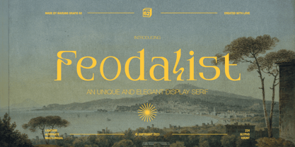 Feodalist is a timeless serif font that effortlessly embodies elegance and luxury. Its classic design, with a touch of uniqueness, adds sophistication to various projects. With meticulously crafted letterforms, Feodalist seamlessly fuses tradition and modernity. The font encompasses: - Uppercase and lowercase letters - Symbols, numbers, and punctuation - Ligatures and alternates for added versatility - Multilingual support for broader usability.


