10,000 search results
(0.029 seconds)
- FF PQR Trial - Personal use only

- Lemonstyle Sweet - Personal use only

- College Block - Personal use only

- Goldoni - Personal use only

- ITC Needlescript by ITC,
$29.99It's been said that creativity requires ten parts to perspiration to one part inspiration. But not always. According to its creator, Mira Vucko, ITC Needlescript was designed in one breath." An accomplished lettering artist, Vucko was sketching letters one afternoon. "I was using a calligraphy nib and was drawing the alphabet without much thought," she recalls. "When I allowed the down strokes of a couple of letters to fall below the baseline, I realized that I had created the impression of movement. I kept drawing letters in this fashion and did the same with horizontal lines. I added a firm ending to the descenders. Instead of dots above the 'i' and 'j,' I placed strokes in the opposite direction." In this way, the first characters that were to become ITC Needlescript emerged. The finished design is a lively, distinctive alphabet that produces a striking texture on the page. Letters intertwine and overlap to create a sense of movement and graphic intensity, especially when reversed out of a dark background. Vucko lives, works and was educated in Zagreb, Croatia. She lived in France and Sweden while in her twenties, but then returned to Croatia to work as a graphic designer for the country's largest newspaper. It was here that her passion for type and typography was born. Vucko has since gone on to become one of Croatia's leading graphic designers, and has won many awards for her advertising and packaging design. Vucko recommends that ITC Needlescript be used for "titling, lively but 'thorny' content, and anywhere that a little typographic drama is called for."" - Biblia Serif by Hackberry Font Foundry,
$24.95 This all started with a love for Minister. This is a font designed by Carl Albert Fahrenwaldt in 1929. In the specimen booklet there’s a scan from Linotype’s page many years ago. They no longer carry the font. I’ve gone quite a ways from the original. It was dark and a bit heavy. But I loved the look and the readability. This came to a head when I started my first book on all-digital printing written from 1994-1995, and published early in 1996. I needed fonts to show the typography I was talking about. At that point oldstyle figures, true small caps, and discretionary ligatures were rare. More than that text fonts for book design had lining OR oldstyle figures, lowercase OR small caps—never both. So, I designed the Diaconia family using the Greek word for minister. It was fairly rough. I knew very little. I later redesigned and updated Diaconia into Bergsland Pro—released in 2004. It was still rough (though I impressed myself). Now, with 4-font Biblia Serif family 13 years later, I’ve cleaned up, made the fonts more consistent internally, added more functional OpenType features, and brought the fonts into the 21st century. I used the 2017 set of features: small caps, small cap figures, oldstyle figures, fractions, lining figures, ligatures and discretionary ligatures. These are fonts designed for book production and work well for text or heads. Finally, in 2021, I went over the fonts entirely and remade them in Glyphs.
 - Mid Century Sans by Dharma Type,
$19.99 Mid Century Sans (MCS) is composed of high-geometric shapes. László Moholy-Nagy —professor in the Bauhaus— said “Typography is a tool of communication. It has to be communication in its most intense form. The emphasis must be on absolute clarity since this distinguishes the character of our own writing from that of ancient pictographic forms.” As same as you can see in modern typefaces in the early twentieth century, MCS has very efficient, clear and minima letterforms. There are not any decorative parts in the skeleton of letters. At the same time, Mid Century Sans has one more feature. In the middle of the twentieth century, one big movement which was called Mid-century modern had occurred. The Mid-century modern movement in the U.S. was an American reflection of the International and Bauhaus movements and it was slightly more organic in form and less formal than the International Bauhaus-style. In other words, it was friendly and stylish. We added Mid-century-spices to the Bauhaus-modernism. The basic letter form is geometric yet it has very friendly strokes and human touch. Mid Century Sans consists of 8 weights and their matching Italics for a wide range of usages. Farther, Mid Century Sans is supporting international Latin languages and basic Cyrillic languages including Basic Latin, Western Europe, Central and South-Eastern Europe. Also MCS covers Mac Roman, Windows1252, Adobe1 to 3. This wide range of international characters expands the capability of your works. Lowercase "a" has OpenType stylistic alternates for advanced typography.
 - Kari Display by Positype,
$49.00 Kari Display is the product of a long standing idea I had to give the well-received Positype typeface, Kari, plastic surgery. Just referring to giving a typeface plastic surgery, or letter lipo, stuck in the back of my head until I was able to pick the project up. The ultimate objective was to refine Kari Display to a point where each glyph was expressed as simple as possible... and in that simplicity a sexiness would appear. Kari is a beautiful script, but it is very 'controlled' and orderly and I wanted Kari Display to break that mold with much more movement, curviness, greater modulation and a more elegant feel on the page. I did not want to take it too far, limiting the use of the typeface, but rather opted for a delicate balance of thick and thin against the added movement of the glyphs. The wealth of sketches and proposed variants during the concepting phase was encouraging and I really pushed to add as many alternate characters, ligatures, swashes (and more) as I possibly could. Just about every character has at least one or more alternates AND the complete offering of alternates completely covers a wide range of Latin-based language groups including Central European diacritics. If you are using any type of OpenType enabled application, then the Kari Display Pro typefaces are the way to go. They include everything found in the 3 separate variants for each style as well as entirely expanding offering of additional swash and ligature sets.
 - Metron by Storm Type Foundry,
$52.00 Metron is so far the most ambitious typeface made to order in the Czech Republic. Despite the fact that for a number of years it has not been used for the purpose for which it was designed, every inhabitant of Prague is still well aware of its typical features. Metron Pro was commissioned by the Transport Company of the Capital City of Prague in 1970 to be used in the information system of the Prague Metro. It was first published in the manual of the Metroprojekt company in 1973 and then used to the full, under the author’s supervision, for lines “A” and “C”. Since 1985 Rathouský's system has been disappearing from the Prague Metro; it survives only in the form of metal letters at its stations and at some stations of the Czechoslovak Railways. In 2014 we're mentioning the 90th birthday of Jiří Rathouský. It’s a good opportunity for updating and re-introducing his Metron. Extended was the choice of figures and fractions, new currency signs added, diacritics revised, etc., but above all the newly designed Cyrillics including true SmallCaps. Now we have six weights plus italics, where the tone of the basic style is even closer to the original. Ten years back we've had the feeling that this typeface should again take a part of Prague’s traffic system and today, when revisiting of all the fonts, the feeling turned to certainty. The main feature of this typeface is namely a noticeability a property above all welcomed in rush of platforms.
 - Grandeux Serif by Mans Greback,
$59.00 Grandeux Serif is a classic Victorian-inspired font that exudes vintage elegance and sophistication. Its distinct vintage style makes it perfect for adverts, restaurant branding, and other high-end design projects that require a touch of luxury and refinement. The font's heavy strokes and high-quality craftsmanship give it a strong presence, while its intricate details and stylistic alternates allow for a truly customized and unique typographical experience. The Grandeux Serif font family includes six high-quality styles to suit various design needs: Light: Delicate and sophisticated for a subtle, elegant presence Light Italic: Adds a touch of dynamic flair to the light style Regular: A well-balanced, classic look for versatile use Regular Italic: Combines the versatility of regular with a touch of expressiveness Bold: A strong, assertive style for impactful designs Bold Italic: Merges the boldness of the bold style with the energy of italic The font is built with advanced OpenType functionality and has a guaranteed top-notch quality, containing stylistic and contextual alternates, ligatures and more features; all to give you full control and customizability. It has extensive lingual support, covering all Latin-based languages, from Northern Europe to South Africa, from America to South-East Asia. It contains all characters and symbols you'll ever need, including all punctuation and numbers.
 - Quarpa by Pasternak,
$9.00 Name: Quarpa Styles: 6 styles Glyphs: 394 Year: 2021 This lofty font features a compact structure as well as a unique combination of rounded corners and square contours. The collection includes six styles: Extra Light, Light, and Semi Light that will ensure elegance; Regular, Medium, Semi Bold and Bold suitable for a solid design. Each of them also has Italic variation. It’s an ideal option for outstanding corporate images, logos, promos, or video presentations. Quarpa has proper kerning, multi-lingual support, and ligatures. Languages: Afrikaans, Albanian, Asu, Basque, Bemba, Bena, Bosnian, Catalan, Cebuano, Chiga, Colognian, Cornish, Corsican, Croatian, Czech, Danish, Embu, English, Esperanto, Estonian, Faroese, Filipino, Finnish, French, Friulian, Galician, German, Gusii, Hungarian, Icelandic, Ido, Indonesian, Interlingua, Irish, Italian, Javanese, Jju, Kabuverdianu, Kalaallisut, Kalenjin, Kamba, Kikuyu, Kinyarwanda, Kurdish, Latvian, Lithuanian, Lojban, Low German, Lower Sorbian, Luo, Luxembourgish, Luyia, Machame, Makhuwa-Meetto, Makonde, Malagasy, Malay, Maltese, Manx, Maori, Meru, Morisyen, North Ndebele, Northern Sotho, Norwegian Bokmål, Norwegian Nynorsk, Nyanja, Nyankole, Occitan, Oromo, Polish, Portuguese, Romanian, Romansh, Rombo, Rundi, Rwa, Samburu, Sango, Sangu, Sardinian, Scottish Gaelic, Sena, Shambala, Shona, Slovak, Slovenian, Soga, Somali, South Ndebele, Southern Sotho, Spanish, Swahili, Swati, Swedish, Swiss German, Taita, Taroko, Teso, Tsonga, Tswana, Turkmen, Upper Sorbian, Vunjo, Walloon, Walser, Xhosa, Zulu
 - ZT Bros Oskon 90 s by Zelow Type,
$13.00 ZT Bros Oskon 90s is a captivating typographic creation that seamlessly blends the aesthetic charm of the 1990s retro era with a modern touch. With unmatched serif elegance and a unique 90s style, this font offers 72 variations, including sharp Condensed forms, graceful Expanded, and captivating italic styles. Every character in ZT Bros Oskon 90s is meticulously crafted, creating a vintage ambiance that is truly enchanting. Featuring 6 font weights ranging from Extra Light to Bold, this font provides you with the flexibility to create a wide range of striking and memorable designs. Features of ZT Bros Oskon 90s: 72 Unique Variations Aesthetic Retro Vibes from the 1990s Elegant Serif Style Condensed, Expanded, and Italic Forms 6 Font Weights: Extra Light, Light, Regular, Medium, Semi-Bold, Bold Exceptional Creative Versatility ZT Bros Oskon 90s is the perfect choice for graphic design projects, branding, posters, and other promotional materials that require a captivating retro touch. Unleash limitless creativity with this font and infuse a nostalgic 1990s vibe into every one of your creations. ZT Bros Oskon 90s has 6 free styles, you can get them on my GUMROAD I hope you have fun using ZT Bros Oskon 90s. Thanks for using this font ~ Zelowtype
 - Pepper Sans by VIDI Visual Design Studio,
$17.99 The core design of Pepper family, designed by VIDI Visual Design Studio, is the fingertip handwriting style inspired by children’s writings on windows. This distinctive low-contrast typeface combines characteristics from neo-grotesque and organic models. Warmer than most Helvetica inspired typefaces, Pepper has organic shapes, playful strokes, rounded endings, and a generous x-height which makes Pepper easy to read. This family could be used well for food packagings, content aimed for children, book covers, branding, high-impact titles and small body texts, advertising, editorial design and more. What makes Pepper Sans Vol.1 competent and more spicy then some other fonts is that it contains a set of more than 900 characters for each of 5 weights that support many Latin-based languages, Greek and Cyrillic. As the weight decreases, the typeface gains impact with becoming elegant, giving titles in (Hair, Thin or Light) a breath of fresh air. We derived a typeface family consisting of Hair, Thin, Light, Regular, Semi Bold in this Vol.1 edition. Typeface features: • 5 weights: Hair, Thin, Light, Regular, Semi Bold • Latin, Greek & Cyrillic multilingual support • More than 900 characters for each of 5 weights Font Specs: • Created: August 2020 • Files type: .ttf
 - Lens Grotesk by Typedepot,
$39.99 Lens Grotesk is a Neo-grotesque type family of 16 fonts born as a result of a very conscious research in the field of the neutral Swiss aesthetic. There's a reason for all the prominent examples of this design like Helvetica and Univers to be used on a daily basis for more than 70 years and it's a simple one - they just work. The closed terminals, the low contrast, uniform widths and proportions makes the Neo-grotesques feel just right. Although very often branded as stiff, the neutral Neo grotesques are here to stay and Lens Grotesk is our own reading of the popular style. Lens Grotesk takes the Neo-grotesk model one step further adding a pinch of Geometric sans-serif to the mix thus creating a way more modern and contemporary looking design. Characterized with more generous oval proportions and slightly more open terminals, Lens Grotesk keeps the modulation and rhythm needed for a slightly longer texts while visibly keeping everything in order. Zooming in you'll find traces of the Geometric aesthetic - the robust almost right angled approach of the arches and tails (look t, f, j, y) and the way more circular rounded shapes. Like all our fonts, Lens Grotesk is equipped with a range of OpenType features, stylistic alternatives and of course Cyrillic support. It comes in a pack of 16 fonts with 8 styles and their matching italics or one variable font file available with all full family purchases. Live Tester | Download Demo Fonts | Subscribe
 - Electrone by Alit Design,
$21.00 💥Introducing "Electrone" – Unleash the Power of Typography with a Superhero Flair! Unleash the electrifying energy of "Electrone," a dynamic font that embodies the essence of superheroes with lightning speed, unmatched strength, and a dash of style. This font is not just a typeface; it's a superpower for your design projects! Key Features: Electrifying Glyphs: With 890 meticulously crafted glyphs, "Electrone" offers a vast array of characters that will add a powerful punch to your designs. Every glyph is a superhero in its own right. Sided Ligature: Seamlessly blend characters with our specially designed sided ligatures, creating a visual impact that resonates with strength and unity. Alternate Characters: Customize your text with alternate characters to give your designs a unique and personalized touch. The alternates are carefully curated to ensure versatility without compromising the superhero aesthetic. Lightning Swash: Add a bolt of energy to your typography with lightning swashes that strike through your text. Watch your words come to life with the electrifying force of "Electrone." Wings of Typography: Elevate your designs to new heights with the winged elements included in "Electrone." These wings symbolize the freedom and power associated with superheroes, making your text soar above the ordinary. Suit Up Your Designs: "Electrone" is not just a font; it's a complete superhero costume for your words. Whether you're working on comic book titles, posters, logos, or any design that demands a bold statement, "Electrone" is here to save the day. Perfect for: Comic Books and Graphic Novels Superhero Movie Posters Action-packed Logos Gaming Graphics Apparel Design and more! Embrace the electrifying power of "Electrone" and turn your designs into epic adventures. Download now and witness the transformation of ordinary into extraordinary!
 - FranciscoLucas Briosa - Unknown license

- FranciscoLucas Llana - Unknown license

- Charlotte Script by Vástago Studio,
$10.00 A funny Script typeface with a simple construction for to show a dynamic texture playing with the baseline. This letters are inspired on the work of House Induestries mixing a traditional serif with a playful script, like some retrospective alphabets in the vintage ads. Enjoy it, and thanks for buy it!
 - Squeam by PizzaDude.dk,
$17.00 Here's a fun font that is quirky, jumpy and uneven. It's also unpredictable, but not more than your text will be clear and legible...but in a fun way! :) I've added several lowercase versions that automatically cycles as you type. A great way to make your text random and lively
 - RMU Gong by RMU,
$30.00 Based upon an Arno Drescher design for Schriftguss, RMU Gong was freshly redrawn and redesigned and is intended for being a splendid font for headlines, subtitles, ads, posters etc. It comes with full sets of superior and inferior numbers, and even a long s can be accessed by typing [alt] + b.
 - Bitsaylen by Aqeela Studio,
$20.00 Bitsaylen is a new script full of elegance and quirk with a playful demeanor and a playful side. Perfect for adding a unique yet relaxed feel, this bag comes with a wide selection of natural looking ligatures. This font is perfect for logos, invitations, wedding designs, social media posts, and more!
 - Posterizer KG Rounded by Posterizer KG,
$40.00 Posterizer Kg Rounded, is basically rounded version of Egyptian, Slab Serif font Posterizer Kg. By adding rounded corners on serifs, the strict form disappears, in that way, the font gets softer form. Posterizer Kg Rounded is useful for sweet themes like cookies, puppies, love, joy, or some other similar things.
 - Hastagram by IbeyDesign,
$17.00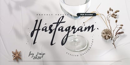 Hastagram Calligraphy Script Font is a fresh calligraphy font. It has a modern style and is perfect for adding an unique look to your watermarks, social media posts, advertisements, logos & branding, invitations, product designs, labels, stationery, wedding designs, product packaging, special events or anything that needs a calligraphy or handwriting taste.
 - Linotype Trajanus by Linotype,
$29.99Warren Chappell named his font after the Roman emperor Trajanus, who ruled in the first century AD. The Roman capitals on Trajanus’ memorial combined with the lower case style from the time of Charlemagne formed the models for the font characters. Trajanus will give a text a classic, almost calligraphic, feel. - Lonestar Western by FontMesa,
$25.00Lonestar Western is a revival of the old classic slab serif font named Hellenic which was very popular in the middle to late 1800s. While watching an old western movie the opening credits caught my attention, it was the Hellenic font with spurs added which gave it a more western look. - HU Garaetteok KR by Heummdesign,
$25.00 It is a cute headline font with straight strokes and rounded ends, giving it a rice cake feel. The initial and final consonants 'ㄹ' were designed differently to give a fun sense of rhythm, and the straight strokes and lively curves added personality to the writing. It contains Hangul, Korean.
 - Penny Arcade by Solotype,
$19.95A popular caps-only type of late Victorian times was called Mural, brought out by Boston Type Foundry in 1890. We always liked it, drew a lowercase for it, and then strengthened it by adding a bit of weight. It now has a nice, understated retro look for paragraphs of copy. - Cocktail Hour JNL by Jeff Levine,
$29.00 The opening title for the 1962 Blake Edwards film "Days of Wine and Roses" [starring Jack Lemmon and Lee Remick] was the inspiration for Cocktail Hour JNL. Adding to the playfulness of this font, the characters float above the baseline. Cocktail Hour JNL is available in both regular and oblique versions.
 - Maleys by Luxfont,
$48.00 Welcome to the world of Maleys color fonts - where trendiness and playfulness meet in dynamic harmony. These fonts give your designs a breath of fresh air, adding originality and inspiration. Features: - Real Golden effect - Extras - Kerning - Multilingual IMPORTANT: - Check the glyphs in the font before buying! - SVG fonts contain raster letters.
 - Wilderness Doodles by Outside the Line,
$19.00 Wilderness Doodles is full of water and trees and mountains. Silhouettes of fish, moose, beaver, bears, elk, wolf, deer and sheep. Camping and hunting boots, float plane, coffee pot, cabin, tent, ax, hatchets, snowshoes, canoe and more. Create ads, invitations, store signage, cards, placemats. All with a outdoorsy Northwoods feel.
 - Hoosier Daddy by Parkinson,
$20.00 Hoosier Daddy is based on Foundry Type samples from various mid-19th century specimen books. This shaded slab serif was made by conforming several different cuts of the styles, filling out the character set, and adding a few contemporary touches for freshness. This is a display face. Use it big.
 - Movie Arts JNL by Jeff Levine,
$29.00 In the June 18, 1929 issue of “The Film Daily”, the curvy and casual hand lettering found within the ad for the movie “Such Men are Dangerous” belies that this was actually a pre-code drama. Digitally redrawn as Movie Arts JNL, it is available in both regular and oblique versions.
 - Tucker Script by Ascender,
$29.99 Tucker Script is an informal handwriting script named for an exuberant yellow Labrador Retriever. The font is perfect for memos, fliers, cards and of course, a personalized dog dish. It is wonderful for adding a jovial appearance to any document. Designed by Steve Matteson. Tucker Script Character Set - Latin 1.
 - Killecthrone by Ilhamtaro,
$19.00 KILLECTHRONE is a font based on the classic college style font. Then modified by adding a PCB pattern to produce a modern and futuristic font. To enable the OpenType Stylistic alternates, you need a program that supports OpenType features such as Adobe Illustrator CS, Adobe Indesign & CorelDraw X6-X7. Cheers!
 - Emily Cute by Fox7,
$12.00 Emily Cute is a cute lettered handwritten font that is easy to read and joyful. You can use it for various projects, such as blog posts, logos, branding, ads, invitations, greeting cards, planners, photo albums, decorations, and much more. Add it to any of your designs, and enjoy the results!
 - Chumpsy by PizzaDude.dk,
$17.00 Chumpsy is clumsy - I did my best to make an awkward and bouncy hand-written font that was funky, but still legible. I added 11 slightly different versions of each lowercase letter, which automatically cycle as you type, or you can manually choose the one that suits you the best.
 - Memorial by Solotype,
$19.95The Fredrick Ullmer Co. in London acted as agent for many typefoundries, and this was one of their offerings. Some of the letters were rather outlandish, so we fearlessly decided to improve them. The result is this dated but pleasant font. The original didn't have a lowercase, so we added it. - Slagless by Almarkha Type,
$29.00 Hello Introducing, Slagless - Urban Display Serif is unique font that uses 19 ligatures to smoothly link letters. inspired by the famous urban logo, perfect for the purposes of designing templates, brochures, videos, advertising branding, logos and more. Perfect for adding a unique twist to word-mark logos, monograms or pull quotes.
 - Kokomo by Hanoded,
$20.00 Kokomo is a beautiful handmade contoured font - which was drawn with an old-fashioned steel pen and Chinese ink. The open, shadowed letters are great for posters and ads. Kokomo comes with extensive language support and has an alternative lower case a, for those who don't like the one I used.
 - Medieval Gunslinger by Ingrimayne Type,
$14.95 What would happen if one took a rather crude, squared-serifed typeface of the type popular in the 19th century and added medieval and calligraphic ornamentation? Maybe the result would be Medieval Gunslinger. The MedievalGunslingerShadOverlay font is spaced so that it can be layered with MedievalGunslingerShadow to produce bicolored lettering.


