7,347 search results
(0.029 seconds)
- Blushbutter Whimsy by Blushbutter,
$45.00I've always loved drawing faeries and I love using them in my scrapbooking pages. So after hunting around for a unique decorative fairy font for my crafts I couldn't quite find what I wanted to use, so I decided to create a whimiscal set of fairy drawings and characters that would suffice. I was influenced in the drawing of the fairies by my love of the 3D poser graphics art,several awesome comics, Alphonse Mucha and several Masters of Art. I couldn't really say what influenced me to draw the letter charaters as I did except I just sat down to draw and they appeared on my blank photoshop canvas. These decorative Fairy Uppercase letters would be great to use in fabric crafts,textiles, embroidery patterns, scrapbooking, greeting cards, Rubber stamps, name titles, Calligraphy, the possiblities I feel are endless when thinking of craft applications. - Calluna by exljbris,
$- Calluna was born more or less by accident. When I needed a little break from designing Museo I was just fiddling around a bit to see if maybe a full slab serif would be something to have a look at. The first thing I did, of course, was to put slab serifs on the stems of Museo. When I did, something nice happened. Slab-serifs with a direction! I ended up using the idea for something I always wanted to do: making a rather serious text face. The goal was to make a text font, but one with enough interesting details. In the end it all came down to finding the balance in a typeface between the robustness needed to function as a text face and enough refinement to look good as a display font. Check out Calluna Sans™ which is a great pair for Calluna™.
 - Humanex by Sébastien Truchet,
$40.00 Humanex is the first text typeface of Sébastien Truchet. He created it during the year of postgraduation ‘Systèmes graphiques, typographique & language' in Amiens. The beginning stages of the font development involved calligraphic research based on humanistic ductus. Sébastien’s goal was to introduce modules in a lineal structure. Downstrokes and upstrokes are homogeneous. Links between stem and curve are straight. It gives solidity and thickness to the typographical composition. The first version was a Semi Bold version and its italic. This typeface gave a blackest text. You can see the first display typeface, Humanex Ultralight. Sébastien kept the Semibold structure in order to make a thin typeface. Its goal is to give support to the Semibold version. It is a good typeface in big sizes. In order to add a better legibility, Sébastien built a Book version to have a brightest grey of text. The reading is more comfortable.
 - Punk Rocker by Fenotype,
$18.00 PunkRocker is a bold condensed sans-serif with three versions and plenty of attitude. PunkRocker is awesome for creating strong tight square text boxes that scream for attention: it’s ideal for movie posters, single covers, as a supertool for fast graphic design. PunkRocker has three versions: Regular which is “clean”, Rough which has the worn-out appearance of a punk-poster or a gig poster that has been outside too long, and Stamp which has rugged outlines and print texture inside characters. Textured versions of PunkRocker have double characters for every standard character: Contextual Alternates will automatically replace any double letter with alternate that has different texture to avoid repetition and keep the appearance more authentic. You can also access these alternates by turning on Stylistic Alternates or via glyph palette. PunkRocker is PUA encoded so you can access extra glyphs in most graphic design softwares.
 - Umba Soft by TypeThis!Studio,
$54.00 The best thing about Umba is its surprise! UMBA Soft is a mellow sans serif typeface designed by Anita Jürgeleit. Your creation should be soft and gentle and you need a suitable font? Something that should be cuddly, sweet and soft but a serious type family that covers all your concerns? Umba Soft is your match! Your typographic composition will improve with your new favourite font. Thirty styles from thin to bold and matching italics helps you to create a highly appealing design product. Alternates and small caps are accessible in separate styles. There is no need for any special software to use them. The styles will appear in your font menu to make sure you stay aware of the many possibilities that your new font offers. 30 styles Italics Alternates Small Capitals Predefined Fractions Sub-/Superscript Numerator/Denominator Old style figures Tabular figures Ligatures Let’s get in touch! www.typethis.studio
 - DIN Next Decorative by Monotype,
$40.99 This four-piece family is the DIN design, but not as you know it. The famously, crisp, clean and precise typeface has been given a textured update that's reminiscent of rusted metal, or rubber stamps. Underneath this lies the same sturdy, geometric shapes that have allowed DIN to stand the test of time, but with a new sense of tangibility. “This kind of treatment is more about creating a feeling or a mood that goes beyond the communication of the words themselves,” explains Monotype Studio director Tom Rickner. “I think it expands the repertoire of what DIN Next can express.” Designed for display, these four typefaces – DIN Next Rust, DIN Next Shadow, DIN Next Slab Rust and DIN Next Stencil Rust – show a new side of DIN Next's personality, as if the surface of each letterform has been gradually worn away over the years.
 - Ergonomique by Monotype,
$31.99 Ergonomique is a humanist sans serif typeface that has been designed to be efficient and comfortable to use across all applications. Ergonomique’s personality is defined by its spurless lowercase glyphs – the stems are truncated and blend into their adjoining arcs, as can be seen in the a/b/d/m/n/p/q/r/u characters. Ergonomique is ideal for branding and display purposes, but also performs well as body copy if you’re seeking a unique style for your text. With its nine weights and complementing italics, Ergonomique is highly versatile, especially when you consider that there are small caps and old style figures included, along with a Latin Extended character set. Key Features: • 18 font family – 9 weights in Roman and Italic • Small Caps, Ligatures, with Proportional, Old Style, and Small Cap figures, plus Fractions, Numerators, Denominators, Superiors, and Inferiors • Full European character set (Latin Extended) • 800+ glyphs per font.
 - Slow Tempo by Dharma Type,
$19.99 Slow Tempo is a relaxed, loose-fit font that you can easily enjoy. Slow Tempo has basic, natural and neutral letterforms and skeletons for a wide range of usage. Though, there are some distinctive features. As you can see, Slow Tempo has low curvature of the intersections between stem & shoulder or bowl and also has large and open apertures. This makes this font relaxed. The letterform has low contrast and geometric shape to be neutral design, large x-height and humanistic terminal to be legible and distinguishable. Slow Tempo consists of 8 weights and their matching Italics for a wide range of usages. Further, Slow Tempo is supporting international Latin languages and basic Cyrillic languages including Basic Latin, Western Europe, Central and South-Eastern Europe. Also CSS covers Mac Roman, Windows1252, Adobe1 to 3. This wide range of international characters expands the capability of your works.
 - Code Monkey by Comicraft,
$19.00 Underpaid? Overworked? If you like Fritos, Jolt and Mountain Dew in your cubicle, your big warm fuzzy Donkey Kong heart is going to like these fonts a lot. Developed in conjunction with actual Code Monkeys*, this user-defined type IS defined -- it's loud and proud, and available in functional monospace for screen or elegant proportional spacing for print. When your pet project needs a soft, pretty face that's visible from across the office, sit down and pretend to work with CodeMonkeyVariable. Released from the captivity of monospacing, these lovely letters can convey even your wildest story ideas. When your syntax needs to line up on screen, get monospaced out with CodeMonkeyConstant. Copy from other sources and your screen captures will look so sweet you'll no longer have to pray your code complies to specs, because even your login page will look like dynamic rock star programming.
 - Antoinette Monogrammes by Dharma Type,
$19.99 Antoinette Monogrammes is a monogram font based on old embroideries in the early 20th century by Janon Co. This font includes Upright script capitals and Normal slanted script capitals and 24 fancy frames. By combining each letters and frames, you can make your own monogram. And Every letters and frames were added handwritten effect to make warm and handcrafted impression. How about making monogram for wedding card, scrap book, stamp, logo? Upright script capitals can be accessed by typing Uppercase keys(A, B, C ....) and Slanted script capitals by lowercase key(a, b, c ...). Frames are 0-9 and exclamation mark(!), at mark(@), number sign(#), dollar($), percent(%), ascii circumflex(^), ampersand(&), asterisk(*), left and right brackets(()), period(.), comma(,), less and greater(). You need to arrange and set the position manually to finish making monograms. Please use graphic applications such as adobe illustrator or photoshop but not microsoft word.
 - Kiosk by Fenotype,
$19.00 Kiosk is a prominent display typeface pair. It is a sturdy condensed sans serif and an eloquent brush script. In addition there are textured “print” versions of them both. Kiosk fonts work as a pair or as themselves. Sans is great for sturdy headlines, menu titles, packaging or any such, the bigger the better. Script is great as a logotype, used for quotes, magazines, packaging and branding. Textured versions are the same fonts with a rugged outline and with a “stamp” texture inside the letters. Kiosk Script is equipped with several OpenType features. It has Contextual Alternates and Standard Ligatures that are automatically help to keep the connections smooth. They’re both automatically on. In addition it has Swash, Stylistic and Titling Alternates and even more alternates for some characters. The font is PUA encoded and you can access alternate characters from OpenType controls or manually from Character or Glyphs window.
 - Algha by Youthlabs,
$17.00 Introducing Algha Beauty Sans Serif Font. Algha inspired from cottagecore which prioritizes beauty and elegance. Algha has an obtuse angle which means that beauty is not confined to the point of view. Algha is suitable for your needs that require beauty. Algha can be worn simply or with ornaments. What's The Feature ? - 3 Stylistic Alternate Set - Stylistic Ligature - Smooth Corner - Multilingual Support - Separate Alternate Files - Opentype Support Need to test words in this font? Just type the box below, and see what it looks like - For more information on accessing alternative flying machines, you can see this link (http://adobe.ly/1m1fn4Y) - If you want to use this font on canva, you can see the tutorial in this link (https://www.youtube.com/watch?v=Rwhf1O3Dv78&ab_channel=tomcunningham) Feel free to message me if you have any question. Thanks, stay safe and healthy, and have a nice day.
 - Blushbutter Fairy Floss by Blushbutter,
$45.00I've always loved drawing faeries and I love using them in my scrapbooking pages. So after hunting around for a unique decorative fairy font for my crafts I couldn't quite find what I wanted to use, so I decided to create a whimiscal set of fairy drawings and characters that would suffice. I was influenced in the drawing of the fairies by my love of the 3D poser graphics art,several awesome comics, Alphonse Mucha and several Masters of Art. I couldn't really say what influenced me to draw the letter charaters as I did except I just sat down to draw and they appeared on my blank photoshop canvas. These decorative Fairy Uppercase letters would be great to use in fabric crafts,textiles, embroidery patterns, scrapbooking, greeting cards, Rubber stamps, name titles, Calligraphy, the possiblities I feel are endless when thinking of craft applications. - MIR Next by Juliasys,
$22.00 MIR Next is a growing multi-script type family best described by the terms “humanist–semi–slab-serif”. Its character set contains Latin and Cyrillic, both extended, as well as Greek, covering more than 100 languages. Strong personality along with consistency between language systems were a basic aim when designing the family. As a result MIR has become a great tool for branding and international identities. A wide choice of symbols and numbers makes it also very useful for statistics, texts about mathematics and the sciences. Serious things are best be said in an unpretentious, relaxed way. MIR gives typography exactly that kind of appearance. Its texts emit a sense of authority but stay easily accessible at the same time. MIR’s name comes from the old Russian word Мир meaning both “world” and “peace” – a unity we will hopefully take for granted sometime in the future.
 - Battle Scarred by Comicraft,
$19.00 We know what you're thinking... This is not a new font, just an old one with a few bullet holes in its helmet, dirt on its shins and some carbon scoring on its breastplate. You're thinking this is like a variant cover by Joe Madureira or J. Scott Campbell -- handsome and rugged on the outside but weak and effete on the inside. Well, my fine, font-finagling friend, you'd be Dead Wrong! This really is an All-New, All-Different, All Star, Ultimate Collectable, from the Comicraft House of Ideas! Our Dynamic Duo -- Johnny Comicraft and Ferran 'Nuff Said have brought you another winner from the Silver Age of comic book lettering. It’s a little worse for wear, we admit it, but wouldn't you be after three rounds with the Justice League of Avengers Assembled?!? See the families related to Battle Scarred: Battle Cry & Battle Damaged .
 - HWT Archimedes by Hamilton Wood Type Collection,
$24.95 Archimedes is a wood type design sometimes known as Mansard. This particular version was brought back to life as a wood type font by Virgin Wood Type. The variation with screw heads in the design was first seen in 1879 by the William H. Page Co. This new digital version is a simultaneous release with Virgin Wood Type and features a variety of styles including the standard screw head option—plus a Phillips head, Hex/Allen Wrench head, and even the vexing Apple® pentalobe tamper reistant star screw. The result is a sturdy and industrial font that has a certain “joie de vivre” and “bling” attitude. Not for every designer, but you know this is for YOU! As a bonus, the screwheads themselves are accessible via a glyph palette, so you can put the screws to Comic Sans, or any other font, if you so desire.
 - Wintanceastre by Hanoded,
$25.00 I am a HUGE fan of Bernard Cornwell’s ‘The Saxon Stories’. Ever since a television series has been made, the series of books is also know as ‘The Last Kingdom’. I have read them all, at break-neck speed and I can’t wait for the next book!! Wintanceastre (Winchester) is based on a 10th century Latin manuscript. I have tried to stay close to the original letters, but since Latin does not have all modern glyphs, I found myself designing the missing ones. So, before you scold me for having made a font that is historically inaccurate: it was never meant to be an exact replica, nor would anyone want an exact replica, as it would be useless for modern texts and designs. Wintanceastre comes with a whole bunch of ligatures and alternate glyphs. Use it for any design that needs a little ‘Dark Ages’ look!
 - Amrys by Monotype,
$65.00 There's an appealing quirkiness about Amrys, which offers a confidently unusual alternative to more conventional designs. Its charm lies in its tapering tips, flexing stems, and unexpected notches, which combine to suggest something of the chiseller's tool at work. As a modulated serif, its letter shapes live between serif and sans serif, lending the design a sense of pleasing irregularity – something that's really highlighted at larger sizes. However this is also a typeface that works for text, injecting rhythm and texture into reading. “It's distinctive, idiosyncratic, and weird,” says its designer, Ben Jones. He started designing Amrys while studying an MA at Reading University, creating it in response to a brief for a magazine typeface. Amrys features an extensive and impressive character set. In addition to Latin, Amrys covers several scripts including Cyrillic, Greek, Arabic and Armenian. The family consists of 8 weights, from Light to Black, with matching italics.
 - Asper Crown by Letterhend,
$17.00 Asper Crown a strong and bold sans serif with a touch of vintage look and feel. Comes with 38 bonus hand drawn illustration in vector and free 12 premade logo. This type of font perfectly made to be applied especially in logo, headline, signage and the other various formal forms such as invitations, labels, logos, magazines, books, greeting / wedding cards, packaging, fashion, make up, stationery, novels, labels or any type of advertising purpose. Features : Regular & Stamp version 38 hand drawn illustration 12 premade logo uppercase & lowercase numbers and punctuation multilingual alternates / swashes and ligatures PUA encoded We highly recommend using a program that supports OpenType features and Glyphs panels like many of Adobe apps and Corel Draw, so you can see and access all Glyph variations. How to access opentype feature : letterhend.com/tutorials/using-opentype-feature-in-any-software/ Email us to letterhend@gmail.com if you need something! Happy Designing!
 - Orotund by Canada Type,
$24.95 This is the digitization and considerable expansion of the cheeky and enormously popular film type Eightball, one of the most widely used faces of the 1970s and 1980s. Round and happy like a bouncy ball, these are letters after a sign maker’s own heart. Seen everywhere in its film version, from bingo and pool hall parlor signs to comic books, now this computer version opens the door for the happy roundness to be used on a much larger scale by anyone who designs layouts on a computer. The original film type included a few alternates. We included them, but we added many more as well. So make sure to check out the various OpenType features in your program while using this font. Eightball is great for a variety of applications, including signage, rubber stamps, poster design, titling, cartoons, comics, and pretty much anything where happy and round fit in.
 - Rennie Mackintosh Allan Glens by CRMFontCo,
$35.00Since the 2006 launch of Rennie Mackintosh Glasgow, the world’s first lowercase Mackintosh-style typeface, designer George R. Grant has been pleased with its acceptance by Mackintosh lovers around the world. In fact, “Glasgow” has proved to be as popular as the original “founding” font, the classic Charles Rennie Mackintosh Font. By modifying many of these letterforms, and giving a more “freehand” shaping, George has developed this latest offering. The font has irregular “serifs” at the extremities of each stem - a suggestion of being handwritten. The name “Allan Glens” comes from the high school Mackintosh attended which, coincidentally, George did too. Says George, “As the school no longer exists, I wanted a way to perpetuate the Allan Glen’s name in type. I can think of no better way than associating it with the name of one of the school’s most famous sons. One of the glyphs even features the school logo”. - Kind Breakout by moriztype,
$20.00 Introducing "Kind Breakout" with a bold and modern vintage style and a touch of stamp effect so you can feel a very distinctive vintage feel. If your latest project needs a touch of class, it's time to take Kind Breakout to your font library. This beautiful and elegant typeface features a vintage style, OpenType features like ligatures, stylistic alternatives, stylistice Set, Swash, Discretionary Ligatures and even comes as a web font. Perfect for posters, logos, and stationery, this is a one of a kind elegant font waiting to impress. Kind Breakout has 725 glyphs and all PUA Encoded Characters, Can be accessed in Adobe Illustrator, Adobe Photoshop, Microsoft Word, CorelDraw and other applications that support the opentype feature, Fully accessible without additional design software. This font will be a great asset to your font library, as it has the potential to enhance your next project creation.
 - Quire Sans by Monotype,
$155.99 My goal was to make a design that might fit in anywhere,” says Jim Ford about his Quire Sans™ typeface. “I wanted it to be highly functional and sexy at the same time.” With one foot comfortably in the realm of oldstyle design and traditional book typography, and the other in evolving electronic media, the Quire Sans family does, indeed, fit in just about anywhere. As for sexy, someone once quotably wrote, “A great figure or physique is nice, but it's self-confidence that makes someone really sexy.” Yes, Quire Sans is sexy, performing confidently in virtually any setting. 2014-06-26 00:00:00.000 57.9900 F43063-S193385 42831 Neue Frutiger World Monotype https://www.myfonts.com/collections/neue-frutiger-world-font-monotype-imaging https://cdn.myfonts.net/cdn-cgi/image/width=417,height=208,fit=contain,format=auto/images/pim/10000/279026_ed8c8093fe1ac59ebe9e3ee1d9262c8e.png Neue Frutiger World is designed for global use with an impressive range of 10 weights, from Ultra Light to Extra Black, with matching italics. It embodies the same warmth and clarity as Adrian Frutiger’s original design, but allows brands to maintain their visual identity, and communicate with a consistent tone of voice, regardless of the language. Neue Frutiger World supports more than 150 languages and scripts including Latin, Greek, Cyrillic, Georgian, Armenian, Hebrew, Arabic, Thai and Vietnamese. “Before Neue Frutiger World it was not an easy task for western brands to find families in Arabic, Hebrew, Thai and Vietnamese which match with their Latin,” says Monotype type director Akira Kobayashi, who led the Neue Frutiger World project. “They may find a type with closer expression, but there was no guarantee if the bold version in the non-Latin family matches the bold in their Latin. Neue Frutiger World offers a better solution.” In addition to Neue Frutiger World’s linguistic versatility, it works hard across environments – suited to branding and corporate identity, advertising, signage, wayfinding, print, and digital environments. The Neue Frutiger World fonts can be paired with Monotype’s CJK fonts: M XiangHe Hei (Chinese), Tazugane Gothic (Japanese), Tazugane Info (Japanese), and Seol Sans (Korean). These were all designed to address brands’ needs to expand into Asian cultures and solve for global typographic challenges.
 - Loppemarked by PizzaDude.dk,
$17.00 Loppemarked is Flea market in danish, and that’s where I got the inspiration to do these fonts from! Headline - chunky serifs here and there, and some are missing! No attempt to get it right…anywhere! Text - The letters are scribbled quickly, leaving not much attention to accuracy. Sans - With this font, there has been some effort to hit the same width of strokes, but it is still off here and there. All in all, the sweet innocence in these letters…I love it! <3</p>
 - Tacky Shoes by PizzaDude.dk,
$18.00 May I present to you: Tacky Shoes. Actually there's nothing tacky here - just liked the sound of that :) Just like the letters may look quite straight-forward, but here and there the lines are a bit off, which enhances the handmade look - which makes it great for work like posters, invitations, flyers, stickers or something that has to do with creativity. Each letter has 6 variants (in all 6 versions!) which makes the text look more natural and random - because these variants cycle as you type!
 - LOLO Dingcats by Okaycat,
$24.50LOLO Dingcats are here! Need some cats? Find just about any kind of cat you can imagine here. Not just a A-Z & 0-9 font, LOLO Dingcats has many extra characters. Check it out! There's a mother cat nursing kittens, a cat curled up sleeping, running cats and sleeping cats.There are black cats, white cats and striped cats. Even cats you might not expect: a pirate cat, a cat with an afro, even a robot cat -- and MORE! A must-have for any serious cat lover! - Bankal by Hugo Kuder,
$10.00 After a few months my new typeface "Bankal" is here! To create it, I always tried to keep a 90 degree angle. In French when you say that something is "bancal" it means that it's not right. This is why I choose this as a name because despite the name she is right. And for the K it's just for the style here. Bankal is a sans-serif font with 3 variations (bold, regular, light) Check more on my website : https://www.hugokuder.com/ or my instagram : hugokuderdesign
 - Sancoale Softened by insigne,
$22.00 Sancoale Softened is the new rounded companion to Sancoale. While the original Sancoale is crisp and defined, its delicate forms also lend themselves well to a lighter, more rounded version. The stems of Sancoale Softened are blunted, and its corners have been carefully rounded, avoiding the “sausage” look seen with some rounded fonts. This blend of definition and delicacy makes the Sancoale Superfamily versatile and appropriate for a variety of applications. The design minimizes the characters to their essence, leaving a default set of simple characters without notches or spurs. However, the typeface family’s slightly technological feel still appears friendly and approachable to the reader. It’s slightly condensed proportions and tall x-height also make the design readable at a wide range of sizes, which works especially well for web pages. These softer letterforms give Softened its unique, futuristic look--great for distinguishing your text or display. There are six weights with true italics. All insigne fonts are fully loaded with OpenType features. Sancoale Softened is also equipped for complex professional typography, including alternates with stems, small caps and plenty of alts, including “normalized” capitals and lowercase letters. The face includes a number of numeral sets, including fractions, old-style and lining figures with superiors and inferiors. OpenType capable applications such as Quark or the Adobe suite can take full advantage of automatically replacing ligatures and alternates. You can find these features demonstrated in the .pdf brochure. The Sancoale family also includes the glyphs to support a wide range of languages, including Central, Eastern and Western European languages. In all, Sancoale Softened supports over 40 languages that use the extended Latin script, making the new addition a great choice for multi-lingual publications and packaging. Sancoale Softened continues with Sancoale’s successfully simple, geometric and legible structure. With its suitability for a wide range of uses, the Sancoale superfamily is a very economical and versatile addition to any designer’s font collection.
 - FS Clerkenwell by Fontsmith,
$80.00 A creative context 2003. Fontsmith was sharing a small, cold, whitewashed studio space in Northburgh Street, Clerkenwell. But things were on the up following prestigious custom type commissions for The Post Office and E4. “Slab serifs were on the brink of another revival, we could feel it,” says Jason Smith. “All we wanted to do was have a play with these slabs, go as far as we could within what was acceptable and readable.” “It wasn’t initially clear what was happening,” recalls Phil Garnham. “We were becoming very influenced by our surroundings, outside the studio space. We absorbed the essence and the designer grime of where we were.” Process Jason began by drawing stems on-screen. “The key aspect of the font is the upward bend of the leading shoulder serif, the way it kind of ramps up and then plummets back down the stem. “The regular and light characters are quite narrow – great for text but the bold is quite wide and chunky – better for headlines. I think ‘y’ is quite different for a slab design. We call it the Fontsmith ‘y’.” Promotion Fontsmith were determined to get FS Clerkenwell noticed. To launch the font, Ian Whalley, a designer friend of Fontsmith, captured words heard on the streets of Clerkenwell, set them in the new font and crafted a small book of typographic conversations. It was a first for Fontsmith. “I think that’s part of why this font has been so successful,” says Phil. “It really does embody the spirit of the area, as a special place for design, arts and crafts. And designers love that.” Contemporary twist FS Clerkenwell, based on influences in and around this part of London with a rich tradition of printing and design, mixes tradition with creation. Old-fashioned values meet new-school trends. Its quirky, contemporary character lends an edge to headlines, logotypes and any large-size text.
 - Blumenkind by Catharsis Fonts,
$15.00 Blumenkind is a fresh, bright, humanist script font radiating boundless optimism and friendly enthusiasm. Its strokes are based on the rounded triangle, which lends it a dynamic bounce and a confident human touch. It shines in a wide range of display and editorial applications, but excels in particular in the context of art, creativity, food, social events, and spirituality. Blumenkind is inspired by an instance of metal-strip lettering found on the B�rgermeister Kornmesser Siedlung residential building complex in Berlin from the 1960s. The font name, being German for �flower child�, aims to capture the positive zeitgeist of that time evident in the letters. Blumenkind comes with extensive language support, tight kerning, attractive ligatures, and subtly varied alternate shapes for some of the most commonly doubled letters � and all that in three linear weights and one calligraphic weight. Furthermore, a complementary version of the font (Blumenkind Alternate) is available, in which the overlapping tittles and accent marks of the original are replaced with more traditional free-floating marks. This font is dedicated to the miracle of medical science. Thanks to Georg Seifert, Rainer Scheichelbauer, and Michael Wallner for technical aid.
 - DigiBo by Volcano Type,
$29.00 Inspired by a scoreboard of the public transport in London our best selling font family is the basic font for the german magazine Starshot and even earned feedback from Sports Illustrated. The technical look of the entire DigiBo family is making the font a worthy member of the Eurostile / DIN -league.
 - F2F Shakkarakk by Linotype,
$29.99The Techno sound of the 1990s, a personal computer, a font creation software and some inspiration had been the sources to the F2F (Face2Face) font series. Thomas Nagel and his friends had the demand to create new unusual faces that should be used in the leading german techno magazine Frontpage"." - ITC Lennox by ITC,
$40.99ITC Lennox is the work of German designer Alexander Ruehl. Ruehl had long digitized typefaces for other designers and decided to give design a try himself. ITC Lennox is suitable for a wide variety of headlines uses, a sans serif display face with a modern feel yet based on classical elements. - Adam Kubert by Comicraft,
$49.00 Joe Kubert's son Adam has a story or two to tell as well; the AdamKubert font, based on Adam's own pen lettering in BATMAN/PREDATOR, was created by Comicraft for Marvel's ULTIMATE X-MEN series. Comicraft fonts are created BY comic book letterers FOR lettering comic books. Accept no substitutes!
 - F2F Shpeetz by Linotype,
$29.99The Techno sound of the 1990s, a personal computer, a font creation software and some inspiration had been the sources to the F2F (Face2Face) font series. Thomas Nagel and his friends had the demand to create new unusual faces that should be used in the leading german techno magazine Frontpage"." - FF Ophelia by FontFont,
$41.99 German type designer Jürgen Brinckmann created this blackletter FontFont in 1993. The font is ideally suited for film and tv, poster and billboards as well as software and gaming. FF Ophelia provides advanced typographical support with features such as ligatures, alternate characters, and stylistic alternates. It comes with proportional oldstyle figures.
 - Freekick by Girinesia,
$11.00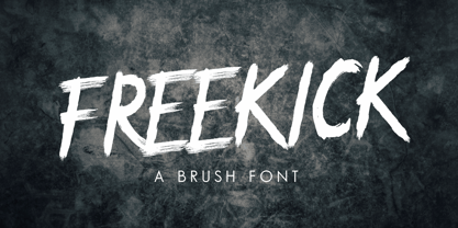 FREEKICK - Brush Font would perfect for sports, music festival, special events or anything What Included this font : PUA Encoded Characters Fully accessible without additional design software. Fonts include multilingual support for; Afrikaans, Albanian, Catalan, Danish, Dutch, English, Icelandic, Italian, Spanish, Portuguese, German, Swedish, Norweigen, Polish, Indonesian, Zulu and etc Simple installations
 - F2F Twins by Linotype,
$29.99The Techno sound of the 1990s, a personal computer, a font creation software and some inspiration had been the sources to the F2F (Face2Face) font series. Heike Nehl and her friends had the demand to create new unusual faces that should be used in the leading german techno magazine Frontpage"." - Quitador by Linotype,
$57.99 Quitador, designed by German designer Arne Freytag (b. 1967), is a constructed Slab Serif typeface family with a humanistic touch especially the Italics. The typeface family has a high x-height, respectively shorter top and bottom lengths. It is suitable for Reading, Headlines, Poster, Magazines, Advertising, Logos Web and Mobile Devices.
 - F2F Lovegrid by Linotype,
$29.99The Techno sound of the 1990s, a personal computer, a font creation software and some inspiration had been the sources to the F2F (Face2Face) font series. Heike Nehl and her friends had the demand to create new unusual faces that should be used in the leading german techno magazine Frontpage"."