10,000 search results
(0.029 seconds)
- Bord by Linecreative,
$16.00 Bord is a type of display font that gives a clean, minimalist and futuristic impression. This font is equipped with upper and lowercase letters (all caps) but the uppercase have futuristic characters and their lowercase give a clean impression, so the combination of upper and lower case letters can give unlimited impression of design, This font supports multiple languages as well.
 - Belgian by FontMesa,
$25.00Belgian is a revival of an old type font from the Bruce Type Foundry of New York, Belgian was first designed as a caps-only font in the 1860s with the lowercase added in 1867. New to this classic font are the Black, Open, Inline and Distressed versions. Also new to Belgian is the addition of a Greek character set. - Kwark by Hanoded,
$15.00 Kwark is a nice, cartoonesque outline font with a bit of grunginess. Yes, it is an all caps font, but upper- and lowercase letters differ in shape, so you can mix and match. The name is not really related to the way the font looks: kwark means 'curd' in Dutch. You think that sounds delicious? Well, then give Kwark a try!
 - Titch by wearecolt,
$9.00 Titch is a brush font, original glyphs drawn with a tombow brush pen. Special care has been taken to retain the individual characteristics of each glyph making Titch a beautifully unique display font. Titch is a small caps font available in both regular and slanted variations. This fun and versatile display font will add a hand made touch to your next packaging design or greetings card.
 - Derojela by UICreative,
$25.00 Introducing of our new product the name is Derojela Serif Font with its unique curves and cut-ins making it one of the most memorable caps fonts on the market .This font is perfect for fashion related branding or editorial design and displays both masculine and feminine qualities. Also you use this font on Logo & Label Design, Apparel Design, Music, Advertising, T-shirts, Brochures And more!
 - Baby Stingrays by Gassstype,
$27.00 Introducing our latest display typeface called Baby Stingrays - Strong Bold All Caps Font Display Vintage Serif with can make your logotype become more interesting. Font is 2 Style Best Vintage font and multilingual support. inspired by the decorative arts and architecture movement Baby Stingrays fonts is perfect for your project and allows you to create designs, headlines, posters, logos, badges and many more that are beautiful.
 - Marfanco by UICreative,
$25.00 Introducing of our new product the name is Marfanco Serif Display Font with its unique curves and cut-ins making it one of the most memorable caps fonts on the market .This font is perfect for fashion related branding or editorial design and displays both masculine and feminine qualities. Also you use this font on Logo & Label Design, Apparel Design, Music, Advertising, T-shirts, Brochures And more!
 - Thunder Kingdom by Dumadi,
$25.00 An elegant and charismatic look is a very suitable nickname given to this font. Thunder Kingdom is a character All-caps font, that comes with variations on Uppercase making this font perfect, comes with ligatures and Multilingual support for use in multiple languages. This font is perfect for fantasy, action, and adventure genre film titles like the picture above. I hope you like this one work.
 - Cold Cuts by Good Gravy Type Co,
$12.00 Cold Cuts is an assorted spread of delicious fonts pre cooked to perfection. This 10 weight font family is $30 for a limited time it is the perfect way to stock your font fridge. Cold Cuts a lean upright font family with a lowercase caps option to give you bonus typesetting choices. A sleek modern vintage style which has a wide variety of display uses. Bon Appétit!
 - Zaftig Pro by Typeco,
$49.00Many current poster artists like to reference the graphic type styles that were popular in the ’60s and ’70s. Zaftig is a contemporary font that takes the geometric and blocky inspiration from that era but then steps off in a modern direction. At first glance, it may appear that the capitals of Zaftig all take up the same amount of space, but certain letters have been designed proportionally for a better flow. However, if the designer would prefer to stack the capital letters in even columns, like blocks, then one can use the Titling Alternates feature. In this feature the metrics of all the capital letters are the same, and certain letters have been designed narrower, allowing for seamless stacking. The space, bullet, asterisk have also been given the same monospaced metrics in this feature to make stacking easy. The Small Caps feature in Zaftig is designed so that the small cap glyphs are the same height as the lowercase. This allows the graphic designer not only the option of small caps, but also the ability to mix and match both kinds of letters to create a distinctive style. There are also alternate numerals in the Small Caps feature that match the height of the small caps. In Stylistic Alternates 1 you will find alternate designs for the Q, A, I, J, L, n, and u glyphs. Or you can find alternates in the Glyph Pallet of your favorite OpenType savvy application. Zaftig is more than it appears on the surface. This OpenType font contains over 1200 glyphs and language support. That makes it an international font which contains letters for most languages that use Latin, Central European, Cyrillic, and Greek scripts. - Viva Beautiful by Cultivated Mind,
$19.00 Viva Beautiful is a lovely hand painted brush script. Viva Beautiful includes two script styles (Regular or B) and an all caps font. Both scripts come in a basic or pro version. Viva Beautiful Pro and Viva Beautiful Pro B include opentype alternates and common ligatures. Try the alternates and ligatures to give your designs a realistic hand painted look. Viva Beautiful and Viva Beautiful B include opentype ligatures. The all caps font is a basic version and pairs beautifully with any Viva script. This brush script family works best for fashion, beauty products, food, apparel and magazines. Viva Beautiful could also be used for film, television, marketing, advertising and websites. Bring beauty to your designs with Viva Beautiful!
 - Yana by Laura Worthington,
$49.00 Yana is classy and confident. Its classical proportions convey worldly sophistication and experience. Designed as a versatile font for everything from text use to headlines and titling, you’ll find yourself using Yana in project after project. Yana is available in regular, bold, and italic variants, and includes two sets of swash capitals, each available in standard sizes, small caps, and mid-sized petite caps, ideal for adding beautiful, properly scaled flourishes to the middle or end of wordmarks. See what’s included! http://bit.ly/2bOpVXA These fonts have been specially coded for access of all the swashes, alternates and ornaments without the need for professional design software! Info and instructions here: http://lauraworthingtontype.com/faqs/
 - Sparhawk by Albatross,
$19.00 Sparhawk in its obvious form is a 3D layered display font, but it's packed with over 300 swashes, extremely rare in the 3D font world. Every single swash is hand-drawn for extreme organic realism. The lowercase are small caps and the swashes are designed to be used mostly with the lowercase letters (top and drop swashes), but the drop (bottom) swashes also work well with all caps. Sparhawk’s large character set and plethora of alternates makes it perfect for logo type, birthdays, weddings, bands… the list goes on. All features include: 8 Awesome Layer Styles, 15 sets of Stylistic Alternates (over 300+ Individually Drawn Swashes), Double-Letter Ligatures for upper and lowercase, and Contextual Alternates.
 - No. Seven by Fenotype,
$35.00 No. Seven is a bold brush style script family of three weights, ornament set and a block capital "small caps" font. No. Seven is equipped with plenty of OpenType features: To activate the alternates click on Swash, Contextual, Stylistic or Titling Alternates or Discretionary Ligatures, Tabular or OldStyle Lining in any OpenType savvy program or manually select the characters from Glyph Palette. Always keep on Standard Ligatures for the best outcome. Combine No. Seven with No. Seven Ornaments and No. Seven Small Caps to complete your designs. No. Seven is an effective font for creating ambitious headlines, logos & posters with a custom-made feeling. For the best price purchase the complete No. Seven Family.
 - Merthiana by Gatype,
$12.00 Merthiana is a modern calligraphy design. This font is elegant and beautiful with a stroke. Can be used for various purposes. such as logos, product packaging, wedding invitations, branding, headlines, signage, labels, signatures, book covers, posters, quotes and much more. Merthiana is encoded with PUA Unicode, which allows full access to all additional characters without having to design special software. Mac users can use Font Book , and Windows users can use Character Map to view and copy any additional characters to paste into your favorite text editor/application. How to access all alternative characters, using the Windows Character Map with Photoshop: https://www.youtube.com/watch?v=Go9vacoYmBw Thank you very much for viewing and Enjoying it.
 - Irish Penny by K-Type,
$20.00 Irish Penny is based on the lettering from Percy Metcalfe's beautiful and influential pre-decimal coinage of Ireland, the Barnyard Collection. The font is more monoline than is conventional for Irish insular styles, almost giving the feel of a modern soft sans, and perfect for small and large scale display purposes. Irish Penny contains a full complement of Latin Extended-A accented characters, Irish lenited consonants with the dot accent, and the tironian et which is commonly used in Ireland instead of an ampersand. Lowercase characters are provided small caps style, slightly reduced in size and subtly thickened in weight. The licensed font comes with a faux italic, and although obliques are not common among insular typefaces, Irish Penny Italic is a useful smart and sporty extra. Although the insular G/g is usually understood, Irish Penny also includes a more latinised option as an alternate G/g. The supplemental 'Irish Penny Alternate G' font places the latinised G and g characters at the normal G/g keystrokes, and makes the original insular glyphs the alternates. An alternate E/e with an angled crossbar is also included. The font contains a selection of discretionary ligatures, these include the ligatures that were used for pre-decimal coins: AC/ac, AE/ae, AL/al, AO/ao, AU/au, AT/at (halfpenny, half crown), AX/ax, AY/ay CA/ca, CC/cc, CE/ce, CO/co (half crown), CU/cu, CY/cy EA/ea (halfpenny, half crown), EC/ec, EE/ee, ET/et, EU/eu (sixpence), EY/ey FE/fe (farthing), FF/ff, FL/fl (florin) GI/gi (penny), GU/gu KA/ka, KE/ke, KI/ki, KO/ko, KT/kt, KU/ku LA/la, LE/le (halfpenny, half crown), LL/ll (shilling), LO/lo, LT/lt, LU/lu, LY/ly RA/ra, RC/rc, RE/re (three/sixpence), RH/rh, RI/ri (florin), RK/rk, RN/rn, RM/rm, RO/ro (half crown), RR/rr, RT/rt, RU/ru, RY/ry TA/ta, TE/te, TO/to, TU/tu NOTE - Irish Penny contains some characters that are not accessible directly from your keyboard, but which may be copied from a font viewer such as Character Map, Font Book or FontExplorer, and pasted into documents. They can also be accessed from the Glyphs browsers within OpenType-aware applications like Adobe InDesign and Illustrator, and Affinity Photo and Publisher.
 - Pariphoom by Jipatype,
$27.00 ขอแนะนำ Pariphoom แบบอักษรอันโฉบเฉี่ยวและทันสมัย เหมาะสำหรับงานออกแบบหลากหลายประเภท ด้วยอักษรแบบ sans-serif condensed และมุมโค้งมน แบบอักษรนี้ให้ความสมดุลที่ระหว่างความเป็นทางการและความเข้าถึงได้ง่าย ชื่อปริภูมิมาจากภาษาไทย แปลว่า “Space” และเช่นเดียวกับชื่อของมัน ฟอนต์นี้สามารถให้พื้นที่มากขึ้นในงานออกแบบของคุณ ไม่ว่าคุณกำลังสร้างสื่อสำหรับสร้างแบรนด์ พัฒนาแคมเปญการตลาด หรือออกแบบเว็บไซต์ Pariphoom มอบความยืดหยุ่นและความอเนกประสงค์เพื่อให้ได้รูปลักษณ์ที่คุณต้องการ Pariphoom มาพร้อมกับรูปแบบที่แตกต่างกันถึง 18 รูปแบบ สิ่งนี้ทำให้คุณมีตัวเลือกมากมายและมีความยืดหยุ่นในการใช้งานในหลากหลายบริบท นอกจากนี้ ฟอนต์นี้รองรับหลายภาษาสำหรับภาษาต่างๆ มากมาย แต่นั่นไม่ใช่ทั้งหมด Pariphoom มาพร้อมกับฟีเจอร์ Opentype เจ๋ง ๆ เช่น Small Caps และ Tabular ซึ่ง Small Caps เป็นวิธีที่ยอดเยี่ยมในการเพิ่มความหลากหลายให้กับงานออกแบบของคุณโดยใช้ตัวพิมพ์ใหญ่แทนตัวพิมพ์เล็ก ในขณะเดียวกัน Tabular ก็สมบูรณ์แบบสำหรับการสร้างตารางและจัดตำแหน่งตัวเลขเพื่อให้ดูเป็นระเบียบมากขึ้น โดยรวมแล้ว Pariphoom ทำให้เป็นตัวเลือกที่ยอดเยี่ยมสำหรับนักออกแบบที่ต้องการสร้างผลงานการออกแบบที่น่าจดจำและมีประสิทธิภาพ Introducing Pariphoom, a sleek and modern typeface that is perfect for a wide range of design projects. With its condensed sans-serif design and rounded corners, this font offers a unique balance of professionalism and approachability. Derived from the Thai language, the name Pariphoom means "Space" and just like its name suggests, this font can give you more space in your design. Whether you're creating branding materials, developing marketing campaigns, or designing websites, Pariphoom offers the flexibility and versatility you need to achieve your desired look. Pariphoom comes with 18 different styles. This gives you plenty of options to choose from and the flexibility to use it in various design contexts. Additionally, this font offers multi-language support for a wide range of languages. But that's not all – Pariphoom comes with some cool Opentype features such as Small Caps and Tabular. Small Caps are a great way to add variety to your design by using small capital letters instead of lowercase letters. Meanwhile, Tabular is perfect for creating tables and aligning numbers for a more organized look. Overall, Pariphoom making it a great choice for designers who want to create memorable and effective design projects.
 - Lincoln Electric by Canada Type,
$30.00 Lincoln Electric started its life as an in-house experimental film type Thomas Lincoln drew shortly after concluding his work as part of Herb Lubalin’s famed crew in the late 1960s,. The master alphabet was drawn on illustration boards using pen and ink and press-type lines. The typeface was initially made for use in the branding and promotional material of Lincoln’s new design outfit. This alphabet’s forms are a spin on Bifur, the all-cap deco face designed by Adolphe Mouron (known as Cassandre) in 1929, and published by the Deberny & Peignot foundry in France. Lincoln Electric evolves Cassandre’s idea further by constructing new shapes more in line with minimalist principles rather than art deco geometry — something clearly evident in Lincoln’s minuscules, which exhibit a clear connection to Bauhaus ideas More than 50 years after the typeface’s design, Thomas Lincoln found the original film alphabet tucked away in his archives and brought it over to Canada Type for digital retooling. The result is a modern and thoroughly elaborate set of fonts that belonging prominently in a 21st century designer’s toolbox. The following features are included in Lincoln Electric: • Three fonts for chromatic layering. • More than 1900 glyphs in each font. • Expanded Latin and Cyrillic character sets. • Small caps and Caps-to-small-caps. • Six different sets of stylistic alternates. • Ordinals and case-sensitive forms. For a showing of the stylistic set variations and a sample of demonstration of chromatic layering, please consult this PDF.
 - Assemblage by Latinotype,
$36.00 Assemblage Designed by Daniel Hernández, Alfonso García, Bruno Jara Ahumada and Luciano Vergara. Thanks to Pedro González for his contribution in the initial stage of the design process. Assemblage is a typeface-inspired by Roman square capitals-that comes in 6 different weights and ranging from Thin to Black. The background of the typeface makes it well-suited for branding, short text, titles and complex compositions, thanks to its italic version. Contrary to some conservative fonts, Assemblage includes an italic version with a look based on Elzeverian and Dutch Barroque typefaces, what gives the font an extra dash of elegance, resulting in a very enjoyable design. The family was specially created for labelling wine bottles and general packaging. Assemblage is a font collection consisting of a Sans Serif plus an Italic version of classic features. The family comes in 6 weights and includes ligatures, caps and small caps plus 3 sets of smaller small caps for different kinds of composition. The Italic version-with strong decorative features-comes with swashes. Assemblage also includes a set of dingbats, especially designed for packaging as well as for publishing or branding. The Sans contains 979 characters and the Italic version 620 characters. Assemblage supports 212 different languages and its OpenType features include ligatures, semi oldstyle figures, 3 sets of ornamental small caps (in the Sans version), swashes, ending forms and alternates in the Italic version.
 - Fluire by Lián Types,
$37.00 MAS AMOR POR FAVOR (1) (more love, please) Fluire means -to flow- in Italian and that’s what this font is all about. The story began when a friend of mine asked for a tattoo with the word -Fluir- (to flow in Spanish). She didn't want a tattoo full of swashes and swirls, like I'm used to doing, but something more fluent, soft and minimal. My very first attempts were more related to copperplate calligraphy but I wasn't even close: I discovered that I needed to forget a little bit about the classic contrast and speed of the engrosser's nib and started playing with a tiny flat metal nib. Letters started to flow, and I immediately thought of turning them into a font. Inspired by the tattoo I created and by other tattoos I saw, I started the journey of what would be a very fun process. The result is a very cute, almost monoline font with a wide range of uses. USES If not used for a tattoo (my first ‘target’), the font delivers amazing results in combination with Fluire Caps: These two need each other, they go together, they talk. I designed Fluire Caps Down and Fluire Caps Up so it’s easier to manage their colors. Also there’s Fluire Caps Down Lines, which has a decorative thin line to add yet another dimension. Use the fonts in magazines, book covers, posters, greeting cards, weddings, lettered walls, storefronts! TIPS Since the font is Open-Type programmed, I strongly recommend using it in applications that support that feature. Also, the font looks way better when -contextual alternates- are activated, but it’s your choice :) Try Fluire, and keep flowing. NOTES (1) The phrase alludes to maybe the most tattooed phrase in Latin America.
 - FT Master Of Poster by Fenotype,
$19.95 Master of Poster is an all caps OpenType family. Each style has over 450 ligatures.
 - JAF Lapture by Just Another Foundry,
$59.00 Lapture is based on the Leipziger Antiqua by Albert Kapr, released in 1971 by the East German foundry Typoart. It has been extended and carefully redesigned by Tim Ahrens in 2002-05. The strong calligraphic characteristics are a result of the design process: "The size of the counters and the width of individual characters at small optical sizes were analysed with a steel pen while the letter shapes were designed in larger size with a specially trimmed reed pen. Sometimes the hand is more innovative than the head alone," says Kapr. A unique feature of this font is the introduction of gothic shapes into a latin typeface. "The basic concept is to string together narrow white hexagons as counters and inter-letter spaces, defined by vertical stems and triangular serifs. The interior spaces are at least as important as the strokes that make up the characters." Lapture is an ideal choice if a reference to gothic style is desired, as true black letter types are often too eye-catching and not as legible as latin fonts for unfamiliar readers. "The last few years have seen a number of very elegant typefaces based on the mellow and feminine renaissance model. However, sometimes we require a font that is strong and robust, harmonic yet rigid," says designer Tim Ahrens. JAF Lapture is provided in OpenType format. Each font contains more than 600 glyphs, including true small caps, nine sorts of figures, contextual and stylistic alternates and accented characters. This means that you only need to purchase one font whereas in other families you would have to buy two or three fonts in order to get the same. Technically, they follow the Adobe Pro fonts and provide the same glyph set and OpenType functionality. JAF Lapture Basic is provided in OpenType format. Each font contains the standard sets of both MacOS and Windows. In contrast to JAF Lapture they do not provide any advanced OpenType features and no extended glyph set.
 - Roster by Fenotype,
$35.00 Roster is a strong brush script family of two weights, caps and a set of ornaments. Roster is great for any kind display use from advertising to packaging and from online to branding. Roster is clear and legible even in smaller sizes and works for longer texts too, but is at it’s best when used for shorter sentences or even just for one or two word display or logo use. Roster is equipped with plenty of Ligatures and Contextual alternates that are automatically activated as long as you keep Standard Ligatures feature on. These features help to maintain the flow and add on some variation when writing with Roster. If you need more than that there is at least three Alternates for each basic character: click on Swash, Stylistic or Titling Alternates in any OpentType savvy program or check out for even more alternates from the Glyph Palette. Since uppercase letters in Roster are mainly designed as initials I made Roster Caps for an all caps version of the capital letters. Roster Caps can be used on it’s own or to support Roster Script. Roster Ornaments is a set of swashes and brush strokes designed to support the font.
 - Delirium Duo by Ana's Fonts,
$15.00 Delirium Duo is a handwritten font duo, consisting of: - A textured brush font with ligatures; - A casual all-caps font with different upper case and lower case characters for a more natural handwritten feel. - Plus two sets of swashes and ornaments that complement each font nicely. This font duo makes it so easy to create beautiful designs, and is perfect for logos, quotes, cards, social media posts, websites, magazines, and packaging.
 - Orecla by Maulana Creative,
$13.00 Orecla is an all caps font. With 3 weights stroke, fun character. To give you an extra creative work. Orecla font support multilingual more than 100+ language. This font is good for logo design, Social media, Movie Titles, Books Titles, a short text even a long text letter and good for your secondary text font with sans or serif. Make a stunning work with Orecla font. Cheers, Maulana Creative
 - Camore by Maulana Creative,
$15.00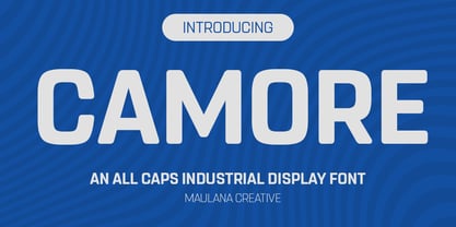 Camore is an all caps font. With 3 weights stroke, fun character. To give you an extra creative work. Camore font support multilingual more than 100+ language. This font is good for logo design, Social media, Movie Titles, Books Titles, a short text even a long text letter and good for your secondary text font with script or handwritting. Make a stunning work with Camore font. Cheers, Maulana Creative
 - Cerulean Blue by Hanoded,
$15.00 Cerulean comes from the Latin word caeruleus, meaning dark blue. I have always liked this color, so I decided to name a font after it. Cerulean Blue is a handmade brush font family, consisting of a nice handwritten font and a caps font. Both fonts come with their Italics. Cerulean Blue can be used for just about any design, but product packaging and book covers come to mind.
 - Trigar by Maulana Creative,
$13.00 Trigar is an all caps font. With 2 style stroke, fun character. To give you an extra creative work. Trigar font support multilingual more than 100+ language. This font is good for logo design, Social media, Movie Titles, Books Titles, a short text even a long text letter and good for your secondary text font with script or handwriting. Make a stunning work with Trigar font. Cheers, Maulana Creative
 - Amerika Pro by CheapProFonts,
$- This is the 200th font released by CheapProFonts, and again I wanted to make something special - so I have chosen to upgrade another well-known font by the infamous Fredrick "Apostrophe" Nader: Amerika! The whole character set for this stylish font has been polished for consistent baseline placement and serif thickness, and proper overshoots has been implemented. All the alternate letterforms (and some new ones) have been included as OpenType alternates AND they have now been made available with accents, too! The Greek and Cyrillic letterforms are properly encoded and kerned. I hope many will enjoy the improvements - and naturally: it is still free! ALL fonts from CheapProFonts have very extensive language support: They contain some unusual diacritic letters (some of which are contained in the Latin Extended-B Unicode block) supporting: Cornish, Filipino (Tagalog), Guarani, Luxembourgian, Malagasy, Romanian, Ulithian and Welsh. They also contain all glyphs in the Latin Extended-A Unicode block (which among others cover the Central European and Baltic areas) supporting: Afrikaans, Belarusian (Lacinka), Bosnian, Catalan, Chichewa, Croatian, Czech, Dutch, Esperanto, Greenlandic, Hungarian, Kashubian, Kurdish (Kurmanji), Latvian, Lithuanian, Maltese, Maori, Polish, Saami (Inari), Saami (North), Serbian (latin), Slovak(ian), Slovene, Sorbian (Lower), Sorbian (Upper), Turkish and Turkmen. And they of course contain all the usual "western" glyphs supporting: Albanian, Basque, Breton, Chamorro, Danish, Estonian, Faroese, Finnish, French, Frisian, Galican, German, Icelandic, Indonesian, Irish (Gaelic), Italian, Northern Sotho, Norwegian, Occitan, Portuguese, Rhaeto-Romance, Sami (Lule), Sami (South), Scots (Gaelic), Spanish, Swedish, Tswana, Walloon and Yapese.
 - Kingthings Scrybbledot Pro by CheapProFonts,
$10.00 A fun and charming scribbled alphabet - perfect for scrapbooking and that handmade look. Lots of technical details had to be fixed, but it now has a professional quality, and our impressive language support! :) Kevin King says: "The Scrapbooking People have asked for grungy fonts - and this is one of my efforts to comply. I scribbled the letters in Paint shop Pro and imported the results into my font program directly. This is the first font i have created directly on the computer without any paper sketches - I think it took considerably more work!" Kingthings Scrybble Pro is a dotless version - perfect if you like the scribbles, but not the splutter. ;) ALL fonts from CheapProFonts have very extensive language support: They contain some unusual diacritic letters (some of which are contained in the Latin Extended-B Unicode block) supporting: Cornish, Filipino (Tagalog), Guarani, Luxembourgian, Malagasy, Romanian, Ulithian and Welsh. They also contain all glyphs in the Latin Extended-A Unicode block (which among others cover the Central European and Baltic areas) supporting: Afrikaans, Belarusian (Lacinka), Bosnian, Catalan, Chichewa, Croatian, Czech, Dutch, Esperanto, Greenlandic, Hungarian, Kashubian, Kurdish (Kurmanji), Latvian, Lithuanian, Maltese, Maori, Polish, Saami (Inari), Saami (North), Serbian (latin), Slovak(ian), Slovene, Sorbian (Lower), Sorbian (Upper), Turkish and Turkmen. And they of course contain all the usual "western" glyphs supporting: Albanian, Basque, Breton, Chamorro, Danish, Estonian, Faroese, Finnish, French, Frisian, Galican, German, Icelandic, Indonesian, Irish (Gaelic), Italian, Northern Sotho, Norwegian, Occitan, Portuguese, Rhaeto-Romance, Sami (Lule), Sami (South), Scots (Gaelic), Spanish, Swedish, Tswana, Walloon and Yapese.
 - Quietism Variable by Michael Rafailyk,
$150.00 A smooth contemplative Antiqua with aspiring to the sky ascenders, inspired by the Quietism philosophy. Clarity of the mind is achieved by bringing the body into a state of calm and contemplation, and this is reflected in the design – the quiet horizontal serifs (body) are opposed to the peaky soaring ascenders (mind). The design also features four optical size subfamilies with different x-height and contrast, oldstyle diagonal stress, oldstyle figures by default, smooth details and slightly dark texture. Variable axes: Weight, Contrast, X-Height. Scripts: Latin, Greek, Cyrillic. Languages: 480+. The complete list of supported languages: michaelrafailyk.com/quietism Kerning: 4553 class-to-class pairs. Hinting: Not applied. Format: TTF – OpenType with TrueType outlines. Variable Font: Quietism Variable provides more options than static versions, and has three axes: Weight (Thin–Black), Contrast (Low-High), and X-Height (Low-High). Variable fonts includes thousands of styles that you can access using a sliders on graphic editor or via CSS on web browser. Mixing different axes gives you extra styles not represented by static fonts. Optical Size: The typeface is represented by four subfamilies: Text (low contrast, high x-height – for paragraph 10-20 pt), Deck (medium contrast, medium x-height – for subheading 20+ pt), Display (high contrast, medium x-height – for heading 72+ pt), Poster (high contrast, low x-height – for big size 120+ pt). Small Caps: Lowercase letters and Oldstyle Figures are replaced with Small Capitals forms. Capitals to Small Caps: Uppercase letters, all figures, and some punctuation are replaced with Small Capitals forms. Case Sensitive Forms: ()[]{}‹›«»-–—•·#%‰@ and Arrows are centered on capitals. Oldstyle figures are replaced with Lining figures. Oldstyle Figures: 0123456789 #%‰. Designed to work with lowercase letters. Used by default. Lining Figures: 0123456789 #%‰. Figures are the same height as uppercase letters (cap height). Proportional Figures: Lining, Oldstyle, Small Caps, Capitals to Small Caps. Tabular Figures: Lining, Oldstyle, Small Caps, Capitals to Small Caps. Ordinals: adehnorst. Superscript, Subscript, Numerator, Denominator: 0123456789. Fractions: ¼½¾⅐⅑⅒⅓⅔⅕⅖⅗⅘⅙⅚⅛⅜⅝⅞⅟ (precomposed). Any other fractions (even those typed through a slash) will also be displayed correctly, with the automatic replacement to Numerator + fraction + Denominator. Slashed Zero: All 0 figures. Contextual Alternates: Number sign character (#) before uppercase letters is replaced by its version centered on capitals. Hyphen character (-) between two uppercase letters is replaced by its version centered on capitals. First of two TT letters is replaced by its alternate form. Letters vwy before the letters fijmnprtuvwxy are replaced with an alternate shorter versions that fits better in the context. Contextual Alternates (Greek): ΆΈΉΊΌΎΏ. Greek uppercase accented characters lose their tonos accent and retain only dieresis in All Caps and Small Caps modes. Turned on by default. If you need tonos accents in All Caps then turn off Contextual Alternates (calt) feature. Stylistic Alternates: FTГТИЦЩцщ and their versions with diacritical marks. Stylistic Set 01 “Arrows”: Left <- Right -> Up Left Right <-> Up Down North West South East \> South West Stylistic Set 02 “Round-Square Cyrillic”: ДИЙЍЛФвгджзийѝклнптцчшщьъю characters are replaced with its Bulgarian or Russian forms. Stylistic Set 03 “Cyrillic Tse Shcha short tails”: ЦЩцщ characters are replaced with its alternate form with short tail. Stylistic Set 04 “Cyrillic I full serifs”: ИЙЍӢ characters are replaced with its alternate form with inner serifs. Stylistic Set 05 “FT bent inward serif”: FTГ characters and their versions with diacritical marks are replaced with its alternate form with right head serif that bent inside. Stylistic Set 06 “Small Caps centered on Capitals”: Small Caps are vertically centered on uppercase letters. Standard Ligatures: fi fl fb ff fh fj fk ffb ffh ffi ffj ffk ffl. Discretionary Ligatures: Th ct st. Localized Forms: 52 character substitutions for Azeri, Bulgarian, Catalan, Dutch, German, Kazakh, Macedonian, Moldavian, Polish, Romanian, Serbian, Tatar, Turkish. Glyph Composition/Decomposition (Diacritics): Full Latin and based Vietnamese set of diacritics (571 characters). Precomposed.
 - Bloody Nose by Mabry Creative,
$35.00 Bloody Nose, from Mabry Creative, is an original decorative font with embedded OpenType features. Consisting of hand-scrawled characters, the font is set in all caps and features ninety-eight glyphs with six alternate versions of each. The alternates automatically and randomly cycle through for a more authentic handwritten effect. Bloody Nose was created using an eyedropper to apply red ink to Bristol board. The natural running and pooling of the ink as it absorbed into the board inspired the font’s title.
 - Sapore by Fonderia Serena,
$23.90 Sapore is a script font family, mostly monoline, inspired by the elegant handmade signs in the beautiful city of Venice, Italy, where I work and live. Many of these signs were made at the beginning of the 20th century by skillful craftsmen and artists, carrying that distinct vintage Italian flavour, and this is why I named the font Sapore, which means precisely flavour (also, one of the signs is from a pastry shop that makes the most delicious things). The design takes this retro vibe into the 21st century, making it up-to-date and fresh, while keeping it authentic. It is a script font, but I added some stand alone capitals that you can use in all caps words and texts effortlessly, as the open type code is taking care of using the right set of letters at the right time, I could have made two separate fonts, but I wanted to give you the best value I could and ease of use. Make sure contextual alternates are always on! There are also swashes, alternate styles, stylistic sets, small caps, 2 figure sets and decorative elements, all accessible through open type. I think the font is particularly suited for display use, as in logos, packaging design, branding, but it is readable enough for small text blocks. You can access the non-linking caps by clicking on the discretionary ligatures button. You can access the loopy caps by clicking on the titling alternates button. The main version has straight terminals but I included a round version and a calligraphic one, called “classico”. Hope you like it!
 - 1786 GLC Fournier by GLC,
$38.00This family was inspired by numerous documents and books printed in Paris during the end of the 1700s. Mainly, documents printed by P.G. Simon & N.H. Nyon, “Printers of the parliament” were used for the Normal and italic styles and “Caps”. “Titling” characters were coming from a collection of hymns printed by Nicolas Chapart. In France these Fournier characters, as Baskerville in Great Britain, were the most often in use in the late 1700s, just before the Didot designs. This font supports strong enlargements, specially the capitals of “Caps” file and “Titling”, remaining very smart, elegant and fine. - Neogrotesk by Los Andes,
$39.00 Not of the Alps but from Los Andes. It tastes a lot more like wine than cheese. Neogrotesk is a versatile and functional workhorse typeface with a neutral look and Latin flavor. The font includes multiple typographic features such as alternates, ligatures, small caps, case-sensitive punctuation, arrows as well as lining, old style and tabular figures. Neogrotesk is the perfect choice for editorial, corporate and advertising design. This 40-style type comes in 5 weights with matching italics and contains 770 glyphs. The complete set consists of 4 sub-families: Essential, Essential Alt, Pro and Small Caps.
 - Lempicka by Molly Suber Thorpe,
$17.99 Lempicka is a ligature-rich typeface duo with support for Latin and Greek. Lempicka Display and Small Caps are a pair of light, clean fonts with strong Art Deco character. Lempicka Display has over 150 ligatures and alternates (in Greek, too!), so it's extremely customizable and versatile. Lempicka Small Caps is Display's little sister: the perfect complement for creating hierarchy in a layout.⠀ This is a beautiful typeface for wedding invitations and personal stationery, as well as unique logo design and branding projects. The name of this type family is an homage to Art Deco painter Tamara de Lempicka.
 - Pseudographia by The Ampersand Forest,
$35.00 Pseudographia is a lighthearted, loving pastiche of “Greek-Style” type inspired by J.M. Bergling’s 1917 “Society Greek” lettering. Happily living in the world of kitschy cross-cultural fonts of the kind found on restaurant awnings around the US, Pseudos is blithely unconcerned with legibility. Instead, it embraces its own benign exoticism and revels in its own chicanery! Pseudographia’s standard letterforms are angular Roman forms. Its Stylistic Set One contains a simplified Small Caps version of the kind commonly seen at Mediterranean eateries. Its Stylistic Set Two contains a full set of outlined Ornamental caps. Opa! Part of The Ampersand Forest's Sondheim Series.
 - Roadway by K-Type,
$20.00 Roadway is based on U.S. highway lettering observed on New York street signs. Two weights of capitals would often be used on the same sign, condensed for the main name, and a half-size regular superscript for ‘road’ or ’street’. Roadway is a Small Caps font. The upper case consists of condensed capitals, the lower case consists of regular width small caps, sized at 50% and superscript. A small superscript comma and period, aligned with the lowercase, are at keystrokes < and > respectively. A small hyphen lining with the superscript lowercase is at the en dash position (Mac: option hyphen, Windows: alt-0150).
 - Organon Sans by G-Type,
$60.00 The six weight Organon Sans typeface is a stylish and feature-laden OpenType family which complements its sister Organon Serif, both components working in tandem to create an elegant, legible and thoughtfully designed suite of fonts which share similar cap & x heights, stem widths and ascender/descender values. Tapered stems give the Organon Sans fonts an attractively robust appearance.
 - Alstoria by Bombastype,
$35.00 Alstoria is a Bold Serif Display font. Suitable for your projects like branding, packaging, printing, header, and many more. Contains 320+ glyphs and 10 ligatures. You could check the full glyph map at this link. This font also contains many swash alternates option to play. Works well for vintage and modern style like you see in our preview images.