10,000 search results
(0.039 seconds)
- Dederon Sans by Suitcase Type Foundry,
$75.00Dederon Serif has been specifically designed for book setting. Preliminary sketches were drawn in 2004. Its inspiration — particularly its weight and width proportions — can be traced to the Liberta typeface from the TypoArt type foundry in former Eastern Germany. After a careful study of the model, the design of Dederon branched off into its own direction, finding its distinctive voice and becoming a wholly original type family. Dederon Serif kept most of the elements typical for the Old Style Roman lettering, such as the angle of the stress, the medium x-height, and lower contrast. In large sizes, the typical shapes of the letters stand out — the calligraphic feel characteristic for the Czech typefaces by Oldrich Menhart, the unusual serifs hinting at the angle of the pen, the shapes of the stems, or the terminals of dots and ears. Upon finishing the serif version, a sans-serif variant called Dederon Sans was added. The construction principles are also derived from the Old Style Roman model, which lends the lettering its open, humanist feel. Yet the design also conforms to the rules of the modern sans serif. Most characteristics of Dederon Sans match the serif version — the weight of individual cuts, the width proportions, x-height, ascenders' and descenders' length, and the slope of the italics. Each version of Dederon Open Type Std contains the standard Western Latin character set and the Central European characters; a number of basic and accented ligatures, small caps; old style, small caps and caps, table, fraction and superscript numerals; expert glyphs and alternative characters. This brings the total to a comfortable 820 glyphs per weight - Auchentaller by HiH,
$12.00 Auchentaller was inspired by a travel poster by Josef Maria Auchentaller in 1906. To our knowledge, it was never cast in type. Grado lies on the northern Adriatic, between Venice and Trieste. At one time the port for the important Roman town of Aquileia. With the decline of the Roman Empire, the upper Adriatic region came under the rule of the Visigoths, the Ostrogoths, the Byzantines, the Lombards, the Franks, the Germans, the Venetians and finally, in 1796, the Austrian Hapsburgs. So it remained until the dissolution of the Austro-Hungarian Monarchy in 1919, following World War I, when the seaport of Trieste was awarded to Italy. With Trieste came Montefalcone, Aquileia and Grado. The area was marked by years of political tension between Italy and Yugoslavia, exemplified by the d'Annunzio expedition to capture Fiume (Rijeka) in September, 1919. Some basic discussion of the period from 1919 to 1939 may be found in Seton-Watson’s Eastern Europe Between The Wars (Cambridge 1945) and Rothschild’s East Central Europe Between The Two World Wars (Seattle 1974). In 1965 I was traveling by train from Venice to Vienna. Crossing the Alps, the train stopped for customs inspection at the rural Italian-Austrian border, just above Slovenia. We were warned not to get off the train because there were still shooting skirmishes in the area. Through all this, Grado remained literally an island of tranquility, connected to the mainland by a only causeway and lines on a map. Auchentaller not only painted the beach scene at Grado, he moved there, living out the rest of his life in this comfortable little island town. His travel illustration contains the text from which the design of our font Auchentaller is drawn. The text translates: "Seaside resort : Grado / Austrian coastal land". Please see our gallery images to see a map locating Grado, as well as Auchentaller’s painting of the resort. Auchentaller is a monoline all-cap font, light and open in design , with a lot of typically art nouveau letter forms. Included in our font are a number of ligatures. As is frequently seen in designs by German speakers, the umlaut is embedded in the O & U below the tops of the letters. This approach led to two whimsies: a happy umlauted O and a sad umlauted U. This font has a clean, crisp look that is very appealing and very distinctive. Auchentaller ML represents a major extension of the original release, with the following changes: 1. Added glyphs for the 1250 Central Europe, the 1252 Turkish and the 1257 Baltic Code Pages. Add glyphs to complete standard 1252 Western Europe Code Page. Special glyphs relocated and assigned Unicode codepoints, some in Private Use area. Total of 336 glyphs. 2. Added OpenType GSUB layout features: pnum, liga, salt & ornm. 3. Added 116 kerning pairs. 4. Revised vertical metrics for improved cross-platform line spacing. 5. Revised ‘J’. 6. Minor refinements to various glyph outlines. 7. Inclusion of both tabular & proportional numbers. 8. Inclusion of both standard acute and Polish kreska with choice of alternate accented glyphs for c,n,r,s & z. Please note that some older applications may only be able to access the Western Europe character set (approximately 221 glyphs). The zip package includes two versions of the font at no extra charge. There is an OTF version which is in Open PS (Post Script Type 1) format and a TTF version which is in Open TT (True Type)format. Use whichever works best for your applications.
 - Golden Clouds by Anastasia Kuznetsova,
$22.00 Say hello to Golden Clouds :) A charming and cute font duo with handwritten letters and doodles!! Bring some irresistible fun to your design with Golden Clouds Font Duo! This playful font duo consists of a fast-flowing signature font and a charming font with small capital letters as the perfect companion. But that's not all - the set also includes a bonus Doodle font containing hand-drawn drawings designed to give your "Golden Clouds" fonts the appeal of handmade. Golden Clouds Script • A clean, smooth handwritten signature font containing uppercase and lowercase characters, numbers and a wide range of punctuation marks. Golden Clouds SmallCaps • Clean, charming handwritten font with capital letters. Golden Clouds Doodles • A set of hand-drawn drawings designed in combination with Script and Small Caps fonts. Just set it as your own font and enter any character to create each drawing. "Golden Clouds" is ideal for everyday use in greeting cards, illustrations, quotes, original branding, book covers, children's books, packaging and much more :) Font Features: A-Z; a-z character set; 1 language (English); numbers and punctuation marks, symbols. Fonts can be opened and used in any software that can read standard fonts, even in MS Word. No special software is required to get started. It is recommended to use it in Adobe Illustrator or Adobe Photoshop. Made with love and magic ♡ Thank you for reading it, and do not hesitate to send me a message if you have any questions! ~ Anastasia
 - First Contact by SilverStag,
$19.00 I am First Contact, a super ultra condensed all caps font with support for over 90 languages and over 540 ligatures. I am a cutting-edge font that is both cool and chic, yet still personal. I am perfect for a wide range of design projects, from logos and branding to headlines and posters. I am the future of your typography. I am the font that will take your designs to the next level. I am bold, I am confident, and I am here to make a statement. I am not like other fonts. I am not afraid to be different. I am unapologetically myself. I am First Contact, and I am here to shake things up. I am the perfect font for anyone who wants to stand out from the crowd. I am the font for the bold, the brave, and the innovative. I am First Contact, and I am the font for the cool kids. I am the font for the trendsetters. I am the font for the people who want to be ahead of the curve. I am First Contact, and I am here to help you create something truly unique. I am more than just a font. I am a movement. I am a call to action. I am a challenge to be different. So what are you waiting for? Use me today!
 - King Pong by Dan Auer,
$5.00 Inspired by apes and barrels, King Pong is a display font that's heavy, blocky, yet cheerful. Letterforms are brought to life through removal from a single square. Ascenders and descenders bring contrast and interest to the letterforms through a curved form cut at a 45 degree angle. King Pong works great for themes related to video games, technology, and music while the letterforms perform well in low-contrast environments and in very large formats – such as posters.
 - Central Display by Prioritype,
$19.00 Central Display - A Display Serif Font (All Caps) This typeface is inspired by fashion magazines. Strong and classy character. For the main display is very suitable. For example in poster design, branding, social media posts, magazine covers and so on. Features: Uppercase, Lowercase, Numeral, Punctuation & Multilingual. Multilingual contained: Afrikaans, Albanian, Asu, Basque, Bemba, Bena, Breton, Catalan, Chiga, Cornish, Danish, Dutch, English, Estonian, Filipino, Finnish, French, Friulian, Galician, German, Gusii, Indonesian, Irish, Italian, Kabuverdianu, Kalenjin, Kinyarwanda, Luo, Luxembourgish, Luyia, Machame, Makhuwa-Meetto, Makonde, Malagasy, Manx, Morisyen, North Ndebele, Norwegian Bokmål, Norwegian Nynorsk, Nyankole, Oromo, Portuguese, Quechua, Romansh, Rombo, Rundi, Rwa, Samburu, Sango, Sangu, Scottish Gaelic, Sena, Shambala, Shona, Soga, Somali, Spanish, Swahili, Swedish, Swiss German, Taita, Teso, Uzbek (Latin), Volapük, Vunjo, Zulu. Thanks :)
 - Garvo by BeJota,
$25.00 Garvo is based on old Hollywood movie posters, vintage film credit designs and pays homage to Herb Lubalin's Serif Gothic font & lettering. This is why Garvo is named after the acclaimed international actress Greta Garbo. The Garvo family comes in 6 weights (from Thin to Black) and includes 2 different subfamilies: Garvo and Garvo Poster. Garvo is perfect for short readable texts, such as advertising and packaging designs, while Garvo Poster brings a wide range of contextual alternatives which makes it perfect for high impact pieces. Both styles increase the overall family flavor with discretionary ligatures, small caps figures. The 12 styles of Garvo are perfectly well suited for branding projects, album covers, audiovisual related designs, magazines and layouts, among other uses.
 - Eleckatrical Banana JNL by Jeff Levine,
$29.00 From the same page of a vintage German lettering textbook entitled “50 Alphabete fur Technikur und Fachschulen” (loosely translated to “50 Alphabets for Technicians and Specialized Schools”) that inspired Trippy Hippy JNL comes Eleckatrical Banana JNL. It’s another novelty, free form Art Nouveau hand lettered alphabet that works well in recreating 1920s period pieces or for designing a retro-inspired rock and roll concert poster reminiscent of the 1960s. The name of the typeface is from a line in the 1966 pop hit “Mellow Yellow by Donovan (Leitch), and his extended pronunciation of ‘electrical’: “…E-lec-a-tric-cal’ banana is going to be the very next craze…” Caps only Fonts. Eleckatrical Banana JNL is available in both regular and oblique versions.
 - Saveur Sans Round by Arkitype,
$10.00 Saveur Sans Round is the softer, friendlier cousin of Saveur Sans, a font family inspired by art deco and French cafes. This display family has clean, simple letterforms that feel modern but at the same time have a retro, art-deco styling. This family can add a sophistication to any layout whether it be print or online. Saveur Sans Round is a great selection for headlines, logotypes and branding. it is an all-caps display family with some neat alternatives including an alternative O and E that instantly give your copy that retro-deco look. The promos have been inspired by French food and design. This family is perfect for use in packaging and branding of food products as well as menus and restaurant or cafe branding.
 - Munchies by W Type Foundry,
$25.00 Munchies is a reverse contrast slab-serif font family. Inspired by the volume and size of 19th century wood letterpress blocks and the Italian Caslon language. Munchies has 12 variants, from Heavy to Thin, with opentype options in a set consisting of uppercase, lowercase, small caps, ligatures, and alternate letters (A, M, N, V, W, &, Arrows, *). Munchies is divided into two subfamilies: Normal and Display. The Normal style has an appearance reminiscent of Western posters with a “measured” contrast. While the Display style takes the contrast to the extreme. Both styles are also available in Variable version. The inverted contrast makes it an interesting and striking looking typeface that stands out in any context. Perfect for headlines, bold branding, or animation like kinetic typeface.
 - Pani Sans by Alessio Laiso Type,
$19.99 Pani Sans is a contemporary type family in 18 styles designed by Alessio Laiso. It takes inspiration from Italian rationalist and art deco typefaces, bringing them into the present with the mix of its reliable geometric structure and distinctive warm personality. The italics add to the unique character of the family by featuring distinguishing calligraphic touches. Pani Sans is fully equipped for intense professional use for both print and digital applications. It supports 219 languages, covering 100% of the Latin Plus character set, and it ships with powerful OpenType features including beautiful small caps, ligatures, stylistic alternates, fractions, tabular figures, old-style figures, and more. The variable fonts included in the family package allow you to pick the perfect weight, for unlimited design freedom.
 - Headline Helpers Three SG by Spiece Graphics,
$39.00 Wouldn't it be nice to have an assortment of little hand-lettered words? Words like “The” or “A”; “With” or “At”; “To” or “From”? Headline Helpers Three are word accents that can go just about anywhere. Set off the title of your next design project with one of these little gems. Or use a Helper with your new product introduction headline. Convenient instructions and character map come as standard equipment with this highly desirable addition to your type library. Headline Helpers Three is available in the OpenType Std format. Advanced features currently work in Adobe Creative Suite InDesign, Creative Suite Illustrator, and Quark XPress 7. A Windows TrueType version of this font has also been provided if you prefer normal keyboard access.
 - Aracne by Antipixel,
$15.00 The all-caps Aracne collection features tall, slightly scrawled letterforms, and is available in regular, condensed and ultra condensed styles for maximun functionality. With a spiritted quality and casual character, it will add a personal style to your work. Aracne is a full of energy handwritten font, with light and regular styles, including italics. It provides a wide range of possibilities, including the Aracne Soft and Stamp, which offer softer and cleaner edges. It’s has a glyph coverage supports languages such as English, Spanish, French, German, Polish, Czech, among many others. It’s recommended usage is for display titles, and small ammount of text, because of its good legibility and quality of glyphs. Check out her sisters Aracne Condensed and Aracne Ultra Condensed!
 - Headline Helpers Four SG by Spiece Graphics,
$39.00 Wouldn't it be nice to have an assortment of little hand-lettered words? Words like “The” or “A”; “With” or “At”; “To” or “From”? Headline Helpers Four includes word accents that can go just about anywhere. Set off the title of your next design project with one of these little gems. Or use a Helper with your new product introduction headline. Convenient instructions and character map come as standard equipment with this highly desirable addition to your type library. Headline Helpers Four is available in the OpenType Std format. Advanced features currently work in Adobe Creative Suite InDesign, Creative Suite Illustrator, and Quark XPress 7. A Windows TrueType version of this font has also been provided if you prefer normal keyboard access.
 - Histories Family by Graptail,
$19.00 Since the beginning, “Histories” has been inspired by the shape of the letters displayed on the cover of fairy tale books or animated film covers. Likewise with the naming of the font "Histories" so that the message of the letters is conveyed. And this stylistic combination should also be reflected in the lowercase set which also allows to open up a spectrum of possible uses. Basic calligraphy represents a solid basis for the development of lowercase glyphs, ensuring proper interaction with uppercase letters. “Histories” features multiple ligatures that combine the playerful structure with a more attractive feel. With glyphs, it provides a wide range of uses across ligature combinations, alternate marks, pre-caps, assortments and connectors; each of which can be accessed via Open Type.
 - Carlin Script by Linotype,
$40.99The Carlin Script family, inspired by the Carolingian minuscule alphabet (ca 800 A.D.), is one of the great new families available through Linotype's Library's Take Type 5 collection. Take a closer look at these beautiful characters; with them, one can create a different, more personal feeling than commonly comes from more available script and chancery fonts. Like a monk with his writing table, German designer Hans-Jürgen Ellenberger created this new design, which includes 10 different weights, bringing scribal excellence directly to your keyboard. The Carlin Script family includes an additional Initial set-allowing the creation of medieval-flavored drop or initial caps in snap. And the critics are raving: Carlin Script was a winner in the New York-based Type Directors Club's 2003 Type Design Contest!" - Molianty by Akifatype,
$10.00 Molianty is highly legible script typeface, with a touch of a bold, classic and fun vintage look. It includes OpenType features with stylistic alternates. It can be used for various purposes, such as posters, t-shirt, signage, logos, news, badges etc. To enable the OpenType Stylistic alternates, you need a program that supports OpenType features such as Adobe Illustrator CS, Adobe Indesign & CorelDraw X6-X7, Microsoft Word 2010 or later versions. Molianty is coded with PUA Unicode, which allows full access to all the extra characters without having special designing software. Mac users can use Font Book , and Windows users can use Character Map to view and copy any of the extra characters to paste into your favourite text editor/app.
 - Coast by Blackmoon Foundry,
$42.00 The Coast is a Sans Serif type family inspired by enamel signs from the 1920s. The Coast has a large x-height which gives the font a friendly look and guarantees great performance in very small sizes. The Coast family also works great in huge sizes since it has some very special and highly elaborated characters like the small “e” and “g” which distinguishes it from an ordinary Sans Serif. The family includes real small caps, small capital figures, medieval and monospaced lining figures for information in tables. Coast and Coast Wide both come with a variety of special characters, alternates, mathematical symbols and the unusual ligature “rt”. Also on board: the german capital letter “sharp s” = ẞ. That’s about it.
 - Hendangan by Kotak Kuning Studio,
$25.00 Hendangan is a handwritten signature script with a natural & stylish flow. Hendangan would be perfect for logos & branding, photography, watermark, social media posts, advertisements, invitation, product designs, label, stationery, wedding designs, product packaging, special events, or anything that needs handwriting taste. We highly recommend using a program that supports OpenType features and Glyphs panels such as Adobe Illustrator, Adobe Photoshop CC, Adobe InDesign, or CorelDraw, so you can see and access all Glyph variations. This is encoded with Unicode PUA, which allows full access to all additional characters without having special design software. Mac users can use Font Book, and Windows users can use Character Map to view and copy one of the extra characters to paste into your favorite text editor/application. Thank You.
 - Possible by K-Type,
$20.00 POSSIBLE is both sans and serif, either is possible. The typeface is a sans-serif impersonating a spur serif, or it’s a glyphic with the look and feel of a sans. This clean, contemporary family is inspired by Percy J Smith’s ’Petit Serif’ from 1928, and similarly takes inspiration from Johnston’s Underground, though more recent influences provide geometric and humanist elements that, together with the tiny micro-serifs, improve clarity and legibility. Spur serifs such as Petit Serif, Copperplate and Liberty are often caps-only fonts, but Possible contains a lowercase, as well as a full Latin Extended-A character set. Possible is available in five weights – Thin, Light, Regular, Medium and Bold – each supplied with a corresponding, optically-corrected italic.
 - Headline Helpers Two SG by Spiece Graphics,
$39.00 Wouldn't it be nice to have an assortment of little hand-lettered words? Words like “The” or “A”; “With” or “At”; “To” or “From”? Headline Helpers Two are word accents that can go just about anywhere. Set off the title of your next design project with one of these little gems. Or use a Helper with your new product introduction headline. Convenient instructions and character map come as standard equipment with this highly desirable addition to your type library. Headline Helpers Two is available in the OpenType Std format. Advanced features currently work in Adobe Creative Suite InDesign, Creative Suite Illustrator, and Quark XPress 7. A Windows TrueType version of this font has also been provided if you prefer normal keyboard access.
 - ZT Arturo by Zetafonts,
$29.00 ZT Arturo is a sans serif family designed by Francesco Canovaro as part of his research in the digital reinvention of handmade brush lettering. Marrying a fun, playful approach to letterforms to the versatility of a text family with multiple weights and advanced features, Arturo comes in seven weights with matching italics, and sports a wide array of OpenType features including stylistic alternates, small caps and discretionary ligatures (providing options for display usage and fine-tuning in logo design) as well as more offbeat features as ordinals, superior and inferior numerals, tabular, lining and oldstyle figures and OpenType-generated fractions. The family is complemented with a outline version that can be used on its own or together with the heavy weight for multi-layer color font inventions.
 - Le Bonjour by Vintage Voyage Design Supply,
$14.00 Classic retro sans with some modern looks. Contrast vertical and horizontal lines in Bold style and elegant and airy Light style. This font has no lowercase letters, only the small caps which makes it very suitable for Headers, Logotypes, sub-headers, etc. This family has a French mid-century spirit with the alternate underlined O, inherent in that time, ligatures for L-pairs and T-pairs letters and some decorative alternates for A, C, H, J, O, Q, and U letters. The Le Bonjour has three widths: Bold, Regular and Light. Four styles for Bold and Regular: Clear, Offset Decor Line, Pressed and Stroke. And two styles for Light: Clear and Stroke. (the light style is too narrow for Offset decor and Press styles)
 - Tooting Sans by HamburgerFonts,
$39.95 Tooting Sans is a well-crafted, contemporary humanist sans. Designed for the needs of editorial, advertising and signage, Tooting Sans is not only suitable for setting large amounts of text at small sizes, it also has a presence and robustness for powerful headlines. Tooting Sans has slightly condensed letters with clean lines, open forms and predominantly straight terminals, although some vertical strokes have angled terminals for variation. This helps to keep the flow of the copy alive whilst being economical with space and legible in both text and headline usage. Released as an OpenType font, Tooting Sans expands upon the standard sans serif character set to include Greek and Cyrillic glyphs, small caps, oldstyle figures, proportional figures, ligatures and improved support for Latin-based languages.
 - Best Street by Gatype,
$12.00 Best Street is a new variant of handcrafted script typeface. present to you to complete your collection of script fonts.This typeface has been enriched with additional alternative characters for up to 403 glyphs. Hope it helps to capture the soul of any design. Finally, there are no words to say other than "Succeed and enjoy." Best Street is coded with PUA Unicode, which allows full access to all additional characters without having to design any special software. Mac users can use Font Book, and Windows users can use Character Map to view and copy any additional characters for pasting into your favorite text editor / application. How to access all alternative characters using Adobe Illustrator: https://www.youtube.com/watch?v=XzwjMkbB-wQ https://www.youtube.com/watch?v=Go9vacoYmBw
 - Stencil Moonlight by Linotype,
$29.00Latvian designer and educator Gustav Grinbergs created Stencil Moonlight as an attempt to slightly lighten up the stencil type scene. Intended as a lively, semi-formal face, its shapes are smooth and compact. It leaves a very heavy feeling on the page, as its letters display a very fat bold design. Stencil Moonlight is available is two separate font styles, Regular and Small Caps. When used together, the Stencil Moonlight family can create the perfect combination for your next display need. Stencil Moonlight works best in larger sizes, where it is clear that its forms stem from an experiment with stencil design. Grinbergs recommends the face for application in package design, advertising, poster design, and perhaps even for the subtitling of foreign films! - Grafex by Mysterylab,
$22.00 Grafek is a unique reverse-contrast font with tapered vertical strokes and heavier horizontals on the top and bottom. This typeface is loaded with individual character, bolstering its excellent legibility with a moderately extended width. It’s a strong choice for large headlines, web banner graphics, and branding/logo usages. It’s got a high-end and elegant flair on shorter words, especially when choosing an all lowercase lettering design, for example on a logo treatment. It has a whiff of a nautical, antique map vibe, and even conjures up a hint of Oceania and Tiki-style graphics. Grafek will prove to be a great choice on book and magazine titles, and its width lends itself easily to wide mega-scaled outdoor marquee graphics and billboards.
 - Cartesius by T4 Foundry,
$21.00Veteran designer Bo Berndal has created Cartesius, an oldstyle serif typeface with roots in the 16th and 17th centuries, France and Venice. Bo Berndal: "Rene Decartes, the great French philosopher, was invited to Sweden in the 17th century, when the country was at the height of its power. In the university city of Uppsala he used the Latin name form Cartesius. The typeface that carries his name is inspired by letterforms from the 1600s, but upper case letters are of pure Roman type". Cartesius holds up well even under less than perfect circumstances, and is suitable for magazine and book design. It comes with a full range of styles, including small caps. Swedish type foundry T4 premiere new fonts every month. Cartesius is our fifth introduction. - Shelf by SzymonType,
$- Shelf is a humanistic sans-serif font of cool and solid character. Its frugal, clean and organic drawing as well as its name were inspired by the ice shelf landscape. Shelf was designed as a universal tool for creating a coherent information and navigation systems with accompanying publications, such as visual identity of exhibitions including catalogues. It is suggested to set long texts in Roman and Italic, while the best combination for a wayfinding system is Roman and Oblique. Every weight, therefore, contains Roman, Italic and Oblique versions. The variety of over 1500 glyphs constitutes a rich set of Latin script characters. Shelf includes small caps, a broad set of figures, a wide set of alternative style variants, arrows and a number of OpenType features.
 - Merlo Neue Round by Typoforge Studio,
$29.00 Merlo Neue Round is the younger brother of Merlo Round and cousin of Merlo Neue. This new family received a refreshed, rounded style and a new shape of many glyphs. New Merlo consist of a wide range of instances' seven new weights with italics, from Hairline to Bold allows to use the family in a complex way, depending on the users' needs. The font has a glyph set for latin and cyrylic script, small caps and old-style figures. Merlo Neue Round would be a great choice for display use as well as for the longer texts. This family is inspired by a "You And Me Monthly" published by National Magazines Publisher RSW "Prasa" from May 1960 till December 1973 in Poland.
 - Freckle Face Pro by Stiggy & Sands,
$29.00 Freckle Face Pro draws its inspiration from Pillbury's “Funny Face” drink mix packages. I loved these drink mixes when I was a kid, not only because of the great flavors, but also the fun packaging. Who knew the love affair would renew itself later by finding myself loving the lettering too! An rough-hewn appearance, frolicking baseline, and fun but legible letterforms makes this font a real crown pleaser. The SmallCaps and extensive figure sets give Freckle Face Pro a more diverse design voice, ranging from lightly comic to borderline insane. Opentype features include: - SmallCaps. - Full set of Inferiors and Superiors for limitless fractions. - Tabular, Proportional, and Oldstyle figure sets (along with SmallCaps versions of the figures). - Stylistic Alternates for Caps to SmallCaps conversion.
 - Fallefi Script by Akifatype,
$10.00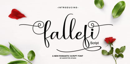 Fallefi Script is highly legible script typeface, with a touch of a bold, classic and fun vintage styling. It includes OpenType features and stylistic alternates. It can be used for various purposes, such as posters, t-shirt, signage, logos, news, badges etc. To enable the OpenType Stylistic alternates, you need a program that supports OpenType features such as Adobe Illustrator CS, Adobe Indesign & CorelDraw X6-X7, Microsoft Word 2010 or later versions. Fallefi Script is coded with PUA Unicode, which allows full access to all the extra characters without having special designing software. Mac users can use Font Book, and Windows users can use Character Map to view and copy any of the extra characters to paste into your favourite text editor/app.
 - Headline Helpers One SG by Spiece Graphics,
$39.00 Wouldn't it be nice to have an assortment of little hand-lettered words? Words like “The” or “A”; “With” or “At”; “To” or “From”? Headline Helpers are word accents that can go just about anywhere. Set off the title of your next design project with one of these little gems. Or use a Helper with your new product introduction headline. Convenient instructions and character map come as standard equipment with this highly desirable addition to your type library. Headline Helpers One is available in the OpenType Std format. Advanced features currently work in Adobe Creative Suite InDesign, Creative Suite Illustrator, and Quark XPress 7. A Windows TrueType version of this font has also been provided if you prefer normal keyboard access.
 - Mondish by Tour De Force,
$25.00 Mondish is an elegant sans serif family that comes in five weights with matching Italics. Commonly recognized as fashionable font by its design and main purpose, Mondish is actually much more than that. Characteristic by high contrasted stems, gentle calligraphic endings of lowercase letters, slightly condensed Italics and slanted letter axis through the entire family, it leaves an impression as a designer's charming partner for a wide variety of projects. Mondish is equipped with OpenType features such as Stylistic and Contextual Alternates, Oldstyle Figures, Ordinals, Subscript and Superscript, Initial Forms, Denominator, Numerator and Fractions with Standard and Discretionary Ligatures followed with Small Caps. Beside basic and extended Latin character set, Mondish comes with Cyrillic support. Exactly 700 glyphs in total.
 - Rosalen by Pista Mova,
$12.00 Rosalen Script is an amazing typeface handmade script font that we created in freestyle for those of you doing work and crafts. It's perfect for all kinds of work you do for multiple purposes like logos, wedding invitations, titles, t-shirts, letterheads, signage, labels, news, posters, badges, etc. Files include: OpenType features with alternate styles, binders, swipes, and multiple language support. To enable the OpenType Stylistic alternative, you need a program that supports OpenType features such as Adobe Illustrator CS, Adobe Indesign & CorelDraw X6-X7, Microsoft Word 2010 or later. How to access all alternative characters, using the Windows Character Map with Photoshop: https://www.youtube.com/watch?v=Go9vacoYmBw How to access all alternative characters using Adobe Illustrator: http://youtu.be/iptSFA7feQ0 Thank you!
 - Los Lana Pro by Latinotype,
$39.00 Los Lana Pro is a handmade display typeface. Unlike other font families, this type has not a modular structure, that is, each character has been individually designed. The coherence of structure elements across different characters is given by irregular strokes. This curveless typeface is perceived as being curved because of its straight lines, which form different-size angles. Los Lana Pro is a rustic typeface that captures the stereotypical “Andean hippie” handmade aesthetics. Irregular shapes and broken lines give it a distinct personality. Los Lana Pro looks better in larger sizes. Includes many ligatures, two groups of alternate characters, and titling caps characters. Languages include: Basic Latin, Western European, Euro, Catalan, Baltic, Turkish, Central European, Romanian and Pan Africa Latin. Photos by Sergio Recabarren.
 - Gioviale by Laura Worthington,
$37.00 Gioviale is a unique hybrid that seamlessly blends an italic and script typeface with flair and elegance, and carryies just a hint of tailored and clean, structured underpinnings. Its versatility is exemplified in its greater readability at small sizes compared to other scripts. Gioviale includes an entire set of alternate swash caps, 20 ornaments, 20 discretionary ligatures, and 300 swashes, which include a standard uppercase set for more traditional text settings, and a swash uppercase set which are even more flourished. See what’s included! http://bit.ly/2bUXDcH *NOTE* Basic versions DO NOT include swashes, alternates or ornaments These fonts have been specially coded for access of all the swashes, alternates and ornaments without the need for professional design software! Info and instructions here: http://lauraworthingtontype.com/faqs/
 - Headline Helpers Five SG by Spiece Graphics,
$39.00 Wouldn't it be nice to have an assortment of little hand-lettered words? Words like “The” or “A”; “With” or “At”; “To” or “From”? Headline Helpers Five includes word accents that can go just about anywhere. Set off the title of your next design project with one of these little gems. Or use a Helper with your new product introduction headline. Convenient instructions and character map come as standard equipment with this highly desirable addition to your type library. Headline Helpers Five is available in the OpenType Std format. Advanced features currently work in Adobe Creative Suite InDesign, Creative Suite Illustrator, and Quark XPress 7. A Windows TrueType version of this font has also been provided if you prefer normal keyboard access.
 - Coarse Grind by Hanoded,
$15.00 I bought a new coffee machine - the piston variety. It is shiny, made in Italy and I can make a killer espresso or latte with it. I usually start off the day with a pour over coffee and save my milky coffee for later. I also have two grinders: one for a coarse grind (pour over) and one for a finer grind (espresso and latte). Yes, you will probably say that it’s quite extravagant to have two grinders, but I do like my coffee! Anyways, this is what I thought of when I worked on Coarse Grind. Coarse Grind is a well balanced all caps display font. It comes with extensive language support and a set of alternates for the lower case letters.
 - ITC Coconino by ITC,
$29.99ITC Coconino is the work of Serbian designer Slobodan Miladinov. His original inspiration for this monostroked typeface was the idea of translating certain auditory impressions into type, in this case, the surprising and confusing music of the Serbian hip hop musician Voodoo Popeye." Miladinov is an art director in Belgrade and created Coconino using a "freemouse" technique with Adobe Illustrator and sees his work as "computer calligraphy which allows for a specific directness and immediacy in notation." The strokes of this font are simple and abrupt with a studied irregularity. The forms can look either cheerful and lighthearted or chaotic and subtly disturbing. Coconino was named for the home of hte Krazy KAt comics and even includes a few additional characters from the strip."