5,706 search results
(0.035 seconds)
- Petala Pro VF by Typefolio,
$129.50 The multi-award winning 'Petala Pro' typeface family has been given a Variable Font version.
 - Drexler by Device,
$29.00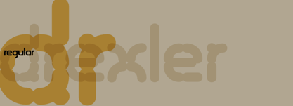 Drexler is a logically constructed molecular font built via nanotechnology and mathematically derived geometric permutations.
 - Jazayeri Kufic Shoushtar by Arabetics,
$79.00 The Jazayeri Kufic Shoushtar font is a beautiful typographic implementation of the decorative Kufic calligraphy inscribed on the walls of the historic Grand Mosque of Shoushtar in southwestern Iran. This mosque contains many other inscriptions added over time for documentary purposes but its four monumental Kufic inscriptions which are revived in this font are the most essential ones to understand its design and meaning. Built in the ninth century CE, this mosque is one of the earliest hypostyle mosques in Iran. It was built in “the city of scholars” when its residents included two great Sufis, Sahl Ibn Abdullah Tostari and Mansur Hallaj. The designer and producer of the font is Seyed Mohammad Vahid Mousavi Jazayeri, a well-known Iranian master calligrapher, designer, scholar, and author. Mousavi Jazayeri has taken a personal interest in the Kufic script and devoted years to independent research, visiting archaeological locations, historic buildings and cemeteries, mosques, libraries and museums to study the script through direct contact. He has developed a systematic research methodology and published his findings in several books. His professional interest in script and calligraphy stimulated his discovery of the historic method for cutting the Kufic pen, which has had a direct impact on his own work, as seen in several well-received exhibitions and workshops. The historical research and achievements of Mousavi Jazayeri brought together the first international group dedicated to the study and revival of the historic Kufic script operation through kuficpedia.com.
 - Summer of 76 by Darumo,
$15.00 Introducing Summer of '76, a nostalgic multi-line font inspired by the 70's aesthetic. Perfect for big eye-catching headers. Сan be used for text blocks also. Includes two styles: solid and multi-line (regular). This font could be the perfect solution if you want to give a lovely retro touch to your designs.
 - Happy Holidays by Comicraft,
$19.00 Back in 2006 when we first released our Happy Holidays font, we thought the War on Christmas was over! We'd taken down our Menorahs, our Christmas trees, reclining Buddhas and red, black and green Kwanzaa decorations, and were prepared to sprinkle nothing more than a little Season's Greetings over our end of year celebrations. When we saw our friends and neighbors at department stores, we'd greet them with a simple, cordial, non-denominational “Happy Holidays.” But the font showed up at our company party this year having learned over 200 new languages (and, it must be said, a little bit loaded on Stylistic Alternates) in a mood to celebrate EVERYTHING. It was wishing people happy Bodhi Day, Solstice, Festivus, you name it! It even brought (count 'em) THREE new outfits based on the colors of Christmas, Hanukkah and Kwanzaa. So may the designs on the cups of the hot beverages that take you through the long dark coffee break of the soul that stretches from Halloween to Thanksgiving to New Year's Day be a little more festive this year with the refreshed, Remastered, all-inclusive spirit of Happy Holidays!
 - FHA Eccentric French by The Fontry,
$25.00 The curves are vintage and the serifs are big. They're so big that for years I never had the courage to tackle this intimidating font. But when fellow signmaker Frank Smith laid the groundwork for this intriguing typeface by Frank H. Atkinson, I couldn't pass on the opportunity to take it from paper to keyboard. After all, at over 100 years old, I felt this alphabet had never been given a proper, digital treatment. So how did this face survive the last century? Well, for those who don't know the history, it survived in Atkinson's ubiquitous book, Sign Painting, published first in 1908, the generational standard for anyone interested in sign-related type design. The layouts and lettering treatments in this book have influenced countless designers for more than a hundred years, but most haunting to me was this strange face with the big serifs. Well, I'm haunted no more. The work is done, the kerning is complete, and nothing but a mouse-click separates a very old idea from the modern world. It's wide, it's big, and with those crazy serifs, it is definitely eccentric-!!!
 - Cognac by Solotype,
$19.95Many years ago, we bought a bunch of proofs that had apparently come from the defunct Van Loey-Nouri foundry in Belgium. Cognac was an incomplete alphabet among them, which we completed. Just a guess, but 1910 seems like a probable date for this art nouveau design. - Calligraphic Ornaments by ITC,
$29.99English designer Richard Bradley created the Calligraphic Ornaments symbol font for ITC in the 1990s. Drawn in a lively traditional style similar to fine calligraphy, this font's characters set the perfect holiday spirit with little teddy bears, a Santa Claus, ringing bells, holly leaves, and other charms. - Toronto Gothic by E-phemera,
$12.00Toronto Gothic was developed from a headline in a 1920s issue of the Toronto Star. In a previous life, it was probably Condensed Titling Gothic #11, but in this form its rounded corners and irregular lines are meant to make it look worn from years of use. - P22 Sherwood by IHOF,
$24.95 Sherwood is a reproduction of an unusually small wood type font from England, dating from the last years of the 18th century. Somewhat reminiscent of Caslon Old Face. The original wood type is used at Sherwood Letterpress and can be seen on the Sherwood home page.
 - Heavy Black by Panritype Studio,
$17.00 Heavy Black is all capital brush font, made from real brush pen with original texture. it can work with any design project, such as clothing or street wear logos, headlines, social media, quotes, and more. The original texture will give a strong impression on your design.
 - Urmeba JNL by Jeff Levine,
$29.00 Urmeba JNL has an odd history. Originally conceived a few years back as a... well... ‘barf’ font, this limited-character type design was revised by Jeff Levine into a less-offensive idea... that of friendly little amoebas (such as you'd find in a glass of water).
 - Valentine's Letters by Greater Albion Typefounders,
$5.00 Remember party banners made out of string and letters on cutout card shapes? Well, Valentine's letters is the typeface equivalent of these joyful banners. Valentine's Letters will let you string heart shapes, each bearing an individual character across the page, making a romance filled banner. Have fun!
 - Australis Pro by Latinotype,
$39.00 Australis is a hybrid roman font that won first prize in the Morisawa International Type Design Competition in 2002. After 10 years the family is finally complete and its release coincides with the reopening of the competition in 2012, in Japan. Designed by Francisco Gálvez Pizarro.
 - Stencil Sheet JNL by Jeff Levine,
$29.00 Stencil Sheet JNL was modeled from an antique brass stencil sign that was custom hand punched for the customer. Sets of punch dies were available for years that allowed rubber stamp shops and similar trades to make custom stencils out of sheets of zinc or brass.
 - Monotype Broadway by Monotype,
$29.99For many type lovers, Broadway is the quintessential Art Deco typeface. Designed as an all-caps typeface in 1927 by Morris Fuller Benton for ATF, it was expanded two years later with a lower case designed by Sol Hess, who also drew the inline version, Broadway Engraved. - Moulin Rouge by Solotype,
$19.95This came from a shop near Munich, Germany, and was a very poor proof with no font name on it. Never did identify it. When we cleaned it up, we liked it pretty well. We think it is typical of some early twentieth century art nouveau fonts. - Ornella by URW Type Foundry,
$39.99 Ornella is a very typical art nouveau typeface that perfectly fits into the series of URW++ Jugendstil fonts released in the last couple of years. Ornella was reworked, redesigned, completed and digitally remastered by Ralph M. Unger for URW++, based on specimen taken from old font catalogues.
 - Verismo by Martin Verstraaten,
$20.00 Verismo (Italian for ‘realism’, from vero, meaning ‘true’) is a genre of operas with scenarios based on contemporary everyday life. This font is inspired by old school sign painting techniques. In addition, the font has a contemporary look and can therefore be used in many different designs.
 - Recreation JNL by Jeff Levine,
$29.00 Recreation JNL is Jeff Levine's own take on a popular vintage typeface from the late 50s or early 60s that's seen a resurgence in recent years. While the basic alphabet is somewhat modeled from the classic design, all the other characters in the font are original.
 - Verismo Inline by Martin Verstraaten,
$20.00 Verismo (Italian for ‘realism’, from vero, meaning ‘true’) is a genre of operas with scenarios based on contemporary everyday life. This font is inspired by old school sign painting techniques. In addition, the font has a contemporary look and can therefore be used in many different designs.
 - Quiny by Nestype,
$17.00 Quiny is built with bold and curvy characters, Perfect if you need fun for your projects.
 - Scraper by Graffiti Fonts,
$29.99 This rough and bold style uses detail and motion to create text with gritty character. These fat letters mimic a paintbrush or palette knife in a simple graff style.
 - Grongert by Oleg Gert,
$25.00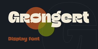 Decorative font Stonegert equipped with alternative characters, ligatures, and multi-language support. This font equipped with several features such as alternative characters, ligatures, and multi-language support that makes it easier for you to design. This font is perfect for your design needs such as poster design, logo design, branding, social media design, book, magazine, etc.
 - Courage by Positype,
$35.00 High-contrast? High impact? Have Courage? Eye-catching and (extra, extra) bold, Courage balances ultra-high stroke weight, delicate details, and unique letterforms with a self-indulgent passion that will make you feel a little guilty using it. Honestly, use it large and don’t try to force it into a small space, because these fearless letterforms need room to move. Flavored with both upright and italic styles, each font includes an indulgent level of alternates, swashes and titling options, visual elements and more. A backstory with a different name Years ago, I was commissioned to take my Lust typeface and produce something unique to use for large format graphics for an event…cool. It needed to be hyper-contrast with a lot of over-the-top details. With a tight turnaround, I looked for primers within my development catalogue to help me, and settled on some early work on a typeface I had drawn called Hedonist. I used those sketches and its conventions to retrofit and build out Lust Hedonist (only to see the project go bust on the client’s end). I intended to go back shortly after the Lust Hedonist release to finalize a retail version of the OG Hedonist, but I never could settle on the look of the 'g' or the numerals, got distracted with other projects, and never picked it back up… until last year. After randomly doodling a fat, flat ‘g’ with an extremely tilted counter axis, I knew immediately how it could be used and that (re)set things in motion. Only problem was, in the process of refining the letterforms I began truly dissecting the pieces, rediscovering all of the recklessness within Hedonist, and decided on fundamentally rewriting the approach to the typeface… literally flaying it to the bone. I’m much, much happier with this finished typeface now, but the name no longer fit the moniker given to the first, adolescent approach—there’s far more audacity and cleverness in these letterforms, tenacious in their resolution now. As a result, the name Courage fit the mettle of this typeface so much more, so I kept it.
 - Human Sans by Ian Farnam,
$20.00 Human Sans is a humanist sans serif font created as an experiment. The goal, how much a simple substitution of a small set of characters could change a font's nature. In its base form, Human Sans is a humanist sans serif geared toward text. However, through stylistic sets, it can adopt a myriad of different visual styles. This includes geometric alternates, uncials alternates, contextual swash caps, and the high and low midlines, typically seen in Art Deco lettering. These features are combinable for whatever look you may need. Human Sans comes with a full set of diacritics, in 9 weights and corresponding Italics.
 - Authority by RetroSupply Co.,
$19.00 Inspired by public fonts in New York in the 1970s. Authority pays tribute to the almost unnoticed but powerful effect type have on our lives. From waiting on a cold morning to catch the 307 to Morton West High School, to the rain and snow worn stencil on a postal box. Public typography is a part of the little spaces in your lives where life actually happens. Government designed fonts were chosen to communicate authority and help grease the gears of the day-to-day grind. Authority beckons back to these days with it's mildly condensed feel, squared corners and weight presence.
 - Butterfish by Bogstav,
$17.00 Art Deco inspired font in 4 different versions with multi language support as well as contextual alternates!
 - Sketchura by Open Window,
$19.95 Sketchura offers a gritty twist on a classic font style -Futura- It was completely hand sketched which makes the font an organic centerpiece to any of your grungy design applications.
 - Undercoat by Open Window,
$19.95 Undercoat offers a gritty twist on a classic font style (Helvetica). It was completely hand painted which makes the font an organic centerpiece to any of your grungy design applications.
 - Gryffensee by Catharsis Fonts,
$30.00 Gryffensee is designed to be the Futura of blackletter, combining the time-honored gravity and relentlessness of the Gothic script with the clean, contemporary freshness of the geometric sans. Built from a tightly controlled inventory of lines, arcs, sharp cuts, and OpenType features, Gryffensee was born and raised in the digital age, yet retains the powerful charisma and human warmth of its mediaeval blackletter ancestors. As a result, it excels in a wide range of display settings, logotypes, and short text. Unlike most conventional blackletters, it even handles all-caps usage with grace, and includes an extensive Cyrillic character set (in the Pro version). Apart from a generous range of automatic ligatures and contextual alternates, Gryffensee offers stylistic alternates that allow users to customize its appearance to their tastes. The capital letters |AGHIKZ| come in alternate cuts that trade traditional shapes for increased legibility, while the letter |s| appears in three cuts, each with a unique, distinct flavor. All these options are accessible through OpenType stylistic sets in the main Latin font, Gryffensee Eins. For easy use in applications without OpenType support, we provide two additional Latin fonts (Gryffensee Zwei and Drei) in which these options replace the default cuts. Finally, Gryffensee Pro offers all the functionality of Gryffensee Eins, plus Cyrillic support. My intention to devise a contemporary geometric blackletter was inspired by four hand-painted letters, |ABCD|, in Sasha Prood�s online portfolio. I later found out that he had, in turn, taken those letters from an existing font, Bastard, by Jonathan Barnbrook. Luckily, by that time my project had taken on a life of its own. Gryffensee is an original design that bears only the most superficial resemblance to Bastard. Gryffensee is a mediaeval spelling of the lake Greifensee near which I grew up. It is pronounced [?gri?f?n?se?], or "GRIEF-un-say" in English approximation. This font is dedicated to Simone.
 - Carocks by ZetDesign,
$15.00 Carocks is a handwritten brush font inspired by violence, chaos, cruelty, fear, horror, resistance and more. This font gives a strong impression on each of your works and is made in a regular and italic style and is equipped with an opentype feature to help designers produce amazing works.
 - Shibuya Dancefloor by Megami Studios,
$10.00 Inspired by Rob’s years of living in Japan, Shibuya Dancefloor is an expanded version of an earlier font that we did, adding hiragana and katakana to the mix. It's perfect for anime artwork, sci-fi lettering or even just making flyers for that party you're planning down in Roppongi!
 - Mandarin Duck by Yasemin Varlik,
$10.00 Mandarin Duck is a very playful typeface where its design was inspired by the rare duck seen in New York once every year. The delicate tail of this duck creates the edges of the characters. It is bold and fun, a perfect typeface for children books and larger texts.
 - Scurvy Dog by Hanoded,
$15.00 Aye, me lovelies, this be Scurvy Dog, a grand font! The letters were etched into a dead man's chest with a blunt rapier, pickled in brine and covered in spew. Ye could be using this crafty penmanship for yer logs or writing yer dear ol' mothers a letter.
 - Chills by Comicraft,
$19.00 Is that the trees rustling, or the hinges on the gate? Pull up your covers as daylight grows dim... there is indeed a chill of fear in your heart and the blood in your veins is turning cold. Try your best not to shiver and shake... The Iceman cometh!
 - Brussels by Solotype,
$19.95The Stephenson Blake foundry in England, made two fonts, Flemish Expanded and Flemish Condensed. In our view, one was too wide, the other too narrow; so we redrew it and renamed it Brussels. Why not? Belgium is one of the few places where you may still hear Flemish spoken. - Deco Revival JNL by Jeff Levine,
$29.00 Some time back, a few basic characters were drawn out (possibly inspired by some vintage sheet music) and set aside for a future font project. Despite being incomplete for a few years, this once-forgotten design is now available as Deco Revival JNL, in both regular and oblique versions.
 - Ramp Age by PizzaDude.dk,
$20.00Ramp Age was originally made with a brush, but I wanted a more rough look to it. I manually traced the brush-strokes with short, straight lines, making the font more characteristic in its look. Can be used for grafitti things, but fits in the horror-genre as well! - Jingle Bells by Girinesia,
$13.00 Hello guys... We proud presenting our new font. Jingle Bells is playfull font, display bold font. Jingle Bells would perfect for kids poster, flyer , cover children book, cartoon, comic , cristmast invitation, new year party and etc. Features: Standard glyphs Uppercase and Lowercase Numerals & Punctuations Multilanguage Works on PC & Mac