10,000 search results
(0.018 seconds)
- Helion by Fonthead Design,
$19.00Helion is a font designed by Ethan Dunham that has a sleek sci-fi feel to it. While it appears to be monocase, many of the lower case letters are different, though the x-height equals the cap height. You can use this to add variation to your headlines. - RAN by URW Type Foundry,
$35.99 RAN Reformed Typeface for Beginners by Georg Salden - a headstrong and courageous approach to an improved handling of handwriting. Diverse and sometimes irreconcilable theories exist about how beginners are supposed to learn writing and reading. This has led to fierce discussions among experts already. We don’t want to pour more oil on the fire, but hope to create a new awareness for this topic, which is important to everyone of us. For beginners the combination of single characters (sounds) to whole words is essential during the acquirement of reading and writing. In this process they develop the skill to recall entire terms from memory. Therefore, after current practice, every word shall be written in a single stroke without lifting the pen in between. Georg Salden contradicts this postulate and warns, that coercively holding the pen down within a word can easily lead to exaggerated loop formations and a general meandering of the written text. The intellectual process in connecting single sounds to words while writing would happen anyway and the prohibition to lift the pen would often lead to tensions. To still support the necessary connections in general and to simplify the connecting, he teaches to write all round letters like a, e, g, o with inclusion of the connecting stroke, so that the spacing and combining with the next character arise by themselves. By settling the stroke at certain points and with a clear and logical writing method, a conscious and careful contact with the various strokes arises. All this automatically leads, together with a certain deceleration, to an increase of beauty and readability in the handwriting. The repeatedly discussed topic »connected or unconnected« appears to be solved in the most comfortable way as, depending on the particular character combination, both solutions are possible.
 - Glis by BXS Type,
$10.00 The Glis font is a unique expression of authenticity, meticulously hand-drawn to bring a touch of charming personality to your designs. With rounded and slightly irregular strokes, Glis is more than just typography; It's a visual experience that adds artisanal charm and a sense of warmth to your creations. Each character is carefully designed to convey a relaxed and welcoming aesthetic, providing a visually captivating approach to your typographic compositions. Try Glis to infuse a dose of originality and softness into your designs. **Uppercase
 - Zany Route by Putracetol,
$22.00 Zany Route is a delightful and rounded typeface designed to rev up the fun in transportation-themed projects. With its playful and engaging style, it's the perfect addition to any creative project. Whether used on its own or combined with any of its eleven thematic variations, Zany Route is sure to transport your designs to a world of joy and adventure. This font offers eleven distinct variations inspired by transportation, including planes, cars, gears, motorcycles, trucks, and more. It's the ideal choice for designs related to transportation, catering to children and crafters alike. Zany Route is your ticket to logos, children's themes, crafting, invitations, packaging, posters, titles, businesses, greeting cards, stickers, children's books, magazines, and any designs connected to the world of transportation.
 - Egal by Koral Creative,
$30.00 Introducing EGAL, the highly sophisticated and premium font inspired by the symbol of equality, the equals sign (=). Meticulously crafted with the utmost attention to detail, EGAL is the epitome of luxury typography, perfect for elevating your brand's image. Egal is a contemporary display font inspired by old sans fonts, designed to provide a premium feel to any project. It is designed to fit any logo or branding project and supports over 70 languages, including Cyrillic. With 395 glyphs, Egal is the perfect choice for anyone looking to add a stylish and sophisticated touch to their project. The word "egal" itself is derived from the French word for "equal", emphasizing the font's intent to provide a sense of balance and harmony to any project.
 - Plenti by MADType,
$19.00 Plenti is the fat font to add to your visual communication toolbox. Friendly, square, and quirky all at the same time. It is itching to get used on posters and websites.
 - Pace by Ratzlaff Type,
$9.00 Pace is a geometric minimalist typeface with a large range of weight options to suit multiple scenarios, from videogames to sports magazines. To inspire movement and speed, try the Slanted styles.
 - Killega by Sealoung,
$12.00 Killega is a bold and modern serif font. Elegantly crafted to become a top choice, this font has the potential to bring each of your creative ideas to the highest level!
 - Sangeki by Anomieka,
$12.00 Sangki is a cool and bold serif font. Masterfully designed to become a true favorite, this font has the potential to bring each of your creative ideas to the highest level!
 - BE BOlD by WAP Type,
$15.00 Be Bold is an incredibly unique display font. Masterfully designed to become a true favorite, this font has the potential to bring each of your creative ideas to the highest level!
 - DB Dainty Swirl by Illustration Ink,
$3.00DB Dainty Swirl is great for embellishments, adorning a scrapbook page or adding a nice to touch to a card or invitation. Adds a classy, finished look to any project. Enjoy! - Miny Fellas by Stringlabs Creative Studio,
$25.00 Miny Fellas is inspired by classic typography and brings its own unique style to any design project. Use this gorgeous and unique handwritten font to bring any DIY project to life!
 - Mleyoth by Griyotype,
$10.00 Mleyoth is a bold and detailed blackletter font. Masterfully designed to become a true favorite, this font has the potential to bring each of your creative ideas to the highest level!
 - Janda Spring Doodles by Kimberly Geswein,
$5.00 Doodles ranging from cute animals to Easter eggs to flowers of various types.
 - Vibration by Funk King,
$5.00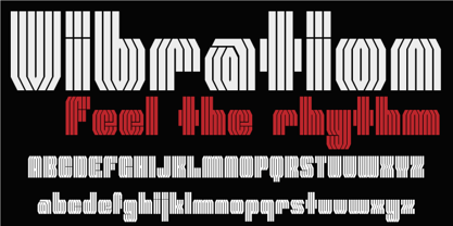 Vibration is a modular font. Use it to give energy to your designs.
 - Liam by Intellecta Design,
$19.95Liam, an oldstyle easy to use typeface, excelent to emulate old printed books... - Shmulik Yael MF by Masterfont,
$59.00 Tender and elegant hand writing font, expanded to add air to your text.
 - Prismatic Spirals Pro by MMC-TypEngine,
$182.00 PRISMATIC SPIRALS PRO FONT! The Prismatic Spirals PRO is a Decorative Type-System and ‘Assembling Game’, itself. Settled in squared pieces modules or tiles, embedded by unprecedented Intertwined Prismatic Structures Design, or intricate interlaced bars that may seem quite “impossible” to shape. Although it originated from the ‘Penrose Square’, it may not look totally as an Impossible Figures Type of Optical Illusions. More an “improbable” Effect in its intertwined Design, that even static can seem like a source of Kinetical Sculptures, or drive eyes into a kind of hypnosis. Prismatic Spirals Pro has two related Typefaces both more basic or easier to use versions, the Default Family plus its “bold” braided version Prismatic Interlaces… PRO provides a more advanced, complex, and twisted Design, plus requires to be typed alternating caps. Instructions: Use the Map Font Reference PDF as a guide to learn the 'tiles' position on the keyboard, then easily type and compose puzzle designs with this font! All alphanumeric keys are intuitive or easy to induce, you may easily memorize it all! Plus, often also need to consult it! *Find the Prismatic Spirals Pro Font Map Reference PDF Here! (!) Is recommended Print it to have the Reference or open the PDF to also copy and paste, when consulting is required or when it may be difficult to access, depending on the keyboard script or language. The 2 glyphs sets are separated in colors for facilitating. Also use the Map Font with key captions or switch to it for ensure that the characters are alternating between both uppercase and lowercase letters as other Keys as numbers, marks, and punctuation along the strings, holding Shift one by one or actually two by two. As a Tiles Type-System, the line gap space value is 0, this means that tiles line gaps are invisibly grouted, so the user can compose designs, row by row, descending to each following row by clicking Enter, same as line break, while advances on assembling characters. Background History: The first sketches of my Prismatic Knots or Spirals Designs dates back then from 2010, while started developing hand-drawn Celtic Knots and Geometric Drawings in grid paper, while engage to Typography, Sacred Geometry and the “Impossible Figures” genre… I started doing modulation tests from 2013, until around 2018, I got to unravel it in square modules or tiles from the grid, then idealized it as fonts, along with other Type projects. This took 13 years to come out since the first sketches and 6 months in edition. During the production process some additional tiles or missing pieces were thought of and added to the basic set, which firstly had only the borders, corners, crossings, nets, Trivets connectors or T parts and ends, then added with nets and borders integrations. Usage Suggestions: This type-system enables the user to ornate and generate endless decorative patterns, borders, labyrinthine designs, Mosaics, motifs, etc. It can seem just like a puzzle, but a much greater tool instead for higher purposes as to compose Enigmas and use seriously. As like also to write Real Text by assembling the key characters or pieces, this way you can literarily reproduce any Pixel Design or font to its Prismatic Spirals correspondent form, as Kufic Arabic script and further languages and compose messages easily… This Typeface was made to be contemplated, applied, and manufactured on Infinite Decorative Designs as Pavements, Tapestry, Frames, Prints, Fabrics, Bookplates, Coloring Books, Cards, covers or architectonic frontispieces, storefronts, and Jewelry, for example. Usage Tips: Notice that the line-height must be fixed to 100% or 1,0. In some cases, as on Microsoft Word for example, the line-height default is set to 1,15. So you’ll need to change to 1,0 plus remove space after paragraph, in the same dropdown menu on Paragraph section. Considering Word files too, since the text used for mapping the Designs, won't make any literal orthographical sense, the user must select to ignore the Spellcheck underlined in red, by clicking over each misspelled error or in revision, so it can be better appreciated. Also unfolding environments as Adobe Software’s, the Designer will use the character menu to set body size and line gap to same value, as a calculator to fit a layout for example of 1,000 pts high with 9 tiles high, both body size and line gap will be 111.1111 pts. Further Tips: Whenever an architect picks this decorative system to design pavements floor or walls, a printed instruction version of the layout using the ‘map’ font may be helpful and required to the masons that will lay the tiles, to place the pieces and its directions in the right way. Regarding to export PNGs images in Software’s for layered Typesetting as Adobe Illustrator a final procedure may be required, once the designs are done and can be backup it, expanding and applying merge filter, will remove a few possible line glitches and be perfected. Technical Specifications: With 8 styles and 4 subfamilies with 2 complementary weights each (Regular and Bold) therefore, Original Contour, Filled, Decor, with reticle’s decorations and 2 Map fonts with key captions. *All fonts match perfectly when central pasted for layered typesetting. All fonts have 106 glyphs, in which 96 are different keys with 2 versions of each of both caps and shift keys, plus a few repeated for facilitating. It was settled this way in order for exchanging with its Prismatic relative fonts which has only 48 different keys repeated twice. Concerning tiles manufacturing and Printed Products as stickers or Stencils, any of its repeated pieces was measured and just rotated in different directions in each key, so when sided by other pieces in any direction will fit perfectly without mispatching errors. Copyright Disclaimer: The Font Software’s are protected by Copyright and its licenses grant the user the right to design, apply contours, plus print and manufacture in flat 2D planes only. In case of the advent of the same structures and set of pieces built in 3D Solid form, Font licenses will not be valid or authorized for casting it. © 2023 André T. A. Corrêa “Dr. Andréground” & MMC-TypEngine.
 - Bella Copia by Vincenzo Crisafulli,
$29.00 Bella Copia is a font dedicated to the world of childhood, to the writing of primary school children, but can also be used to compose texts or express essential concepts. It can be used for food, fashion, logos and much more. The clarity in the sign wants to express simplicity and immediacy. As far as possible, what is "not needed" has been taken away from individual glyphs. In the illustrations an attempt has been made, by combining images with fonts, to express the concept of cleanliness, simplicity and clarity. It is composed of 314 glyphs to try to embrace as many languages as possible.
 - DST Helfita by Designsation,
$16.00 This first font was made as an experimental work for us. learn a alot of typeform from other typeface in the past, bring us to this grace position. We learn about Variable font and all the thing to do some improvement in our work. such a nice time to present this new font to the world as the ground breaking of our mission to scale up our skill and to step up into the next vision as a font designer. We create this font with variable and Open Type features. Some instances including, from thin to black. and on the variable font has and oblique style.
 - LHF Centennial Panels 1 by Letterhead Fonts,
$46.00 One of four fonts consisting of the best old fashioned panels from Golden Era Studios. Each font contains 36 expertly drawn panels. Each letter generates a different design. Special Note: Due to the large file size of these fonts, they will not convert for use in Gerber Omega. Instead, Omega users may wish to use an alternate program to type the characters and import them into Omega as .eps files. CorelDraw users should use the "Weld" command rather than "Convert to Curves" command to convert these fonts to vector outlines. Otherwise, the program may crash due to the sheer number of points in each panel.
 - Street Stronger by Sipanji21,
$13.00 "Street Stronger" is a graffiti font with three layers that can be used to create a three-dimensional (3D) effect on your text. By using these three layers in your design, you can add depth and dimension to your typography. Fonts with these layers are often used in street art, posters, or other designs that aim to create a prominent 3D effect. With "Street Stronger," you have the ability to create text that looks different and adds a strong 3D impression by using the various layers. This allows you to customize the text's appearance to fit your design vision and add a powerful three-dimensional touch to your project.
 - Flinscher by Greater Albion Typefounders,
$16.00 The Flinscher family contains twenty display typefaces, in weights that vary from light to black, and widths that extend from condensed to expanded. The family’s design inspiration traces its roots to the early portion of the twentieth century. In essence, it is a calligraphic script typeface family with blackletter influences. The letter forms are decorative and distinctive, yet clear and easy to read, and in use set up a regular rhythm that leads the eye from character to character. The Flinscher typefaces are well suited to design work that needs to combine formality with fun. Just the thing for a certificate or a book cover!
 - Trilight by Pelavin Fonts,
$12.00 Trilight is a result of my fascination (obsession?) with how the appearance of a typeface can impact on the tactile as well as visual sense to strengthen and guide its imapct. It consists of simple block characters with a triple highlight to give the effect of dimension. The Trilight family consists of both highlighted and solid characters to provide a two color display without the need to convert characters to outline.
 - Wildflower Blossom by RagamKata,
$14.00 Wildflower Blossom modern serif Wildflower Blossom is a unique serif font with a modern touch. With its elegant and slim letter shapes, it offers a distinctive and captivating beauty. Available in 2 styles, regular and italic, it provides options to customize and tailor your design project to your needs. Use Wildflower Blossom to add a professional impression to your design and make it more appealing to your audience.
 - Prussak BC by Jujumisur’s Ficus,
$19.00 I wanted to do somewhat like Blackletter, but Blackletter is hard to read sometimes, so I tried to solve this problem and to do something unique. This font is able to be used with all European languages including ancient and reconstructed languages like Old Church Slavonic (it can be written by Cyrillic or Glagolitic script), Proto Slavic, Ancient Greek etc. It also includes IPA, so it can be used in education.
 - Richard Kailay by Silverdav,
$18.00 Introducing, Richard Kailay font, with an elegant style, is here to give a luxurious impression to your design, made with consistent strokes so as to produce works that will perfect your design, there are many alternates and ligatures to add a luxurious impression to your design. Richard Kailay is very suitable for Branding, Logos, Magazines, handicrafts, quotes, book covers, wedding invitations, and more. If you have any questions, Please Contact Us
 - Integra Chic by Kustomtype,
$25.00 Kustomtype’s “Integra Chic” font is a sans serif font family with a regular & oblique version. It contains all upper & lower cases. The “Integra Chic” family is coordinated into letterforms, metrics, and weights to work better together. Why still looking for old school types for your posters, advertising, text, design, artwork, headtext, editoral design, magazines, etc... “To banish imperfection is to destroy expression, to check exertion, to paralyze vitality.” John Ruskin
 - Norseman 2 by Alphabet Agency,
$21.00 Forged to be as imposing as a Norse horde ready to stampede into battle, Works great in all caps which it was initially designed to. I designed the lowercase characters to match really well with each other and the uppercase, so it works well in title case. Designed by Jon Swinn.
 - Balania by Sabrcreative,
$25.00 Welcome to Sabr Creative, your source for artistic fonts that captivate the eye and enhance your designs. Introducing Balania, a stunning script swash font that exudes elegance and flair. Crafted with precision, Balania is designed to add a touch of sophistication to your projects, from wedding invitations to branding materials.
 - Unitext Variable by Monotype,
$155.99Unitext Variable Regular is a single font file that features one axis: Weight. TFor your convenience, the Weight axis has preset instances from Hairline to Black. This Roman (upright) font is provided as an option to customers who do not need Italics, and want to keep file sizes to a minimum. - Axteroid by PizzaDude.dk,
$20.00Axteroid was made to look like something that was teleported from a computergame from way-back in the 80s. To make it more 21st century-like, I have spiced the font up with some OpenType alternate letters and ligatures! You will need to use OpenType supporting applications to use the autoligatures. - Mordings JNL by Jeff Levine,
$29.00Mordings JNL is an odd-lot collection of images. These assorted dingbats are leftover art that never quite made it to one particular dingbat font category, but together comprise an eclectic assortment. Topics range from weather to vintage-style restaurant menu icons to decorative embellishments to an old-fashioned telephone dial. - AZ Script by Artist of Design,
$25.00 AZ Script font was inspired from a need to have a "worn look" on bold headline script of letters This font utilizes an "old look" to the line work which is designed to have a "worn feel" to it. Ideal for use as headline or sub-head text in you design.
 - Threefortysixbarrel by Typodermic,
$11.95 Rev your engines and get ready to add some muscle to your typography with Threefortysixbarrel, the ultimate typeface for those who live life in the fast lane. This high-octane typeface was peeled right off the air filter of a 1970 Plymouth Barracuda. With Threefortysixbarrel, you’ll be able to proclaim your message with confidence and authority. This no-nonsense alphabet is barely street legal, just like the muscle cars it takes inspiration from. And with three different styles to choose from, you can customize your typography to match your message perfectly. First up, we have Threefortysixbarrel. This is the serious, clean version of the font, with a powerful personality that commands attention. It’s perfect for when you need to make a statement that can’t be ignored. If you’re looking for a more vintage feel, Threefortysixbarrel Intake is the way to go. This style features a realistic rusty letterpress effect that will make your typography look like it’s been around since the golden age of muscle cars. It’s perfect for adding a touch of nostalgia to your designs. And finally, we have Threefortysixbarrel Exhaust. This style is raspy and faded, barely hanging on—just like a muscle car that’s been pushed to its limits. It’s the perfect choice when you want your typography to have a scruffy, worn-in feel. But that’s not all—the textured styles of Threefortysixbarrel also include custom pairs that will be substituted automatically in apps that can handle OpenType ligatures. This means that repeated character textures will be broken up, resulting in an even more realistic, scruffy effect. So what are you waiting for? Grab the pistol grip, slam the pedal down, and peel out with Threefortysixbarrel. This typeface is the ultimate choice for anyone who wants to add some serious muscle to their designs. Most Latin-based European writing systems are supported, including the following languages. Afaan Oromo, Afar, Afrikaans, Albanian, Alsatian, Aromanian, Aymara, Bashkir (Latin), Basque, Belarusian (Latin), Bemba, Bikol, Bosnian, Breton, Cape Verdean, Creole, Catalan, Cebuano, Chamorro, Chavacano, Chichewa, Crimean Tatar (Latin), Croatian, Czech, Danish, Dawan, Dholuo, Dutch, English, Estonian, Faroese, Fijian, Filipino, Finnish, French, Frisian, Friulian, Gagauz (Latin), Galician, Ganda, Genoese, German, Greenlandic, Guadeloupean Creole, Haitian Creole, Hawaiian, Hiligaynon, Hungarian, Icelandic, Ilocano, Indonesian, Irish, Italian, Jamaican, Kaqchikel, Karakalpak (Latin), Kashubian, Kikongo, Kinyarwanda, Kirundi, Kurdish (Latin), Latvian, Lithuanian, Lombard, Low Saxon, Luxembourgish, Maasai, Makhuwa, Malay, Maltese, Māori, Moldovan, Montenegrin, Ndebele, Neapolitan, Norwegian, Novial, Occitan, Ossetian (Latin), Papiamento, Piedmontese, Polish, Portuguese, Quechua, Rarotongan, Romanian, Romansh, Sami, Sango, Saramaccan, Sardinian, Scottish Gaelic, Serbian (Latin), Shona, Sicilian, Silesian, Slovak, Slovenian, Somali, Sorbian, Sotho, Spanish, Swahili, Swazi, Swedish, Tagalog, Tahitian, Tetum, Tongan, Tshiluba, Tsonga, Tswana, Tumbuka, Turkish, Turkmen (Latin), Tuvaluan, Uzbek (Latin), Venetian, Vepsian, Võro, Walloon, Waray-Waray, Wayuu, Welsh, Wolof, Xhosa, Yapese, Zapotec Zulu and Zuni.
 - Guaruja Neue by Tipogra Fio,
$- Get in touch with Tipogra Fio and get inspired by Guaruja Neue specimens. Guaruja Neue is a neo-grotesque typeface with additional industrial traits to it, such as open corners in diagonal glyphs and short curves. The semi-cursive italics shapes, more than an orthographic matter, give sea waves for the headlines and copies that Guaruja Neue will compose, since it is named after a city on the coast of São Paulo, Brazil. Stylistic alternates, ligatures, ordinals, arrows and emojis give extra personality for texts that cross millennial and modernist concepts, going from a comprehensive Latin script, including Vietnamese support, until a basic Cyrillic set. Brazilian music tells the graphic story of Guaruja Neue specimens, songs that speak about beaches and the city of Guarujá, as well as the inspiration of 50’s and 60’s modernist design and the music movement of Bossa Nova. This family is also an evolution of Guaruja Grotesk (2021), a typeface with four fonts —Regular, Italic, Bold and Bold Italic— developed as part of a design school project, that now in Neue gains professionalism, refinement and knowledge. Guaruja Grotesk took 18 months to make, and Neue took additional 12 months of redrawing and rethinking, as design as processes. Part of the project got feedback from the typeface designer Ulrike Raush, under the Alphabettes mentorship program. Overview and features: 8 weights and 8 italics; 2 free fonts: Guaruja Neue Regular and Guaruja Neue Italic; Extended Latin and basic Cyrillic; 800+ glyphs; Numbers: proportional, tabular, superscripts, subscripts, denominators, numerators and fractions; Greek for math; Case-Sensitive forms; Arrows; Standard and discretionary ligatures; SS01: one story a and SS02: two story g; Emojis and SS03: negative alternate emojis; Ligatures for English ordinals;
 - Zipple - Unknown license

- Space Gimboid - Unknown license

- Fatman by AType,
$17.95Fatman is such big thick person. To me it seems to the most interesting font Fatman BL. I name it fatman with the broken leg. The letter A is similar to it. - Fontazia Christmas Tree 2 by Deniart Systems,
$24.00 Add more flair to the holiday season with Fontazia Christmas Tree 2 featuring 62 elegantly simple tree illustrations. These stylish tree motifs are sure to add elegance to all your holiday designs.

