10,000 search results
(0.018 seconds)
- Thrusters by Typodermic,
$11.95 Welcome to the world of Thrusters—the angular, twin-line display typeface inspired by the timeless classic, Space Duel. Thrusters is the perfect way to bring the retro, arcade vibes to your designs! This bold and futuristic typeface is the ultimate tribute to the iconic arcade legacy, and it’s available in four different forms that can be used as layers to create stunning multicolor effects. Whether you’re creating a high-energy video game title screen, a promotional poster for a local arcade, or even a custom t-shirt design, Thrusters has got you covered. With its sharp angles and sleek curves, Thrusters is sure to turn heads and capture attention. It’s the perfect way to add some excitement and nostalgia to any design project. So what are you waiting for? Blast off into the world of retro gaming with Thrusters today! Most Latin-based European writing systems are supported, including the following languages. Afaan Oromo, Afar, Afrikaans, Albanian, Alsatian, Aromanian, Aymara, Bashkir (Latin), Basque, Belarusian (Latin), Bemba, Bikol, Bosnian, Breton, Cape Verdean, Creole, Catalan, Cebuano, Chamorro, Chavacano, Chichewa, Crimean Tatar (Latin), Croatian, Czech, Danish, Dawan, Dholuo, Dutch, English, Estonian, Faroese, Fijian, Filipino, Finnish, French, Frisian, Friulian, Gagauz (Latin), Galician, Ganda, Genoese, German, Greenlandic, Guadeloupean Creole, Haitian Creole, Hawaiian, Hiligaynon, Hungarian, Icelandic, Ilocano, Indonesian, Irish, Italian, Jamaican, Kaqchikel, Karakalpak (Latin), Kashubian, Kikongo, Kinyarwanda, Kirundi, Kurdish (Latin), Latvian, Lithuanian, Lombard, Low Saxon, Luxembourgish, Maasai, Makhuwa, Malay, Maltese, Māori, Moldovan, Montenegrin, Ndebele, Neapolitan, Norwegian, Novial, Occitan, Ossetian (Latin), Papiamento, Piedmontese, Polish, Portuguese, Quechua, Rarotongan, Romanian, Romansh, Sami, Sango, Saramaccan, Sardinian, Scottish Gaelic, Serbian (Latin), Shona, Sicilian, Silesian, Slovak, Slovenian, Somali, Sorbian, Sotho, Spanish, Swahili, Swazi, Swedish, Tagalog, Tahitian, Tetum, Tongan, Tshiluba, Tsonga, Tswana, Tumbuka, Turkish, Turkmen (Latin), Tuvaluan, Uzbek (Latin), Venetian, Vepsian, Võro, Walloon, Waray-Waray, Wayuu, Welsh, Wolof, Xhosa, Yapese, Zapotec Zulu and Zuni.
 - Kari Display by Positype,
$49.00 Kari Display is the product of a long standing idea I had to give the well-received Positype typeface, Kari, plastic surgery. Just referring to giving a typeface plastic surgery, or letter lipo, stuck in the back of my head until I was able to pick the project up. The ultimate objective was to refine Kari Display to a point where each glyph was expressed as simple as possible... and in that simplicity a sexiness would appear. Kari is a beautiful script, but it is very 'controlled' and orderly and I wanted Kari Display to break that mold with much more movement, curviness, greater modulation and a more elegant feel on the page. I did not want to take it too far, limiting the use of the typeface, but rather opted for a delicate balance of thick and thin against the added movement of the glyphs. The wealth of sketches and proposed variants during the concepting phase was encouraging and I really pushed to add as many alternate characters, ligatures, swashes (and more) as I possibly could. Just about every character has at least one or more alternates AND the complete offering of alternates completely covers a wide range of Latin-based language groups including Central European diacritics. If you are using any type of OpenType enabled application, then the Kari Display Pro typefaces are the way to go. They include everything found in the 3 separate variants for each style as well as entirely expanding offering of additional swash and ligature sets.
 - Polarband by Typodermic,
$11.95 Welcome to Polarband—the retro-inspired sans-serif headline typeface that adds a touch of warmth and personality to your designs. Polarband’s stacked layer design allows the inner layer to nestle snugly, creating a sense of depth and dimension that adds an extra layer of interest to your designs. Play around with different color combinations and layering options to create a truly unique look that sets your designs apart. So whether you’re looking to add a touch of retro charm to your next design project or create a bold and eye-catching logo, Polarband is the perfect typeface for you. With its appealing geometric shapes and humble style, it’s sure to become a go-to choice for designers looking to add a touch of vintage flair to their work. Most Latin-based European writing systems are supported, including the following languages. Afaan Oromo, Afar, Afrikaans, Albanian, Alsatian, Aromanian, Aymara, Bashkir (Latin), Basque, Belarusian (Latin), Bemba, Bikol, Bosnian, Breton, Cape Verdean, Creole, Catalan, Cebuano, Chamorro, Chavacano, Chichewa, Crimean Tatar (Latin), Croatian, Czech, Danish, Dawan, Dholuo, Dutch, English, Estonian, Faroese, Fijian, Filipino, Finnish, French, Frisian, Friulian, Gagauz (Latin), Galician, Ganda, Genoese, German, Greenlandic, Guadeloupean Creole, Haitian Creole, Hawaiian, Hiligaynon, Hungarian, Icelandic, Ilocano, Indonesian, Irish, Italian, Jamaican, Kaqchikel, Karakalpak (Latin), Kashubian, Kikongo, Kinyarwanda, Kirundi, Kurdish (Latin), Latvian, Lithuanian, Lombard, Low Saxon, Luxembourgish, Maasai, Makhuwa, Malay, Maltese, Māori, Moldovan, Montenegrin, Ndebele, Neapolitan, Norwegian, Novial, Occitan, Ossetian (Latin), Papiamento, Piedmontese, Polish, Portuguese, Quechua, Rarotongan, Romanian, Romansh, Sami, Sango, Saramaccan, Sardinian, Scottish Gaelic, Serbian (Latin), Shona, Sicilian, Silesian, Slovak, Slovenian, Somali, Sorbian, Sotho, Spanish, Swahili, Swazi, Swedish, Tagalog, Tahitian, Tetum, Tongan, Tshiluba, Tsonga, Tswana, Tumbuka, Turkish, Turkmen (Latin), Tuvaluan, Uzbek (Latin), Venetian, Vepsian, Võro, Walloon, Waray-Waray, Wayuu, Welsh, Wolof, Xhosa, Yapese, Zapotec Zulu and Zuni.
 - Avionic by Grype,
$16.00 The aviation world contains loads of stylish logotypes, from handwritten scripts to geometric styles and so on. The Avionic Condensed family finds its origins of inspiration in the Air China company logotype, and from there has been expanded upon to create a large stylistic family of 40 fonts. Avionic celebrates the geometric sans serif styling of the original logotype, evolving beyond the condensed all capital set logo to include a lowercase designed in parity with the original design style, as well as many weights and widths to offer a fresh diversity. Each subfamily includes a full standard character set with expansive international support of latin based languages, and 5 weights jumping from book to black, along with 5 accompanying obliques. This family is ready to chart a course for your design destination, whatever it may be. Here's what's included with the Avionic Family bundle: 370 glyphs per style - including Capitals, Lowercase, Numerals, Punctuation and an extensive character set that covers multilingual support of latin based languages. 5 weights in each subfamily: Book, Regular, Bold, Heavy, & Black. • 4 widths in the collection: Condensed, Regular, Wide, and Extra Wide. Accompanying Obliques with each weight/width style. Fonts are provided in TTF & OTF formats. The TTF format is the standard go to for most users, although the OTF and TTF function exactly the same. Here's why the Avionic Collection is for you: You're in need of a dynamic geometric font with a variety of weights and widths for your designs You're an aviation junkie and have to have anything inspired by Air China You love the style of Bank Gothic, but really want something just a little different You are looking for a pseudo-techno style font family with versatility You just like to collect quality fonts to add to your design arsenal
 - Frosty Xmas by SilverStag,
$19.00 Get ready to unwrap a typographic delight with Frosty Xmas, the holiday-themed serif font designed to infuse your projects with festive charm and timeless elegance. With its soft round corners, delicate serifs, and all-uppercase characters, Frosty Xmas exudes a timeless charm that complements a wide range of holiday designs. Its classic serif letters, adorned with swirls, swashes, and star elements, add a touch of whimsy and magic to your creations. Whether you're crafting holiday cards, designing festive branding, or creating typographic posters that echo the joy of the season, Frosty Xmas is your go-to companion. Its versatility knows no bounds, making it equally suited for standard branding, logo design, and a wide array of creative ventures. But that's not all – Frosty Xmas comes bundled with 40 hand-drawn holiday doodles, adding an extra layer of whimsy to your projects. From snowflakes to stockings, candy canes to Christmas trees, these doodles are the perfect embellishments for all your holiday-themed endeavors. Crafted with over 450 carefully designed glyphs, Frosty Xmas supports over 90 languages, making it a versatile tool for designers and crafters worldwide. Whether you're creating holiday greeting cards, packaging labels, or typography posters, Frosty Xmas will infuse your designs with festive cheer. Elevate your designs, captivate your audience, and make this holiday season truly memorable with Frosty Xmas. The magic begins with each letter – are you ready to unwrap the joy? Happy designing and Merry Frosty Xmas! 🎄✨
 - Think Straight by HIRO.std,
$20.00 Think Straight a Bold Display Font. This font describes about fun, dynamic, street style, headline, pleasure, humanist, easy going, and easy to use. FEATURES - Uppercase and Lowercase letters - Support Opentype Features - 89 Ligatures - Numbering and Punctuations - PUA Encoded Characters - Multilingual Support - Works on PC or Mac USE Think Straight works great in any branding materials, logotype, poster, print, headline, t-shirt, packaging, magazine etc. Enjoy using! Thanks.
 - MeM by 26+,
$40.00 MeM is an eccentric experimental type system created by Elena Schädel and Jakob Runge in 2012. It produces many personalities, each individual and emotive. You will never know which of the alternating letters is going to occur next. Basically, at the heart of it all is MeM: four different weights and letter shapes melded together into one powerful font and shuffled with the sleek usability of OpenType.
 - Nouveau Cartoon JNL by Jeff Levine,
$29.00 Samuel Welo’s “Studio Handbook – Letter and Design for Artists and Advertisers” was a go-to source of inspiration for generations of layout artists, graphic designers and sign painters. An interesting example of free-form pen lettering was found amongst the pages of one edition and it has now been recreated as a digital typeface called Nouveau Cartoon JNL; available in both regular and oblique versions.
 - Nouveau Handlettered JNL by Jeff Levine,
$29.00 The roots of Nouveau Handlettered JNL go back to the sheet music cover for the 1917 song "(Someday) Somebody's Gonna Get You". This simple style of sans serif titling has the casual, imperfect charm of the pen and ink lettering so prevalent in the decades before metal type and other technical advancements made the craft almost obsolete. The typeface is available in both regular and oblique versions.
 - Perigord by Scriptorium,
$18.00Perigord has mixed origins. It was inspired by Gutenberg’s capitals and by lettering developed by German designer Ernst Bentele, but its calligraphic antecedents go back to French initials of the Carolingian period. The result of this is a formal, attractive and antique look which we hope you'll like. The full version includes alternate forms for many of the letters, as well as numbers and punctuation. - Staluco by Konstantine Studio,
$17.00 Jump back to the classics with Staluco - A bold sans-serif font inspired by vintage greeting cards and town signs in the 70s 80s era. This font captures the vibes and sense of going-home and childhood-like spirits from your grandparent's house. Perfectly fit for logo, a town sign, branding, poster, clothing, merchandise, music project, books, greeting cards, street, and urban culture concepts, you name it.
 - Spicy Hour by PizzaDude.dk,
$17.00 Spicy Hour can be used for all your dishes and designs that needs that extra seasoning. Just mix, and you are ready to go! The ingredients includes contextual alternates, which in this case means that every letter has 5 different versions, which automatically cycles as you type. In other words, it spices up your text! Multilingual support is also a part of the dish!
 - Hegarown by Rvandtype,
$12.00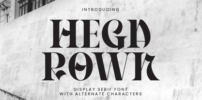 Introducing Hegarown Font, a captivating display font with a contemporary and cool aesthetic that makes it an ideal choice for a wide range of creative projects. Whether you're designing logos, establishing brand identities, crafting invitations, creating stunning stationery, shaping wedding designs, or producing eye-catching social media posts, Hegarown Font is your go-to solution. Features: Alternate Characters Numbers and punctuation Multilingual PUA encoded Thank You
 - Recepts NF by Nick's Fonts,
$10.00Here’s a futuristic face with a neo-retro twist, based on the logotype for the 1990s tank-warfare videogame for the Mac, Spectre. Whether you're going back to the future or resurrecting a blast from the past, this face will get you there in style. Both versions of this font include the complete Unicode Latin 1252, Central European 1250 and Turkish 1254 character sets. - Foreign Skies by PizzaDude.dk,
$17.00 Foreign Skies is that hastily written brush font you're going to need, if you're looking for an authentic brush font. I am aware that Foreign Skies doesn't always meet the criteria of a professional signletteres demands of "perfect strokes" - but that is the basic idea! It is super legible, even at small sizes, but at the same time it is uneven, bouncy, clumsy and rough!
 - Estrand by Firstype Studio,
$16.00 Hello, design enthusiasts! Allow me to present "Estrand" - a distinctive Display font with a penchant for sharp angles and bold character. Estrand features an edgy and angular design, characterized by rigid corners and a slightly condensed form that exudes a sense of precision and boldness. The font is crafted with sharp angles, giving it a unique and commanding presence. Its condensed nature ensures a sleek and modern aesthetic, making it an excellent choice for designs that demand a tinge of fierceness. Key Features: Sharp Angles and Bold Character: Estrand embraces a sharp design with well-defined angles, adding a touch of assertiveness to your typographic compositions. Slightly Condensed Form: The font's condensed structure contributes to a sleek and modern look, allowing for efficient use of space in various design applications. Distinctive and Commanding: With its firm personality, Estrand stands out as a font that commands attention and leaves a lasting impression. Versatility: Whether applied to branding, logos, or any design project, Estrand's unique characteristics make it adaptable to a wide range of creative endeavors. Estrand is your go-to font for designs that demand a sharp and distinctive edge. If you have any inquiries or require further information, feel free to reach out. Your feedback is highly appreciated. Thank you for considering "Estrand" for your design endeavors.
 - Odradeck by Harvester Type,
$20.00 Odradeck is a typeface that originated from the idea of creating a tall, but narrow font, while combining brutalism and technogenic. The difficulty was not to go to extremes and make the font moderately neutral in order to significantly increase the range of font applications. Odradeck came out with a strict, industrial, geometric, but moderately neutral semi-mono font with two axes of variability: height and slant. To all this, + 300 glyphs were added and, as a result, support for +80 languages. The structure of the font allows you to use it in a limited space, and its flexibility will allow you to fill and use this space to the maximum. You can apply it in a very wide range of designs. Whether it's a logo, packaging, banner, title, text, poster, merchandising, identity, branding or product design. Language support: Afrikaans, Albanian, Asu, Basque, Bemba, Bena, Breton, Catalan, Chiga, Colognian, Cornish, Croatian, Danish, Dutch, Embu, English, Esperanto, Estonian, Faroese, Filipino, Finnish, French, Friulian, Galician, Ganda, German, Gusii, Icelandic, Inari Sami, Indonesian, Irish, Italian, Jola-Fonyi, Kabuverdianu, Kalenjin, Kamba, Kikuyu, Kinyarwanda, Lower Sorbian, Luo, Luxembourgish, Luyia, Machame, Makhuwa-Meetto, Makonde, Malagasy, Manx, Meru, Morisyen, North Ndebele, Norwegian Bokmål, Norwegian Nynorsk, Nyankole, Oromo, Portuguese, Quechua, Romansh, Rombo, Rundi, Rwa, Samburu, Sango, Sangu, Scottish Gaelic, Sena, Serbian, Shambala, Shona, Soga, Somali, Spanish, Swahili, Swedish, Swiss German, Taita, Teso, Uzbek (Latin), Volapük, Vunjo, Walser, Zulu.
 - Antoine by Anastasia Kuznetsova,
$19.00 Introducing Antoine — is a vintage retro display typeface. The three font combinations I launched are very compatible if for the victorian classic design concept. As for if the font was worn by itself, without combinations are also brave!! In addition to many get unique character, luxury, brave and elegant. You also have a collection ornament, very suitable if in the gradient. This font is also very easy to use with other design programs or with out design program. Antoine Typeface is perfect for beverage label design project. coffee label. logotype design, badges, classic wedding concept. victorian design concept and so on. gig poster, letterhead, droop cap, titles, and any artworks. Now it’s your time to go crazy and explore the uniqueness of this typeface!! I invite you to familiarize yourself with the preliminary images and hope that you will be imbued with my vision of this creative font, which, I am sure, will be suitable for all the interesting projects you are working on. Fonts can be opened and used in any software that can read standard fonts, even in MS Word. No special software is required to get started. It is recommended to use it in Adobe Illustrator or Adobe Photoshop. Made with love and magic ♡ Thank you for reading it, and do not hesitate to send me a message if you have any questions! ~ Anastasia
 - Denominary by Balibilly Design,
$19.00 Denominary typeface is about precision, beauty, and refinement. It's crafted with care and attention to detail for professional creative people who value quality and distinction. The Denominary typeface has an advanced feature that sets it apart from others: auto-active contextual alternates. Our font engineer writes this feature to minimize kerning between characters automatically, making it very convenient and easy to use, especially for web purposes where minimal kerning means a smaller font size. The feature adjusts the kerning based on the specific characters being used, ensuring optimal spacing between letters. Contextual alternates will push your typography project to a balanced form. We designed the letterform by considering the white space and contrast to get a natural voice and fluid, and of course, this will happen in a legible and stylish. Denominary typeface offers extensive language support and stylistic variations, thanks to its 482 glyphs. It also has discretionary ligatures, case-sensitive forms, and slashed zeroes for added typographic options. The condensed style saves space, and seven weights will provide more options. Denominary typeface brings refinement, exclusivity, and sophistication to any design project. It's a typeface that tells a story of precision, beauty, and distinction. Go ahead with the game in terms of its advanced auto-active contextual alternates feature, giving you a competitive edge in the design field.
 - Kubrick by Quadrat,
$25.00 Kubrick is an experiment in extremes. The Light font is very tall and slender, the Black font is very massive, and Kubrick's slender counters push some of its glyphs to the edge of recognition. The thin counters and negative spaces also give text set in Kubrick a definite visual sparkle, especially in all-uppercase settings. Because of its extreme letterforms, Kubrick is recommended only for large display use. The default letterspacing is set fairly wide to keep text legible. Kubrick was a double-experiment. One part of it was to see how heavy and massive a typeface I could make while still keeping it legible. The other part was to develop a Multiple Master font. Multiple Master fonts were a format developed by Adobe that allowed the user to change things like the weight and width of a typeface. Monollith started as just such a Multiple Master typeface, but when Adobe discontinued the Multiple Master format, I stopped work on the typeface. Later I decided to continue work on it, but as five separate font weights: Light, Medium, Bold, ExtraBold and Black. Very rectilinear letterforms with extremely narrow counters and negative spaces. The five fonts go from very thin and condensed to very heavy and extended. Use in large display settings where unornamented high visual impact is desired.
 - Aldero by R9 Type+Design,
$48.00 Aldero™ strives to be as useful to any design environment as Alder trees are to the forest. Wildlife and insects feed on Alder leaves and seeds. The tree also provides shelter for animals in winter while its shades keep streams from getting too hot in summer. The trunks and branches are excellent habitats for lichens and mosses. The nitrogen-rich leaves help fertilize the soil where they landed. Alder’s utilitarian nature inspires us to create Aldero™, a handy, versatile, go-to type family for all professional designers. To achieve what we set out to do, we gave Aldero™ the two-in-one looks, doubled the sets of ligatures, and loaded it with plenty more of Opentype features. We put in long hours, months after months, until we are proud of the outcome. And we truly believe that you will enjoy working with this typeface as much as we do. With five weights, ten styles, and 1,100+ glyphs per style, this versatile typeface comes with virtually two looks. The standard glyph set is perfect for formal, corporate design, while the stylistic alternate set elicits a fun, friendly, and casual feel. You can use each style separately or mix and match them to achieve your design aesthetic. Thanks to these options, a wide range of design possibilities are at your fingertips. In addition to the two large sets of ligatures (for both the standard and the stylistic glyph sets), we also pack tons of Opentype features into Aldero™ to improve your user experience while working with this typeface. To activate the case-sensitive features, for example, highlight the phrase with the type tool, then hit the “All Caps” button; or select each mark, punctuations, or symbols with the type tool, then choose the case-sensitive option from the Opentype popup window. Hope you enjoy working with Aldero™ as much as we do! To find out more about Aldero™ Opentype features and type specimen, please visit https://r9typedesign.com/aldero-features
 - Sunblock Pro by Grype,
$19.00 Clean and geometric deco sans typefaces have been used in a range of scientific publications, corporate logotypes, and beauty products over the years. However, a typeface of this style has yet to have an expansive range of widths and weights to become a design workhorse, until now. The Sunblock family finds its origin of inspiration in the Coppertone sunscreen company logo, and from there expands to type megafamily. Sunblock celebrates the rounded geometric forms of deco and bauhaus lettering through a compressed lens, transcending its brand inspired origin to give birth to a font family that pulls on modern and historical styles. It inherited its soothing tone from the limited character logotype that inspired it, and goes on to include a lowercase, small caps, and a comprehensive range of widths and weights, creating a straightforward, uncompromising collection of typefaces that lend a solid foundation and a broad range of expression for designers. Here's what's included with the Sunblock Collection bundle: 643 glyphs per style - including Capitals, Lowercase, Numerals, Punctuation and an extensive character set that covers multilingual support of latin based languages. (see the 7th graphic for a preview of the characters included) 21 fonts in 5 width subfamilies: Ultra Condensed, Extra Condensed, Condensed, Semi Condensed, & Standard. 5 weights per subfamily (except Ultra Condensed): Thin, Light, Regular, Bold, & Black. Fonts are provided in both TTF & OTF formats. The TTF format is the standard go to for most users, although the OTF and TTF function exactly the same. Here's why the Sunblock Collection is for you: You're in need of a deco geometric font family with a big range of weights and widths You're love that Coppertone letter styling, and want to design anything within that genre You're looking for an alternative to Chalet Comprime with a more versatile range of styles You're looking to start up your own derivative Sunscreen product line You just like to collect quality fonts to add to your design arsenal
 - Sonder by Fenotype,
$30.00 Sonder is a smooth brush Script and condensed Sans family of three weights on both. Both Script and Sans work as standalone fonts but they’re designed to go nicely together. Combine with Sonder Extras for smooth brush strokes for ambitious headlines, logos & posters. Sonder comes with a clean version and a “Print” version of each cut. Print versions have delicately rugged outlines and print texture inside. Sonder Script is packed with several OpenType features: Contextual Alternates and Standard Ligatures are automatically on to keep the text vibrant. If you need even more sparkly letters try Swash, Stylistic or Titling Alternates. The Scripts are PUA encoded and you can access extras from character map in most design softwares. For the best price Sonder can be purchased as “clean” Family - or as Print Family that has all cuts as printed versions. For the absolutely best price get the whole Complete Family pack that has all fourteen fonts and go wild with it!
 - Beynkales by Scriptorium,
$18.00Now here's a font with an unusual backstory. You may recall that a while ago we discovered that Tim Burton was using an outdated version of one of our fonts for the interior titles in his The Corpse Bride. Well, our quest to get hold of him didn't bear any immediate fruit, but in a totally unrelated event we were contacted by the graphic arts company working with the overseas distributors for The Corpse Bride and it turned out that they needed a font based on the main title of the movie so they could keep the same style when they retitled it into other languages. The original title was either hand lettered or a heavily modified font, bearing some resemblance to our Ligeia and Tuscarora fonts, so we had to create a whole font more or less from scratch and extrapolate most of the letters from the very limited sample in the original title by identifying certain consistent characteristics and building new characters around them. It was a lot of work, but the good news is that they didn't want exclusivity, so we've got the font to add to our collection. We ended up calling it Beynkales which means 'Bone Bride' in Yiddish, which makes sense given the context of the movie. So here it is, in all its tattered glory, and bound to end up in our Halloween font selection later this year as well. Beynkales Alternate is a companion font that includes a full set of alternative upper and lower case characters which can be used on their own or in combination with the characters from Beynkales to create a more varied and handwritten look. - DDD Pipe Bold - Unknown license

- DDD Cubic - Unknown license

- D3 Mouldism Round Alphabet - Unknown license

- D3 Mouldism Round Italic - Unknown license

- D3 Factorism Katakana Italic - Unknown license

- DDD Round Square - Unknown license

- Code Next by Fontfabric,
$39.00 10 years later, one of the first geometric typefaces in our portfolio and a popular favorite of yours is rising to a whole new level! We’re revealing the stand-alone type family Code Next—a staggering evolution from Code Pro in functionality, versatility, and application. The transformation includes 6 new weights, 10 new Italics, full support of Extended Cyrillic and Greek, full redesign and glyphs refinement, 2 variable fonts, to name but a few. Going back to 2011, the grotesque-inspired Code Pro was designed to complement memorable pieces that make a statement. Balancing between stylization and simplification, it was encoded with the distinct voice of basic organic shapes to stand the test of time. Little did we know, it would expand and live up to the potential of a “font from the future” as the new Code Next. Today, a type family of 22 styles, this geometric sans solidifies its relevance and carries a strong constructive aesthetic through simplified forms with a twist. These fit any modern design in print, web, and display visualization. Developed to go above and beyond, Code Next comes prepared for multi-script projects with Extended Latin, Extended Cyrillic, and Greek. Explore Code Next’s versatility and switch things up with the help of 2 variable fonts, more than 1280 glyphs, and an extensive OpenType features set including small caps, standard and discretionary ligatures, contextual and stylistic alternates, stylistic sets, case sensitive forms, and much more. Overview: • Font family of 22 fonts • 10 weights • Languages - Full support of Extended Latin; Extended Cyrillic; Greek • Entirely refined design and metrics • Glyph count - 1288 • Variable fonts - 2 fonts OpenType features: • Small Caps • Standard Ligatures • Discretionary Ligatures • Contextual Alternates • Stylistic Alternates • Stylistic Sets • Case-Sensitive Forms • Ordinals • Localized Forms • Lining Figures • Proportional Figures • Tabular Figures • Oldstyle Figures • Subscripts • Scientific Inferiors • Superscripts • Numerators and Denominators • Fractions • Roman figures • Extensive mathematical support • Navigation symbols
 - Kate Slab Pro Ultra Expanded by Monday Type,
$19.00 Kate Slab Pro Ultra Expanded is a sophisticated and robust modern Slab Serif Typeface that works in a variety of design scenarios. It is designed to work in big attention grabbing headlines as well as in smaller text and even body text. The recognition value of Kate Slab Pro Ultra Expanded is its biggest asset in world of uniformity. Ranging from “100 Thin” all the way to “900 Black” makes Kate Slab Pro Ultra Expanded such an amazing and versatile font family that stands out. Kate Slab Pro Ultra Expanded doesn’t only work great in lifestyle and fashion related contexts but will also look amazing for restaurants, coffee shops or and other use cases that ask for character and identity. To fill all the gaps of a designer’s needs, Kate Slab Pro Ultra Expanded comes with an italic style with every weight. Those italics are equipped with unique and real italic characters and will make you love it. Being a Slab Serif Kate Slab Pro Ultra Expanded manages to remind you of a classic Font Family with a modern and timeless approach that will make you happy for decades. Monday Type can’t wait to see the beautiful designs you are going to create with our Kate Slab Pro Ultra Expanded.
 - Kate Slab Pro Expanded by Monday Type,
$19.00 Kate Slab Pro Expanded is a sophisticated and robust modern Slab Serif Typeface that works in a variety of design scenarios. It is designed to work in big attention grabbing headlines as well as in smaller text and even body text. The recognition value of Kate Slab Pro Expanded is its biggest asset in world of uniformity. Ranging from “100 Thin” all the way to “900 Black” makes Kate Slab Pro Expanded such an amazing and versatile font family that stands out. Kate Slab Pro Expanded doesn’t only work great in lifestyle and fashion related contexts but will also look amazing for restaurants, coffee shops or and other use cases that ask for character and identity. To fill all the gaps of a designer’s needs, Kate Slab Pro Expanded comes with an italic style with every weight. Those italics are equipped with unique and real italic characters and will make you love it. Being a Slab Serif Kate Slab Pro Expanded manages to remind you of a classic Font Family with a modern and timeless approach that will make you happy for decades. Monday Type can’t wait to see the beautiful designs you are going to create with our Kate Slab Pro Expanded.
 - Rustery Mirages by Fikryal,
$25.00 Introducing Rustery Mirage, a striking modern serif font that effortlessly blends timeless elegance with contemporary flair. With its sleek and sophisticated design, Rustery Mirage is the perfect choice for projects that demand a touch of refinement and versatility. Crafted with meticulous attention to detail, Rustery Mirage exudes confidence and professionalism. Its clean lines and balanced proportions create a harmonious balance between classic charm and modern aesthetics. The font’s serifs add a touch of traditional grace, while it's sleek curves and subtle flourishes lend a fresh and stylish appeal. Rustery Mirage is highly legible, making it an excellent choice for various applications. Whether you’re designing branding materials, editorial layouts, website headers, or social media graphics, this font will effortlessly enhance your project’s visual impact. Its versatility allows it to shine in both print and digital mediums, adapting seamlessly to any design environment. Experience the allure of Rustery Mirage and elevate your designs to new heights. Captivate your audience with this modern serif font that exudes elegance, versatility, and a touch of contemporary sophistication. Let Rustery Mirage be your go-to choice for creating stunning typographic masterpieces that leave a lasting impression. If you have any questions please don’t hesitate to contact me follow my Instagram: @fkryall Thank you
 - Blank Manuscript by Aah Yes,
$14.95Blank Manuscript allows you to produce sophisticated musical scoresheets even on basic Word Processors - anything from simple plain staves to complex full-page orchestral scores of your own design, to write in the notation yourself. The basic stuff is really easy and straightforward, but there's some quite advanced things you can do as well. So Copy and Save these Instructions. • The main stuff is simple and tends to follow the initial letter. Treble, Bass and Alto clefs are on upper case T B A (there are more clefs, below). The 5 Lines for the clefs are on L or l. • A small v will give a small vertical line (like a bar line) and a Big U will give a Big Upright - these can start or end a line or piece. • Time Signatures - type the following letters: Think of W for Waltz and it's easy to remember that 3/4 time is on W. Then from that they go up or down together like this: V=2/4 W=3/4 X=4/4 Y=5/4 Z=6/4 Compound Times are on H I J K like this: H=3/8 I=6/8 J=9/8 K=12/8 Common Time and Cut Common symbols can be found on semi-colon and colon respectively (all begin with Co- ). 2/2 3/2 are on lower case a and b, 7/4 and 7/8 are on lower case c and d, 5/8 is on small k (think POL-k-A) • Flat signs are on the numbers. Flat signs on LINES 1 to 5 are on numbers 1 to 5. Flat signs on SPACES 1 to 5 are on numbers 6 to 0 (space 1 being above line 1, space 5 being above the top line of the stave). Sharp signs are on the letters BELOW the long-row numbers. Which is q w e r t for the sharp signs on Lines 1 to 5, and y u i o p for sharp signs on spaces 1 to 5. Doing it this way means it works the same for all clefs, whether Treble, Bass, Alto, Tenor or any other. Sharp and Flat Signs always go in this order, depending on how many sharps or flats your key signature requires: Treble Clef Sharps t i p r u o e Flats 3 9 7 4 2 8 6 Bass Clef Sharps r u o e t i w Flats 2 8 6 3 1 7 = Alto Clef Sharps o e t i w r u Flats 7 4 2 8 6 3 1 • Guitar Chord Boxes are on G and g (G for Guitar) Upper Case G has a thick line across the top Lower case g has an open top, for chords up the fretboard TAB symbols are available: Six-string Tablature is on s & S for Six. Four-string Tablature is on f & F for Four. (Lower case has the "TAB" symbol on it, Upper Case has just the lines to continue.) Five-string tablature, is on lower case "j" (as in BAN-j-O) and of course L or l will continue the 5 lines. •RARE CLEF SIGNS including Tenor Clef, are on various punctuation marks, i.e. dollar, percent, circumflex, ampersand & asterisk, above the numbers 4 to 8. NOTE: The important symbols were kept on the letter and number keys, which are fairly standard all over, but some of the less important symbols are on various punctuation keys, which in different countries are not the same as on my keyboard. If it comes out wrong on your system, all I can say is it's right on the systems we've tried, and they'll be in here somewhere, probably on a different key. CLOSING THE ENDS OF THE LINES and BAR-LINES is done with the 3 varieties of brackets - brackets, brace and parentheses - Left/Right for the Left/Right end of the line. Parentheses L/R () which are above 9, 0 give a clef with a small vertical upright (the same as a bar line). Brace L/R and Brackets L/R (both on the 2 keys to the right of P on my keyboard) will close off a staff line with tall upright bars. Brace gives a double upright - one thick, one thin. Brackets give a single tall upright. A Big Upright is on Big U, (Big U for Big Upright) and a small vertical line is on small v (small v for small vertical). The Big Upright is the maximum height, and the small vertical is exactly the same height as a stave. And there's a tall upright Bar, on Bar (which is to the left of z on my keyboard, with Shift,) which is the same height as the bar on upper case U but twice as broad. • There's a staff intended for writing melodies, which is a little bit higher up than an ordinary treble clef giving a space underneath to put lyrics in - on m and M for Melody line. Lower case has the Treble Clef on, Upper case M has just the higher-up staff lines with no clef. (Use mMMMMMMM etc.) However this clef will be in the wrong place to put in sharp and flat signs, key signatures and so on, so if you use this clef you'll have to write the sharps, flats and key signature yourself. There's also a clef that's smaller (less tall) than the ordinary clef, but with the same horizontal spacing so it will align with other standard-sized clefs - on slash (a plain clef) and backslash (with a Treble Clef). • There are some large brackets for enclosing groups of staves, such as you'd use on large orchestral scores, on Upper Case N O P Q R, which can aid clarity. N and O on the left, Q and R on the right. P is a Perpendicular line to be used on both sides to increase the height of the enclosure, in this way but with the staff lines in between: N Q P P P P P P O R OTHERS —————————————— • Repeat marks are on comma (left) and period/full stop (right). • Hyphen is left as a sort of hyphen - it's a thin line like a single staff line, with the same horizontal spacing as ordinary staff lines - in case you want to draw a line across for a Percussion Instrument, or a Title or Lyric Line. • Space is a Space, but with HALF the width or horizontal spacing as ordinary staff lines, so 2 space symbols will be the same width as a clef symbol or line. • Grave (to the left of 1 on the long row, or hold down Alt and type 0096 then let go) gives a staff line that is one eighth the width of an ordinary staff line. • If you want manuscript in a clef and key which requires a flat or sharp sign in the space underneath the 5 lines, they’re on = equals and + plus . SYMBOLS • Many of these symbols will only be useful if you have worked out in advance which bars will need them, but they are here in case you've done that and wish to include them. • Symbols for p and f (piano and forte) are on 'less than' and 'greater than' < > (above comma and full stop) and m for mezzo is on Question, next to them. They can be combined to make mp, mf, ff, pp, etc. These signs -- and other signs and symbols like Pedal Sign, Coda Sign and so on -- can be found on various punctuation mark keys, including above 1, 2, 3 in the long row, and others around the keyboard. There's a sort of logic to their layout, but in different countries the keys are likely to give different results to what is stated here, so it's probably best to just try the punctuation and see if there's any you might want to use. (But on my keyboard a Coda sign is on circumflex - because of the visual similarity. Pedal sign is on underscore. A "Sign" symbol is on exclamation mark.) They were only included in case you really need them to be printed rather than handwritten. • However, a Copyright symbol is deemed necessary, and also included are a "Registered" symbol and a TradeMark symbol. They are found in the conventional places, and can be accessed by holding down ALT and typing 0169, 0174 or 0153 respectively in the numberpad section and letting go. • Staff lines with arco and pizz. above are on capital C and D respectively ---C for ar-C-o. • An empty circle above a staff line (to indicate sections by writing letters A, B, C or 1,2,3 inside for rehearsal marks) is on n. The actual signs for an A, B, C and D in a circle above the staff line can be produced by holding down ALT and typing 0188, 0189, 0190 and 0191 respectively and letting go. • The word "Page", for indicating page numbers, is on the numbersign key. • The two quotes keys, (quote single and quote double) have symbols representing "Tempo is", and "play as triplets", respectively. • INSTRUMENT NAMES There's a whole lot of Instrument Names built in (over a hundred) which can be printed out above the clef, and you do it like this. Hold down Alt and type in the given number in the numberpad section, then let go. For Piccolo it's 0130, for Flute it's 0131, Cornet is on 0154, Violin is on 0193, and the numbers go up to over 0250, it's a fairly complete set. There's also a blank which is used to align un-named clefs on 0096. Put them at the very beginning of the line for the best results. Here they are: WOODWIND Piccolo 0130 Flute 0131 Oboe 0132 Clarinet 0133 Eng Horn 0134 Bassoon 0135 Soprano Sax 0137 Alto Sax 0138 Tenor Sax 0139 Baritone Sax 0140 Saxophone 0142 Contrabassoon 0145 Recorder 0146 Alto Flute 0147 Bass Flute 0148 Oboe d'Amore 0149 Cor anglais 0152 Pipes 0241 Whistle 0242 BRASS Cornet 0154 Trumpet 0155 Flugelhorn 0156 Trombone 0158 Euphonium 0159 Tuba 0161 French Horn 0162 Horn 0163 Tenor Trombone 0164 Bass Trombone 0165 Alto Trombone 0166 Piccolo Cornet 0167 Piccolo Trumpet 0168 Bass Trumpet 0170 Bass Tuba 0171 Brass 0172 VOICES Vocal 0175 Melody 0176 Solo 0177 Harmony 0178 Soprano 0179 Alto 0180 Tenor 0181 Baritone 0182 Treble 0183 Bass 0197 (see also PLUCKED STRINGS) Descant 0184 Mezzo Soprano 0185 Contralto 0186 Counter Tenor 0187 Lead 0206 BOWED STRINGS Strings 0192 Violin 0193 Viola 0194 Cello 0195 Contrabass 0196 Bass 0197 Double Bass 0198 Violoncello 0199 Violin 1 0200 Violin 2 0201 Fiddle 0252 PLUCKED STRINGS Harp 0202 Guitar 0203 Ac. Gtr 0204 El. Gtr 0205 Lead 0206 Bass 0197 Ac. Bass 0207 El. Bass 0208 Slide Gtr 0209 Mandolin 0210 Banjo 0211 Ukelele 0212 Zither 0213 Sitar 0214 Lute 0215 Pedal Steel 0216 Nylon Gtr. 0238 Koto 0239 Fretless 0244 KEYBOARDS + ORGAN Piano 0217 El. Piano 0218 Organ 0219 El. Organ 0220 Harpsichord 0221 Celesta 0222 Accordion 0223 Clavinet 0224 Harmonium 0225 Synth 0226 Synth Bass 0227 Keyboards 0228 Sampler 0249 PERCUSSION and TUNED PERCUSSION Percussion 0229 Drums 0230 Vibes 0231 Marimba 0232 Glockenspiel 0233 Xylophone 0234 Bass marimba 0235 Tubular Bells 0236 Steel Drums 0237 Kalimba 0240 OTHERS Harmonica 0246 Mouth Organ 0247 FX 0251 Intro 0243 Verse 0245 Refrain 0248 Chorus 0250 un-named 0096 (this is a small spacer stave for aligning clefs without a name) ALSO copyright 0169 registered 0174 TradeMark 0153 Rehearsal marks 0188-0191 (giving A, B, C, D in a circle, an empty circle is on n ) Clef signs for Treble Bass Alto without any staff lines 0253-0255 An Alphabetic List of all signs: a 2/2 time b 3/2 time c 7/4 time d 7/8 time e sharp sign, centre line f Tab sign for 4-string tab g Guitar Chord Box, no nut h half-width stave I sharp sign, third space up j Tab sign for 5-string tab k 5/8 time l Lines - 5 horizontal lines for a stave m Melody Clef - a standard clef but placed higher up, with Treble sign n Stave with an empty circle above o sharp sign, fourth space up p sharp sign, space above stave q sharp sign, bottom line r sharp sign, fourth line up s Tab sign for 6-string tab t sharp sign, top line (fifth line up) u sharp sign, second space up v vertical line (bar-line) w sharp sign, second line up x Fretboard, four strings y sharp sign, first space up z Fretboard, five strings A Alto Clef B Bass Clef C “arco” above stave D “pizz.” above stave E Double Vertical Lines F Four Horizontal lines (for 4-string tab) G Guitar Chord Box with nut H 3/8 time I 6/8 time J 9/8 time K 12/8 time L Lines - 5 horizontal lines for a stave M Melody Clef - a standard clef but placed higher up, plain N Bounding Line for grouping clefs - top left O Bounding Line for grouping clefs - bottom left P Bounding Line for grouping clefs - Perpendicular Q Bounding Line for grouping clefs - top right R Bounding Line for grouping clefs - bottom right S Six Horizontal lines (for 6-string tab) T Treble Clef U tall, thin Upright line V 2/4 time W 3 / 4 time X 4/4 time Y 5/4 time Z 6/4 time 1 flat sign, first line up (the lowest line) 2 flat sign, second line up 3 flat sign, third line up 4 flat sign, fourth line up 5 flat sign, fifth line up (the top line) 6 flat sign, first space up (the lowest space) 7 flat sign, second space up 8 flat sign, third space up 9 flat sign, fourth space up 0 flat sign, space above stave - Jackloft by Mofr24,
$11.00 Introducing Jackloft, the ultimate display font for all your design needs! With its energetic and bold brush textured style, Jackloft is perfect for advertising, headlines, posters, thumbnails, and much more. What makes Jackloft unique is its ability to stand out in any design while still maintaining legibility. This font includes a full set of uppercase and lowercase letters, numbers, and punctuation marks. It pairs well with sans-serif fonts for a modern look or can be paired with other brush script fonts for a cohesive design. The design concept behind Jackloft was to create a font that could convey a sense of energy and excitement while still being readable. The brush textured style gives the font a handcrafted feel, making it perfect for designs that require a personal touch. Jackloft is not a revival or based on a historical design. Instead, it was created to fill a gap in the market for a display font that was both bold and legible. So, whether you're designing a poster or creating a social media graphic, Jackloft has got you covered!
 - Agefin Regad by Product Type,
$17.00 Introducing Agefin Regad, the perfect solution for your superhero-themed projects! With its bold and standout serif design, Agefin Regad is the ideal font for any project that requires a robust and impactful look. Agefin Regad comes in two families: regular and slant, allowing you to choose the perfect style for your design. Whether you’re creating logos, headlines, or posters, Agefin Regad has got you covered. With its unique and attention-grabbing design, Agefin Regad is the perfect choice for projects that need to stand out from the crowd. And with its multilingual support, you can use it for projects all over the world. Get Agefin Regad today and take your superhero-themed designs to the next level! What’s Included : File font All glyphs Iso Latin 1 Ligature, Alternate We highly recommend using a program that supports OpenType features and Glyphs panels like many Adobe apps and Corel Draw, so you can see and access all Glyph variations. PUA Encoded Characters – Fully accessible without additional design software. Fonts include Multilingual support
 - Periplus by PintassilgoPrints,
$26.00 I got rhythm, I got music, I got my swirls, who could ask for anything more? Periplus is quite an eccentric type, full of twists and nice oddities here and there. It is an all-caps font with 2 variations for each letter and number, stored at upper- and lower-case slots. For added amusement, every letter got not 1 or 2, but 4 swash variations. One can be reached through the OpenType swash feature: just select the letter and hit the swash button. The other ones you will access through a glyphs palette. All of them are neatly organized with the 'access all alternates' feature. The font is yet equipped with some stylistic alternates and ornaments. Have fun!
 - Masonic Lodge by Eclectotype,
$20.00 As part of the day job I had to trace an old hand drawn logo of a Masonic Lodge from a very poor scan. When I finally got to the end of it I had almost a whole alphabet and I really liked the hand drawn uneven quality, so I made up the rest of the letters and set about making it into a font. I roughened up all the edges for an even older look, added a host of OpenType features and hey presto, Masonic Lodge was born. There are two versions of each letter and number which automatically alternate when contextual alternates are set, more alternates for O and o characters, a good amount of interlock style L and T ligatures (uppercase) and a square & compass ornament. Use it for pub signs, secret society meetings, monster movie titles and pub menus.
 - D3 Cubism - Unknown license


