10,000 search results
(0.094 seconds)
- Gotten by Stringlabs Creative Studio,
$25.00 Gotten combines authenticity and elegance into one truly stunning script. Use it to turn any design project into a true piece of art! The Gotten font is a great choice to increase the prominence in your project. Although the typography is traditional, the basic elements are great.
 - Elite Resort JNL by Jeff Levine,
$29.00 A 1940s sheet music edition of an early 1900s song entitled "You Taught Me How to Love You, Now Teach Me to Forget" was set in a popular metal type slab serif face. It is presented digitally as Elite Resort JNL, in both regular and oblique versions.
 - Stars And Type by Tim Kirkman,
$22.00 Stars & Type is a display font inspired by a road trip around the USA. It is bold, abstract and experimental and is meant for attention grabbing large headlines. Utilising stars to give a sense of Americana, it would be suited to editorial, advertising and display typography.
 - Have Heart by Set Sail Studios,
$13.00 Have Heart is a set of 2 hand-made marker pen fonts, designed to combine perfectly and allow you to create stunning hand-lettering quickly and easily. Also included is a set of 12 bonus swashes, ideal for giving your text that final touch of finesse!
 - Fd Sunnyside by Fortunes Co,
$14.00 Sunnyside is groovy retro concept typographic come with duo combined, regular and extrude, bring if the old west and the 70s had a lovechild with not a unformal usage, it's the perfect typeface for adding sophisticated playfulness to any design project. fit to logo, brand, apparel, etc
 - Adelines by Gassstype,
$28.00 New font Adelinesis a handwritten brush that is 2 Style and written casually and quickly. Letters are made with brushes on Procreate. That is why Adelines has charming, authentic and relaxed characteristic more natural look to your text with a more natural look to your text.
 - Nostagila by Forberas Club,
$16.00 This font is made based on memories from the past. Where is writing in a diary that tells about everyday stories. Are you ready to write a story with this font? or did you want to make a crafty item, this font will do it too.
 - Malpicamoln by Allouse Studio,
$16.00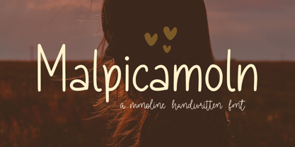 Proudly Presenting, Malpicamoln A Monoline Handwritten Font Malpicamoln is perfect for product packaging, branding project, megazine, social media, wedding, or just used to express words above the background. Malpicamoln also multilingual support. Enjoy the font, feel free to comment or feedback, send me PM or email.
 - Comic World by Fox7,
$12.00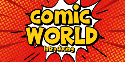 Comic World is a cool, vintage styled display font. It is the perfect font for titles or words needing a more dramatic emphasis. Whatever the topic, this font will be a wonderful asset to your font library, as it has the potential to enhance any creation.
 - Naname Kun by Julmeme,
$15.00 Naname Kun is a geometric typeface created with oblique lines as a main texture. Its unique particularity is to be filled with diagonal hatching that varies in thickness to create different styles and weights. Applicable for any type of graphic design, especially for posters and logotypes.
 - Trade Journal JNL by Jeff Levine,
$29.00Trade Journal JNL and its oblique counterpart are derived from a classic grotesk sans face from the 1800s. Despite the 'Grotesk' style name, the font design is actually quite pleasing to the eye and a nice alternative to many of the sterile sans serif faces of today. - Gesture by Sinfa,
$16.00 A desire that is honored, a result that describes a gesture that combines script fonts with Signature to meet customer desires. The embodiment of the results that are more likely to be in a signature that is perfect for logos and branding, you determine it yourself .
 - Kelso Round by Talbot Type,
$18.00Kelso Round is a highly original, outline display font. Each character is represented by a single continuous line to create a fluid and rhythmic look. A friendly and distinctive typeface that’s both easy to read and easy on the eye. Also available as Kelso, with sharper edges. - Aradela Display by Attract Studio,
$18.00 Aradela Display is a psychedelic style font with unique ornamental characteristics that will set your project apart from the rest. Aradela Display comes using the opentype feature to access ligatures and alternates, each glyph is created to create harmony. It will brighten up your work, for sure.
 - Grut Stuph by PizzaDude.dk,
$20.00Grut Stuph is a weird breed between serif and graffiti, and on top of that a good portion of comic! Comes in Open Type with different alternate letters and is full of fun! Note: you will need to use OpenType supporting applications to use the autoligatures. - Mocha Script by Borges Lettering,
$52.00 Created by veteran Sign Painter, Bruce Bowers and Lettering Artist, Charles Borges de Oliveira. Mocha Script boasts over 243 characters which includes alternates, ligatures and special end characters which allows the Designer to create a magnitude of variations of letters to produce unique hand lettered words. Enjoy!
 - Springloved by Almarkha Type,
$23.00 Springloved is a cute display font, carefully created to become a true favorite. Its casual charm makes it appear wonderfully down-to-earth, readable and, ultimately, incredibly versatile. Springloved will look outstanding in any context, whether it’s being used on busy backgrounds or as a standalone headline!
 - Volante by Hindia Studio,
$12.00 Volante is a gorgeous condensed sans serif typeface that comes with various stylistic alternates and discretionary ligatures. It comes with multiple weights, from thin to heavy, with 3 extra outline styles. This is perfect to sweeten up your headlines, branding visual identity, editorial, poster, and etc.
 - Gvardia by ParaType,
$30.00 Type family of two weights was designed in 2000-2001 by Oleg Karpinsky and licensed by ParaType. Similar to Ariergard face in letterforms but differs from it by slab serifs, which always project to the center of an em square. For use in advertising and display typography.
 - Speed by Artyway,
$16.00 I suggest you to pay attention to the "Speed" font. It's bold, with sharp angles corners, spurs and slope for dynamic effect. "Speed" font has a unique charm and easy visual readability, so it's perfect for headlines, whether for sports events, automotive posters, logo or monograms designs.
 - Alaska by Solotype,
$19.95This interesting type was introduced by the Chicago firm of Marder, Luse & Company in 1890, about the time designers were beginning to lose some of the excessive ruffles and flourishes that characterized the Victorian age. Originally a caps-only font, we have added a lowercase to match. - Miller Banner by Carter & Cone Type Inc.,
$35.00 Miller Banner takes Matthew Carter’s popular Miller series to new heights: 100pt and up, beyond any examples among the Scotch Roman’s historic antecedents. Optimized for very large settings, its hairlines have been sharpened and the contrast sweetened, lending grace and crisp elegance to banner headlines and titles.
 - Walahard by JprintStudio,
$10.00 Introducing Walahard, Walahard is a sweet, soft handwritten font. Get inspired by its authentic feel and use it to create gorgeous wedding invitations, beautiful stationary art, eye-catching social media posts, and cute greeting cards. Ready to use for projects, texts, letters, or whatever you want!
 - Dolina Script by Tour De Force,
$25.00 Ingredients: 1) Dusan's right hand; 2) The eye of the Cobra, leg from the dragon, software from the Bill; 3) Elliott Smith (TM) playing in the background; 4) Old grandmother to tell you not to spice it too much; 5) Empty label for your jar/ box/ product...
 - Moondays by Greentrik6789,
$18.00 Moondays Font is a unique and contemporary serif font that adds a distinctive aesthetic to your design projects. This versatile display font is perfect for creating eye-catching headlines, titles, and logos. Discover the beauty of Moondays Font and elevate your designs to the next level.
 - Alaturka by Bülent Yüksel,
$19.00 ABOUT FAMILY: What makes "Alaturka" elegant, friendly and contemporary is its very rounded curves with very open terminals. "Alaturka" has been designed with a higher "x-height" than other fonts in its class to make tiny readability more obvious in any use situation. It will be ideal for use in small sizes such as business cards or mobile applications. This typeface is also equipped with powerful OpenType features to satisfy the most demanding professionals. It has solid features like case sensitivity, small, true capitals, full ligatures, tabular figures for tables, old-style figures to elegantly insert numbers into your sentences, and more alternative characters to give personality to your projects. FEATURE SUMMARY: - 2 style: 1From 1923 To 2023 - 8 weights: Thin, Extra Light, Light, Regular, Medium, Bold, Extra Bold, and Black. - 3widths: Normal, Narrow, and Condensed. - Matching italics (12º) for all weights and widths. - Matching small caps for all weights and widths. - Lining and old-style figures (proportional and tabular). - Some alternate characters - Unlimited fractions. - Automatic ordinals (1st, 2nd, 3rd, etc.). - Extended language support: Most Latin-based scripts - Extended currency support. You can enjoy using it.
 - Croasian by MKGD,
$13.00 The main reason I wanted to design this font was because I really didn’t like how poorly some fonts tried to mimic an Oriental appearance. Trying to make western words appear Asian with a font composed of brush strokes is almost always doomed to failure. However, I find Croasian works extremely well with one syllable words that are Asian sounding. A good font to have if you want to express an Asian name or business phonetically in a western alphabet while still retaining an Asiatic feel. Croasian has a glyph count of 397 and supports the following languages Afrikaans, Albanian, Asu, Basque, Bemba, Bena, Bosnian, Catalan, Chiga, Colognian, Cornish, Croatian, Czech, Danish, Embu, English, Esperanto, Estonian, Faroese, Filipino, Finnish, French, Friulian, Galician, German, Gusii, Hungarian, Icelandic, Indonesian, Irish, Italian, Kabuverdianu, Kalaallisut, Kalenjin, Kamba, Kikuyu, Kinyarwanda, Latvian, Lithuanian, Low German, Lower Sorbian, Luo, Luxembourgish, Luyia, Machame, Makhuwa-Meetto, Makonde, Malagasy, Malay, Maltese, Manx, Meru, Morisyen, North Ndebele, Norwegian Bokmål, Norwegian Nynorsk, Nyankole, Oromo, Polish, Portuguese, Romanian, Romansh, Rombo, Rundi, Rwa, Samburu, Sango, Sangu, Scottish Gaelic, Sena, Shambala, Shona, Slovak, Slovenian, Soga, Somali, Spanish, Swahili, Swedish, Swiss German, Taita, Teso, Turkmen, Upper Sorbian, Vunjo, Walser, Zulu
 - Anatole France by Ingo,
$36.00 handwritten decorative variable font A few fonts already exist which have been drawn in accordance with the exact same principles. But these are just drawn - only drawn. The ANATOLE FRANCE retains the hand script character in spite of its stringent composition. An old portfolio of script patterns from the 1920s or 1930s, which appeared in the Georg D. W. Callwey Publishing House in Munich, includes among its pages one with a handwritten poster script, as was very typical for the 1920s. To begin with, there is the emphasized decorative character, which stands out due to stressing the stems. Next, the attempt to portray the character forms with the help of a few but always recurring basic elements is driven to the limits. Theoretically speaking, that which should have led to a contrived, geometrically determined type, obtains a likeable and pleasant look through the ductus of the manually guided brush. The classic version of ANATOLE FRANCE includes 5 fonts: Light, SemiLight, Normal, SemiBold, Bold. The variable font allows seamless font weights from 300 (Light) to 700 (Bold). Alternate letterforms are available through the appropriate OpenType features: style set 1 (O Q V) style set 2 (v w)
 - Boniksun by Alit Design,
$14.00 "BONIKSUN Typeface" is a modern sans serif font that comes in a variety of weights, ranging from Thin to Heavy. It has a high body, making it easy to read even in small sizes. The font includes 572 glyphs, which allow for a wide range of typographic possibilities. In addition to the regular weight, "BONIKSUN Typeface" also includes a condensed version, which is ideal for situations where space is limited. The font supports Private Use Area (PUA) encoding, allowing you to access special characters and symbols that are not available in standard character sets. Overall, "BONIKSUN Typeface" is a versatile font family that can be used in a variety of design contexts, from branding and advertising to editorial and web design. Its clean and modern aesthetic make it a popular choice for designers looking for a fresh and contemporary look. Language Support : Latin, Basic, Western European, Central European, South European,Vietnamese. In order to use the beautiful swashes, you need a program that supports OpenType features such as Adobe Illustrator CS, Adobe Photoshop CC, Adobe Indesign and Corel Draw. but if your software doesn't have Glyphs panel, you can install additional swashes font files.
 - Liebelei Pro by Wannatype,
$29.90 “Liebelei” – dalliance, flirtation, hanky-panky; kind of diminutive of “Liebe” (German for love) The typeface Liebelei has its roots back in 1932, when Vienna-based painter Rudolf Vogl created the poster for a movie called Liebelei after the popular play by Arthur Schnitzler. Only the title letters existed of that typeface. I loved the letters from first sight and proceeded by adventurously interpreting the missing characters. The goal was to create letterforms that fit to the original from the 1930s and represent a modern multi-purpose font. It should be an easy-to-use italic font with warm and friendly details and a huge variety of alternates and languages. The characteristic curled ends of most letters provide a script touch to the Liebelei. The first font entirely designed was the bold one which corresponds to the original poster lettering, although I tweaked the proportions a tiny bit to a more contemporary shape. Liebelei covers Western, Central European, and Central Eastern European Languages and contains also complete Greek and Cyrillic character sets. Liebelei is best for poster design as well as detailed usage, for example handsome tables, since it supports small caps, different kinds of numerals and fractions.
 - Angulosa M.8 by Ingo,
$38.00 At first glance, »Angulosa M.8« is one of those fonts that a technician or engineer would probably draw. And yet it differs fundamentally from typefaces constructed in this way. The right angle forms the basic element of the »Angulosa M.8«, but that's about it with the pure mathematics. Serif-like upstrokes and downstrokes on some letters improve readability, and carefully used slants makes the appearance a little friendlier. The proportions are not based on any mathematical principle, but are derived from freehand writing of the letterforms with a broad quill. In terms of style, »Angulosa M.8« belongs most closely to the modernist, constructivist typeface attempts, such as those undertaken at the Bauhaus in the 1930s. The styles of »Angulosa M.8« range from "Condensed" to "Expanded", from "Light" to "Black", plus the respective oblique form, which in this font is slanted to the left. All variants can be adjusted continuously in the variable font: the font width ranges from 50 to 150, font weight from 300 to 900, upright [0] and italic [1]. The »Angulosa M.8« supports all European languages including Eastern and Central European, Turkish, Greek and Cyrillic.
 - Nautica Sottile by Resistenza,
$49.00 The Copperplate penmanship style has a distinctive flow and character. Many years of steady and patient practice allow calligraphers to achieve the flow, direction, sequencing, and speed required from the copperplate ductus, to achieve its distinctive, elegant, fluid aesthetic. Nautica is a monumental new script from Resistenza, which builds on the creator’s accomplished penmanship skills. The delicate strokes have high contrast and an extravagant personality. These letterforms invoke 18th-century sailors logbooks and the nostalgic correspondence those at sea sent home to their loved ones, with letters looping and rolling into one another like the waves these intrepid adventurers voyaged on. Nautica’s ornate feel is perfectly suited to romantic applications, and with three weights, one set of useful navigational icons and some nautical knots Nautica will allow you to create rich and cohesive graphics for those 'tying-the-knot' or in any display context which requires some sophistication. Nautica allows you to achieve the complexity and flow of copperplate calligraphy with OpenType features. Supreme swashes inspired by brush pen stroke, and exhaustive alternates, with over 900 glyphs and extensive language support, Nautica offers full professional typographic features, for a natural ‘written’ look. Check out also “Voguing” & “Nautica”
 - Riposte by Scholtz Fonts,
$15.00 Riposte is a powerful and carefully-integrated handwriting font. You should use it where you want to create a strong impact but want to avoid heavy, boxy, formal fonts. The characters were designed for excellent letter-spacing without kerning, but you can switch kerning on to add some subtle enhancements to the letter-spacing. Riposte is readable, even at quite small sizes. It was designed to be used as a mix of upper and lower-case letters. Do not make text using only uppercase letters since the spacing of the uppercase letters was optimized for use together with lowercase letters. So remember, when you want your text to have the powerful impact of the master swordsman with his balanced stance and vigorous movement -- try Riposte. The font is fully professional: carefully letterspaced and kerned. It contains over 235 characters - (upper and lower case characters, punctuation, numerals, symbols and accented characters are present). It has all the accented characters used in the major European languages. Riposte works well in professional layout application packages as well as in word-processing packages such as Microsoft Word® that do not support professional kerning.
 - Rocher by Harbor Type,
$29.00 🏆 Selected for Tipos Latinos 8. 🏆 Hiii Typography 2018 Merit Award. Rocher was designed while looking for an answer to a simple question: what would a typeface look like if it was made of stone? It certainly would look solid, but did we have to add cracks and rubble so it would resemble rocks? We didn’t think so. We decided to tackle the problem a different way. We added corners where there usually aren’t any and threw some unusual letterforms into the mix. The result is a typeface that feels like stone, but if you look closely there is nothing inherently stony about it. Unexpected corners provide just the right amount of roughness, while unusual letterforms give the text an informal aesthetic, traces of something naive and handmade. A family was born when the sturdy letterforms were turned into a series of playful layers. With 9 fonts in total, Rocher can be mixed and matched to create unique layered compositions that add depth to the layout. We designed Rocher to be used in logotypes, packaging, mobile apps and headlines. We are confident you will find another handful of scenarios where it can shine.
 - Lipa Agate by TypeTogether,
$49.00 Lipa is the name of the Slovenian national tree 'Linden'. The typeface Lipa Agate by Croatian designer Ermin Međedović, is part of a bigger type collection, comprising various type groups into one coherent system which Ermin developed over the past 10 years. Lipa Agate is the first to be released; a sans serif designed and engineered to be used in the smallest text sizes, best under 10pt, and in very bad printing conditions. It is perfect for phone books, classified ads, directories or any other job requiring economy without jeopardising legibility. To achieve this, Lipa Agate employs a range of tools, such as deep ink-traps, narrow proportions and a tall x-height. Contemporary editorial design requires a high amount of flexibility to respond to various design situations in a consistent fashion. Lipa Agate — with its 3 levels of condensation, 4 weights and 2 sets of different x-heights, 'High' and 'Low', which share the same width — fulfils these requirements wonderfully. That's a total of 24 fonts! To make this clean and honest workhorse face complete, its large character set also includes small caps, arrows, info-numerals and much more.
 - Nympha by Onrepeat,
$30.00 Nympha Family Features: 4 Styles 2 Weights Over 800 characters per style (3200 in total) Up to 10 stylistic variations for each character (!) European Language Support Hundreds of Ligatures, Swashes and Stylistic Alternates Old Numerals True Italics & Much More Trailer: https://vimeo.com/471556131 Nympha is an elegantly crafted and luxuriously exuberant serif typeface, exuding femininity and glamour but also a side of exquisity. Its hard contrast and refined details, along with its opulent swashes and voluptuous curves, create a beautiful and powerful statement to any typographic composition, mixing glamour with a contemporary aesthetic. One could say Nympha has two distinct, yet connected, personalities in the form of two stylistic sets of characters: a contemporary and elegant one and an exquisite and unusual one, both can (and should) be mixed to achieve surprising results. Nympha offers a vast amount of swashes, alternates and ligatures, featuring up to 10 stylistic variations for each character, making it possible to generate endless compositions with ease. Available in 4 styles, 2 weights, offering over 3200 characters. Visit https://www.behance.net/gallery/106734865/Nympha-Typeface/ for a full walkthrough of everything Nympha has to offer.
 - Finest Romance by Din Studio,
$25.00 Be a trendsetter and get prominent with the best style from the Finest Romance. Finest Romance is a duo font from mixtures of serif and script fonts. This harmonic duo font work hand in hand to produce marvelous designs because it expresses modernity, elegance and a little romance. Additionally, the geometric serif font’s letters are simple and consistent for a great legibility purpose. On the other hand, the script font’s letters are designed to be similar to a handwriting by adding more variations to the letters with curves and final swinging wipes. You can use this font together or separately based on your necessity. With this font’s amazing features, you can enhance your design products. Features: Stylistic Sets Ligatures Multilingual Supports PUA Encoded Numerals and Punctuations Finest Romance fits for various design projects, such as posters, banners, logos, magazine covers, quotes, name cards, invitations, headings, printed products, merchandise, social media, etc. Find out more ways to use this font by taking a look at the font preview. Hopefully, you have a great experience using our font. Feel free to contact us if you require more information when you are dealing with a problem. Thank you. Happy designing.
 - Cooper Screamers by Wordshape,
$- In 1925, at the request of Barnhart Brothers & Spindler, the foundry he worked for, Oswald Bruce Cooper designed a wide selection of "screamers", oversized exclamation points used to grab attention in display advertising. The foundry rushed the screamers into production, much to Cooper's dismay. Cooper was disappointed with the final form of the screamers– they were designed in assorted weights to match the assorted Cooper series of typefaces, as well as in a variety of other formal solutions- squaredoff, incised, wavy, Tuscan, and rounded. Cooper's working design methodology was to re-draw his projects a number of times in order to refine the formal results. However the screamer project was hastily cut by the head of BB&S's matrix engraving room in fourteen sizes from the initial sketches, causing Cooper to fire off a fiery missive stating, "Everything I draw is bum the first half-dozen times I draw it; the trouble with these is that I drew them only once!" This typeface is the result of researching Cooper's original drawings and series of engraved proofs for the screamers, as well as the original Screamer type specimen. Cooper Screamers have never been available before in digital format.
 - Jeko by EllenLuff,
$39.00Jeko is an exciting geometric typeface with contemporary touches. It’s born from strong elementary shapes, with clean circles interwoven with modern cuts and sharp edges. It has a distinctive voice, retaining the simplicity and elegance of classic geometric typefaces with a fresh, stylish rework. It's bold in personality and fills the space without shouting, appearing refined and confident. It’s high X-height and strong capitals sustain a large amount of visibility across all weights, and have been optically corrected for even better legibility. It has been designed as a variable font to give lots of options and access to unique type looks; however it also includes nine weights to give just as much access to creativity to those without access to variable supporting software. Aventa’s matching italics sloped at a lively 11º help give it a full range of expressions. Its distinctive character and many variables make it a versatile, stylish workhorse, great for interfaces and design. Jeko is a re-designed form of the Aventa Typeface. Each font contains just over 570 glyphs with full Western, Central, Eastern European and Cyrillic language support. Check out Larken which is a great pair for Jeko. - Anziano Pro by MAC Rhino Fonts,
$59.00 Anziano follows the direction staked out with Delicato. When creating traditional typefaces, it is inevitable to be influenced by earlier designs. Anziano does show touches of another classic typeface – Weiss (by Emil Rudolf Weiss, 1926). Weiss is often misjudged and overlooked. Perhaps the most well known Swedish typeface – Berling (by Karl-Erik Forsberg, 1914–1995) is actually based largely on Weiss. MRF have appreciated the design of Weiss uprights for a long time. When Stefan Hattenbach bought the first Swedish edition of The Lord of the Rings (1959–61), in 2004, he was amazed by the excellent flow of the text presented on each page. Despite the very original character that Weiss has, it was a pleasure to read a book set in such a typeface. MRF realized that several major foundries had already done interpretations of Weiss, more or less true to the original. MRF didn’t want to add on to that list! Instead Stefan tried to find his own path. Anziano consists of three core styles, Regular, Italic and Bold; each with small caps, ornaments, stylistic ligatures, and extended Latin accents. Lining, tabular, oldstyle and smallcap numerals help round out Anziano’s typographic range and function.