10,000 search results
(0.206 seconds)
- Pinocchio by TrueBlue,
$20.00This font is a classic scholastic handwriting font designed to help students learn to write. - KG Red Hands by Kimberly Geswein,
$5.00 A chunky fat font perfect for titles. Still neat and legible while being super chunky.
 - FG Lana by YOFF,
$13.95 FG Lana is a teenager with big visions and a bit naive kind of writing.
 - Casual Script by Jesse Tilley,
$19.95My own hand writing, which is surprisingly messy for a font artist. Hope you enjoy! - Grange Shadow, crafted by the renowned type designer Dieter Steffmann, is a font that effortlessly captures the nostalgia of a bygone era while maintaining a sense of contemporary flair. It is part o...
- Sigmund Freud Typeface by Harald Geisler,
$29.00 “For those who regret what keyboards and touch screens have done to their penmanship, typographer Harald Geisler has an answer: Sigmund Freud.” — The Wall Street Journal Sigmund Freud was a neurologist who lived from 1856 to 1939. His research and studies led to the foundation of ‘Psychoanalysis’. When I first saw Freud’s century old letters, I was fascinated by the beauty of these historic manuscripts. It made me smile to imagine a person writing his or her shrink a letter set in Freud’s handwriting. I started to plan creating a font based on his manuscripts. I contacted the Sigmund Freud Museum Vienna and Freud Museum London. To start the creation I selected eight handwritten documents from the archive in Vienna – This selection of specimen was my orientation during the design process. The Samples were created between 1883 to 1938 and are of various character such as handwritten scientific papers, personal letters, notes and a telegram. A successful Kickstarter Campaign "The Sigmund Freud Typeface - A Letter to your Shrink" with over 1400 Backers enabled me to visit the archive in Vienna and study the original manuscripts of Sigmund Freud. After a year of preparation and design work, I finished four alphabets based on Freud’s handwriting. What are the different Versions PRO, Kurrent, #1, #2, #3 and #4 about? “This project gives people the convenience afforded by the computer while maintaining the romantic nostalgia, beauty, and character of letter writing with real handwriting.” — Daniel Vahab, The Huffington Post When you write with your hand, every letter looks a little different. When you write a text on your computer every letter looks exactly the same. In order to make type look like handwriting, I chose four different variations of each letter from Freud’s manuscripts, drew and stored them in the font. The font is then programmed to exchange letters while you are typing. This makes the rendered result on your screen or print look like unique handwriting. PRO While you are typing… the PRO Version actively combines all four alphabets and exchanges them automatically. Through this mechanism never the same two o’s will stand next to each other. With every touch a unique look is generated. This works in certain applications i.e. Word 2010(or newer), Pages, TextEdit, Editor(Pre-installed on Windows 7 or newer), InDesign, Illustrator… →Here you can see an animation of what this effect looks like in action. (Please Note: some applications like LibreOffice, OpenOffice do currently not support this feature. Date: December 2013) #1 #2 #3 and #4 The Sigmund Freud Typeface #1, #2, #3 and #4 each hold one individual lowercase alphabet based on Freud’s handwriting. Kurrent Most of Freud’s correspondence was written in German. Until the 1950′s a different handwriting was taught throughout German speaking countries (Switzerland, Austria, Germany). This style is called Kurrent. The name Kurrent and Cursive derive from the Latin word currere - to run, hurry - both styles were designed to write fast. As you can see in the samples above, Freud practiced both Kurrent and when writing english Cursive (Latin script or Joined-up). Kurrent has three significantly different letters (s,h,e). Use Kurrent to render the authentic look of an historic Sigmund Freud letter in German. Bundle On the Top of this page you can get all six fonts of the Sigmund Freud Typeface Family in a bundle. International Typeface All styles of the Sigmund Freud Typeface feature a wide range of accented letters so you can write to all your friends in Sweden (Bjørn) France (Chloé & Zoë), Ireland (Dáirine), Poland (Łucja), Germany (Jörg) and almost everywhere around the globe (Find a complete list in the tech specs). Usage recommendations I hope that this design will be valuable to you and most of all that you have fun with this typeface! 1. Point Size — To reproduce the size of Sigmund Freud’s handwriting adjust the type size between 18-24 point in your word processor. If you are using an imaging software like Photoshop set the resolution to 300dpi and adjust the point size between 18-24. 2. Line Spacing — Narrow the line hight until swashes of capital letters touch the baseline above. This also happens when you write a letter and gives the document a unique handwritten look. 3. Right Aligned — Freud had the habit to write towards the right edge of the page and start loosely on the left. Set your text alignment to ‘right’ to incorporate this dramatic expression also to your documents. What do other People say about the Sigmund Freud Typeface? “Wouldn’t you love to write a letter to your shrink using the Sigmund Freud typeface?” — Dorothy Tan, Design TAXI ''“JUST DON’T WRITE A LETTER TO YOUR MOTHER WITH IT… …until the reader looks a bit closer, and they see 70+ years of modern science weighing in on turn-of-the-century pop psychology."'' — Mark Willson, Fast Company “Doctor, what does it mean if you dream of creating a font of Freud’s handwriting?” — Ayun Halliday, Open Culture “…geekily romantic, at once artistic and scientific” — Edie Jarolim, Freud’s Butcher “…sympathisch” — Jürgen Siebert, Fontblog !WOW! Thank you for reading the complete font description! You are awesome! If you still have a question please contact me through MyFonts or my website haraldgeisler.com. Credits This project was made possible by the help of 1481 Backers on Kickstarter and the kind support of the Sigmund Freud Museum Vienna and the Freud Museum London. Thank you. All of Freud’s Manuscripts shown are © Sigmund Freud Museum Vienna. Poster Image: IN17 - Sigmund Freud, Germany 1932. © Freud Museum London. Flag Image: IN19 - Sigmund Freud 1930’s. © Freud Museum London.
 - EF Kaffeesatz by Elsner+Flake,
$35.00 The Kaffeesatz EF typeface was designed in 1993 by Ralf Borowiak in three weights: “Schwarz”, “Weiß” and „Süß“ (“Black“, “White” and “Sweet”). Since it is experiencing ever increasing popularity, the Elsner+Flake Designstudios augmented the “Schwarz“ and “Weiß“ versions with a complement of Cyrillic characters.
 - Empyrean by Greater Albion Typefounders,
$16.00 Empyrean is a display Roman typeface which sets out to be deliberately different. Its letterforms explore white space and the art of leaving things out. Empyrean is a futuristic Roman design which builds in respect for typographic tradition with an exploration of design possibilities.
 - Klute by Alias Collection,
$60.00 Klute references stylised forms of writing; historic Germanic, blackletter letterforms and graffiti and tagging. Its references are based on a personal idea of lettering - the action of writing is more personal and human than the craft of calligraphy or the mechanics of typing. These references suggest the idea of saying something particular and personal.
 - Gartisans by Sign Studio,
$10.00 Gartisans are inspired by the appearance of games produced by Japan. Has a distinctive curves on the character (writing with Katakana). By using this font you will be able to feel the feel of the Katakana writing style (simple, clear, characterized). It is suitable for book cover design, poster, game UI, and logo making.
 - Côté by Studio Bayley,
$4.00 A modern geometric sans serif that comes in 2 weights with 3 styles for each; Solid, Outline and Stripes. Côté was originally designed as a purely striped typeface but evolved to more weights to create a fun and playful typeface that can be layered and scaled. The solid weight allows for title or body copy while the stripes should be used as large as possible!
 - Lamiran by RagamKata,
$14.00 Lamiran is a Distorted Wavy Font . You're not going to write a novel with this font, I will tell you that but... if you want something seriously psychedelic thats part art and part font, then this is the font for you. Using it sparingly to mix and match with a clean sans serif or go all out for a good time. Thanks, Have a wonderful Day. Ragamkata
 - Matchstick by Fenotype,
$25.00 Matchstick is a hand drawn brush script. Matchstick is packed with loads of ligatures and alternates that help simulate a swift look of a handwriting. This feature is set in Standard Ligatures and it is normally automatically on. Matchstick is a great display brush to be used in writing headlines, packaging, posters or as a logotype. Matchstick works great when paired with strong sans serifs.
 - Cheddar Gothic Rough by Adam Ladd,
$25.00 Cheddar Gothic Rough is a hand-drawn, textured display all-caps typeface with condensed proportions. The uppercase characters add distinction with extended crossbars and chiseled terminals, while the lowercase provides a more classic sans serif appearance. Carefully drawn for quality and readability, but still rough enough to exhibit the handmade details. Cheddar Gothic Rough is great for display, branding, packaging, advertising, food, sports, titles, and more.
 - Diogenes by Ludwig Type,
$45.00 Diogenes is an elegant and crisp text typeface. While the skeletons of the individual characters are distinct and strong, the serifs are fine and sharp. This is especially true for the capitals with their comparatively strong horizontal strokes. The graceful appearance of Diogenes makes it an ideal choice for books, newspapers, and magazines, both at small text sizes and display sizes. See also this minisite.
 - Hackbot by Typefactory,
$14.00 Hackbot is a font which is both retro-inspired and amusing to the eye. The gaps between the letterings allows you to feel vintage and travel back to the old times. It’s a font which uses a sans serif style of writing, but uses a retro design to make an overall unique font. It’s flawlessly suitable for promoting games, creating quotes, retro designs and much more.
 - Oculi Magni by TeGeType,
$25.00 Oculi Magni is a new sans serif type family of 8 weights with italics. This font was specially designed for the composition of texts in small size as captions or footnotes but the thin and black weights can also be used in display sizes. The x-height, as tall as possible, allows the composition of very tight, very dense texts while maintaining a perfect readability.
 - Rounded Elegance by Douglas Charles,
$12.00 In the "Rounded Elegance" font family you will find modern, clean and elegant fonts. The family is thought and designed to provide smooth and modern logo creation as well as writing subtitles and brand slogans for end customers. The "Rounded Elegance" family is a unique sans serif type, with smooth, rounded contours. The package contains the new version (2.0) of the well-known Rounded Elegance font.
 - Mersh by Sign Studio,
$12.00 Mersh is a type system that provides a wide range of options for any design project. The typeface comes with 9 weight in both regular and italic styles. Mersh is the result of exploring minimalist design trends and classic typography. Have the ability to be a display font and writing text well. Mers sans serif family is a very versatile font suitable for headlines, posters, logotypes, etc.
 - Rail Travel JNL by Jeff Levine,
$29.00 Here’s yet another interpretation of the classic “thick and thin” sans serif lettering most popular during the Art Deco era. This particular design comes to you through the courtesy of a hand lettered 1930s travel poster from the Pennsylvania Railroad. Some capitals are much wider than others, while the lower case ‘i’ is somewhat truncated. Rail Travel JNL is available in both regular and oblique versions.
 - Gopher by Adam Ladd,
$25.00 Gopher is a reverse contrast, geometric sans serif typeface in 3 optical sizes ranging — Text, Normal, and Display. With the most subtle contrast,Text works best in smaller type settings while Display is the most dramatic as the contrast has been pushed more to the extreme for an immediate visual impact. Gopher works great in a variety of settings for branding, advertising, posters, magazines, packaging, and more.
 - Tropic Fresh by Sign Studio,
$15.00 Tropic Fresh is a serif font that adapts to today's design styles. Equipped with alternative characters and also ligature. High detail in every part of the body. Uppercase and lowercase have the ideal height so this font is still good for writing formal text. Tropic Fresh is a versatile font to support a wide variety of today's designs. All PUA Encoded characters, so they are easily accessible.
 - Auxiliary by Wildan Type,
$10.00 Auxiliary is a humanist sans serif font. Make it more interesting and dynamic. Auxiliary is designed for content display and text. Maximizes thickness while maintaining balance in each shape. This is perfect for any type of creative project. Auxiliary come with 4 styles plus Multilingual support.. That is Regular, Italic, Hollow, and Hollow Italic. Makes every project you work on easier, and will certainly be awesome!
 - ZT Mostion by Zelow Type,
$14.00 Introducing "ZT Monstion," a fusion of sans and grotesque styles, both in bold weight, radiating an essence of simplicity and modernism. Crafted meticulously, this typeface embodies the purity of sans-serif aesthetics while embracing the boldness of grotesque forms. Its carefully refined x-height and expertly smoothed angles create a mesmerizing balance, where minimalistic design meets commanding boldness. With each character empowered by the weighty black typography.
 - Insta Story by Bluestudio,
$6.00 Insta Story is a matching font family, consisting of a family of 10 sans serif font styles and paired with 1 script that we made to look like hand writing, so that it looks natural. Insta Story is perfect for all types of your business projects such as: logo design, business cards, greeting cards, magazines, newspapers, social media design, watermarks and more. Happy designing...! Thanks.
 - Fermata by Fermata Fonts,
$15.00 Fermata is an original calligraphic textface inspired by humanist serif typefaces from the 16th century, characterized by the translation contrast of a handwritten pen stroke, monumental Roman capitals, and true italics. Fermata has been modernized for 21st century textual requirements, with clean lines, moderated contrast, and a seamless blending of italics and lining characters into the text form, while still retaining the warmth and subtle idiosyncracies of the handwritten origins of old style serifs. The font was developed with invaluable advice and mentorship from Hannes Famira.
 - Tabac Big Glam by Suitcase Type Foundry,
$39.00 Tabac Big Glam probably stretches the Tabac super-family’s boundaries the furthest. While it’s based on the serif version, it achieves an especially surgical cleanliness and extremely sharp typesetting by completely letting the serifs go. Despite this, the text isn’t boring for a moment — the angled cut of the stems on b, d, h, k, l, the open loop on g or the rounded variant of the italic y, which can be called by turning on the stylistic set, reliably banishes any suspicions of the letters’ monotony.
 - Aluniea by IbraCreative,
$17.00 Aluniea is a classic modern serif typeface that effortlessly marries timeless elegance with contemporary design sensibilities. With its balanced letterforms, graceful strokes, and refined details, Aluniea exudes sophistication and versatility, making it a quintessential choice for a wide range of design applications. The typeface’s subtly flared serifs and harmonious proportions lend it a sense of balance and readability, while its clean lines and distinct character variations provide a distinctive, yet approachable, aesthetic that is perfect for conveying a sense of tradition and refinement in a modern context.
 - Pokerface by Ascender,
$29.99 Pokerface is an industrious mixed-case display font devised on the theme of playing cards, designed by Jim Ford. Most letterforms in the font have 'four of a kind' while some are only available in pairs. It features Clarendon-style slab serif and grotesque sans serif forms. Furthermore, the letterforms are 'shuffled' to give a random appearance in standard text. It fuses a utilitarian sturdiness with a soft and friendly feel, and adds a bold flare to headlines, logos and posters. Character Set - Latin 1, OpenType extras.
 - Aegiste by Flawlessandco,
$9.00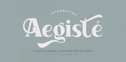 Aegiste is a Serif Retro Font with some font swashes that can add a touch of vintage to each letter. An Original typeface that suitable for any graphic designs such as branding materials, t-shirt, print, business cards, logo, poster, t-shirt, photography, quotes .etc This font support for some multilingual. Modern Serif Retro that contains uppercase A-Z and lowercase a-z, alternate character, numbers 0-9, and some punctuation. If you need help, just write me! Thanks so much for checking out my shop!
 - Pioggia by Fontdation,
$15.00 Introducing Pioggia, a modern and playful serif font. This clean and minimalistic serif is crafted with love and high attention to the details. Packed with OpenType features (such as alternate chars, swashes, ligatures, etc), lets you play and explore every characters available. Pioggia is very versatile, suits best for almost everything, whether you're working on classic themed design, or the modern ones. If you're often working with a magazine, layouts, logotypes, hipster-quote writings, t-shirt designs, etc, Pioggia is your next go-to font.
 - Black Orange by Flawlessandco,
$9.00 Black Orange is a Retro Serif Font. Journey back in time to the classic and timeless era of design with "Black Orange," a captivating retro serif font that exudes the essence of vintage charm. There's some connected letters and some alternates that suitable for any graphic designs. This font support for some multilingual. Also contains uppercase A-Z and lowercase a-z, alternate character, numbers 0-9, and some punctuation. If you need help, just write me! Thanks so much for checking out my shop!
 - Flawsome by Flawlessandco,
$9.00 Flawsome is a stylish and modern italic serif font that combines traditional serif elements with contemporary design features. There's some connected letters and some alternates that suitable for any graphic designs such as branding materials, t-shirt, print, business cards, logo, poster, t-shirt, photography, quotes .etc This font support for some multilingual. Also contains uppercase A-Z and lowercase a-z, alternate character, numbers 0-9, and some punctuation. If you need help, just write me! Thanks so much for checking out my shop!
 - PF Fusion Sans Pro by Parachute,
$79.00 Fusion Sans is an amalgamation of traditional early nineteenth-century sans-serif letters. Despite its monotone structure it retains certain features common to roman. For instance lowercase ‘a’ and the two-storey ‘g’ are normal roman characters, while most letters are designed with a thinning of stroke at the junction of rounds to stems. Other letters are borrowed from earlier gothics, like lowercase ‘t’ which was first seen on a typeface that was developed by Paul Rand for Westinghouse in 1960. Fusion Sans is a tall family of 4 weights which is suitable for long headlines. The new ‘Pro’ version developed in 2006, provides support for all European languages including Greek and Cyrillic while it comes loaded with 19 special OpenType features.
 - Moonscape by Sohel Studio,
$13.00 “Moonscape” is a Condensed serif that has 40 Unique Ligatures. Depicted to provide a confident and impressive base headline, while still feeling warm and welcoming. there are 4 different styles that you can apply in your design projects. This typeface is perfect for an book or movie title design, fashion brand, magazine, clothes, lettering, quotes, social media posts and so much more. Moonscape Features: 5 Weights font (Regular,Thin,Italic,Bold,Outline) Uppercase Numerals & Punctuation Accented characters Multilingual Support 40 Ligatures PUA Encoded While using this product, if you encounter any problem or spot something we may have missed, please don't hesitate to drop us a message. We'd love to hear your feedback in order to further fine-tune our products. Thanks and have a wonderful day
 - Doctrine by Barnbrook Fonts,
$75.00 A contemporary sans-serif typeface with an agreeable character, Doctrine Sans is the moderate comrade of the display typeface Doctrine Stencil. From the obscure starting point of the North Korean national airline livery, Doctrine was developed to encompass a series of more mature typographic influences. Doctrine draws influence from the classic mid-century neo-grotesques and, while it retains a sense of crisp modernity, it exudes a more contemporary and human character. The rounded, lighter weights speak with graceful composure while the large x-height, low contrast and squarer, heavier, weights give Doctrine an affable charm and a persuasive voice. The alternate characters borrow elements from humanist and geometric styles and provide an idiosyncratic, experimental counterpart to the primary character set.
 - Moena by RagamKata,
$16.00 Moena | Stylish Modern Serif Font Moena is a unique serif font that showcases distinctive characters in each letter, while maintaining a high level of readability. With its slight thinness, this font remains versatile for all design purposes, especially for logo designs. Moena's uniqueness lies in its meticulously crafted letterforms, where each character carries its own distinct personality. The font exudes an air of creativity and elegance, making it ideal for adding a touch of sophistication to your designs. Whether you're working on logos, branding, or other design projects, Moena's versatility shines through. Its delicate yet readable appearance adds a sense of refinement, allowing your designs to stand out effortlessly. Crafted with precision and a keen eye for detail, Moena ensures that every curve and stroke is thoughtfully designed to maintain legibility while showcasing its individualistic charm. With Moena, you have a powerful tool to create captivating and memorable designs that leave a lasting impression. Unleash your creativity and elevate your designs with the unique character of Moena!
 - Serat by Wahyu and Sani Co.,
$24.00 Serat is a medium contrast flared serif with mixed up styles of classic typefaces which is highly influenced by early stages of Latin based hand writing. The lowercase are modernized versions of Carolingian minuscules, vertical stems which touch the baseline have been modified to have horizontal cut for simpler look and keep the calligraphic style for terminals & stroke ends. Then the uppercase are flared serif which were influenced by Roman inscriptional capitals. The font name was taken from the Javanese word "serat" which means writing (noun). It comes with some unique features, such as: - Carolingian style alternate for some letters (a,e,f,g,t), also comes with separated stylistic set for long 's', and long left leg 'x' and alternative ampersand. - Discretionary ligatures for all caps titling. - Standard Ligatures. - Tabular and Proportional for both Lining and Old-style figure. - Fraction with Nominator and Denominator. - Superscript and Subscript for numbers, etc. Serat would be suitable for "classic" themed work; poster, book cover, branding, videography, etc.
 - Geo Deco by Tipo Pèpel,
$28.00 Geodeco font family brings to you the recovery of the typographic forms from the beginning of the 20th century, with a strong ArtDecó flavour but from a new point of view: modernity and geometry. Modernity in the visual contrast between lowercase and capital letters, where rounded shapes are opposed to the breaks and graphic tensions of the strokes of the capital letters. which gives it an enormous originality. Generous doses of internal whites, assure a powerful legibility even with the spite of its short ascending and descending strokes. What we get is a coherent and martial look where fluidity and homogeneity is the main note. Soft and rounded minuscule, with large internal whites for super legibility, bombproof, especially on screens, where Geodeco lives with an astonishing naturalness. The capital letters, used alone as display, or as companions of the minuscule characters, give the family a touch of originality and exotic flavor. Like the spices in the food; a brief but intense note. Breaking the rectangular shapes so that the appearance of the letter comes out benefits from enlarging the internal whites and making them consistent with the white of the lower case. GeoDeco works very well in plain text with the obvious limitation that it is not a type for small bodies, but exceptionality weldon for plain text and signage. Maximum visibility, total beauty on screens. A family of this new century with the flavour of that epoch of experimentation that were the years 20. Extensive multilanguage support and almost all Opentype functionalities. Try it and it will convince you - for sure!
 - Lilla Letter Lover by Letterground Foundry,
$11.99 "Lilla Letter Lover" is a captivating font designed specifically for children's books. This delightful typeface brings an element of playfulness to reading, while also enhancing phonemic awareness. The font's remarkable strength lies in bridging the gap between handwritten and printed letters. For early readers, this transition can be challenging, but "Lilla Letter Lover" simplifies the process. It merges the familiar aspects of handwritten letterforms with the clarity of printed text, providing a seamless reading experience. This feature ensures that children can comfortably navigate both forms of writing, enhancing their overall literacy skills. The whimsical charm of "Lilla Letter Lover" instantly captures young readers' imaginations. Each letter is thoughtfully designed with basic shapes and simplicity in mind, for an experience where letters come to life, fostering a love for reading and storytelling. Additionally, "Lilla Letter Lover" offers a unique opportunity for sight-based spelling learning. The visually distinctive presentation of words helps young readers to develop a strong visual memory of spelling patterns. This visual association enables them to recognize and recall words with ease, strengthening their reading and writing proficiency. In summary, "Lilla Letter Lover" is not just a font; it is an enchanting gateway to make reading a joyous adventure for children of all ages.