8,657 search results
(0.023 seconds)
- Zodchiy by Chvyalev,
$15.00 Cyrillic (and Latin) poster font is limited in composition by uppercase. Monumental, dry, ascetic. Designed for the design of posters, title pages of projects, signage, book covers, building facades. It is formed based on architectural and drawing fonts. It combines Russian traditions and modern trends. The shape of the letters varies from round wide to oblong narrow, in this contrast lies the idea of the font. At first glance, this contradictory decision finds harmony with closer acquaintance.
 - Rudge by Adam B. Ford,
$9.00 Rudge is an intentionally rough sans-serif font. It was designed to share the look and feel of many “antique” fonts, although it lacks the standard serif look of those fonts. The corners are slightly rounded, the edges are wobbly, and the kerning is tight. It could be used as a faux “sloppy printing” font or just a more regularized hand-drawn font. It comes in six flavors: Light, Regular, and Bold, with italic versions of each.
 - Little Merry by Astageni,
$15.00 "Introducing Little Merry — the bubbly, round typeface that adds a touch of whimsy to your design endeavors! This fun and friendly script font boasts a bold style, perfect for sparking creativity in your projects. Whether you're crafting T-shirt designs, phone cases, greeting cards, invitations, mugs, or anything else you can imagine, Little Merry is here to infuse your creations with charm. Let your designs come to life with this delightful font and unleash your creative spirit!"
 - Audebaud by MADType,
$39.00 This wood type revival is a rare specimen, indeed. Audebaud is a charming and bold 19th Century Clarendon of French lineage. With its rounded terminals, and unique proportions; this font will instill a joie de vivre in any design. The design was inspired by the work of Constant Audebaud. Audebaud was an engraver of wooden type that was used for posters and the like. His work appeared in the 1880s in the Deux-Sèvres département of France.
 - Linotype Zurpreis by Linotype,
$29.99Linotype Zurpreis is a family of two typefaces created by the Swedish designer Bo Berndal in 1999. The letterforms in these faces are made up almost entirely of curves, giving them a slightly handmade, inky, or psychedelic appearance. The round characters dance and bounce along their baseline, lending a fun and uneven quality to text set with the fonts. Linotype Zurpreis is best used in sizes above 12 points, either for short passages of text, or headlines. - Kernel by JCFonts,
$19.00 Kernel is a square geometric type family in six weights with matching obliques and small caps. The design mixes slightly rounded terminals and shoulders with square counterforms, giving the shapes a strong masculine and futuristic look, great for applications like innovation, technology, sports and of course, sci-fi ! The fonts, delivered in Opentype format, include diacritics for most European languages and come with a variety of Opentype features : two stylistic sets, tabular figures, case-sensitive forms, fractions and more.
 - Sunfleur by Valley Type,
$17.00 Sunfleur is a high dose of peace and love. With flared edges and rounded terminals, its playful forms were inspired by the flower child style of the 1960s. The waxing and waning curves of the letters complement each other for optimal readability and flow. Sunfleur also features a series of happy flower icons. Bring positive energy to logos, headlines, packaging, editorial, and posters. Includes all uppercase characters with punctuation, glyphs, diacritics, numerals, icons, and multilingual support.
 - Polaris by AVP,
$10.00 Polaris is a rounded sans-serif family with four styles designed for easy reading. Perfect for print - brochures, posters, newsletters and stationery. For signage, Polaris comes with a variety of compatible arrows. Polaris is also great on-screen: use it on your website as an alternative to the over-used standards. Polaris works in the background, creating an atmosphere of harmony and modernity while your words deliver the message and your graphics and images achieve the prominence they deserve.
 - MC Balwey by Maulana Creative,
$15.00 Balwey is a Compressed round sans serif Display font. Bold stroke, fun character with a bit of ligatures and alternates. To give you an extra creative work. Balwey font support multilingual more than 100+ language. This font is good for logo design, Social media, Movie Titles, Books Titles, a short text even a long text letter and good for your secondary text font with script or serif. Make a stunning work with Balwey font. Cheers, Maulana Creative
 - MC Garleo by Maulana Creative,
$12.00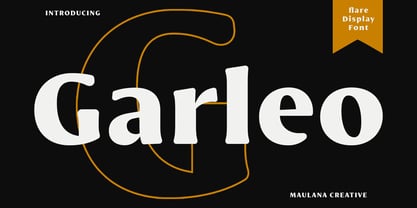 Garleo is a round flare serif Display font. Bold stroke, fun character with a bit of ligatures and alternates. To give you an extra creative work. Garleo font support multilingual more than 100+ language. This font is good for logo design, Social media, Movie Titles, Books Titles, a short text even a long text letter and good for your secondary text font with script or serif. Make a stunning work with Garleo font. Cheers, Maulana Creative
 - Biscuit Pro by Kustomtype,
$30.00 Biscuit is a rounded unique typeface, clearly and easy readable with upper- and lowercase. Perfectly applicable for big or bold tekst pages. This font family has an excellent legibility - both in print and on the web - and an optimized kerning. Biscuit is intentionally designed to be used as a display typeface in publications, packaging and al of your artwork and design. It's warm and cosy character suits extraordinary well for modern or vintage typography and corporate design.
 - Config by Adam Ladd,
$25.00 Config was influenced by geometric sans with circular forms but the proportions have been condensed by incorporating straight sides for a design that is sturdy and efficient yet friendly. The neutral design with subtle details makes it functional for type setting in small and large sizes. Its clean nature makes it readable at small sizes but the touch of character—as seen in the notched joints, rounded details, and horizontal/vertical terminals—make it interesting at large sizes.
 - Coltan Gea by deFharo,
$11.00 Coltan Gea is a Slab Serif typographic family with 6 Weights plus the italic versions all include small capital letters and cryptocurrency symbols. It is a geometric, minimalist typeface, with neo-grotesque modulations and slightly rounded corners. The typeface has alternative letters and numbers, small caps and advanced OpenType functions. The proportions, metrics and kerning I have configured meticulously for a perfect reading in any size. The complete package includes the roman version in VariableFont format.
 - MC Mackley by Maulana Creative,
$14.00 Mackley is a round extrabold sans display font. XBold stroke, fun character with a bit of ligatures and stylistic. To give you an extra creative work. Mackley font support multilingual more than 100+ language. This font is good for logo design, Social media, Movie Titles, Books Titles, a short text even a long text letter and good for your secondary text font with script or serif. Make a stunning work with Mackley font. Cheers, Maulana Creative
 - Kiddo by EPtackArts,
$3.00 Kiddo is a whimsical, handwritten font family created for use along side children's media. It pairs nicely with Monterrat and other neat, rounded sans serif fonts. It looks great with brightly colored, soft illustrations to create lively layouts full of movement. The characters are simple and easy to read as to not compete with the semi-inconsistent baselines and stroke weights. The line variations add a lot of character to the typeface that really compliments a good story.
 - Schnitz by Linotype,
$29.99Linotype Schnitz is part of the Take Type Library, selected from the contestants of Linotype’s International Digital Type Design Contests of 1994 and 1997. Designed by the Finnish artist Osmo Niemi, the characters seem to contain no round forms at all. Linotype Schnitz looks as though it were chiseled and has an angular, almost brittle feel. The restless and lively appearance makes Linotype Schnitz particular well-suited to headlines and shorter texts with point sizes of 12 and larger. - SK Pupok by Shriftovik,
$32.00 SK Pupok is a soft decorative typeface with rounded shapes. Its friendly appearance is suitable for many design tasks. The typeface has two styles: regular and outline. This configuration allows you to experiment with typeface compositions and styles. The SK Pupok typeface is multilingual and supports many languages, including the basic and extended Latin, Cyrillic, and many others. It is great for creating any design works and will look great in poster design and even in web design.
 - Quara by Delve Fonts,
$39.00 Quara is a typeface that takes its cues from cutting edge technology and new gadget lust. Quara enjoys short downloads on the web, long walks on mobile devices, and romantic dinners by LED light. An avid gamer (esp. MMORPG) and science fiction fan, Quara longs to be the first font in space and have its pixels scattered among the stars. Designed by Delve Withrington in 2009, this slightly rounded square sans has a generous x-height and low contrast.
 - AZN Unified by AthayaDZN,
$14.99 Introducing "AZN Unified" font by AthayaDZN. UNIFIED was inspired by the evolving sports world that recently just expanded into the digital verse. UNIFIED’s rounded and sharp look is representing its nature of unity, equipped with 4 different angles of corners, UNIFIED achieved its mixed modern style of a bold serif font. Language Support : Afrikaans, Albanian, Danish, Dutch, English, Estonian, Filipino, Finnish, French, Galician, Indonesian, Irish, Italian, Luxembourgish, Norwegian, Portuguese, Romansh, Scottish Gaelic, Spanish, Swedish, Swiss German, Uzbek (Latin).
 - Lemmy by Maulana Creative,
$14.00 Lemmy is a simply rounded sans serif font. With bold stroke, fun character with a bit of ligatures and alternates. To give you an extra creative work. Lemmy font support multilingual more than 100+ language. This font is good for logo design, Social media, Movie Titles, Books Titles, a short text even a long text letter and good for your secondary text font with sans or serif. Make a stunning work with Lemmy font. Cheers, Maulana Creative
 - Mensura Slab by Graviton,
$20.00 Mensura Slab font family has been designed for Graviton Font Foundry by Pablo Balcells in 2013. It is a modular, geometric typeface with subtle rounded angles that provides a soft, pleasant appearance. It has been conceived to be primarily a display typeface, but given its clarity it can also be used for composing short and intermediate length texts. Mensura Slab consists of 8 styles and 4 weights plus italics. Each containing small caps and several alternate characters.
 - Salacious by PizzaDude.dk,
$18.00 Salacious is my soft/rough all-caps font, inspired by both comics and grafitti. The weight and width of the letters varies a bit. Not in a disturbing way, but more in a lively and organic way. I've added 5 (slightly) different versions of each letter (which automatically cycles as you type!) The letter shapes are a bit rough, due to the fact that they are handmade, and all corners are rounded, which gives a nice soft look!
 - Fuel by VersusTwin,
$39.00 The Fuel typefaces are a modern update on the techno sans, complete with soft rounded corners as well as decorative inktraps. Stylistic Alternates included within all styles are alternates for the capital B, E, G, and R characters, as well as all of their accented siblings. The Fuel Complete package bundles all of the dynamic styles of the Fuel, Fuel Extended, Fuel Uni, Fuel Uni Extended, and Fuel Script typefaces into one powerhouse of a collection.
 - Oldion by Locomotype,
$19.00 Oldion is a captivating display font, draws inspiration from the boundless realms of science fiction and modern technology. With its distinctive and futuristic accents adorning each letter, Oldion breathes life and dynamism into your projects. Available in both regular and rounded styles, infuses a touch of innovation and intrigue into your designs. Oldion is your ideal choice for a wide range of creative applications, from commanding movie posters and attention-grabbing headlines to captivating packaging and distinctive logotypes.
 - Liquid Monogram by MonogramBros,
$12.00 Liquid Monogram Font is a perfect round shaped monogram font consisting of 78 letters and 1 frame. With just a single font file you will be able to create beautiful monograms in just a matter of minutes after the purchase! Liquid Monogram Font comes with font file in .otf format. It features all the modern advanced font features such as contextual alternates, effectively eliminating the need to use multiple separate font files for left, center and right letters.
 - Highills by Grontype,
$14.00 Highills is awesome bold decorative font. created in rounded corner that give this font a tough and calm feel. this font has s good looking as header and as text both. Highills is fit perfectly for branding projects, movies, logos, social media posts, posters, books, and many more. Features: Basic Latin Glyphs Bold Uppercase and Lowercase Letters Alternates & Ligatures Numeral and Punctuation Multilingual Support Thankyou for picking up this font, hope you enjoy it. Regard. Grontype
 - Brignell Sunday by IB TYPE Inc.,
$40.00 BRIGNELL SUNDAY is an eight font family designed by Ian Brignell. A relaxed, easy-reading companion for any day of the week. A clean, modern, friendly sans serif characterized by an open style with occasionally rounded corners, occasional curved junctures on diagonals and a slightly sloped lower case A. Brignell Sunday was born in 2006 and was inspired by corporate custom font ideas Ian designed for an LG Electronics sub-brand called Best Shop. Extended Latin set.
 - Vidocq by Typogama,
$19.00 Vidocq is a single weight typeface designed for use in headlines and titles, inspired by the woodcut styles of the 19th century. Its rounded forms and dark stroke translate into a bold yet friendly appearance coupled with a narrow proportion that let’s it set well in condensed settings. Thanks to an extended character set and wide range of Opentype features that includes arrows and fleurons, Vidocq was created to allow designers to play with various styles while composing layouts.
 - Robard by Dear Alison,
$24.00 My brother is an architect, and I have always loved his lettering, you know, the style of writing that can be found on architectural drawings. There is a common thread to it, yet each architect or engineer brings their own personality to it. I have seen a similar style being used by some hand-letterers for invitations, place cards and signage. Inspired, I set out to create my own, and the result is my new typeface, Robard! I wanted something compact, somewhat modular, done quickly but with control, and sourced from hand-lettering. Starting out with a handful of pigment ink pens, I settled on a 0.1mm Copic Multi-Liner, and using a light table with a grid underneath the paper, I cranked out grouping after grouping, letter after letter, numbers, punctuation, accents, just trying to zero in on the feeling and the look I was after. There were some ideas that didn't work, like unicase (there would be no regular lowercase), or swash alternates. Ultimately, I ended up with a decent array of glyphs to choose from, and alternates like oldstyle numbers, and an alternate set of caps for the lowercase slots, and even alternative figures so doubles like 88 would be different. In the font, the OpenType ligature code automatically alternates the cap and lowercase (alternate cap) letters, and numbers as you type, lending Robard that hand-lettered look in a digital typeface that I was hoping for. There are also oldstyle figures, and unlimited fractions, ordinals, and a few alternate letters. I hope you like Robard!
 - Hyper Super by Bisou,
$15.00 Made in La Chaux-de-Fonds Switzerland, Hyper Super is born while the hyperdesigner Bisou watches "Blow up", a french film-lover show. This episode about Paul Newman quotes the 1969 movie "Winning". The Italian poster with the title "Indianapolis pista infernale" uses a striking handmade font that inspire Hyper Super, a very fast font. Hyper super is thought from ground up to give a strong impact and an impression of speed. Its retro 70’s car racing movies style makes it best suitable a dog race stadium. It works perfectly with short texts for advertisement like a tuning garage sign or delivery pizza menu. Just use it for your pizza restaurant and see Paul Newman in person apply for a delivery boy job.
 - Nolan Next by Kastelov,
$40.00 Nolan Next is a low-contrast humanist sans-serif with a large x-height and streamlined appearance. It is based on Nolan, but with a more compact letterforms and remastered curves. Designed to appeal to a broader audience due to its narrower width and subtle presence, Nolan Next is ideal for everyday usage. It is well suited for design applications ranging from branding and corporate identity to editorial and web design. Comprising of eight weights with matching italics, Nolan Next is easy to work with and accommodating to your needs. Designed to work as a universal typeface, it also stands its ground in headlines, presentation materials, logotypes, etc. Additionally, the typeface includes an extended character set supporting an array of languages.
 - Hyperpolar by Bisou,
$12.00 Made in La Chaux-de-Fonds (Switzerland), hyperpolar is born while the designer (Bisou) watches "Godard mon amour", a biopic about Jean-Luc Godard's depression in 1967-68. A parade of murder mystery books is staged at the middle of the movie and at exactly 56 minutes and 47 seconds, the book "Confrontation" strikes Bisou's eye. It is the first inspiration for this awsome retro font. Hyperpolar is thought from ground up to give a strong impact. It’s retro 50’s crime stories style makes it best suitable book covers. It works perfectly with short texts for advertisement like a trench coat or a smoking pipe store. Just hang it over a video club and see what thrilling cinephiles will come in.
 - Streetcar JNL by Jeff Levine,
$29.00 An ebay purchase of a vintage Speedball lettering pen set yielded an extra bonus… numerous alphabets on paper rendered in both pen and ink and via pencil sketches. One such design in rough pencil layout is a classic serif typeface often found on many passenger and freight trains, trolley cars and busses. This “Railroad Roman” was scanned from the original sketches and then re-drawn digitally, all along retaining the charm and attractiveness often found in hand lettering. The end result is Streetcar JNL, which is available in both regular and oblique versions.
 - Interlude by Scriptorium,
$12.00Interlude originated with some title lettering which we found in an Austrian theatre program from the early 1900s. With some more research we found a similar style called Tradition which was designed by Bernard Naudin and produced by a Parisian type house during the period before World War I. Using those two sources we ultimately produced two variant versions of the font, combining elements of the two sources. Interlude features characters with open areas in the heavier strokes, while Prelude is a solid, more script-like version of the style. - Potus Uncial by Jonahfonts,
$40.00 The Uncial alphabet is a majuscule script with unjoined letters which is found in European manuscripts of the 4th to 8th centuries and from which modern capital letters are derived. Potus Uncial is designed with lowercase letters reflecting the Uncial style while keeping them as close to the original majuscule script Uncials and making it a useful modern day font. I have found it to be appropriate for historic, medical and spatial topics and may be used in packaging designs, medical journals, declarations, greeting cards and prehistoric articles.
 - EB Base Mono by Fenotype,
$19.95 Not your average monospaced typeface, Base Mono flourishes with several handsome OT features mostly found exclusively in text fonts. Despite the geometric and techno feel of the initial roman version, the cursive version is heavily influenced by traditional Finnish weaving and folk art! The contradiction is taken further by inclusion of such classical features as small capitals and lower case figures, usually found in slightly more traditional fonts. Base Mono family suits many editorial, corporate identity and logotype tasks. It can even be used for setting text such as captions and headlines.
 - Skippy is Canon by Edd's Aurebesh Fontworks,
$5.00 Working on a Star Wars project? This font is in the main Star Wars written language of Aurebesh, and contains all the additional letters found in the language as glyphs. Designed to be a blocky workmanlike font that has the roughness commonly found in Star Wars related visuals. All numbers are also included as well as central punctuation symbols. The name is a very obscure reference to the old Star Wars expanded universe, when a force-sensitive droid self destructed in order for Uncle Owen to purchase R2-D2.
 - Paneuropa Inline by ROHH,
$19.00 Paneuropa Inline is a retro display typeface inspired by a classic modernist design from Poland. It has a retro mood, but is reworked from the original to achieve a better consistency in letterforms and spacing. The set includes 3 versions of the font, each one featuring different worn/grunge effects to fit various sizes and design scenarios. Paneuropa Inline is designed for all kinds of retro, vintage, grunge, eco, bio, organic projects in mind and nicely fits to industries and purposes such as food & beverage, gardening, travel & hospitality, vintage-styled apparel, restaurants and pubs.
 - Geiger by WyldType,
$14.99 Geiger is a geometric typeface inspired by type found in the intros of Commodore 64 games, its attention to the grid and its limited set of building blocks. The design of Geiger respects these criteria to create a sturdy alphabet without diagonals, and loosen its grip on the classic limitations to produce a complete character set worthy of today`s high-resolution displays with a retro touch. The properties of classic computing platforms, like their limited memory and low-resolution displays, required that the designers and programmers of the time devise and use certain techniques to produce interesting visual results. These platforms offered limited sets of default building blocks from which to build more complex graphics and type, and some skilled coders would work around these limitations to produce the unexpected. One of the areas that saw experimental digital type flourish is the Commodore 64 intro scene. The Geiger family includes four styles (regular, oblique, bold and bold oblique), all include common ligatures (fi, ff, ffi, fj, fl, jj, tt, Th, TT) and a few stylistic alternates (K, L). A particular attention was paid to the pattern created by the vertical stem and negative spaces of tightly set text, especially for Geiger Bold. Geiger produces good results at a size of 30pt or more, but we suggest using it at higher display sizes.
 - Ongunkan Arkaic Greek by Runic World Tamgacı,
$45.00 Many local variants of the Greek alphabet were employed in ancient Greece during the archaic and early classical periods, until around 400 BC, when they were replaced by the classical 24-letter alphabet that is the standard today. All forms of the Greek alphabet were originally based on the shared inventory of the 22 symbols of the Phoenician alphabet, with the exception of the letter Samekh, whose Greek counterpart Xi (Ξ) was used only in a sub-group of Greek alphabets, and with the common addition of Upsilon (Υ) for the vowel /u, ū/.[1][2] The local, so-called epichoric, alphabets differed in many ways: in the use of the consonant symbols Χ, Φ and Ψ; in the use of the innovative long vowel letters (Ω and Η), in the absence or presence of Η in its original consonant function (/h/); in the use or non-use of certain archaic letters (Ϝ = /w/, Ϙ = /k/, Ϻ = /s/); and in many details of the individual shapes of each letter. The system now familiar as the standard 24-letter Greek alphabet was originally the regional variant of the Ionian cities in Anatolia. It was officially adopted in Athens in 403 BC and in most of the rest of the Greek world by the middle of the 4th century BC.