10,000 search results
(0.034 seconds)
- Menara by Hazztype,
$20.00 Menara is a captivating vintage serif font that effortlessly blends elegance and charm with a touch of nostalgia. This condensed typeface showcases the beauty of traditional letterforms, infused with a contemporary twist. Its italic variant adds a dash of dynamic flair, creating a truly versatile font that is perfect for both classic and modern design projects. With its refined and sleek appearance, Menara exudes a sense of sophistication and refinement. The condensed letterforms allow for maximum impact, making it ideal for headlines, titles, and branding materials. Whether you're designing a vintage-inspired logo, packaging, or editorial layouts, Menara delivers a timeless aesthetic that commands attention. The italic style of Menara introduces a subtle sense of motion and playfulness to the font. It adds an expressive quality that can bring emphasis and character to your designs. Perfect for adding an extra touch of elegance to wedding invitations, book covers, or product labels, the italic variant of Menara lends a unique personality to your typography.
 - Singel by Fontfabric,
$35.00 Singel is a neoclassical serif with semi-condensed proportions. As a contemporary interpretation, this typeface combines the rationalist modulated stroke with an elegant silhouette and crisp serifs. The altogether splendid appearance of Singel, completed with a full set of Small Capitals and true form of italics makes it perfect for any luxurious and graceful design. Other aspects of its characteristics include the consistency of 10 styles from Light to Bold; a coverage of Extended Latin and Cyrillic with span for more than 130 languages; a flawless functionality and support of many OpenType features, such as localizations, tabular numerals, inferiors and superiors, numerators & denominators, fractions, case sensitivity etc. Features: • Over 900 glyphs in 10 styles (Light to Bold); • Extended Latin and Cyrillic for more than 130 languages; • Tall x-height and Semi-Condensed proportions; • High contrast and modulated stroke with vertical stress; • Neoclassical characteristics and moderate apertures; • Full set of Small Capitals; • True form of italics; • Coverage of multiple OpenType features; • Suitable for wide design purposes.
 - ITC New Veljovic by ITC,
$57.99 Thirty years after its first appearance, Jovica Veljović has produced ITC New Veljovic Pro, a completely revised edition of his first typeface, ITC Veljovic (1984). Prof. Veljović has tapped into all the experience he has garnered over the past decades; by carefully adjusting the proportions of the characters he has provided the new typeface with a more harmonious presence. The serifs have been subtly curtailed and the letters made slightly more condensed. Some new features of ITC New Veljovic are the double-story “g” with its completely closed loop and the more open forms of the “c” and “e”. In the italic variants, the latter is much rounder. Thanks to Veljović’s outstanding work, the optimized ITC New Veljovic can now be used in all contemporary applications. The new Condensed style saves considerable space when it comes to setting longer texts. The Display versions show off the striking, crystal-clear shapes of the design at their best in larger point sizes.
 - Marcione by Eko Bimantara,
$24.00 Marcione is the real deal, a contemporary and dynamic condensed display font family that blends the classic Deco and Grotesk styles in a playful and modern way. This font family got personality, you can see it right away in the lowercase letters, with a diagonal stem in characters like “a”, “h”, “m”, and “n” that gives it that extra kick. You can use Marcione to create some killer designs in editorial, branding, or advertising. This font family packs a punch with six distinct styles, ranging from Light to ExtraBold, and it’s got you covered with broad Latin language support. That means no matter where you’re from, Marcione can help you make a statement. This font is highly versatile and visually engaging, a true boss. With its condensed design, it takes up minimal space while still commanding attention and conveying a sense of sophistication. Trust me, you won’t regret having Marcione in your font library, it’s the real deal.
 - Floki by LetterMaker,
$39.90 Floki is a contemporary condensed sans serif with sixteen styles ranging from extralight to extrabold and accompanying italics. The amount of styles, condensed proportions and large character set make Floki suitable for various uses such as infographics, packaging, branding, advertising and editorial design. Floki’s aesthetics are distinctly modern and they have a hint of softness which comes from sublty curving the diagonal strokes in letters such as A and V. This feature really shines when you set text in tightly set caps as big as possible. Stylistically Floki leans more to the humanist sans serif but it has a flavour of geometry in its shapes as well. The result of this combination of features is a highly usable typeface with a clear voice of it's own. All styles feature small caps and multiple sets on numerals including lining figures, old style figures, tabular figures, small cap figures, numerators, denominators, superiors, inferiors and fractions. Floki has latin extended character set making it well suited for multilingual typography.
 - Koondim by Twinletter,
$17.00 Introducing Koondim, a retro condensed font with a classic retro-inspired design. This font is perfect for various special projects, such as branding, packaging, logos, and more. With its OpenType feature, Koondim comes with 54 alternate styles and 38 ligatures that add a stylish and unique touch to your design. Koondim font is a versatile choice for any designer looking for a retro, condensed style with a touch of modern sophistication. The beautiful alternates and ligatures make it easy to create a customized look and elevate your designs. Plus, its multilingual support ensures that your message can be communicated clearly to a global audience. What’s Included : - File font - All glyphs Iso Latin 1 - Alternate, Ligature - Simple installations - We highly recommend using a program that supports OpenType features and Glyphs panels like many Adobe apps and Corel Draw so that you can see and access all Glyph variations. - PUA Encoded Characters – Fully accessible without additional design software. - Fonts include Multilingual support
 - Shopping Script by Roland Hüse Design,
$15.00 Shopping Script is designed after and inspired by my handwritten shopping list that was originally a lot less stylish, I have written each words multiple times to achieve the organic and natural flow with a bit spaced out style. This font is an existing work of mine that came in only one weight. Now I added multiple weights I as well as expanded and condensed instances, along with a weight and width variable font file that can be set to anything in between Thin Condensed to Heavy expanded. There are standard ligatures for it, jt, ll and tt, stylistic alternates for uppercase "A" and lowercase "e". For lowercase r and s there are contextual/initial variants when they are first letter of a word. A guide of open type features and how to activate them is available at https://drive.google.com/file/d/1q4j4X8ZntqgEUB8gUmflUNtmlX4IVQBq/view?usp=sharing Most latin based languages are covered from Western European to Eastern.
 - Squad by Fontfabric,
$- Squad is a humanist sans serif with semi condensed proportions. Inspired by Adrian Frutiger’s perfectionist style this typeface is a harmonious breed of humanist heritage and contemporary simplicity. The balanced characteristics, clear and legible silhouette and simultaneously vivid appearance of Squad makes it perfect for any design purpose. The figures are evident — it consists of 18 styles from Thin to Black; covers Extended Latin, Cyrillic and Greek with span for more than 130 languages; flawless functionality and supporting many OpenType features, such as localizations, tabular numerals, inferiors & superiors, numerators & denominators, fractions, discretionary liga- tures, case sensitivity etc. Designers: Svetlin Balezdrov, Svet Simov Features: • Over 780 glyphs in 18 styles (Thin to Black) • Extended Latin, Cyrillic and Greek scripts for more than 130 languages; • High x-height and Semi Condensed proportions; • Moderate contrast and vertical stress; • Humanistic characteristics and open vertical terminals; • True form of italics; • Coverage of multiple OpenType features; • Perfect for text, headlines and web;
 - Hacksaw Brush by Ferry Ardana Putra,
$17.00 Hacksaw is dry brush font handmade with a dedicated soul. This super condensed and trippy typeface was designed to be exclusive and is perfect for those who love condensed, wild, natural brushed feel fonts. This typeface is perfect for creating elegant branding and headlines for handmade, food & beverage, artisan goods, quotes, invites, t-shirts, logos, and, or use it to elevate your social media feed! Hacksaw features: A full set of upper & lowercase characters Numbers & punctuation Multilingual language support PUA Encoded Characters Dozen of Swashes OpenType Features ——— ⚠️To enable the OpenType Stylistic alternates, you need a program that supports OpenType features such as Adobe Illustrator CS, Adobe InDesign & CorelDraw X6-X7, Microsoft Word 2010 or later versions. There are additional ways to access alternates/swashes, using Character Map (Windows), Nexus Font (Windows), Font Book (Mac) or a software program such as Pop Char (for Windows and Mac). ⚠️For more information about accessing alternative, you can see this link: http://adobe.ly/1m1fn4Y
 - Bia by Bykineks,
$9.00 Bia Superfamily is a new font creation designed with transitional serif classification, consisting of 100 font styles. It is supported by 85 languages of the Western/Eastern Europe and Turkish region, making it suitable for global use. In addition, Bia Superfamily has features such as numerator, denominator, inferior, modern, and old-style figures. Bia Superfamily features four different classifications in both serif Low & High (Contrast) and sans-serif Low & High (Contrast) variations, including ultra-condensed, condensed, regular, expanded, and ultra-expanded. With its diverse range of font styles, Bia Superfamily offers versatility and flexibility for use in various industries such as skincare, perfume, jewelry, stationary office, newspaper, cover book, web design, sign airport, sign hotel, wedding invitation, and text. Bia Superfamily is the perfect font choice for those who want to showcase a luxurious and elegant feel in their designs. Its professional and elegant characteristics make it stand out and attract attention to any design.
 - Brecksville by OzType.,
$15.00 Brecksville is a condensed grotesk typeface that takes inspiration from early German designs of the mid-19th century. It was designed as part of my current research into grotesk typefaces and different letterforms, as part of my dissertation research, “Perfected Letters: German Grotesk in the Nineteenth Century”, which focuses on the role of German design in typography. The Brecksville font family provides a wide range of weights, ranging from light to bold for both its rounded display style and more rugged sharp style. Both its styles feature the same horizontal proportions and metrics so they can freely be combined with no spacing issues. Brecksville's visually punchy condensed style and sharp edges, allows it to stand out on the screen – at almost any size. Its black composition also brings out the details needed in magazine and tabloid headlines, while maintaining readability throughout. The rounded display version is ideal for posters and other uses where you want something eye catching but not too hard on the eyes.
 - Varietta by Sudtipos,
$39.00 Varietta is the result of my fascination with photographing the type designs of some marquees in Spanish markets. In them you can see many letter designs with reversed contrast and in different widths, probably based on the possibilities of photocomposition. At the same time I was working on the expansion of the Hastile typeface designed by Alessandro Butti for the Nebiolo foundry in Italy in the late 1930s, of which I had not seen any digitization. As I am not a fan of perfect revivals, I thought it could be interesting to connect Spain and Italy in a single typeface. The first step was to expand Butti's design to 27 styles, ranging from thin condensed to black expanded. To look for the Spanish connection and its characteristic inverse contrast I took advantage of the current technology that allows variable typefaces with many axes. From this, three scenarios of horizontal contrast were incorporated (top, bottom and mixed) which allows infinite possibilities of use. The final result is a collection of 108 static typefaces or a single variable file.
 - ITC Galliard eText by ITC,
$29.00A clear and enjoyable reading experience hinges on the legibility of text copy, especially when reading on screen. This is why Monotype has developed the eText collection of fonts specifically tailored for the text-heavy display environments of e-readers, tablets, mobile devices, and the Web. Matthew Carter designed the original ITC Galliard. Carl Crossgrove created this eText version. - Caracas Stencil Pro by John Moore Type Foundry,
$25.00 Caracas Stencil Pro is a new family of stencil sans serif fonts, looking friendly, sweet and comfortable to read. Where text flow between straight lines and round by becoming transparent in the interest of readability. Caracas Stencil is ideal for working in small letters and texts of a technical nature. Caracas is a humanistic approach to reading sans forms.
 - Antique Ornaments JNL by Jeff Levine,
$29.00Antique Ornaments JNL collects twenty-six vintage printers' ornaments from the 1800s into one convenient digital font file. - Essential Pragmata Pro by FSD,
$23.37 Essential version of PragmataPro™. It contents a selection of glyphs useful for programming in English language only.
 - Ah, Roddy! If fonts were guests at a party, Roddy would be the one wearing a bow tie with sneakers, casually charming everyone with stories that span from the quirky to the profound. It’s not just a ...
- Trebuchet MS by Microsoft Corporation,
$49.00Trebuchet™ Family, designed by Vincent Connare in 1996, is a humanist sans serif designed for easy screen readability. Trebuchet Family takes its inspiration from the sans serifs of the 1930s which had large x heights and round features intended to promote readability on signs. The typeface name is credited to a puzzle heard at Microsoft, where the question was asked, 'could you build a Trebuchet (a form of medieval catapult) to launch a person from the main campus to the consumer campus, and how™' The Trebuchet fonts are intended to be the vehicle that fires your messages across the Internet. 'Launch your message with a Trebuchet page'. Character Set: Latin-1, WGL Pan-European (Eastern Europe, Cyrillic, Greek and Turkish). - Black Cluster by Hanoded,
$15.00 First things first: I am really not a Star Trek fan. I did come up with this name, which I thought had a good ring to it. When I checked whether the name was already taken, I found out that Black Cluster is a term from Star Trek. Now you want to know what a Black Cluster is, so just check out poster 2 and read all about it. For me, Black Cluster is a handmade ink font, with a lot of jumping glyphs, a lot of diacritics and a handful of ligatures. It may be rough, but you will be pleasantly surprised by what it can do to a design! May the font be with you. Oh, no, that was from Star Wars…
 - Citrine by XO Type Co,
$40.00 Citrine is a study in curves, based upon word-processing and in-game text. A tall lowercase makes for easy reading, curved joints give it friendliness, and broad spacing delivers distinctive all-caps treatments. Here’s a downloadable PDF specimen. Citrine’s basic idea began as “a Havelock for reading.” Essential geometry delivers a sense of harmony, and forms sit broadly next to each other to be easily read, even onscreen and very small. Citrine includes case-sensitive alternate shapes for smooth all-caps typesetting, small caps, and a wide range of diacritics to cover a multitude of latin-based languages.
 - Processual by letra Um,
$2.00After readings and reflections about the process-poem,“anti-literary” movement, contemporary of concretism, a font of simple form that could provide directions and sense of reading demanded its creation. So we have done the labor of the processual, modulate by consequence and not by option, born with autonomy and authority. The process demanded soon two things: first, to not be one more “hard to read pixelfont” used only by its creators; second, to attend to the requirements of the poem-process, not like a good daughter but like a modern and comprehensive grandchild (the generations understand themselves to the jumps). - Elektrakution by Comicraft,
$19.00 SHE'S DEAD, FRANK It's the year 1991, BC (Before Comicraft) when REM were still making records and Frank Miller’s memorable run on Marvel Comics’ DAREDEVIL was just over ten years old. Comicraft’s Richard Starkings found himself working in Anaheim, California for Graphitti Designs. Graphitti had produced the first hardcover edition of Miller’s Batman tale, DARK KNIGHT RETURNS and was now putting together the sequel to Miller’s DAREDEVIL — ELEKTRA LIVES AGAIN! Richard was not engaged to letter this book, the pages of Frank’s incredible original art that came through Graphitti’s studio were already lettered by Marvel Stalwart, Jim Novak. However, there were some cover elements that needed to be added, based on the logo originally rendered by Frank’s brother, Steve. Starkings set about the task of creating an alphabet that could be used to develop Steve’s idea for the trade dress -- the cover elements, the back cover copy and credits on the interior pages. This was long before Macintosh computers and font programs made this work considerably easier, so Rich sat down with a pencil and a sheet of vellum and rendered an alphabet that could be used as the basis for the text that was needed... Those sketches have languished in a drawer for nearly thirty years, but now, finally, Comicraft’s John Roshell has dusted off those old letterforms and Elektrakuted a font based on those designs, a font we HAD to call ELEKTRAKUTION! As for Elektra; she’s dead, Frank. Features: Ten weights (Light, Regular, Bold; Rough Light, Regular & Bold; Inline, Inline Rough, Outline & Outline Rough) with upper & lowercase characters, Western & Central European accents and Greek characters.
 - Moritz by Solotype,
$19.95Loosely based on an early 20th century type from the Brussels foundry of Van Loey-Nouri. Many European foundries had fonts of this general design. Schelter & Gieseke of Germany had several. - Robur by Canada Type,
$24.95 It shouldn't be a surprise to anyone that these letter shapes are familiar. They have the unmistakable color and weight of Cooper Black, Oswald Cooper's most famous typeface from 1921. What should be a surprise is that these letters are actually from George Auriol's Robur Noir (or Robur Black), published in France circa 1909 by the Peignot foundry as a bolder, solid counterpart to its popular Auriol typeface (1901). This face precedes Cooper Black by a dozen of years and a whole Great War. Cooper Black has always been a bit of a strange typographical apparition to anyone who tried to explain its original purpose, instant popularity in the 1920s, and major revival in the late 1960s. BB&S and Oswald Cooper PR aside, it is quite evident that the majority of Cooper Black's forms did not evolve from Cooper Old Style, as its originators claimed. And the claim that it collected various Art Nouveau elements is of course too ambiguous to be questioned. But when compared with Robur Noir, the "elements" in question can hardly be debated. The chronology of this "machine age" ad face in metal is amusing and stands as somewhat of a general index of post-Great War global industrial competition: - 1901: Peignot releases Auriol, based on the handwriting of George Auriol (the "quintessential Art Nouveau designer," according to Steven Heller and Louise Fili), and it becomes very popular. - 1909-1912: Peignot releases the Robur family of faces. The eight styles released are Robur Noir and its italic, a condensed version called Robur Noir Allongée (Elongated) and its italic, an outline version called Clair De Lune and its condensed/elongated, a lined/striped version called Robur Tigre, and its condensed/elongated counterpart. - 1914 to 1918: World War One uses up economies on both sides of the Atlantic, claims Georges Peignot with a bullet to the forehead, and non-war industry stalls for 4 years. - 1921: BB&S releases Cooper Black with a lot of hype to hungry publishing, manufacturing and advertising industries. - 1924: Robert Middleton releases Ludlow Black. - 1924: The Stevens Shanks foundry, the British successor to the Figgins legacy, releases its own exact copies of Robur Noir and Robur Noir Allongée, alongside a lined version called Royal Lining. - 1925: Oswald Cooper releases his Cooper Black Condensed, with similar math to Robur Noir Allongée (20% reduction in width and vectical stroke). - 1925: Monotype releases Frederick Goudy's Goudy Heavy, an "answer to Cooper Black". Type historians gravely note it as the "teacher steals from his student" scandal. Goudy Heavy Condensed follows a few years later. - 1928: Linotype releases Chauncey Griffith's Pabst Extra Bold. The condensed counterpart is released in 1931. When type production technologies changed and it was time to retool the old faces for the Typositor age, Cooper Black was a frontrunning candidate, while Robur Noir was all but erased from history. This was mostly due to its commercial revival by flourishing and media-driven music and advertising industries. By the late 1960s variations and spinoffs of Cooper Black were in every typesetting catalog. In the early- to mid-1970s, VGC, wanting to capitalize on the Art Nouveau onslaught, published an uncredited exact copy of Robur Black under the name Skylark. But that also went with the dust of history and PR when digital tech came around, and Cooper Black was once again a prime retooling candidate. The "old fellows stole all of our best ideas" indeed. So almost a hundred years after its initial fizz, Robur is here in digital form, to reclaim its rightful position as the inspiration for, and the best alternative to, Cooper Black. Given that its forms date back to the turn of the century, a time when foundry output had a closer relationship to calligraphic and humanist craft, its shapes are truer to brush strokes and much more idiosyncratic than Cooper Black in their totality's construct. Robur and Robur Italic come in all popular font formats. Language support includes Western, Central and Eastern European character sets, as well as Baltic, Esperanto, Maltese, Turkish, and Celtic/Welsh languages. A range of complementary f-ligatures and a few alternates letters are included within the fonts.
 - Youthanasia Texture - Personal use only

- Covered By Your Grace by Kimberly Geswein,
$5.00 Authentic markered handwriting, neat enough to read but fun enough to inject some personality into your project.
 - Easy Game by PizzaDude.dk,
$18.00 Easy Game is my laid back, easy to read, fun to watch comic and all-purpose font!
 - Public Secret DEMO - Personal use only

- Penzance by TEKNIKE,
$45.00 Penzance is a display monospace handwriting font. The typeface is a distinct hand drawn font using a fountain pen quill ink style. The Penzance name means "holy headland" in the Cornish language and is derived from the town on the English coast of Cornwall. Penzance is great for display work, invitations, writing, books, posters, logos and headings.
 - Holofernes NF by Nick's Fonts,
$10.00The raw emotional energy of German Expressionism is evident in this font, based on Judith Type, designed by C. H. Kleukens in 1923. This version takes its name from the Biblical character who lost his head to the original font’s namesake. Both versions of the font include 1252 Latin, 1250 CE (with localization for Romanian and Moldovan). - Lovelica by PandAE86,
$10.00 Lovelica is a magical handwritten font carefully created with a touch of elegance. It will elevate a wide range of design projects to the highest level, be it branding, headings, wedding designs, invitations, signatures, logos, labels, and much more! Uppercase Lowercase Numeral Punctuation Ligatures Multilingual characters support Thank you and have a nice day ! Dedi T A
 - Originator by TEKNIKE,
$39.00 Originator is a display modular monospace font. The typeface has a distinct technical geometry using sharp angled corners. "Originator" name is derived from Latin and means 'one who first creates or initiates something into existence.' Originator is recommended for display work, branding, logos, technical writing, team sports, aerospace, aviation, automotive, racing, fashion, cinema, architecture, invitations, posters and headings.
 - Solidaritha Script by Great Studio,
$15.00 Solidaritha Script is a stylish calligraphy font that features a varying baseline, smooth line, classic and elegant touch. Can be used for various purposes.such as headings, signature, logos, wedding invitation, t-shirt, letterhead, signage, lable, news, posters, badges etc. Solidaritha Script features 389+ glyphs and 194 alternate characters. including initial and terminal letters, alternates, ligatures and multiple language support.
 - Destroy by Meutuwah,
$12.00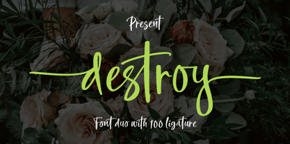 INTRODUCING Destroy Brush is handwritten font with a modern Brush feel. Destroy Brush is perfect for modern projects, headings, blogs, logos, brandings, web design, card, coffee shop, t-shirt, invitations and more! Programs that support in this font is a Microsoft Office Adobe Photo Shop, Adobe Illustrator, Adobe Indesign, and Corel Draw, badges etc. Thank You Font Lovers....!
 - Waikiki Doodles by Outside the Line,
$19.00 Take a little trip to the land of sun and sand with Waikiki Doodles. 30 resort drawings that can be used for Waikiki and other warm weather destinations. From generic tourist icons like palm trees and a camera to the specific like Diamond Head and hula dancer. 29 drawings and the word Aloha lettered in script.
 - Shaunte by Trophy Font,
$21.00 Shaunte is eye-catching display bold typeface that comes in four styles: normal, inktraps, rounded, inktraps rounded. a display sans-serif with an inverted or reverse contrast. Its imperfections keep it casual while still providing legibility. Shaunte is a powerful option at large sizes for use on headings, posters, billboards, magazines, advertisements, from casual to hipster. etc.
 - UNY by TEKNIKE,
$45.00 UNY is a display slab serif font. UNY is a distinct all caps geometric typeface inspired by varsity, college and university sports as well as the military. The UNY name was derived as a new styled acronym from the word university. UNY is great for sports, sports teams, schools, fantasy, display work, invitations, writing, quotes, posters, acronyms and headings.
 - Wolfriend by Letterafandi Studio,
$9.00 Wolfriend is a refined and graceful calligraphy typeface with characters that dance along the baseline. It can be used for various purposes such as logos, wedding invitations, headings, t-shirts, letterhead, signage, labels, news, posters, badges and so much more. Wolfriend is PUA encoded which means you can access all of the glyphs and swashes with ease!
 - Sophia Laluna by Typehand Studio,
$18.00 Sophia Laluna is display serif that works beautifully for branding projects and quotes. Best used as a display for heading and logos, Sophia Laluna give any project a touch of luxury and class. Sophia laluna is beautifully upper and lowercase typeface that looks incredible in both large and small settings as a display and body text.
 - Violets by Tanincreate,
$12.00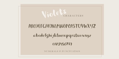 Violets is a cute handwritten brush font designed initially for using in a packaging design. Quirky and casual it is actually very versatile, and can be used in a variety of project styles - children book design, invitations, quotes, headings, blogs, logos and more, where a hand written type is needed. Features numbers, signs, punctuation, multilingual glyphs.

