10,000 search results
(0.034 seconds)
- Brogi by Factory738,
$15.00 Brogi is a stylish sans serif font designed specifically for logo and brand designs. Brogi exuded a sense of boldness and sophistication despite his menacing styles. Ligature fonts can be used for almost any purpose you can imagine. 10 Weights (Light, Regular, Medium, Bold and Black) 2 Styles (Regular & Italic) Basic Latin A-Z and a-z Numerals & Punctuation Stylistic Ligatures Multilingual Support for ä ö ü Ä Ö Ü ... Free updates and feature additions Thanks for looking, and I hope you enjoy it.
 - Quirk by Wooden Type Fonts,
$15.00A grunge font, drawn largely by hand. Characters are deliberately dissimilar. Very informal. - Sidkit MF by Masterfont,
$59.00 Grunge, rough, very coarse typeface. Great for posters, book jacket, music ads etc.
 - Olarwe by Ardyanatypes,
$15.00 A modern and elegant look of a sans serif tagline. This font comes with nine levels of thickness, from light to black, according to your needs. It pairs well with san serif and modern script as pictured or stands alone as a representative header and brand for an elegant look. Olarwe is equipped with a professional modern character font that can present an elegant and attractive identity for your company for business use, such as business cards, name tags, and uniforms as brand elevation. This modern Olarwe typeface is suitable for embossing as letter nameplates or even sprinkling them in your office with elegant-looking cutting stickers. This elegant Olarwe-type shape also looks excellent for book covers or magazine articles. You can see all the available characters in the screenshot above, and you can try the modern & elegant Olarwe now for any design issues. Olarwe is also multilingual, making it easy to work with for any country and language use. It also comes with Ligatures and alternative stylistics to make your designs more attractive.
 - Kaligawe by Locomotype,
$19.00 Introducing Kaligawe, the perfect font for designers looking to make a bold statement with their work. This display sans font boasts a unique blend of mediaeval and sans-serif characteristics that will give your designs a distinct edge. With nine weights available, from Thin to Black, you'll have plenty of options to choose from when it comes to creating eye-catching posters, attention-grabbing headlines, captivating movie titles, and stylish packaging. What sets Kaligawe apart from other fonts is its ability to combine old-world charm with modern style. Its mediaeval touches provide a classic, timeless feel, while its strong sans-serif characteristics give it a contemporary edge. The result is a font that can be used for a wide range of design projects, whether you're creating something with a vintage vibe or a more modern look.
 - Acto by DSType,
$40.00 Acto is a type system designed as the sans serif counterpart of the previous released Acta. Both type families were designed in 2010 for the redesign of the Chilean newspaper La Tercera, but unlike some of our previous fonts (i.e., Leitura) Acto doesn't exactly match Acta in terms of structure, so they can live on their own. Acto is our first sans where the uppercase has the same height as the ascenders, so we decided to avoid common problems like the confusion between the I and the l, by drawing a curved l. We kept that spirit by removing the spurs on the b, g and q, resulting on a more warm typeface than Prelo, for instance. In the end it's a very powerful sans family, with eleven weights with matching italics, for editorial and corporate design.
 - Varisse by AVP,
$19.00 Varisse spans over two centuries of type design and draws its inspiration from well-loved classics that are as fresh today as they were when they were created. The range stretches from a quintessential 18th century transitional serif to an uncompromising 20th century sans. Think Baskerville, think Gill. The idea was to create a family that shared similar forms and the same vertical metrics, allowing them to be mixed to provide impact and readability as required. With a generous x-height and a host of options, the Varisse family is ideally suited to branding, packaging, magazines and editorial. It also provides a wealth of opportunity in website presentation. The fonts are divided into five subfamilies by degree of ‘serification’. Varisse Sans Varisse Soft Sans Varisse (normal) Varisse Soft Serif Varisse Serif Each subfamily contains six weights and accompanying italics.
 - Brinar by Hackberry Font Foundry,
$24.95 I've been working on a usable sans serif for body copy since the mid-1990s (though I certainly did not know it at the time). This one works well. It started life back in the mists of time as a scan of an old German font by Carl Fahrenwaldt. It was developed fully as a synergized serif with strong traditional roots and released as Bergsland Pro. Now it finally makes it to where I was headed all along as a sans text font. This is a well modulated humanist, sans serif font family with many OpenType features and over 600 characters: Caps, lower case, small caps, ligatures, swashes, small cap figures, old style figures, numerators, denominators, accents characters, ordinal numbers, and so on. It is designed for text use in body copy. But it also works very well for elegantly stylized display.
 - Between by Monotype,
$40.99 Akira Kobayashi’s Between™ typeface comes in three main states. While different from each other, they all offer human-centered design to ensure that copy set in them is affable and approachable. An added benefit is the ability to transition “between” font designs, choosing different styles – or even individual characters – to create hierarchy, contrast or emphasis. Kobayashi designed the Between typeface in response to the current popularity of rounded, humanist sans serif designs over the cool grotesques of the 20th century. Between 1 melds industrial and humanist sans ethics. Between 2 represents a sans version of Kobayashi’s Cosmiqua® typeface, striking a balance between crisp and legible, organic and friendly. Between 3 is a freestyle sans with an uplifting sprightly mien. Between has 48 styles; each has eight weights of roman with its own italic counterpart. The family offers a large set of alternative glyphs and OpenType® features. A full interactive type specimen can be viewed here: http://www.monotype.com/fonts/between/ Featured in: Best Fonts for Logos
 - Preto Semi OT Std by DizajnDesign,
$- Preto Semi is an experiment. It is an attempt to create a readable type for text point sizes (other than sans-serif and serif). Preto Semi is not a Sans with added serifs or Serif with serifs removed. The use of the serifs is redefined and used for other purpose(s). The serifs became the extension of the stroke, they help to solve the spacing problem of sans-serif types and they use the primary function of serifs – keeping the eye on the baseline and emphasize the horizontal rhythm of the lines of text. Preto Semi is intended for magazines and editorial design, as other members of Preto family. Preto is an extensive type family, which explores the function of serifs on readability and legibility. Preto consist of three subfamilies: Sans, Semi and Serif. Preto is designed for multilingual typesetting. All of the subfamilies have equal gray value but different texture which can be use to differentiate languages. Preto sub-families have two text weights and two bold styles (Regular -> Bold, Medium -> Black). Every weight has a companion Italic style as well.
 - Preto Semi by DizajnDesign,
$24.00 Preto Semi is an experiment. It is an attempt to create a readable type for text point sizes (other than sans-serif and serif). Preto Semi is not a Sans with added serifs or Serif with serifs removed. The use of the serifs is redefined and used for other purpose(s). The serifs became the extension of the stroke, they help to solve the spacing problem of sans-serif types and they use the primary function of serifs – keeping the eye on the baseline and emphasize the horizontal rhythm of the lines of text. Preto Semi is intended for magazines and editorial design, as other members of Preto family. Preto is an extensive type family, which explores the function of serifs on readability and legibility. Preto consist of three subfamilies: Sans, Semi and Serif. Preto is designed for multilingual typesetting. All of the subfamilies have equal gray value but different texture which can be use to differentiate languages. Preto sub-families have two text weights and two bold styles (Regular -> Bold, Medium -> Black). Every weight has a companion Italic style as well.
 - GF Gesetz - Unknown license

- Avenir Next Cyrillic by Linotype,
$49.00 The original Avenir typeface was designed by Adrian Frutiger in 1988, after years of having an interest in sans serif typefaces. The word Avenir means “future” in French and hints that the typeface owes some of its interpretation to Futura. But unlike Futura, Avenir is not purely geometric; it has vertical strokes that are thicker than the horizontals, an “o” that is not a perfect circle, and shortened ascenders. These nuances aid in legibility and give Avenir a harmonious and sensible appearance for both texts and headlines. In 2012, Akira Kobayashi worked alongside Avenir’s esteemed creator Adrian Frutiger to bring Avenir Next to life, as a new take on the classic Avenir. The goal of the project was to take a beautifully designed sans and update it so that its technical standards surpass the status quo, leaving us with a truly superior sans family. Since then, Monotype expanded the typeface to accommodate more languages. Akira’s deep familiarity with existing iterations of the Frutiger designs, along with his understanding of the design philosophy of the man himself, made him uniquely suited to lead the creation of different language fonts. Avenir Next World family, the most recent release from Monotype, is an expansive family of fonts that offers support for more than 150 languages and scripts that include Latin, Cyrillic, Greek, Hebrew, Arabic, Georgian, Armenian and Thai. Avenir Next World contains 10 weights, from UltraLight to Heavy. The respective 10 Italic styles do not support Arabic, Georgian and Thai, since Italic styles are unfamiliar in these scripts/languages. Separate Non-Latin products to support just the Arabic, Cyrillic, Georgian, Hebrew and Thai script are also available for those who do not need the full language support.
 - Avenir Next World by Linotype,
$149.00 The original Avenir typeface was designed by Adrian Frutiger in 1988, after years of having an interest in sans serif typefaces. The word Avenir means “future” in French and hints that the typeface owes some of its interpretation to Futura. But unlike Futura, Avenir is not purely geometric; it has vertical strokes that are thicker than the horizontals, an “o” that is not a perfect circle, and shortened ascenders. These nuances aid in legibility and give Avenir a harmonious and sensible appearance for both texts and headlines. In 2012, Akira Kobayashi worked alongside Avenir’s esteemed creator Adrian Frutiger to bring Avenir Next to life, as a new take on the classic Avenir. The goal of the project was to take a beautifully designed sans and update it so that its technical standards surpass the status quo, leaving us with a truly superior sans family. Since then, Monotype expanded the typeface to accommodate more languages. Akira’s deep familiarity with existing iterations of the Frutiger designs, along with his understanding of the design philosophy of the man himself, made him uniquely suited to lead the creation of different language fonts. Avenir Next World family, the most recent release from Monotype, is an expansive family of fonts that offers support for more than 150 languages and scripts that include Latin, Cyrillic, Greek, Hebrew, Arabic, Georgian, Armenian and Thai. Avenir Next World contains 10 weights, from UltraLight to Heavy. The respective 10 Italic styles do not support Arabic, Georgian and Thai, since Italic styles are unfamiliar in these scripts/languages. Separate Non-Latin products to support just the Arabic, Cyrillic, Georgian, Hebrew and Thai script are also available for those who do not need the full language support.
 - Avenir Next Hebrew by Linotype,
$79.00 The original Avenir typeface was designed by Adrian Frutiger in 1988, after years of having an interest in sans serif typefaces. The word Avenir means “future” in French and hints that the typeface owes some of its interpretation to Futura. But unlike Futura, Avenir is not purely geometric; it has vertical strokes that are thicker than the horizontals, an “o” that is not a perfect circle, and shortened ascenders. These nuances aid in legibility and give Avenir a harmonious and sensible appearance for both texts and headlines. In 2012, Akira Kobayashi worked alongside Avenir’s esteemed creator Adrian Frutiger to bring Avenir Next to life, as a new take on the classic Avenir. The goal of the project was to take a beautifully designed sans and update it so that its technical standards surpass the status quo, leaving us with a truly superior sans family. Since then, Monotype expanded the typeface to accommodate more languages. Akira’s deep familiarity with existing iterations of the Frutiger designs, along with his understanding of the design philosophy of the man himself, made him uniquely suited to lead the creation of different language fonts. Avenir Next World family, the most recent release from Monotype, is an expansive family of fonts that offers support for more than 150 languages and scripts that include Latin, Cyrillic, Greek, Hebrew, Arabic, Georgian, Armenian and Thai. Avenir Next World contains 10 weights, from UltraLight to Heavy. The respective 10 Italic styles do not support Arabic, Georgian and Thai, since Italic styles are unfamiliar in these scripts/languages. Separate Non-Latin products to support just the Arabic, Cyrillic, Georgian, Hebrew and Thai script are also available for those who do not need the full language support.
 - Only You Sexy Icons by LeType,
$19.90 The Icons developed to the font Only You Sexy make reference to hipsters concept a recurring nostalgia and a recovery of an almost forgotten romanticism. Bring all that romance back. Bring the sensuality in your works and projects. The font has more than 300 icons. Also available Only You Sexy.
 - Addison by Kimmy Design,
$15.00 Addison is a typeface that brings together modern western styles with a rustic texture. Between Addison West, with thick block serifs, and Circus, a more decorative face, the two would bring an authentic and unique style to any artwork. The bold faces make a stand and standout for any design concept.
 - Miracle Boy by NJ Studio,
$9.00 Hi...Thank for your visit :) Miracle Boy a display font. It features fun characters that will take your projects to the next level! This font is PUA code which means you can easily access all the glyphs that are full of sans! It also features many special features including glyphs. font designs that are made for various vector designs, printing such as digital wedding blogs, online shops, social media, while printing can be used in the field of product clothing, accessories, bags, pins, logos, business cards, watermarks and many others ... so it can make your product look fun and attractive, and also Multilingual support!!! Happy design ...
 - Silver Miranda by Asenbayu,
$15.00 Silver Miranda is a sans serif font with an elegant and classy. Each typeface is crafted to produce a vintage modern font. This font features can direct you to access unique typeface collections. You can make works with clean elegant and professional writing, or make attractive decorative with alternative and ligature styles. This font is great for creating any desired projects such as logos, posters, headlines, albums, quotes, clothes and many more. This font is perfect for you if you want to come up with something interesting! Please see the pictures provided. I would like to know how you can get creative with this font. Thank you!
 - Hello Cute by NJ Studio,
$9.00 Hi...Thank for your visit :) Hello Cute a playpul font. It features fun characters that will take your projects to the next level! This font is PUA code which means you can easily access all the glyphs that are full of sans! It also features many special features including glyphs. font designs that are made for various vector designs, printing such as digital wedding blogs, online shops, social media, while printing can be used in the field of product clothing, accessories, bags, pins, logos, business cards, watermarks and many others ... so it can make your product look fun and attractive, and also Multilingual support!!! Happy design ...
 - Radona by insigne,
$29.00 Radona is a blast from the 80’s that's rader than rad. Radona is the typeface version of Synthwave, an electronic music subgenre that takes influence from the 1980s but builds on it, resulting in a construct that lives in the minds of both those who have experienced it and those who haven't. Radona expresses a nostalgia for 1980s culture, attempting to replicate and appreciate the era's vibe, but extends it further with something new. This sans family has plenty of 80's flavor, but with some fresh twists to push it to the limit. Radona is a geometric sans-serif typeface. Radona has a few quirky characteristics, but it has a generally neutral tone and structure that makes it ideal for usage in print, especially when a contemporary look is desired. It looks amazing in both body text and headlines. The geometric grotesques that were popular in the 1980s served as inspiration. It's a typeface that's been crafted for usage in a range of design fields, from branding to packaging, and it can be used in anything from interfaces to apps. Radona is an excellent typeface for use on websites and other digital applications. Radona comes with a wide variety of styles and a large selection of stylistic alternatives, ligatures, small caps and other special features. Along with parachute pants, synthesized guitar riffs, and VHS scanlines, Radona brings back the 1980’s.
 - Branden by Craft Supply Co,
$17.00 Branden – Casual Sans Serif Font is a modern sans serif font family whose design refers us to the style of casual sans serif. The distinctive features of Branden – Casual Sans Serif Font are the relatively low contrast of strokes, the slightly squarish shapes of round characters and the emphasized business like simplicity.
 - FS Albert by Fontsmith,
$80.00 The x factor How do you make a font like FS Albert unique, distinctive? “When designing a font I try to question every letter,” says Jason Smith, “but all you need is a few that have an x factor. With FS Albert, they’re the lowercase ‘a’ and ‘g’ and the uppercase ‘I’ and ‘J’. “I remember a friend saying, ‘Why on earth have you designed the ‘a’ like that? Isn’t it too friendly for this kind of font?’ And, in a way, that’s what I wanted – honesty and warmth, because a lot of big brands at the time really needed to show a more human side.” Range of weights and styles FS Albert is a charismatic type: a warm, friendly sans serif face with a big personality. Open, strong and amenable, and available in a wide range of weights and styles, FS Albert suits almost every task you put it to. Fontsmith has crafted five finely-tuned upright Roman weights and four italic weights, as well as a special Narrow version to provide the best coverage and give headlines and text an easy-going character. The chunky kid “FS Albert was inspired by – and named after – my son, who was a bit of a chunky kid,” says Jason Smith. “I designed an extra bold weight because I always felt that the really big font heavy weights had the most personality. “I recently told Albert this story. He laughed, and forgave me for thinking he was a fat baby. He liked the big personality bit, though.” 1000s of glyphs Not content with a character set that covered Europe and the whole of the Western world, the studio decided to go further afield. There are now FS Albert character sets that cover western and eastern European languages, including those of Russia, as well as Cyrillic, Arabic and Greek scripts. In fact, the font now covers more than 100 languages, making it ideal for bringing a consistent typographic style to the communications of global brands.
 - FS Albert Paneuropean by Fontsmith,
$90.00The x factor How do you make a font like FS Albert unique, distinctive? “When designing a font I try to question every letter,” says Jason Smith, “but all you need is a few that have an x factor. With FS Albert, they’re the lowercase ‘a’ and ‘g’ and the uppercase ‘I’ and ‘J’. “I remember a friend saying, ‘Why on earth have you designed the ‘a’ like that? Isn’t it too friendly for this kind of font?’ And, in a way, that’s what I wanted – honesty and warmth, because a lot of big brands at the time really needed to show a more human side.” Range of weights and styles FS Albert is a charismatic type: a warm, friendly sans serif face with a big personality. Open, strong and amenable, and available in a wide range of weights and styles, FS Albert suits almost every task you put it to. Fontsmith has crafted five finely-tuned upright Roman weights and four italic weights, as well as a special Narrow version to provide the best coverage and give headlines and text an easy-going character. The chunky kid “FS Albert was inspired by – and named after – my son, who was a bit of a chunky kid,” says Jason Smith. “I designed an extra bold weight because I always felt that the really big font heavy weights had the most personality. “I recently told Albert this story. He laughed, and forgave me for thinking he was a fat baby. He liked the big personality bit, though.” 1000s of glyphs Not content with a character set that covered Europe and the whole of the Western world, the studio decided to go further afield. There are now FS Albert character sets that cover western and eastern European languages, including those of Russia, as well as Cyrillic, Arabic and Greek scripts. In fact, the font now covers more than 100 languages, making it ideal for bringing a consistent typographic style to the communications of global brands. - Motopica by Anomali Creative,
$19.99 Motopica was born when I watched a show, namely "the pickers". At that time I realized that there were still many communities or people who really loved Western culture (Cowboy), Vintage Style in the 40s - 60s era and Classic Motorbike style (Caferacer). So I intend to combine these three concepts into a single font, and Motopica was born, which brings the spirit of the three styles, namely Western Cowboy, Vintage, Beer and motorbike. Motopica can be used as a Vintage Poster, Vintage Signage, Vintage badge What's Included Motopica Reguler Motopica Italic Motopica College Motopica Bold How to install your new font This font can be used with all software that can read standard fonts. Check out my instagram for update: https://www.instagram.com/anomalikreatif/ Thanks so much for checking out my shop! All the best, Krisna
 - Mosherif by HansCo,
$12.00 Mosherif is a type of sherif font created with the aim of using for logo branding and print media. This font has three style that can be combined manually with one another in one word / text so that it looks unique and interesting. One example is in the first preview ( cover ), where the word "MOSHERIF" was made using three font styles ( Mosherif Regular, Mosherif Tall and Mosherif Short ). You can make it manually by making a space and remove some characters between words "MOSHERIF" becomes "M HE F" with using the font "Mosherif Tall" and fill it with "Mosherif Regular" in character "O" and "R" and "Mosherif Short" in character "S" and "I" by stacking them. By bringing the concept of vintage, clean, thick and sharp, hopefully Mosherif can provide choices for designers. Enjoy!
 - Sharp Stroke by Kaer,
$15.00 Hand drawn felt pen font. Vector grunge style design for your posters or prints.
 - Demented Avenger by Phat Phonts,
$20.00A splattery grunge font with ink blobs suitable for horror movies or Halloween use - Jaguarundi by Dharma Type,
$9.99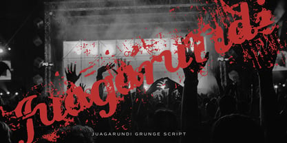 This extremely scratched and decadent font is suitable for posters of rock or grunge.
 - Rust Bucket by BA Graphics,
$45.00 A mild grunge, a simple distressed gothic with just enough roughness to be cool.
 - Kaminari-Kun by Julmeme,
$25.00 Kaminari-Kun is a typeface that has a very strong and unique impact. With its iconic saw-toothed design, characters can fit into each other and can be associated to create an modern and electric design. Applicable for any type of graphic design, especially for posters and logotypes.
 - Tim Sale by Comicraft,
$39.00 If you're familiar with the work of Eisner Award winning artist Tim Sale, you'll also be familiar with the soft curves and hard edges of the characters he brings so vividly to life in the pages of GRENDEL, BATMAN and SUPERMAN. Now you can get to know a selection of the characters Tim has been working on his whole life, and Comicraft has been kind enough to arrange them in alphabetical order for you! Based on Tim's own hand lettering work in the lost Dark Horse classic, BILLI 99, the Tim Sale font brings together the class and finesse of Hunter Rose, the elegance and charm of Bruce Wayne and the honesty and trustworthiness of Clark Kent. Don't go into the big city alone at night without it. See the families related to Tim Sale: Tim Sale Lower & Tim Sale Brush.
 - GF Halda Smashed - Unknown license

- GF Halda Normal - Unknown license

- Blackfire by Fype Co,
$13.00 Blackfire is a classic sans serif font that features beautiful alternates and ligatures, with regular and rounded edges in favor of a smooth and clean look. Blackfire features beautiful alternates and ligatures, allowing you to experiment with and create a multitude of stunning results. You can also use Blackfire for design projects like logotype, poster, promotional design, header, and many more.
 - Jungle Giant by Rachel Kick,
$12.00 Jungle Giant is a quirky, hand-drawn sans and script duo. It has a playful and organic feel that works great for branding, social media, and marketing! The script includes over 35 alternatives with swashes and alternate styles. The uppercase print includes 2 styles - regular and italic so that it can match the tilt of the script or stand on its own.
 - Puipui by Jipatype,
$25.00 Puipui is a sans serif typeface with a rounded, contrast stroke and minimal look. Comes with 9 weights and italics of each weight total 18 styles. Support multi-languages and Thai language. Suitable for Headline or text body. Puipui can help you to create a mood and tone of cuteness suitable for kid, pet, food product or anything about cuteness content.
 - Eterna by Wiescher Design,
$39.50 Eterna is a very beautiful font with diverse uses. In small sizes it acts like it was a Sans typeface, the swings and points tend to be overlooked. In bigger sizes it works as a very elegant embellished typeface, showing off the rich forms. The capital letters can also successfully be used as Initials. Your designer of very versatile fonts Gert Wiescher
 - Cursive Signa Script Variable by Pedro Teixeira,
$670.00 Cursive Signa Script Variable, quite possibly the first true cursive and signature variable font. It has 90 styles that range between weight, slant and alternates. It can be use in a lot of projects, like logos, end of a statement, pairing with a beautiful sans serif like Aleante, in a title, invites and so on. Designed by Pedro Alexandre Teixeira
 - Namyv by Poloskov,
$14.50 Namyv is the first font I did ... and now it’s improved! I combined all the best of the font. It’s unique and interesting. A great choice for website and app designs. I'm using Namyv Bold for posters and other print designs. It's very strong! And you can combine Namyv font with any Sans Serif font. They will look fantastic. Cyrillic characters included!


