10,000 search results
(0.044 seconds)
- Alpengeist JF by Jukebox Collection,
$32.99 This typeface was inspired by a hand lettered sign for a German-themed attraction. A good choice when a legible blackletter face is needed, this font is useful for a variety of designs or for personalizing your Alpenhorn.
 - Longbow BB by Blambot,
$20.00 Longbow BB is an unconventional gothic/blackletter typeface with a hefty compliment of European characters. The Opentype version has autoligatures to make any two adjacent, duplicate letters or numbers look slightly different for a more hand-lettered look.
 - Hobenshaw by Letterara,
$10.00 Introducing a new hand drawn font carefully crafted with a personal charm. It is a hot font, perfect for a design that stands out even if it’s a logo or simply a stylish text over a background image.
 - ArTarumianGrigNor by Tarumian,
$40.00 This typeface reproduces letters written with a broad-nib pen casually by hand. The pen direction is close to vertical. Designed to create captions for illustrations, especially children's books, as well as for inscriptions in balloons of comics.
 - Twigglee by Ingrimayne Type,
$9.95 Twigglee was inspired by the hand lettering on the plates in a 19th century book on ornaments by Owen Jones. It has no lower-case letters; the upper-case letters are simply repeated on the lower-case keys.
 - Agatized Formal by ULGA Type,
$25.00 Agatized Formal is a chunky stencil typeface with slightly condensed letterforms and tight spacing. Designed primarily for display use, it’s ideal for posters, logos, advertising, book cover designs or small chunks of text such as pull-out quotes. It exudes authority without taking itself seriously, like a plump jolly uncle in charge of a brass band. Agatized Formal is a big, bold typeface with a charismatic presence that commands attention – in a friendly way, of course. But what really makes this typeface come alive is its arsenal of alternative characters and ligatures. There is a saying: Use sparingly. Whoa! Not here, no, no, no. Make your Glyphs palette earn its money. Flex your OpenType muscles: get stylized, contextualized, indulge in some ligaddiction. This typeface is a peacock that likes to put on a show, spread its plumage and strut around in all its blazing glory. Agatized, according to Wiktionary, means: A living thing converted into the form of agate; fossilized. I felt the name suited the solid, almost rock-like letterforms, but most of all I just wanted a typeface name that began with the letter A. Although Agatized Formal is a single-weight typeface it has a sibling, Agatized Informal, an older, more casual brother, rougher round the edges with craggy good looks and an altogether more jaunty style.
 - Obliterate GRP by Grype,
$16.00 Obliterate is a self destructing sans-serif typeface created from old rub off typography sheets brought back from the brink of becoming landfill fodder. It contains four sets of capitals and one alternate set of numerals for a randomized look. Here’s what’s included with Obliterate: 633 glyphs - including Capitals, Alternate Capitals (in lowercase slots), Numerals, Punctuation, two additional alternate Capitals sets and an extensive character set that covers multilingual support of latin based languages. (see the last graphic for a preview of the characters included) Ligatures Feature that auto-switches between Capitals & three other alternate Capitals glyphsets, as well as Numerals and Alternate Numerals for visual randomness. The ligatures feature will be automatically enabled for most with opentype compatibility, otherwise you can access the alternate glyphs via a Glyphs panel. (try typing below to watch it alternate between sets) Four Sets of Distressed Capitals each come complete with international accented characters for each version. Here’s why Obliterate is for you: You're into legible but distressed typestyles that imitate a random looking distress to it You're a fan of the band Inner Circle, whom the font was originally a tribute to You're a fan of old Letraset/Transfertype rub off lettering You're designing a modern horror movie poster and want a typeface with some tooth to it You just like to collect quality fonts to add to your design arsenal
 - Guaruja Neue by Tipogra Fio,
$- Get in touch with Tipogra Fio and get inspired by Guaruja Neue specimens. Guaruja Neue is a neo-grotesque typeface with additional industrial traits to it, such as open corners in diagonal glyphs and short curves. The semi-cursive italics shapes, more than an orthographic matter, give sea waves for the headlines and copies that Guaruja Neue will compose, since it is named after a city on the coast of São Paulo, Brazil. Stylistic alternates, ligatures, ordinals, arrows and emojis give extra personality for texts that cross millennial and modernist concepts, going from a comprehensive Latin script, including Vietnamese support, until a basic Cyrillic set. Brazilian music tells the graphic story of Guaruja Neue specimens, songs that speak about beaches and the city of Guarujá, as well as the inspiration of 50’s and 60’s modernist design and the music movement of Bossa Nova. This family is also an evolution of Guaruja Grotesk (2021), a typeface with four fonts —Regular, Italic, Bold and Bold Italic— developed as part of a design school project, that now in Neue gains professionalism, refinement and knowledge. Guaruja Grotesk took 18 months to make, and Neue took additional 12 months of redrawing and rethinking, as design as processes. Part of the project got feedback from the typeface designer Ulrike Raush, under the Alphabettes mentorship program. Overview and features: 8 weights and 8 italics; 2 free fonts: Guaruja Neue Regular and Guaruja Neue Italic; Extended Latin and basic Cyrillic; 800+ glyphs; Numbers: proportional, tabular, superscripts, subscripts, denominators, numerators and fractions; Greek for math; Case-Sensitive forms; Arrows; Standard and discretionary ligatures; SS01: one story a and SS02: two story g; Emojis and SS03: negative alternate emojis; Ligatures for English ordinals;
 - FS Sally by Fontsmith,
$80.00 Bookish A little bit bookish, but quietly elegant and well-proportioned, FS Sally is a graceful font family. It’s a refreshingly uncomplicated design that brings sophistication to text and display type, and a distinctive aplomb to both large and small volumes of text. Hidden talents There’s more to FS Sally than meets the eye. Choose Standard for the Latin alphabet or Pro if you work with Cyrillic and Greek typography. There’s a large range of special features, including elegant small caps and a set of discretionary ligatures to add a traditional flavour to figures and fraction sets. Rhythmic There’s a rhythm and flow to FS Sally – the result of the classic but asymmetric design of its serifed feet and shoulders. The inward curve of the serif at the shoulder and the outward curve at the foot subliminally guide the eye through each letterform, and the flicked feet of the “a”, “d” and “u” add an extra kick of energy to the rhythm. The italic forms have their own flow, too, with a pen-like fluency that retains the formal discipline required for a text type. Regular to heavy FS Sally’s five weights, all with italics, cover every kind of print application. The regular weight is elegant in display and an easy read in longer texts. A subtle step up from the regular is the medium, which was created to deliver a stronger colour and finish in poorer printing conditions. The semibold offers a strong alternative to the regular at smaller sizes, and its intermediate feel suits it to sub-headings, title pages and calmer designs. The bold works excellently in book and title headings, and FS Sally Heavy lends weight and punch to poster headlines and logotypes.
 - FS Sally Paneuropean by Fontsmith,
$90.00Bookish A little bit bookish, but quietly elegant and well-proportioned, FS Sally is a graceful font family. It’s a refreshingly uncomplicated design that brings sophistication to text and display type, and a distinctive aplomb to both large and small volumes of text. Hidden talents There’s more to FS Sally than meets the eye. Choose Standard for the Latin alphabet or Pro if you work with Cyrillic and Greek typography. There’s a large range of special features, including elegant small caps and a set of discretionary ligatures to add a traditional flavour to figures and fraction sets. Rhythmic There’s a rhythm and flow to FS Sally – the result of the classic but asymmetric design of its serifed feet and shoulders. The inward curve of the serif at the shoulder and the outward curve at the foot subliminally guide the eye through each letterform, and the flicked feet of the “a”, “d” and “u” add an extra kick of energy to the rhythm. The italic forms have their own flow, too, with a pen-like fluency that retains the formal discipline required for a text type. Regular to heavy FS Sally’s five weights, all with italics, cover every kind of print application. The regular weight is elegant in display and an easy read in longer texts. A subtle step up from the regular is the medium, which was created to deliver a stronger colour and finish in poorer printing conditions. The semibold offers a strong alternative to the regular at smaller sizes, and its intermediate feel suits it to sub-headings, title pages and calmer designs. The bold works excellently in book and title headings, and FS Sally Heavy lends weight and punch to poster headlines and logotypes. - LFT Arnoldo by TypeTogether,
$39.00 LFT Arnoldo began as an all-caps book cover typeface created during the rebranding of Oscar Mondadori, the most important Italian publisher, with over 4,500 titles from ancient classics to contemporary works, and spanning academic essays to children’s and self-help books. For such a diverse catalogue, it was necessary to find a coherent and flexible paradigm which took into account genre and readership differences and ensured harmony among its works. The main idea was to create a typeface suitable for the branding element and which could be used for each title of the immense catalogue. So what makes LFT Arnoldo a companion to the centuries? Starting with the design of the capital letters, it is first a rational typeface with contemporary proportions. But rationality without style wasn’t enough, so its glyphic nature carries an engraved feeling to resemble letters when chisel is put to stone. Once these two traits were settled, the entire character set was developed as a flared humanist sans in order to complete the family and extend its usage, from titles and display settings to texts. LFT Arnoldo sets titles with dignified authority to appear digitally carved and more arresting than the usual sans or flared sans designs of the past. It is calm and dependable in paragraph use and a captivating vehicle of aesthetic expression in title and display use. At once rugged and syncopated, the slight hourglass stems and incised details make each letter come alive and engrave each paragraph upon our emotions. LFT Arnoldo intends to be a resilient type family for centuries to come. Its seven roman weights have italic counterparts and the entire family is loaded with OpenType features: alternates, ligatures, small caps, oldstyle and lining numerals, and science and math capabilities. In the battle of charisma, where the right voice must project intelligence, influence, and refinement, LFT Arnoldo is the victor.
 - Magola by Andinistas,
$39.95 Magola is a creamy flavor font family whose purpose is to season with emotions the reading of words and phrases formed by puffy glyphs coated with a caramel of empty spaces external and internal. Independently or in groups, members of the family serve to decorate and organize packaging or advertising material in letters apparently crafted for food or entertainment contexts. Its starting point was to draw letters like a ballon fish evolved into a black version with empty areas and microscopic contrasted with colorful inflated and filled areas. Then the challenge was based on the sum transferred between full and empty into a lighter caliber. In that vein, its overall design adapted skeletons of italics and Roman calligraphy. Therefore, its regular, bold and black files have great height "x" with upwards and downwards extremely short and large internal counterblocks to facilitate reading. In this regard, to strengthen its objective and capture the reader's attention, its kind of contrast and simulated auctions flat tip brush strokes, and amount of contrast between thick and thin in the black version is slightly inverted. Its sizes, smooth strokes and irregular lines reinforce its traditional spirit, so it is favorable to shine the information on posters or large-format media. In short, its optical conformation based on a non-literal way, in metrics similar in all family members to be easily exchanged without changing the ìxî height. It is therefore a striking and versatile tool, that besides being useful in large sizes, can be used in small sizes as well. And more importantly, its general concept is more profitable when its members are mixed to nest headings, subheadings and short paragraphs, designed according to size, position, color and location in logos, covers, posters, ads and flyers.
 - Antique Packaging JNL by Jeff Levine,
$29.00 The box cover of “Drawing Stencils No. 3 for Use on Slate or Paper” [a children’s drawing set produced by Montgomery, Ward & Company of Chicago circa the 1890s] had its title in an elegant spurred Roman type face. Working from the few letters available, a complete character set was created that resulted in Antique Packaging JNL, which is available in both regular and oblique versions. To note, this is the 1500th font release from Jeff Levine Fonts since its inception in January of 2006.
 - VLNL Irish Stew by VetteLetters,
$35.00 Obviously the Irish Stew font finds its origin in Ireland. During a vacation in West Ireland Donald® fell in love with the famous local dish. In fact, he loved Irish stew so much he couldn't wait to create a font dedicated to the stew from Ballymaloe. He found the inspiration for this font on an old shop front sign somewhere in Dublin. The sign only contained a few characters, but the stew had given him more than enough energy and inspiration to complete the whole alphabet!
 - ITC Zinzinnati by ITC,
$29.99ITC Zinzinnati is based on a font called Ohio, released in 1924 by Die Schriftguss A.G. Typical of the Plakatstil letterforms of the time, the original font had a rough outline, as if drawn with a brush. Nick Curtis has smoothed the rough edges, which enhances the design's playful curves and engaging charm. As for the name: it's the punchline to an old vaudeville routine that starts with the question, Name a city in Ohio that begins with a 'Z.'" Pie in the face, comin' atcha!" - NAKED - Personal use only

- Fortima by Meat Studio,
$30.50 Fortima is a 12 style angular sans serif that utilises subtle modular shapes, designed by Stew Deane. The result is a font with character that adapts to a variety of sectors and brands, and is suitable for anything from advertising and branding to web and screen. The angular shapes help create a unique aesthetic that are instantly recognisable and have impact and character in large or small sizes.
 - Dahlia Darling by Sulthan Studio,
$12.00 This beautiful handwritten font we made very attractive with a natural touch we worked back to clean smudges and into smooth lettering it's easy when you cut as well as print stickers and other cool work you're working on this font has 3 front swashes and 3 back swashes for lowercase and one alternative for uppercase, 98 ligature Fonts include uppercase and lowercase letters, punctuation numbers, and language support
 - Tannen by Rafael Jordan,
$30.00 Tannen is an interpretation of the Emil Meyer’s Tannenberg, the result is a fun and cool blackletter display built without curves and casual look with a lot of personality and expressivity. It has 3 independent styles (regular, inline and shadow) that can be combined with each other, plus a stencil style. Tannen counts with 3 weights per style, OpenType features (ligatures, alternates, fractions and more) and supports dozens of latin languages.
 - Aeda Rift by ZP Fonts,
$20.00 Aeda Rift is a high-contrast display typeface characterized by its sharp serifs and graceful contours, mirroring the elegance and hostility of the desert landscape. Consisting of nearly 400 glyphs, this font includes a full upper and lower case Latin-based alphabet, punctuation, symbols, diacritics, and ligatures—all together supporting over 82 languages. Perfect for headlines, pull quotes, and intro decks, Aeda Rift is carefully kerned and primed for creativity.
 - Core Gaon by S-Core,
$59.00 CoreGaon is a modern sans-serif font. The main characteristics of the typeface are rounded edges of strokes and soft look & feel. Restrained angles of diagonal make text be in good order and it is helpful for legibility and readability. Supported codepages are MS Windows 1252 Latin1 and MS Windows 949 Korean consisting of 11,172 Korean letters and Symbols except Chinese. We suggest to use for books, magazines and posters.
 - Fisterra by TipoType,
$39.00 Fisterra Morte and Fisterra Fora: one typeface, two perspectives. The duality between the calm and the intensity with which we can face with each situation. Informal, serif and display in two flavors: Morte has the softness and the humanism of its voluptuous curves; Fora, the precision and accuracy of its sharp angles. They share a single skeleton of condensed uppercase letters, with expanded nuances in some alternate characters and ligatures.
 - Bamble Hearts by Awan Senja,
$14.00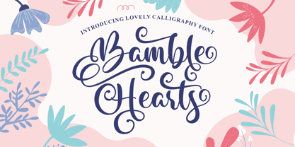 Bamble Hearts is a lovely calligraphy font. It has a modern and elegant look and is perfect for logos, branding, invitations, photography, wedding stationary, labels, and every other design which needs an unique and luxurious touch. This font is PUA encoded which means you can access all of the cute glyphs and swashes with ease! It also features a wealth of special features including alternate glyphs and ligatures.
 - Bolton Commercial by Greater Albion Typefounders,
$14.00 Bolton Commercial revives and updates one of Greater Albion's designer's earliest typeface families, Bolton, which was recently used on the credits of a popular UK television series. The family consists of five faces- Regular and Obliqued, Blocked, Embossed and Engraved. All have a late Victorian/Edwardian feel and are ideal for posters, signage, Book covers...and of course television credits! Bolton Commercial combines the virtues of flair, fun and legibility.
 - Rotenfold by HansCo,
$15.00 Rotenfold is a Elegant yet Luxury Handwriten that is luxurious in a casual and distinctive style that is perfect for your branding design, and will also be very beautiful in your wedding invitations and business cards and especially for your brand name logotype. This one should make your designs instantly professional and amazingly! Be a perfect professional in a minute and start creating with this font today! Enjoy
 - Hygge Adore by Struvictory.art,
$15.00 Hygge Adore is a delicate slab serif font with winter patterns in uppercase letters. Inspired by classic Christmas fonts and scandinavian motives. Hygge Adore font is suitable for craft products branding and packaging (handmade candles, soap, tea, coffee, ect.), Christmas and hygge design. Use individual letters and symbols to create logos and monograms. Hygge Adore includes stylistic alternates for all uppercase symbols and numbers. Alternative glyphs are without patterns.
 - Landre by Larin Type Co,
$15.00 Landre is a stylish and original multi-functional font that fits perfectly for both modern and vintage design. With it, you can create beautiful logos, labels, templates, signs, highlight text, use it for outdoor advertising, branding, and much more. Also in this font there are stylistic alternates, ligatures and swashes that will make your design even more attractive and interesting. It is easy to use and has OpenType features.
 - Carlottena by Stefani Letter,
$12.00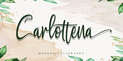 Carlottena is a beautiful and elegant script font. Its modern and classy look is perfect for logos, branding, invitations, social media posts and every other design that needs a handwritten touch and can be used for almost every design. This font is PUA encoded which means you can access all of the amazing glyphs and swashes with ease! It also features a wealth of special features including alternate glyphs and ligatures.
 - Fruge by Grontype,
$12.00 Fruge is a fresh, calm, and charming monoline handwriting font family. This font is a round edge style and equipped with extra ligatures and alternatives. Fruge is Perfect for editorial design, branding, packaging, cards, posters, stickers, quotes, social media posts and more! Features: Regular & Italics Basic Latin Glyphs Uppercase and Lowercase Letters Alternates & Ligatures Numeral and Punctuation Multilingual Support Thankyou for picking up this font, hope you enjoy it. Regard. Grontype
 - NorB Comic by NorFonts,
$28.00 NorB Comic fonts are handwritten text fonts inspired from my childhood comic comic-books, they can be used with any word processing program for text and display use, print and web projects, apps and ePub, Comic Books, graphic identities, branding, editorial, advertising, scrapbooking, cards and invitations … or even just for fun! NorB Comic fonts come with 6 weights each with their matching italics and in a Normal and Condensed version.
 - Quick Remarks by Sarid Ezra,
$17.00 Quick Remarks is a reverse and modern serif that comes with stylish and noticeable contrast. With unique uppercase and lowercase, this fonts will make your presentation, poster, or logo even more stunning and stand out! You can mix and match the uppercase and lowercase for unlimited form. This font also include many beautiful ligatures. This fonts support Multi Language. Features Uppercase with unique lowercase Ligatures Number & Symbol Multi language
 - Zaddera by Jinan Studio,
$12.00 Zaddera is a stylish script font with luxury, stylish, and elegant characteristics. Its ornate and decorative style makes it a great choice for wedding invitation design, event signs, and other design projects that require a touch of sophistication and romance. Alternative options, ligatures, and slant versions can provide a variety of looks for each letter, allowing you to customize and personalize the text to achieve the desired look.
 - Pimpus by 066.FONT,
$9.99 Pimpus is a display font in which each letter has been handwritten, giving it an authentic and original character. It exudes a varied and extravagant style, and with its daring and sophisticated letterforms, Pimpus attracts attention and gives projects a touch of nonchalance. It is ideal for creative projects such as posters, invitations or branding materials, where a striking and distinctive text finish is sought that stands out. Remastered in 2023.
 - Bandy by NamelaType,
$19.00 Rounded and bended slab that's why we named this font "Bandy" This font is great for you to use as a display font and is suitable for body text. cool anyway if you use it for your design and printing needs. Available in many languages, and open type features, supported with Latin and standard Cyrillic. Build with 14 fonts with 7 sizes with matching Oblique and 2 Variables
 - Peacy by Craft Supply Co,
$20.00 Introducing Peacy – Psychedelic Font Playful and Vibrant Typography Peacy Psychedelic Font, the ultimate psychedelic font, radiates fun and cheerfulness with its lively shapes and vibrant colors. Each letter dances with its unique personality, creating a dynamic visual experience. Reggae-Inspired Vibes Infused with the spirit of reggae music, Peacy captures freedom and positivity. Its flowing curves and wavy lines mirror the rhythmic melodies and laid-back vibes of reggae culture.
 - Gumball Machine by Rachel McBride Creative,
$9.00 Gumball Machine Typeface is everything you ever wanted in retro type design. With eight font styles, its disconnected and eccentric nature is enough to give any project some funk. Amazing for the spring and summertime! Use for website and brand design, product labeling, album/movie/project graphics, t-shirts and clothing, and anything else that needs a spark! Gumball Machine has 440 glyphs and supports most western languages.
 - Triz by Typeóca,
$30.00 Triz is a high-contrast monospaced sans-serif, bringing together a typewriter rhythm and a fashion magazine look. With 5 different weights and 3 different contrast variations, Triz shines on both footnotes and headlines. With more than 1.000 glyphs, the Triz has an extensive language support and a lot of features, like its distinctive 'thin' alternates for diacritics, symbols and punctuation, small caps, arrows, manicules and much more.
 - Hexaframe CF by Connary Fagen,
$35.00 Hexaframe CF evokes the awe and potential of of heavy machinery and robotics. Clad in tough polygons and rounded edges, Hexaframe is a perfect typeface for corporate identity, STEM toys, and user interface design. Hexaframe CF pairs well with simple typefaces set in contrasting sizes, including Greycliff CF, Artifex CF, and Visby CF. All typefaces from Connary Fagen include free updates, including new features, and free technical support.
 - ITC Dyadis by ITC,
$29.99ITC Dyadis font is the work of Austrian designer Yvonne Diedrich. It is named for the Greek word dyas", meaning duality and explores the duality of serif and sans serif letterforms, blending their styles and focusing on their connection with one another. The forms were inspired by the typefaces of the 1920s and 30s and combine the legibility and elegance of a serif font with the simplicity of sans serif." - Jorick by NREY,
$19.00 Jorick is a vintage feeling serif font inspired by retro fonts. It perfectly represents modern and vintage esthetics. The font includes both uppercase and smallcase letters. The font is perfect for wedding elegant invitation cards, beauty and fashion package design, very suitable for books design, magazines typography, packaging, branding and more other creative project. It have supporting for many european languages and perfect cyrillic! Thank you and have a great day!
