10,000 search results
(0.031 seconds)
- Bucker by Maulana Creative,
$15.00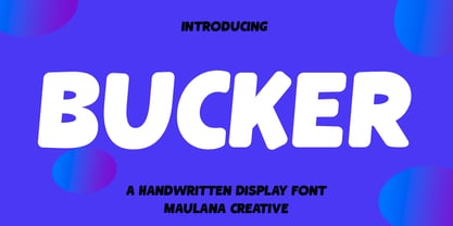 Bucker is a casual handwritten font. With slanted medium low contrast stroke, fun character with a bit of ligatures and alternates. To give you an extra creative work. Bucker font support multilingual more than 100+ language. This font is good for logo design, Social media, Movie Titles, Books Titles, a short text even a long text letter and good for your secondary text font with script or serif. Make a stunning work with Bucker font. Cheers, Maulana Creative
 - Slacker by Fenotype,
$35.00 Slacker is a carefree brush script with soft features, low contrast and well balanced character forms. Slacker is excellent for creating easygoing yet catchy headlines, logotypes or even longer texts. Slacker is equipped with Standard Ligatures and Contextual Alternates - they help to keep the flow lively and balanced and connections smooth so you should normally keep the features on. In addition Slacker has Stylistic, Swash and Titling Alternates for more showy letterforms. If you want to keep letters connecting to one another at maximum try turning on Stylistic Set 01 (SS01). On top of these Slacker has even more alternates in the Character Window making the total glyph count to 660. Slacker Extras is a set of 50+ brush strokes with the same style as the brush and a set of catchwords.
 - Quacker by Ergibi Studio,
$16.00 Quacker is a display sans font and is equipped with 80 alternative characters that make this font look beautiful. Alternative letters are provided to make this font look sweet and classy. Quacker is very good for your work such as logos, brands, packaging, posters, invitations, social media, and ads.
 - Green Mountain 3 - Unknown license

- Green Apple Splatters - Unknown license

- Village Green JNL by Jeff Levine,
$29.00 Village Green JNL is based upon a font called “Giraffe Extended” from the 1892 edition of the MacKellar, Smiths & Jordan type specimen book, and is available in both regular and oblique versions. Its Art Nouveau styling can also fit well with 1960s counter-culture revival projects. According to Wikipedia “A village green is a common open area within a village or other settlement. Historically, a village green was common grassland with a pond for watering cattle and other stock, often at the edge of a rural settlement, used for gathering cattle to bring them later on to a common land for grazing. Later, planned greens were built into the centres of villages.”
 - Let's Go Green by Atom,
$15.00 Let's Go Green is a natural, organic, casual, uneven touch font! Made naturally using brush strokes with ink on paper, giving a very unique and distinctive impression. It is ideal for logos, quotes, print media, product packaging, merchandise, advertising, social media and your design projects. Let's Go Green comes as a single font that is packed with OpenType Features. It contains the complete set of lowercase & uppercase letters, various punctuation marks, numbers, and multilingual and ligature support. Thanks for using this font! Happy Design :)
 - HU Green Tea by Heummdesign,
$15.00 English HU Green Tea is a brush-type calligraphic display font for headlines with round shape and smooth strokes. This font gives you beautiful, natural and relaxed impression and is suitable for natural pictures, magazines, logos, posters, product designs and etc. Greek Το HU Green Tea είναι μια γραμματοσειρά καλλιγραφικής οθόνης τύπου πινέλου για τίτλους με στρογγυλό σχήμα και απαλές πινελιές. Αυτή η γραμματοσειρά σας δίνει όμορφη, φυσική και χαλαρή εντύπωση και είναι κατάλληλη για φυσικές εικόνες, περιοδικά, λογότυπα, αφίσες, σχέδια προϊόντων κ.λπ. Cyrillic HU Green Tea - каллиграфический дисплейный шрифт кистевого типа для заголовков с круглой формой и плавными мазками. Этот шрифт создает красивое, естественное и непринужденное впечатление и подходит для естественных изображений, журналов, логотипов, плакатов, дизайна продуктов и т. Д.
 - Greene And Hollins by Greater Albion Typefounders,
$15.00 Greene and Hollins of Wolverhampton were a rather smart gentleman’s outfitter, much frequented by my late grandfather and altogether redolent (in memory and actuality) of a bygone age of retail service and respect. I believe they’re out of business now, but we’re rather pleased to offer them this very small if rather random memorial. Greene and Hollins is a set of seven display typefaces, with uniform metrics, which can be overlaid to create multi-coloured ‘engraved’ effects. Also ideal to recreate traditional sign-writing, garment labels, signage and anything else where a period flare is required.
 - NOh Green Raven by OhType!,
$28.00 Green Raven is a typeface that speaks for itself, with personality and impact, wide lowercase and imposing uppercase. Generous counter forms make it highly readable in small sizes but always defending their strength, aggression and character.
 - Hacker Argot - Unknown license

- Sackers Roman by Monotype,
$29.99Sackers Roman is an engraver, all-capitals family for invitations and stationery. The letters have strong contrast between thin and thick strokes. See also Sackers Gothic, Sackers Square Gothic, Sackers Script, and Sackers Classic Roman. - Mr Palker by Letterhead Studio-YG,
$35.00 A slab serif Mr Palker and grotesque Mr Palkerson build one superfamily together. These are blank types. In a way even the display ones. Typefaces for newspapers, announcements, cheap advertising and police posters. Mr Palker and Mr Palkerson will turn every language into a fence. And due to six types of faces one can choose what material should the fence be made from — from Thin steel rods to the Black stone blocks. In their simplest appearance Mrs P&P are intended for the solid blank composition in victorian or industrial style. They are quite decent, a bit old-fashioned slab serif and grotesque with closed aperture. All my types have layers. Walker and Palkerson also do. Besides the standard set of symbols, they have 4 add-ons. 1. Alternate glyphs, including unicase ones. 2. Ligatures with A letter. 3. Extra tall small caps. 4. Two-storey ligatures. All this options are intended for the complex composition. The additional letters are rather eccentric as their main function here is to imitate the victorian oddities. Imitate, parody, just not repeat. There are lower-case As and Es in the set in height of small caps and uppercases. They can turn every writing into the unicase. The lower-case A (as well as uppercase and small caps version of it) has deliberately by my taste grown a ludicrous tail. To compensate it I’ve built all the possible ligatures - ад, ал, ая. There are 35 of this ligatures all together. Take a closer look at the Russian letters D, L, K, Ya from the main set as well as their alternates. The additional glyphs are one more comic than the other — on purpose to imitate (not to repeat!) the victorian set. This sets have lowercase numbers. And small caps numbers as well. What a modern typeface without them. They also have an У-letter with a generously curvy tail. As if before the WWI. The Latin of course has alternates as well. It has letters to make the perfect French sound more like the russian provincial version of it. The tails of Js and Ts can be made a little bit more open — or a little bit closed. My favorite feature here, an invention of a kind - extra tall small caps. It allows to compose logos with the small caped uppercases directly from the keyboard. The small caps of this typefaces are usually much taller than the customary ones. This is the kind of small caps that Palker and Palkerson have. More to that, the strokes’ weight and the letters width are corresponded to the uppercases. Just a ready set for making a logo a la 1913 style. With a unicase, one has to mind! One more trick with the tall small caps is a possibility to make them work like lower uppercases. Their height is just in between of lower- and uppercases. Isn’t it great to have an additional set of uppercase working ponies in stock for the case of emergency. And finally — the trademark of Palkers family, two-storey ligatures. They are made in the height of uppercases and turn every writing into an ornament or a puzzle of a kind, while at the same time making them much shorter. Each face has 90 of them. Mainly those are twins: CC, BB, DD and so on. ll this things are for the unhasty compositing, even for lettering. Which means that for the things which are not there you always should have Command+Option+O and some patience. Also — among the two storey ligatures one also can find some belvedere villas. All my types are glasses from the one kaleidoscope. The P&Ps family was preliminary part of the victorian set, which already has 1 Cents and Clarendorf - optionally one can add Costro, Gordoni, Handy, Guardy, Surplus, Red Ring, Red Square, Babaev to the list. And also Sklad, Odessa, Dreamland, Romb, Platinum - here, at Letterhead’s, every second one is victorian. All together our typefaces can allow one to set advertisement of any kind, even the trickiest one, and compose everything, from the coffee place’s menu to the antiquarian magazine.
 - Sackers Gothic by Monotype,
$32.99 Sackers Gothic is part of the larger Sackers series, a collection of fonts drawn from templates for producing engraved stationery and social cards by Gary Sackers, a Charlotte, North Carolina intaglio printer. Many typefaces were made from similar sources, including Monotype’s Engravers series, as well as Jim Spiece’s ITC Blair, and Mark van Bronkhorst’s Sweet Sans. Sackers’ typefaces, which were initially made into photo-set type, were digitized by Compugraphic and released in the late 1980s. Sackers Gothic has since become a popular choice for conveying sincere and plainspoken language on dust jackets, posters, and of course, in stationery. The face pairs well with display faces of a disparate nature, and serves as a ready foil for anything requiring an air of typographic sophistication.
 - Sackers Script by Monotype,
$40.99Sackers Roman is an engraver, all-capitals family for invitations and stationery. The letters have strong contrast between thin and thick strokes. See also Sackers Gothic, Sackers Square Gothic, Sackers Script, and Sackers Classic Roman. - Bernard Wacker by Letterena Studios,
$10.00 Bernard Wacker is a modern and classic slab serif font with a unique and fancy look. This typeface is perfect for an elegant & luxury logo, book or movie title design, fashion brand, magazine, clothes, lettering, quotes, and so much more.
 - DS Greece - Unknown license

- Greeting Monotone by Monotype,
$29.99Based on Art Nouveau models, Greeting Monotype was created by M.F. Benton in 1927. The Greeting Monotone font works well for titling, packaging and greeting cards. - Greeting Cards by Laura Worthington,
$29.00 Greeting Cards contains over 30 hand-lettered expressions with so many uses! Express yourself in style! Most of these versatile expressions are designed with thoughtful spacing, so if the greeting has more than one word, there is both a version with all of the words on one line and an alternate version with the words on two or more lines. As a special bonus, a folder with transparent GIFs of all expressions have been included making it even easier to add to your emails or publications. See what’s included! http://bit.ly/2bGW2ML
 - Jali Greek by Foundry5,
$24.00 Jali is a humanist sans serif typeface, suitable for wayfinding. It supports Arabic, Greek, and Latin. ‘Jali’ means clear in Arabic. Its design reflects clarity, with low-contrast strokes, ample counters, and distinguishable marks. Jali offers a warm and efficient reading experience. Awards: TDC Certificate in Typographic Excellence and Granshan’s 1st Prize, Arabic & Latin Category, 2019.
 - Ramadan Greeting by Nathatype,
$29.00 Ramadan Greeting is a captivating display font that pays homage to the graceful aesthetics of Arabic calligraphy. Ramadan Greeting is more than just a font; it's a bridge between heritage and modern design. It's a versatile tool that allows you to infuse your projects with the timeless beauty and cultural richness of Arabic calligraphy. The characters in Ramadan Greeting are thoughtfully designed with rounded, soft shapes that exude a sense of warmth and approachability. The high contrast between the strokes adds a traditional and authentic flair while maintaining legibility and clarity, even at display sizes. In addition, you can also enjoy the features here. Features: Stylistic Sets Alternates -Multilingual Supports PUA Encoded Numerals and Punctuations Ramadan Greeting fits in headlines, logos, posters, flyers, branding materials, greeting cards, print media, editorial layouts, and many more designs. Find out more ways to use this font by taking a look at the font preview. Thanks for purchasing our fonts. Hopefully, you have a great time using our font. Feel free to contact us anytime for further information or when you have trouble with the font. Thanks a lot and happy designing.
 - Greeting Script by Ayca Atalay,
$19.00 Greeting Script | A Hand Lettered Script Font Greeting Script is a cute and tidy hand lettered script font. It is perfect for adding text to any illustration work as it preserves its hand drawn quality whilst being legible and neat.
 - Seasons Greetings by Ingrimayne Type,
$14.95 Seasons Greetings is intended to bring Christmas cheer. It has a very limited character set, with all the letters being lower-case. One set of letters is white on black Christmas balls, while the other is black on white Christmas balls. The lower-case letters can be layered on top of the upper-case letters to give bi-colored lettering. The letters on the Christmas ornaments are from the typeface Cuthbert.
 - Oksana Greek by AndrijType,
$25.00 Oksana Greek has only basic Latin and monotonic Greek characters from multilingual Oksana. It has six weights with real italics, and Alt faces with Old Style figures, ampersand, alternative characters -a-g-k-y- and Greek -Ε-Ξ-β-ε-θ-φ-.
 - Baldufa Greek by Letterjuice,
$47.00 Baldufa is a charming typeface with strong personality, which looks very comfortable in text. There is a search to obtain complicated curves and detailed features, which gives the typeface a touch of beauty and elegance. However, this is also a self-conscious design that claims through the rounded serifs and irregular vertical stems appreciation for quirkiness and human imperfection. The letterforms are inspired by the slight distortions and idiosyncrasies that came with old printing methods. It has distinct, features such as rounded serifs, irregular vertical streams, ink traps and extremely thin junctions. In the Italic, serifs have been removed to enhance movement and expressivity. These experiments in form have not come at the cost of legibility: The typeface remains suitable for both small and display text.
 - Groen California by Fargun Studio,
$19.00 Introducing Groen California Font. It’s a cool and fancy font duo. When combined, these two fonts will add a unique spark to any design project! Here’s a run through everything included in this product: Groen California Sans is a modern and bold sans serif typeface featuring characters that stand out from every background. Groen California Script is a brush font with beautiful and natural brush stroke with Alternates and Ligatures, that perfect for logo, poster, product, apparel, packaging and many more.
 - Greek Myth by Maulana Creative,
$15.00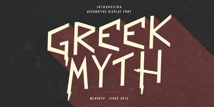 Greek Myth is a decorative display font. Bold stroke, fun character with a bit of ligatures and alternates. To give you an extra creative work. Greek Myth font support multilingual more than 100+ language. This font is good for logo design, Social media, Movie Titles, Books Titles, a short text even a long text letter and good for your secondary text font with script or serif. Make a stunning work with Greek Myth font. Cheers, Maulana Creative
 - Blue Jay Way NF by Nick's Fonts,
$10.00Modern Caps—and lowercase, too—was how Ross George described the pattern for this typeface in his Speedball Text Book. Not surprisingly, the design was used on the Beatles' original Magical Mystery Tour album, which suggested the current name. Art Deco meets Psychedelia! Both versions include the complete Unicode Latin 1252, Central European 1250 and Turkish 1254 character sets, with localization for Moldovan and Romanian. - Iwata G Gothic Pro by IWATA,
$199.00
- P22 St G Schrift by IHOF,
$39.95 P22 ST.G Shrift is a font series based on the type designs of Stefan George with an italic version designed by Colin Kahn. Stefan George (1868-1933) was a German poet who led the revolt against realism in German literature. All of his works were privately published and the typefaces that were used reflected his neo-classic and anti-industrial (progessive) aesthetics; oftentimes consisting of his own hand lettering designs. The original font was cast in 1907 by a small foundry in Germany and was used primarily for the works of George as well as other books including a monumental edition of Dante's Divine Comedy. The ST.G Shrift Fonts contained in this set are derived from 3 known variations of the original roman typeface, St.G., found in various books published in Berlin in the early 20th century. ST.G Shrift One contains the most idiosyncratic characters, while ST.G Shrift Two uses more familiar characters as well as a redesign of characters including the t and the k to be more in keeping with modern san-serif designs. The OpenType version of the roman contains both one and two and expands on them by including central European characters, small caps, and small caps titling figures. The Small Caps titling figures are derived from the first version of the typeface. Below is a features list (accessible through the type palette in Adobe programs) and their functions: ST.G Shrift Opentype Features: Small Caps: Changes Lowercase to Small Caps Titling Figures: Changes Uppercase to Titling Caps, and Small Caps to Small Caps Titling Figures Contextual Alternates: Changes Character Set to match ST.G One and changes Small Caps to Titling Small Caps Ornaments: Changes < > and ? (greater, less and bullet) to ornaments ST.G Shrift Italic is an art nouveau version of the roman. The OpenType version includes central European characters, small caps, titling caps, titling small caps and ornaments.
 - Days - 100% free

- Bad - Unknown license

- Pais by Latinotype,
$39.00 "País" is a contemporary and modern grotesque sans serif, inspired by the grotesques of the early 20th century, but more geometric and with a wider x-height than its referents; making it ideal for the current times. "País" comes in 2 versions, each with 9 weights, from thin to black, and matching italics, for a total of 36 fonts. The standard sans serif version is fresh, clean, and more ideally neutral. It's a perfect choice for editorial design, branding, headlines, or any other piece of graphic design. The "País Alt" version has more expressive and modern characters, with some giving it a much more playful image. It is ideal for logos, packaging, web and television use. País contains a total of 682 characters that make it possible to write in more than 200 Latin languages and basic Cyrillic.
 - Cayed by Allouse Studio,
$16.00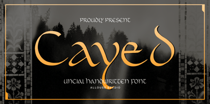 Proudly Presenting, Cayed a Uncial Handwritten Font that will bring an classic feel for your need. Cayed is perfect for any titles, logo, product packaging, branding project, megazine, social media, wedding, or just used to express words above the background. Cayed also come with Multi-Lingual Support. Enjoy the font, feel free to comment or feedback, send me PM or email. Thank You!
 - Basis by MADType,
$19.00 Basis is a bitmap font family which is happy being used at both small and large sizes. Designed as a 9 point bitmap face for the web, it offers different styles than most normal bitmaps. The stencil style can be used for display purposes, while the SmallCaps lowercase is great for website navigation menus.
 - Bias by T-26,
$19.00 - Brays by suhadidesign,
$16.00 According to the market demand, fonts tend to be unique fonts, so I decided to make a unique display serif font that is in your view. The Brays font is a font with many ligatures that is very unique and sought after, comes with a stylish style to become a market favorite. We keep this font looking elegant, classy, easy to read, stylish, attractive and easy to use. Brays Font is a great choice for beauty brands, magazines, travel, newspapers, books, brand names, branding, branding, quotes, album covers, and other projects. The Brays font is here to take the quality of your designs to a higher level. Brays Font is my Twenty ninth Font created in 2022 The Brays font style will make you love designing and taking advantage of the cool design results for this font. Continue to follow us for updates on making further fonts :) Font Features: • All capital letters • Stylistic ligatures • Stylistic alternate • Multilingual Support • Numeral and punctuation
 - Abi by Bohloul Arabic Type Design,
$30.00 For everyone wishing for a modern serif that’s as clear and readable as a sans in restrictive digital environments, meet ABI by Reza Bohloul. Sans serifs are commonly used on small screens to save space and carry a modern tone and Abi is the best one. Abi now provides a serif option for these restrictive digital environments. The screen has met its serif match. Abi was created from and for the digital world. Abi supports Arabic, Persian, Urdu and Kurdish languages.
 - Ways by Fontfabric,
$30.00 Born at a crossroads, the collaborative sans family of 18 styles Ways is the latest arrival in our portfolio. The name is no coincidence, as Ways pulls out all the stops to bring you excellent legibility. Combined with brutal and elegant details for a distinct humanist flair, this sans offers perfect functionality across all weights. Visual compensations, extra white space, wider apexes, subtle tweaks, and moderate inktraps distinguish Ways among similar typefaces. Use over 690 glyphs, extended Latin and Cyrillic support, extensive OT features set, icon set of more than 60 navigation pictograms, and one variable style, to design full-fledged signage systems that get you from point A to point B without relying on G-Maps. Family overview: 9 weights (from Thin to Black) + italics Extended Latin Cyrillic 690+ glyphs languages 1 variable font (2 axes) 1 free font - Ways SemiBold OpenType Features: Localized Forms Standard Ligatures Contextual Alternates Lining Figures Tabular Figures Subscript Scientific inferiors Superscript (Superiors) Numerators Case-Sensitive Forms Standard and Discretionary Ligatures Stylistic Alternates Contextual Alternates
 - Bia by Bykineks,
$9.00 Bia Superfamily is a new font creation designed with transitional serif classification, consisting of 100 font styles. It is supported by 85 languages of the Western/Eastern Europe and Turkish region, making it suitable for global use. In addition, Bia Superfamily has features such as numerator, denominator, inferior, modern, and old-style figures. Bia Superfamily features four different classifications in both serif Low & High (Contrast) and sans-serif Low & High (Contrast) variations, including ultra-condensed, condensed, regular, expanded, and ultra-expanded. With its diverse range of font styles, Bia Superfamily offers versatility and flexibility for use in various industries such as skincare, perfume, jewelry, stationary office, newspaper, cover book, web design, sign airport, sign hotel, wedding invitation, and text. Bia Superfamily is the perfect font choice for those who want to showcase a luxurious and elegant feel in their designs. Its professional and elegant characteristics make it stand out and attract attention to any design.


