10,000 search results
(0.036 seconds)
- Sugarbang by astroluxtype,
$20.00 The 1960’s and 1970’s are the inspiration for Sugarbang! Everything from music packages, beach party movies of the 60’s to cereal box art of the 1970’s are reflected in the kooky style that this font evokes. Sugarbang! is built on a random baseline so letterforms bounce up and down adding to the “zany” look of the design. Look to the second font, Koo Koo Puff, to be the next release in the Cerealboxx collection. Available now. It is a minimal font set which includes uppercase and lowercase letterforms. Suggested uses for the font would be above 42 points in size. Please note its normal tight spacing and that cap “T” and cap “L” have been specially kerned to account for the overhang of certain other letterforms. Sugarbang! - just add milk and it’s sugar frosted font goodness.
 - Zin Display by CarnokyType,
$46.00 Zin Display is a contemporary typeface designed for various situations of typographic usage. Characteristic feature is a large x-height and balance between neutral construction of letters (strictly vertical axis), dynamic open forms (opened terminals) and sharp instrokes, outstrokes and serifs. Another typical feature is a visually narrower connection between stems and strokes. The complete font family consist of three width proportions (Normal, Condensed and Extended). Every sub-family has 5 weights, ranging from Light to Black with matching Italics. Zin Display can be effectively used especially for display typesetting but works for longer text as well. It can be used especialy in magazine layouts and editorial design, as well in advertising typography, orientation systems, corporate identities and many other situations. Zin Display is a member of the Zin super family, which also includes Zin Sans, Zin Slab and Zin Serif fonts.
 - ITC Lubalin Graph by ITC,
$40.99 ITC Lubalin Graph® was initially designed by Herb Lubalin and drawn to fit the requirements of typographic reproduction by Tony DiSpigna and Joe Sundwall in 1974. Its underlying forms are those of Lubalin's previously released ITC Avant Garde Gothic, but its shapes were modified to accommodate large slab serifs. Its condensed weights, which include small caps and oldstyle figures, were later additions by Helga Jörgenson and Sigrid Engelmann in 1992. The family, with its generous x-height and overall tight fit has come to represent the typographic style of American graphic design in the 1970s. The typeface is at home when paired with mid-century modern design and spare sanses or more traditional text faces from the period. ITC Lubalin Graph covers four weights in its condensed width from Book to Bold, and five weights in its normal width.
 - Lamaesa by Carlos Maeso González,
$15.90 Lamaesa is a versatile and original design sans serif typeface. Designed to be used primarily on medium and large point sizes. Designed so you do not get tired of reading it, but at the same time, so that you notice its particularity. Oriented for use in headlines and continuous text, with a solid appearance, but with a slight aroma of handwriting, which gives it an ambivalent and original character. It is perfect for magazines, company letters, websites, advertisements, restaurant menus, and any support and function where it is essential to attract attention in an elegant and non-abusive way. Basic Latin characters. It consists of 217 glyphs (ISO 8859-15): uppercase, lowercase, numbers, currency symbols, and special characters. It consists of six fonts: light, normal and bold as well as their oblique equivalents. Carlos Maeso González is the designer of the typeface “Lamaesa”.
 - CA Kometo by Cape Arcona Type Foundry,
$19.00 CA Kometo is an oblique headline typeface that consists of two styles, “Regular” (the Shadow) and “Fill”. Kometo has come to save the world. A superhero typeface featuring the super powers “shadow” and “imperfection”. It comes to save you from a world of boredom. Join Kometo and experience the fun of stacking fonts! Write something with “Fill”, copy paste it to another layer and switch to “Regular“. Maybe you will want to give it a little offset? Or you can also try to use the “Fill” style for body text, but do so at your own risk, spacing and kerning is optimized for the use with the “Regular“ style, so don't be too harsh if the results looks more vivid than text normally does. The character set is well built, supporting Western and Central European languages.
 - The Overleys by Fargun Studio,
$14.00 The Overleys is a handwritten font with quick dry strokes and a signature style. perfect for branding projects, homeware designs, product packaging or simply as a stylish text overlay to any background image or posters. The Overleys has an entire alternate glyph set. This is accessible simply by their own separate font file - just install this as normal and select 'The Overleys Swash' , ‘The Overleys Alt' or ‘The Overleys Brush’ in your text-tool. The Overleys includes 3 Font files: 1. The Overleys - A handwritten script font containing upper & lowercase characters, numerals and a large range of punctuation. 2. The Overleys Alt - The second version of The Overleys, with a completely new set of both lower and uppercase characters. 3. The Overleys Swash - A set of 26 hand-drawn swashes, with cool touch to underline you’re The Overleys text.
 - Block Capitals by K-Type,
$20.00 BLOCK CAPITALS is a square, geometric, small caps display face that avoids fashionable foibles and exudes the neutral, unpretentious functionality of time-honoured block lettering. The family has three widths (Narrow, Normal and Wide), and the Bold weights are loosely based on well-used squared nets – 3x5, 4x5 and 5x5. However, the typeface escapes its grid origins whenever necessary with slightly modulated stroke weights, sensitive spacing and careful kerning. The aim is to retain the strength and simplicity of strictly geometric characters while introducing barely perceptible refinements that add elegance and usability. That said, letters and numbers line up horizontally without overlapping the capline or baseline, even the tail of the Q does not descend below the Baseline. Diacritics are modesty proportioned, accented characters extending no farther than necessary, allowing the leading on multiple lines of text to be kept to a minimum.
 - Dionisio by CastleType,
$49.00 Dionisio, a CastleType original, takes its inspiration from one of the overlooked treasures of the CastleType library: Ransahoff. The latter is extremely condensed and very elegant. I particularly like its hairline slab serifs and cross-bars. I decided to use it as a starting point for a new design, but to make the proportions more classic and to make it more sensuous with gentler curves and bracketed cross-bar serifs. The result is very Bodoni-like, but less extreme and more contemporary looking. Meanwhile, Dionisio maintains a hint of Ransahoff with condensed letterforms and very fine serifs. Dionisio brings together the best of both, making it the perfect choice where a slender, sophisticated typeface is needed. Dionisio is available in two widths: normal and condensed, five fonts each. Includes an extensive character set and OpenType features.
 - Glorial by Runsell Type,
$17.00 Introducing Glorial - An Elegant Script Font The handwritten calligraphy script works perfectly for classy designs. Glorial Script includes a full set of uppercase & lowercase letters with beginning swashes , a full set of lowercase letters with ending swashes, a full set of contextual alternates lowercase letters , 50+ ligatures features that makes the font look more natural. Glorial fonts that special for fashion and matches applies in some designs such as the logotype, brand, magazine, website or blog headlines, packaging, branding, quotes, invitation cards, greeting cards, business cards, and wedding more. Glorial is coded with PUA Unicode, which allows full access to all the extra characters without having special designing software. Mac users can use Font Book, and Windows users can use Character Map to view and copy any of the extra characters to paste into your favorite text editor/app. Glorial Includes: - 50+ Ligatures, Contextual alternates, Stylistic alternates, and Swash - Uppercase, lowercase, numeral, punctuation and symbol - .OTF format files - PUA Encoded Characters - Fully accessible without additional design software - Multilingual support for English, French, Italian, Spanish, Portuguese, German, Swedish, Norwegian, Danish, Dutch, Finnish, Indonesian, Malay, Hungarian, Polish, Croatian, Turkish, Romanian, Czech, Latvian, Lithuanian, Slovak, Slovenian How to get access alternate glyphs with designing software to open type fonts check this link : http: //adobe.ly/1m1fn4Y If you have any question please do not hesitate to contact me. Happy creating!
 - Dunver by Putracetol,
$24.00 Introducing Dunver - a display typeface font inspired by vintage albums and posters from 1960s music bands. The classic typeface, combined with fun and groovy impressions, make Dunver a unique and distinct font choice. This font is perfect for any kind of display purpose, including album covers, posters, labels, t-shirts, apparel, signage, quotes, logos, greeting cards, and logotypes. Dunver is especially well-suited for music and party events. With its retro feel and bold design, it can help you create designs that perfectly capture the energy and excitement of the event. Whether you're designing posters, flyers, or social media graphics for your next gig or music festival, Dunver can help you make an impact. The font comes with a range of features, including alternate characters divided into several OpenType features such as Swash, Stylistic Sets, Stylistic Alternates, Contextual Alternates, and Ligature. These OpenType features can be accessed using OpenType savvy programs such as Adobe Illustrator, Adobe InDesign, Adobe Photoshop CorelDRAW X version, and Microsoft Word. In the zip package, you will find Dunver in otf, ttf, and woff formats. It comes with uppercase and lowercase letters, opentype alternates and ligatures, numbers, punctuation, and symbols, as well as multilanguage support. Dunver is not just a font - it's a versatile tool that can help you bring your creative vision to life.
 - The Andrei font, though not a specific font widely recognized under that exact name in popular typography databases or among standard font formats, can be imagined or conceptualized based on some ass...
- Anglican - Unknown license

- Cardiff - Unknown license

- the King & Queen font - Unknown license

- Tatline by Groteskly Yours,
$15.00 Tatline was intended to be a fun side project that developed into something cool and rather unprecedented. It's bold, it's chunky —and it just looks good whether it's a mock movie poster or a key element in a brand identity for a business. With serifs thicker than stems, it looks more down to earth, solid, reliable and firm. And yet there's an almost imperceptible playfulness in the way it looks and behaved on the screen and paper. Tatline would look great on posters and flyers. We've tried creating a coffee brand identity with it —and surprise, looks great again. Maybe it's magic, but we like to think it's just a result of tough work put into creation of Tatline. Try it yourself and let us know what you think!
 - Yorkten Slab by insigne,
$- The Yorkten family of fonts is back with another satisfying addition to its clean style. The rhythmic, new Yorkten Slab expands Yorkten’s basic, contemporary form of geometric and simple lines and adds a level of self-confidence and elegance to your work. Slab's basic structure is compact. It’s more condensed than most slabs, so you can save space yet still have clear, consistent readability. The added serifs create a fresh text color, too, that syncs well with the new font’s inherited features. Like its predecessor, Yorkten Slab offers its natural, simple structure with more than fifty fonts in the family and three different widths - extended, normal or condensed. Each group has eight weights from a lean thin to tough looking black, giving Yorkten Slab plenty of bragging rights among its peers. And like Yorkten, too, Yorkten Slab’s greatest value is the ability of its members to work easily and well together and with a variety of other fonts. Yorkten Slab ensures that you have the necessary tools for any challenge. In combination with its superior functionality and excellent readability, this versatile font can be effectively used for many print and screen operations: e-books, applications, headlines, banners, posters and websites to name a few options. Don’t wait any longer. Start tapping the possibilities that Yorkten Slab offers your work.
 - ION A by Setup,
$19.95 ION A is a part of the ION superfamily, which consists of 3 families: condensed (ION A), normal (ION B) and wide (ION C), each having a compelling range of 10 weights. Styles Thin to Black have 436 glyphs supporting more than 70 Latin-based languages and the three heaviest weights, named U1, U2 and U3 have 94 basic glyphs. ION glyphs are based on the classic 7-segment display, but for readability and aesthetic reasons, some alphabetic characters don't follow this matrix strictly. In case you like things in order, don't worry, there's a stylistic set that replaces all characters with their strict alternatives. The special characters, such as #, @ or % are composed of special segments, but are designed to fit seamlessly within the whole character set. ION was designed with the needs of contemporary graphic design in mind. There are alternative characters, discretionary ligatures, slashed zero, superior & inferior numbers, fractions, ordinals and three handy stylistic sets. The ten styles of ION A are accompanied with a special 11th style called Cells, allowing you to design a special underlying layer of black or outlined cells. This way you can create various containers and boxes for your text, highlight what's important or go wild and draw a space invader, using the cells as building blocks. Learn more about the OpenType features and Cells at www.urtd.net/ion.
 - Weiss Rundgotisch by Linotype,
$67.99The German designer Emil Rudolf Weiss originally created Weiss Rundgotisch for the Bauer typefoundry in 1937. In their catalog for the typeface, Bauer began with this quote from Leonhard Wagner: The round gothic (rundgotisch) script is the most beautiful kind of script; she is called the mother and the queen of all the rest." While designing Weiss Rundgotisch, Weiss was inspired by Renaissance types cut by the Augsberg printer Erhard Ratdolt. Ratdolt had spent some time in Venice, which is most likely where he became familiar with round gothic letters. This sort of letterform was never as popular in Germany as Fraktur or Gotisch may have been, but round gothic types were used there for centuries to represent arts and craft feelings, as well as old-fashioned handwork. For a blackletter typeface, Weiss Rundgotisch is very similar to normal serif and sans serif designs, especially its uppercase letters, which seem to have some uncial influence in them as well. Therefore, Weiss Rundgotisch is more legible for contemporary readers, making this an excellent choice for anyone looking to set text, logos, or headlines with in blackletter. Weiss Rundgotisch was apparently quite a difficult typeface to design, even for a master designer like Weiss. He began work on the face in 1915; Weiss Rundgotisch's development took over 20 years to complete." - Sketchnote by Delve Fonts,
$29.00 The Sketchnote typeface was born of necessity: designer Mike Rhode needed a series of hand-drawn fonts to illustrate and produce his book, “The Sketchnote Handbook.” Because of its origin, this typeface was designed to be practical and convey the human character and quirks of his normal handwriting and hand-drawn lettering. The family is comprised of five fonts: Sketchnote Text in Regular, Bold, and Italic, the somewhat compressed and bold Sketchnote Square for headlines, and the playful Sketchnote Dingbats. Sketchnote Text is a casual script with a slightly bouncy baseline. In order to mimic the differences present in natural handwriting, OpenType features are built-in that automatically switch between multiple versions of each letter or number. In total, over 240 alternates in each of the text fonts are employed, making for a more authentic appearance. The warm texture of Sketchnote is the result of actual ink-spread on paper captured in the scans of written letterforms and was intentionally left intact during the digitization process to preserve that feeling. Rhode created Sketchnote Square as a display type to complement Sketchnote Text. Drawn instead of written, the letters often have neat little happenstance voids within the strokes. Sketchnote Dingbats features a selection of icons, rules, and arrows to provide some functional and fun tidbits, handy for bringing additional life to any design.
 - ION C by Setup,
$19.95 ION C is a part of the ION superfamily, which consists of 3 families: condensed (ION A), normal (ION B) and wide (ION C), each having a compelling range of 10 weights. Styles Thin to Black have 436 glyphs supporting more than 70 Latin-based languages and the three heaviest weights, named U1, U2 and U3 have 94 basic glyphs. ION glyphs are based on the classic 7-segment display, but for readability and aesthetic reasons, some alphabetic characters don't follow this matrix strictly. In case you like things in order, don't worry, there's a stylistic set that replaces all characters with their strict alternatives. The special characters, such as #, @ or % are composed of special segments, but are designed to fit seamlessly within the whole character set. ION was designed with the needs of contemporary graphic design in mind. There are alternative characters, discretionary ligatures, slashed zero, superior & inferior numbers, fractions, ordinals and three handy stylistic sets. The ten styles of ION C are accompanied with a special 11th style called Cells, allowing you to design a special underlying layer of black or outlined cells. This way you can create various containers and boxes for your text, highlight what's important or go wild and draw a space invader, using the cells as building blocks. Learn more about the OpenType features and Cells at www.urtd.net/ion.
 - Le Havre Rough by insigne,
$19.00 Le Havre Rough. It’s high-resolution, hand-crafted letterpress to the core. Based on insigne’s popular Le Havre typeface, this new heat-treated, weathered face of all caps joins the realism and appeal of the top-quality Le Havre family. Rough’s eroded, printed look is extremely customizable, offering eleven distressed choices that appear fantastic even at large output sizes. Go ahead. Try it on, say, a billboard. Maybe even Times Square. The font includes hand-printed texture and distinctive shadow choices, too. Options include three inline versions, two shadow layers, and a clean primary version. Combine and match the options easily as you need, layering normal and shadow variations to alter appearance and texture. You can activate Art Deco alternates by using OpenType contextual alternates. Rough has an extra-large character set for many languages. Additionally, the typeface offers 62 extra ornaments like arrows, emblems, numbers & lines. Use its full texture and grit to capture the classic, genuine print feel that you need in your project. A few suggestions for use: - In Photoshop, jigger with various 'anti-aliasing' options for best outcomes. Smooth or strong is generally best. - In Illustrator, the shadow layer occasionally doesn't align when using the regular layer. To fix the alignment, open the type drop-down menu and choose Area Type Options > Em Box Height. Learn more about the using layered type styles on this informative video.
 - ION B by Setup,
$19.95 ION B is a part of the ION superfamily, which consists of 3 families: condensed (ION A), normal (ION B) and wide (ION C), each having a compelling range of 10 weights. Styles Thin to Black have 436 glyphs supporting more than 70 Latin-based languages and the three heaviest weights, named U1, U2 and U3 have 94 basic glyphs. ION glyphs are based on the classic 7-segment display, but for readability and aesthetic reasons, some alphabetic characters don't follow this matrix strictly. In case you like things in order, don't worry, there’s a stylistic set that replaces all characters with their strict alternatives. The special characters, such as #, @ or % are composed of special segments, but are designed to fit seamlessly within the whole character set. ION was designed with the needs of contemporary graphic design in mind. There are alternative characters, discretionary ligatures, slashed zero, superior & inferior numbers, fractions, ordinals and three handy stylistic sets. The ten styles of ION B are accompanied with a special 11th style called Cells, allowing you to design a special underlying layer of black or outlined cells. This way you can create various containers and boxes for your text, highlight what’s important or go wild and draw a space invader, using the cells as building blocks. Learn more about the OpenType features and Cells at www.urtd.net/ion.
 - Ranelte by insigne,
$- The beauty of a classic is that it never really goes out of style. The pure, simple elements which define its greatness only strengthen and solidify with time and exposure--elements like those that inspired Ranelte, the new sans serif from insigne design. While it pays homage to the enduring DIN series of the early-20th century, the new Ranelte is far from outdated. The classic style happily connects with its more modern side, incorporating a more pronounced curve than many of its contemporaries do. This accentuated curve helps pad the type against being cold or overly technical, especially with its inherent semi-modular form and geographic feel. In short, you end up with a good vibe at the intersection of high-tech and friendly. A versatile typeface, Ranelte is designed for headline use as well as print and web copy. Within this family’s three widths and eight weights (along with italics), the letter proportions remain easily readable through their tendency toward equalisation, while still avoiding strict monospacing. The typeface also features sophisticated typographical help in the form of OpenType features. Included in the set are case-sensitive types, fractions, super- and subscript characters, and stylistic alternates. It comes using a comprehensive array of old style and lining figures. All features comprehensively cover the Latin-based languages. Thinking about it again, a classic may never go out of style, but that doesn’t mean you can’t improve on it. A little adjustment can have a beauty all its own. So discover the tuning of Ranelte, and enjoy all the new things you can do with a classic.
 - Tatline Neue by Groteskly Yours,
$12.00 Tatline Neue is a serif font family of 14 fonts encompassing a wide range of weights — from Thin to Heavy. Tatline Neue was modelled after the original Tatline display font, but this major overhaul resulted not only in updated and tweaked shapes and smother curves, but also in addition of 13 new weights, making Tatline Neue a perfect tool for designers and typographers alike. Each font contains 450 glyphs, multiple sets of numbers, stylistic alternatives for certain glyphs, ligatures, numerators, denominators, old style figures, and other symbols. Tatline Neue can be freely used across Western European, Central European, South Eastern European languages. Tatline Neue was designed from the scratch to keep glyphs consistent across all weights. Thinner fonts are more uniform, with little to no variation in the weight of the strokes. Bolder fonts, on the other hands, are chunky and somewhat comic —in a good way. Tatline Neue was born out of a display font, losing none of its original quirkiness and vibe. While serif fonts are often seen as vintage and orthodox, Tatline Neue strikes a livelier note: one of cheekiness, bizarreness, quirkiness, and expressiveness. Thanks to a wide range of weights, Tatline Neue is a great tool for a variety of projects: whether it's used for plain text in a larger body of text or as a headline font, or even as a key element in a logo creation or brand identity. Tatline Neue is a serif font for those who are tired of seeing the boring in the typography and design; it's a font for explorers, for adventurers, for those who seek to find their own voice.
 - DB Family Tree by Illustration Ink,
$3.00DB Family Tree is a great DoodleBat with plenty of style rooted in strong genealogy. Makes a great adornment to any creative project. - Venture by Michael Hill Design,
$6.00Venture is an all caps typeface inspired by the great outdoors. Also comes in 2 extra styles, great for that vintage print look! - Shibori by Dumadi,
$35.00 Meet our new brand font design, Shibori which is designed and created by Dumadistyle. Shibori is a playful typeface font created for a multipurpose creative fun project. Its fun, cheerful and joyful characteristics are designed for children-friendly product display. Kids storybook cover, youtube for kids thumbnail, the font will surely be sparkling the joy. What’s Included : + Shibori (OTF) + Standard glyphs + Style Alternate + Ligature + Works on PC & Mac, Simple installations + Multilingual Accent This Font Support Languages : Afrikaans, Albanian, Asu, Basque, Bemba, Bena, Breton, Catalan, Chiga, Cornish, Danish, Dutch, English, Estonian, Faroese, Filipino, Finnish, French, Friulian, Galician, German, Gusii, Indonesian, Irish, Italian, Kabuverdianu, Kalenjin, Kinyarwanda, Luo, Luxembourgish, Luyia, Machame, Makhuwa, Meetto, Makonde, Malagasy, Manx, Morisyen, North, Ndebele, Norwegian, Bokmål, Norwegian, Nynorsk, Nyankole, Oromo, Portuguese, Quechua, Romansh, Rombo, Rundi, Rwa, Samburu, Sango, Sangu, Scottish, Gaelic, Sena, Shambala, Shona, Soga, Somali, Spanish, Swahili, Swedish, Swiss, German, Taita, Teso, Uzbek (Latin), Volapük, Vunjo, Zulu. Accessible in Adobe Illustrator, Adobe Photoshop, Adobe InDesign, even work on Microsoft Word. PUA Encoded Characters – Fully accessible without additional design software. Fonts include multilingual support + Image used: All photographs/pictures/vectors used in the preview are not included, they are intended for illustration purposes only. Thanks
 - Diphthong by Diphthong Type Foundry,
$10.00 The challenge was to create a single typeface weight that was versatile enough without a large font family, and could be put to use with a variety of media formats, from book text to advertising spreads, all while remaining legible and delightful to read. Originally designed between the years 2002 and 2004, the inspiration for the design originated from the concepts of Stefano Giovannoni's uber-contemporary industrial designs and architecture. Where to start with such a font design was obvious to Diphthong Regular's designer, Max Hancock; to create a transitional, slab serif form that was corky and serious, interchangeably. The characteristics of the font followed a postmodern playfulness, popular in many sub-cultures looking for an alternative to the harsher, cut-shape, deconstructivist styles. And, the unique objective behind the design was to make it so that the usual difficult combination of the t and h (hth) in language was legible as well as pleasant to look at, thus the reason for the name. The soft, subtle roundings add a flair of utilitarianism while the cut edge ascenders help to blur the line between cute and diametrical mannerisms.
 - Abraham by Sabrcreative,
$15.00 Discover the versatile and stylish Abraham Font Family at MyFont. With 8 unique styles, including Regular, Italic, Rough, Stamp, Shadow, Outline, and Rounded, this modern sans-serif modular family offers endless creative possibilities. Perfect for a wide range of design projects, Abraham is suitable for logos, greeting cards, quotes, posters, branding, business cards, stationary, blog headers, and more. Each style of the Abraham Font Family features both uppercase and lowercase letters, ensuring flexibility in your designs. Additionally, it includes stylistic alternates, standard ligatures, and numerals & punctuations in OpenType format for seamless typography. Enhance your artwork with the multilingual support of the Abraham Font Family, which includes a wide range of accents and characters to accommodate various languages. The font family is PUA encoded, allowing for easy access and usage across different platforms and software. With the Abraham Font Family, you'll receive the following fonts: Abraham Regular, Abraham Regular Italic, Abraham Outline, Abraham Outline Italic, Abraham Rough, Abraham Stamp, Abraham Shadow, and Abraham Rounded. Whether you're designing greeting cards, package designs, brand identities, or art projects, Abraham Font Family will add a touch of sophistication and creativity to your work.
 - Christmas Snowflake by Stefani Letter,
$12.00 Christmas Snowflake is a friendly, fresh, rich, and beautiful handwritten font. It is ideal for holiday-themed greeting cards, invitations, logotype, branding, stationery, poster, and any project that requires a beautiful touch. Fall in love with its incredibly distinct and timeless style and use it to create spectacular designs! This font is PUA encoded which means you can access all of the glyphs.
 - Snowy Wonderland by Mvmet,
$15.00 Snowy Wonderland is perfect choice display font for winter and Christmas themed designs. You can use it for anything ranging from t-shirts, book designs, and greeting cards to stickers and posters, or anything that needs a casual touch, it will be your perfect font to pick. Fall in love with its incredibly versatile style, and use it to create lovely designs!
 - Cuttauri Script by Nk Studio,
$14.00 Cuttauri is a lovely modern script, with an authentic feel. Use it to create gorgeous wedding invitations, beautiful stationary art, eye-catching social media posts, and cute greeting cards. This font is PUA encoded which means you can access all of the glyphs and swashes with ease! It also features a variety of special features including alternate glyphs and ligatures.
 - Christmas Soul by Stefani Letter,
$12.00 Christmas Soul is a friendly, fresh, rich, and beautiful handwritten font. It is ideal for holiday-themed greeting cards, invitations, logotype, branding, stationery, poster, and any project that requires a beautiful touch. Fall in love with its incredibly distinct and timeless style and use it to create spectacular designs! This font is PUA encoded which means you can access all of the glyphs.
 - Bulgary Rose by Heinzel Std,
$18.00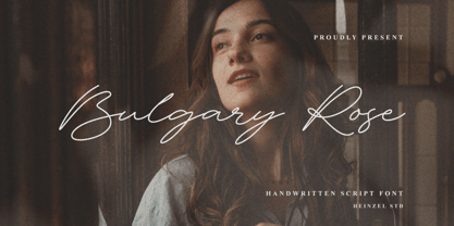 Bulgary Rose is a Signature Script Font, described by an elegant touch, perfect for your favorite projects. It looks stunning on wedding invitations, thank you cards, quotes, greeting cards, logos, business cards, social media, magazines, marketing materials, and every other design which needs a handwritten touch. Fall in love with its incredibly distinct and timeless style and use it to create spectacular designs!
 - Love Jingle by Mvmet,
$16.00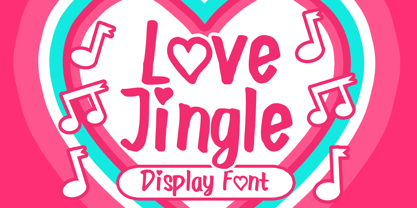 Love Jingle is a fun and lovely handwritten font that you can use it for anything ranging from t-shirts, book designs, packaging, and greeting cards to stickers and posters, or anything that needs a casual touch, it will be your perfect font to pick. Fall in love with its incredibly versatile style, and use it to create lovely designs!
 - Squidy Club by Raditya Type,
$17.00 Squidy Club is a fun display font, fresh & modern style. Squidy Club Font suitable for logo, branding, greeting card, poster and any design that you create. Thank you for checking and i hope you enjoy it. Always put your heart into it and don’t worry to try. I hope you have as much fun using it as i did making it.
 - Sidesakey by Aminmario Studio,
$20.00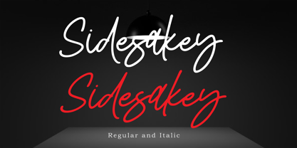 Sidesakey simplifies elegance into one truly stunning handwritten font. With its relaxed feel, Sidesakey is incredibly versatile, suitable to each of the design projects you may have in mind! Use it to create beautiful greeting cards, wedding invitations, logos, website titles and much more! Comes in Regular and Italic styles. Thank you for your purchase! Hope you enjoy with our font
 - Arthaus by John Moore Type Foundry,
$24.95 Arthaus is a typeface family inspired by Herbert Bayer letter study for an universal alphabet, this version is built on a rigorous geometrical basis as originally planned by this master of the Bauhaus in 1927. Arthaus comes in 4 weights and one outline version. Ideal for creating posters and brands is a treat for anyone who deals with graphic design.
 - Growing Garden by Wyarecreatype,
$7.00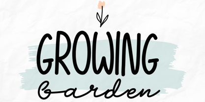 Growing Garden is an elegant and natural trio handwritten font. This original look will appeal to a wide range of crafty ideas. It looks stunning on wedding invitations, thank you cards, quotes, greeting cards, logos, business cards and every other design which needs a handwritten touch. Includes: Uppercase and lowercase For every questions or help, Please contact me. Happy Creating! Thanks!
 - Caffe Sunday by Mvmet,
$9.00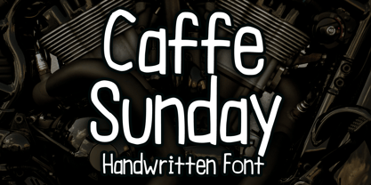 Caffe Sunday is a casual and playful blackletter font. You can use it for anything ranging from t-shirts, book designs, and greeting cards to stickers and posters, packaging designs, or anything that needs a casual touch, it will be your perfect font to pick. Fall in love with its incredibly versatile style, and use it to create lovely designs!


