10,000 search results
(0.125 seconds)
- Fontleroy NF Pro by CheapProFonts,
$10.00 I have completely redone the spacing in this font, making the sidebearings more conventional. And after replacing the kerning with fresh pairs working together with the new spacing the font looks like a real gem. I love it! The inline version has a wider spacing after the letters CEK = no connecting words. Otherwise just as lovely and retro! Nick Curtis says: "Here’s a strange hybrid: I took the lower case from the formal script font Stuyvesant, straightened out its rather extreme 22° slant, and combined them with caps from the font Bellevue, again making them upright, and adding an inline effect. The result is a font that flows very nicely, with a nice balance between clean lowercase characters and swashy caps. Thanks to Deb Dunbar for naming this font. Fontleroy Brown is the solid version, produced at the request of the King of Ding, Jeff Levine." ALL fonts from CheapProFonts have very extensive language support: They contain some unusual diacritic letters (some of which are contained in the Latin Extended-B Unicode block) supporting: Cornish, Filipino (Tagalog), Guarani, Luxembourgian, Malagasy, Romanian, Ulithian and Welsh. They also contain all glyphs in the Latin Extended-A Unicode block (which among others cover the Central European and Baltic areas) supporting: Afrikaans, Belarusian (Lacinka), Bosnian, Catalan, Chichewa, Croatian, Czech, Dutch, Esperanto, Greenlandic, Hungarian, Kashubian, Kurdish (Kurmanji), Latvian, Lithuanian, Maltese, Maori, Polish, Saami (Inari), Saami (North), Serbian (latin), Slovak(ian), Slovene, Sorbian (Lower), Sorbian (Upper), Turkish and Turkmen. And they of course contain all the usual “western” glyphs supporting: Albanian, Basque, Breton, Chamorro, Danish, Estonian, Faroese, Finnish, French, Frisian, Galican, German, Icelandic, Indonesian, Irish (Gaelic), Italian, Northern Sotho, Norwegian, Occitan, Portuguese, Rhaeto-Romance, Sami (Lule), Sami (South), Scots (Gaelic), Spanish, Swedish, Tswana, Walloon and Yapese.
 - VAG-HandWritten - 100% free

- Sovetryne by PizzaDude.dk,
$15.00 Ahhh, who doesn't want to sleep late? That’s excactly what a “sovetryne” wants ... even though he/she often sleeps way to much! But that’s not the case with this font. It’s legible, even though it’s slightly worn. Change between upper- and lowercase letters to variate the typing - and turn on ligatures, in order to use the substitution of double letters such as aa, bb, cc and many more!
 - Harttiney by MJB Letters,
$19.00 Harttiney is a chic handwritten script, every single letter has been carefully crafted to make your design looks great. it’s is a modern script style that has a beautiful beginning & ending swashes added with additional bottom swashes to easily customize your own design, this font is perfect for any purpose, such as logo design, branding design, packaging design, posters, fashion design, wedding design, wedding invitations, watermarks, and more! Works on PC & Mac Simple installations Accessible in Adobe Illustrator, Adobe Photoshop, Adobe InDesign, even work on Microsoft Word. PUA Encoded Characters – Fully accessible without additional design software
 - Honey Pools by Dumadi,
$20.00 Honey Pools is a handwritten Quirky font created with application brush strokes. This font is designed for casual designs but will bring out your designs as stunning as possible. It includes all lowercase and uppercase characters, numbers and symbols, multilingual support, and Ligature. Honey Pools is perfect for celebratory designs like st Patrick's Day poster design, Spring season Design, Ester Design, valentine design fonts, social media design fonts, content design, and other designs. Compatible with design studios such as Photoshop, Affinity Design, Adobe Illustrator, or Silhouette. That makes it great for creative projects. Thank you, Toni Dzulham - Dumadistyle
 - Unless by Gassstype,
$23.00 Introducing of our new product Unless is Terror Brush Font and Multilanguage support font with a dramatic movement with special alternative glyph and Ligature glyph. This font is great for your next creative project such as logos, printed quotes, invitations, cards, product packaging, headers, Logotype, Letterhead, Poster, Label, and etc. That is why Unless has Rough and strong characteristic more natural look to your text with a more modern look to your text. You can activate Ligature and Alternative glyphs OpenType panel . Unless is perfect for homeware designs,branding projects, Logo design, Quotes product packaging,and cartoon.
 - Bad Command by Gassstype,
$25.00 Hello Everyone, Introduce our new collection, Bad Command is Ligature Brush Font.font is a Signature Style and classy style, inspired by famous logos of Technology and brands that have very strong characteristics, this font is great for your creative projects such as watermark on photography, and perfect for logos & branding, invitation,advertisements,product designs, stationery, wedding designs,label ,product packaging, special events or anything that need handwritting taste. That is why Bad Command has charming, authentic and relaxed characteristic more natural look to your text with a more natural look to your text. You can activate Ligature OpenType panel.
 - Grilldem by Jipatype,
$27.00 กริลล์เด็ม เป็นแบบอักษรลายมือให้ความรู้สึกเป็นมิตร เหมาะสำหรับงานออกแบบเกี่ยวกับเมนูอาหารหรืองานใด ๆ ที่ต้องการแบบอักษรลายมือ ด้วยความที่ กริลล์เด็ม มีความผอมเพรียวจึงเหมาะสำหรับงานที่มีพื้นที่จำกัด อีกทั้งยังรองรับหลากหลายภาษา ทำให้คุณสามารถใช้งานได้ในหลากหลายโปรเจ็ค กริลล์เด็ม มีทั้งหมด 2 ลักษณะ Regular และ Italic อีกทั้งยังมีฟีเจอร์ Samll caps และ Tabular ทำให้เป็นฟอนต์ที่ครอบคลุมทุกความต้องการในงานออกแบบของคุณ Introducing Grilldem, a hand-written typeface that exudes friendliness. Perfect for designing food menus or any writing that requires a display font, Grilldem features a condensed design that makes it a great choice for limited space. With multi-language support, this font is versatile and can be used in a variety of projects. Grilldem comes in two styles - regular and italic - and includes small caps and a tabular feature, making it a comprehensive font for all your design needs.
 - Mahardika by Lemon Studio Type,
$10.00 Mahardika is a Retro Sport sans Serif family with variable font technology, and its axis weight range spreads from Light to black forms. Flexible and adaptable, it is 100% Latin Plus, Supporting 219 Latin-based languages, which are spoken in different 212 countries. This font is suitable for any project. Great for graphic design and any display use. It can easily work for web, signage, corporate as well as editorial designs. Jantur Type has 9 weights with a total of 9 styles. and legibility makes it suitable for any kind of text application, from brand design to extensive text layouts.
 - Hype Runner by Invasi Studio,
$17.00 Hype Runner is a bold and stylish brush font that is perfect for sports and anything that requires strength and power. With its unique style and edgy look, Hype Runner is ideal for a wide range of design projects, including headings, flyers, greeting cards, product packaging, book covers, printed quotes, logotypes, and album covers. This font features alternate glyphs, ligatures, and support for Latin Multilingual, giving you plenty of design options to create unique and eye-catching designs. Whether you're creating designs for sports or simply want a strong and impactful font, Hype Runner is a great choice.
 - Waterloo Bold by ITC,
$29.99The slab serif Waterloo Bold was designed by Alan Meeks. He chose unique and individual forms to give this alphabet its unmistakable character. The cross strokes of the capitals are not in the optical center, the serifs have light furrows, and the figures have a slight slant tot he right, giving this font a dynamic, flowing look. Waterloo Bold is reminiscent of cigars, whiskey and the 1930s and should be used only in headlines in large point sizes. - Eugenia by Phoenix Group,
$8.00 Eugenia is a font for display and poster needs. Each stroke reflects the strong nature of a woman who hates what she loves. This font is suitable for posters with the theme of art and enthusiasm. The name Eugenia reflects the glory and the figure who likes to do good, we hope that people who use this font can make something that is good for others.
 - Ferguson by Arterfak Project,
$14.00 Ferguson is a geometric slab serif which made with a mono-line concept and versatile style. Inspired by old western and magazine designs. Ferguson has a straight and consistent line to give neat looks. Ferguson is made for editorial and formal purposes. but still flexible to use it in other typographic projects. This font family has 6 weights and 2 widths that gives you many options on your designs projects. - Regular versions: Comes from Light, Normal, Medium, Bold, Black, and Ultra Black. Very recommended for editorial use such as body text, sub-headline, and tagline. The bolder weights are goods for headline too. Strong and geometric! Suitable for sports themes, social movement, masculine and logotypes. - Condensed versions: Available in Light, Normal and Bold. Great choice for a headline, and display. This condensed designed a bit minimalist than regular version to keep the readability. Also, there is Bold Shadow style to complete the vintage movement which happening now. Suitable for a poster, magazines, and clothing project. Ferguson font family has up to 28 accents: Afrikaans, Albanian, Catalan, Croatian, Czech, Danish, Dutch, English, Estonian, Finnish, French, German, Hungarian, Icelandic, Italian, Latvian, Lithuanian, Maltese, Norwegian, Polish, Portuguese, Romanian, Slovak, Spanish, Swedish, Turkish, Zulu. Fonts featured : - Uppercase - Lowercase - Numerals - Some symbols - Diacritics Thank you. Hope you like it and enjoy!
 - Lombardia Script by Mans Greback,
$69.00 Lombardia Script is a creative and decorative script font that exudes vividness and elegance. This font is perfect for designing logotypes, tattoos, and other projects that require a signature-like quality. Designed with the art of calligraphy in mind, Lombardia Script features a delicate and expressive stroke that gives it a natural and authentic look. Its ink and brush-like appearance adds to its creativity and uniqueness, making it a great choice for any project that requires a touch of sophistication. Lombardia Script comes in four styles: Regular, Italic, Bold, and Bold Italic. This range of styles provides versatility and allows for dynamic and creative designs. With its beautiful and flowing letterforms, Lombardia Script is the perfect choice for adding a touch of elegance and creativity to any project. Use underscores _ anywhere in a word to make a swash. Example: Wonder_woman Use multiple underscores to make different swashes. Example: Extra__vagant The font is built with advanced OpenType functionality and has a guaranteed top-notch quality, containing stylistic and contextual alternates, ligatures and more features; all to give you full control and customizability. It has extensive lingual support, covering all Latin-based languages, from Northern Europe to South Africa, from America to South-East Asia. It contains all characters and symbols you'll ever need, including all punctuation and numbers.
 - Rufina STD by TipoType,
$13.00 Rufina was as tall and thin as a reed. Elegant but with that distance that well-defined forms seem to impose. Her voice, however, was sweeter, closer, and when she spoke her name, like a slow whisper, one felt like what she had come to say could be read in her image. Rufina's story can only be told through a detour because her origin does not coincide with her birth. Rufina was born on a Sunday afternoon while her father was drawing black letters on a white background, and her mother was trying to join those same letters to form words that could tell a story. But her origin goes much further back, and that is why she is pierced by a story that precedes her, even though it is not her own. Maybe her origin can be traced back to that autumn night in which that tall man with that distant demeanor ran into that woman with that sweet smile and elegant aspect. He looked at her in such a way that he was trapped by that gaze, even though they found no words to say to each other, and they stayed in silence. Somehow, some words leaked into that gaze because since that moment they were never apart again. Later, after they started talking, projects started coming up and then coexistence and arguments, routines and mismatches. But in that chaos of crossed words in their life together, something was stable through the silence of the gazes. In those gazes, the silent words sustained that indescribable love that they didn't even try to understand. And in one of those silences, Rufina appeared, when that man told that woman that he needed a text to try out his new font, and she saw him look at her with that same fascination of the first time, and she started to write something with those forms that he was giving her as a gift. Rufina was as tall and thin as a reed, wrote her mother when Rufina was born.
 - Steagal by insigne,
$24.75 I love geometric sans serifs, their crispness and rationality. Le Havre taps into this style, but for a while, I've wanted to create a font recalling the printed Futura of the 1940s, which seems to have an elusive quality all its own. After seeing an old manual on a World War II ship, I developed a plan for "Le Havre Metal" but chose to shelve the project due to Le Havre's small x-height. That's where Steagal comes in. When Robbie de Villiers and I began the Chatype project in early 2012 (a project which led one publication to label me the Edward Johnston of Chattanooga!), we started closely studying the vernacular lettering of Chattanooga. During that time, I also visited Switzerland, where I saw how designers were using a new, handmade aesthetic with a geometric base. I was motivated to make a new face combining some of these same influences. The primary inspiration for the new design came from the hand-lettering of sign painters in the United States, circa 1930s through 1950s. My Chatype research turned up a poster from the Tennessee Valley Authority in Chattanooga, Tennessee, which exhibited a number of quirks from the unique hand and style of one of these sign artists. Completing the first draft of Steagal, however, I found that the face appeared somewhat European in character. I turned then to the work of Morris Fuller Benton for a distinctly American take and discovered a number of features that would help define Steagal as a "1930s American" vernacular typeface--features I later learned also inspired Morris Fuller Benton's Eagle. The overall development of Steagal was surprisingly difficult, knowing when to deliberately distort optical artifacts and when to keep them in place. Part of type design is correcting optical illusions, and I found myself absentmindedly adjusting the optical effects. In the end, though, I was able to draw inspiration from period signs, inscriptions, period posters, and architecture while retaining just enough of the naive sensibility. Steagal has softened edges, which simulate brush strokes and retain the feeling of the human hand. The standard version has unique quirks that are not too intrusive. Overshoots have almost been eliminated, and joins have minimal corrections. The rounded forms are mathematically perfect, geometric figures without optical corrections. As a variation to the standard, the “Rough” version stands as the "bad signpainter" version with plenty of character. Steagal Regular comes in five weights and is packed with OpenType features. Steagal includes three Art Deco Alternate sets, optically compensated rounded forms, a monospaced variant, and numerous other features. In all, there are over 200 alternate characters. To see these features in action, please see the informative .pdf brochure. OpenType capable applications such as Quark or the Adobe Creative suite can take full advantage of the automatically replacing ligatures and alternates. Steagal also includes support for all Western European languages. Steagal is a great way to subtly draw attention to your work. Its unique quirks grab the eye with a authority that few typefaces possess. Embrace its vernacular, hand-brushed look, and see what this geometric sans serif can do for you.
 - KG Chasing Cars by Kimberly Geswein,
$5.00 This cute bunting style font includes extras like a cupcake, anchor, and a fleur de lis. Use the ( ) { } [ ] to make end pieces and join them with the underscore __.
 - ITC Handel Gothic by ITC,
$40.99 The Handel Gothic? typeface has been a mainstay of graphic communication for over 40 years - all the while looking as current as tomorrow. Designed by Don Handel in the mid-1960s, and used in the 1973 United Airlines logo developed by Saul Bass, Handel Gothic was an instant success when released to the graphic design community. Its generous lowercase x-height, full-bodied counters and square proportions make the design highly readable at a wide range of sizes. Handel Gothic's slightly idiosyncratic character shapes gave the face a futuristic look 40 years ago that retains its power today. In addition, its Uncial-like lowercase is instantly identifiable - and unique among sans serif typestyles. Award-winning type designer Rod McDonald was attracted to the simple, decisive forms of the original, but he felt the design needed to be refined and updated. ?One of my goals was to bring a modern typographic discipline to what was really an old phototypesetting font.? To achieve his goal, McDonald re-proportioned every character and balanced the delicate relationship between the curves and the straight strokes. He also added a number of alternate characters to extend the range of the design. ?I wanted to give designers a large enough character set so they wouldn't feel constrained in what they could do. I want them to be able to play with the fonts, not just set words.? McDonald enlarged the family from the single-weight original to five weights, each with a full suite of alternate characters.In 2015 Nadine Chahine designed matching arabic weights to this family.
 - Stagehand JNL by Jeff Levine,
$29.00 Too often, familiarity in type design can fool us into mislabeling similar styles of lettering. The Art Deco years provided many variations of the thick-and-thin alphabet, and we tend to lump all of them together as being "a version of Broadway", as this is the most popular of the genre. However, if one looks closely at each design, they will see variations of line thickness, angles and even individual character design. One such variation is Stagehand JNL, based on a set of wood type and now presented in digital form.
 - Viva Beautiful Collection by Cultivated Mind,
$19.00 Continue your branding with the ever popular Viva Beautiful font. A new hand-painted brush script collection by Cultivated Mind. Viva Beautiful is back with nine new fonts that include six scripts, a caps font, free words font, free extras and plenty of alternates/ligatures. There are five sets of alternates for every letter adding to the uniqueness of your designs. The new Viva Beautiful scripts are a much cleaner brush script than the original. All scripts come in pro and regular versions. Both versions are Latin Pro. Pro scripts include 260 alternates and 8 common ligatures. Ligatures are programmed to pop up when specific letter pairs are typed. Try the alternates and ligatures together to give your designs a realistic hand-painted look. The all caps font is a basic version that includes 5 common ligatures and looks great paired with the scripts. Regular versions include Latin Pro characters but do not include alternates and ligatures. Viva Beautiful Collection works best for beauty products, music branding, film, television, cookbooks, book covers, food marketing, magazines, and websites. Check out Cultivated Mind Type on Instagram for fun Viva design ideas. Bring beauty to your designs with Viva Beautiful! Fonts designed by Cindy Kinash. Poster designs by Corinne Alexandra.
 - FS Blake by Fontsmith,
$80.00 Art deco The inspiration for FS Blake’s elegant, lightly geometric forms can be traced back to design of the 1930s; designer Emanuela Conidi was influenced by the typography of cool, European, art deco posters. FS Blake bears traits of the art deco style, from its thin weights to its heavy weights, giving a set of faces each with their own distinct character, but still with a strong family resemblance. Mechanical type Mechanical and organic shapes combine in FS Blake to create a harmonious whole of generous curves and cursive spikes. A strong, punchy contender in display sizes, it’s also got a gentle touch with small text in lighter weights. Lively, versatile and with plenty of character contrast between weights, the FS Blake family offers impact in whatever task it’s given.faces each with their own distinct character, but still with a strong family resemblance. Sketch book Great fonts still emerge from a combination of hand, paper and pencil. After filling her sketch book with ideas, Emanuela and Jason extracted the elements that both felt could work in a font. The process yielded a whole crop of starting points for future designs as well as a focus for FS Blake as a striking, characterful, almost industrial font.
 - Rothorn by ROHH,
$35.00 Rothorn™ is a modern, minimalist geometric sans with its own personality derived for subtle design details, such as cut diagonal corners, pointed t, very small contrast and closed aperture. The letterforms give the typeface a lot of charisma, keeping a very minimal, clear and well balanced look at the same time. Its powerful and sharp shapes together with the variety of weights from Hairline to Black make it a perfect choice for headlines and branding. Generous x-height, careful spacing and distribution of weights give it a color and legibility great for long paragraphs of text. Rothorn is a geometric member of a large type system including such families as Montreux Grotesk (Swiss-style grotesk), Lütschine (narrow headline family) and Conthey (narrow headline unicase family). The Rothorn family consists of 10 weights with corresponding italic styles, giving a total of 20 styles. Italic styles were hand drawn to get sharp and fine letter shapes. It includes a 2-axis variable font letting you adjust the weight and italic slant to your exact needs. The family has extended latin language support, as well as broad number of OpenType features, such as, case sensitive forms, ligatures, contextual alternates, lining, oldstyle, tabular and circled figures, slashed zero, fractions, superscript and subscript, ordinals, currencies and symbols.
 - Milky River Cyrillic Script by Ira Dvilyuk,
$17.00 Milky River Cyrillic playful childish font contains the uppercase and main & alternative lowercase letters. And also the full set of double letters a large range of numerals and punctuation. The Milky River font will be perfect for use in all your fun design projects be it logos, labels, packaging design, blog headlines. Also, it will look great on mugs, cards, kids' books headlines, or other typographic projects. Milky River Cyrillic playful childish cute font contains the Cyrillic glyphs too. The Milky River symbols are an additional font with 36 hand-drawn doodles, catchwords, arrows, and swashes and can help to make your design more original. Combine and arrange swashes and illustrations to create your own designs and make borders, frames, dividers, logos, and more (just use a-z and 0-9 keys in the included Milky River symbols font). A different symbol is assigned to every uppercase or lowercase standard character so you do not need graphics software just simply type the letter you need. Support for 31 languages: Latin glyphs for Afrikaans, Albanian, Basque, Bosnian, Catalan, Danish, Dutch, English, Estonian, Faroese, Filipino, Finnish, French, Galician, Indonesian, Irish, Italian, Malay, Norwegian Bokmål, Portuguese, Slovenian, Spanish, Swahili, Swedish, Turkish, Welsh, Zulu. And Cyrillic glyphs support for Russian, Belorussian, Bulgarian, and Ukrainian languages.
 - Fairplex by Emigre,
$49.00 Zuzana Licko's goal for Fairplex was to create a text face which would achieve legibility by avoiding contrast, especially in the Book weight. As a result of its low contrast, the Fairplex Book weight is somewhat reminiscent of a sans serif, yet the slight serifs preserve the recognition of serif letterforms. When creating the accompanying weights, the challenge was to balance the contrast and stem weight with the serifs. To provide a comprehensive family, Licko wanted the boldest weight to be quite heavy. This meant that the "Black" weight would need more contrast than the Book weight in order to avoid clogging up. But harmonizing the serifs proved difficult. The initial serif treatments she tried didn't stand up to the robust character of the Black weight. Several months passed without much progress, and then one evening she attended a talk by Alastair Johnston on his book "Alphabets to Order," a survey of nineteenth century type specimens. Johnston pointed out that slab serifs (also known as "Egyptians") are really more of a variation on sans serifs than on serif designs. In other words, slab serif type is more akin to sans-serif type with serifs added on than it is to a version of serif type. This sparked the idea that the solution to her serif problem for Fairplex Black might be a slab serif treatment. After all, the Book weight already shared features of sans-serif types. Shortly after this came the idea to angle the serifs. This was suggested by her husband, and was probably conjured up from his years of subconscious assimilation of the S. F. Giants logo while watching baseball, and reinforced by a similar serif treatment in John Downer's recent Council typeface design. The angled serifs added visual interest to the otherwise austere slab serifs. The intermediate weights were then derived by interpolating the Book and Black, with the exception of several characters, such as the "n," which required specially designed features to avoid collisions of serifs, and to yield a pleasing weight balance. A range of weights was interpolated before deciding on the Medium and Bold weights.
 - Duende by Aerotype,
$49.00 Created with headline, logo and other short display work in mind, Duende comes in two weights with alternates for the upper and lowercase, consecutive characters are controlled with the OpenType Ligature feature. Display bigger lowercase crossbars as the surrounding characters allow with OpenType Contextual Alternates on, or create your own custom lowercase f or t with a non-crossbar character and one of the included crossbar options Other features include case-sensitive quotes and smart apostrophes. Duende has an alternate for every capital letter and multiple alternate options for the lowercase including swashy terminal characters and non-connecting alternates. Also included are a few clip-on swash elements that can be used to create initial and terminal forms. Duende uses smart crossbars for common situations, unifying Af, Aft, At, Att, Aff, tt and ff with a single crossbar when the OpenType Ligature feature in on. The Ligature feature also ensures subtle baseline variation when two lowercase characters are keyed twice in a row. Enable Contextual Alternates in your OpenType menu and Duende uses bigger f and t crossbars as the surrounding characters allow. Enable Discretionary Ligatures for lowercase o connections. You can also make your own lowercase f and t to fit any situation combining one of the included crossbars and non-crossbar f or t characters (available as ‘Alternates for Current Selection’ when f or t is selected). Just select the crossbar you want from the glyph table as a separate text element and move it anywhere. Also included are ten tt ligatures with crossbars and one without. Duende also has a few other swashy things that can be used to cross the lowercase f and t. Customize alternate capitals U, V, W, X and Y with any one of the swash options available in the glyph table for those characters.
 - Mosteri by HansCo,
$15.00 Mosteri is a gorgeous and elegant display font with an incredibly delicate feel. It features gorgeous and mysterious swashes and ligatures that make this script incredibly versatile. Whether you’re looking for fonts for Instagram, calligraphy scripts, or magic- or wizard-themed projects, Mosteri will turn any creative idea into a true piece of art. This font will look outstanding in any context, whether it’s being used on busy backgrounds or as a standalone headline! Comes with a full uppercase, lowercase, numbers and punctuation + standard multilingual support. It’s great for branding, logo designs, lettering, logotype, craft, posters, packaging and much more. We recommend using Adobe Illustrator or Photoshop. Tutorial how to Install & use Alternate / Special Character : https://hanscostudio.com/tutorial/ Enjoy!
 - Sunmori by Gassstype,
$22.00 Here comes a New font,Introducing SUNMORI It's Unique Display Font is a Textured Natural Style and classy style, this font is great for your creative projects such as watermark on photography, and perfect for logos & branding, invitation,advertisements,product designs, stationery, wedding designs,label ,product packaging, special events or anything that need handwritting taste. SUNMORI a natural Hand Drawn feel. This handmade font will make your design has a beautiful natural touch for each details. It is perfect for any design project as Invitation,logo, book cover, craft or any design purposes,photos, photography overlays, signs, window art, scrapbooking, tags and so much more! That is has charming, authentic and relaxed characteristic more natural look to your text.
 - Nigelina by Pixesia Studio,
$19.00 Introducing Nigelina - a Modern and Vintage Serif Font Nigelina is a modern and vintage serif display font that looks unique, feminine and give a luxurious feel. This modern font has soft swasher and smooth curves that give any project an extra touch class. This typeface would look great embossed on logos & branding, invitations, stationery, wedding designs, social media posts, advertisements, printed quotes, product packaging, product designs, labels, photography, watermarks, special events or even magazine layouts. FEATURES - Stylistic Alternates - Ligatures - PUA Encoded - Uppercase and Lowercase letters - Numbering and Punctuations - Multilingual Support - Works on PC or Mac - Simple Installation - Support Adobe Illustrator, Adobe Photoshop, Adobe InDesign, also works on Microsoft Word Hope you Like it. Thanks.
 - Alfazine Script by Mysterylab,
$24.00 Alfazine Script is a bold and spirited script with extensive ornate detailing. This versatile font is evocative of antique signpainters' letters, circus wagon & carnival booth graphics, groovy 1960s psychedelic scripts, and even sportswear team insignias, all combined with a modern approach towards lively curlicues and ball finial stroke ends. As with all other font offerings from Mysterylab Designs, we take great care with artful kerning and weight-matching of glyphs to allow this font to be used not only at attention-grabbing headline and logo sizes, but also at small body copy sizes in extended passages. Alfazine also features an extruded shadow version that's very useful for designing logos and customized layered lettering.
 - Bobba Tea by Gassstype,
$23.00 Here comes a New font, Introducing Bobba Tea It's Fun Display Font is a Cute Craft style and Textured Natural Style , this font is great for your creative projects such as watermark on photography, and perfect for logos & branding, invitation,advertisements,product designs, stationery, wedding designs,label ,product packaging, special events or anything that need handwritting taste. Bobba Tea a natural funny Hand Drawn feel. It is perfect for any design project as Invitation,logo, book cover, craft or any design purposes,photos, photography overlays, signs, window art, scrapbooking, tags and so much more! Inspired by Food Logo style and combination with Cute Craft style. This font is PUA encoded which means you can access all of Alternates glyphs.
 - Aldero by R9 Type+Design,
$48.00 Aldero™ strives to be as useful to any design environment as Alder trees are to the forest. Wildlife and insects feed on Alder leaves and seeds. The tree also provides shelter for animals in winter while its shades keep streams from getting too hot in summer. The trunks and branches are excellent habitats for lichens and mosses. The nitrogen-rich leaves help fertilize the soil where they landed. Alder’s utilitarian nature inspires us to create Aldero™, a handy, versatile, go-to type family for all professional designers. To achieve what we set out to do, we gave Aldero™ the two-in-one looks, doubled the sets of ligatures, and loaded it with plenty more of Opentype features. We put in long hours, months after months, until we are proud of the outcome. And we truly believe that you will enjoy working with this typeface as much as we do. With five weights, ten styles, and 1,100+ glyphs per style, this versatile typeface comes with virtually two looks. The standard glyph set is perfect for formal, corporate design, while the stylistic alternate set elicits a fun, friendly, and casual feel. You can use each style separately or mix and match them to achieve your design aesthetic. Thanks to these options, a wide range of design possibilities are at your fingertips. In addition to the two large sets of ligatures (for both the standard and the stylistic glyph sets), we also pack tons of Opentype features into Aldero™ to improve your user experience while working with this typeface. To activate the case-sensitive features, for example, highlight the phrase with the type tool, then hit the “All Caps” button; or select each mark, punctuations, or symbols with the type tool, then choose the case-sensitive option from the Opentype popup window. Hope you enjoy working with Aldero™ as much as we do! To find out more about Aldero™ Opentype features and type specimen, please visit https://r9typedesign.com/aldero-features
 - Bibliophile Script by Sudtipos,
$79.00 A friend once jokingly told me that what I really do is mine extinct arts for parts to use in modern things, like going to the scrapyard to pick up bumpers, quarter-panels and dashboards off of Datsuns and Ponies to build a shiny new Ferrari. I still kind of grin at that, but I certainly do spend a lot of time looking at old things and imagining ways they would work today. This shiny new Ferrari here is called Bibliophile, and it contains scrap heap parts from various pages by Louis Prang, the Prussian-American printer and publisher who inspired my Prangs fonts. This is my second engagement with the late 19th century man, and it’s quite a bit more intricate than just an italic Didone with a connected lowercase. Bibliophile marries Round Hand calligraphy with Italian capitals, two styles not often relayed in the same alphabet, but work together beautifully when combined well. When you combine them well with a few long-practised tricks of the trade, then mix in a few trusted features from my previous work over the years, you get my usual crazy exuberance, like 17 different shapes for the d, 21 different forms for the y, endings, beginnings, swashes, ornaments, and so on. It’s no secret that I can get carried away when I’m so consumed by an idea. — Bibliophile comes in 2 weights, each of them with over 900 glyphs covering all the latin languages. Bibliophile also comes with a bold weight, something I’m always reluctant to do with something as adventurous and complex as the structure of this historical mashup. But I couldn’t chase away the idea of increasing the contrast while maintaining the hairlines in a lowercase this narrow. Part of it was the curiosity about the outcome, and part was the sheer challenge of it. I think it turned out OK. Words set in either weight will show delicateness and elegance, and the more time you spend inside the font and micro-manage the setting, the more ways you will find to magnify either. Bibliophile can be as muted or luxurious as you want it to be. This is the kind of alphabet that fits well in fashion marketing and high-end packaging, from the very subdued to the super-exquisite. Enjoy the gleaming new vehicle made with freshly polished old parts.
 - Cisalpin by Linotype,
$29.99 The ideal typeface for cartography The Swiss designer/typographer Felix Arnold designed Cisalpin during the late 1990s, after he had challenged himself to create a contemporary typeface that could be used for cartographic uses. Arnold came to the subject of cartographic typefaces after analyzing many maps and atlases, and discovering that there was no standard typeface for these types of documents. Like any good cartographic type, Cisalpin is very legible at small sizes. While he was drawing this typeface on his computer, Arnold used a reduction glass to refine his design, making it work in these situations. Cisalpin is a linear sans serif face, with slight resemblance to renaissance serif types. The various weights are all clearly differentiated from one another. And because space is often a premium on maps, Cisalpin runs narrow. Words close in around themselves to help them become more identifiable. The letterforms in Cisalpin are durable, and can maintain their readability when placed over complex backgrounds. They have open interior forms, flattened curves, tall x-heights, and a capital height that almost reaches the tops of the ascenders. Cisalpin also has pronounced Italics, with a very clear angle of inclination. Each letterform in the family has been optimized so that they cannot be easily mistaken for another. This again helps minimize the misunderstandings that often occur because of illegibility. Although Cisalpin was developed for use in cartography, it may be used for countless other purposes; any font that can work well in small sizes on a map could be used almost anywhere else!
 - Banquet by Solotype,
$19.95In our early days of type hunting, we considered this to be the prize of our collection. Fonts of this late Victorian period seem to have less ruffles and flourishes than the earlier ones, which makes them easier to read. - Welinside by Good Java Studio,
$20.00 Welinside is a natural and modern handwritten font. It's perfect for logos, invitations, stationery, wedding designs, social media posts, advertisements, product packaging, product designs, labels, photography, watermark, special events or anything. - Very simple installation - PUA Encoded open - Very great for branding, logotype, handlettering, invitations, or fashion branding - Multilingual Support - Support for Adobe Illustrator, Corel Draw, Indesign or Adobe Photoshop - Support for MAC or Windows
 - Mogiena by Muksal Creatives,
$15.00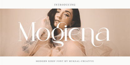 Mogiena Modern serif Font typeface with beautiful alternate and ligature, special glyphs, ornament and multilingual support. It's a very versatile font that works great in large and small sizes. Perfect for editorial projects, Logo design, Clothing Branding, product packaging, magazine headers, or simply as a stylish text overlay to any background image. Features: Lowercase and Uppercase Ligature Numerals & Punctuation Accented characters Multiple Languages Supported
 - Senar by Larin Type Co,
$14.00 Senar is a great font family that includes 20 fonts ( Slab serif - 5 weights upright and 5 weights oblique, Sans serif - 5 weights upright and 5 weights oblique ). It is a modern, versatile and easy-to-read font that is perfect for a wide range of design solutions, such as logos, branding, label, packaging, web titles, text descriptions, as a primary or secondary, and much more.
 - Gush Kettel AT by madeDeduk,
$12.00 Gush Kettle is a distinct note font made manually with a pen contains 50+ ligatures with two alternative. Gush Kettle is great for branding, posters, logos, invitation, writing and headings. Feature Uppercase & Lowercase Number & Symbol International Glyphs Multilingual support Alternative Ligature Thanks so much for checking out my shop and feel free to drop us a message any time and follow my shop for upcoming updates
 - Batavia Retro by Alpha Bento,
$15.00 Introducing a new handwritten font, Batavia Retro, a modern and minimal typeface packed with handwritten ligatures. Batavia Retro adds chic elegance to websites, wedding stationery, modern logos and branding, social media quotes and more. Great for signature logos and more. Batavia Retro Features Full Set of standard alphabet and punctuation Extra set of Alternate lowercase Extra stylistic alternates and ligatures PUA Encoded Multilingual Characters
 - Sudsier AT by madeDeduk,
$12.00 Sudsier is a note hand drawn font contains 50+ ligatures and comes with two alternative font. Sudsier is great for branding, posters, logos, invitation, writing and headings. Feature Uppercase & Lowercase Number & Symbol International Glyphs Multilingual support Alternative Ligature Thanks so much for checking out my shop and feel free to drop us a message any time and follow my shop for upcoming updates Hope you enjoy it.
