10,000 search results
(0.04 seconds)
- Black Gold VP by VP Creative Shop,
$15.00 Black Gold is sophisticated typeface with tons of alternate glyphs, ornaments and multilingual support. It's a very versatile font that works great in large and small sizes. Black Gold is perfect for branding projects, home-ware designs, product packaging, magazine headers - or simply as a stylish text overlay to any background image. Feel free to contact me if you have any questions!
 - Moldiv by ATK Studio,
$15.00 Moldiv is a sans serif display typeface with geometric appearance. Its clean and angular shapes provide a futuristic and robust design. Moldiv consists of a single weight, an extended European character set, and kerning and symbols were manually edited. It has a timeless style which is great for display purposes, especially for headlines, posters, magazines, book covers, logos, and much more.
 - Swagg by Miller Type Foundry,
$29.00 Swagg is a unique and friendly sans that looks great at any size. Originally starting as a branding project, Swagg is now a full fledged family with 5 weights. Swagg is loaded with goodies like old style figures, tabular figures, true italic, arrows and much more. Most proudly Swagg shows off a Greek alphabet, making it an ideal workhorse family for your collection!
 - Promag Fonts Duo by XdCreative,
$29.00 Promag sans duo is inspired by climora serif by faldykudo, while maintaining a feminine and elegant impression, combined with a beautiful Promag Scripts which is a perfect combination to your various design needs. Promag would look great for logos & branding, invitations, stationery, wedding designs, social media, advertisements, printed quotes, product packaging, labels, photography, watermarks, special events, or even magazine layouts. Thank you.
 - Bold Yeah by Mvmet,
$16.00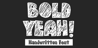 Bold Yeah is a bold and rough hand-drawn display font. It works great for creating cool designs that scream for attention. It’s ideal for anything ranging from t-shirts, book designs, restaurant menu, blog writing, greeting cards to stickers, or anything that needs a casual touch. Fall in love with its incredibly cool style, and use it to create lovely designs!
 - Faesa Breages by Muksal Creatives,
$15.00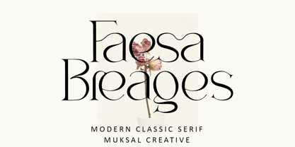 Faesa Breages Modern Classic serif typeface with beautiful ligatures, special glyphs, ornament and multilingual support. It's a very versatile font that works great in large and small sizes. Perfect for editorial projects, Logo design, Clothing Branding, product packaging, magazine headers, or simply as a stylish text overlay to any background image. Features: Lowercase and Uppercase Ligatures Numerals & Punctuation Accented characters Multiple Languages Supported
 - Whortle by Katsia Jazwinska,
$19.00 Bold, free-flowing and confident, Whortle is guaranteed to add an eye-catching appeal to your designs. Irregular shapes and dancing baseline make it feel much more personal. It looks great in both all-caps as well as lowercase. Whortle comes with upper and lowercase characters, large set of punctuation glyphs, numerals, and supports international languages. Hope you like it!
 - Refresh Screen by Arendxstudio,
$18.00 Refresh Screen contains 3 script weights (clean, rough, alternative) and 1 solid display weight. Give your new brand, wedding invitations, and quotes a fresh hand painted look with realistic texture. Refresh Screen was created to give a natural yet stylistic look to your next project! Works Great For: Logos Labels Signage Signature Logo Title Website Etsy Product Quotes Instagram Packaging Business Card & More
 - CCS Kaelia by Creative Corner Studio,
$19.00 Introducing CCS Kaelia Sans serif, a Bold Minimalist Elegant Modern vintage font with beautiful ligatures, tons of special alternative glyphs, ornament and multilingual support. It's a very versatile font that works great in large and small sizes. Perfect for branding projects, Logo design, Clothing Branding, product packaging, magazine headers, or simply as a stylish text overlay to any background image.
 - Kaisar by Hazztype,
$21.00 Kaisar is a geometric sans serif typeface that draws inspiration from Eurostile or similar typefaces, with less boxy feels. It comes with 9 weights and matching italics and contains 400+ glyphs that support broad latin language. Kaisar was designed to give a corporate, technological, futuristic look, great for many contexts from web to print, as a headline or as a body text.
 - Nordika by Scholtz Fonts,
$19.00Nordika is an understated, elegant, sans serif face with that clean legible corporate look. Its simple, trendy design makes it distinctive enough for display work. It makes a bold statement and is highly readable. Nordika is both condensed and quite bold and is therefore suitable for body text where some emphasis is required. Great for text and headlines - for just about any application. - La Marisa by Kaligra.co,
$29.00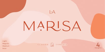 La Marisa is a Minimalist Modern Elegant vintage font with beautiful ligatures, tons of special alternative glyphs, ornament and multilingual support. It's a very versatile font that works great in large and small sizes. La Marisa is perfect for branding projects, Logo design, Clothing Branding, product packaging, magazine headers, or simply as a stylish text overlay to any background image.
 - Natural Cadence by Muksal Creatives,
$15.00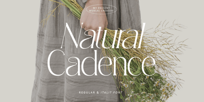 Natural Cadence Modern serif Font typeface with beautiful alternate, special glyphs, ornament and multilingual support. It's a very versatile font that works great in large and small sizes. Perfect for editorial projects, Logo design, Clothing Branding, product packaging, magazine headers, or simply as a stylish text overlay to any background image. Accented characters Multiple Languages Supported Features: Lowercase and Uppercase Alternate Numerals & Punctuation
 - Borba by Edyta Demurat,
$20.00 Borba is light, fresh and friendly at first glace. It's simple, modern and elegant due to its monoline and minimalistic form. It is really readable which makes it perfect for long texts but it looks great in titles and short sentences as well. To sum up, borba is a universal typeface which may be used whenever you need a stylish and modern typography.
 - CCS Lorena by Creative Corner Studio,
$19.00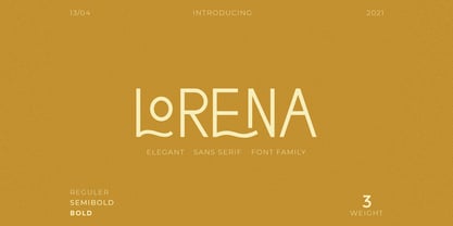 CCS Lorena is a Minimalist Modern Elegant font with beautiful ligatures, tons of special alternative glyphs, ornament and multilingual support. It's a very versatile font that works great in large and small sizes. CCS Lorena Sans is perfect for branding projects, Logo design, Clothing Branding, product packaging, magazine headers, or simply as a stylish text overlay to any background image.
 - Patinas Pointed by Inumocca,
$13.00 Patinas Pointed with 2 Style Reguler and Destroy. Modern Urban Serif Font, Powerfull and has a great Character, Good Font to use for covering your Project, like Branding, Headline Letter, Flyer, Signage, Quotes, Poster Typography, Bookcover, Magazine cover, Poster, Quotes Lettering, Logos, and more your project design. - Unique glyphs - Multilingual Characters Support - UPPERCASE - Lowercase - Numeric - Symbol - Punctuation Character inumocca type Studio
 - MGN Larusso by Morgana Studio,
$18.00 MGN Larusso is a mixed-width sans font produced by Morgana Studio. It features a unique design that combines both regular and condensed letterforms to create a visually interesting and versatile typeface. With its modern and distinctive appearance, MGN Larusso is a great choice for a wide range of design projects, adding a touch of sophistication and style to your work.
 - Hellrose by madeDeduk,
$12.00 Hellrose is a scratches hand drawn font contains 50+ ligatures with three alternative. Hellrose is great for branding, posters, logos, invitation, writing and headings. Feature Uppercase & Lowercase Number & Symbol International Glyphs Multilingual support Ligature Thanks so much for checking out my shop and feel free to drop us a message any time and follow my shop for upcoming updates. Hope you enjoy it.
 - Liquorstore by Chank,
$99.00 Inspired by hand-painted liquor store signage in Minneapolis, as well as constructivist propaganda posters and old magazine logos, Chank created Liquorstore as a simple yet elegant exercise in font creation based on basic geometric forms with subtle, humanist sensibilities. Works great for display usage for headlines, labels and prohibitive signage. A simple and versatile, must-have display poster font!
 - Aikenap by Muksal Creatives,
$15.00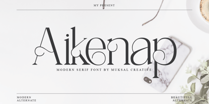 Aikenap Modern serif typeface with beautiful alternete, special glyphs, ornament and multilingual support. It's a very versatile font that works great in large and small sizes. Perfect for editorial projects, Logo design, Clothing Branding, product packaging, magazine headers, or simply as a stylish text overlay to any background image. Features: Lowercase and Uppercase alternete Numerals & Punctuation Accented characters Multiple Languages Supported
 - Epic Miracle by Prestige Artsy Studio,
$29.99 Epic Miracle is beautiful rounded bold retro serif with a 90s touch. A great serif that works beautifully in modern designs. You can definitely create amazing logos, headings, apparel designs and more. Epic Miracle is an essential font for branding as well if you want to go BOLD. I can't wait to see what you can create with Epic Miracle!
 - Orange Avenue by Krismagraph,
$15.00 Orange Avenue is an Elegant Ligature Serif Font. Its soft curves mixed with high contrast glyphs, give it a feminine and masculine quality. Come with two versions, namely Regular & Outline. It comes with epic ligatures and alternates. Great in layout design for quotes or body copy, best used as a display for headings, logos, branding, magazines, product packaging, and invitations.
 - Nimous Daven by madeDeduk,
$12.00 Nimous Daven is a distinct hand drawn font contains 50+ ligatures with two alternative. Nimous Daven is great for branding, posters, logos, invitation, writing and headings. Feature Uppercase & Lowercase Number & Symbol International Glyphs Multilingual support Alternative Ligature Thanks so much for checking out my shop and feel free to drop us a message any time and follow my shop for upcoming updates
 - Augan by Muksal Creatives,
$15.00 Augan Modern sans serif typeface with beautiful alternete, special glyphs, ornament and multilingual support. It's a very versatile font that works great in large and small sizes. Perfect for editorial projects, Logo design, Clothing Branding, product packaging, magazine headers, or simply as a stylish text overlay to any background image. Features: Lowercase and Uppercase alternete Numerals & Punctuation Accented characters Multiple Languages Supported
 - DT Skiart Lexiconic by Dragon Tongue Foundry,
$10.00 Apparently, Lexicon is the most expensive font in the world. ‘Skiart Lexiconic’ has been on a long growing path getting to where it is now. This font family was originally inspired by the san serif font ‘Skia’, by Mathew Carter for Apple. ‘Skiart’ was designed to feel more like a serifed font, but without any actual serifs. It took a small step between sans serif and serif fonts. Next on the path towards a serif font came Skiart Serif Mini, with tiny serifs added. This was a true serif font, although they were subtle. Then came ‘Skiart Serif Leaf’. and now... We present to you... DT Skiart Lexiconic. Having evolved from the Skiart family, we chose to give it the serifed styling of Lexicon. This is no way a copy or clone of Lexicon. It still has the basic bones of the original Skiart font, but the position, shape and size of the serifs were very much influenced by the world famous Lexicon font. DT Skiart Lexiconic is not the most expensive font in the world.
 - CA Play by Cape Arcona Type Foundry,
$29.00 This font invites you to play with it. The Real version has longer tails, while the Roman version cuts them up to make the font more suitable for text. The Script version connects the letters, while the Dynamic version is just an italic style.
 - K&T Heidi by K and T,
$70.00 This is a well-built, functional (all caps) typeface, which is very modern in character. The use of diagonal corners in this angular typeface is inspired by the pennant numbers on British Royal Navy warships, which adds an military quality to this typeface. The gaps, which form the Stencil divisions, follow pre-established horizontal and vertical lines, they help to achieve both geometric and proportional harmony. The direction of the gaps is always at a right angle to the stroke.
 - Onick by Wordshape,
$- While researching the history of Onitsuka Tiger's branding and graphic design, I came across an odd, yet highly appealing piece of custom lettering on the company's ONICK ski boots from the 1970s. Reminiscent of aspects of the typeface Black-Out by Eli Carrico (released by my type foundry Wordshape), yet vertically compressed with razor-sliced counters and odd stencil element that makes up one of the legs of the "K", the ONICK lettering is a potential source for an intriguing modular font. I immediately thought of Ryoichi Tsunekawa as a potential collaborator to bring this piece of lettering to full-fledged life in the contemporary context. Based in Nagoya, Tsunekawa runs an independent type foundry called Dharma Type, including three specialized foundry sub-labels: Flat-It, devoted to display lettering; Prop-A-Ganda, a series of fonts inspired by and based on retro propaganda posters, movie posters, retail sign lettering & advertisements in the early 20th century; and Holiday Type, a series of decorative and retro scripts for holiday use. The past year has seen a flurry of notice of his work abroad, having been featured in both MyFonts' "Creative Characters" and YouWorkForThem's newsletter. As the work of most Japanese type designers is almost wholly unnoticed abroad, for Tsunekawa to be interviewed by two of the most popular type distribution companies in the world is definitely something beyond the norm. Perhaps it is because he works independently, or perhaps it is due to the charm and friendliness with which his typefaces are infused. Either way, this attention is both welcome and appreciated. Beyond mere charm, Tsunekawa's work is nuanced, detailed, and accessible due to its high level of finish. His fonts stand apart from his contemporaries in Latin typeface design in Japan due to his fascination with pop, vernacular and historical lettering from "non-pure" sources- whereas type designers like Kunihiko Okano and Akira Kobayashi have spent years analyzing the essence of Western letterform construction and unlocking the essence of Latin forms, Tsunekawa views surface and the awkward nature of his sources as being of value, as well. His irreverence for the formal doctrines of history imbue his typeface designs with a rugged inventiveness that would be missed by most- glyphs without source designs are guessed at and approximated, often in a manner wildly divergent from what Western eyes would assume. It is in these moments that I find sheer delight in Tsunekawa’s work and what make me most pleased to invite him aboard Neojaponisme and Onitsuka Tiger’s type development project. His assorted typefaces show an eclecticism in finish and as holistic systems- Tsunekawa's return email to me about the proposed type project showed a digital sketch of how a completed typeface family from the source lettering might look, rendered with an effortlessness and dedication to detail that belies a skilled craftsperson. Further development showed Tsunekawa’s rigor- the typeface in development rapidly featured glyphs ignored by many: a full set of fractions, Eastern European diacritics and accents, superior and inferior numerals, alternate characters, and custom ligatures - all designed with regulated, detailed spacing. ONICK is a typeface Tsunekawa should be proud of- an homage to a moment in history rendered in the absolute best fashion. We are proud to present it to the world! --Ian Lynam
 - Freibeuter NR by Otto Maurer,
$23.00 FREIBEUTER NR is a typical Western font but this is based on a FAMOUS Motorcycle Club from the television that everyone knows. The word FREIBEUTER is the German version of pirate. FREIBEUTER did in earlier times what pirates do, but they do it with the government togetherness. NR stands for NIEDERRHEIN, this is the area where I live and work. The PATCH Version is the best way to make fast a nice Banner or Patch with this font. You can use the WrapTEXT tool in Illustrator or Photoshop to wrap the banner in al forms!
 - Linotype Compendio by Linotype,
$40.99Linotype Compendio is a part of the Take Type Library, chosen from the contestants of the International Digital Type Design Contests from 1994 and 1997. Christian Bauer designed this font based on the basic forms of Transitional faces of the 17th century. The outer contours of the letters are purposely raw and irregular, much like alphabets printed on low-quality paper. The legibility of the font is thus reduced, making it necessary to use this font only for shorter texts or headlines, but it is exactly this characteristic which lends Linotype Compendio its distinctiveness. - Grapple BRK Pro by CheapProFonts,
$10.00 Another very squarish and futuristic font from Brian Kent. This time I've kept the very thin style of the diacritics, but I have redesigned the A and H (and a couple of other letters and glyphs ;) - mostly to give them a little more "meat". And then added the usual plethora of accented letters for our unique language support, of course. Result! ALL fonts from CheapProFonts have very extensive language support: They contain some unusual diacritic letters (some of which are contained in the Latin Extended-B Unicode block) supporting: Cornish, Filipino (Tagalog), Guarani, Luxembourgian, Malagasy, Romanian, Ulithian and Welsh. They also contain all glyphs in the Latin Extended-A Unicode block (which among others cover the Central European and Baltic areas) supporting: Afrikaans, Belarusian (Lacinka), Bosnian, Catalan, Chichewa, Croatian, Czech, Dutch, Esperanto, Greenlandic, Hungarian, Kashubian, Kurdish (Kurmanji), Latvian, Lithuanian, Maltese, Maori, Polish, Saami (Inari), Saami (North), Serbian (latin), Slovak(ian), Slovene, Sorbian (Lower), Sorbian (Upper), Turkish and Turkmen. And they of course contain all the usual "western" glyphs supporting: Albanian, Basque, Breton, Chamorro, Danish, Estonian, Faroese, Finnish, French, Frisian, Galican, German, Icelandic, Indonesian, Irish (Gaelic), Italian, Northern Sotho, Norwegian, Occitan, Portuguese, Rhaeto-Romance, Sami (Lule), Sami (South), Scots (Gaelic), Spanish, Swedish, Tswana, Walloon and Yapese.
 - Romanson by Larin Type Co,
$15.00 Romanson - a modern display serif font with a lot of alternates and ligatures. This font can look more classic (conservative) serif, which is perfect for texts. So same he can be more expressive, playing and more modern with alternative substitutes and ligatures, try to play with them and you will get the uniqueness in your project. Just try to create a logo from uppercase, change them to create the best and harmonious and inimitable design. This font includes 205 Uppercase, 27 Lowercase alternates and 51 Ligatures.
 - VLNL TpDuro by VetteLetters,
$30.00 VLNL TpDuro was designed by chef Martin Lorenz and Juanra ‘Wete’ Pastor. Its concept was inspired by an Albrecht Dürer design from 1525, which shows a system to construct a gothic lowercase letter. Following the logic of this lowercase construction, but not the traditional uppercase letters of regular fraktur (brokenscript) alphabets, some brand new upper case letters were designed. The 45 degree tilted square that forms the basis of the letters, is as square and hard as a cracker. And we love crackers. You can put cheese on them. The ‘pixel’ feeling of the downstroke was intensified by repeating the rotated square module as often as they could. All this resulted in a strong, dark typeface with a steady rhythm, with one foot in history and the other in modern times. It works well as a display typeface for short texts, headlines and logos. Music festivals and heavy metal bands should also pay attention. This is hard stuff.
 - Zull Wettis Cyrillic by Ira Dvilyuk,
$18.00 The script font Zull Wettis was handwritten with a dry brush and will look great on branding design, posters, apparel, logotype, website header, fashion design, wedding card design, and more. Zull Wettis script font contains a full set of uppercase and lowercase letters and 23 ligatures - which can be used to create a handwritten calligraphy look. The Cyrillic part of the font contains the uppercase letters and lowercase letters and 18 ligatures, giving a realistic hand-lettered style. Zull Wettis Symbols is a font with over 36 unique, hand-drawn elements and swashes that can help to make your design more original. A different symbol is assigned to every uppercase or lowercase standard character plus numbers 0-9 so you do not need graphics software just simply type the letter you need. Multilingual Support for 32 languages: Latin glyphs for Afrikaans, Albanian, Basque, Bosnian, Catalan, Danish, Dutch, English, Estonian, Faroese, Filipino, Finnish, French, Galician, Indonesian, Irish, Italian, Malay, Norwegian Bokmål, Portuguese, Slovenian, Spanish, Swahili, Swedish, Turkish, Welsh, Zulu. Works perfectly on the Canva platform. For Cricut & Silhouette recommended. And Cyrillic glyphs support Russian, Belorussian, Bulgarian, Ukrainian, and Kazakh languages.
 - Ghost Sign JNL by Jeff Levine,
$29.00 Ghost Sign JNL is a spurred serif type design based on the faded lettering of an antique brick wall sign for Homer Hardware [located in Homer, NY] and is available in both regular and oblique versions. From Wikipedia: “A ghost sign is an old hand-painted advertising sign that has been preserved on a building for an extended period of time. The sign may be kept for its nostalgic appeal, or simply indifference by the owner. Ghost signs are found across the world with the United States, the United Kingdom, France and Canada having many surviving examples. Ghost signs are also called fading ads or brickads. In many cases these are advertisements painted on brick that remained over time. Old painted advertisements are occasionally discovered upon demolition of later-built adjoining structures. Throughout rural areas, old barn advertisements continue to promote defunct brands and quaint roadside attractions. Many ghost signs from the 1890s to 1960s are still visible. Such signs were most commonly used in the decades before the Great Depression. Ghost signs were originally painted with oil-based house paints. The paint that has survived the test of time most likely contains lead, which keeps it strongly adhered to the masonry surface. Ghost signs were often preserved through repainting the entire sign since the colors often fade over time. When ownership changed, a new sign would be painted over the old one.”
 - Cautions Brush by Fargun Studio,
$12.00 Thanks for checking out Cautions Brush! A fabulously fun yet elegant script font with tons of energy, allowing you to create beautiful hand-made typography in an instant. With extra bouncy curves & loops, Cautions Brush is guaranteed to make your text stand out - perfect for logos, printed quotes, invitations, cards, product packaging, headers and whatever your imagination holds. What's really awesome is that Cautions Brush comes with a complete set of lowercase alternates, which allows you to create even more authentic custom-feel text. Another great feature is the bonus ornaments font, which allows you to add some really unique and elegant finishing touches to your script text. Cautions Family includes 2 font files; Cautions Brush• A handwritten script font containing upper & lowercase characters, numerals and a large range of punctuation. Cautions extras • A set of hand-drawn swashes & doodles, the perfect finishing touch to underline your Cautions Brush text & doodles for perfect lettering logos. Simply install this as a separate font, select it from your font menu and type any A-Z, a-z & 0-9 character to create a swash & Doodles.
 - Sunpalm Addict by YdhraStudio,
$20.00 Sunpalm Addict is a stylish modern calligraphy font. It’s containing upper & lowercase characters, all punctuation and numerals. Also contains 85 ligatures to help the text flow naturally For those of you who are needing a touch of elegance and modernity for your designs, this font was created for you! Sunpalm Addict is great for Invitations, Greeting Cards, Posters, Name Card, Quotes, Blog Header, Branding, Logo, Fashion, Apparel, Letter, Book, Magazine, Advertising Design, Stationery and more! Sunpalm Addict Features: - Upper and Lowercase Standard Characters, Punctuation, Numerals - OpenType features such as multiple ampersand (&) and many ligatures - Bonus Illustration - PUA Encoded Characters - Fully accessible without additional design software. - Includes a range of multilingual characters. You can access all those alternate characters by using a program that supports OpenType features such as Adobe Illustrator CS, Adobe Indesign & CorelDraw X6-X7. Guides to access all alternates glyphs : http://adobe.ly/1m1fn4Y Mix and match the alternate characters to add an attractive message to your design. Please, Feel free to contact me by e-mail yyudhara@gmail.com for any question about my font, Extended License document and more.
 - Rifleman by Open Window,
$19.95 What a nice tranquil feeling you get from the wide forms of this font. The air of spontaneity was the most important thing about developing Rifleman. The forms were carefully and slowly constructed and then loosely traced with a paintbrush. Maybe the original drawings will become a font someday but i like to think that they won't for some reason. Surprisingly Rifleman is left to only the bare essential elements, anything that wasn't necessary was left out or removed. The goal was to make it as lightweight as possible to make up for the intricate detail. Rifleman is a surprisingly lightweight font offering lends itself to speedy typesetting!
 - Big Welly by Inclusive Fonts,
$19.95 Big Welly …in the United Kingdom we have a very British phrase which is ‘Give it some Welly (Wellie)’ this is often shouted to a person as encouragement or criticism, it asks for more effort to be put into whatever he or she is doing. The saying comes from an informal name for Wellington Boots; Wellies - named after The Duke of Wellington. Hence, ‘Big Welly’ the font, this font is bold and big on the one hand and handwritten on the other. These two attributes make this font ideal as a poster font or t-shirt font for instance to make your message really stand out. So, if you need a bit of added oomph in your design – look no further than ‘Big Welly’.
 - Pinel Pro by URW Type Foundry,
$39.99 The characteristic ‘French face’ was originally made in 1899 under the supervision of Joseph Pinel. Thus, what was originally French 10 pt. Nº 2, got its present name. The Frenchman Joseph Pinel called himself a "typographical engineer", but was at the time employed as a type draughtsman at the Linotype Works in Altrincham. It appears that this and some other faces that he supervised, were, except for use on the Linotype, also meant for manufacturing matrices for the Dyotype. This composing machine was an invention of Pinel. The Dyotype was a rather complicated machine and consisted, like the Monotype, of two separate contraptions, a keyboard which produced a perforated paper ribbon and a casting machine which produced justified lines of movable type. Unlike the Monotype which has a square matrix carrier, the Dyotype had the matrices on a drum (in fact two drums, hence the name of the machine). A Pinel Diotype company was founded in Paris and a machine was built with the help of the printing press manufacturer Jules Derriey. As is often the case, a lack of sufficient capital prevented the commercializing of this ingenious composing machine. Coen Hofmann digitized the font from a batch of very incomplete, damaged and musty drawings, which he dug up in Altrincham. He redrew all characters, bringing up the hairstrokes somewhat in the process. The result is a roman and italic, while the roman font also includes Small Caps