10,000 search results
(0.037 seconds)
- Lech Sans Pro by Ingo,
$44.00 A modern sans serif – large x-height, lively forms The Lech Sans Pro is businesslike-modern but at the same time present the effect of liveliness and movement. The shapes of the individual characters follow the "humanistic" form language of modern faces. In this way, Lech Sans Pro offers an attractive alternative to most of the sans serif fonts used today. The proportions have been selected to be very legible even as a body type for longer texts. The font is so robust in detail that a title in large capitals is very eye-catching. It can function positively as well as negatively and is also still legible from a great distance. Lech Sans Pro supports West European languages including Scandinavian, Central and Eastern European languages, also including Turkish, Vietnamese as well as Greek and Cyrillic. Along with ligatures for the letter combinations fi, ff, fl, tt and tz the font also includes stylistic alternates for N, R, f, l as well as for the German sharp s and the figure 3. Additionally, Lech Sans Pro offers several sets of figures: proportional standard figures of equal height lining figures in height of the capitals proportional medieval figures with ascenders and descenders disproportional tabular figures of equal width superior and inferior scientific figures and numerators resp. denominators for fractions circled figures
 - Sybilla by Karandash,
$19.95 Sybilla is a robust, but friendly, humanist slab serif well suitable for broad range of design projects. A true workhorse and superb text type family, Sybilla was especially designed with legibility in mind. Its soft almost cursive shapes and generous internal spaces define a slab serif that is easier on the reader’s eye and help establish a feeling of warmth and friendliness. The type family consists of eight weights with complimentary italics. While the Light, Book, Regular and Medium weights are great performers for body text, the Thin, Bold and Heavy weights make an excellent choice for headlines. Also there is the specially designed Ultra weight if extra punch is needed. Sybilla has extensive multilingual support and specially designed Cyrillic that works harmoniously with its Latin counterparts - a perfect choice for design projects that need both writing systems running side by side.
 - Elvira Serif by Sudtipos,
$39.00 Elvira Serif is a typeface family that proposes to make the use of display serifs a little more fun, including in its anatomy some sharp points, ink traps implanted in some glyphs, and the formality of a traditional serif. All of these elements make Elvira Serif a great option that balances the contemporary with traditional touches. Elvira Serif has 9 weights, as well as true italics, which gives it dimension and versatility in its use. It can be used for a wide variety of purposes: it works well on the web, headlines and especially designed for book publishing at small sizes. Elvira Serif has the ability to look robust and imposing in its black weight, and subtle and elegant in its light weight. Enjoy it, it is made with a lot of passion and fun by Sudtipos and Vástago.
 - Chocoball by Yumna Type,
$16.00 It is significant to have a unique font to create impressive, impactful designs because people often forget common things which may cause your work to be forgotten as well. You may have lost your candidate customers even before they know your brand and product. Let us introduce you to Chocoball, a font with firm impressions to protrude your designs. Chocoball is an uppercased display font designed in playful, modern concepts. It has firm, attractive impressions because of the inclined square letter shapes making it more unique than the others. Furthermore, it can show off your desired messages on your designs easily with the use of the uppercases. Besides, this font is able to build up a strong, recognizable brand identity. A playful display font is flexible and suitable for various design types as its advantage because it is applicable for either formal or informal designs producing interesting, consistent results. You can apply Chocoball, which gives you a clipart as a bonus, for big text sizes to be legible. You can enjoy the available features here as well. Features: Ligatures Multilingual Supports PUA Encoded Numerals and Punctuations Chocoball fits best for various design projects, such as brandings, posters, banners, headings, magazine covers, quotes, printed products, merchandise, social media, etc. Find out more ways to use this font by taking a look at the font preview. Thanks for purchasing our fonts. Hopefully, you have a great time using our font. Feel free to contact us anytime for further information or when you have trouble with the font. Thanks a lot and happy designing.
 - Quotes by Sudtipos,
$49.00 «Quotes» is the second typeface calligraphed by Yani Arabena, designed along with Guille Vizzari and Ale Paul, for Sudtipos. Being thrilled by the use of the pointed brush, spontaneous messages, gesture and freshness to represent inspirational phrases and quotes written by hand, «Quotes» comes in two handwriting styles: Script and Caps. «Quotes Script» and «Quotes Caps» are thought together and complement each other filling with rhythm and infinite sensations to the spoken words. A more free and spontaneous version –Script–, joined by an uppercase system –Caps–, that offers a huge amount of alternate glyphs, ligatures and connectors, to enrich different messages brought to life with this type family. «Quotes Script» counts on a great variety of alternate signs in its lowercase as well as its uppercase letters. It hands a combination of ligatures and capital alternates that allows to shape the beginnings and endings of words and phrases intended to be inspiring and to inspire others that read them. «Quotes» also stands for the fashion universe, Gourmet, Natural, the D.I.Y. passionates, and for all those who seek for the Handcrafted spirit and agrees that it adds an added value to its products and in their communication possibilities. Nowadays, new trends in the calligraphic and drawn letters fields, have lead to the use of the brush pen as a daily practice, bringing to life phrases that motivates people to share their thoughts. «Quotes» is a typeface that invites to write, share and influence others to make their own. Sometimes a feeling can’t be explained, but «Quotes» is a font that can.
 - Cat e Poultry by Proportional Lime,
$19.99 Love them or hate them Cats are one of the most successful animals on the planet. If they had thumbs we would all be in trouble. Fortunately for us these four legged sharks have managed to domesticate us and we are able to coexist peacefully. So this font is to share the joy of being blessed with the presence of such noble animals be it those of the Pantherinae Felidae or the not so humble Felis Catus (Domestic Cat). Why the Turkey? Well... you will have to buy the font to find out.
 - Bex Script by The Ampersand Forest,
$35.00 Bex Script is a riff on traditional French script forms: the Bâtarde, the Ronde, and the Coulée. It has two versions: First, there’s La Belle, a straightforward, lovely interpretation of the script form, suitable for things like invitations, poetry and branding. La Belle’s evil twin is La Bête, a more whimsical (and considerably more hairy) version, great for anything that requires an elegant-but-beastly feel. Bex is surprisingly versatile! With three optional capital forms (Swash, Caps, and Small Caps) all taller than the x-height, Bex has a variety of voices. A full small cap set and a full set of Swash Caps, plus a large complement of alternates, initial forms, terminal forms, and ligatures makes it customizable and… well, FANCY! Additionally, both versions of Bex Script have a set of ten ornament glyphs. La Belle has a combination of fleurons on a culinary theme and symbols of France. La Bête has ten pseudoheraldic beasts that would feel at home at the top center of any whimsical letterhead. NOTE: A few years ago in Paris, I was lucky enough to stop at the Librairie Paul Jammes in St Germain-des-Prés, where I bought a turn-of-the-19th-century signature from a Type Specimen of the printer Joseph Gaspard Gillé. The irregularity of his script types — particularly the ones at smaller sizes, like the Cicéro — was very intriguing. They seemed to blend the Ronde with some elements of the Bâtarde and Coulée. And they, along with the work of French master penman Louis Rossignol, gave Bex Script its initial form.
 - Alimentary by Missy Meyer,
$12.00 Alimentary (adjective): relating to nourishment or sustenance. If you've seen my other fonts, you know I tend to lean into food-based names. This name has to do with food and science combined, so it's double nerdy in the ways I like to be nerdy! I started with Alimentary Medium, which was inspired by my shorter, wider font MacGuffin - I wanted something taller, narrower, with a hip and retro feel. When I finished the Medium weight, I felt like I wanted a Light weight. Then a Heavy weight. Then I figured, "what the heck," and made an outline version of the Medium weight too. In the end, I wound up with four members of the Alimentary family, each with over 700 glyphs! Not only do they all have the basics (A-Z, a-z, 0-9, and tons of punctuation), but they also each have 330 characters for European language support, and a limited selection of Greek, Coptic, and Cyrillic characters. Plus a double handful of alternates and ligatures to add a little variety to your designs! And of course, all of the Alimentary fonts are super-smoothed, with reduced nodes and clean curves, so whether you're cutting them out, printing them, engraving them, or using them in a way I haven't even thought of, these fonts will be sharp and crisp!
 - Mintely by Din Studio,
$29.00 Mintely is a sophisticated and versatile serif font family designed to elevate your typography to new heights of elegance and legibility. With its 6 style variations and 8 weight options, this font offers an extensive array of choices to suit a wide range of design projects. This family combines classic and modern elements, resulting in a timeless design that can adapt to various design contexts. The 6 style variations in this serif provide you with a variety of typographic options, allowing you to experiment with different looks and moods. Whether you need a sleek and minimalistic appearance or a more decorative and ornate style, Mintely has you covered. Additionally, the 8 weight options in Mintely offer a wide range of possibilities in terms of contrast and emphasis. From thin and elegant weights to bold and impactful variations, this font family ensures that you can effortlessly find the perfect weight for your specific design needs. Because of its legibility you can use this font in a variation of text sizes. Enjoy the available features here. Features: Multilingual Supports PUA Encoded Numerals and Punctuations Mintely fits in headlines, logos, posters, flyers, invitations, branding materials, print media, editorial layouts, headers, and any many more. Find out more ways to use this font by taking a look at the font preview. Thanks for purchasing our fonts. Hopefully, you have a great time using our font. Feel free to contact us anytime for further information or when you have trouble with the font. Thanks a lot and happy designing.
 - Fits by DearType,
$40.00 Fits is a modern version of the versatile vintage style script. It's clean, legible and easy to use. Fits was meant to be used as an everyday workhorse font, thus its uses are endless - from websites and signage to merchandise and editorial designs. It looks great on product packaging and menus, being easily readable from afar. It has some initial forms and ligatures, as well as fancier alternates for the capital letters (in case you want to spice things up a bit). Unlike its predecessor, BeachBar, Fits has more basic letter shapes which makes it the perfect script for most day-to-day design applications - think apps, websites, merchandise, posters and cards, blog titles, t-shirts, branding and animation projects, etc. As promised, Fits comes in seven weights for a different impact and with a neat set of Cyrillic letters. All in all, Fits is a simple and workable script that will fit most design tasks perfectly.
 - Bigruns Brush by Din Studio,
$29.00 Looking for a font that will make your branding stand out? Do you sometimes have an appetite for a bit more wholesome typography? Looking for a fabulous, stylish, and adventure font? We've got what you want. Bigruns Brush - A Display Brush Font Bigruns Brush is a display font is accompanied by a gorgeous handcrafted script brush font that works together in perfect harmony. This font made all in uppercase that easy on the eyes and nice to look while it’s also easy to read. Designed primarily as a captivating font to add the right amount of modernity and style, The best choice to ensure a great font match for your designs and projects! Well suited to titles, poster designs, branding, quotes, and logos. Our font always includes Multilingual Support to make your branding reach a global audience. Features: Ligatures Stylistic Set PUA Encoded Numerals and Punctuation Thank you for downloading premium fonts from Din Studio
 - Washington Lumut by Zaki Creative,
$9.00 The Washington Lumut calligraphy is calligraphy font with a classic style and a touch of elegance, inspired by the handwriting of Italian women and ancient manuscripts. Carefully designed to work together in harmony that makes it very suitable for wedding media, book covers, greeting cards, logos, branding, business cards and certificates, even for any design work that requires a classic, formal or luxurious. Try Washington Lumut Calligraphy, enjoy the richness of OpenType features and let her fun and elegant excitement make you happy and enhance your creativity! You can use this font very easily. multilingual support and special ligatures If you do not have programs that support OpenType features like Adobe Illustrator and CorelDraw X Versions, you can access all alternative flying machines using Font Book (Mac) or Character Map (Windows): Do not forget to see, buy, like and share my other great products And feel free if you have a question, please contact me : zakicreative6@gmail.com Thank you for purchases.!
 - P22 Tyndale by IHOF,
$24.95Quill-formed roman/gothic with an olde-worlde flavor. Some background in the designer's own words: "A series of fonts came to mind which would be rooted in the medieval era -for me, a period of intense interest. Prior to Gutenberg's development of commercial printing with type on paper in the mid-1400s, books were still being written out by hand, on vellum. At that time, a Bible cost more than a common workman could hope to earn in his entire lifetime. Men like William Tyndale devoted their energies to translating the Scriptures for the benefit of ordinary people in their own language, and were burned to death at the stake for doing so. Those in authority correctly recognized a terminal threat to the fabric of feudal society, which revolved around the church. "This religious metamorphosis was reflected in letterforms: which, like buildings, reflect the mood of the period in which they take shape. The medieval era produced the Gothic cathedrals; their strong vertical emphasis was expressive of the vertical relationship then existing between man and God. The rich tracery to be seen in the interstices and vaulted ceilings typified the complex social dynamics of feudalism. Parallels could be clearly seen in Gothic type, with its vertical strokes and decorated capitals. Taken as a whole, Gothicism represented a mystical approach to life, filled with symbolism and imagery. To the common man, letters and words were like other sacred icons: too high for his own understanding, but belonging to God, and worthy of respect. "Roman type, soon adopted in preference to Gothic by contemporary printer-publishers (whose primary market was the scholarly class) represented a more democratic, urbane approach to life, where the words were merely the vehicle for the idea, and letters merely a necessary convenience for making words. The common man could read, consider and debate what was printed, without having the least reverence for the image. In fact, the less the medium interfered with the message, the better. The most successful typefaces were like the Roman legions of old; machine-like in their ordered functionality and anonymity. Meanwhile, Gutenberg's Gothic letterform, in which the greatest technological revolution of history had first been clothed, soon became relegated to a Germanic anachronism, limited to a declining sphere of influence. "An interesting Bible in my possession dating from 1610 perfectly illustrates this duality of function and form. The text is set in Gothic black-letter type, while the side-notes appear in Roman. Thus the complex pattern of the text retains the mystical, sacred quality of the hand-scripted manuscript (often rendered in Latin, which a cleric would read aloud to others), while the clear, open side-notes are designed to supplement a personal Bible study. "Tyndale is one of a series of fonts in process which explore the transition between Gothic and Roman forms. The hybrid letters have more of the idiosyncrasies of the pen (and thus, the human hand) about them, rather than the anonymity imbued by the engraving machine. They are an attempt to achieve the mystery and wonder of the Gothic era while retaining the legibility and clarity best revealed in the Roman form. "Reformers such as Tyndale were consumed with a passion to make the gospel available and understood to the masses of pilgrims who, in search of a religious experience, thronged into the soaring, gilded cathedrals. Centuries later, our need for communion with God remains the same, in spite of all our technology and sophistication. How can our finite minds, our human logic, comprehend the transcendent mystery of God's great sacrifice, his love beyond understanding? Tyndale suffered martyrdom that the Bible, through the medium of printing, might be brought to our hands, our hearts and our minds. It is a privilege for me to dedicate my typeface in his memory." - Evita by ITC,
$29.99Gérard Mariscalchi is a self-made designer. Born in Southern France of a Spanish mother and an Italian father, he has worked as a mechanic, salesman, pilot, college teacher – even a poet (with poetry being the worst-paying of these professions, he reports.) “Throughout all this, the backbone of my career has always been design,” Mariscalchi says. “I’ve been drawing since I was five, but it wasn’t until I was twenty-four that I learned that my hobby could also help me earn a living.” It was about this same time that Mariscalchi fell in love with type. He studied the designs of masters like Excoffon, Usherwood and Frutiger, as well as the work of calligraphers and type designers such as Plantin, Cochin and Dürer. With such an eclectic background, it’s no surprise that Mariscalchi’s typeface designs are inspired by many sources. Baylac and Evita reflect the style of the art nouveau and art deco periods, while Marnie was created as an homage to the great Lithuanian calligrapher Villu Toots. However, the touch of French elegance and distinction Mariscalchi brings to his work is all his own. Baylac Who says thirteen is an unlucky number? Three capitals and ten lowercase letters from a poster by L. Baylac, a relatively obscure Art Nouveau designer, served as the foundation for this typeface. The finished design has lush curves that give the face drama without diminishing its versatility. On the practical side, Baylac’s condensed proportions make it perfect for those situations where there’s a lot to say and not much room in which to say it Evita Mariscalchi based the design of Evita on hand lettering he found in a restaurant menu, and considers this typeface one of his most difficult design challenges. “The main problem was to render the big weight difference between the thin and the thick strokes without creating printing problems at small point sizes,” he says. Unlike most scripts, Evita is upright, with the design characteristics of a serif typeface. Mariscalchi named the face for a close friend. The end result is a charming design that is light, airy, and slightly sassy. Marnie Based on Art Nouveau calligraphic lettering, Marnie is elegant, inviting, and absolutely charming. Mariscalchi paid special attention to letter shapes and proportions to guarantee high levels of character legibility. He also kept weight transition in character strokes to modest levels, enabling the face to be used at relatively small sizes – an unusual asset for a formal script. Marnie’s capital letters are expansive designs with flowing swash strokes that wrap affectionately around adjoining lowercase letters. The design easily captures the spontaneous qualities of hand-rendered brush lettering. - Baylac by ITC,
$29.99Gérard Mariscalchi is a self-made designer. Born in Southern France of a Spanish mother and an Italian father, he has worked as a mechanic, salesman, pilot, college teacher – even a poet (with poetry being the worst-paying of these professions, he reports.) “Throughout all this, the backbone of my career has always been design,” Mariscalchi says. “I’ve been drawing since I was five, but it wasn’t until I was twenty-four that I learned that my hobby could also help me earn a living.” It was about this same time that Mariscalchi fell in love with type. He studied the designs of masters like Excoffon, Usherwood and Frutiger, as well as the work of calligraphers and type designers such as Plantin, Cochin and Dürer. With such an eclectic background, it’s no surprise that Mariscalchi’s typeface designs are inspired by many sources. Baylac and Evita reflect the style of the art nouveau and art deco periods, while Marnie was created as an homage to the great Lithuanian calligrapher Villu Toots. However, the touch of French elegance and distinction Mariscalchi brings to his work is all his own. Baylac Who says thirteen is an unlucky number? Three capitals and ten lowercase letters from a poster by L. Baylac, a relatively obscure Art Nouveau designer, served as the foundation for this typeface. The finished design has lush curves that give the face drama without diminishing its versatility. On the practical side, Baylac’s condensed proportions make it perfect for those situations where there’s a lot to say and not much room in which to say it Evita Mariscalchi based the design of Evita on hand lettering he found in a restaurant menu, and considers this typeface one of his most difficult design challenges. “The main problem was to render the big weight difference between the thin and the thick strokes without creating printing problems at small point sizes,” he says. Unlike most scripts, Evita is upright, with the design characteristics of a serif typeface. Mariscalchi named the face for a close friend. The end result is a charming design that is light, airy, and slightly sassy. Marnie Based on Art Nouveau calligraphic lettering, Marnie is elegant, inviting, and absolutely charming. Mariscalchi paid special attention to letter shapes and proportions to guarantee high levels of character legibility. He also kept weight transition in character strokes to modest levels, enabling the face to be used at relatively small sizes – an unusual asset for a formal script. Marnie’s capital letters are expansive designs with flowing swash strokes that wrap affectionately around adjoining lowercase letters. The design easily captures the spontaneous qualities of hand-rendered brush lettering. - Marnie by ITC,
$29.99Gérard Mariscalchi is a self-made designer. Born in Southern France of a Spanish mother and an Italian father, he has worked as a mechanic, salesman, pilot, college teacher – even a poet (with poetry being the worst-paying of these professions, he reports.) “Throughout all this, the backbone of my career has always been design,” Mariscalchi says. “I’ve been drawing since I was five, but it wasn’t until I was twenty-four that I learned that my hobby could also help me earn a living.” It was about this same time that Mariscalchi fell in love with type. He studied the designs of masters like Excoffon, Usherwood and Frutiger, as well as the work of calligraphers and type designers such as Plantin, Cochin and Dürer. With such an eclectic background, it’s no surprise that Mariscalchi’s typeface designs are inspired by many sources. Baylac and Evita reflect the style of the art nouveau and art deco periods, while Marnie was created as an homage to the great Lithuanian calligrapher Villu Toots. However, the touch of French elegance and distinction Mariscalchi brings to his work is all his own. Baylac Who says thirteen is an unlucky number? Three capitals and ten lowercase letters from a poster by L. Baylac, a relatively obscure Art Nouveau designer, served as the foundation for this typeface. The finished design has lush curves that give the face drama without diminishing its versatility. On the practical side, Baylac’s condensed proportions make it perfect for those situations where there’s a lot to say and not much room in which to say it Evita Mariscalchi based the design of Evita on hand lettering he found in a restaurant menu, and considers this typeface one of his most difficult design challenges. “The main problem was to render the big weight difference between the thin and the thick strokes without creating printing problems at small point sizes,” he says. Unlike most scripts, Evita is upright, with the design characteristics of a serif typeface. Mariscalchi named the face for a close friend. The end result is a charming design that is light, airy, and slightly sassy. Marnie Based on Art Nouveau calligraphic lettering, Marnie is elegant, inviting, and absolutely charming. Mariscalchi paid special attention to letter shapes and proportions to guarantee high levels of character legibility. He also kept weight transition in character strokes to modest levels, enabling the face to be used at relatively small sizes – an unusual asset for a formal script. Marnie’s capital letters are expansive designs with flowing swash strokes that wrap affectionately around adjoining lowercase letters. The design easily captures the spontaneous qualities of hand-rendered brush lettering. - 99 Names of ALLAH Linear by Islamic Calligraphy75,
$12.00 We have transformed the “99 names of ALLAH” into a font. That means each key on your keyboard represents 1 of the 99 names of ALLAH Aaza Wajal. The fonts work with both the English and Arabic Keyboards. We call this Calligraphy "Linear" for obvious reasons. The first "Alef" has a "fatha", this indicates that the name can be pronounced only one way, "AR-RAHMAAN". (in the zip file you will find a pdf file explaining the differences in the "harakat", pronunciation and spelling according to the Holy Quran). This calligraphy is very clear and no letters overlap. Decorative letters used in this calligraphy: "Mim, Aain, Sin, HHe, He, Kaf, Ta & Saad". Purpose & use: - Writers: Highlight the names in your texts in beautiful Islamic calligraphy. - Editors: Use with kinetic typography templates (AE) & editing software. - Designers: The very small details in the names does not affect the quality. Rest assured it is flawless. The MOST IMPORTANT THING about this list is that all the names are 100% ERROR FREE, and you can USE THEM WITH YOUR EYES CLOSED. All the “Tachkilat” are 100% ERROR FREE, all the "Spelling" is 100% ERROR FREE, and they all have been written in accordance with the Holy Quran. No names are missing and no names are duplicated. The list is complete "99 names +1". The +1 is the name “ALLAH” 'Aza wajal. Another important thing is how we use the decorative letters. In every font you will see small decorative letters, these letters are used only in accordance with their respective letters to indicate pronunciation & we don't include them randomly. That means "mim" on top or below the letter "mim", "sin" on top or below the letter "sin", and so on and so forth. Included: Pdf file telling you which key is associated with which name. In that same file we have included the transliteration and explication of all 99 names. Pdf file explaining the differences in the harakat and pronunciation according to the Holy Quran.
 - New York Line by Kustomtype,
$30.00 When you go traveling you always fall in love with something… At this time, it is the inscription of Holland America Line which is sparkling on ‘New York Hotel’, Rotterdam-Holland. Based on the letters I had at my disposal from the Holland America Line inscription at ‘Hotel New York,’ I started to complete the alphabet in the same style as the original text. Eventually, I digitized everything in order to acquire a usable and modern font to be able to use it for all graphic purposes. The font is ideal for head text, posters, logos, editorial, branding, signage, web applications, modern design, etc... Don't hesitate to use this unique historical font! It will give your work that glamour that you will find in this extraordinary font. Enjoy the New York Line. The Holland America Line was founded in 1873 as the Dutch-America Steamship, a shipping, and passenger line. Because it was headquartered in Rotterdam and provided service to the Americas, it became known as Holland America Line (HAL). From 1901 the iconic building on the Kop van Zuid shines. It previously housed the Holland America Line; now it houses the hotel-restaurant, Hotel New York. A building with a great history. Hotel New York has a beautiful history. Built in 1901, many ships sailing away and opened in 1993 as a hotel and restaurant. The New York Line Font comes with uppercase, lowercase, numerals, punctuations so you can use it to customize all your designs. Perfect for Logos, Letterhead, Poster, Apparel Design, Package design, Label design etc. The New York Line Font is designed by Coert De Decker in 2018 and published by Kustomtype Font Foundry. Enjoy your journey with the New york Line!
 - Bingana by LetterStock,
$18.00 Bingana This pair was inspired by kids movie poster design that i saw on some gallery, It was crafted by hand specially to add natural handmade feeling in its brand identity than i make it clean with pentool. We improve with handmade to make a playful feel, this font is bold so it can look strong if you use it for branding or even title for your poster design with playful decorative style. Opentype features Bingana font has 175 character set included Bingana Font is very good looking in playful decorative logotype, labels, t-shirt prints, product packaging, invitations, advertising and others. This fonts works with folowing languages: Afrikaans, Albanian, Asu, Basque, Bemba, Bena, Chiga, Cornish, Danish, English, Estonian, Filipino, Finnish, French, Friulian, Galician, German, Gusii, Indonesian, Irish, Italian, Kabuverdianu, Kalenjin, Kinyarwanda, Low German, Luo, Luxembourgish, Luyia, Machame, Makhuwa-Meetto, Makonde, Malagasy, Malay, Manx, Morisyen, North Ndebele, Norwegian Bokmål, Norwegian Nynorsk, Nyankole, Oromo, Portuguese, Romansh, Rombo, Rundi, Rwa, Samburu, Sango, Sangu, Scottish Gaelic, Sena, Shambala, Shona, Soga, Somali, Spanish, Swahili, Swedish, Swiss German, Taita, Teso, Vunjo, Zulu Thank you for using this font. LS
 - Premium Sans by ZeeshanFoundry,
$40.00 Premium Sans is a professional typeface which is aspired to solve the major typographic challenges in editorial, print, Graphic design, Commercial designs and other form of templates and documents such as pdf or ms word. It has four weights light, regular, semi bold, bold. Each with an italic profile, so in total it has 8 typefaces. We created this typeface to have attention of reader in Graphic commercial designs and as well as on editorial designs. The X-height plays a great role in readability of a typeface, so we tried to give it a reasonably high x-height with accordance to ascenders and descenders. We've engineered it in such a way that it can easily be paired with script, slab serif and serif typefaces. Premium sans is made on minimum required character set which will be handy while typing currency symbols like cents, dollars or euro and also be very useful when typing the characters consisting of diacritic. We've designed it in such a way that either you write a long content for editorial purposes or you create a typographic or graphic/commercial design it will look nice and fine which is the uniqueness of this font.
 - Cobbler Sans by Juri Zaech,
$30.00 Cobbler Sans is a friendly type family in six weights and the humble cousin to Cobbler. With its rounded aspect and proportions of geometric type Cobbler Sans is expressively soft and contemporary. All terminals are shaped organically and even inner corners are rounded. The few remaining straight lines give the typeface the stability of a workhorse while keeping the playfulness that characterizes the entire Cobbler family so much. Additionally there is a pile of OpenType features built in. For example loads of discretionary ligatures that make capital letters interlock left and right. Other features include automatic fractions, case sensitive punctuation and contextual alternates. Cobbler Sans works great for branding, packaging, editorial or any display application – and it comes with an expansive character set that covers over 200 languages. Furthermore Cobbler Sans is manually kerned and auto-hinted for crisp display on screen also in small sizes.
 - Kurri Island by Mans Greback,
$29.00 Kurri Island is a positive sans-serif typeface. It was drawn and created by Måns Grebäck between 2017 and 2020. With its slightly irregular strokes and bends the font has a characteristic fun and comical and look. The sans is easy-going and relaxed while being serious enough to be used professionally. Kurri Island is an extensive multi-style font family, composed of 24 high quality fonts. The weights are Thin, Light, Regular, Medium, Bold and Black. Being favorably used as a block letter sans-serif, it has an additional Caps style to maximize the impression, and each font are provided as Italic. Its range of styles gives the typeface great flexibility, while also giving the ability to emphasize phrases or words. Kurri Island contains all characters you'll ever need, including all punctuation and numbers. It has an extensive lingual support, covering all European Latin-based scripts.
 - MIR Next by Juliasys,
$22.00 MIR Next is a growing multi-script type family best described by the terms “humanist–semi–slab-serif”. Its character set contains Latin and Cyrillic, both extended, as well as Greek, covering more than 100 languages. Strong personality along with consistency between language systems were a basic aim when designing the family. As a result MIR has become a great tool for branding and international identities. A wide choice of symbols and numbers makes it also very useful for statistics, texts about mathematics and the sciences. Serious things are best be said in an unpretentious, relaxed way. MIR gives typography exactly that kind of appearance. Its texts emit a sense of authority but stay easily accessible at the same time. MIR’s name comes from the old Russian word Мир meaning both “world” and “peace” – a unity we will hopefully take for granted sometime in the future.
 - Austten by Wacaksara co,
$20.00 Austten is a bold connected script font with a clear style and dramatic movement this font is great for your next creative project such as logos, printed quotes, invitations, cards, product packaging, headers, Logotype, Letterhead, Poster, Apparel Design, Label, and etc. Austten comes with uppercase, lowercase, numerals, accents (Multilingual characters), punctuations and so many variations on each characters include opentype alternates, common ligatures and also additional swash to let you customise your designs.
 - Vembazax Rm by HIRO.std,
$- VEMBAZAX RM is a Display font. This font describes about strong, taft, manly, hard, power, masculine, stiff, mighty, brave, gallant, rigid. FEATURES - Support Opentype Features - Support Ligatures - Uppercase - Numbering and Punctuations - PUA Encoded Characters - Multilingual Support - Works on PC or Mac USE VEMBAZAX RM works great in any branding, logotype, magazines, poster, social media posts, clothing, advertisements, product packaging, product designs, label, company profile, quotes and any projects that need STRONG taste.
 - Surprise Spring by Putracetol,
$24.00 Introducing a bouncy script font called "Surprise Spring", a bold script with unique element added for each character and alternates. Come with open type feature with a lot of alternates, its help you to make great lettering. Surprise Spring is perfect for is perfect for logotype creation, crafting, quote, lettering compositions, wedding invitations, fashion projects, book design cover, magazines typography, cards, packagings, posters, branding and more. This font is also support multi language.
 - Relaxy by HIRO.std,
$11.00 Relaxy is a Brush Handwritten Script. This font describes about funny, dynamic, informal, humanist, easy going, and will bring a good combination for your works. FEATURES - 3 alternates Uppercase and Lowercase letters - Numbering and Punctuations - Multilingual Support - Works on PC or Mac - Simple Installation - PUA Encoded Characters USE Relaxy works great in any poster, book, magazine, typeface, quotes, print, social media posts, e-book , and any projects that need semi casual and informal taste.
 - Billbreak by Ergibi Studio,
$17.00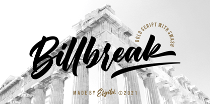 Billbreak is a bold script font inspired by urban fashion. This font is great for your next creative project such as logos, badge, apparel, product packaging, headline, T-shirt/apparel, Poster, or anything which needs a Calligraphy. Billbreak comes with uppercase, lowercase, numerals, punctuations and so many variations on each character include opentype alternates, and common ligatures to let you customize your designs. If you have any questions, don’t hesitate to contact us Ergibi Studio
 - Sagordi by Objectype,
$20.00 Sagordi is a font that displays a strong and modern style. With clean lines and bold shapes, Sagordi is perfect for use in various applications, ranging from logo design to marketing materials, digital publications, and more. This font is designed with careful details to ensure excellent readability at various sizes and resolutions. Sagordi is a great choice for designers who are looking for a flexible and adaptable font that can match various design styles.
 - Hey Folks by HIRO.std,
$20.00 Hey Folks is a Display Typeface This font describes about stylist, modern, DIY spirit, retro, vintage and easy to use. Hey Folks inspired by street culture, modern life, vintage and retro. FEATURES - Uppercase and Lowercase letters - Numbering and Punctuations - PUA Encoded Characters - Multilingual Support - Works on PC or Mac - Simple Installation USE Hey Folks Display Typeface works great in T-shirt/ Apparel Design, DIY Project, Title, Poster and Magazine. Enjoy using! Thanks. HIRO.std
 - Sparkling by Olivetype,
$18.00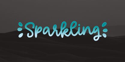 Sparkling is a relaxed, fashionable, and cute monoline script font. It looks great on a variety of designs, such as print design, stickers, wedding invitation, apparels, logos, and so on This font is supporting multi languages, which includes: Afrikaans Albanian Catalan Danish Dutch English Estonian Finnish French German Italian Norwegian Portuguese Spanish Swedish Zulu. You will get : Basic Latin A-Z, a-z, numbers, symbols, and punctuations. Accented Characters : ÀÁÂÃÄÅÆÇÈÉÊËÌÍÎÏÑÒÓÔÕÖØŒŠÙÚÛÜŸÝŽàáâãäåæçèéêëìíîïñòóôõöøœšùúûüýÿžß Thank you
 - Brose by Linecreative,
$16.00 Brose - Bold oblique font with sharp angles for dynamic effects. Use ligature characters to give you unlimited designs, this font is great for your work such as posters, logos, branding, covers, banners, t-shirts and headers, or even large-scale artwork Brose oblique Bold, offers you: Brose -oblique bold font including Upper & Lowercase characters(ALL CAPS has a different form characte), Ligatures Character Numbers and Punctuation Supports Multi linguage (Latin Western Europe), Numbers and Punctuation
 - Rocktypes by HIRO.std,
$18.00 Rocktypes is Display Font This font describes about about strong, bold, taft, manly, hard, power, stiff, mighty, brave, gallant, rigid. FEATURES - Uppercase letters - Numbering and Punctuations - PUA Encoded Characters - Multilingual Support - Works on PC or Mac USE Rocktypes works great in any branding, logotype, magazines, poster, social media posts, clothing, advertisements, product packaging, product designs, label, company profile, quotes and any projects that need STRONG and BOLD taste. Enjoy using! Thanks. HIRO.std
 - Limoen by Hanoded,
$15.00 Limoen means 'lemon' in Dutch. Why did I call this font Limoen? Well, I guess I ran out of meaningful names, so I had to work with whatever popped in my head - which happened to be Limoen. Don't ask… Limoen is a very cute, very threedee-ish typeface. It works great in poster ads and as a display font. It comes with upper and lower case letters and a whole bunch of diacritics. Enjoy!
 - Indiana Script by Mans Greback,
$59.00 In a classic logotype style, Indiana Script is a sharp and steady typeface created by Måns Grebäck. With its bold brush strokes and vintage tilt, this typeface works great in old-style logos and headlines. It contains ligatures and alternate characters, and supports a very wide range of languages. Write _ after a word to get a swash. Example: Indiana_ With ligatures activated, write _ and a number for more swashes. Example: Visual_2 Music_6
 - Sunnylise by Mevstory Studio,
$10.00 Sunnylise, from Mhdafifersya, is a handwritten script font with a simple and classy style. It includes a set of lowercase characters without connecting strokes. Be sure to turn on your OpenType features when using Sunnylise - it’s packed with ligatures and alternate characters for both upper and lower case glyphs. This font is great for your next creative projects such as headlines, quotes, album cover, bold branding, business cards, and many other design project. Thanks
 - Byassa by Gassstype,
$23.00 Hello Everyone, introduce our new product Font Byassa it is Quick Brush Font.This is a Textured Natural Style and classy style with a clear style and dramatic movement. This font Byassa is great for your next creative project such as logos, printed quotes, invitations, cards, product packaging, headers, Logotype, That is has charming, authentic and relaxed characteristic more natural look to your text. You can activate 4 Ligatures glyphs and 9 Alternates glyphs OpenType panel.
 - Whale Show by Olivetype,
$18.00 Whale Show is a fun display font with a youthful, whimsical, and bubbly feel, great if you need to create a friendly, playful mood in your design. This font is also quite versatile and easy to work with. You can use it for logos, posters, headlines, etc. So what’s included : Basic Latin Uppercase and Lowercase Numbers, symbols, and punctuations Multilingual Support. Fully accessible without additional design software Simple Installations Works on PC & Mac Thank You.
 - Lovely Purple by Abo Daniel,
$15.00 introducing LOVELY PURPLE - catchy and quirky handwritten - LOVELY PURPLE is natural handwritten font. It is great for quotes, card, banner, book, cutting, silhouette, social media content and anything of craft project. Lowercase and uppercase are matching each other, so you can combine them as you want. I created some ligatures to make it look so natural. Features: - Uppercase - Lowercase - Number & punctuations - Multilingual - PUA encoded I hope you love it... regards, Abo Daniel Studio
 - Kanaya by Putracetol,
$14.00 Kanaya is a beautiful modern script font. Kanaya has a very beautiful alternate character, and has modern, elegant and luxurious swashes in each lowercase character. Kanaya is perfect for wedding events, anniversaries, birthday, greeting cards, logotype, branding, wedding invites and cards, elegant logos, posters, packaging, stationery, websites, and many more. Includes OpenType features with a lot of alternates, to help you to make great lettering. This font is also support multi-language.