9,212 search results
(0.029 seconds)
- Van Condensed by Vanarchiv,
$30.00
- Keiss Condensed by DSType,
$50.00 The Keiss type family is our interpretation of the popular nineteen century Scotch Roman typefaces. We intended to keep a very classic approach while introducing a couple of new elements that differentiate this type family from it’s ancestors. This design, with short descenders and ascenders, along with three very distinct optical sizes makes this type family well suited for contemporary newspapers. The Title and Big versions range from Thin to Heavy, with matching italics, in order to be used in big sizes and stand out in the design. The Text ranges from Thin to ExtraBold and is a standalone type family for text usage, with narrow proportions and wider and open italics for improved text setting. The Condensed versions, ranging from Thin to Bold, don’t have italics, although they can be matched with the italics of the Title and Big versions, due to the fact they are very condensed.
 - Sanchez Condensed by Latinotype,
$- Sánchez, designed by Daniel Hernández, is a serif typeface belonging to the classification slab serif, or Egyptian, that bears a strong resemblance to the iconic Rockwell, but with rounded edges— offering contrast and balance to the square structure. Sánchez & Sánchez Condensed comprises 12 variants, ranging from extra light to black, each of the same x-height. Regular and Italic variants are available for free.
 - Rehn Condensed by moretype,
$40.00 With all the features of its wider relative, Rehn Condensed has been specifically designed for those situations where space is a premium. Rehn and Rehn Condensed together offer a complete package suitable for a wide range typographic applications.
 - Wasabi Condensed by Positype,
$20.00 Remastered in 2019. Wasabi is the re-imagining of my very first release, Iru. Like Iru, Wasabi was heavily influenced by the monument lettering style, Vermarco. The simple, geometric forms allowed for small lettering sizes to be sandblasted cleanly and has been a monument lettering workhorse for decades… the only issue centered around the lack of a lowercase or any other letters beyond the 26 uppercase glyphs and the numerals. Wasabi solves this with the same simple, efficient line reminiscent of the old Vermarco while bringing it into the 21st century. Visual and optical incongruities of the original uppercase were replaced with new interpretations for the capital letters, a new lowercase and small caps were produced and the original single weight alphabet was replaced with six new weights. Wasabi has several ‘lighter’ weights primarily because the thin lines and simple transitions produce very elegant relationships… and I wanted to make sure those relationships could be explored regardless of the scale of letter. Stylistic Alternates show up through the upper, lowercase and small cap glyphs that attempt to simplify these shapes even more when the opportunity arises. Wasabi is as much a utilitarian typeface as it is a headline face. This realization led to the decision to produce a companion Condensed version shortly after the initial regular weights were developed and tested; so, try them all!
 - Homage Condensed by GarageFonts,
$49.00 Paying homage to the 1960s and 1970s designs of Tom Carnase and Herb Lubalin, Homage Condensed is a digital revival and recutting of LSC Condensed in two weights along with italics and numerous stylistic alternate characters.
 - Magallanes Condensed by Latinotype,
$29.00 Say hello to the new Magallanes Condensed Family, a contemporary neo-humanist sans serif font designed by Daniel Hernández. Its strokes and terminals are related to the calligraphic strokes from humanist typefaces. It comes with 8 styles, from Ultra Light to Black, each with its true italics. Every weight comes with alternative glyphs for a more dynamic use. Magallanes is the perfect titling font to complement text faces in magazines, logotypes, etc. Languages supported include Basic Latin, Western European, Euro, Catalan, Baltic, Turkish, Central European, Romanian, Pan African Latin.
 - Avancar Condensed by Brenners Template,
$19.00 Avancar Condensed Font Family showcases the exquisite pairing of modern grotesque style and soft sans-serif design. These conjunctions provide the effect of owning two subfamily typefaces and are an amazing solution for designers. The main feature of this font family is a semi-condensed design with a slightly higher x-height. And, while having the same skeleton design and stem width, they provide a completely different look and feel.
 - Aragon Condensed by Canada Type,
$24.95The condensed version of Hans van Maanen's Aragon is a headline star. The elements that made Aragon a popular "Dutch Garamond" text repeat here, with the slight stress shifts and tapering stems optimized for headline use. Aragon Condensed also comes in bold and italic variations. All three fonts contain extended language support, superiors and inferiors, and class-based kerning. - Queulat Condensed by Latinotype,
$- This font is the condensed version of Queulat, but keeping the same features as the original typeface. Queulat Cnd is a hybrid typeface that combines different styles, reflecting charm, freshness and, especially, a strong personality.. Since it is a condensed font, it is well-suited for publishing and subheadings. The font is inspired by Modern and Grotesk styles. The former is shown in some characteristic features such as teardrop terminals, which give the typeface an attractive unique look, making it an ideal choice for logotypes and labelling. The latter, with its rationality, makes Queulat Cnd a stable and strong face for headings and subheadings. The combination of styles can be clearly seen by comparing the Regular with the Alt version. The Regular version is more simple than the Alt one. Differently, the alternative version possesses more features of the Modern style, like teardrop terminals in ‘k’ and ‘v’.
 - Prelo Condensed by DSType,
$55.00Prelo was designed to be a neutral, highly readable typeface, for identity, editorial and information design. With nine weights and nine true italics, from Hairline to Black, Prelo is a workhorse typeface, full of OpenType features such as Small Caps, Tabular Figures, Central Europe characters and Historical Figures, among others. Like other DSType fonts, most of the diacritics were designed to fit the gap between the x-height and the caps height, avoiding some common problems with the accented characters. The curves are soft and smooth, providing legibility, even in very poor conditions and the neutrality allows this typeface to be used with any serif companion. - Blitz Condensed by Wiescher Design,
$20.00 A very glitzy Blitz! Blitz-Condensed is an addition to my normal Blitz family. Both are topheavy fonts and are meant to be used together. The font gets a special shine because of this effect. And it stays readable despite its special design. Your designer of surprising typefaces, Gert Wiescher
 - Candide Condensed by Hoftype,
$49.00 Candide Condensed is the complement for Candide and widens greatly the possible applications of the Candide family. Through Its moderately condensed proportions, it also works superbly as a discrete space saving text face. Candide Condensed comes with the same character layout and features as Candide. Candide Condensed consists of 16 styles. It comes in OpenType format and provides an extended language support. All weights contain standard and discretionary ligatures, proportional lining figures, tabular lining figures, proportional old style figures, lining old style figures, matching currency symbols, fraction- and scientific numerals, matching arrows and alternative characters.
 - Breuer Condensed by TypeTrust,
$30.00 Breuer Condensed is a mechanical sans ideal for captions and headline settings, and may also be suitable for moderate lengths of body copy with its comprehensive offering of OpenType features. The italics are optically adjusted obliques with a selection of augmented lowercase glyphs to provide a warmer read. The overall design ensures a distinct aura of technical precision in a personable tone. This family of eight fonts is designed to accompany the Breuer Text and Breuer Headline sets released in 2007. Breuer Condensed offers a 76% narrower footprint compared to Breuer Text and is fine-tuned to render typographic color equivalent to each sibling Text weight.
 - Grave Digger - Unknown license

- Grave Dirt - Unknown license

- Grave Ornamental by Intellecta Design,
$25.95Grave is a Intellecta's best seller, a classic font design remastered, distressed and antique, merging the bodonian style with tendrils and victorian ornaments. Ideal to use in in display purposes for a stylized type design. Its family of fonts has too Grave Ornaments , a dingbat/decorative display font featuring many different styles of flourishes and ornaments, great for a vintage antique feel. Completes the collection Grave Plus , where six different fonts has different styles of victorian fleurons and ornaments merging with a bodonian shaded typeface in great style. A beautiful and big family, available single or in pack with an attractive price. - Holla Grave by Rashatype,
$10.00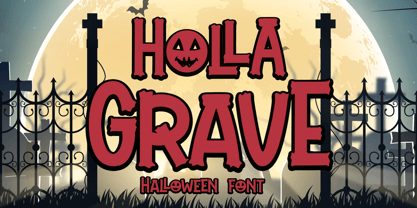 Holla Grave is a cool and spooky display font. It is perfectly suitable for any Halloween-related project or crafty idea! This font is PUA encoded, which means that you can access all of the glyphs and swashes with ease!
 - Wavy Gravy by Bedoodle,
$9.00 - Grave Plus by Intellecta Design,
$29.90 Grave is a Intellecta's best seller, a classic font design remastered, distressed and antique, merging the bodonian style with tendrils and victorian ornaments. Ideal to use in in display purposes for a stylized type design. Its family of fonts has too Grave Ornaments, a dingbat/decorative display font featuring many different styles of flourishes and ornaments, great for a vintage antique feel. Completes the collection Grave Plus, where six different fonts has different styles of victorian fleurons and ornaments merging with a bodonian shaded typeface in great style. A beautiful and big family, available single or in pack with an attractive price.
 - Spooky Grave by Letterara,
$14.00 Spooky Grave is a chunky lettered and spooky display font. Add this font to your favorite Halloween-themed ideas: invitations, banner, advertising, logo, movie, poster, novel, app game scary or horror, and notice how it makes them come alive! No matter the topic, this font will be an incredible asset to your fonts’ library, as it has the potential to elevate any creation. This font is PUA encoded which means you can access all of the glyphs.
 - Grave Ornaments by Intellecta Design,
$19.90 Grave is a Intellecta's best seller, a classic font design remastered, distressed and antique, merging the bodonian style with tendrils and victorian ornaments. Ideal to use in in display purposes for a stylized type design. Its family of fonts has too Grave Ornaments, a dingbat/decorative display font featuring many different styles of flourishes and ornaments, great for a vintage antique feel. Completes the collection Grave Plus, where six different fonts has different styles of victorian fleurons and ornaments merging with a bodonian shaded typeface in great style. A beautiful and big family, available single or in pack with an attractive price.
 - Growing Script free - Personal use only

- SKETCHUP FREE TRIAL - Personal use only

- Octin Sports Free - 100% free

- Octin Prison Free - 100% free

- walker free style - Unknown license

- Octin College Free - 100% free

- Octin Vintage Free - 100% free

- Scooter Boy Free - Unknown license

- Sui Generis Free - Unknown license

- Neuropol X Free - Unknown license

- Octin Spraypaint Free - 100% free

- Chinese Rocks Free - Unknown license

- Fenwick Outline Free - Unknown license

- Fat Free Solid - Unknown license

- BoumBoum (Free version) - Unknown license

- Fancy Free JNL by Jeff Levine,
$29.00 Up until the late 1920s, it was a popular habit in American songwriting to use African Americans as the topic of compositions using denigrating themes, words and even exaggerated character illustrations on the covers of the published sheet music. One such example of what was considered "entertainment" for its time was a piece entitled "Little Black Me". While this now socially and morally unacceptable piece of forgettable tripe is collected by some only for the historical documentation of the times they reflected, one good "positive" came out of this negative chapter of our country's musical heritage: The beautiful floral ornamented letters in the song's title has yielded Fancy Free JNL. Originally hand-lettered on an arc, these spurred Roman letters have been re-drawn, and are offered in both the regular design and a companion version with the ornamentation removed for lettering that is less ornate.
 - Free Form Deco by Jeff Levine,
$29.00 Toward the end of the 1920s, Art Deco influences were starting to creep into modern design. The hand lettered title on the cover of the1928 sheet music for “Fascinatin’ Vamp” not only embraced the new Deco movement, but sent it on a wild typographic ride. Letters of mixed thicknesses and stylings made up the two word title, and this unusual group of letter shapes became the inspiration for Free Form Deco JNL, which is available in both regular and oblique versions.
 - Sultan Free Bold by Sultan Fonts,
$19.99 Sultan free is an Arabic text typeface for desktop applications. Sultan free is a freestyle script. It is available in One style, calligraphic, and very dynamic. This makes it suitable for large display sizes, especially in the area of advertising, while still functioning well as a text face. The font includes a support for Arabic, Persian, and Urdu. Sultan free typeface comes with many opentype features.


