7,328 search results
(0.054 seconds)
- Fangs ALot by Ingrimayne Type,
$9.00 FangsALot is a bizarre typeface family that was designed to alternate two character sets. These sets are alternated automatically in applications that support the OpenType feature Contextual Alternatives (calt). The template used to design characters is a distorted triangle that resembles a curved tooth or a fang. This shape can be flipped horizontally, vertically, and both horizontally and vertically to give four orientations. Two of these orientations are used in the regular style and two in what is called the italic style. I thought the fang motif did not come through clearly in the regular and italic styles. Rather the impression they give is more like graffiti lettering. To emphasize the fang motif I added two more members to the family by filling fang outlines with unadorned sans-serif characters. Then to allow more color in lettering, I added two more styles with letters on black. I then had six styles based on triangles skewed left and right. Why not fill the family out with three more styles based on an isosceles triangle? The end result is a family of nine. All members of the family are monospaced and are hard to read. The three graffiti-like styles have some alternative letters that can be accessed with the OpenType feature Stylistic Sets. Also, for each style it is possible to use only one set of characters by adding a space after each letter and then adjusting the character spacing. The graffiti-like styles can be useful in situations where the hard-to-read property is not important but where a menacing and vicious touch is needed, such as topics of sharks, teeth, biting, and vampires.
 - The Best We Could Do by Chank,
$39.00 The new font “The Best We Could Do” was created by artist and author Thi Bui who used the font in the graphic novel by the same name. The font is brush-script handwriting font which displays human personality rendered with bold confident strokes full of passion and expression. Chank’s work on this font captured Bui’s distinctive textual style and also saved her a ton of headache and time in inking. A debut memoir that tells the story of one family’s journey from their war-torn home in Vietnam in the 1970s to their new lives in America, the autobiographical book is lauded for its heart-breaking exploration of identity, family, and home. Bui ties her modern life with the multi-generational experiences of her family, weaving together the emotional threads of their relationships to find clarity in her current day. “The Best We Could Do” graphic novel is published by Abrams ComicArts and is available wherever fine books are sold.
 - Goldplay by Latinotype,
$26.00 Goldplay is based on Isidora Sans design yet features rounded shapes. Its rounded, soft terminals give it a friendly and expressive look, and its modern and contemporary style as well as its classic proportions make it an excellent choice for headlines, logotypes, branding, books, magazines, motion graphics, and use on web and Tv. One of its key features is a large x-height which make it look elegant and classy. Goldplay comes in 2 versions—each in 7 weights, from Thin to Black, and matching italics, resulting in a total of 28 fonts. The standard sans serif version—fresh, clean and contemporary—is a perfect choice for editorial and corporate design, headlines, books, magazines or any other piece of graphic design. The Alt semi-serif display version—more expressive and modern—is ideal for logotypes, branding, packaging, and use on web and Tv. Goldplay contains a set of 540 characters that support over 200 Latin-based languages.
 - ITC CuppaJoe by ITC,
$29.99 Nick Curtis's love affair with typography began when he was barely past adolescence, in a neighborhood alley of East Dallas. On a routine patrol for tossed treasures, he came across a type specimen catalog: a big, fat green binder displaying hundreds of fonts! He was hooked. Curtis's career has taken him from production art to graphic design to art direction, but type has always remained his graphic passion, especially the provocative designs produced from the late 19th through the early 20th centuries. Curtis's inspiration for ITC CuppaJoe comes from Art Deco lettering, but not from the typical sources. Depending upon your age or your interest in early twentieth-century package design ITC CuppaJoe might look familiar. Its foundation is the label art for Bokar, A&P's premium coffee during the 1930s. Curtis built on the gently sweeping curves and bold angular strokes of the original coffee-can lettering to create a distinctive typeface that commands attention. Rich, full-bodied, satisfying - now that's a ITC CuppaJoe!
 - Gravitica Mono by Ckhans Fonts,
$34.00 Features: • Support for 28 languages: Afrikaans Albanian Catalan Croatian Czech Danish Dutch English Estonian Finnish French German Hungarian Icelandic Italian Latvian Lithuanian Maltese Norwegian Polish Portugese Romanian SlovakSlovenian Spanisch Swedish Turkish Zulu Swedish Turkish Zulu • Contains OpenType features with alternates or substitutes • Tabular Figures • Ordinal numbers • 74 icons (It will keep updating.) • 72 graphic patterns for designer (It will keep updating.) • 28 brand symbols (It will keep updating.) • 27 arrows glyphs • 0-99 line circled glyphs • 0-99 solid circled glyphs • A-Z line circled glyphs • A-Z solid circled glyphs Gravitica Mono family consists of 18 styles (6 weights, 6 Italics, 6 Icons), in each of which there are more than 508+ glyphs. In the typeface, each weight includes extended language support, fractions, tabular figures, arrows, ligatures and more. Perfectly suited for graphic design and any display use. Useful links: Gravitica PDF Type Guide and Specimen (You can know how to use icons and arrows, other glyphs.)
 - OCR B by Linotype,
$40.99OCR A and OCR B are standardized, monospaced fonts designed for Optical Character Recognition" on electronic devices. OCR A was developed to meet the standards set by the American National Standards Institute in 1966 for the processing of documents by banks, credit card companies and similar businesses. This font was intended to be "read" by scanning devices, and not necessarily by humans. However, because of its "techno" look, it has been re-discovered for advertising and display graphics. OCR B was designed in 1968 by Adrian Frutiger to meet the standards of the European Computer Manufacturer's Association. It was intended for use on products that were to be scanned by electronic devices as well as read by humans. OCR B was made a world standard in 1973, and is more legible to human eyes than most other OCR fonts. Though less appealingly geeky than OCR A, the OCR B version also has a distinctive technical appearance that makes it a hit with graphic designers. - Laborat by Monotype,
$50.99 Typeface Laborat™, designed by Kristína Jandová, is a Grotesk typeface that combines the geometry of a circle and a square. The visual message of geometry is applied to stylistic sets and modified by special characters, including abstract forms or symbols, that turn the typeface into a visual “graphic” language. The basic character of the typeface lies in the default set based on the circle-like shapes of letters. The stylistic sets 01 to 03 are characterized by different geometrical modifications of the growing character and the idea “from circle to square” applied on the letters a, f, g, l, r, t, u, y. By using these different alterations of consistent letterforms, it offers a playful space for everyone. The first inspiration of the typeface origins in Paul Renner’s Futura sketches, that were a celebration of geometrical playfulness of modernism meeting constructivism. It is modified into a new contemporary “wave” of typography as a graphical method. Laborat comes in six weights, from Hairline to Heavy.
 - FWD Egyptian Tower by Fontwright Design,
$39.99 FWD Egyptian Tower is a designers stack-able Display family best purchased as one package. The four versions can be manipulated in your favorite graphics or sign making application to achieve the different effects as shown in the font family ad designs. All fonts are tightly spaced and are very often intentionally overlapped creating a balance for each very unique wider bottomed character. Being stack-able, the designer can duplicate the original text layer and by changing the font on the lower of the two layers to another of the family can then add another available effect. This can be repeated to add other of the available effects. Then by converting the text of the lower text layers to curves or outlines and welding the characters of the words together, the overlaps can be eliminated. This process is fairly common practice for a graphic designer and quite easy once done a few times.
 - NorB Architect CF by NorFonts,
$32.00 NorB Architect Condensed fonts are the condensed and the extra-condensed version of my NorB Architect font. It comes with 12 weights from Light to Condensed to Extra Condensed along with their Bold and Felt version. These Architectural fonts will add a beautiful architectural hand-lettering style to all your CAD project drawings. Architects have always wanted their CAD drawings to look more like they were drawn by hand, rather than by a CAD program. These AutoCAD fonts are the first step in bringing back that “artistic hand-drawn” feel to your CAD drawings or any graphic design project that can use true type fonts. They also can be used with any word processing program for text and display use, print and web projects, apps and ePub, Comics, graphic identities, branding, editorial, advertising, scrapbooking, cards and invitations … or even just for fun! NOTE: For more variations of 'NorB Architect CF' font please visit click on this link.
 - Wave by Jennifer Delaney Designs,
$23.00 WAVE is characterized by curved lines and intricate details. Each character was individually made in Illustrator and Type Tool using my original illustrations. Wave is a decorative font best used for titles or short bursts of texts in large point settings. The typeface is based on the uppercase letterforms, but I have also created lowercase letters, numbers, and glyphs. The motion lines used in the making of Wave mirror an art deco-style. Inspired by an illustration of a large wave, I was fascinated that by using only lines and solid colors we as artists can depict the translucency and ever-changing movement of waves. I began by delicately sketching out all of the letters using graph paper and micron pens. My work always begins with traditional media. I'm an illustrator, freelance artist, and graphic designer from Chicago, IL. I studied at Texas Christian University, and received my Bachelors of Arts in Graphic Design from Columbia College Chicago. Visit www.jennyddesigns.com for more! :)
 - Ozana Pro Text by Mostardesign,
$25.00 Ozana Pro is a bracketed serif font family adapted to the professional requirements of graphic designers, web designers and mobile app developers. Comprised of 24 styles including 12 styles designed especially for headlines and 12 styles for text and long paragraph design. Ozana Pro is a very versatile family of fonts that can be used in many projects such as editorial design, branding or corporate identity creation, design of posters or logos, the creation of websites or the development of mobile applications. With this design of glyphs differentiated by the optical size according to the styles, the titles have a very graphic aspect while the long texts have a more classic design in order to keep an optimal readability in all cases. Ozana Pro is also equipped with powerful OpenType features such as case sensitivity, true small caps, ligatures, tabular figures, old styles figures, numbers circled. Ozana Pro is also available as a variable font family.
 - Ozana Pro Display by Mostardesign,
$25.00 Ozana Pro is a bracketed serif font family adapted to the professional requirements of graphic designers, web designers and mobile app developers. Comprised of 24 styles including 12 styles designed especially for headlines and 12 styles for text and long paragraph design. Ozana Pro is a very versatile family of fonts that can be used in many projects such as editorial design, branding or corporate identity creation, design of posters or logos, the creation of websites or the development of mobile applications. With this design of glyphs differentiated by the optical size according to the styles, the titles have a very graphic aspect while the long texts have a more classic design in order to keep an optimal readability in all cases. Ozana Pro is also equipped with powerful OpenType features such as case sensitivity, true small caps, ligatures, tabular figures, old styles figures, numbers circled. Ozana Pro is also available as a variable font family.
 - Panton by Fontfabric,
$47.00 NEW! Update 3.0 What’s New: • New Narrow version of 18 weights • Bulgarian Localization Support • Tabular Figures • Case-Sensitive Punctuation • Extended Glyph Case • Icon Sets PDF Specimen available: http://myfonts.us/suAc3K Panton has been expanded with Panton Narrow! It has 9 uprights and 9 matching italics ranging from Thin to Heavy. The Panton font family includes 54 fonts - 19 uprights with 19 matching italics and 16 icon sets as a bonus! It is characterized by excellent legibility in both web & print design areas, well-finished geometric designs, optimized kerning, excellent web-font performance and legibility etc. Inspired by the classic grotesque typefaces - Panton has his own unique style, expressed in perfectly softened geometric forms. The font family is most suitable for headlines of all sizes, as well as for text blocks that come in both maximum and minimum variations. Panton font styles are applicable for any type of graphic design in web, print, motion graphics etc and perfect for t-shirts and other items like posters and logos.
 - Manzello by Tour De Force,
$35.00 To start with one personal fact: I really like to listen Rahsaan Roland Kirk. He was a multi-instrumentalist, real grandmaster and unique jazz virtuoso. The way he improvised and walked through variety of different music influences are admiring. One of things he liked is to modify instruments, so he modified soprano saxophone and got an instrument called manzello. When I was looking for good name for this typeface, it came on my mind that Manzello could be the perfect one. It has the symbolic background from the instrument and theoretically in my head, it's imagined as typeface that rely on stable classic examples, but graphically designed and modified to match modern standards. Manzello contains a dose of characteristics of display typefaces with terminals that aren't perfectly rounded, high contrast between stems and good balanced Italics with elements of fine calligraphy. It's a small font family, something what I was always looking for to have as first text solution in my web and graphic projects.
 - Don Sans by SIAS,
$29.90 Don Sans is a sturdy display sans which evokes the invironment of old-day industrialism, steamers, locomotives and other machinery; dusty back-yard workshops and the glamorous air of backstage life. It has been inspired by various letterings crafted by former graphic workmen who would have had an idea of simple letter construction but did not really wanted to bother with detail sophistication. Hence the result is somewhat quaint and imperfect … if that is something you are willing to enjoy. The unique charme of this typeface lies in its lack of perfection. And yet it embodies a peculiar straight-forward strength and sobriety, a visual stubbornness which is certainly not over-used! Utilize Don-Sans for stationary and ads, for crisp title settings and smart identity graphics; for menus and leaflets, business cards, cutting-edge campaign eye-catchers … whatever your imagination makes of it! Don Sans is a multilingual typeface, it supports every Euro-Latin language.
 - OCR A Extended by Monotype,
$40.99OCR A and OCR B are standardized, monospaced fonts designed for Optical Character Recognition" on electronic devices. OCR A was developed to meet the standards set by the American National Standards Institute in 1966 for the processing of documents by banks, credit card companies and similar businesses. This font was intended to be "read" by scanning devices, and not necessarily by humans. However, because of its "techno" look, it has been re-discovered for advertising and display graphics. OCR B was designed in 1968 by Adrian Frutiger to meet the standards of the European Computer Manufacturer's Association. It was intended for use on products that were to be scanned by electronic devices as well as read by humans. OCR B was made a world standard in 1973, and is more legible to human eyes than most other OCR fonts. Though less appealingly geeky than OCR A, the OCR B version also has a distinctive technical appearance that makes it a hit with graphic designers. - Bremenoff by Designova,
$15.00 Bremenoff is a timeless sans-serif typeface family of 14 fonts, made with simplicity in every aspect of design. Created with a special focus on readability and the finest visual capabilities, this typeface can turn your design projects into something extraordinary. Handcrafted and designed with powerful OpenType features in mind, each weight includes extended language support including Western European & Central European sets. A total of 289 glyphs are included. Bremenoff is a perfect choice for graphic design, text presentation, web design, print and display use. The typeface can be an amazing option for beautiful branding, logo / logotype design projects, marketing graphics, banners, posters, signage, corporate identities as well as editorial design. Adding extra letter-spacing for the Caps will make this font perfect for minimal headlines and logotypes as shown in promo images here. Bremenoff typeface family comes with a total of 14 fonts having 7 weights (Thin / Light / Book / Regular / SemiBold / Bold / Heavy) as well as Italic versions of all weights.
 - Hello Monday by Fenotype,
$25.00 Hello Monday is a bold and wide vintage style serif font with a friendly charm and a reminiscence of a warm nostalgic feeling. Hello Monday is a great typeface for contemporary graphic design with that certain feeling of familiarity. It works well on logos, packaging, restaurant graphics, or any display use, as well as in headlines or shorter texts. Try Hello Monday with reduced tracking for tighter word images, or if you want to use it in really small sizes add some tracking. Hello Monday is equipped with Contextual, Swash, Stylistic and Titling alternates as well as Discretionary Ligatures and even more extra alternates. All these features can be accessed by OpenType controls or straight from Character or Glyphs window. Swash Alternates are the most exaggerating ones while Stylistic Alternates do smaller changes. In addition Hello Monday has 15 ornaments that can be accessed from 0-9 and punctuation by clicking on Titling Alternates.
 - Linotype Franosch by Linotype,
$29.99Linotype Franosch™ is a three weight display typeface designed by artist/graphic designer Max Franosch. Around the time of making the initial sketches, Franosch was looking a lot at Arabic newspaper and magazine headlines. He was drawn to their bold and very graphic" type. A common feature was the "floating" dots which added a rhythmic quality to the text. This came to influence the use of dots in Linotype Franosch™. Apart from this influence, Linotype Franosch also has a very clean and futuristic feel to it, due mainly to the highly geometric nature of the characters and the uniform stroke weight. More about the usability of this typeface can be seen at the Font of the Week of Linotype Franosch. Linotype Franosch is perfect for party flyers, headlines, and internet banner ads. All three faces in the Linotype Franosch family are part of the Take Type 4 collection from Linotype." - Univa Nova by Designova,
$15.00 Univa Nova is a beautiful minimalist typeface with masterclass design and outstanding usability features. The typeface is inspired by some of the original Swiss design-based branding projects. Univa Nova is a perfect choice for graphic design, text presentation, web design, print and display use. The typeface can be an amazing option for beautiful branding, logo / logotype design projects, marketing graphics, banners, posters, signage, corporate identities as well as editorial design. Adding extra letter-spacing for the Caps will make this font perfect for minimal headlines and logotypes as shown in promo images here. The typeface is specially handmade with great OpenType features in mind, each weight includes extended language support including Western European & Central European sets. A total of 306 glyphs are included. Univa Nova typeface comes with a total of 16 fonts having 8 weights (Hairline / Thin / Light / Regular / Medium / SemiBold / Bold / Heavy as well as Italic versions of each weights.
 - BARONK by Twinletter,
$13.00 Introducing BARONK Font – a captivating display typeface that embodies the essence of authentic handwriting! Elevate your projects with the artistic touch of BARONK, a perfect blend of style and individuality. Explore BARONK now and witness your creations come to life! What’s Included : File font All glyphs Iso Latin 1 Alternate, Ligature Simple installations PUA Encoded Characters – Fully accessible without additional design software. Fonts include Multilingual support
 - Xerym by Twinletter,
$13.00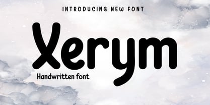 Introducing Xerym Font – a captivating display typeface that embodies the essence of authentic handwriting! Elevate your projects with the artistic touch of Xerym, a perfect blend of style and individuality. Explore Xerym now and witness your creations come to life! What’s Included : File font All glyphs Iso Latin 1 Alternate, Ligature Simple installations PUA Encoded Characters – Fully accessible without additional design software. Fonts include Multilingual support
 - Wacky Duck NF by Nick's Fonts,
$10.00A postcard for a 1952 DeSoto automobile, combined with the (non)sensibilities of legendary British lettering artist Cecil Wade, yielded this slightly tacky and thoroughly wacky gaggle of letters. Use liberally whenever levity, brevity (the soul of wit), or a bit of mischief is called for. Both versions of the font include 1252 Latin and 1250 CE (with localization for Romanian and Moldovan) character sets. - SAWYA by Twinletter,
$13.00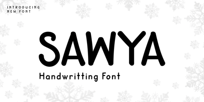 Introducing SAWYA Font – a captivating display typeface that effortlessly embodies the authenticity of handwriting! Elevate your projects with the artistic touch of SAWYA, a seamless blend of style and individuality. Explore SAWYA today to witness your creative visions come alive! What’s Included : File font All glyphs Iso Latin 1 Alternate, Ligature Simple installations PUA Encoded Characters – Fully accessible without additional design software. Fonts include Multilingual support
 - Guillermo by Homelessfonts,
$49.00 Homelessfonts is an initiative by the Arrels foundation to support, raise awareness and bring some dignity to the life of homeless people in Barcelona Spain. Each of the fonts was carefully digitized from the handwriting of different homeless people who agreed to participate in this initiative. Please Note: these fonts include only the latin alphabet; no accented characters, no numbers or punctuation. MyFonts is pleased to donate all revenue from the sales of Homelessfonts to the Arrels foundation in support of their mission to provide the homeless people in Barcelona with a path to independence with accommodations, food, social and health care. Guillermo was born in Argentina. And after crossing four continents and travelling in more than twenty countries, he still has his accent. His luck ran out on the streets of Barcelona. But despite his circumstances, he hasn’t lost a bit of his wit or articulacy. “The worst thing about the street is something that touches your heart, your brain. Not being able to have sex, not having any privacy until it leaves you empty.” On the street he follows his passion for art and writing as best he can, using old cardboard when he can’t find paper and listening to the music that comes to him. His way of thinking and expressing himself leaves people wide-eyed and open-mouthed, but even so he admits he’s a solitary man. “Solitude is an individual word. A solitary type like me can’t bring the word solitude to the whole world.”
 - Solantra by Stephen Rapp,
$44.00 Solantra is a solidly crafted handwritten script. I’ve long felt that beautiful writing is more pleasing to the eye than the more attention grabbing swashes and flourishes. That being said, both have their role in design and Solantra has a large slice of each. Solantra combines vintage style handwriting with all its quirks and English Roundhand of that same era. The result is a solid setting script filled with charm and personality. With default Adobe Illustrator settings for Ligatures and Contextual Alternates active, the vintage charm is in full display. Want to add more flair? There are loads of more embellished letters inside the full version. Solantro takes into account how scripts are actually written so that connections from letter to letter are more fluid and rhythmic than the average script font. In natural script/handwriting most letters end at the bottom right and move up to connect with the next. Some letters like o, v, and w, however; end at the top right. Rather than force these letters to dip down and go back up they should ideally connect from that upper right point. This is accomplished through a series of alternate letters and ligatures with extensive contextual feature programming. So, for example, you might get one version of a ligature in the middle of a word and a different one at the beginning or end of that word. Solantra also takes into account another often overlooked feature of natural handwriting. When you write you inevitably pick your pen up from the paper at times. This is often just to reposition the hand, but in the days of writing with dip pens this was also needed to attain a fresh supply of ink. Having these occasional breaks in connections makes the writing less static and more rhythmic. While the Basic versions are limited to a standard character set and several ligatures and alternates for better settings of text, the full pro versions contains 1292 glyphs and an abundance of features. Even with numbers there are options like Oldstyle numbers, fractions, and ordinals. Central European language support is included as well as some select ligatures that use accents. To see more on the technical aspects and instructions on using Solantra, please check out the user’s guide in the Gallery section. **Note: The Pro versions of Solantra which do not have the word “Basic” attached to the title, have everything in them. So if you license a Pro version there is no need to get the Basic versions.
 - ITC Needlescript by ITC,
$29.99It's been said that creativity requires ten parts to perspiration to one part inspiration. But not always. According to its creator, Mira Vucko, ITC Needlescript was designed in one breath." An accomplished lettering artist, Vucko was sketching letters one afternoon. "I was using a calligraphy nib and was drawing the alphabet without much thought," she recalls. "When I allowed the down strokes of a couple of letters to fall below the baseline, I realized that I had created the impression of movement. I kept drawing letters in this fashion and did the same with horizontal lines. I added a firm ending to the descenders. Instead of dots above the 'i' and 'j,' I placed strokes in the opposite direction." In this way, the first characters that were to become ITC Needlescript emerged. The finished design is a lively, distinctive alphabet that produces a striking texture on the page. Letters intertwine and overlap to create a sense of movement and graphic intensity, especially when reversed out of a dark background. Vucko lives, works and was educated in Zagreb, Croatia. She lived in France and Sweden while in her twenties, but then returned to Croatia to work as a graphic designer for the country's largest newspaper. It was here that her passion for type and typography was born. Vucko has since gone on to become one of Croatia's leading graphic designers, and has won many awards for her advertising and packaging design. Vucko recommends that ITC Needlescript be used for "titling, lively but 'thorny' content, and anywhere that a little typographic drama is called for."" - Boogie by Linotype,
$40.99German graphic designer Ralf Weissmantel created Boogie in 2003. Boogie is an ironic reference to pop art, and to disco lettering from the 1960s and 70s. Its round forms and outlines evoke the flashing, pulsating lights and music of that era. Shipping with five different, width-compatible fonts, the Boogie typeface has four different components: an outlined letterform is the base element, and forms the first font. Three additional fonts may be layered over top of this base, surrounding the first font with up to three bubble-outlines. In graphics applications like Adobe PhotoShop or Illustrator, these elements can each be assigned different colors. There is also a fifth font, which contains the base outlined letterform pre-surrounded by three additional outlines of the same color. Boogie works best in large headline, display and signage applications, where its forms can be clearly seen and enjoyed. When different colored layers are applied, text set in Boogie will gyrate and jive across the page! Weissmantel has worked as an art director for various international advertising agencies, and has led Corporate Design projects for firms such as Grey and MetaDesign. His design work, honored internationally, has been included in the typography collection of the Museum for Art and Trade in Hamburg. He is currently teaching graphic design at the Düsseldorf University of Applied Sciences. Weissmantel has been an associate of the United Designers Network since August 2002. Boogie received an Honorable Mention in the 2003 International Type Design Contest, sponsored by Linotype GmbH. - Night Light Neon by Wing's Art Studio,
$24.00 Night Light is a specially created collection of seven neon inspired fonts giving designers the power to replicate traditionally hand-made lettering from the comfort of their own computer. Choose from the selection of script, sans serif and outline fonts to set your text. Then apply our custom graphic styles for a life giving jolt of electricity! The appeal of neon lettering lives in its power to display a message in a functional, eye-catching and timelessly cool way. How many times have you stopped in the street to admire a bar sign or shop front blazing with neon colors? It's aesthetic works equally well for a Hot Dog stand or high-end fashion brand, providing a tried and tested technique for grabbing customer attention. I've designed these fonts to make the power of neon accessible to all, investing time to research real neon signs and how they are made, paying attention to their human imperfections and inherent limitations (all of which makes them). This research has been distilled into these essential styles; Script, Outline, Inline, Square and Compressed. These seven core fonts give designers a new opportunity to take advantage of realistic neon lettering in their print and online projects, perfect for music promotion, film titles, YouTube tutorials and gig posters. Ready to be moulded to any requirement, the power of neon is in your hands. Neon Graphic Style Presets Available Here The link above provides access to the graphic styles seen in the visuals with support for Adobe Photoshop, Adobe Illustrator, Adobe After Effects. Simply download and follow the instructions provided.
 - Motor Mouth by T4 Foundry,
$31.00Motor Mouth provides racy type, oozing of high octane gasoline and selfconfidence. Designer Martin Fredrikson CORE, graffiti artist turned typeface designer and car paint expert, combines his sense of speed with raw power lettering. Sloped and cocky, Motor Mouth is an original design in the great tradition of Nascar and Indy 500 and makes you think of roaring muscle cars and hot asphalt. Swedish type foundry T4 premiere new fonts every month. Motor Mouth is our fourth introduction. - MC Giant Caps by Maulana Creative,
$15.00 Giant Caps is a graffiti display font. With slanted medium low contrast stroke, fun character with a bit of ligatures and alternates. To give you an extra creative work. Giant Caps font support multilingual more than 100+ language. This font is good for logo design, Social media, Movie Titles, Books Titles, a short text even a long text letter and good for your secondary text font with script or serif. Make a stunning work with Giant Caps font.
 - Doyotama by Nirmalagraphics,
$18.00 Doyotama is my first font that I created in a graffiti style. the font that I made with a sketch with a ballpoint pen then I became the font as it is now. In this font, uppercase and lowercase letters are the same, the only difference is the size. You can use this font for all your needs, such as drawing posters, murals or logos Don't forget to give Feedback after buying my product, thank you very much, Nirmala
 - Spooky Town by Epiclinez,
$18.00 Spooky Town is an awesome, graffiti-style display font that has a street art vibe. This font is suitable for designs such as t-shirts, sportswear, logos, advertisements, clothing, and more. This Font is supporting more than 66 languages, which include: Afrikaans Albanian Catalan Danish Dutch English Estonian Finnish French German Italian Norwegian Portuguese Spanish Swedish Zulu, and more. So what's included : Basic Latin A-Z & a-z. Numbers, symbols, and punctuations Multilingual Support. Accented Characters : ÀÁÂÃÄÅÆÇÈÉÊËÌÍÎÏÑÒÓÔÕÖØŒŠÙÚÛÜŸÝŽàáâãäåæçèéêëìíîïñòóôõöøœšùúûüýÿžß Thank you
 - Offstoke by Maulana Creative,
$14.00 Offsstoke is a fancy graffiti style font. With back slanted mono-line stroke, fun character with a bit of ligatures and alternates. To give you an extra creative work. Offsstoke font support multilingual more than 100+ language. This font is good for logo design, Social media, Movie Titles, Books Titles, a short text even a long text letter and good for your secondary text font with sans or serif. Make a stunning work with Offsstoke font. Cheers, Maulana Creative
 - Southern Clan by IKIIKOWRK,
$17.00 Proudly present Southern Clan - Retrotype, created by ikiiko. A expressive handwriting type with a 80's street graffiti shape. This type is very suitable for making a poster, t-shirt design, magazine header, brand logo, sleeve cover, party flyer, quotes, or simply as a stylish text overlay to any background image. What's Included? Uppercase & Lowercase Numbers & Punctuation Alternates & Stylistic Multilingual Support Enjoy our font and if you have any questions, you can contact us by email : ikiikowrk@gmail.com
 - Shasy Love by Maulana Creative,
$14.00 Shasy Love lovely display font. Bold stroke, fun character with a bit of ligatures and alternates. To give you an extra creative work. Shasy Love font support multilingual more than 100+ language. This font is good for logo design, Social media, Movie Titles, Books Titles, a short text even a long text letter and good for your secondary text font with script or serif. Make a stunning work with Shasy Love graffiti display font. Cheers, Maulana Creative
 - Roaming Around by Olivetype,
$18.00 Roaming Around is a typeface that is perfect for any design project. With its graffiti-inspired style, it's guaranteed to give your designs a hand-painted, stand-out feel. Fight the monotony of clean fonts by giving your designs true character with Roaming Around. So what’s included : Basic Latin Uppercase and Lowercase Numbers, symbols, and punctuations Ligatures Multilingual Support. PUA Encoded and fully accessible without additional design software Simple Installations works on PC & Mac Thank You and Happy Designing!
 - Meposa by Typodermic,
$11.95 Meposa is more than just a typeface; it is a bold statement of individuality and creativity. It’s a unique, tough, and quirky design that defies convention. Meposa’s mixed-case letters with open apertures deviate from the traditional roots of wood-block typography, bringing a fresh and modern twist to an old-school classic. This hybrid typeface is an amalgamation of various design elements from different eras and cultures. The result is a unique and mesmerizing typeface that defies categorization. Meposa also draws inspiration from the 1970s custom van culture, where artists and designers would showcase their creativity by customizing their vehicles with bold and colorful graphics. This typeface channels that same spirit of creativity and individuality, inviting you to break the mold and think outside the box. With historical wood type influences, Meposa pays homage to the timeless and authentic craft of typography. Yet, it also features retro-tech and modern design elements, resulting in a truly one-of-a-kind typeface that bridges the past and the present. In summary, Meposa is a unique and tough display typeface that is both historical and modern, quirky and bold. Its mix of design influences makes it an ideal choice for anyone looking to break the mold and stand out from the crowd. Whether you’re a graphic designer or a creative professional, Meposa is sure to leave a lasting impression. Most Latin-based European writing systems are supported, including the following languages. Afaan Oromo, Afar, Afrikaans, Albanian, Alsatian, Aromanian, Aymara, Bashkir (Latin), Basque, Belarusian (Latin), Bemba, Bikol, Bosnian, Breton, Cape Verdean, Creole, Catalan, Cebuano, Chamorro, Chavacano, Chichewa, Crimean Tatar (Latin), Croatian, Czech, Danish, Dawan, Dholuo, Dutch, English, Estonian, Faroese, Fijian, Filipino, Finnish, French, Frisian, Friulian, Gagauz (Latin), Galician, Ganda, Genoese, German, Greenlandic, Guadeloupean Creole, Haitian Creole, Hawaiian, Hiligaynon, Hungarian, Icelandic, Ilocano, Indonesian, Irish, Italian, Jamaican, Kaqchikel, Karakalpak (Latin), Kashubian, Kikongo, Kinyarwanda, Kirundi, Kurdish (Latin), Latvian, Lithuanian, Lombard, Low Saxon, Luxembourgish, Maasai, Makhuwa, Malay, Maltese, Māori, Moldovan, Montenegrin, Ndebele, Neapolitan, Norwegian, Novial, Occitan, Ossetian (Latin), Papiamento, Piedmontese, Polish, Portuguese, Quechua, Rarotongan, Romanian, Romansh, Sami, Sango, Saramaccan, Sardinian, Scottish Gaelic, Serbian (Latin), Shona, Sicilian, Silesian, Slovak, Slovenian, Somali, Sorbian, Sotho, Spanish, Swahili, Swazi, Swedish, Tagalog, Tahitian, Tetum, Tongan, Tshiluba, Tsonga, Tswana, Tumbuka, Turkish, Turkmen (Latin), Tuvaluan, Uzbek (Latin), Venetian, Vepsian, Võro, Walloon, Waray-Waray, Wayuu, Welsh, Wolof, Xhosa, Yapese, Zapotec Zulu and Zuni.
 - Meloriac by Typodermic,
$11.95 Introducing Meloriac, the unicase display typeface that combines a pseudo-retro feel with a minimalist design, creating a strong and modern-looking font that has become a reliable staple in the toolbox of today’s graphic designer. Inspired by the classic Futura Extra Bold and Avant Garde Gothic Bold, Meloriac is an extra-heavy tribute that is perfect for tight headlines and logos. Its minimalist design and strong strokes make it stand out and demand attention. The font is versatile, able to convey a variety of messages while maintaining its bold and modern aesthetic. Meloriac is more than just a pretty face; it’s also highly functional. For improved clarity, we recommend tracking it wider (adding more space) on subheadings. The result is a cleaner, more legible display that will make your message pop. Additionally, the font’s OpenType stylistic alternates feature allows access to filled letter variations and an alternative ampersand, giving you even more creative control over your designs. Whether you’re designing a poster, a book cover, or a website, Meloriac’s minimalist design and bold aesthetic make it the perfect font to convey your message with impact. Try it out today and see for yourself why it’s a favorite among today’s graphic designers. Most Latin-based European, Vietnamese, Greek, and most Cyrillic-based writing systems are supported, including the following languages. Afaan Oromo, Afar, Afrikaans, Albanian, Alsatian, Aromanian, Aymara, Azerbaijani, Bashkir, Bashkir (Latin), Basque, Belarusian, Belarusian (Latin), Bemba, Bikol, Bosnian, Breton, Bulgarian, Buryat, Cape Verdean, Creole, Catalan, Cebuano, Chamorro, Chavacano, Chichewa, Crimean Tatar (Latin), Croatian, Czech, Danish, Dawan, Dholuo, Dungan, Dutch, English, Estonian, Faroese, Fijian, Filipino, Finnish, French, Frisian, Friulian, Gagauz (Latin), Galician, Ganda, Genoese, German, Gikuyu, Greenlandic, Guadeloupean Creole, Haitian Creole, Hawaiian, Hiligaynon, Hungarian, Icelandic, Igbo, Ilocano, Indonesian, Irish, Italian, Jamaican, Kaingang, Khalkha, Kalmyk, Kanuri, Kaqchikel, Karakalpak (Latin), Kashubian, Kazakh, Kikongo, Kinyarwanda, Kirundi, Komi-Permyak, Kurdish, Kurdish (Latin), Kyrgyz, Latvian, Lithuanian, Lombard, Low Saxon, Luxembourgish, Maasai, Macedonian, Makhuwa, Malay, Maltese, Māori, Moldovan, Montenegrin, Nahuatl, Ndebele, Neapolitan, Norwegian, Novial, Occitan, Ossetian, Ossetian (Latin), Papiamento, Piedmontese, Polish, Portuguese, Quechua, Rarotongan, Romanian, Romansh, Russian, Rusyn, Sami, Sango, Saramaccan, Sardinian, Scottish Gaelic, Serbian, Serbian (Latin), Shona, Sicilian, Silesian, Slovak, Slovenian, Somali, Sorbian, Sotho, Spanish, Swahili, Swazi, Swedish, Tagalog, Tahitian, Tajik, Tatar, Tetum, Tongan, Tshiluba, Tsonga, Tswana, Tumbuka, Turkish, Turkmen (Latin), Tuvaluan, Ukrainian, Uzbek, Uzbek (Latin), Venda, Venetian, Vepsian, Vietnamese, Võro, Walloon, Waray-Waray, Wayuu, Welsh, Wolof, Xavante, Xhosa, Yapese, Zapotec, Zarma, Zazaki, Zulu and Zuni.
 - Tomato Ketchup by Fenotype,
$25.00 Tomato Ketchup is a bold vintage style serif font with a nonchalant charm and sturdy confidence in. Tomato Ketchup has a recognizable flavor and a reminiscence of familiar warm nostalgic feeling. The font is equipped with Contextual, Swash, Stylistic and Titling alternates as well as Discretionary Ligatures and even more extra alternates. Tomato Ketchup is a great typeface for contemporary graphic design with that certain feeling of familiarity and friendliness.