10,000 search results
(0.036 seconds)
- Cold Brew by Fenotype,
$29.00 Cold Brew is a swift brush script family of three weights and a set of extras. Cold Brew is based on hand drawn letters polished with care to retain the vivid appearance of ink brush. Cold Brew is equipped with OpenType features to give you tools for custom-looking design: turn on Stylistic Alternates or Swash in any OpenType savvy program for flashier letters or manually select from even more Alternates from Glyph Palette. Cold Brew Extras is a set of brush strokes and swashes designed to support the font. You can for example easily create custom letters by combining the swash shapes from Extras with the letters. Combine Extras with uppercase letters or use them as underline or just plain extra strokes to emphasise your words.
 - Shinthink by alphArt,
$15.00 Shinthink is a handwritten script font with a simple and natural style and is great for your next creative projects such as watermark on photography, quotes, album cover, logo, business card, and many other design project. Shinthink comes with uppercase letters, lowercase letters, lowercase alternative letters, numbers, punctuation, ligature and multi-lingual support. To use alternative end text is just block end letters and select alternative letters on glyphs option. It may be used in almost any program by using your Operating System’s utilities (CharacterMap for Windows and Font Book for Mac.), as well as Illustrator, Photoshop CC 2017 and several other applications. We hope you enjoy this font. If you have any questions please don't hesitate to drop me a message :) Thank you, Best regards alphArt
 - Cal Roman Modern by Posterizer KG,
$19.00 Cal Roman Modern is one more font from PKG “Cal” (Calligraphic) group. This time for calligraphic sketches we used a wide brush instead of the iron pen. Instead of minuscule letters, there are Small Caps (which are the same weight as capitals). Because there is no difference in the stroke thickness of capital letters and lowercase capital letters the difference in height is only one pen width, because of that, it is possible to use small capitals together with capital letters without noticing a difference in the thickness of the letters. Cal Roman Modern font is rhythmic, informal elegant, bright and light. As such, this font is widely used in the typographic creation of shorter text forms: magazine, catalogs and book titles, logos, posters, movie spots, banners...
 - Sortie Super by Lewis McGuffie Type,
$40.00 Sortie Super is a take on one of the kings of display lettering - Caslon's high-contrast, reversed stress 'Italian' style. It looks great at big sizes and in short flurries... and shouldn't be used in confined spaces. When compared with the original face, the weight and contrast of Sortie Super has been exaggerated. To add gravity to the letters I've increased their width overall and reduced the spacing to a hair-line fracture for added visual impact. Characters like 'S', 'E','O' and 'Z' are relatively close to their historical precedents - however the terminals on the 'C-G-S-З-Є', which have been drawn so to be more consistent. Other aspects, such as the leg of the 'R' and 'Я', the apex of the 'A' and the spur of the 'G' are revised and simplified, to help spacing and optical weight across the alphabet. Also, to reduce visual noise terminals in characters like 'C', 'J' and 'R'' are horizontally aligned. Meanwhile, the central horizontal strokes in the 'B', 'P' and 'R' etc are reduced to a hairline, so as to create a more simplified system of thick-to-thin. The temptation when drawing this kind of esoteric display alphabet is to start to rely on modular components. Which, while copy-paste-repeat is a sure-fire way to make the face more visually consistent, it's a lazy method that risks allowing the font become soulless and mechanical. An early experiment I made was making a monospaced version, which was useful in headlines, but it lost that loving feeling. So, by maintaining a handful of flourishes – the tail of the '?', the inky drop of the '!', the bulbous gloop of arms of the 'Ж' and 'К', the swirling legs in the 'R', 'Я' and 'Л', the big-bowling weight of the 'J' and 'U' – plus a few in-built inconsistencies and a bit of its own silliness, Sortie Super retains some of the organic warmth of its ancestor. Conversely, the counters, apertures and negative space are largely rigidly geometric, which helps give the revival font a bit of a modern touch. Sortie Super is an uppercase-only display font that comes with Western, Central and East European Latin, extended Cyrillic, Pinyin, as well as a set of hairline graphic features and symbols.
 - ITC Johnston by ITC,
$29.00ITC Johnston is the result of the combined talents of Dave Farey and Richard Dawson, based on the work of Edward Johnston. In developing ITC Johnston, says London type designer Dave Farey, he did “lots of research on not only the face but the man.” Edward Johnston was something of an eccentric, “famous for sitting in a deck chair and carrying toast in his pockets.” (The deck chair was his preferred furniture in his own living room; the toast was so that he’d always have sustenance near at hand.) Johnston was also almost single-handedly responsible, early in this century, for the revival in Britain of the Renaissance calligraphic tradition of the chancery italic. His book Writing & Illuminating, & Lettering (with its peculiar extraneous comma in the title) is a classic on its subject, and his influence on his contemporaries was tremendous. He is perhaps best remembered, however, for the alphabet that he designed in 1916 for the London Underground Railway (now London Transport), which was based on his original “block letter” model. Johnston’s letters were constructed very carefully, based on his study of historical writing techniques at the British Museum. His capital letters took their form from the best classical Roman inscriptions. “He had serious rules for his sans serif style,” says Farey, “particularly the height-to-weight ratio of 1:7 for the construction of line weight, and therefore horizontals and verticals were to be the same thickness. Johnston’s O’s and C’s and G’s and even his S’s were constructions of perfect circles. This was a bit of a problem as far as text sizes were concerned, or in reality sizes smaller than half an inch. It also precluded any other weight but medium ‘ any weight lighter or heavier than his 1:7 relationship.” Johnston was famously slow at any project he undertook, says Farey. “He did eventually, under protest, create a bolder weight, in capitals only ‘ which took twenty years to complete.” Farey and his colleague Richard Dawson have based ITC Johnston on Edward Johnston’s original block letters, expanding them into a three-weight type family. Johnston himself never called his Underground lettering a typeface, according to Farey. It was an alphabet meant for signage and other display purposes, designed to be legible at a glance rather than readable in passages of text. Farey and Dawson’s adaptation retains the sparkling starkness of Johnston’s letters while combining comfortably into text. Johnston’s block letter bears an obvious resemblance to Gill Sans, the highly successful type family developed by Monotype in the 1920s. The young Eric Gill had studied under Johnston at the London College of Printing, worked on the Underground project with him, and followed many of the same principles in developing his own sans serif typeface. The Johnston letters gave a characteristic look to London’s transport system after the First World War, but it was Gill Sans that became the emblematic letter form of British graphic design for decades. (Johnston’s sans serif continued in use in the Underground until the early ‘80s, when a revised and modernized version, with a tighter fit and a larger x-height, was designed by the London design firm Banks and Miles.) Farey and Dawson, working from their studio in London’s Clerkenwell, wanted to create a type family that was neither a museum piece nor a bastardization, and that would “provide an alternative of the same school” to the omnipresent Gill Sans. “These alphabets,” says Farey, referring to the Johnston letters, “have never been developed as contemporary styles.” He and Dawson not only devised three weights of ITC Johnston but gave it a full set of small capitals in each weight ‘ something that neither the original Johnston face nor the Gill faces have ‘ as well as old-style figures and several alternate characters. - Egoism by WTFont,
$10.00 Presenting a proud and tall font! The ability to express emotion through typography is one that is very much needed. Thus, the idea of emotional typography to communicate feelings was born. The emotion of Egoism is primarily one that is self serving and personal. While appearing to be deceptively simple, it is designed to have a handmade effect. The center point of the letters has been raised, giving the letters and glyphs a taller appearance. This reflects the feeling of having an inflated Ego. The handmade aspect of this font is what makes it great for giving any design a personal touch. Pair it with a bold Sans Serif font which also has a hand made appearance. Create designs with this Egoism font that enhances your hand made looking pieces!
 - Krimson by Maulana Creative,
$15.00 Krimson is a bouncy fat cutter handwritten font. With bold stroke, fun character with a bit of ligatures and alternates. To give you an extra creative work. Krimson font support multilingual more than 100+ language. This font is good for logo design, Social media, Movie Titles, Books Titles, a short text even a long text letter and good for your secondary text font with sans or serif. Make a stunning work with Krimson font. Cheers, Maulana Creative
 - Calligraphic Griffo by Alice Tebaldi,
$25.90 Calligraphic Griffo comes from my personal interpretation of Francesco Griffo works. He was one Italian's type founder, punch cutter and type designer and the first who drawn and realize the typographical's punch of the italics around the 1500. His dedication to works and incredible perfection make me fall in love with his typefaces. Here my font: a readable and classical Serif with well-proportioned letterforms, a lot of ligatures combination and initial Swash Letters. Hope you like it, enjoy!
 - Spaceship Bullet - Personal use only

- Geometris Semi Condensed by NicolassFonts,
$25.00 Geometris Semi-Condensed is a modern versatile sans-serif typeface. What differentiates Geometris Semi-Condensed from the other fonts is its exceptionally distinctive design. Brilliantly suited for graphic design and display use and perfect for logotypes, t-shirts, packaging, brand identity, books, magazines, newspapers, posters, billboards, and advertising.
 - Heart of Saint George by Chekart,
$20.00 Heart of Saint George is elegant handwritten calligraphic font. It comes with uppercase and lowercase characters, a set of punctuation marks, numbers, Cyrillic characters, ligatures and multilingual support. Ideal for logos, quotes, posters, branding projects, product packaging, t-shirt, book cover, greeting cards and applicable for any graphic design.
 - Kimora by Scoothtype,
$9.00 Kimora is a versatile, modern unique and elegant sans serif font. File Type (Desktop Font): Style: Regular, Shadow, Bold Create unique & beautiful logotype, use it as an elegant solution for your next magazine layout, or choose Kimora for any graphics that require a sleek look with a elegant flair.
 - Extra C Variable by Tipastype,
$56.00 It is an Extra Condensed, Extra Light, Extra experimental and Extra display font. Extra C is a fun font that doesn't take itself too seriously. Ideal for those who need a font with great character and personality but at the same time a delicate touch in their graphic pieces.
 - Overexposed by Cool Fonts,
$24.00 This is a "Grunge" style font that looks as if it was overexposed on film. It is funky yet still very readable. It is best used in sizes over 12 points but really looks cool when used over 16 points. This is a favorite for use in video graphics.
 - Vorringfossen by ErlosDesign,
$17.00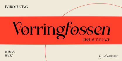 Vørringfossen is a elegant display serif typeface. This elegant typeface features custom ligatures and alternate characters that will help you create beautiful work .Add a sophisticated style to your designs with Vørringfossen. This font is perfect for logos, posters, web design, graphic quotes, album covers, branding, and more.
 - Stargild by Sinfa,
$14.00 Stargild is the perfect typeface for any type of your project with alternative fonts in both lowercase and uppercase and several types of underlines, such as advertisements, branding, quotes, wedding designs, graphic design, logos for online or offline businesses, photography, and more. -other. Make your business more beautiful!
 - Abdo Logo by Abdo Fonts,
$30.00 Abdo Logo is an Arabic display and text typeface. It is useful for headlines, books covers, logos design, slogans, advertisement and other graphic projects. The font is based on the simple lines of free style calligraphy. The font supports Arabic language and I may extended to cover additional scripts.
 - Novelin by Designova,
$25.00 Novelin is a modern typeface with a unique design and a perfect choice for creating logotypes, branding, headlines, corporate identities, and marketing materials for web, digital & print alike. The typeface will be great for branding, logo/logotype design projects, marketing graphics, banners, posters, signage, corporate identities, and editorial design.
 - Rafellia by Tiny Hand Letter,
$12.00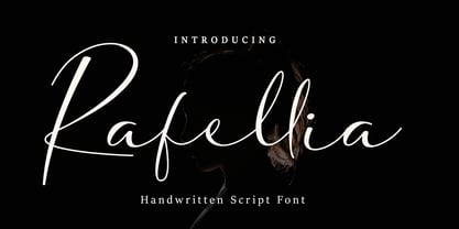 Rafellia is a handwritten script font, with an elegant and beautiful look. Rafellia will look perfect for elegant logos, wedding stationery, posters, quotes, short text, branding, web, graphic design, and more. This font is PUA encoded which means you can access all of the glyphs and swashes with ease!
 - Jassime by Nian Keun Studio,
$12.00 Jassime is an elegant serif font with beautifully crafted characters following the trend so you can use them very well. You can use Jassime in graphic designs, magazines, logos, identity branding, fashion brands, clothes, and many others. Thank you for coming to my shop and enjoying other fonts.
 - Black Apostle by Chekart,
$17.00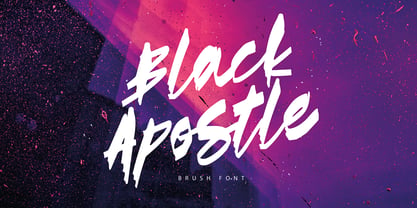 Black Apostle is a hand drawn brush font. It comes with uppercase and lowercase characters, set of punctuation glyphs, numerals, Cyrillic characters, some Cyrillic ligatures and multilingual support. Perfect for logos, quotes, posters, branding projects, product packaging, t-shirt, book cover, greeting cards and applicable for any graphic design.
 - Enviro by ITC,
$29.00Enviro is the work of American graphic designer F. Scott Garland. A lighthearted sans serif, Enviro evokes the style of the movie industry from the 1920s and 30s. Some forms are mildly abstract, but they remain legible nonetheless. Enviro attracts attention and gives any headline a unique look. - Civic Sans by CozyFonts,
$25.00 A Clean Sans Serif font family with a few stylish glyphs to give extra character e.g., L-R-Q-Z-W-g-t. Usage: Any applications is appropriate especially signs, directions, posters, graphics and use especially in Ads and billboards. There's 13 font variations in Civic Sans Font Family.
 - P22 Vienna by P22 Type Foundry,
$24.95 The Vienna Workshop (Wiener Werkstätte) produced a tremendous variety of art from the turn of the century until the beginning of World War II. This set, which includes three typefaces and a collection of graphic extras, draws on both the Art Nouveau and Expressionist traditions of the Workshop.
 - Kargert by Oleg Gert,
$30.00 Kargert is a typeface that carries powerful messages in a modern graphic style with ease. It uniquely combines simplicity and sophistication. With the display typeface Kargert, you can create stunning headlines that will grab attention. Let Kargert impress your viewers and help deliver your message with strong impact.
 - Catshape by RodrigoTypo,
$45.00 Catshape is a font of dingbats, which in combinations with uppercase and lowercase you can generate multiple characters with different textures. In addition to a set of ornaments and a font called Alquitran Stencil, it was designed for different graphics. I hope you can have fun with this font!
 - Kaminari-Kun by Julmeme,
$25.00 Kaminari-Kun is a typeface that has a very strong and unique impact. With its iconic saw-toothed design, characters can fit into each other and can be associated to create an modern and electric design. Applicable for any type of graphic design, especially for posters and logotypes.
 - Hells by 4RM Font,
$19.00 Hells font is made with ultra condensed width and has a strong aesthetic value when used in the right design. Having a regular style and a compressed width adds to the aesthetic of this font. It is suitable for use in graphic designs for posters, flyers, or large designs.
 - LGF Avadar by LGF Fonts,
$9.00 Avadar is a typeface with a fine serif of straight lines and an inner line that breaks the glyph in two. The type is indicated for use in large or very large sizes, especially for display graphics; the spacing between glyphs makes the readability of the text increase.
 - Techno Cowboy by Hipfonts,
$22.00 Introducing Techno Cowboy, a modern techno display font with multilingual support. Techno Cowboy is great for creating eye-catching logos, headlines, ads, posters, web design, print, motion graphics, apparel and much more. If you're looking for a futuristic font that packs a punch, then Techno Cowboy is for you.
 - Good Summer by Sipanji21,
$15.00 Good Summer is a handwritten font with playfull touch. It offers support of English Language. Standard punctuation glyphs are included. Great for crafters and graphics artist alike. Compatible with all operation systems. Its playfulness make it great for creative projects, be inspirational wall posters, logo, branding, and more.
 - Kryptic LP by LetterPerfect,
$39.00 Kryptic is based on a design for computer optical character recognition (OCR) from the 1960s developed by Epps & Evans at the National Physical Laboratory. Its pure geometric and elemental shapes create graphic patterns and visual puzzles that only secondarily communicate meaning. Not recommended for extended text, unless intentionally encrypting!
 - Kappa by W Type Foundry,
$25.00 Kappa is a modern sans serif with humanistic and geometric features. Its structure is slightly narrow to fit in a greater range of platforms (moreover if you print it, you may save a lot of paper), and its height is higher allowing a great legibility in small sizes. This family is composed with the display version and the text version providing a broad spectrum of solutions, making this family easier and friendlier to use. Designed with powerful OpenType features in mind. Each weight includes alternate characters, ligatures, fractions, special numbers, arrows, extended language support, small caps and many more… Perfectly suited for graphic design and any display / text use. The 36 fonts are part of the larger Kappa super family. Learn about upcoming releases, work in progress and get to know us better! On Instagram W Foundry On facebook W Foundry wtypefoundry.com
 - Millenium Pro by TypoStudio Pro,
$29.00 In designing the Millenium® typeface, Patrice Provost was inspired by great typographers in the great French typographic tradition to create a unique and modern variable font. His goal was to reinterpret the mid-20th century sans serif style in a variable typeface that will conform to the need of the 21st century. He succeeded with mastery in drawing large characters. In doing so, patrice provost added an exceptional dimension to the design of this typeface, a graphic personality that evolves over the styles. The attention to detail brought to each letter, each accent, each diacritic, make this font a solid tool for all Western graphic designers and layout artists. With more than 1000 glyphs per style, Millenium® can be used in more than 210 countries. With its 13 styles drawn in Classical Roman style, in Italics and in condensed Millenium® provides designers from all walks of life with a fantastic tool to bring novelty and class to your creations. Ideal for signage, Millenium, thanks to its "wide case", is also widely used for posters. It is also a gold mine for creating logos for dynamic tech start-ups. The Millenium family is made up of designs with progressive weight changes. it is very extensive. It ranges from "Super Thin" to "Extra Black". Unique in the world, its thinness makes it possible to design a very light style even to print on posters and other large formats. Designed from the outset as a variable typeface, Millenium offers a range of 900 possible variations and an infinity of creations...
 - KG Part Of Me by Kimberly Geswein,
$5.00 Very neat kid-friendly handwritten lettering.
 - KG The Last Time by Kimberly Geswein,
$5.00 Playful, whimsical unicase chunky bold lettering.
 - Hannah Joie by LightHouse,
$49.00Hannah Joie was influenced by the early lettering that appeared on posters in Israel (e.g. the 1950s). The style of the lettering was bold, heavy, and prominent. Hannah Joie is an OpenType/TTF Unicode font. - Plain Talk JNL by Jeff Levine,
$29.00 Plain Talk JNL is similar to Eckhardt Centerline JNL, but lacks the thin inline lettering and has a different A and G. The hand-lettered look of this font makes it perfect for titling applications.
 - Earthwerk by PizzaDude.dk,
$20.00Earthwerk is a squarish font with elements of grunge. Comes with unique accented letters, alternate upper- and lowercase, smart ligatures and alternate letters. You will need to use OpenType supporting applications to use the ligatures. - Handmade Gothic JNL by Jeff Levine,
$29.00 Handmade Gothic JNL is one of many typefaces inspired by lettering samples in a 1941 Speedball® Lettering Pen instructional booklet. The bold, Deco-style sans is perfect for many attention-getting headlines and titles.
