10,000 search results
(0.035 seconds)
- Interboro JNL by Jeff Levine,
$29.00Interboro JNL is based on the serif lettering found on an old E-Z Letter lettering guide. - Rabenau by Linotype,
$29.99 Rabenau (formerly Lucinde), the distinctly warm and legible type family For 30 years the graphic designer Axel Bertram worked at creating his typefaces: He developed complete new alphabets for magazines and typewriters as well as for the constant demand for typefaces for use by commercial artists. He has developed wall charts the size of advertising posters as teaching aids for training commercial and graphic artists to write in a clean, classic cursive script. In the eighties he used the American Chyron computer to design a screen font for television. In the mid-nineties he discovered for himself the fabulous possibilities offered by the Fontographer font software program and explored them playfully. From the results of these experiments, Axel Bertram selected a design for further development. From 2003 onwards the calligrapher and type designer Andreas Frohloff collaborated with him on the further development and production of the 16 fonts of the Rabenau™ typeface family.The Rabenau font was inspired by many factors: From the fonts used as book covers to typewriter fonts and even printed material from England dating from the beginning of the nineteenth century (e.g. those used by the skilled printer William Bulmer), Rabenau's relatively high contrast is offset by some organic tapers, subtley rounded bracketed serifs, and a fairly generous x-height. This makes for a typeface that looks especially good in print. Its broad repertoire of weights and styles - Condensed, Poster, and Shadow - give it added versatility, and make it ideal for setting both display and text in the same typeface. Throughout the heavier weights, the contrast is maintained. The Poster Italic sparkles, and will make a fine display type for dynamic headlines, or logotypes. This family of sixteen fonts works beautifully together. All Rabenau font styles have a large set of ligatures and thus cover typical letter combinations in many European languages. Besides the standard ligatures for ff, fi and fl, letter connections are also available for tt, th and fj or ffi, ffl and ffk. The range is completed with lovely arched transitions for the characters st, ck or ct. The latter gives the font that certain something, both in continuous text and above all in headlines.
 - Zennat Pro by Latinotype,
$29.00 This font is inspired by the compact, high-impact design aesthetic of the 1990s in Chile, which was defined by the use of very heavy fonts to create eye-catching graphic pieces. With this idea in mind, Zennat Pro was born, a “semi-slab serif” that takes advantage of OpenType features which rotate in alternate characters to best fit the design. Zennat pro comes in 10 weights, and is ideal for magazine design, motion graphics, trademarks, logos, posters, etc. ...
 - Tacit by Fontar,
$25.00 Tacit is the first typeface to be the creative outcome of a PhD thesis in graphic design. The work's main study had the aim of documenting design processes in an effort to externalise the tacit (experiential) knowledge of graphic designers. Initially the task was only to design several glyphs but the work resulted in a full typeface. Tacit is an elegant sans serif with a distinctive character and is legible at small and large point sizes.
 - Entsha by S.P.M.H,
$20.00 Entsha is a gorgeous sans-serif typeface that is both classically elegant and inherently modern. Create beautiful wedding invitations, use it as an elegant solution for your next magazine layout, or choose Entsha for any graphics that require a sleek look with a vintage flair. Entsha is based on classic letterforms for publishing and display graphics, so you can give your text a classic, elegant feel with Entsha's clean, high-contrast lines and alternating thick and thin strokes.
 - Kalyna by 2D Typo,
$36.00 The Kalyna font is interesting with its stylistic implementation through asymmetrical serif. Such design is characteristic for the Ukrainian style. The drawing of the font is based on the sketches of a famous Ukrainian graphic artist of early 20th century Heorhiy Narbut. His work set the whole school in the Ukrainian graphic art and is still very influential nowadays. The font is capital and also includes a set of ornaments in addition the standard set of symbols.
 - Solomon Sans by Fontfabric,
$40.00 The new Solomon Sans type family includes 14 unique design styles. The font family is characterized by excellent legibility, well-finished geometric designs, optimized kerning etc. Solomon Sans is most suitable for headlines of all sizes, as well as for text blocks that come in both maximum and minimum variations. The font styles are suitable for any type of graphic design - web, print, motion graphics, etc, and perfect for t-shirts and items like posters and logos.
 - Aramis - Unknown license

- !CRASS ROOTS OFL - Unknown license

- Spoonge Punk - Personal use only

- Walk Da Walk One - Personal use only

- Chillgangs by Patria Ari,
$15.00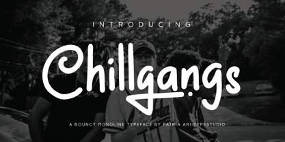 Chillgangs is a monoline display typeface inspired from graffiti culture, with alternative glyphs and swashes. Chillgangs is perfect for apparel, logo, social media posts, advertisements, product packaging, product designs, label, and many more.
 - Malo Aino by Maulana Creative,
$14.00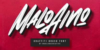 Give your designs an authentic handcrafted feel. "Malo Aino Graffiti Brush Font" is perfectly suited to signature, stationery, logo, typography quotes, magazine or book cover, website header, clothing, branding, packaging design and more.
 - Cybertown Subterranean - Unknown license

- Epoch by Jonahfonts,
$25.00 A very graphic font with emphasis on legibility, dynamics and modern. Recommended for posters, titles, book covers, books, greeting cards, signage, packaging, invitations, magazine articles and advertising.
 - Price Tag by Turtle Arts,
$20.00Price Tag is a bold, graphic alphabet inspired by labels and vintage price tags. A touch of grunginess makes this alphabet look extra cool in larger sizes. - Zan Zan by Pitt's Hand,
$20.00 A fun font to create pop and young graphics, with a non-obvious font created starting from a handcrafted line. For an urban, snappy and fresh result.
 - Glide by Typedepot,
$35.00 Elegant custom font with rounded corners, great for logos, posters, motion graphics and t-shirts. The name is inspired by the sleek curves and its smooth look.
 - RTCO Fransworth by Roams Type Co,
$12.00 RTCO Fransworth Inspired by Vintage Horror Novel & Movies Poster Typograhphy This font is suitable for graphic designs such as logotypes, merchandise, printed stickers, and other branding needs.
 - Awwam by Eyad Al-Samman,
$20.00 Awwam refers to the region of Awwam which is now thought by most scholars to be Ma'rib or the famous temple of Awwam otherwise known as Mahram Bilqis. The Awwam temple—Arabic Haram Bilqis or Mahram Bilqis—is a Sabaean temple near Ma'rib in today's Yemen. It was built by Mukarrib ‘Yada'il Dharih I’ between the 7th and 5th century B.C. Also, one of the most frequent titles of the God ‘Almaqah’ was the Lord of Awwam. Almaqah was the main God of the ancient Yemeni kingdom of Saba' and also the kingdoms of D’mt and Aksum in Eritrea and Northern Ethiopia. Different members of the ruling dynasties of Saba' regarded themselves as Almaqah’s children. Awwam is a wide and headline Arabic display typeface. The main trait of this typeface is the wide, curved, and streamlined design of its wide kashida, letters, and ligatures. This feature renders it as one of the modern stylish typefaces used for headlines, titles, headers, banners, and captions. Among the distinguished letters of Awwam typeface are the “Alef”, “Qaaf”, “Waaw”, “Yaa”, “Gheen”, and others. Moreover, Awwam typeface has a character set which supports Arabic, Persian, Urdu, and simple Latin letters/numerals with a limited range of specific Arabic and Latin ligatures. This typefac comes in two styles (i.e., Awwam, and Awwam-Pro) with a single weight (i.e., regular) and nearly 650 distinctive glyphs for each style. Due to its ultra-wide design, Awwam typeface is mostly appropriate for headings and titles in Arabic, Persian, and Urdu. It can be graphically and visually exploited in books, novels, magazines, newsletters, pamphlets, posters, and interfaces of other objects such as clothes and equipment. Moreover, it can be pleasingly used for signs, books’ covers, advertisement light boards, and titles of flyers, and books of children and adults. In brief, Awwam typeface is one of the new wide Arabic typefaces which can be utilized efficiently in diverse graphic, typographic, and artistic works for different languages and cultures.
 - Faya by Clevus,
$16.00 Proudly present Faya stencil modern ligature. Faya is a font designed with a modern stencil style that blends classic elements with elegant contemporary touches. Featuring ligatures that offer design flexibility, Faya is suitable for various graphic design needs, including posters, banners, logos, and more. Don't forget to use all caps too in your mixing and matching - it adds contrast and impact to your type design. Design tips! : Tighten your letterspacing for larger titles to create a range of looks. Crafted with meticulous attention to detail, Faya's letterforms are bold, sharp, and geometrically-shaped, catching the eye with their visually appealing design. The font boasts high clarity and legibility, offering a range of different letter variations such as elegant uppercase and lowercase letters. With its clean yet stylish appearance, Faya is perfect for modern and minimalist design applications. Font Features : Lettres, numbers, symbols, and punctuation, alternates and ligatures No special software required they may be used even in canva, any basic program /website apps that allows standard fonts That's it folks! Multilingual Support Language Support: Danish, English, Estonian, Filipino, Finnish, French, Friulian, Galician, German, Gusii, Indonesian, Irish, Italian, Luxembourgish, Norwegian Bokmål, Norwegian Nynorsk, Nyankole, Oromo, Portuguese, Romansh, Rombo, Spanish, Swedish, Swiss-German, Uzbek (Latin) Follow My Shop For Upcoming Updates Including Additional Glyphs And Language Support. And Please Message Me If You Want Your Language Included or If There Are Any Features or Glyph Requests, Feel Free to Send me A Message. Kindly check over on Instagram! https://www.instagram.com/clevustudio/ Have a Good Day !
 - Cogsworth by Anastasia Kuznetsova,
$17.00 Get to know the natural and neat font "Cogsworth"! This beautiful neat retro font with imperfect ink edges and a little careless shading is inspired by nature. Eco-friendly fashion takes into account the health of consumers, the health of the planet. The "Cogsworth" font is perfectly combined with any stylized graphics, watercolors, and also looks great on its own as part of a minimalist design. Play with letters to get different effects. Great for branding, wedding invitation design, packaging design, quotes, label design and more. Font Features A-Z; a-z character set; 1 language (English); numbers and punctuation marks, symbols. A font containing uppercase and lowercase letters, numbers, and a wide range of punctuation marks. Fonts can be opened and used in any software that can read standard fonts, even in MS Word. No special software is required, and to get started. It is recommended to use it in Adobe Illustrator or Adobe Photoshop Made with love ♡ Thanks for checking it out, and feel free to drop me a message if you had any queries! ~ Anastasia
 - Victorian Fonts Collection by Burntilldead,
$14.00 Have you ever imagine to make layered Victorian logo as fast as you blink your eyes? or even make your document and website with victorian classical vibes? Abracadabra! Introducing you opentype font... King Edward and Queen Victoria fonts in one solid package. Very victorian, ornamental, decorative and classical. A solid combination that can bring your design, logo, document, website, etc. back to 1800 decade. Multilingual fonts-family and playful one with 200 alternate characters. Personal & commercial license is included! HOW TO GET ACCESS TO ALTERNATES? Make sure you run an APP or Software that allow you to access Glyph panel. All characters are available through Glyph panel, even more each of the alternate letter has it’s own unicode (PUA) so you can copy/paste from Apple Font Book or Windows Character Map. Total amount of glyphs 1814. OPENTYPE FEATURES - First lowercase (after a capital) and last letter swap automatically. You just need turn on Contextual Alternates. The Victorian graphic Dingbats collection joined together into standard font format (OTF and TTF). Easy to use and great for your decorative document, layout, sign, logo, etc.
 - Melodi by Diego Berakha,
$20.00 Melodi is the result of years of working with hand made types on my designs. Every time I draw the letters and words that I need for every design piece. One day I decided to go serious and make a real type of it and “Melodi” is the result of this work. It’s a calligraphic font, built using a regular stroke, and carefully crafted to have nice joins between all the letters. It has some playful but stylish capitals that brings lot of personality to the font. It work super nice either in lowercase writing as in all-caps texts. It looks specially good on lists of words or small sentences. Melodi is a playful but very versatile font, it can be used in lots of different scenarios. From creating a logo, writing the tittles of a catalogue or use it in a poster combined with other types (it work really well as counter point of more classical types) to motion graphics animations or advertising work. It can be cute but it also can do hard work!
 - Bronto by W Type Foundry,
$29.00 Bronto is a typeface that mutated many times: it went from being morphologically conventional, to have soft features, to finally have some inverted contrasts that made it more dynamical; but all this without losing sight of the meaning of a typefamily, and the aim pursued by this work: Bronto doesn’t behave as a piece of art, but as a tool. In some weights, this typeface possesses fluffy characteristics and is boldly bighead, while in other versions is slightly contrasted and controlled; this in order to maintain the essential features of the typefamily along the versatility and usability of the 20 variations that composed it. Bronto it’s inspired in neo humanists typographies of the 20th century, and in Chilean lettering. This kind of work was made by the spontaneity of the paintbrush, which gave an inverted contrast to some characters. This typeface has plenty of OpenType features, specially an extensive set of ligatures in all weights. Bronto is well suited for motion graphics, letterings, web, advertisings, magazines and books.
 - Jojo by Canada Type,
$24.95 A little more flower and a little less power, please. Fun, friendly, fashionable, and feminine to a fault, Jojo takes display typography to a whole new level, where eyes can’t help but appreciate the day and the design at hand. It takes a graphic designer very little imagination to see these letters on posters, book covers, clothes, and craft paraphernalia. Or how about a sign over a bakery? A music sleeve? A romantic comedy titling? Cosmetics products? Pretty much anywhere! Jojo takes its name from a Beatles song about getting back to where we once belonged. It also takes most of its shapes from vintage photo-setting days, when an art nouveau typeface called Spring, by B. Jacquet, was putting happy times back where they belonged, which was everywhere. The original photo-setting face came in just 26 letters and 10 numerals. This digital retooling optimizes the original forms and expands on them, for a full character set of over 430 glyphs, including ligatures and stylistic alternates, and support for the majority of Latin languages.
 - Absalon by Michael Nordstrom Kjaer,
$39.00 Absalon has square letter shapes. It has some characteristics semi-sharp and semi-rounded corners and it has a relatively tall x-height for legible text. To create the perfect typesetting the spaces between individual letter forms has been precisely adjusted. The Absalon font family is perfect for the web as well as for print, for display as well as longer text, for motion graphics, on the side of a van, t-shirts, logotypes and so on. The font family consist of 5 weights or 10 styles and it has 410 glyphs. A total of more than 4000 glyphs. The styles are: Light, Light Italic, Regular, Italic, Medium, Medium Italic, Bold, Bold Italic, Extra Bold & Extra Bold Italic. It has OpenType features such as automatic fractions, subscript, superscript, numerators, denomerators, ordinals and the “f” ligature set. Absalon has extended language support (most Latin-based scripts are supported). The name of the font family is Absalon and it is a reference to a Danish bishop in the middle ages. He was a key figure in the founding of Copenhagen, the Capital of Denmark.
 - Cherry by Fenotype,
$19.00 Cherry is a bold and smooth display family with connecting script “Brush” and supporting thin marker caps “Sans”. In addition there is “Extras” which is a set of strokes and ornaments designed to go with the fonts. Cherry Print is the same set with rugged outlines and eroded print texture. Cherry Brush has clear and smooth letter shapes with lot’s of character. It’s great for Logo, Poster, Headlines, Packaging or any Display use. Cherry Brush is equipped with plenty of contextual alternates and ligatures that keep the connections smooth. This feature is set in Standard Ligatures and it’s on by default. Cherry Brush is designed so that you can also use it to writ ALL CAPS. For more flashy initials try Swash feature. Cherry Brush is PUA encoded so you can access extra characters in most graphic design softwares. Cherry Sans is an all caps thin marker font with two size of letters (uppercase & lowercase). Cherry Sans is clean and legible. It’s designed to work with Cherry Brush but works just fine on its own too.
 - HWT Mardell by Hamilton Wood Type Collection,
$24.95 The Hamilton Wood Type & Printing Museum staff is honored to partner with New York-based graphic designer Louise Fili on her first font release project. The new font, “Mardell,” is named for Hamilton retiree and wood type cutter Mardell Doubek. This is the fourth font to be cut for the museum as part of the Wood Type Legacy Project. "The bold, lively angularity of Italian futurist letterforms made it a natural choice for wood type.” says Fili. This digital version presents Fili’s wood type design for use in web and print applications.
 - America Line by Kustomtype,
$30.00 Since its foundation in 1901, the iconic building in the Rotterdam neighborhood Kop van Zuid, is shining. Where previously the Holland America Line was housed, you will now find Hotel New York. A building with a tremendous history. We’re glad to take you back in time with captivating memories. In 1991, catering entrepreneurs Daan van der Have, Hans Loos and Dorine de Vos refurbished the at the time vacant property into a hotel/restaurant. To honor its 25 years existence, we celebrate this happening with a brand-new font, ‘America Line’. A tribute to Wim ten Broek, the multi-talented Dutch Graphic Designer. As early as the 1930’s before the Second World War, Wim ten Broek made the famous posters for the Holland-America Line. The influence of A.M. Cassandre here in, is clearly recognizable. Wim ten Broek also worked for HAL with large surfaces and fixed lines in which primary colors dominate, accentuated with shadows acquired by spraying technique. He also made graphic works for, among others, the World Exhibition in New York, the Dutch railway company ‘Werkspoor’ and the royal Dutch steel factory ‘Hoogovens’. His drawings and lettering gave me a love for the trade and naturally gave me a completely different view on fonts. That’s how I slowly but surely made my way to the trade. Based on the letters I had at my disposal from the Holland – America Line poster, I started to complete the alphabet in the same style as the original text. I digitized everything in order to acquire a usable and modern font. The Holland America Line Font comes with uppercase and lowercase with all the needs of modern times to create a good digital font and to be able to use it for all graphic purposes. The font is ideal for headtext, posters, logos, etc... Don't hesitate and use this unique historical font! It will give your work that glamour that you will find in few fonts. Enjoy the Holland America Line. The Holland America Line Font comes with uppercase, lowercase, numerals, punctuations so you can use the Holland America Line font to customize all your designs. The Holland America Line font is designed by Coert De Decker in 2018 and published by Kustomtype Font Foundry. The Holland America Line Font can be used for all graphic purposes. It is ideal for headtext, posters, logos, logos, letterhead, apparel design, package design, label design etc... Don't hesitate any longer and enjoy this unique historical font! It will give your work the glamour that you will only find in a few fonts. Enjoy your journey with the Holland America Line!
 - A10 STAR Black by Mogtahid,
$90.00 As a former typographer / lino and calligrapher, Abdallah NASRI had recourse to the nature of the idea of an "INTERCHANGEABLE" collection for types who in reality offer a police collar parallel to the complex typeface of the variable. Our fashion is outlined by a simple calculation defined by superimposed geometric circles where we used only its ¼ to fill the need for the angles of each of our letters. Always with the idea of having in the same allocated space, the same letter nested as many times as fat example from Hairline to Ultrabold. It was in this way that I was able to obtain a large number of styles, with a very interesting kerning which prompted me to extend the font to other languages with +1000 characters and +600 glyphs. I have always been treasured by the all in "1". I assure you that I sought to obtain the maximum of Visibility for a use S / Titling TV, WEB Pages and Typography Typo; once the difficult thing was done, I was rewarded by a font that has countless typographic openings for the world of graphics with 10 styles of weights in hand, and again I am happy to have personalized the charm of each letter by new details; I do not regret the time spent on thinking about it so that it is useful and at the same time pleasant as a working tool, finally profitable in all sectors and more multilingual, without forgetting that it is a family of inter change c ' is to say: All the types occupy the same height of the body and it is their fats which differs in the same space width of each of the letters, therefore no interference in spacing. Here, an additional alternative, a participation of a septuagenarian in the service of the love of modern digital typography. • TEST: At 50% screen in a body of 12 pixels, the A10 STAR Alphabet subjected to a test, has a clear Readability / Visibility. • P.S: A10 STAR integrates Diacriticism in all its forms. Texte d'origine : Abdallah NASRI a eu recours en étant ancien typographe/lino et calligraphe à la nature de l'idée d'une collection "INTERCHANGEABLE" pour les types qui en réalité offre un collier de police parallèle à la fonte complexe du variable. Notre mode est esquissé par un calcul simple défini par des ronds géométrique superposés où on a utilisé seulement son ¼ pour garnir le besoin des angles de chacune de nos lettres. Toujours dans l’idée à avoir dans le même espacement alloué, la même lettre imbriquée autant de fois de graisse exemple du Hairline à Ultrabold. C’est de cette manière que j’ai pu obtenir un grand nombre de styles, avec un crénage très intéressant ce qui m’a incité à étendre la police à d’autres langues avec +1000 caractères et +600 glyphes. J’ai toujours été prisé par le tout en « 1 ». Je vous assure que j’ai cherché à obtenir le maximum de Visibilité pour une utilisation S/Titrage TV, Pages WEB et Maquette typo ; une fois le difficile fait, j’ai été récompensé par une police qui possède d’innombrable ouverture typographique pour le monde du Graphisme avec comme atout en main 10 styles de graisses, et encore je suis content pour avoir personnalisé le charme de chaque lettre par des détails nouveaux ; je ne regrette pas le temps passé dessus à réfléchir pour qu’il soit utile et à la fois agréable comme outil de travail, enfin profitable tous secteurs confondus et en plus multilingue, sans oublié que c’est une famille d’inter change c’est-à-dire : Tous les types occupent la même hauteur du corps et c'est leurs graisses qui diffère dans un même espace largeur de chacune des lettres, donc aucune interférence dans l’espacement. Voilà, une alternative supplémentaire, une participation d’un septuagénaire au service de l’amour de la typographie numérique moderne. • TEST : A 50% d'écran dans un corps de 12 pixels, l'Alphabet A10 STAR soumise a un test, présente une nette Lisibilité / Visibilité. • P.S : A10 STAR intégre la Diacritique dans toutes ses formes.
 - Monkey Hat by PizzaDude.dk,
$20.00 Monkey Hat is art deco with a fresh twist of graffiti, and on top of that a lot of funk! Comes with a good handful of ligatures to make the text even more playful!
 - Herralds by Heyfonts,
$13.00 Herralds is a graffiti display font . Herralds is a free-style font that has the characteristics of street art that shows freedom and is filled with unique characters to make your projects stand out.
 - Jemina by Creativemedialab,
$20.00 Jemina is a modern, unique serif font. The dynamic curve of each letter looks elegant and charismatic and will be the center of attention for the eye which sees it. The abstract feel of its characters strikes a balance between modern and classic typography. Perfect for branding, logo, and fashion-related concepts.
 - Joy by Yasmina Creates,
$33.00 Joy is sure to spice up your text life! She overflows with style and personality. She loves to be center stage on headlines, flirting with her readers eyes. There are over 100 ligatures, creating words with some letters connecting and others standing on their own. This creates a modern, fresh, handwritten look.
 - Newcastle by FaceType,
$9.00 Newcastle gives you great opportunities for spicy typography. If you find some similarities to one of our fonts, ‘Blitzplakat’, you are right. We took it to the next level and made it even better: We extended the range of letters, added optional catchwords, extra shapes, shadows, dust and arrows. Here is a lead to get the most out of Newcastle: Use ‘Discretionary Ligatures’ in the OpenType section of your layout program of choice to turn frequent short words like ‘and’, ‘of’ or ‘from’ into catchwords. Choose ‘Styleformat 01’ to make them vertical. Keep ‘Contextual Alternates’ activated to make consecutive letters look more realistic (the second letter will be replaced automatically by a slightly different looking version). Want to roughen the look of your design even more? Add the dust hidden in the ‘Extras’ style by typing underscore, emdash, endash or hyphen. This font is vintage fun - let’s party!
 - Geekabeat by PizzaDude.dk,
$20.00 Geekabeat is my wooden lookalike grunge typeface! All uppercase letters has got a funky swirl. Comes with different upper- and lowercase letters, alternate letters (both upper- and lowercase!) and ligatures for both double letters and double numbers, along with ligatures for most common letter-combinations - and of course it has got unique accented letters! You will need to use OpenType supporting applications to use the ligatures.
 - Gravesend Sans by Device,
$39.00 Smart, legible and elegant, Gravesend Sans is a based on the unique typeface used for the iconic grass-green signage for the Southern Railway. In existence from 1923 to 1948, when the network was nationalised, the Southern Railway linked London with the Channel ports, South West England, the South coast resorts and Kent. The same design was also used for the ‘hawkeye’ signs on the London, Midland and Scottish Railway, differentiated by black letters on a yellow background. Reference for each letter was taken from vintage ‘target’ station nameplates and other platform signage. The rarest letters were the Q, seen in Queens Road Battersea, the X, seen in East Brixton, and the Z, used in Maze Hill, site of an infamous train crash in 1958. Being hand-made, the letters often differ in width and thickness. There was no lower case. The Bluebell Railway, a heritage steam line, runs over part of the old Southern Railway network and uses a very similar type. The design of the numbers differed considerably, but here have been taken from the Device 112 Hours font Smokebox. As well identifying platforms, they were used on the front of the steam engine’s smokebox, hence the name, and stylistically are more in keeping with the letters than some of the squarer versions that can be seen in old photographs. William Caslon IV is credited with the first Latin sans-serif type, shown in a 1816 Caslon specimen book. ‘Two Lines English Egyptian’, as it was called, was caps-only, and there are several other correlations between that type design and this one. Includes a selection of authentic arrows and manicules, plus abbreviated ligatures such as ‘St.’ (Saint or Street) ‘Rd.’ (Road) and ‘Jn.’ (Junction). The Cameo version includes many graphic banner elements that can be freely combined.
 - Barberry by FontaZY,
$35.00 Barberry is a hand-made brush script typeface equipped with some decorative OTF features, made by Zakhar Yaschin (FontaZY). Barberry font contains stylistic alternates, initial and final alternates (which is duplicated by contextual alternates in the case when ini & fina are not supported), ligatures, titling alternates, small caps and large collection of swashes (additional variants - in Stylistic Set). The Barberry font is essential for hand-made lettering and design. The Barberry family also includes Barberry Vigniette font with over 200 icons and vigniettes in it. Barberry Letters supports most of Western languages (including Central Europian, Baltic and Eastern European languages) and also Cyrillic. Each lowercase letter has three positional versions of the design – basic (if the letter is in the middle of a word), initial (if the word starts with it) and the final (in the end of the word) that makes the set look more alive and expressive. Working with Barberry Letters you can enable and disable if needed such typographic tools as swashes, ligatures, small caps, titling alternates, stylistic alternates, additional swashes and the already mentioned initial and final alternates. If your design software does not support the use of the initial and final alternatives, they can be duplicated by contextual substitutions. There are more than 20 Latin and Cyrillic ligatures in the Barberry Letters. It works by default as the standard ligatures, but you can switch it off for design reasons or to select the more appropriate typographic solution in any particular case. Ornamental font Barberry Vigniette has more than 200 pictograms and vignettes that can decorate your typographic layout. All icons are drawn with a brush in the same style as the Barberry Letters. You can use them inside the text lines, or make the ornamental decoration for text, or use separately, without any letters. OpenType extensions of the Barberry Letters significantly expand the choice of typographical tools to design a better, more expressive layout. Choosing the optimal variant of certain letters in each case, you can receive a unique composition. Whether it is lettering for packaging or magazine headline, logotype or the name in the invitation – just one Barberry font-family gives you the very wide typographic possibilities.
 - Linear Curve Fatty - Unknown license


