10,000 search results
(0.026 seconds)
- Supra Condensed by Wiescher Design,
$29.00 »Supra-condensed« – designed by Gert Wiescher in 2013 – is the condensed version to this new sans typeface family of eight weights with matching italics. The condensed version is designed for space-saving typography but with high legibility in mind. The light and normal weights and the dominant x-height with its high ascenders make for easy reading of long copy. The heavy and x-light weights are great for elegant headlines. Supra is an OpenType family.
 - ITC Studio Script by ITC,
$29.99ITC Studio Script was designed by Robert Evans, an informal script for applications in which a calligraphic look would be appropriate. The font includes a wide variety of alternate characters, which give a graphic designer's creativity no limits. - Ruina One by RodrigoTypo,
$25.00 Ruina One is a Rough and distressed font, but at the same time very gestural. It is especially great for youth and child graphics, but can be applied in many other domains too. Ruina One contains various ligatures.
 - Gromer by Heyfonts,
$13.00 Gromer is an exsperimental font adaoted from a combined groovy font and graffiti that maks it’s unique character as Display Font,this font is very suitable to use as your project design such as graphic template or clothing
 - Beast Bird by ErlosDesign,
$19.00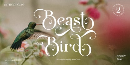 Beast Bird is a decorative display serif with vintage and elegant vibes. Add a sophisticated style to your designs with Beast Bird. This font is perfect for logos, posters, web design, graphic quotes, album covers, branding, and more.
 - Valvolina by Device,
$39.00 Valvolina is a bold headline font inspired by Italian Futurism and the Moderne graphic design of the inter-war period. It uses elementary geometric shapes to build its characters, lending it an energy and punch. Dramatic and contemporary.
 - Vagabond by Studio K,
$45.00 Vagabond is a vintage font family whose natural home is on the back porch, ranch or railroad. A rugged slab serif with a lived-in look, it’s lends a note of earthy authenticity to any graphic design project.
 - ITC Tomism by ITC,
$29.99ITC Studio Script was designed by Robert Evans, an informal script for applications in which a calligraphic look would be appropriate. The font includes a wide variety of alternate characters, which give a graphic designer's creativity no limits. - ALT Lautus by ALT,
$5.00 Lautus is a 10 weight typeface and can be use in almost every graphic design application. It’s great for minimal design, logos, posters, and magazines Check out the whole presentation here http://www.behance.net/gallery/Alt-Lautus-Typeface/788079
 - NF Elena by NicolassFonts,
$17.00 NF Elena was designed by Nikolay Savchuk. NF Elena was created on base Katerina sans-serif typeface. It is brilliantly suited for graphic design and display use and perfect for magazines, newspapers, books, websites, brand identity, and advertising.
 - Blancs by 4RM Font,
$30.00 Blancs font is created with the utmost value of aesthetics and classy aura, with an anatomical feature that is geometrical, with an extended style. This font is suitable for use in graphic design, especially those with futuristic themes
 - Sevil alias Esra Lite - Unknown license

- AmpleNu by Soneri Type,
$50.00 AmpleNu is a display type family derived from the Ample typeface. It has optical mono-linear stroke and a bit squarish form in nature. It has a seamless stroke movement instead of sharp angles formed by the junction of two strokes, which is a prominent feature of its design. It is designed to be a little eye-catching yet legible. It has clear and distinguishable letterforms, which helps to elaborate and emphasize the message. It is graphically strong and commands the viewer's attention. The overall appearance of type is suitable for setting and using it as heading, title, headline, logotype, etc. The type family consists of sixteen styles which include eight upright weights and their italics. AmpleNu has a bit more squarish counters and angles than Ample typeface, it even has straight terminals while Ample typeface has a slight curve. In addition to this, few characters have some major or minor changes and the letter ‘g’ plus ‘y’ and their respective diacritics have alternate style variations. AmpleNu is designed by Aakash Soneri during the period between 2018-2020.
 - BENTO - 100% free

- Displace Serif by Serebryakov,
$35.00 Displace Serif is a continuation of my Displace fonts. Adding serifs allows you to see the font in a new way. There is a more pronounced charm of Italian monumental fonts, but in an expressive way. The appearance of the serifs allowed the font to move to the antiqua class, but this is purely a formal matter. The proportion of serifs changes markedly from weight to weight, allowing the font to retain its decorative character. In the Light drawing the serifs are barely visible and delicate, while in the Black they are in superposition. The font is catchy, noticeable, which makes it suitable for graphics requiring instantaneous spectator emotions. Displace Serif is suitable for editorial design, as despite the modern image it retains the classic concept.
 - Mortend by Arterfak Project,
$20.00 Introducing our new exploration named Mortend, a strong expanded font family. Mortend designed with geometric shapes, bold, strong curves, and modern feels. Inspired by the brutalism poster and minimalism design which has been trending nowadays, and gives you more chance to express your creativity. This font family brings a strong feel yet elegant look that you can use for many purposes. Mortend is an all-caps font with the different letterforms of 'small-caps' that you can combine at will. This family is highly recommended for display or headline on your poster, flyer, apparel, motion graphic, logotype, signage, packaging, labels, and more! The regular and light one, also good for short body text and quotes. Fonts featured: Uppercase Smallcaps Numbers Symbols & punctuation Standard accented characters
 - Royalbrick by Bake me a font,
$20.00 Royalbrick is a contemporary display unicase typeface. It is a part of upcoming type family — light and condensed style. The font was inspired by factory stamps’ typography on bricks made in 19-20 century on Russian manufactures — this kind of bricks was also called “royal bricks”. It has a unique image with “squashed” stems and dynamic expanding strokes, and there are also some kind of ancient Cyrillic’s vibes in it’s letterforms. It is an excellent example of combining national character with modern trends and expressive graphics. Royalbrick consist of extended Latin and Cyrillic, figures, two sets of punctuation (normal and "thin" with ss01), few ligatures and stylistic alternatives and a special set for letters with accents — ss02 named "Downstairs Accents". The font has 292 glyphs.
 - Millwright by 10four,
$24.95 Millwright is a display typeface family inspired by spunky DIY attitude and Industrial era hardware… an exercise in rendering glyphs with a rudimentary, hand-cut flavour. The type family’s built in Open Type features allow for easy substitution of glyphs… creating plenty of diversification for letter combinations, and multiple glyph variations. Millwright results in designs that are packed with bold character and Do-it-yourself pizzazz. Millwright’s quirky letterforms lend itself to a multitude of graphic applications; from serious branding applications, to light-hearted packaging, to children’s book publishing, to hand-crafted DIY projects. Millwright comprises a family of 4 styles; the utilitarian “Regular” weight, a brash “Black” weight, to the art-deco inspired "Inline" and the accompanying “Inside” for layering multiple colours.
 - HS Ali by Hiba Studio,
$59.00 HS Ali was designed in memoriam of my brother - Ali Abu Afash who was martyred during the last aggression on Gaza in summer 2014. HS Ali introduced a modern OpenType Arabic typeface, which had the characterstic, features of Kufi style with noticeable both curvy and sharp segments; beside the refinements of its letters that made it more readable. HS Ali is a display font that has been designed to be used in titles in modern graphic and publication projects. It supports Arabic, Persian, Urdu and Kurdish languages and contains four weights: Light, regular, medium and bold which can be condsiderd as and elaboration to the library of Arabic fonts contemporary models that meet the variant purposes of designs for all tastes.
 - Nobella by Mans Greback,
$59.00 Nobella is a flowing, mid-century script typeface, perfect for logos and sport-style graphics. With its curly style and decorative swashes, this font could be considered a baseball classic and is guaranteed to give any logotype a creative, vivid appearance. Its thin parts and its large capital letters makes for a typeface that combines lightness with expressiveness. Use underscore _ to make a swash. Example: Yankees_ Use multiple underscores to make swashes of different lengths. Example: New York________ (Download required.) The font contains all characters you'll ever need, including all punctuation and numbers. It contains contextual and stylistic alternates and many other OpenType features. It supports all Latin based languages: North, East, West and Central European; North and South American; Southeast, North, Central Asian.
 - Perspective Sans by Bülent Yüksel,
$29.00 The font primarily had a strong body. Family has a four layered experience. All and in harmony. This font has a strong personality, that makes it perfect for use in headline sizes. Also use for print, motion graphics, logo design, packaging design, t-shirts and more. By using layers, you can design different colors and sizes by repositioning lights and shadows. This will allow you to take your designs to the next level. Using this unique font, you'll have a lot of fun and produce beautiful materials. You can contact me at buyuksel@hotmail.com, pre-purchase and post-purchase with questions and for technical support. There is nothing as satisfying as to do a good quality and properly job. You can enjoy using it.
 - Altissimo by Soneri Type,
$32.00 Altissimo is a display type family, derived from the Ample typeface, it has large x-height, optical mono linear and a bit squarish in nature. It has a smooth curve instead of sharp angles formed by the junction of two strokes, which is a prominent feature of its design. It is designed to be a little eye-catching yet legible. It has clear and distinguishable letterforms, which helps to elaborate and emphasise the message. It is graphically strong and commands viewer's attention. The overall appearance of this type is suitable in setting it as heading, title, headline, etc. The type family consists of seven weights viz. Thin, ExLight, Light, Regular, Medium, Bold and ExBold. Altissimo is designed by Aakash Soneri in a period between 2017 and 2018.
 - MartiniThai Neue Slab V2 by Deltatype,
$39.00 Award winning 2017 font from Demark (Thailand) and G-Mark (Japan) in Graphic Design, MartiniThai Neue Slab is now available with better taste. Deltatype created a better version of MartiniThai Neue Slab V2: refined for better outline, we fine-tuned all outlines for better letterforms. Proportion were adjusted for better consistent. Metrics got new values for increased readability. Kerning, fine-tuned kerning pair for better spacing between the letters. MartiniThai Neue Slab V2 comes in six weights: Thin, Light, Regular, Bold, Extra Bold, Black. Thai Language is included in this package. MartiniThai Neue Slab is a unique slab serif in Thai Script that creates a sense of timeless and contemporary feel and is used by a media provider and nationwide in Thailand.
 - Ample by Soneri Type,
$50.00 Ample is a display type family, optical mono linear and a bit squarish in nature. It has a smooth curve instead of sharp angles formed by the junction of two strokes, which is a prominent feature of its design. It is designed to be a little eye-catching yet legible. It has clear and distinguishable letterforms, which helps to elaborate and emphasise the message. It is graphically strong and commands viewer’s attention. The overall appearance of type is suitable in setting it as heading, title, headline, etc. The type family consists of six weights viz. Thin, ExLight, Light, Regular, Medium and Bold. Considering the nature of this type family, italics have been excluded. Ample is designed by Aakash Soneri in a period between 2013 and 2014.
 - ZT Bros Oskon 90 s by Zelow Type,
$13.00 ZT Bros Oskon 90s is a captivating typographic creation that seamlessly blends the aesthetic charm of the 1990s retro era with a modern touch. With unmatched serif elegance and a unique 90s style, this font offers 72 variations, including sharp Condensed forms, graceful Expanded, and captivating italic styles. Every character in ZT Bros Oskon 90s is meticulously crafted, creating a vintage ambiance that is truly enchanting. Featuring 6 font weights ranging from Extra Light to Bold, this font provides you with the flexibility to create a wide range of striking and memorable designs. Features of ZT Bros Oskon 90s: 72 Unique Variations Aesthetic Retro Vibes from the 1990s Elegant Serif Style Condensed, Expanded, and Italic Forms 6 Font Weights: Extra Light, Light, Regular, Medium, Semi-Bold, Bold Exceptional Creative Versatility ZT Bros Oskon 90s is the perfect choice for graphic design projects, branding, posters, and other promotional materials that require a captivating retro touch. Unleash limitless creativity with this font and infuse a nostalgic 1990s vibe into every one of your creations. ZT Bros Oskon 90s has 6 free styles, you can get them on my GUMROAD I hope you have fun using ZT Bros Oskon 90s. Thanks for using this font ~ Zelowtype
 - Incompleeta by Rex Face,
$19.99 Incompleeta is a modern sans serif, display font. Removing structural elements from some of the characters results in some really interesting word forms. Incompleeta is a graphic designer�s best friend. It�s great for branding, headlines, and signage.
 - Quacker Slate by Crumphand,
$10.00 Quacker Slate is a hand written family font with perfect reading for your graphic, good kerning. this font good for your brand/company, fashion content, slogan logo, instagram content. What's Included In Glyph ? Uppercase Lowercase Numerals Symbols European Multilingual
 - Luizane by Panatype Studio,
$17.00 LUIZANE is a psychedelic inspired typeface. It's retro, bold, and playful. Perfect for your designs that want to have fun, and carefully crafted for all graphic design needs. LATIN EXTENDED ( Western European, Central European, South Eastern European ) Thank You
 - Radian by Ayca Atalay,
$8.00 Radian is a modern geometric sans serif typeface that comes in 16 weights: 8 upright fonts and their matching italics. Radian works well in any graphic design project and purpose, both as a display typeface and in smaller sizes.
 - Monsta by 4RM Font,
$19.00 Monsta font is made with a certain form of emphasis on glances so that it seems fun and scary and also gives a cheerful theatrical atmosphere. suitable for use in graphic designs such as posters, logos, covers, and others.
 - Cubition by NicolassFonts,
$17.00 Cubition font family was designed by Nikolay Savchuk. Cubition was created on base Everest Pro sans-serif typeface. It is brilliantly suited for graphic design and display use and perfect for brand identity, magazines, newspapers, books, websites, and advertising.
 - Yodo by The Northern Block,
$12.80 A geometric typeface that combines elegant curves with precise angles. The contemporary nature of this font will compliment a wide variety of graphic design applications. Details include 3 weights, a full character set, manually edited kerning and Euro symbol.
 - Paprika by W Type Foundry,
$15.00 Paprika is a cute script with a slight messy touch. It is inspired in the modern calligraphy trends, therefore, sometimes it can be seen as an elegant typeface or as an spontaneous font; it depends on the context in which it is being used. This is the first W script, making our catalogue wider and more eclectic, all thanks to our new team member Isabel La Rivera. Paprika includes capital swashes, contextual ligatures, alternatives letters, and extras, making this project perfectly suited for several areas of graphic design. Learn about upcoming releases, work in progress and get to know us better! On Instagram W Foundry On facebook W Foundry wtypefoundry.com
 - Flexo by Durotype,
$49.00 Flexo is a geometric sans typeface, with humanistic warmth. It is a synthesis of the geometric and the humanistic. It has both mathematical straightforwardness, and humanistic refinement. Flexo has a squarish design, making it stand out in many uses. It will shine in both headlines and text. It is well suited for graphic design and corporate identity design. Flexo has sixteen styles, extensive language support, eight different kinds of figures, sophisticated OpenType features — so it’s ready for advanced typographic projects. Free demo font available. Flexo in use: 1 2 3 4 5 6 7 8 9 10 11 12 13. For more information about Flexo, download the PDF Specimen Manual.
 - Chocolate by Sparklefonts,
$22.00A digital foundry situated in England's rural South-West and established in 2005, Sparklefonts is Geoff Andersen, a man on a quest, from philosophy to aesthetics, from wild inspiration to wild gesticulation, from post-modernism right through to post-rationalisation. Boldly seeking unique and viable letterform architectures, he is equally determined to maintain legibility without compromising style. His journey has taken him through stencils and uncials, calligraphy and typography, through graphic design and guitar design. The story has been moving, the view spectacular, the punctuation superb. Geoff's sources are apparently limitless, his passion overwhelming, his fonts a labor of love, his therapist a Trojan! - Texas Hero by Three Islands Press,
$39.00 It occurred to me years ago that the graphic arts community might find useful a digital typeface that mimicked the classic look of nineteenth-century handwriting. Conveniently, my mother then still volunteered at the Center for American History at the University of Texas at Austin, my hometown. She made copies of the letters of a few famous Texans -- Houston, Austin, Travis, Burnet, Rusk. Thomas J. Rusk’s penmanship caught my eye as the most accessible of the bunch. I hadn't realized at the time what a challenge it'd be to render a realistic-looking script face, but the result has, in fact, filled a niche.
 - Tungsten by Sparklefonts,
$22.00A digital foundry situated in England's rural South-West and established in 2005, Sparklefonts is Geoff Andersen, a man on a quest, from philosophy to aesthetics, from wild inspiration to wild gesticulation, from post-modernism right through to post-rationalisation. Boldly seeking unique and viable letterform architectures, he is equally determined to maintain legibility without compromising style. His journey has taken him through stencils and uncials, calligraphy and typography, through graphic design and guitar design. The story has been moving, the view spectacular, the punctuation superb. Geoff's sources are apparently limitless, his passion overwhelming, his fonts a labor of love, his therapist a Trojan! - Dialog by Sparklefonts,
$22.00A digital foundry situated in England's rural South-West and established in 2005, Sparklefonts is Geoff Andersen, a man on a quest, from philosophy to aesthetics, from wild inspiration to wild gesticulation, from post-modernism right through to post-rationalisation. Boldly seeking unique and viable letterform architectures, he is equally determined to maintain legibility without compromising style. His journey has taken him through stencils and uncials, calligraphy and typography, through graphic design and guitar design. The story has been moving, the view spectacular, the punctuation superb. Geoff's sources are apparently limitless, his passion overwhelming, his fonts a labor of love, his therapist a Trojan! - Festival by Sparklefonts,
$22.00A digital foundry situated in England's rural South-West and established in 2005, Sparklefonts is Geoff Andersen, a man on a quest, from philosophy to aesthetics, from wild inspiration to wild gesticulation, from post-modernism right through to post-rationalisation. Boldly seeking unique and viable letterform architectures, he is equally determined to maintain legibility without compromising style. His journey has taken him through stencils and uncials, calligraphy and typography, through graphic design and guitar design. The story has been moving, the view spectacular, the punctuation superb. Geoff's sources are apparently limitless, his passion overwhelming, his fonts a labor of love, his therapist a Trojan! - Gerucht 2.0 by Rumors Foundry,
$11.00 Gerücht Typeface is a family of digital fonts designed in 2019 by Gabriele Bellanca for Rumors Foundry in three different weights and their corresponding slanted versions. All rights reserved. Gerücht (in English rumor) is the name of the font-family: today the name of a font is part of the graphic design itself, unlike in the past, where it usually consisted of a simple retrospective description (such as in the case of Gothic Condensed No.2) of its characteristics. It's a "one-word advertising slogan", writes Tobias Frere-Jones, which serves to build an idea and a charm to associate with that type of character.

