10,000 search results
(0.034 seconds)
- NorB TypeWriter by NorFonts,
$35.00 NorB TypeWriter is my emulation of the IBM Selectric 'Light Italic' ball witch was used by my grand-brother for his correspondance during the 70’s and 80’s. It's however a slanted mono-spaced looking typewriter font. You may want to use this font with any word processing program for text and display use, print and web projects, apps and ePub, comic books, graphic identities, branding, editorial, advertising, scrapbooking, cards and invitations and any casual lettering purpose… or even just for fun! NorB TypeWriter features 677 glyphs, OpenType features and comes in 8 weights each with their matching italics and in a Thin, Light, Normal and Bold version.
 - Siah by Si47ash Fonts,
$19.00 Extra bold, extremely black! Siah font comes with 2 weights and provides a modern and clean sans serif Arabic/Persian type experience for headlines and headings! Siah means "Black" in Persian. This font also supports basic Latin. The complete font family is a great choice for all graphic designers, typographers and visual artists. Shahab Siavash, the designer has done more than 30 fonts and got featured on Behance, Microsoft, McGill University research website, Hackernoon, Fontself, FontsInUse,... Astaneh text and headline font which is one of his latest designs, already got professional typographers, lay-out and book designers' attention as well as some of the most recognizable publications in Arabic/Persian communities.
 - Boyscotte by Trim Studio,
$13.99 Boyscotte Handwritting font, a elegant mix beauty and masculine font, its crafted to deliver the simple style it self, and brings mature on design style, Boyscotte also have 3 different weight, so you can easily combine and adjust the design theme with it Its perfectly suited for crafter and graphic artist to complete their design such as invitation, advertisement, poster, logo, birthday, product sign, magazine, book, and many more! even so contains All Standard glyphs and punctuations --- File Include: - Boyscotte Regular - Boyscotte Medium - Boyscotte Bold Thank you for let us be your design partner, If you have any questions please don't hesitate to drop me a message
 - Synth2 by Pasternak,
$15.00 The font has a truly futuristic nature. It perfectly conveys the atmosphere of technology and futurism and it's the best choice for sci-fi and hi-tech topics and pictures. The font letters are unrounded, it's build is very simple and straight. The font includes 7 styles: thin, extra light, light, regular, medium, bold, and black. With the variety of font widths, there is the ability to make different combinations in graphic or web design projects as well. Carefully kerned letters look well in paragraphs and titles. Special attention to uppercase headings. The font counts 477 glyphs for each style. The thin style is free to use.
 - Magnetic Script by Mysterylab,
$14.00 Introducing Magnetic Script, a bold stylized font family that is not only eye-catching and assertive, but highly legible at both display and text sizes. The heart of this font's usefulness is the three-layer setup that allows you to quickly copy a text block twice, then reassign the main layer, the extruded shadow underlayer, and the top highlight layer to three different colors. Magnetic Script is massively versatile, and appropriate for many uses including university / collegiate logos, sports team logos, graphics for motorcycle clubs, automotive rallies, microbrewery labels, and vintage & retro styles of all kinds. It's the ultimate branding and logo design font suite.
 - Qixohe by Twinletter,
$18.00 Qixohe is an elegant blend of tradition and modern style. With its strong Black letter characters, this font brings an irreplaceable classic element to your projects. It's the perfect choice for creating striking titles, memorable logos, or memorable prints. Qixohe's special features include alternative ligatures and characters that allow you to express your creativity to the fullest. With Qixohe, you can create a design like no other, one that will be remembered by all who see it. Whether for graphic design, branding, or printmaking projects, Qixohe will provide the character and notoriety you're looking for. So, grab Qixohe now and give your designs an unforgettable bold and elegant touch.
 - Alpineo by Soneri Type,
$32.00 Alpineo is a display type family, optical mono linear and a bit squarish in nature. It has a distinct stroke-joint style, which is a prominent feature of its design. It has been designed to be a little eye-catching yet legible. It has clear and distinguishable letterforms, which helps to elaborate and emphasis the message. It is graphically strong and command viewer’s attention. The overall appearance of type is suitable in setting it as logotype, punchline, title, headline, etc. The type family consists of six weights viz. Thin, ExLight, Light, Regular, Medium and Bold. Alpineo is designed by Aakash Soneri, founder Soneritype in the year 2017.
 - Auriol by Linotype,
$29.99Auriol and Auriol Flowers were designed by Georges Auriol, born Jean Georges Huyot, in the early 20th century. Auriol was a French graphic artist whose work exemplified the art nouveau style of Paris in the late 19th and early 20th centuries. In 1900, Georges Peignot asked Auriol to design fonts for Peignot & Sons. The resulting Auriol font was the basis for the lettering used by Hector Guimard for the entrance signs to the Paris Metro. It was re-released by Deberny & Peignot in 1979 with a new bold face, designed by Matthew Carter. These decorative fonts with a brush stroke look are well-suited to display settings. - Waltowns by Variatype,
$24.00 Waltowns is a dynamic and expressive typeface that captures the essence of street art with its bold and energetic design. The letters are characterized by organic shapes, reminiscent of marker strokes on urban surfaces. The font exudes a raw and brave vibe, reflecting the spirit of graffiti culture. The font includes a diverse set of characters, allowing for creative and eye-catching compositions. Whether you’re designing posters, album covers, or any other graphic project, Waltowns inject a sense of urban attitude and artistic edge. Its versatility makes it suitable for a wide range of applications, making your designs stand out in the crowd. Waltowns is not just a font; it’s a statement. It represents expression, the vibrancy of the streets, and the bold creativity that defines graffiti art. Use Waltowns to bring a touch of urban authenticity to your design projects and let your creativity run wild on the walls of the digital world.
 - Arista Sans by Dora Typefoundry,
$18.00 Arista Sans is a true sans serif typeface enhanced with bold, high-contrast geometric shapes. Arista is perfect if you want to try to make your presentation perfect for all purposes, social media graphics or other designs. And of course you can use this font and pair it well with a bold sans serif. Features: All Caps Font with different uppercase and lowercase Number & Symbol Supported Languages Alternates and Ligatures PUA Encoded What is included: Arista Sans Regular Arista Sans Outline We highly recommend using a program that supports OpenType features and Glyphs panels like Adobe apps and Corel Draw, so you can see and access all Glyph variations. This type of family has become the work of true love, making it as easy and fun as possible.I really hope you enjoy it! if you have any questions or problems please contact email:doratypefoundry@gmail.com Thank you Enjoy the font and go get creative :)
 - Bourdos by Mans Greback,
$49.00 Bourdos is an energetic script typeface. Its vivid letter forms move quickly over the paper, with active calligraphic movements and a joyful humour. A beautiful handwriting font, Bourdos should be used for a modern logotype, an enthusiastic headline, or any graphic that needs that extra spark of life. The Bourdos family consists of four styles. The weights Bold and Regular, as well as Italic and Bold Italic. Use underscore _ to make a swash. Example: Amaz_ing Use multiple underscores to make different swashes. Example: Price__less (Download required.) The font is built with advanced OpenType functionality and has a guaranteed top-notch quality, containing stylistic and contextual alternates, ligatures and more features; all to give you full control and customizability. It has extensive lingual support, covering all Latin-based languages, from North Europe to South Africa, from America to South-East Asia. It contains all characters and symbols you'll ever need, including all punctuation and numbers.
 - Adecion by Dora Typefoundry,
$15.00 Adecion is designed for maximum visual and emotional impact. Its four weights excel in posters, social media, headlines, large format print - and anywhere else you want to get noticed. Hidden between straight lines and firm confidence is a hint of charm and mischievous character; Adecion gives your words a powerful sound as well as fun to use. Perfect for graphic design and any screen use of your projects such as branding, magazines, editorials, wedding invitations, logo design, posters, social media, and more! FEATURES: • 4 Font weight • Uppercase & Lowercase • Alternative Uppercase • Numbers & Punctuation • Characters with accents • Supports Multiple Languages WHAT'S INCLUDED: • Adecion - Light. • Adecion - Regular. • Adecion - Bold. • Adecion - Extra Bold. This type of family has been the work of real love, making it as easy and enjoyable as possible. I really hope you enjoy it! I can't wait to see what you do with Adecion! Feel free to use the #Dora Typefoundry tag and the # Adecion Display font to show what you've been up to!
 - Beats by 4RM Font,
$29.00 Inspired by street posters, this font combines the value of beauty and authenticity in its creation. and the style set feature adds variety to the anatomy of the letters, this font belongs to the display category which is suitable for use in graphic designs such as posters, billboards, and large graphic designs.
 - Ornamental Deco 2D by 2D Typo,
$36.00 This font was inspired by Lviv ArtDeco architecture dominating in 1920s-30s. This collection of ornaments is a graphic representation of building decorative elements, mostly of metal tracery elements and wall bas-relief. This font can be used for a variety of purposes, in graphic design as well as in industrial design.
 - Dividers by Dingbatcave,
$15.00Formerly only available from my own font site for orders over $50, Ann’s Dividers are now being made available separately. Decorative, spirally, funky and artsy lines and separators perfect for web graphics or on a printed page. A must-have for all web graphic designers. There are 72 characters in this font. - Moppetops LL by Leftover Lasagne,
$25.00 Moppetops is a sophisticated yet quirky handwritten typeface that comes with a huge amount of graphical elements, accented and even greek letters. The font features auto ligatures for duplicate letters, some connected letters, quite a few graphical elements that can be accessed by shortcuts (lowercase letter + number form 0-9) and smallcaps.
 - Kolesom by Frantic Disorder,
$12.00 Kolesom is bold display font that inspired from classic rusty stuff like old signage and poster. This typeface has various styles of font that includes Clean, Alt, Texture, and Western. I found it perfect for poster design, t-shirt design, and other display design needs. Works best in 100pt and above.
 - RM Signwriter by Ray Meadows,
$19.00 Inspired by the signwriting on traditional old canal boats in the UK, this bold, block serif design has many potential uses. Due to the modular nature of this design there may be a slight lack of smoothness to the curves at very large point sizes (around 100 pt and above).
 - AZ Script by Artist of Design,
$25.00 AZ Script font was inspired from a need to have a "worn look" on bold headline script of letters This font utilizes an "old look" to the line work which is designed to have a "worn feel" to it. Ideal for use as headline or sub-head text in you design.
 - Palatino Nova Paneuropean by Linotype,
$67.99Palatino® Nova is Prof. Hermann Zapf's redesign of his own masterpiece, Palatino. The original Palatino was cut in metal by August Rosenberger at D. Stempel AG typefoundry in Frankfurt, and released in 1950. Palatino was later adapted for mechanical composition on the Linotype machine, and became one of the most-used typefaces of the 20th Century. Palatino was designed for legibility, and has open counters and carefully weighted strokes. The type was named after Giambattista Palatino, a master of calligraphy from the time of Leonardo da Vinci. Palatino is a typeface based on classical Italian Renaissance forms. A modern classic in its own right, Palatino is popular among professional graphic designers and amateurs alike, working well for both text and display typography. Hermann Zapf and Akira Kobayashi redeveloped Palatino for the 21st Century, creating Palatino Nova. Released by Linotype in 2005, the Palatino Nova family is part of Linotype's Platinum Collection. Palatino Nova includes several weights (Light, Regular, Medium, and Bold), each with companion italics. Four styles (Regular, Italic, Bold, and Bold Italic) have Greek and Cyrillic glyphs built into their character sets. The Palatino Nova family also includes revised versions of Aldus (now called Aldus Nova), as well as two titling weights. The first titling weight, Palatino Nova Titling, is based on Hermann Zapf's metal typeface Michelangelo, including Greek glyphs from Phidias Greek. The heavier titling weight, Palatino Nova Imperial, is based on Sistina. The fonts in the Palatino Nova family support all 48 Western, Central, and Eastern European languages. Additional features: ligatures and historical ligatures, Small Caps, ornaments, and a range of numerals (proportional & tabular width lining and Old style Figures, fractions, inferiors, and superiors)." - Palatino Nova by Linotype,
$50.99 Palatino® Nova is Prof. Hermann Zapf's redesign of his own masterpiece, Palatino. The original Palatino was cut in metal by August Rosenberger at D. Stempel AG typefoundry in Frankfurt, and released in 1950. Palatino was later adapted for mechanical composition on the Linotype machine, and became one of the most-used typefaces of the 20th Century. Palatino was designed for legibility, and has open counters and carefully weighted strokes. The type was named after Giambattista Palatino, a master of calligraphy from the time of Leonardo da Vinci. Palatino is a typeface based on classical Italian Renaissance forms. A modern classic in its own right, Palatino is popular among professional graphic designers and amateurs alike, working well for both text and display typography. Hermann Zapf and Akira Kobayashi redeveloped Palatino for the 21st Century, creating Palatino Nova. Released by Linotype in 2005, the Palatino Nova family is part of Linotype's Platinum Collection. Palatino Nova includes several weights (Light, Regular, Medium, and Bold), each with companion italics. Four styles (Regular, Italic, Bold, and Bold Italic) have Greek and Cyrillic glyphs built into their character sets. The Palatino Nova family also includes revised versions of Aldus (now called Aldus Nova), as well as two titling weights. The first titling weight, Palatino Nova Titling, is based on Hermann Zapf's metal typeface Michelangelo, including Greek glyphs from Phidias Greek. The heavier titling weight, Palatino Nova Imperial, is based on Sistina. The fonts in the Palatino Nova family support all 48 Western, Central, and Eastern European languages. Additional features: ligatures and historical ligatures, Small Caps, ornaments, and a range of numerals (proportional & tabular width lining and Old style Figures, fractions, inferiors, and superiors)."
 - Aviel - 100% free

- TOY_SOLDIERS - Personal use only

- FLUID - Personal use only

- Nostalgia by Resistenza,
$39.00 Say Hello to Nostalgia! A Modern Font with a retro feeling 3 Fonts Regular, Effect and Flowers Go back in time and travel through the magazines and graphics from the fabulous 1970´s. Different serif typefaces, rounded and bold were the big focus to add a spark of life and modernity to the products. Nostalgia is our contemporary interpretation of this beautiful collection of fonts. Our aim is to draw the positive mood of these nostalgic letterforms with softened edges and rounded terminations, to evoke a fresh and contemporary view on this graphic approach. An extended set of alternates & swashes specially designed to create stylish lettering compositions have been included. You can Access your OpenType features and discover all the possibilities. Combining the glyphs with "Nostalgia Icons" as well as changes of color you'll feel the magic. This endless collection of flowers and decorative forms will boost the vintage mood to any project. The result is a very versatile font that works in a wide range request, from logos, headlines, branding, magazine design to wedding cards, poster and so much more.
 - Nagel by ParaType,
$40.00 Nagel is a contemporary uniwidth display sans serif for headlines and short texts. It’s a closed low-contrast typeface with an emphasis on stroke joints. The length of the line set in Nagel remains the same in all weights. Nagel has all the advantages of monospaced typeface graphics, but none of their functional disadvantages. Characters in Nagel are made monospace-like wide, as opposed to traditionally narrow characters of proportional fonts, and often have slab serifs. Letters of monospaced fonts that have to be narrowed down considerably, have the usual width here. The scope of Nagel is branding and identity of IT companies, infographics, scientific and technical documentation — any areas where a technical, modern typeface with distinctive graphics may be required. The typeface includes three upright styles — Regular, Medium, Bold; two sets of 11 and 18 slanting degrees and a variable version with two axes: Weight and Slant. The character set includes extended Cyrillic and Latin alphabets, arrows, triangular bullets, index numbers and fractions. Designed by Alexander Lubovenko.
 - Stage Grotesk by Designova,
$15.00 A classic sans-serif typeface made with perfection and readability in focus, Stage Grotesk is your simple choice for textual representation at its level best. Created with a special focus on minimalism and simplicity in typography, this typeface can transform your design projects to another level of visual appeal. Stage Grotesk typeface family comes with a total of 14 fonts having 7 weights (Thin / Light / Regular / Bold / ExtraBold / Black) including upright as well as Italic versions of all weights. Handcrafted and designed with powerful OpenType features in mind, each weight includes extended language support including Western European & Central European sets. A total of 618 glyphs are included covering extra symbols, punctuations, and marks. Stage Grotesk is a perfect choice for graphic design, text presentation, web design, print, and display use. The typeface can be an amazing option for beautiful branding, logo/logotype design projects, marketing graphics, banners, posters, signage, corporate identities as well as editorial design. Adding extra letter-spacing for the upright capital letters will make this font perfect for minimal headlines and logotypes as shown in promo images here.
 - Kross Neue Grotesk by Designova,
$15.00 Kross Neue Grotesk is a minimalist sans-serif typeface family of 16 fonts featuring the finest design made with attention to every detail. Created with a special focus on minimalism and simplicity in typography, this typeface can transform your design projects to another level of visual appeal. Handcrafted and designed with powerful OpenType features in mind, each weight includes extended language support including Western European & Central European sets. A total of 268 glyphs are included. Kross Neue Grotesk is a perfect choice for graphic design, text presentation, web design, print and display use. The typeface can be an amazing option for beautiful branding, logo / logotype design projects, marketing graphics, banners, posters, signage, corporate identities as well as editorial design. Adding extra letter-spacing for the Caps will make this font perfect for minimal headlines and logotypes as shown in promo images here. Kross Neue Grotesk typeface family comes with a total of 12 fonts having 6 weights (Thin / Light / Book / Regular / Bold / Heavy) as well as Italic versions of all weights.
 - Magendfret by sugargliderz,
$24.00 Magendfret is a typeface that was designed very mechanically. However, it is also the optimal typeface for expressing soft warmth. Magendfret was designed by constructing a "line." That is: it is based on the concept "it is the combination of a straight line and a curve with a character." I made the character from the act of using and constructing a vector graphics editor, a mouse, and a keyboard. That, I thought when constructing it, should make neither a roman type nor italic type into a novel form, and a very general form. Once those characters were bit-map-ized, they traced again mechanically by the vector graphics editor. It became a soft impression by this work. The very mechanical act of changing the thickness of a line uniformly constitutes the family. The thickness of seven patterns was created first and, finally it results in four patterns. Respectively, styles called Light, Regular, Medium, and Bold are attached as usual. The name Magendfret is meaningless. It is an anagram of a certain words selected very arbitrarily.
 - Octava by ParaType,
$30.00 PT Octava™ was designed at ParaType in 2001 by Vladimir Yefimov. The first (Cyrillic only) version named Scriptura Russica (1996) consisting of three styles (book, italic, bold) was commissioned by the Russian Bible Society. Lately the Latin letters and bold italic were added. Inspired by Lectura, 1969, by Dick Dooijes and Stone Print, 1991, by Sumner Stone. In spite of large x-height the typeface is both space saving and quite legible at small sizes. Expert fonts including small caps (book) and old style figures are available.
 - Alathena by Studio Sun,
$20.00 Alathena was inspired by the French art decade between art nouveau to art deco, comes with 2 style, Alternative swash and Modern deco, with some modified ligatures. Available with 6 Weights, Thin, Extra Light, Light, Regular, Bold, Extra Bold with support 75+ language (Latin Pro), and contains OpenType features. - Matching small caps for all weights. - Old Style Figure. - Full "f" Ligature set. - 20+ Optional (discretionary) ligatures. - Over 400+ Swash Characters. - Automatic Fractions. - Automatic Ordinals. - Extended language support for most Latin-based Western and Central European languages, including all the swash and alternate characters.
 - Claremont by Red Rooster Collection,
$45.00Claremont is a serif font family designed by Les Usherwood (Typsettra). Usherwood originally created four weights – a light, extra bold, light italic, and extra bold italic. Paul Hickson (P&P Hickson) and Steve Jackaman (ITF) digitized the family and created eight new weights, and it was released exclusively for the Red Rooster Collection in 1993. Claremont shares similarities to Bookman Old Style, but also shares properties with slab serif Egyptian-style typefaces. Like all Usherwood typefaces, the family was engineered with great care for maximum legibility and aesthetics. ©1993. International TypeFounders, Inc. - Nelson by Laura Worthington,
$25.00 Evocative of paint on weathered wood, Nelson’s engraved capital letters are as rustic and confident as the Old West. Combine the engraved face with bold and rough versions to create handsome wordmarks, or use Nelson to captivate customers of food packaging, restaurant menus, and roadside attractions. See what’s included! Engraved • Ornaments • Rugged • Bold *NOTE* Basic versions DO NOT include swashes, alternates or ornaments These fonts have been specially coded for access of all the swashes, alternates and ornaments without the need for professional design software! Info and instructions here: http://lauraworthingtontype.com/faqs/
 - onakite - Unknown license

- BPmono - Unknown license

- Distress - Unknown license

- Angleterre Book - Unknown license

- Pollyanna - Unknown license

- Zar2 Casual by SzarDesign,
$19.95 Zar-2 Casual is great for informal fun graphics, pairs well with Zar-2 Script.
 - FP Palina by Fontpartners,
$29.00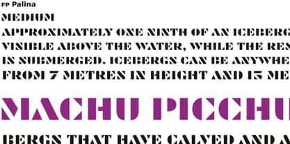 FP Palina is a very simple and geometric, stencil typeface with a strong graphic design.


