10,000 search results
(0.021 seconds)
- Alan Walker by Goodigital13,
$20.00 Perfectly suited to signature, stationery, logo, typography quotes, magazine or book cover, website header, clothing, branding, packaging design and more.perfectly suited to signature, stationery, logo, typography quotes, magazine or book cover, website header, flyer, clothing, branding, packaging design and more.
 - Firsta by Stringlabs Creative Studio,
$25.00 Firsta is a Script Font with Handwritten Style. The Firsta font made with digital brush pen strokes that making this font look authentic. This font is perfect for fashion brand, wedding invitation, business card, logo brand, signature, and then calligraphy.
 - Baliung by Stringlabs Creative Studio,
$25.00 Baliung is a Script Font with Handwritten Brush Style. The Baliung font made with digital brush pen strokes that making this font look authentic. This font is perfect for fashion brand, wedding invitation, business card, logo brand, signature, and then calligraphy.
 - Reinstay by Stringlabs Creative Studio,
$25.00 Reinstay is a script font with textured brush style. The Reinstay font made with digital brush pen strokes that making this font look authentic. This font is perfect for fashion brand, wedding invitation, business card, logo brand, signature, and then calligraphy.
 - Vagnotie by Stringlabs Creative Studio,
$25.00 Vagnotie is a Script Font with Modern Brush Style. The Vagnotie font made with digital brush pen strokes that making this font look authentic. This font is perfect for fashion brand, wedding invitation, business card, logo brand, signature, and then calligraphy.
 - Vezthisory by Stringlabs Creative Studio,
$25.00 Vezthisory is a Script Font with Handwritten Style. The Vezthisory font made with digital brush pen strokes that making this font look authentic. This font is perfect for fashion brand, wedding invitation, business card, logo brand, signature, and then calligraphy.
 - Myglaos by Sealoung,
$25.00 Myglaos is a lovely elegant font for branding and logo design. This typeface includes a massive selection of ligatures, making it perfect for a variety of creative projects such as branding, logo design, content creation, packaging designs, stationery & so much more.
 - Cattlebrand by Holland Fonts,
$30.00Based on sketches of an alphabet from examples of South Western cattle brand marks. I always liked the idea of these brands for a font. A few years later a basic font - just the capitals - was used for some logo designs. - Karita by Nathatype,
$29.00 Your design project is your brand’s introduction to the public, so it is crucial to do it in the right way. An inappropriate font can totally change your messages and damage your work. For that reason, Karita is here to assist you with your needs. Karita is a classic, elegant, professional display serif font to increase the product and brand values promoted. This font looks more prominent than the others and shows strong, yet elegant impressions to attract customers. Continuity elements on every little scratch of the letters’ edges lead your eyes to follow one letter to another in line with serif font characters. Besides, this font type has thick lines and strong contrasts to attract customers and to show firm impressions. For a legibility reason, you can use this font for big text sizes. You can enjoy the available features here as well. Features: Stylistic Sets Ligatures Multilingual Supports PUA Encoded Numerals and Punctuations Karita fits best for various design projects, such as brandings, posters, banners, headings, magazine covers, quotes, invitations, name cards, printed products, merchandise, social media, etc. Find out more ways to use this font by taking a look at the font preview. Thanks for purchasing our fonts. Hopefully, you have a great time using our font. Feel free to contact us anytime for further information or when you have trouble with the font. Thanks a lot and happy designing.
 - Macklin Variable by Monotype,
$156.99Designed by Malou Verlomme of the Monotype Studio, Macklin is a superfamily, which brings together several attention-grabbing styles. Macklin is an elegant, high contrast typeface that demands its own attention and has been designed purposely to enable brands to appeal more emotionally to modern consumers. Macklin comprises four sub-families —Sans, Slab, Text and Display— as well as a variable. The full superfamily includes 54 fonts with 9 weights ranging from hairline to black. The concept for Macklin began with research on historical material from Britain and Europe in the beginning of the 19th century, specifically the work of Vincent Figgins. This was a period of intense social change--the beginning of the industrial revolution. A time when manufacturers and advertisers were suddenly replacing traditional handwriting or calligraphy models and demanding bold, attention-grabbing typography. Typographers experimented with innovative new styles, like fat faces and Italians, and developed many styles that brands and designers continue to use today, such as slabs, serifs, and sans serifs. Verlomme pays respect to Figgins’s work with Macklin, but pushes the family to a more contemporary place. Each sub family has been designed from the same skeleton, giving designers a broad palette for visual representation and the ability to create with contrast without worrying about awkward pairings. With Macklin, Verlomme shows us it’s possible to create a superfamily that allows for complete visual expression without compromising fluidity. - FS Rosa by Monotype,
$52.99 FS Rosa is a free-spirited and optimistic serif typeface – reminiscent of those used on fanzines, film sequences and book covers of the 1970s, such as Cooper and Windsor, it has a laid-back nature with a touch of rebellion. It also reminds of type used in colourful protest graphics by nun-turned-designer Corita Kent, and its personality is akin with brands like Whole Foods - positive rather than preachy. While unconventional, it’s sensible enough to work perfectly for socially conscious brands, magazines, websites and campaigns that want a fairer and more responsible world. Hand-drawn digitally, FS Rosa is warm and open-minded – its irregular letterforms are rounded, with soft terminals, a large x-height and wide apertures. But it is also quirky and eclectic, with irregular shapes – its short ascenders and descenders have slanted serifs, its uppercase forms have unusually low crossbars and the letters are filled with oddities and surprises. The typeface looks to stand out against a sea of homogenous, geometric sans serifs, and celebrates beauty through imperfection. It comes in five weights of Thin, Light, Regular, Bold and Black. The heavier weights make an impact and are great for loud, headline statements. The Regular weight is functional, balanced and robust for text, and the lighter weights have an elegance and contemporary beauty. FS Rosa is eclectic yet with its soft roundness, also positive and progressive. Its name, inspired by the phrase “rose-tinted glasses”, reflects its optimism.
 - Stay Calm by Nathatype,
$29.00 A typography can often be a deniable, yet crucial factor in designs’ displays and nuances. Additionally, it may be hard to find prominent, elegant, catchy fonts, whereas customers can easily forget designs without the right typography and remember nothing about your brands. Even the most interesting designs will look dull and too ordinary with inappropriate fonts. Therefore, we would like to introduce you to the Stay Calm, the perfect font option to create prominent designs. Stay Calm is an elegant, prominent display serif font to attract everybody's attention. It has bigger and thicker font proportions than the other ordinary serif fonts as its character to ease people to see it in big text sizes. Such unique characters as curvy thin lines and big, protruding dots, make this font suitable to create unique, interesting designs and applicable for bigger text sizes. You may also enjoy the available features here. Features: Ligatures Multilingual Supports PUA Encoded Numerals and Punctuations Stay Calm fits best for various design projects, such as brandings, posters, banners, headings, magazine covers, quotes, invitations, name cards, printed products, merchandise, social media, etc. Find out more ways to use this font by taking a look at the font preview. Thanks for purchasing our fonts. Hopefully, you have a great time using our font. Feel free to contact us anytime for further information or when you have trouble with the font. Thanks a lot and happy designing
 - Cutie Cat by Goodigital13,
$20.00 You can use it as a logo, badge, insignia, packaging, headline, poster, etc signature, stationery, logo, typography quotes, magazine or book cover, website header, flyer, clothing, branding, packaging design and more. suitable for logo, branding, greeting card, poster and any design that you create. perfect for many different project such as logos & branding, invitation, stationery, wedding designs, social media posts, advertisements, product packaging, product designs, label, photography, watermark, special events or anything.
 - Breston by Gian Studio,
$10.00 Breston Display is a contemporary display font designed with strong, sharp and dynamic. Perfect for any branding, magazine, posters, logos, titles, blogs, fashion brands, resorts, cosmetics, invitations, weddings, branding, packaging, magazines, boutiques, social media, restaurants, spas, greeting cards, headers, headlines and more . Breston comes with a full set of uppercase, lowercase letters, numbers, punctuation and multilingual support. Super Easy to Use Alternative - It supports OpenType etc so you don't need any special software. Happy Designing
 - Manky by DYSA Studio,
$19.00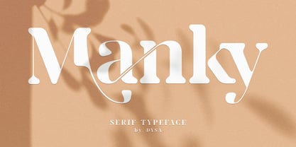 Manky is Serif Typeface Font. This another collection of Serif is perfect for your next personal branding project, excellent for your brand. Manky have a smooth edges, so this font gives an authentic handcrafted feel style. Manky is perfect choice for people looking for clean, modern, minimalist, elegant, beauty design styles. Suitable for almost any graphic designs such as logo, branding materials, business cards, gift cards, t-shirt, cover, thumbnail, print, poster, photography, quotes .etc
 - Recoiled by Luhop Creative,
$20.00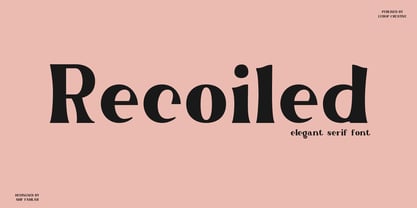 Recoiled is a elegant serif font. Made for any professional project branding. It is the best for logos, branding and quotes. Every letter has a unique and beautiful touch. a great choice for branding, logos, stickers, svg designs, shirts, social media, advertisements, product packaging and more! Font Features : Character set A-Z in uppercase and lowercase Ligatures Numerals & Punctuation Accented Characters Multilingual Support Thank you for downloading premium fonts from Luhop Creative
 - Paintoura by Ilhamtaro,
$14.00 PAINTOURA is a relaxed display font, suitable for playful design, branding and social media needs of a brand. Also suitable for supporting food design or snack packaging. With a relaxed style, this font is very flexible to support modern designs, it can also be used for branding designs in fashion. To enable the OpenType Stylistic alternates, you need a program that supports OpenType features such as Adobe Illustrator CS, Adobe Indesign & CorelDraw X6-X7. Cheers!
 - Overlander by Oakstone Creative,
$6.50 Overland is a strong Art Deco typeface, inspired by the train 'The Overland' that runs in Australia, the font is perfect for headlines, display, branding and much more... even wedding stationary!. It is a bold and dense with an obvious deco inspired background, great for any projects or brands that wear the roaring 20's to 40's on their sleeve. Great for Signage, Wedding stationary, logos, branding materials, business cards, quotes, posters, and more!
 - Lagom Grotesk by S6 Foundry,
$20.00 Lagom Grotesk is a contemporary neo-grotesque sans serif typeface with strong stylistic geometric contrasts. Its distinctive wide-open stance was designed to give the right visual consistency for branding and communications, representing the shifting contemporary aesthetics. The distinctive stance gives the right visual consistency for branding and communications. Lagom Grotesk is perfectly suited for headlines, large-format prints, brand identities, social media, advertising, editorial design, posters, magazines, logos, headings, body copy, digital and more.
 - Prismatic Spirals by MMC-TypEngine,
$93.00 PRISMATIC SPIRALS FONT! The Prismatic Spirals Font is a decorative type-system and ‘Assembling Game’, itself. Settled in squared pieces modules or tiles, embedded by unprecedented Intertwined Prismatic Structures Design, or intricate interlaced bars that may seem quite “impossible” to shape. Although it originated from the ‘Penrose Square’, it may not look totally as an Impossible Figures Type of Optical Illusions. More an “improbable” Effect in its intertwined Design, that even static can seem like a source of Kinetical Sculptures, or drive eyes into a kind of hypnosis. Prismatic Spirals has two related families, its “bold” braided version Prismatic Interlaces and the Pro version. While the default is simpler or easier to use, as all piece’s spin in same way, PRO provides a more complex intricate Design which requires typing alternating caps. Instructions: Use the Map Font Reference PDF as a guide to learn the 'tiles' position on the keyboard, then easily type and compose puzzle designs with this font! All alphanumeric keys are intuitive or easy to induce, you may easily memorize it all! Plus, often also need to consult it! *Find the Prismatic Spirals Font Map Reference Interactive PDF Here! (!) Is recommended to Print it to have the Reference in handy or just open the PDF while composing a design with this typeface to also copy and paste, when consulting is required or when it may be difficult to access, depending on the keyboard script or language. As a Tiles Type-System, the line gap space value is 0, this means that tiles line gaps are invisibly grouted, so the user can compose designs, row by row, descending to each following row by clicking Enter, same as line break, while advances on assembling characters. Background History: The first sketches of my Prismatic Knots or Spirals Designs dates back then from 2010, while started developing hand-drawn Celtic Knots and Geometric Drawings in grid paper, while engage to Typography, Sacred Geometry and the “Impossible Figures” genre… I started doing modulation tests from 2013, until around 2018, I got to unravel it in square modules or tiles from the grid, then idealized it as fonts, along with other Type projects. This took 13 years to come out since the first sketches and 6 months in edition. During the production process some additional tiles or missing pieces were thought of and added to the basic set, which firstly had only the borders, corners, crossings, nets, Trivets connectors or T parts and ends, then added with nets and borders integrations. Usage Suggestions: This type-system enables the user to ornate and generate endless decorative patterns, borders, labyrinthine designs, Mosaics, motifs, etc. It can seem just like a puzzle, but a much greater tool instead for higher purposes as to compose Enigmas and use seriously. As like also to write Real Text by assembling the key characters or pieces, this way you can literarily reproduce any Pixel Design or font to its Prismatic Spirals correspondent form, as Kufic Arabic script and further languages and compose messages easily… This Typeface was made to be contemplated, applied, and manufactured on Infinite Decorative Designs as Pavements, Tapestry, Frames, Prints, Fabrics, Bookplates, Coloring Books, Cards, covers or architectonic frontispieces, storefronts, and Jewelry, for example. Usage Tips: Notice that the line-height must be fixed to 100% or 1,0. In some cases, as on Microsoft Word for example, the line-height default is set to 1,15. So you’ll need to change to 1,0 plus remove space after paragraph, in the same dropdown menu on Paragraph section. Considering Word files too, since the text used for mapping the Designs, won't make any literal orthographical sense, the user must select to ignore the Spellcheck underlined in red, by clicking over each misspelled error or in revision, so it can be better appreciated. Also unfolding environments as Adobe Software’s, the Designer will use the character menu to set body size and line gap to same value, as a calculator to fit a layout for example of 1,000 pts high with 9 tiles high, both body size and line gap will be 111.1111 pts. Further Tips: Whenever an architect picks this decorative system to design pavements floor or walls, a printed instruction version of the layout using the ‘map’ font may be helpful and required to the masons that will lay the tiles, to place the pieces and its directions in the right way. Regarding to export PNGs images in Software’s for layered Typesetting as Adobe Illustrator a final procedure may be required, once the designs are done and can be backup it, expanding and applying merge filter, will remove a few possible line glitches and be perfected. Technical Specifications: With 8 styles and 4 subfamilies with 2 complementary weights each (Regular and Bold) therefore, Original Contour, Filled, Decor, with reticle’s decorations and 2 Map fonts with key captions. *All fonts match perfectly when central pasted for layered typesetting. All fonts have 106 glyphs, in which 48 are different keys repeated twice in both caps and shift, plus few more that were repeated for facilitating. It was settled this way in order for exchanging with Prismatic Spirals Pro font which has 96 different keys or 2 versions of each. Concerning tiles manufacturing and Printed Products as stickers or Stencils, any of its repeated pieces was measured and just rotated in different directions in each key, so when sided by other pieces in any direction will fit perfectly without mispatching errors. Copyright Disclaimer: The Font Software’s are protected by Copyright and its licenses grant the user the right to design, apply contours, plus print and manufacture in flat 2D planes only. In case of the advent of the same structures and set of pieces built in 3D Solid form, Font licenses will not be valid or authorized for casting it. © 2023 André T. A. Corrêa “Dr. Andréground” & MMC-TypEngine.
 - Prismatic Interlaces by MMC-TypEngine,
$93.00 PRISMATIC INTERLACES TYPEFACE! Prismatic Interlaces is a decorative system and ‘Assembling Game’, itself. Settled in squared pieces modules or tiles, embedded by unprecedented Intertwined Prismatic Structures Design, or intricate interlaced bars that may seem quite “impossible” to shape. Although it originated from the ‘Penrose Square’, it may not look totally as an Impossible Figures Type of Optical Illusions. More an “improbable” Effect in its intertwined Design, that even static can seem like a source of Kinetical Sculptures, or drive eyes into a kind of hypnosis. Prismatic Interlaces has two related families, both as a kind of lighter weight versions Prismatic Spirals Default & Pro. While Default is simpler or easier to use, same way as Prismatic Interlaces, Pro provides a more complex intricate Design that requires typing alternating caps. Instructions: Use the Map Font Reference PDF as a guide to learn the 'tiles' position on the keyboard, then easily type and compose puzzle designs with this font! All alphanumeric keys are intuitive or easy to induce, you may easily memorize it all! Plus, often also need to consult it! *Find the Prismatic Interlaces Font Map Reference Interactive PDF Here! (!) Is recommended to Print it to have the Reference in handy or just open the PDF while composing a design with this typeface to also copy and paste, when consulting is required or when it may be difficult to access, depending on the keyboard script or language. As a Tiles Type-System, the line gap space value is 0, this means that tiles line gaps are invisibly grouted, so the user can compose designs, row by row, descending to each following row by clicking Enter, same as line break, while advances on assembling characters. Background History: The first sketches of my Prismatic Knots or Spirals Designs dates back then from 2010, while started developing hand-drawn Celtic Knots and Geometric Drawings in grid paper, while engage to Typography, Sacred Geometry and the “Impossible Figures” genre… I started doing modulation tests from 2013, until around 2018, I got to unravel it in square modules or tiles from the grid, then idealized it as fonts, along with other Type projects. This took 13 years to come out since the first sketches and 6 months in edition. During the production process some additional tiles or missing pieces were thought of and added to the basic set, which firstly had only the borders, corners, crossings, nets, Trivets connectors or T parts and ends, then added with nets and borders integrations. Usage Suggestions: This type-system enables the user to ornate and generate endless decorative patterns, borders, labyrinthine designs, Mosaics, motifs, etc. It can seem just like a puzzle, but a much greater tool instead for higher purposes as to compose Enigmas and use seriously. As like also to write Real Text by assembling the key characters or pieces, this way you can literarily reproduce any Pixel Design or font to its Prismatic Spirals correspondent form, as Kufic Arabic script and further languages and compose messages easily… This Typeface was made to be contemplated, applied, and manufactured on Infinite Decorative Designs as Pavements, Tapestry, Frames, Prints, Fabrics, Bookplates, Coloring Books, Cards, covers or architectonic frontispieces, storefronts, and Jewelry, for example. Usage Tips: Notice that the line-height must be fixed to 100% or 1,0. In some cases, as on Microsoft Word for example, the line-height default is set to 1,15. So you’ll need to change to 1,0 plus remove space after paragraph, in the same dropdown menu on Paragraph section. Considering Word files too, since the text used for mapping the Designs, won't make any literal orthographical sense, the user must select to ignore the Spellcheck underlined in red, by clicking over each misspelled error or in revision, so it can be better appreciated. Also unfolding environments as Adobe Software’s, the Designer will use the character menu to set body size and line gap to same value, as a calculator to fit a layout for example of 1,000 pts high with 9 tiles high, both body size and line gap will be 111.1111 pts. Further Tips: Whenever an architect picks this decorative system to design pavements floor or walls, a printed instruction version of the layout using the ‘map’ font may be helpful and required to the masons that will lay the tiles, to place the pieces and its directions in the right way. Regarding to export PNGs images in Software’s for layered Typesetting as Adobe Illustrator a final procedure may be required, once the designs are done and can be backup it, expanding and applying merge filter, will remove a few possible line glitches and be perfected. Technical Specifications: With 8 styles and 4 subfamilies with 2 complementary weights each (Regular and Bold) therefore, Original Contour, Filled, Decor, with reticle’s decorations and 2 Map fonts with key captions. *All fonts match perfectly when central pasted for layered typesetting. All fonts have 106 glyphs, in which 49 are different keys repeated twice in both caps and shift, plus few more that were repeated for facilitating. It was settled this way in order for exchanging with Prismatic Spirals Pro font which has 96 different keys or 2 versions of each. Concerning tiles manufacturing and Printed Products as stickers or Stencils, any of its repeated pieces was measured and just rotated in different directions in each key, so when sided by other pieces in any direction will fit perfectly without mispatching errors. Copyright Disclaimer: The Font Software’s are protected by Copyright and its licenses grant the user the right to design, apply contours, plus print and manufacture in flat 2D planes only. In case of the advent of the same structures and set of pieces built in 3D Solid form, Font licenses will not be valid or authorized for casting it. © 2023 André T. A. Corrêa “Dr. Andréground” & MMC-TypEngine.
 - Sea Angel by Zane Studio,
$18.00 Sea Angel - Elegant Beauty Expressive Serif Font - Fashion Classy Luxury Font Sea Angel comes with several binders, so you can combine them to create the perfect typographic design. The Sea Angel Elegant Serif font is perfect for your upcoming project. Such as luxury logo and branding, classy editorial design, women's magazine, cosmetic brand, fashion promotion, art gallery branding, museum, architectural history, boutique branding, stationery design, blog design, modern advertising design, invitation card, art quote, home decoration , book titles/covers, special events, and more. Hope you enjoy my fonts and if you have any questions feel free to message & I'm happy to help :) Zane Studio
 - Original SS by Sensatype Studio,
$15.00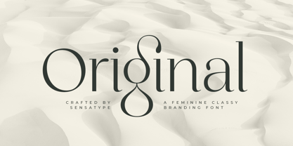 Original is a Feminine Classy Branding Font A new font that we created special for branding needs, with extra ligature in unique characters add value of your brand. It so nice to leverage designer or product owner that need solutions to make their design look more stylish and modern. And specially for satisfy font, We prepared any ligatures, and any alternate characters to help you create unlimited variations for your creative needs. Original Branding font ready with: Any options to get creative variations (combination of Alternate and Ligatures) Preview as a inspirations that you can do with Original font Ready with Lowercase and Uppercase characters Wish you enjoy our font. :)
 - Revla Slab by Eclectotype,
$40.00 The Revla family just keeps expanding! This is Revla Slab. It has the same exuberant charm as its siblings ( Revla Sans and Revla Serif ) with a touch more chunk. OpenType contextual alternates make for text that is lively and bouncy, without the monotony of obviously repeating letterforms. It’s shamelessly fun, but pretty serious at the same time. The range of weights can be used to maintain an even colour across different sizes - use lighter weights for bigger sizes and vice versa. OpenType features include automatic fractions, ordinals, contextual alternates (which along with the pseudo-randomness, help maintain a nice tight fit with minimal glyph collisions), standard and discretionary ligatures (OK, only one discretionary ligature, but it’s a belter!), and case-sensitve forms. Obviously, in sharing a common skeleton, it will work well with other members of the Revla Superfamily, particularly Revla Sans.
 - Cal Roman Black by Posterizer KG,
$19.00 Cal Roman Black is one more font from the PKG “Cal” (Calligraphic) group. This time for calligraphic sketches we used a wide brush instead of the iron pen. Instead of minuscule letters, there are Small Caps (which are almost the same weight as capitals). There was an intention to keep the spacing as small as possible, because of that, there is no obvious difference in the stroke thickness of the capitals and the lowercase capital letters. The difference in height is only one-third of the brush-width. Cal Roman Black font is rhythmic, informal, dark and hefty... romantic and strong at the same time (just like Ferdinand). As such, this font is widely used in the typographic creation of shorter and closely packed text forms such as magazine headlines, brochures and book covers, t-shirt designs, logos, posters, movie spots, banners...
 - Vinneta by Dima Pole,
$27.00 Vinneta is a direct italic font. Its contours and graceful, and precise. Vinneta has a huge number of alternative variations of the glyphs, 20 stylistic sets, it allows you to create a variety of compositions. In addition Vinneta has 17 OpenType features, including oldstyle numbers, swashes, contextual alternates, historical forms, standard ligatures, discretionary and contextual ligatures, localized forms, stylistic alternates, and more others. For convenience here are two faces, one with stylized capitals (they are different from swashes), in another - classic capitals. Vinneta has characters of all European and Slavic languages. "Vinneta" it is an ancient city of the Venedi (Wends), the legendary highly developed Slavic-Aryan people that lent its name to Venice city, lake Bodensee in southern Germany, the land of Wendland in Lower Saxony; and besides, Lithuanians and Estonians even today, this name referred to the Slavs (Veneja and Vene).
 - Seashore Pro by Sudtipos,
$59.00 A feminine, graceful script whose thicker horizontals create a wave-like rhythm — hence the name. Seashore is loosely based on an "eccentric" (left-leaning) penmanship style of the late 19th century. Used mainly by professional "engrossers" in certificates and tributes, or by society ladies in their stationery and invitations, it sent a message of true refinement, as the style would have been only been mastered after the more common business, Spencerian, and standard ornamental styles. In fact, unusual script styles were in such demand that type foundries of the era exploded with metal-type knockoffs of increasing fanciness. Seashore includes a wide variety of swash capitals, alternate endings, and contextual ligatures, over 900 glyphs in all. Seashore is best used in short display settings — in names and addresses on formal invitations, in menus and food packaging, or fashion and beauty contexts.
 - Comply Slab by Arkitype,
$12.00 Comply Slab is inspired by action and extreme sports, Comply gets it's name from the well known skate trick the “No Comply”. This type family doesn't mess about! With 9 weights from thin to black, Comply Slab will give you some great options to use. This font family will “kill it” in both print and digital, in headlines for editorial, posters, banners, websites, apparel, packaging, logos or magazines just to name a few. If you want to make a statement that gets the message across in a slick way with some cool looking glyphs Comply Slab is the font! There is an alternate R and S so you can choose to go with the cool default sharp glyphs or swap them for a more traditional chamfered corner version. Each of the 9 weights has an italic version to add even more action.
 - Garrulous by Missy Meyer,
$12.00 Looking for a tall, skinny, rounded serif font, with a fun hand-written feel? Look no farther than Garrulous! Garrulous is a mixed-case font, with the lowercase letters standing just as tall as the uppercase, so you can mix and match uppercase and lowercase in the same word for an extra fun look. It also comes with 32 double-letter ligature pairs, 17 uppercase and 15 lowercase, so you won't have the exact same letter twice in a row. As usual, the letters in Garrulous have been cleaned up extensively, to make everything sharper and easier for crafters and for any print projects. And I've included over 300 extended Latin characters for language support. Garrulous includes: - Standard characters A-Z, a-z, 0-9, and punctuation - 32 double-letter ligature pairs - Over 300 extended Latin characters for language support
 - Altivo by Kostic,
$40.00 Altivo is a proper workhorse sans serif. Sixteen OpenType fonts in eight weights (with true Italics) range from Thin to Ultra. Meticulous care was taken to ensure high legibility in text sizes on the screen. The typeface is designed to have wide proportions, generous x-height, loose spacing, ink traps, large apertures and low stroke contrast. Altivo’s ink traps are not only a functional design feature, they also look interesting and lend character to the typeface in headlines. True Italics, small caps and multiple sets of figures, as well as a complete set of lowercase superscript were all included in the family to accommodate high typographic standards. If you need to pair it with a serif font, you can’t go wrong with Chiavettieri, since both typefaces were made with the same basic proportions, and their tabular figures are the same width.
 - Scissor Madness by Hanoded,
$15.00 Back in 2017, I was working on a cutout font that I originally wanted to call Scissor Madness. In the end, I named it Cut Along and it was quite a popular font for a while. This week I decided to clean up my fonts folder a bit (as I usually have tons of unfinished fonts lurking in there) and I found a file named Scissor Madness. It was the original try-out for Cut Along. It contained a couple of nice glyphs that I never used, so I started playing around with them and after a day, I had a whole new font! So, in short, Scissor Madness was partly cut out by hand, partly computer made, but it is 100% fun to use! Scissor Madness comes with a bunch of very cute discretionary ligatures.
 - 1726 Real Española by GLC,
$42.00 This family was inspired from the set of fontfaces used by Francisco Del Hierro, to print in 1726 the first Spanish language Dictionary from the Spanish Royal Academy (Real Academia Española, Diccionario de Autoridades). These two Transitional styles are said to have been the first set of official typeface in Spain, like the French “Reale” (take a look at our "[/fonts/glc/1790-royal-printing/ 1790 Royale Printing)". In our two styles (Regular & Italic), fontfaces, kernings and spaces are as closely as possible the same as in the original. This Pro font is covering Western, Eastern and Central European, Baltic and Turkish languages, with standard and “s long” ligatures and twin letters in each of the two styles and a few Italic swashes inspired from the font used in 1746 by the same printer for another edition from the Royal Academy.
 - Romana by Bitstream,
$29.99The French interest in the revival of suitably edited Oldstyle romans as an alternative to a world of Modern typefaces started in 1846 when Louis Perrin cut the Lyons capitals. About 1860, as Phemister was cutting the Miller & Richard Old Style in Edinburgh, Theophile Beaudoire turned the idea of the Lyons capitals into a complete Oldstyle typeface, with similar overwhelming success; it was generally known as Elzevir in France and Roemisch, Romanisch, Romaans or Romana in Germany, Holland and Switzerland. In 1892, Gustav Schroeder, at the Central Division of ATF, expanded the series, adding a boldface under the name De Vinne. It was promptly copied, initially in Europe by Ludwig & Mayer, and spread rapidly throughout the US and Europe, becoming the best known member of the series. ATF made popular an ornamental form under the name De Vinne Ornamental. - Dear Dolores by Samuelstype,
$24.00 Dear Dolores has had its name from the latin word dolorem, meaning sorrow or grief. When I started working on this display font I found myself trying it out using the latin requiem texts. The capitals somehow sat well with the monumental and solemn words of mourning. The broken hairlines suggested stone cuttings where the fine details had been worn down and obliterated over time and it felt at home in a churchyard or in a monument park. Adding lowercase gave the font a more personal and friendly appearance and opened up new possibilities for use. The name itself is a fictional message to someone long missed or perhaps lost too soon. Dear Dolores comes in a cut and an uncut version where the fine details are left intact. Both are excellent for headlines or memorable quotes.
 - Mr Anteater by Hipopotam Studio,
$20.00 Hand drawn serif typeface designed for one of our books. You can use just the regular style or set the fill style over the stroke style to get a more colorful version. It has upper and lowercase characters with up to three alternate glyphs. Build in OpenType Contextual Alternates feature will automatically set alternate glyphs depending on frequency of appearance of the same character (even in web font but only in HTML5 browsers). The script doesn’t throw random glyphs (so it won't break the layered, two colored version). For example in the word “HIPPOPOTAMUS” you will automatically get three different “P” glyphs and two “O” glyphs. It really works great but of course you can always fine tune it by hand. Mr Anteater has younger sister. Mrs Ant was designed for side notes in the same book.
 - Escritura Hebrew by Vanarchiv,
$21.00 It was my first attempt to drawing a Hebrew alphabet to mach directly with other typeface (Latin) which I already designed. The Latin version is an handwriting display typeface influenced by chancery handwriting from the Italian Renaissance (broad-nib pen). One of the most typographic characteristic is there wavy forms, especially the serifs, where contains some of the main calligraphic references from this font family. The Hebrew script contain reverse contrast, the vertical proportions are more tall and the stroke weight is slightly more strong than latin lowercase to produce a correct visual balance between them, especially on small sizes (text proportions). This Hebrew square book-hand was influenced by Sephardic script style. The Latin characters contains interrupted strokes, the same was made for Hebrew letterforms to transpose correctly the same calligraphic approach between these two different alphabets.
 - Sicero by Konstantine Studio,
$12.00 Back in 1800 - 1900, the Serif fonts or known as Roman styles were very popular. Used in so many media, came from calligraphic technique and refined till it became a solid style even so many sign painters use this letter style back in that era. And today, these kinda style still got their fans who love the elegant yet clean solid style. That's what this came for. Please welcome, Sicero Duo Fonts. Its a dynamic duo fonts that came in Serif and Sans-Serif style which is perfectly fit to each other. Bring the old vibes instantly to your project with them :) Sicero Roman A Serif style font with implementations of old-era style, clean and done in click-by-click to fulfil your perfectionist personal. And it comes in Old Style Numbering too, to make the vibes stronger in the whole vintage design when using it. Sicero Sans A Sans-Serif font to make a good pair with Sicero Roman still holding those old vibes but a little bit modern touch in here to reach wider range of trends. Use it all alone is still good to go if you want something different with not pairing it with Sicero Roman as well. Available in OTF, TTF, and Webfonts. Enjoy it more. Have some fun with it, Oldsport :) Cheers, Konstantine Studio
 - Varese Outlined by Tarallo Design,
$14.99 Varese Outlined is the perfect font for giving content a retro, dimensional, and playful feel. Use it for headlines or short body text for an optimistic or nostalgic tone. It comes in two variations, outlined and shadow. It has standard uncolored and colored options. Please see the slides to know what each color font is named. This geometric and modular typeface was inspired by Italian posters of the 1920s and 1930s. Its design playfully explores the boundaries between unity and variety. The blocky characteristics lend it well to tightly composed text either horizontally or vertically. The lowercase is similar in form to the uppercase, yet many of the lowercase letters have interior spaces (counterforms). It comes with standard ligatures; ff, fi, fl, ffl and three alternate glyphs for number 1. The color fonts in Varese Outlined are vector-based and in the fully scalable SVG OpenType format. Color fonts are supported by Photoshop 2017, Illustrator and InDesign 2018, and QuarkXPress 2018 (and later versions). Those who do not want a color font should purchase the files simply named “Regular” and “Outlined”. These will not have any color words in the names. Varese Outlined has two siblings; Varese and Varese Soft. The designer suggests pairing Varese Outlined with his ornamental fonts FormPattern or FormPattern Color Two, Three, or Six.
 - Minnak by Esintype,
$18.00 Minnak, as a whole geometric display type is our take on Square Kufic (Makili) style Latin script fonts, comes in eleven weights with linear progression. It is an Uniwidth typeface at the core. From Hairline to Black, all multiplexed weights take up the same space in width and can be used interchangeably. Supports wide range of Open Type features, with many stylistic alternates in 12 context. Minnak is also have a close relation with pixel fonts, because in spite of its based on Makili forms, it all started as a pixel font in the drawing stage before further steps came into play. The key difference between Minnak and Makili style is that the latter must have the exact square counters with no diagonal strokes, and any other components of a letterform must conform to be proportional. Such style-specific requirements determine the overall dimensions of the glyphs and therefore, there can be only minor differences between the typefaces. In Minnak, counters are rectangular because of its narrow and condensed proportions, but the Makili form influence is still manifest. This impression is best confirmed with Medium weight where negative spaces and stem thickness are equal. Contrast and virtually no optical correction were presented, as characteristic of its genre had to have equal horizontal and vertical line thicknesses. As per the minimal and authentic look of the type, all glyphs are drawn as straight or only as 45-degree diagonal strokes. The representation of the ‘diagonalless’ approach is preserved by stylistic alternatives, making its similarity in visual aesthetics clearly visible. Marks and punctuation is another feature that doesn’t follow the strict rules of the origin style. Although not a pixel font, all building parts of the glyphs in Minnak share the same unit precision as they are designed with pixel equivalents in mind. Even space characters are designed to match glyph widths, meeting the demands of certain typesetting or multi-line lettering compositions. With its Pseudo Ancient and Runic alternates, extention parts and ornaments included in all weights, Minnak is suitable for branding, logo and monogram designs, the screen titles and headlines, packaging, posters, book covers and more, where it shines at big sizes. Its pixel font-like appearance makes it a significant choice for the modern compositions. Thanks to mostly uniform width design, it is possible to use Minnak also as a system for lettering. This feature can be used as vertical fitting of the letters between the lines. As a casual expression in Turkish, “Minnak” is one of the seven typeface designs in Esintype's ancient scripts of Anatolia project, Tituli Anatolian series — representing Seljuk period in the medieval Anatolia and their tradition of architectural stone ornamentation.
 - Sweet Kitten by Yumna Type,
$16.00 Sweet Kitten is a elegant handwritten font. Made for any professional project branding. It is the best for logos, branding and quotes. Every letter has a unique and beautiful touch. Features: Standard Ligatures PUA Encoded Multilingual Support Numerals and Punctuation by Yumnatype