10,000 search results
(0.017 seconds)
- Tepuy by John Moore Type Foundry,
$20.00 Tepuy is the name given to the ancient plateau-shaped mountains that abound in the Venezuelan Amazon. Tepuy is a display typeface inspired by the symbolic forms of the Venezuelan ethnic roots. It is constructed based on a very precise geometry of open forms that produce a double letter in form and counterform. Tepuy originates as an evolution curve of my Font Makiritare rectilinearly. Was devised for a book of photographs of the ancient mountains of the Venezuelan Amazon, its form and Makiritare are morphologically inspired crafts in the ethnic groups of the region. Tepuy is held in a very precise geometric construction based on rounded forms, each letter is a form envelope enclosing another in counterform, is a letter to display. Tepuy comes in four versions Regular, Light and thin, and there is a double line version enclosed. Tepuy recommended for creative headlines for the label and packaging design aimed at all ages.
 - Publica Slab by FaceType,
$- ‘Publica Slab’ is the serifed sister of Publica Sans and Publica Play – packed with subtle open type features, tabular options, rare currencies signs and symbols and arrows, ‘Publica Slab’ provides everything you need for big design tasks like signage, corporate design and magazine design. Take a close look at our gallery (especially ‘OpenType Features 1–6’) to discover the versatility of Publica Slab. Alternates Give your typography a certain spin with the variety of alternate letters provided. Currency You need to set prices in exotic countries? No problem: Publica Slab gives you loads of rare currency symbols. Case Sensitive Forms Sometimes you write in all caps and there are some symbols (e.g. brackets) that need some extra treatment to make it look perfect – that’s what case sensitive forms are for. Figures Publica Slab provides 6 sets of figures, like lining, tabular, oldstyle, numerators ... Discretionary Ligatures Ligatures can make your logo or headline look spicy. So there are plenty of them.
 - BUNK by AdultHumanMale,
$20.00 BUNK is an 11 font system that can be layered in different ways to create various classic titling effects, think Old Timey signage 'COME IN WE'RE OPEN'. It's a display font that produces the different results by mixing and matching the various fonts together. Bunk's layer combos give you the control to create brilliant bevel, convex and 3-D styles. Each font contains the same metrics, so when your title is set, copy and paste-in-place to create layers of different weights/styles to build out your desired effect. Unlike other Layered Fonts out there, BUNK has upper case and lower case as well as currency symbols and lots of foreign characters too. Over 180 glyphs!. Five of the fonts (Shades 1,2,3,4,5) are clearly dependent on each other to create a complete font, so theses are only available in the Full family pack (11 fonts) or in the Layer Kit Family pack (7 fonts).
 - Marat by Ludwig Type,
$45.00 Although originally conceived as a magazine face – with strong serifs and open character shapes for good legibility in small sizes, and compact letter forms optimized for narrow columns and tight headlines – Marat evolved into a comprehensive family for general use. This specific construction and the round forms of the letters create an elegant, soft and friendly appearance. The typeface suits a wide range of typography, e.g. editorial, brochures, packaging and corporate design. In particular, in bold weights it works surprisingly well, which is not always the case with serif faces. Marat includes oldstyle and lining figures (both proportional and tabular), a wide range of language support and various OpenType features (e.g. ligatures, case-sensitive forms, fractions, superiors and inferiors). It is the perfect companion for Marat Sans, a clean and lively sans serif typeface. Marat has been selected by the Type Directors Club of New York to receive the Certificate of Excellence in Type Design 2008.
 - XXII CoolScript by Doubletwo Studios,
$25.99 XXII CoolScript - The vibrant typeface with a ton of alternates MAJOR UPDATE This is a big update of XXII CoolScript. First of all, from now it’s a whole family with 7 new weights from ExtraThin to Black. It comes with more than hundred additional glyphs, some more alternates, ligatures, numerals and fitting opentype features for fractions and two extra ampersands. This lovely script font by Lecter Johnson is another, more soft and round one in the series of Doubletwo Studios’ script fonts (XXII YeahScript, XXII AwesomeScript). Its wonderfully designed letters, ligatures and alternates may bring a charming and individual handwritten look to your creation. This fonts are designed to easily create logos, headlines and text phrases within a blink of an eye. Just open your glyphs-palette* and simply chose, from up to 27 different alternates and variations per glyph, the one that fits best for your needs. *For further information visit the Behance Project.
 - Serenus by Eurotypo,
$28.00 Serenus is a new cursive typeface whose main characteristic is the dynamism of its spontaneous and agile “ductus”, with a subtle difference in thickness that gives it elegance and presence. This font comes with a condensed version that can be used for more extensive texts. Both fonts are enriched with OpenType features, Serenus has a total of 612 characters, in OpenType format, such as Stylistics Alternatives, Swashes, Ligatures, stylistic sets. To this, we add a support of central European language to adjust your design. Enabling them makes it possible to create beautiful and elegant typographic designs. Make sure you open up the OpenType panel in Illustrator, Photoshop, and InDesign (or any OpenType compatible application) or the character map to make use of all of those features. With virtually endless ways to personalize its use, Serenus helps you to design invitations, greeting cards, logos, business cards, fashion magazines, food, packaging and menus, book covers, websites and whatever your imagination!
 - Publica Play by FaceType,
$- Publica Play is Publica Sans’ and Publica Slab’s playful sister. It comes with loads of subtle open type features, tabular options, rare currencies signs and symbols and arrows – ‘Publica Play’ has everything you need for playful design tasks. Take a close look at our gallery (especially ‘OpenType Features 1–7’) to discover the versatility of Publica Play. Alternates and Stylistic Sets Give your typography a certain spin with the variety of alternate letters provided. Explore the Stylistic Sets provided. Currency You need to set prices in exotic countries? No problem: Publica Play gives you loads of rare currency symbols. Case Sensitive Forms Sometimes you write in all caps and there are some symbols (e.g. brackets) that need some extra treatment to make it look perfect – that’s what case sensitive forms are for. Figures Publica Play provides 6 sets of figures, like lining, tabular, oldstyle, numerators ... Discretionary Ligatures Ligatures can make your logo or headline look spicy. So there are plenty of them.
 - Shopping Script by Roland Hüse Design,
$15.00 Shopping Script is designed after and inspired by my handwritten shopping list that was originally a lot less stylish, I have written each words multiple times to achieve the organic and natural flow with a bit spaced out style. This font is an existing work of mine that came in only one weight. Now I added multiple weights I as well as expanded and condensed instances, along with a weight and width variable font file that can be set to anything in between Thin Condensed to Heavy expanded. There are standard ligatures for it, jt, ll and tt, stylistic alternates for uppercase "A" and lowercase "e". For lowercase r and s there are contextual/initial variants when they are first letter of a word. A guide of open type features and how to activate them is available at https://drive.google.com/file/d/1q4j4X8ZntqgEUB8gUmflUNtmlX4IVQBq/view?usp=sharing Most latin based languages are covered from Western European to Eastern.
 - Revisal by Type Dynamic,
$35.00 Revisal is a humanist sans family. Open forms are very useful for signage. The Revisal family includes 7 weights, from Hairline to Black, with their corresponding italics. Each font includes OpenType Features such as Stylistic Alternates, Proportional Figure, Tabular Figures, Numerator, Superscript, Denominators, Scientific Inferiors, Subscript, Ordinals and Fractions. Revisal family supports Latin and Cyrillic, all these languages are covered: Latin language support: Afar, Afrikaans, Albanian, Asturian, Azeri, Basque, Bosnian, Breton, Bulgarian, Catalan, Cornish, Corsican, Croatian, Czech, Danish, Dutch, English, Esperanto, Estonian, Faroese, Filipino, Finnish, Flemish, French, Frisian, Friulian, Gaelic, Galician, German, Greenlandic, Hungarian, Icelandic, Indonesian, Irish, Italian, Kurdish, Latin, Latvian, Lithuanian, Luxembourgish, Malagasy, Malay, Maltese, Maori, Moldavian, Norwegian, Occitan, Polish, Portuguese, Provençal, Romanian, Romansch, Saami, Samoan, Scots, Scottish, Serbian, Slovak, Slovenian, Spanish, Swahili, Swedish, Tagalog, Turkish, Walloon, Welsh, Wolof Cyrillic language support: Adyghe, Avar, Belarusian, Bulgarian, Buryat, Chechen, Erzya, Ingush, Kabardian, Kalmyk, Karachay-Balkar, Karakalpak, Kazakh, Komi, Kyrgyz, Lak, Macedonian, Moldovan, Mongol, Permyak, Russian, Rusyn, Serbian, Tatar, Tofa, Tuvan, Ukrainian, Uzbek
 - Angie Sans Std by Typofonderie,
$59.00 A sanserif with human touch in 6 fonts Angie Sans is a low contrast incised sans serif sharing some similarities with Optima by Hermann Zapf and Pascal by José Mendoza, both created at the end of the 50’s. The later, feature an italic not published by the initial foundry who launched Pascal. Angie Sans follow same path with its italic based on Chancery forms from the Renaissance, narrower than the roman shapes. With its capitals based on Roman proportions, lowercases featuring open counters, strong horizontals, Angie Sans is a legible typeface. The manual gesture is present in Angie Sans, which offer the plastic qualities such as warmth, craftmanship and humanity. Angie Sans is an Incised Garalde who works well for display as text settings. Available in 6 series, with matching italics, Angie Sans will work well in design projects where delicate and human touch is required. Angie Sans Morisawa Awards 1990
 - Squad by Fontfabric,
$- Squad is a humanist sans serif with semi condensed proportions. Inspired by Adrian Frutiger’s perfectionist style this typeface is a harmonious breed of humanist heritage and contemporary simplicity. The balanced characteristics, clear and legible silhouette and simultaneously vivid appearance of Squad makes it perfect for any design purpose. The figures are evident — it consists of 18 styles from Thin to Black; covers Extended Latin, Cyrillic and Greek with span for more than 130 languages; flawless functionality and supporting many OpenType features, such as localizations, tabular numerals, inferiors & superiors, numerators & denominators, fractions, discretionary liga- tures, case sensitivity etc. Designers: Svetlin Balezdrov, Svet Simov Features: • Over 780 glyphs in 18 styles (Thin to Black) • Extended Latin, Cyrillic and Greek scripts for more than 130 languages; • High x-height and Semi Condensed proportions; • Moderate contrast and vertical stress; • Humanistic characteristics and open vertical terminals; • True form of italics; • Coverage of multiple OpenType features; • Perfect for text, headlines and web;
 - VVDS My Spellbound by Vintage Voyage Design Supply,
$10.00 My Spellbound an authentic groovy typeface. So, The Stranger Things series is already watched and you'll waiting the last one season for another two years. Well, if you miss for late 70s or early 80s in your design – this one is for you. Smooth, groovy and playful – exactly for your vintage projects. This typeface will suit for the display block texts like package labels or will be perfect for an any display header. Create a vintage t-shirt print or make groovy stickers - Spellbound will suits perfectly. A lot of alternates will give you a really wide range of results. You may combine it with Italics and get a really playful pair. Two characters for any caps and up to 6 alternates for lowercases. Regular and true Italic Open Type Features Multilingual I would really love to see what you create with my products, so please feel free to tag me @vintagevoyagedesign on Instagram. Happy creating! Thank you.
 - Scala Sans Pro by Martin Majoor,
$49.00 The award-winning Scala family (1990-1993) is a worldwide bestseller and has established itself as a ‘classic’ among digital fonts. It was one of the first serious digital text fonts to support small caps, ligatures and different set of numbers. In fact Scala and Scala Sans (1990-1993) are two workhorse-like typefaces sharing a common form principle: the skeletons of both Scala and Scala Sans are identical, therefore they can be combined perfectly. Where many of the modern sans serifs (like Helvetica and Univers) have rather ‘closed’ letter shapes, the same elements in Scala Sans are much more ‘open’. This greatly improves legibility, especially in the smaller point sizes. The italic of Scala Sans is not a slanted version of the roman, but rather a ‘real’ italic. Another part of Scala is very popular among its users: Scala Hands, containing more than one hundred decorative hands and pointers, is included in the Scala fonts and is a free bonus.
 - Mc Lemore by Galapagos,
$39.00Back when OpenType hadn't yet opened and Apple was developing the Line Layout Manager called GX Typography I created a test font that I name after my stepdaughter, Kristen (now ITC Kristen). Not wanting to offend my wife I started on a font project and gave her name to this new set of glyphs, Roberta. Unfortunately, the name was already in use so I needed to find another name for the fonts. After September 11th I decided that there were people I'd met during my life who were truly cut from the cloth of the hero. Master Sargent McLemore of the 75th Ranger Battalion was one of these people. I met the Sarge when I was in basic training at Fort Gordon. I saw him 2 weeks before he died in 1970. All of the heroes we see on the silver screen pale in comparison to this man. John Wayne and Clint Eastwood both have played the type well, both could have taken lessons from the Sarge. - VLNL Berlagebrug by VetteLetters,
$30.00 VLNL Berlagebrug Designer Donald DBXL Beekman daily crosses the Berlage bridge spanning the Amstel river in Amsterdam. The Berlagebrug was built as part of the city planning project ‘Plan Zuid’ by H.P.Berlage and opened in May 1932. Its name, carved out of two granite headstones, sparked the design of this font family. The original lettering is attributed to Anton Kurvers in the early 19th century, and can be seen on many Amsterdam buildings and bridges. It’s typical lettering of the Amsterdamse School, the Dutch equivalent of the expressionist art deco architectural style, and mostly known for its extravagant brick work. VLNL Berlagebrug is a rounded display font that comes in three outline styles matching the building materials used in the bridge. Gietijzer (cast iron) is smooth, Zandsteen (sandstone) has a softly distressed outline, and Graniet (granite) is outspoken rough and crumbled. The capital letters in VLNL Berlagebrug are in the Amsterdamse school style, the lowercases are more straight alternate capitals, giving you more design options.
 - Spry Roman by Stephen Rapp,
$49.00 Handmade, expressive, lively, organic— …words typically used to describe a script font or a casual sans. Spry Roman opens up new possibilities. It’s origin is handwritten letters created using a pointed nib on slightly toothy paper. While based on a Roman form, the letters are designed to break out of the mold and dance along the baseline. Spry Roman Pro is a fully featured opentype font. Among the 964 glyphs are loads of alternate characters and swash letters; a full set of small caps; simple fractions; case sensitive punctuation; and a variety of ornaments, border elements, and flourishes. It also includes a full dose of language support for not only main characters, but also for alternates and small caps. Ligatures have been kept to a minimum to allow users the option of tracking text. **Please note that the Pro version has all the glyphs of the others combined. The smaller versions are for those who don't have opentype savvy apps like Adobe Illustrator.
 - Aspira by Durotype,
$49.00 Aspira: the legible geometric typeface. Aspira is a multi-purpose typeface. It is suitable for both text and display use — for graphic design, corporate identity design, magazines, newspapers, books, reports, advertising, signage, etc. Aspira is a versatile typeface. It offers 112 styles consisting of 8 weights and 7 widths. It offers 56 upright fonts and 56 italic fonts. It offers lining and oldstyle figures (proportional and tabular). It offers small caps, ligatures, arbitrary fractions, and extensive language support. Aspira is a geometric typeface. It offers a fresh geometric personality which is pleasant and not too conspicuous. Aspira is a multi-width typeface. It offers 7 widths — much more than what is currently usual. Aspira is a legible typeface. Many of its details, like its open apertures and subtle variations in stroke width, are designed to enhance its legibility. Free demo font available. Aspira in use: 1 2 3 4 5 6 7 8 9 10. For more information about Aspira, download the PDF Specimen Manual.
 - VAG Rounded by Linotype,
$34.99 Originally commissioned in 1979 as a new corporate typeface for Volkswagen AG, the VAG Rounded™ family’s geometric sans letterforms feature distinct rounded terminals, imparting the design with a friendly, approachable demeanor. With its design led by Gerry Barney, the VAG Rounded family remained in use for Volkswagen AG’s unified, worldwide automobile marketing for over a decade. The design was released for public use in 1989, and was bundled with many desktop publishing software titles available at the time. This opened the door for millions of computer users to work with the VAG Rounded type family. Available in four weights—from thin to black the VAG Rounded family is an apt choice for logo design, identity systems, or any application where a typographic warmth is desired. For contrast in voice, consider pairing the design with a more reserved serif typeface, or a sans serif with narrow styles, such as those found in the Alternate Gothic, Trade Gothic, or FF DIN type families.
 - Garlandia Script by Lettersams,
$10.00 Garlandia was inspired by Retro style in combination with a Handwriting style. Garlandia Script has many alternative swash and features like stylistic alternates, stylistic set, ligature and swashes so you can mix and match as you wish. Garlandia comes with open type features such as alternative styles, style sets and great features for logos, posters, badges, book covers, t-shirt designs, handwritten quotes, product packaging, headers, posters, merchandise, social media & greeting cards. To activate the OpenType Stylistic alternative, you need a program that supports OpenType features such as Adobe Illustrator CS, Adobe Indesign & CorelDraw X6-X7, Microsoft Word 2010 or newer versions. Garlandia is coded with PUA Unicode, which allows full access to all additional characters without having special design software. Mac users can use Font Book, and Windows to attach to your favorite text editor / application. If you need help or have questions, let me know or via email "lettersams@gmail.com" I am happy to help :) Thank you!
 - Humato Broken - Personal use only

- APF Lagoon Regular by Pomegranate,
$30.00 In 2007-8, Carolyn Puzzovio developed this OpenType typeface: Lagoon which is based on an Armenian model from the Mechitarist monastery, Venice, 1810. This project was supported by a grant from the AHRC (Arts & Humanities Research Council, UK) and won a first prize in the Granshan 08 type design competition. Oſten, Armenian digital types are designed to match the forms of Latin type characters and ‘Latinized’, by uprighting the forms; truncating ascenders and descenders and raising the x-height – but in this case the Latin characters in the OpenType font have been designed to blend in with the traditional Armenian proportions which are based on cursive forms – also incorporating some of the quirky shapes from the original model. Faithfully following the original created difficulties of ‘clashing’ characters, particularly those with long descenders, so the font contains over 100 alternative characters in the Armenian part, which will normally substitute automatically where necessary. The sloping lower case characters and upright capitals are traditional in Armenian – capitals are used less in the Armenian language. Three new characters for the Armenian unicode range are included: the Armenian dram (currency) symbol; the eternity symbol; and the index number symbol. This font which will be one of the first OpenType fonts to incorporate these newly unicoded characters.
 - Mediafont by La Boîte Graphique,
$25.00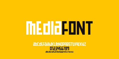 Mediafont is a modern geometric font ideal for titration, branding, poster.
 - Shapiro Base by OGJ Type Design,
$29.00 The bold cut is a good starting point for a branding.
 - Prosaic Std by Typofonderie,
$59.00 A Postmodern vernacular sanserif in 8 fonts Prosaic designed by Aurélien Vret is a Postmodern typographic tribute to the french vernacular signs created by local producers in order to directly market their products visible along the roads. These signs drawn with a brush on artisanal billboards do not respect any typographic rules. The construction of these letterforms is hybrid and does not respect any ductus. Nevertheless the use of certain tools provokes a certain mechanism in the development of letter shapes. It’s after many experiments with a flat brush, that’s these letterforms have been reconstructed and perfected by Aurélien Vret. This is the starting point for the development of an easily reproducible sanserif with different contemporary writing tools. From non-typographical references of Prosaic towards readability innovation The influence of the tool is revealed in the letterforms: angular counterforms contrasting to the smoothed external shapes. This formal contrast gives to Prosaic a good legibility in small sizes. These internal angles indirectly influenced by the tool, open the counterforms. In the past, to deal with phototype limitations in typeface production, some foundries modified the final design by adding ink traps. In our high resolution digital world, these ink traps — now fashionable among some designers — have little or no effect when literally added to any design. Should one see in it a tribute to the previous limitations? Difficult to say. Meanwhile, there are typeface designers such as Ladislas Mandel, Roger Excoffon, and Gerard Unger who have long tried to push the limits of readability by opening the counters of their typefaces. Whatever the technology, such design research for a large counters have a positive impact on visual perception of typefaces in a small body text. The innovative design of counter-forms of the Prosaic appears in this second approach. Itself reinforced by an exaggerated x-height as if attempting to go beyond the formal limits of the Latin typography. It is interesting to note how the analysis of a non-typographical letters process has led to the development of a new typographic concept by improving legibility in small sizes. Disconnected to typical typographic roots in its elaboration, Prosaic is somewhat unclassifiable. The formal result could easily be described as a sturdy Postmodern humanistic sanserif! Humanistic sanserif because of its open endings. Sturdy because of its monumental x-height, featuring a “finish” mixing structured endings details. The visual interplay of angles and roundness produces a design without concessions. Finally, Prosaic is Postmodern in the sense it is a skeptical interpretation of vernacular sign paintings. Starting from a reconstruction of them in order to re-structure new forms with the objective of designing a new typeface. Referring to typographic analogy, the Prosaic Black is comparable to the Antique Olive Nord, while the thinner versions can refer to Frutiger or some versions of the Ladislas Mandel typefaces intended for telephone directories. Prosaic, a Postmodern vernacular sanserif Prosaic is radical, because it comes from a long artistic reflection of its designer, Aurélien Vret, as well a multidisciplinary artist. The Prosaic is also a dual tone typeface because it helps to serve the readability in very small sizes and brings a sturdy typographic power to large sizes. Prosaic, a Postmodern vernacular sanserif
 - The Operational Amplifier font, crafted by the notable font designer Ray Larabie, showcases a distinctive approach to typeface creation, reflecting Larabie's penchant for unique, functional, and some...
- Eastman Condensed by Zetafonts,
$39.00 Discover here the Eastman Roman Family See the Eastman Grotesque Family Designed in 2020 for Zetafonts by Francesco Canovaro and Andrea Tartarelli with help from Solenn Bordeau and Cosimo Lorenzo Pancini, the original Eastman typeface family was conceived as a geometric sans workhorse family developed for maximum versatility both in display and text use. The original wide weight range has been complemented with three more additional widths, to give you maximum control over the appearance of text in your page. While Eastman Compressed and Eastman Condensed behave as space-saving condensed families, Eastman Grotesque adapts the family design style to humanist proportions. All share a solid monolinear design and a tall x-height that makes body text set in Eastman extremely readable on paper and on the screen. Influenced by Bauhaus ideals and contemporary minimalism, but with a nod to the pragmatic nature 19th century grotesques, Eastman has been developed as a highly reliable tool for design problem solving, and given all the features a graphic designer needs - from a wide language coverage (thanks to over one thousand and two hundred latin, Cyrillic and greek characters) to a complete set of open type features (including small capitals, positional numbers, case sensitive forms). The most impressive feature of all Eastman fonts remains the huge choice of alternate characters and stylistic sets that allows you to fine-tune your editorial and branding design by choosing unique, logo-ready variant letter shapes. Don’t want to lose too much time with the glyphs palette? Use the Eastman Alternate weights, thought for display use and presenting a selection of some of the more eye catching & unusual letter shapes available for the family.
 - Blacker Pro by Zetafonts,
$39.00 Blacker Pro is the revised and extended version of the original wedge serif type family designed by Cosimo Lorenzo Pancini and Andrea Tartarelli in 2017. Blacker was developed as a take on the style that Jeremiah Shoaf has defined as the "evil serif" genre: typefaces with high contrast, oldstyle or modern serif proportions and sharp, blade-like triangular serifs. Due to the high contrast in the design - slightly reminescent of didone typefaces - Blacker has been developed in two optical subfamilies. The display version offers tighter tracking, higher contrast and sharper corners for maximum effect at big sizes, while the text variant offers better readability and screen rendering at smaller sizes, with lower contrast and looser spacing. In the pro version, two additional condensed variant families have been added (condensed display and condensed text) allowing for more freedom and versatility in typesetting where space constraints are present. Also, three titling uppercase-only variants have been added, with a slightly extended feel, and two decorative subfamilies (inline and diamond). Each of these seven variants has been developed in six weights from light to heavy, with matching italics, for a total of 69 styles covering a wide range of editorial and advertising uses. All Blacker Pro feature a revised and extended character set covering over two hundred languages using the latin, cyrillic and greek alphabets. Open type features include small caps, positional numerals, fractions, superior & inferior figures, alternate forms, and an extended set of standard and discretionary ligatures. With its bold personality, Blacker aims to be a modern classic used for bold statements and self-conscious brands, making your text look great both on paper and on the screens.
 - Shentox by Emtype Foundry,
$69.00 During a visit to London in 2008 I fell in love with the square font used on the British car number plates. I was immediately inspired to start working on this font and have been developing it intermittently ever since. Several more trips to London and the project evolved before it finally took off and became Shentox. Despite the starting point being inspired by simple, everyday car plates, the font soon evolved into something fine and very rich in detail. Even though the square genre is very restrictive, Shentox is a highly legible contemporary font with a full range of weights, useable not only as a display family for headlines and posters, but as a distinct, clean font family for branding and general editorial use (Especially magazines). It has been carefully drawn paying extra attention to the details, high end finishes that makes Shentox a safe font for use in large scale work. For example, the curves of every individual corner have been adjusted character by character to avoid the common problems encountered with square fonts (Eg. darker corners between weights or a visually inconsistent radius between the Upper and Lowercases as a result of copy/paste). Shentox italic, which has a 12 degree slant, has been corrected to avoid distortion when slanted. The radius of the upper-right and lower-left corners are more pronounced, giving it a more fluid Italic feel. Shentox is available in Open Type format and includes ligatures, tabular figures, fractions, numerators, denominators, superiors and inferiors. It supports Central and Eastern European languages. This type family consists of 14 styles, 7 weights (Thin, UltraLight, Light, Regular, Medium, SemiBold and Bold) plus italics. Shentox PDF
 - Natom Pro by Mostardesign,
$25.00 A family of fonts with rhythm. Natom Pro is a modern and geometric font family adapted to the professional requirements of graphic designers, web designers and mobile application developers. Comprised of 19 styles including 8 styles designed especially for the design of headlines, Natom Pro is a very versatile family of fonts that can be used in many projects such as editorial design, branding or corporate identity creation, design of posters or logos, the creation of websites or the development of mobile applications. This font, with a resolutely contemporary aspect, also hides a unique typographic design since it has 2 distinct styles (Title and Roman) which have 2 different typographic rhythms in order to graphically differentiate the appearance of titles, subtitles and long paragraphs. With this design of rhythmically differentiated glyphs according to the styles, the headlines have a very graphic aspect while the long texts have a more classic aspect in order to keep optimal readability in all scenarios. Its architecture is also very modern since it was designed and drawn with particular attention to the geometry of the forms with clear and open endings cut at 90 degrees. The number of styles has also been simplified with the most used thicknesses (Extra Light, Light, Regular, Medium, Bold and Black) in order to speed up your graphic design process. For the more experienced designers, Natom Pro is also available in a variable version. Natom Pro is also equipped with powerful OpenType features like case sensitivity, true small caps, full ligature set, tabular figures for tables, « old styles figures » to elegantly insert figures into your sentences, numbers circled or even alternative characters to satisfy the most demanding professionals.
 - Eastman Grotesque by Zetafonts,
$39.00 Designed in 2020 for Zetafonts by Francesco Canovaro and Andrea Tartarelli with help from Solenn Bordeau and Cosimo Lorenzo Pancini, the original Eastman typeface family was conceived as a geometric sans workhorse family developed for maximum versatility both in display and text use. The original wide weight range has been complemented with three more additional widths, to give you maximum control over the appearance of text in your page. While Eastman Compressed and Eastman Condensed behave as space-saving condensed families, Eastman Grotesque adapts the family design style to humanist proportions. All share a solid monolinear design and a tall x-height that makes body text set in Eastman extremely readable on paper and on the screen. Influenced by Bauhaus ideals and contemporary minimalism, but with a nod to the pragmatic nature 19th century grotesques, Eastman has been developed as a highly reliable tool for design problem solving, and given all the features a graphic designer needs - from a wide language coverage (thanks to over one thousand and two hundred latin, cyrillic and greek characters) to a complete set of open type features (including small capitals, positional numbers, case sensitive forms). The most impressive feature of all Eastman fonts remains the huge choice of alternate characters and stylistic sets that allows you to fine-tune your editorial and branding design by choosing unique, logo-ready variant letter shapes. Don’t want to lose too much time with the glyphs palette? Use the Eastman Alternate weights, thought for display use and presenting a selection of some of the more eye catching & unusual letter shapes available for the family.
 - Eastman by Zetafonts,
$39.00 Discover the complete Eastman type family: Eastman Grotesque and Eastman Condensed! Designed in 2020 for Zetafonts by Francesco Canovaro and Andrea Tartarelli with help from Solenn Bordeau and Cosimo Lorenzo Pancini, the original Eastman typeface family was conceived as a geometric sans workhorse family developed for maximum versatility both in display and text use. The original wide weight range has been complemented with three more additional widths, to give you maximum control over the appearance of text in your page. While Eastman Compressed and Eastman Condensed behave as space-saving condensed families, Eastman Grotesque adapts the family design style to humanist proportions. All share a solid monolinear design and a tall x-height that makes body text set in Eastman extremely readable on paper and on the screen. Influenced by Bauhaus ideals and contemporary minimalism, but with a nod to the pragmatic nature 19th century grotesques, Eastman has been developed as a highly reliable tool for design problem solving, and given all the features a graphic designer needs - from a wide language coverage (thanks to over one thousand and two hundred latin, cyrillic and greek characters) to a complete set of open type features (including small capitals, positional numbers, case sensitive forms). The most impressive feature of all Eastman fonts remains the huge choice of alternate characters and stylistic sets that allows you to fine-tune your editorial and branding design by choosing unique, logo-ready variant letter shapes. Don’t want to lose too much time with the glyphs palette? Use the Eastman Alternate weights, thought for display use and presenting a selection of some of the more eye catching & unusual letter shapes available for the family.
 - Palsam Arabic by Abjad,
$45.00 Since the beginning, Palsam was intended to be a super multilingual family, with a real cursive Arabic companion, and a display cut. The typeface was designed to be used for setting text and titles of contemporary Arabic content, specially magazines, and websites. The Arabic and Latin scripts were designed at the same time, to make a true authentic bilingual typeface. Both scripts have affected each other in several ways through the entire design process, which happened within ten years. Palsam has an inviting, approachable, fashionable and humanist look. Thanks to its low contrast, open apertures, detailed calligraphic strokes, and smooth counters, which also make it easy to read at smaller sizes. The main highlight for Palsam was the Cursive companion. For the first time, the calligraphic Ijaza style was used as a model for designing the Arabic cursive. Since the Ijaza is a hyper combination of Naskh and Thuluth, which makes it perfect to be a companion for the upright Naskh. Moreover this script was used in margins, and to highlight specific content inside a paragraph in older manuscripts. With true cursive companions in five weights, and many opentype features, Palsam grants all the tools needed to set complex information and editorial designs applications. More than 1000 characters are included per weight, including small caps, fractions, old style and lining numbers, ligatures, contextual ligatures, and discretionary ligatures. It supports over 40 languages that use the Latin extended, as well as Arabic, Farsi, and Urdu Languages. PalsamArabic only covers the Arabic script. The latin script was designed in collaboration with the Slovenian type designer Alja Herlah.
 - Moilgo by Fype Co,
$16.00 Moilgo is a beautiful bold typeface that was inspired by classic typefaces that are synonymous with luxury brands, beauty and elegant curves, high contrast and an all-round feel, perfect for art projects and typography across all platforms. Moilgo also has unique ligatures which makes it easy for you to create a logo for your personal branding and your business beautifully. Moilgo will be perfect for many project like logos, magazines, posters, branding, packaging, quotes, blog headers, advertisements, and more.
 - Amel by Nandatype Studio,
$9.00 Amel is a modern display font. This font will look great on a variety of design ideas, perfect for feminine logo signs, fashion & editorial design heads, branding projects, Apparel Branding, packaging, magazine titles, advertisements, T-shirts, postcards, valentines, posters, invitations, weddings, branding projects, social media posts, magazines, book covers, and more. This will add a fun and friendly touch to any of your projects! This font is PUA encoded which means you can access all the glyphs and sweeps easily and more.
 - Moressans by IKIIKOWRK,
$17.00 Introducing Moressans - Luxurious Type, created by ikiiko. Moressans is a sans serif type with a thin and rounded shape. A simple font, with a thin size, adds to the impression of elegance and also fashionable too. This typeface is perfect for an elegant logo, branding, fashion brand, luxury brand, layout magazine, beauty product, packaging product, quotes, or simply as a stylish text overlay to any background image. What's included? Uppercase & Lowercase Number & Punctuation Alternates Multilingual Support Works on PC & Mac
 - Sweet Brownie by Yumna Type,
$16.00 Sweet Brownie is a elegant handwritten font. Made for any professional project branding. It is the best for logos, branding and quotes. Every letter has a unique and beautiful touch. Includes: Sweet Brownie (OTF) Features: Standard Ligatures PUA Encoded Multilingual Support Numerals and Punctuation by Yumnatype
 - Popy Jelly by Yumna Type,
$16.00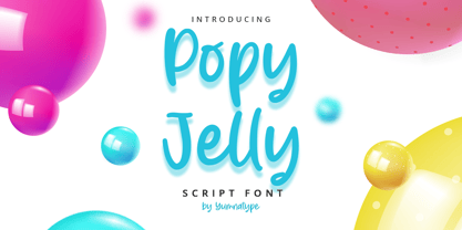 Popy Jelly is a elegant handwritten font. Made for any professional project branding. It is the best for logos, branding and quotes. Every letter has a unique and beautiful touch. Includes: Popy Jelly (OTF) Features: Standard Ligatures PUA Encoded Multilingual Support Numerals and Punctuation by Yumnatype
 - Razor Bland by Din Studio,
$29.00 Razor Bland is a classy handwritten font. Made for any professional project branding. It is the best for logos, branding and quotes. Every letter has a unique and beautiful touch. Features: PUA Encoded Multilingual Support Numerals and Punctuation Thank you for downloading premium fonts from Din Studio
 - Hi Lea by Zamjump,
$17.00 Hi Lea is kids and fun typefaces. It has an authentic handwritten look and bold feel which makes it perfect for digital branding and design. Use this font for logos, social media, birthday invitations, wedding decorations, invitations, home decor, websites, blogs, instagram, business cards, branding and more!
 - Cloudy Wavy by Yumna Type,
$16.00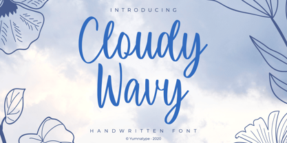 Cloudy Wavy is a beautiful handwritten font. Made for any professional project branding. It is the best for logos, branding and quotes. Every letter has a unique and beautiful touch. Includes: Cloudy Wavy (OTF) Features: Standard Ligatures PUA Encoded Multilingual Support Numerals and Punctuation by Yumnatype
