10,000 search results
(0.015 seconds)
- Couple Vol1 by Fontforecast,
$34.99 Couple vol1 is an extensive ampersand font with 230 glyphs and Valentine inspired doodles. Handmade with love. To accentuate two words or names in your text we designed these fun expressive ampersands. Couple vol1 contains a wide variety of styles, some glyphs can even be layered. You will surely find the perfect match for your Valentine project, wedding invite, logo design, etc. Everything is better together! Note: The font used in the presentation text is our Salt and Spices Pro SC2 (not included in Couple vol1)
 - SK Irrationalist by Shriftovik,
$16.00 SK Irrationalist is a new experimental accidental font created by the SHRIFTOVIK font foundry and Tikhon Reztcov. This font is very unusual. It uses non-standard graphic techniques. Sloping non-parallel lines, sharp shapes and a combination of rectangles and circles all make the font special. The SK Irrationalist font was inspired by the works of constructivist artists of the early 20th century. The font contains both Latin, Latin Pro version for European countries and Cyrillic. This font delivered in 4 styles: Regular; Sharp; Outline; Rounded.
 - P22 Zaner Basic by IHOF,
$24.95 P22 Zaner is based on ornamental penmanship from the turn of the 20th century. The Zaner font set includes four unique fonts that complement the other fonts in the set. Each font is available in PostScript and TrueType formats as well as OpenType which offers even more characters, options and overall functionality. Set options include PostScript and TrueType with a bonus set of extras and a “super” pro set containing over 3,000 characters. Zaner is perfect for wedding invitations and documents that require a touch of elegance.
 - Osande TXT by XdCreative,
$29.00 About Osande-TXT Neo-Grotesques Sans Osande TXT was created and inspired by Osande Pro (by. faldykudo), which carries a modern sans style with a touch of neo-grotesques / neo-gothic These include a large x-height, simpler forms and more static, low contrast, and often a condensed width. Osande TXT comes with enhancements characters and more complete language support, so you will be more flexible to use this font family for your various design, both for body text or displays. Thank you in advance _xdCreative
 - Aphrodite Slim by Typesenses,
$57.00 Aphrodite Slim Pro is not just a lighter version of its sister Aphrodite Pro. Aphrodite Slim Pro has duplicated the quantity of characters of its partner, and that means more than 500 new glyphs, reaching a total of more than 1000. More delicate and meticulous, Aphrodite Slim Pro is once more a new typography with deep calligraphic ideals: We immersed ourselves into the world of each calligraphy ductus and each calligraphy masters by studying from decoration to lettering books. This was the key for the logic of Aphrodite Slim’s behavior. The new concept of Aphrodite Slim Pro was to join diverse styles of calligraphy in one in order to achieve an autonomous expressiveness, in fact, this is what calligraphy aims to, and we agreed to bring those ideals to the world of typography: It is justifiable to be inspired in hundred-year-old calligraphies, but it is even better if the results you obtain have a plus. A personal plus. During the creation process we were wondering whether it was possible to mix certain strokes of such rigid styles as uncial, (Li·n’s favourite style), with strokes of the copperplate, (Sav’s favourite style), and also to take and mix cualities of cancelleresca cursiva, formata and moderna; finally giving our creation a roman-transition italic look. So Aphrodite Slim takes ideals and aspects from those formal styles, following its own logic though, and emphasizing the fact of being a decorative typography. Calligraphy masters of our past are who we are in debt with. They are the cause we have lovely letters now. They have been spontaneous at the moment of creation, what differs from the type-designers of nowadays, whose spontaneity is more limited. Digital faces that we are used to see these days are a result of long hours of optical adjustments, grids, macros and inspirations of other existing typography, but without personal contributions. Aphrodite Slim wants to refute this. Its mission is to rescue de spontaneity of the artesanal lettering in order to obtain unique words; those which only calligraphy masters of our past or lettering artists of our present could give us. We have worked hard to achieve this, making Aphrodite the most universal font we could: It was necessary to study the most common words, focalizing more in the ones referring to “sensitivity”, of four of the most spoken languages in the world. Aphrodite Slim has an enormous quantity of decorative characters and special ligatures for phrases and words in English, French, Spanish and German. (See English, Français, Español, Deutsch PDF in the gallery section). We promise there is no existing type that decorates/ligates glyphs and words like Aphrodite Slim does: It is the first time a font like this really considers its purpose. -The way glyphs are ligated is insane- : Aphrodite Slim rescues some ideals of persons like Jan van den Velde (Italian cancilleresca writing of XVI Century) who understands ascenders and descenders as possibilities to beautify the lines of writing with curved strokes that seem to be dancing above and below of the words. This master also creates ascenders and descenders even where they are not necessary, on letters that do not actually need them: Aphrodite Slim takes this ideal. The font counts with a wide range of glyphs that seem not to be satisfied with its more primitive form and prefer to extreme their parts to be decorative. It also existed masters of calligraphy like José de Casanova of XVII Century, who, with a magnificant skill and a really personal mark, had the particularity of ligating words that were actually separated with spaces. This is another innovative feature in Aphrodite Slim. An investigation of the most common beginnings and endings words of the English language was done. Having that feature activated (discretionary ligatures), common words will start to ligate or to be decorated even when they are separated by spaces. Impossible to forget Francesco Periccioli of XVII Century and our experience us designers to face with works of him: His letters, that today are included in the group of cancellerescas modernas, have been a direct inspiration to the oldstyle figures and historical forms variables in Aphrodite Slim. Giovanni Antonio Tagliente (XVI Century) and his particular way of making tails and diagonals longer than usual, qualities that our creation reflects too. Finally, our adventures in Biblioteca Nacional and Barrio San Telmo, Buenos Aires, were essential for us to make Aphrodite Slim more complete and interesting: Sav did an excellent work when studying how the decorative miscellanea and swirls of early XX century were. She also investigated what particularities made those roman titling characters look antique so she could rescue some ideals for the oldstyle figures and historical forms variables. This also leaded her to create the ornaments variable in Aphrodite Slim. We are really proud of presenting Aphrodite Slim Pro, a typography that was the result of days and nights of working hard, because we do love what we do; and we are glad we are living in a present that gives us the possibility to spread this kind of art, because that is the way we consider our job: Aphrodite Slim Pro is Art. Hope you can appreciate the enormous work this type has. Features. Aphrodite Slim Pro is the most complete variable. It includes more than 1000 glyphs. Thanks to the Open-Type programming, it counts with a easy way to change/alternate glyphs if the application in which the font is used supports this. The variables contained in Aphrodite Slim Pro are also offered separately. Aphrodite Slim Text: It is the variable for lines and paragraphs. Thus it is the least ornamental and the most accurate to achieve a satisfying legibility. It has the Standard Ligatures feature in order to improve the possible conflicts some glyphs could have by others. Aphrodite Slim Contextual: It is the one that makes emphasis in decorating. It has the particularity of ligating/decorating words of common use in English, French, Spanish and German. It also has the quality of ligating common beginnings and endings of the common words in English. Aphrodite Slim Stylistic: With similar features of Slim Contextual. It includes a set of decorative numbers for a display use. Aphrodite Slim Swash: This one has special beginnings and endings to decorate words. Aphrodite Slim Endings: It makes words look as a signature. Aphrodite Slim Historical: It adds an antique look to the written word. It also has the special historical ligature function. Aphrodite Slim Titling: This one is the most decorative. Its copperplate inspired ornaments give words a special color, in order to handle the quantity of decoration, it comes with the standard ligature feature, which has the most common ligatures plus others that make decorative swirls not to be conflictive. Aphrodite Slim Ornaments: A set of 52 ornaments. Aphrodite Slim Pro includes all this features plus the Stylistic Set 1; Stylistic Set 2 and the possibility of Slashed Zero. We recommend you to check out the gallery in order to see all these features in action.
 - Pendekar by Goodigital13,
$20.00 This font is perfect for fashion brand, apparel, shoes company, business card, logo brand, clothing, and also business brand name like Coffeshop or Bakery. elegant and classic handwritten font. Whether you’re looking for fonts for Instagram or calligraphy scripts for DIY projects, Deventer will turn any creative idea into a true piece of art!
 - Reusco Display by Tebaltipis Studio,
$15.00 Reusco Display comes with some alternates, so you can combine it to make a perfect typography design. It is perfect for your up coming projects. Such as luxury logo and branding, classy editorial design, woman magazine, cosmetic brand, fashion promotional, art gallery branding, museum, historical of architectural, boutique branding, stationery design, blog design, modern advertising design, card invitation, art quote, home decor, book/cover title, special events and any more. That's it! Have fun with Reusco Display font. Thank you! Tebaltipis Studio
 - Murray Slab by Tkachev,
$25.00 Murray Slab is a techno-style typeface with four styles. This font family will be the best solution for posters, signage, magazine, product branding, corporate branding, logos and titles.
 - Molly Lips by Raditya Type,
$15.00 Molly Lips, a monoline handwritten font. Molly Lips can be used for brand identity, wedding invitations and wedding calligraphy, feminine or organic logos, small business branding, packaging, and more!
 - Pritude Radiance by Sohel Studio,
$16.00 Pritude Radiance is a Modern elegant branding serif typeface with Unique alternative , multilingual support with perfect kerning. This typeface is perfect for an elegant & luxury logo , classy editorial design, women's magazine, fashion brand , cosmetic brand, fashion promotion , modern advertising design, invitation card, art quote, home decoration , book/cover titles, special events, Tote bag, T-shirt, Advertising and much more.
 - Liliming by Cubo Fonts,
$25.00 That font was designed for Liliming, a famous Shanghainese feminine fashion brand. As the brand itself, it shows a solid background - a former typewriter machine feeling - and a fresh creative touch.
 - Bandoeng by HRDR,
$19.00 Bandoeng was inspired by the cover of the 1920 Nebiolo book. It is perfect for product logo, signage, branding projects, headlines, posters, packaging, clothing brand logos, Vintage design and much more.
 - GoodBadUgly by Tkachev,
$35.00 GoodBadUgly is a new sans serif type with a Wild West flair. This font family will be the best solution for posters, signage, magazine, product branding, corporate branding, logos and titles.
 - Brassens by Typorium,
$53.00 Le Typorium présente une nouvelle famille de caractères calligraphiques basés sur une écriture étudiée à travers les manuscrits et autographes de Georges Brassens, poète et musicien (1921-1981). Son tracé, rigoureux et appliqué, souvent minutieux, est à l’image d’une œuvre unique et singulière, immédiatement reconnaissable. Le script Brassens offre des fonctionnalités OpenType telles que des caractères alternatifs pour les majuscules et les minuscules afin de renforcer la fluidité d’une écriture manuelle, des chiffres alternatifs, des fractions et un jeu de caractères accentués étendu pour prendre en charge de nombreuses langues étrangères. Trois graisses ont été créées afin d’offrir une large palette de possibilités graphiques. 60 images d’un poète qui a cassé sa pipe à l’âge de 60 ans., classées en trois séries de vignettes (pictogrammes, symboles, portraits), elles illustrent l’univers imagé et la richesse symbolique de la poésie de Georges Brassens où les représentations mythologiques et allégoriques y tiennent une part importante. Georges Brassens est un poète, auteur-compositeur-interprète né à Sète le 22 octobre 1921, mort à Saint-Gély-du-Fesc le 29 octobre 1981 et enterré au cimetière Le Py de Sète. Auteur de plus de deux cents chansons populaires, il met en musique et interprète ses poèmes en s’accompagnant à la guitare. Outre ses propres textes, il met également en musique des poèmes de François Villon, Victor Hugo, Paul Verlaine, Paul Fort, Antoine Pol, ou encore Louis Aragon. Il reçoit le Grand Prix de Poésie de l’Académie Française e 1967. Un grand nombre d’écoles, salles de spectacle, voies, parcs et jardins portent également son nom, dont à Paris le parc Georges-Brassens, tout proche de l’impasse Florimont où il vécut ses premières années parisiennes, de sa maison de la rue Santos-Dumont et du café Les Sportifs Réunis – Chez Walczak – rue Brancion qui lui inspira « Le Bistrot ». À Sète, l’Espace Georges Brassens ainsi que de nombreux festivals et associations redonnent vie au poète et à son œuvre. The Typorium presents a new calligraphic typeface family based on a writing studied through the manuscripts and autographs of Georges Brassens, poet and musician (1921-1981). Its layout, rigorous and applied, often meticulous, is in the image of a unique and singular work, immediately recognizable. Brassens script offers OpenType features such as alternate characters for upper and lower case to enhance the fluency of handwriting, alternate numbers, fractions and an extended accented character set to support many foreign languages. Three weights have been created to offer a wide range of graphic possibilities. 60 images of a poet who broke his pipe (French expression for passing away) at the age of 60, classified into three series of vignettes (pictograms, symbols, portraits), they illustrate the imagery world and the symbolic richness of Georges Brassens poetry where mythological and allegorical representations hold an important part. Georges Brassens is a poet, singer-songwriter born in Sète on October 22, 1921, died in Saint-Gély-du-Fesc on October 29, 1981 and buried in Le Py cemetery of Sète. Author of more than two hundred popular songs, he sets to music and performs his poems, accompanying himself on the guitar. In addition to his own texts, he also sets to music poems by François Villon, Victor Hugo, Paul Verlaine, Paul Fort, Antoine Pol, or Louis Aragon. He received the Grand Prix of Poetry from the Académie Française in 1967. A large number of schools, theaters, streets, parks and gardens also bear his name, including in Paris the Georges-Brassens park, very close to the impasse Florimont where he lived his first years in Paris, his house in the rue Santos-Dumont and the café Les Sportifs Réunis - Chez Walczak - rue Brancion which inspired "Le Bistrot". In Sète, the Espace Georges Brassens as well as numerous festivals and associations bring the poet and his work back to life.
 - Minormayor by Maulana Creative,
$11.00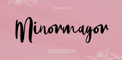 Give your designs an authentic handcrafted feel. Minormayor is perfectly suited to logo, stationery, branding, typography quotes, magazine or book cover, website header, clothing, branding, packaging design, restaurant and more. Cheers, MaulanaCreative
 - Humaira by SimpleType Studios,
$18.00 Humaira is a modern Sans serif font that embodies elegance and charm in every character. It is perfect for luxury logos, branding, classy editorial designs, women magazines, cosmetic brand, promotional designs, the fashion industry, and more. Humaira is perfect for branding projects, logo, wedding designs, social media posts, advertisements, product packaging, product designs, label, photography, watermark, invitation, stationery and any projects
 - Freedam Theory by Stringlabs Creative Studio,
$25.00 Fredam Theory is a Retro bold script with Groovy style, unique design taste and combine with classic retro style of the 80s, trendy, vintage, and sporty. The Fredam Theory is perfect for retro lovers, besides this font is also perfect if used for brands such as: barbershop, motorcycle club, clothing, logo brand, coffee shop, shoe brands, hipster and many more.
 - LEMON MILK - Personal use only

- Qebab Shadow FFP - Personal use only

- Oliva by Viktor Nübel Type Design,
$25.00 Oliva & Oliva Italic are two strong and funky display fonts. Influences came from typefaces like Futura Black by Paul Renner and Motter Ombra by Othmar Motter, but also Stilla by François Boltana and Allegro by Hans Bohn lay on the desk. All these ingredients were mixed to a new and contemporary type experience and packed in proper OpenType files Oliva & Oliva Italic are OpenType Pro, featuring full Western, Central European, Baltic, Turkish and also Cyrillic language support. They contain ligatures, superior numerals, and a stylish set of decorative ornaments and arrows.
 - Chunkie by Hackberry Font Foundry,
$24.95 Chunkie is a simple serif experiment going for minimal width and maximum height. I made it into my display version of OpenType Pro, but mainly it was a vehicle for me to try out some more extreme serif ideas and glyph shapes. The solutions for the lowercase a and e are unique, for example. The double g ligature is a fun solution. I like the solution for the @, but I’m not sure how it will be received. That being said, it turned into a useful dark display face with a small x-height.
 - 1545 Faucheur by GLC,
$42.00 This family was inspired by the set of fonts used in Paris by Ponce Rosset, aka “Faucheur” to print the account of the second voyage to Canada by Jacques Cartier, first edition, in 1545. It is a Garalde set, the punchcutter is unknown, certainly it was not Garamond himself. In our two styles (normal and italic), fontfaces, kernings and spaces are scrupulously the same as in the original. This Pro font covers Western, Eastern and Central European languages (including Celtic) Baltic and Turkish, with standard and long-s ligatures in each of the two styles.
 - 1522 Vicentino by GLC,
$60.00 This font is mainly inspired from the engraved characters of the small book known as “Operina”, or “The method and rules for writing cursive letters or chancery script” from the famous calligrapher Ludovico Vicentino Arrighi, published in Roma in 1522 and signed with simplicity “Ludovico Vicentino”. The font contains a large set of standard ligatures and alternative characters: two lower cases, four sets of standard capitals, long s and variants, titlings, each feature easy to use with OTF managing software. It is a pro font, containing Baltic, Eastern, Central, Western European and Turkish diacritics.
 - 1350 Primitive Russian by GLC,
$44.00 This rough font was inspired by a Russian Cyrillic hand of the 1350s “Russkaja Pravda” (a Russian text of common Laws). As a Pro font, it supports Western and Northern European, Icelandic, Baltic, Eastern, Central European and Turkish specific characters, as well as Old Russian glyphs, including many which fell out of use in the 1700s, except in religious texts — in all over 136 Russian glyphs. The upper and lower case have the same form and almost same size, like in the original texts, which had only one size and style.
 - Alathena by Studio Sun,
$20.00 Alathena was inspired by the French art decade between art nouveau to art deco, comes with 2 style, Alternative swash and Modern deco, with some modified ligatures. Available with 6 Weights, Thin, Extra Light, Light, Regular, Bold, Extra Bold with support 75+ language (Latin Pro), and contains OpenType features. - Matching small caps for all weights. - Old Style Figure. - Full "f" Ligature set. - 20+ Optional (discretionary) ligatures. - Over 400+ Swash Characters. - Automatic Fractions. - Automatic Ordinals. - Extended language support for most Latin-based Western and Central European languages, including all the swash and alternate characters.
 - Militia Sans by Canada Type,
$24.95Militia Sans is the sans-serif version of Militia. A heavy sans serif with very distinct stenciling, Militia Sans is ideal for strong designs that settle for nothing less than total obedience. A few alternates are sprinkled throughout the character set. Militia Sans comes in all popular font formats, and offers a full range of Latin support, including Western, Eastern and Central European languages, as well as Baltic, Celtic/Welsh, Cyrillic, Esperanto, Greek, Maltese, Turkish, and Vietnamese. The Open Type font is entitled Militia Sans Pro, and contains class-based kerning. - CamingoDos SemiCondensed by Jan Fromm,
$65.00 CamingoDos SemiCondensed fills the gap between CamingoDos and CamingoDos Condensed and combines them to a homogeneous and versatile type family. The flexibility of the semi-condensed version makes it a typographic all-rounder. On the one hand CamingoDos SemiCondensed is perfectly suited for compact headline settings. On the other hand, it works well as an ergonomic, space-saving typeface for large texts. CamingoDos SemiCondensed comes with a Pro version that offers a rich set of expert typographic features like small caps, ligatures, stylistic alternates, different figure sets, arrows, fractions and ordinals.
 - Zosimo Cyrillic by Delicious Type,
$39.00 Zosimo is a neo-grotesque typeface created by designer Ron Gilad (Delicious Type) in cooperation with renowned typographer Oded Ezer based on his ubiquitous Alchemist typeface. Carefully drawn curves, robust shapes and a range of OpenType features make Zosimo a great choice for designing logotypes, signage, titling, texts and more. Zosimo now comes in three families: Standard (full Latin support), Cyrillic (basic Latin and Cyrillic) and Pro (all included). Totalling in 9 weights, roman and italic, Zosimo can accommodate all your type-related design needs in one big happy family.
 - GHEA Granshan by Edik Ghabuzyan,
$40.00 GHEA Granshan is a super font family. It has 9 upright weights and their Italics. It supports Latin Pro, Armenian, Greek, Cyrillic, Bulgarian & Ukrainian alternatives alphabet systems. The weights from Regular to Bold and their Italics can be used as text fonts. The weights thinner than Regular and thicker than Bold can be used as Display fonts. It is an easily readable fond and the eyes don't get tired while reading. GHEA Granshan has a slight contrast style and at the same time is quite bright and clear.
 - Zosimo Std by Delicious Type,
$39.00 Zosimo is a neo-grotesque typeface created by designer Ron Gilad (Delicious Type) in cooperation with renowned typographer Oded Ezer based on his ubiquitous Alchemist typeface. Carefully drawn curves, robust shapes and a range of OpenType features make Zosimo a great choice for designing logotypes, signage, titling, texts and more. Zosimo now comes in three families: Standard (full Latin support), Cyrillic (basic Latin and Cyrillic) and Pro (all included). Totalling in 9 weights, roman and italic, Zosimo can accommodate all your type-related design needs in one big happy family.
 - CamingoDos by Jan Fromm,
$45.00 CamingoDos is characterised by tight shapes, elliptical curves, subtle contrast and a strong, humanistic appearance: attributes that were all applied with particular care and attention for legibility. It comes in a wide range of seven weights from ExtraLight to Black which makes it perfectly suitable for editorial and corporate design. Furthermore it now has two additional related families: CamingoDos SemiCondensed and CamingoDos Condensed. CamingoDos comes with a Pro version that offers a rich set of expert typographic features like small caps, ligatures, stylistic alternates, different figure sets, arrows, fractions and ordinals.
 - Militia by Canada Type,
$24.95Militia is the face of well-orchestrated military coups, tanks and gun barrels, maps and covert plans, camouflage and war paint. It has no irony, patience, or give-and-take politic. It is strong, successful, swift and significantly in your face. Militia comes in all popular font formats, and offers a full range of Latin support, including Western, Eastern and Central European languages, as well as Baltic, Celtic/Welsh, Cyrillic, Esperanto, Greek, Maltese, Turkish, and Vietnamese. The Open Type font is entitled Militia Pro, and contains class-based kerning. - Revx Neue Rounded by OneSevenPointFive,
$9.00 Revx Neue Rounded is a modern rounded sans serif typeface. It contains 14 styles - 7 uprights and corresponding italics. The typeface supports the OpenType Latin Pro character set of 455 characters. It is packed with powerful OpenType features, alternative glyphs, kerning pairs, guided typing experience, and more which makes the typeface well featured. The typeface is suitable for all platforms (web, display, print, etc.). Revx Neue Rounded blends beautifully in your designs. Revx Neue (Non-Rounded corners): https://www.myfonts.com/fonts/one-seven-point-five/revx-neue/ Feedback: https://forms.gle/iY8Zswmsg689m95M8
 - Roxale Story by Reyrey Blue Std,
$16.00 Introducing - Roxale Story. a new fresh & modern serif with smooth curves. It comes with elegant style, classy, and contrasts, with features and consist of regular, italic and calligraphy italic. Roxale Story is perfect for luxury logo and branding, classy editorial design, woman magazine, cosmetic brand, fashion promotional, art gallery branding, museum, historical of architectural, boutique branding, stationery design, blog design, modern advertising design, card invitation, art quote, home decor, book/cover title, special events and any more. Features : · All Uppercase and Lowercase · Number & Symbol · Supported Languages · Alternates and Ligatures · PUA Encoded
 - Andara by BonjourType,
$15.00 'Andara' is a handwritten font. We created this font for any modern branding brand. Unique and natural hand touch gives a different impression, this can make attention to take a closer look at your brand. Some agencies like this font for branding modern products, you can also make a large number of logos with one font as this font is suitable for use on web logos, signatures, portfolios, prints, headers, magazines, book covers, printed t-shirts, crafts, and cosmetic packaging. Hope this is a font worthy of your collection. Thank you,
 - Armeston Display by Tebaltipis Studio,
$15.00 Armeston Display - MultiPurpose Serif Typeface - Classic Expressive Fancy Display Font Armeston Display comes with some alternates, so you can combine it to make a perfect typography design. It is perfect for your up coming projects. Such as luxury logo and branding, classy editorial design, woman magazine, cosmetic brand, fashion promotional, art gallery branding, museum, historical of architectural, boutique branding, stationery design, blog design, modern advertising design, card invitation, art quote, home decor, book/cover title, special events and any more. That's it! Have fun with Armeston Multi Purpose font. Thank you! Tebaltipis Studio
 - Bird Script by Lián Types,
$24.95 Characterized by quickness, lightness, and ease of movement, Bird Script is a font which challenges many aspects of type-design: every single stroke, comes directly from the author’s hand and tries to reflect not only the tool used, but also his feelings at the moment of writing. Bird Script is a font filled up with the energic gestures of what it’s called gestural calligraphy, a not very explored field in typography, where hardly ever a letter comes the same way two times: When manipulating the pen, the letterer seeks for the beauty of the differences and the grace of a confident execution. Originally done with a flat speedball pen nib nº5 and retouched with pencil for the bolder elements, it turned into a very pleasant to the eyes font which dances between the formal rules of typography and the artistic look of calligraphy. Bird Script Pro and Bird Script Light Pro come with many ligatures, alternates and ornaments. Into the standard ligatures we find lots of pairs of two and three ligated letters so when they are activated the font seems alive. However if none of them are activated, the font gives a really particular text pattern, specially in smaller sizes. Get Bird Script, add rhythm to your work.
 - Crucifix by Canada Type,
$39.95In June of 2004, Canada Type released Crucifix, a condensed three-tiers typeface that tried to bridge the gap between traditional blackletter forms and the traditional European gothics. The main goal of Crucifix was to have as many as 4 different variations on each letter form, so the original release consisted of three fonts: a main font with a standard character set, a small caps set, and a unicase variation. Now Canada Type presents the next generation of this typeface: Crucifix 2.0 and Crucifix Pro. This new version takes advantage of both Unicode and OpenType technologies to make Crucifix as versatile as ever. The PostScript Type 1 and the True Type version boast extended Latin character set support, including Western, Eastern and Central European, Turkish and Baltic, as well as two non-Latin scripts: Cryillic and Greek. The OpenType version, Crucifix Pro, goes even further by including all of above in one font, along with proper automation to accommodate on-the-fly ligatures, small caps, numerators, denominators, some fractions and a ton of stylistic and contextual alternates - all programmed to work with the latest OpenType-enabled programs. Unique, stark, and with more than 900 characters, Crucifix has that clinical sharpness and special dramatic wonder to make it perfect for mystery, gothic, and horror design settings. - Tupelo by Canada Type,
$39.95 Philip Bouwsma’s offbeat mind, always working in mysterious ways, brings us one of the unlikeliest syntheses of historical influences in a perfectly fluid, organic, and highly expressive connected script. Tupelo takes its inspirational roots from the handwritings of two of the most influential men in world history: Elvis Presley and Abraham Lincoln. It took a little research and analysis on Bouwsma’s part to reveal that The King’s and Honest Abe’s methods of writing shared a common ancestor: a writing system they had both learned as youths during their early school years. While Tupelo’s lowercase maintains the slant, color, texture, and flourish of Elvis’s handwriting, its uppercase is the embodiment of Lincoln’s well-versed originality. This is the closest a typeface has ever come, in its timeliness and historic relevance, to making a statement about these modern days' fusion of politics and popular culture. Tupelo comes in two main fonts, plus a set of beginning lowercase, a set of ending lowercase, and plenty of alternates and extras. The non-Pro set consists of five fonts, while Tupelo Pro combines the lot in a single font of over 840 characters, which includes programming for push-button swash caps, stylistic alternates, oldstyle figures, beginning and ending letters. Elvis and Abe would be proud!
 - Abelina by Sudtipos,
$69.00 «Abelina» is a typeface that can be used in display sizes for titles where part of the central premise is to emulate certain features of gestural handwriting. Concepts like spontaneity, speed and fluidity, associated with the use of certain calligraphic tools – in this case the pointed brush – led to a typographic result based on the pattern-like structure coming from the chancery and italic calligraphic models. «Abelina» - initially designed by Yanina Arabena (Calligrapher, Graphic Designer and Typographer) - is reborn to make way for “Abelina Pro” through the solid work of Guillermo Vizzari working together with Ale Paul from Sudtipos. Throughout its use, “Abelina Pro” maintains the structure of a firm style, integrating a dynamic rhythm in the composition of short texts and offering personality to each of the words it builds. It has over a thousand glyphs, including several alternates, ligatures combination, initials and miscellaneous to reinforce the idea of the author of merging a calligraphic project in the typographic world; allowing new ways to capture this great universe of italic faces. «Abelina» project was initially born as a typographic project developed by Yanina Arabena – tutored by Ale Paul and Ana Sanfelippo – under completion of the Specialization in Typography Design at University of Buenos Aires, Argentina, during the years 2011 and 2012.

