6,624 search results (0.035 seconds)
  1. KR America Under Attack - Unknown license
  2. KR Filled With Flowers - Unknown license
  3. FeltMark - Unknown license
  4. KR Holiday Teddies Three - Unknown license
  5. KR Morning Must - Unknown license
  6. KR Oh Christmas Tree - Unknown license
  7. KR Rice N Stix - Unknown license
  8. KR Mad Tea Party - Unknown license
  9. KR On The Go - Unknown license
  10. KR Christmas Dings Three - Unknown license
  11. KR Font Fishin 2 - Unknown license
  12. KR Christmas Dings One - Unknown license
  13. KR All Patched Up - Unknown license
  14. KR Apple A Day - Unknown license
  15. KR Winds Of Change - Unknown license
  16. KR Lots Of Holly - Unknown license
  17. KR Back To School - Unknown license
  18. KR Christmas Color Me - Unknown license
  19. Abtechia - Unknown license
  20. KR Be Mine Always - Unknown license
  21. KR His N Hers - Unknown license
  22. Wavy - Unknown license
  23. KR Be Mine More - Unknown license
  24. KR Be Mine Again - Unknown license
  25. KR Halloween Signs Two - Unknown license
  26. KR Oh Witchy Poo! - Unknown license
  27. KR St Patricks Frames - Unknown license
  28. KR Party Time Dings - Unknown license
  29. KR Heart of Flowers - Unknown license
  30. Poster Bodoni by Bitstream, $29.99
    A slightly more refined revival of the Fat Face, as supervised by Chauncey Griffith at Mergenthaler one year after ATF’s Ultra Bodoni.
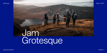
  31. Jam Grotesque by JAM Type Design, $25.00
    Inspired by the beautiful typefaces like Helvetica and Neue Haas Unica, this beautiful typeface looks fantastic in print as well as online.
  32. Poster Bodoni WGL by Bitstream, $49.00
    A slightly more refined revival of the Fat Face, as supervised by Chauncey Griffith at Mergenthaler one year after ATF’s Ultra Bodoni.
  33. Frisco Antique Display SG by Spiece Graphics, $39.00
    Here is a decorative condensed antique design that is sure to fit a variety of contemporary situations. The Bruce Type Foundry (later acquired by V. B. Munson) developed this wonderfully shaded Tuscan in the 1880s - or possibly earlier. It was known back then as Style No. 1050 and carried a pronounced three-dimensional look with a thin hairline at the bottom and right of each stroke. It is best to use Frisco Antique in large display sizes because it is easy to lose these delicate hairlines. A lowercase and several alternate characters have been provided for your convenience. Frisco Antique Display is also available in the OpenType Std format. Some new characters have been added to this OpenType version. Advanced features currently work in Adobe Creative Suite InDesign, Creative Suite Illustrator, and Quark XPress. Check for OpenType advanced feature support in other applications as it gradually becomes available with upgrades.
  34. Valentina SG by Spiece Graphics, $39.00
    Here’s what happens when your trusty felt tip marker takes a trip to cartoonland. Each of Valentina’s plump characters has a rough and splotchy texture. Some letters even bounce up and down like a 3-year old. As cartoon faces go, Valentina is a bit on the imperfect side. But that’s normal for a funny face. Use it in a variety of comical situations. Make convincing captions under your own artwork or design greeting cards with it. You can even blow it up to huge sizes to create a wild and crazy look. Valentina Medium is now available in the OpenType Std format. Some new characters have been added to this OpenType version as stylistic alternates. This advanced feature works in current versions of Adobe Creative Suite InDesign, Creative Suite Illustrator, and Quark XPress. Check for OpenType advanced feature support in other applications as it gradually becomes available with upgrades.
  35. DIN Next Decorative by Monotype, $40.99
    This four-piece family is the DIN design, but not as you know it. The famously, crisp, clean and precise typeface has been given a textured update that's reminiscent of rusted metal, or rubber stamps. Underneath this lies the same sturdy, geometric shapes that have allowed DIN to stand the test of time, but with a new sense of tangibility. “This kind of treatment is more about creating a feeling or a mood that goes beyond the communication of the words themselves,” explains Monotype Studio director Tom Rickner. “I think it expands the repertoire of what DIN Next can express.” Designed for display, these four typefaces – DIN Next Rust, DIN Next Shadow, DIN Next Slab Rust and DIN Next Stencil Rust – show a new side of DIN Next's personality, as if the surface of each letterform has been gradually worn away over the years.
  36. Aviator SG by Spiece Graphics, $39.00
    Aviator, also known as Ventura Slim, is based on an old 1930s lettering style popularized by Carl Holmes in his wonderful book on the subject. Angular and at the same time aerodynamic, this low-waisted typeface is great for tight-fitting headlines and other condensed titling situations. You may find it equally useful in developing company logos with a truly retro look. This resurrected digital version of Aviator comes with a convenient and stylish set of alternate characters and small figures. Now enjoy your flight! Aviator is now available in the OpenType Std format. Some new characters have been added to this OpenType version including stylistic alternates and historical forms. These advanced features work in current versions of Adobe Creative Suite InDesign, Creative Suite Illustrator, and Quark XPress. Check for OpenType advanced feature support in other applications as it gradually becomes available with upgrades.
  37. LTC Athena by Lanston Type Co., $29.95
    LTC Athena brings a somewhat “lost” hot-metal typeface back from obscurity into digital Opentype format. In fall 2012, printing historian Rich Hopkins contacted P22 type foundry regarding some inked type drawings he had just uncovered from his acquisition of the Baltimore-based “Baltotype” company some 20 years ago. It is a rare face whose original matrices were destroyed and thought fully lost. The drawings included a full upper and lower case set, numerals, basic punctuation, and alternate forms of some letters. The design is a narrow deco-flavored design from the 1950s with a curious avoidance of straight lines in the stems and main strokes. The face has been expanded to over 340 characters by Miranda Roth and includes ligatures as well as a full Pan-European character set. It is released through the Lanston division of P22 in consideration of its earlier incarnation as a metal typeface.
  38. Niedermann Grotesk by steve mehallo, $19.14
    With the printing of the Futurist poem “Zang Tumb Tuuum” in 1914, modern art had taken a typographic twist: “words in freedom” (parole in libertà) were now a major part of the art world. The avant garde followed suit. Niedermann Grotesk is based on the everyday type that appeared in early modernist collages, journals and manifestos. It is a peculiar style of lettering—which was originally inspired by the Sachplakat (object poster) work of Lucian Bernhard—and adapted for hot metal in 1908 by Heinz Hoffmann. 100 years ago, the style became a workhorse of the German printing industry. Niedermann Grotesk is an updated variant, referencing the original poster art, each letter carefully drawn with an old brush. Bumpy, bold and blunt—with a suite of alternate characters and a few dingbats—Niedermann Grotesk is perfect for advertising, packaging, poetry, art, protests and retro homage.
  39. ITC Scram Gravy by ITC, $29.99
    The 1928 logotype for Sertal Toiletries consisted of a stylized woman's head, a very snaky S, and five fine, fat deco caps spelling out the rest of the brand name. From these five clues, designer Nick Curtis divined the rules" of the typeface and drew a complete alphabet, including a lower case. The result: ITC Scram Gravy. The finished product could be described as Bodoni on steroids. Tight curls in characters like the 'm,' 'r' and 'y' soften the lower case and give the design a light-hearted flavor. ITC Scram Gravy takes its name from one of many running gags in the screwball comic strip "Smokey Stover," which had folks alternately splitting their sides and scratching their heads from 1935 to 1973. Those familiar with Bill Holman's strip will recall Smokey's car, the Foomobile, and one of his famous nonsense declarations: "No foo-ling, that scram gravy ain't wavy.""
  40. Jellyka, End_less Voyage - Personal use only
Looking for more fonts? Check out our New, Sans, Script, Handwriting fonts or Categories
abstract fontscontact usprivacy policyweb font generator
Processing